Equipped for Life
Opinion by Emily Gosling Posted 12 March 2026
The protein market has absolutely boomed in recent years – a trend that doesn’t look as though it’s going away any time soon: a 2025 survey from the US-based International Food Information Council (IFIC) revealed that the most common diet that Americans followed in the past year was “high protein”, and that consumers use “good source of protein” as the top criteria to define a ‘healthy’ food.
But now that suddenly everything from pot-based noodles to biscuits to crisps, popcorn and pancakes are boasting a boost of the muscle-making macronutrient, surely it’s safe to say that not all protein packed products are made equal.
This latest trend in ‘wellness’ eating has, as they tend to do, ushered in a tonne of confusing promises, complex ingredients lists and jargon-laden on-pack info that would bamboozle even the most seasoned smoothie-quaffing types.
Equip, however, looks to cut through all that; and has recently been rebranded by Montreal- and Los Angeles- based brand and design agency Wedge (Cocolab, Matheson Food Company, Ami Ami).
The brand is by no means new: it started life in 2015, founded by former sports rehab clinician and functional medicine practitioner Dr. Anthony Gustin apparently to fill the gap in supplements that he could confidently recommend to his patients, family, and friends thanks to being free from fillers, sugar, and additives.
Just over a decade since Equip began life, the landscape for such products looks vastly different, and according to Wedge, despite its early success it was struggling to define its position in an increasingly competitive market, and needed a revamp to support its ambitious growth plans.

According to Wedge, Equip is a “counter movement to overcomplicated health trends” and a “return to timeless nutrition that works, because that’s how nature designed it… Nutrition used to be simple. But health and wellness as a category at large is becoming increasingly over-engineered. Too processed. Too slick. Too ‘trust us’.”
Bad news for vegans and veggies however, as the product line is centred on bovine protein (though Equip and Wedge’s branding alike are both very keen to drive home the fact that the sources of said bovine protein are “raised on the land”. To which I’d counter, ‘what, as opposed to in water, or mid air?’ But clearly that means something to someone.)
I’m probably not the most impartial to judge the whole ‘raised on land’ promise as a vegan of 20 years, and a vegetarian since around 10 years old, but I think the point here is that Equip looks to strip back all the nonsense and ultraprocessed stuff and additives and such and make the whole protein thing a lot simpler. Or as Wedge puts it, “Equip exists to restore what’s lost in our diet. Centuries-old foods for the modern world. No synthetic shortcuts. Honest food built on generations of wisdom and backed by science.”

These core values led to the creation of the central brand idea “Nutrition As Nature Intended”; a concept that feels evident across the whole brand world. It’s a refreshing riposte to the hyperslick, Silicon Valley-ish, frequently bro-crentric branding so often found with protein products – all that manosphere ‘MAKING GAINS’ type stuff on products literally named after weapons (Grenade, we’re looking at you).
So just as the product strips things back to their natural, basic fundamentals, so does the branding, aiming to create a future proof brand thanks to its ability to draw on the good stuff from the past. It’s not nostalgic as such, but it’s certainly rustic – a uniquely artisanal approach among a sea of competitor brands that often veer so far from resembling anything food-related, let alone natural, that it can be hard to even tell what they are.
Everything is straight out of the farm here: you can almost feel the gingham cheesecloth. The art direction and brand photography is all smiling maidens and fields and cows. Perhaps this is just me being overly squeamish/PETA-leaning, but I always find it odd when things made of animals show the animals themselves – surely, SURELY no one could look at that sweet scruffy cow face with its big kind cow eyes and think ‘that’s exactly what I want to eat in the form of conveniently packaged up protein bars’, but perhaps they do. Arguably, it’s better than pretending animal-based products arrive with us through some sort of fairy dust immaculate conception, but I do struggle to get my head around it.
All that aside, the brand design is clever for sure: not only is it so different to the approach of its competitors, it so succinctly captures exactly what the brand is all about – its ethos, its ingredients, its USP.

Wedge says that to achieve that sense of earthy goodness in its designs it opted to “tap into cultural codes” that it dubbed “natural nostalgia”, drawing inspiration from “vintage pantry staples such as flour bags, butter, yogurt, etc. that reflected a time when food felt genuine and trusted.”
Thanks to the deft hands of the design team, though, things thankfully never get twee or land in pastiche territory. That’s due to the way in which it’s all kept pretty simple – while there’s a heavy leaning on some charming (but IMO not mindblowing) brand illustrations, everything is about clarity – yes, it draws on the past, but it feels like a brand that won’t feel dated any time soon.
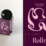
I love the typographic choices – so much so that I don’t even mind the all-lower-case wordmark, an ongoing trend of sorts that I’ve done my fair share of grumbling about over the years. The wordmark uses a font called Aachen Dee, originally designed for Letraset by Colin Brignall and Alan Meeks. It works really, really well – just enough character, just enough clarity, and a superbly satisfying mirroring of the lowercase ‘q’ and ‘p’ that’s just very lovely to look at.
Elsewhere, the branding for the most part uses a nice mixture of one sans and one serif. For the former, Wedge opted for Adobe font Acumin, which is fine – sort of unremarkable, if anything, a tiny smidgen too infantile, in my opinion.
Its serif sibling, however, is gorgeous, and really offsets the rest of the brand elements brilliantly: where longer swathes of copy use the aforementioned Acumin, product names, titles and headlines online use P22 Mackinac by Rochester, New York-based foundry P22. It’s a great choice here, not just in aesthetic but in underscoring the reference points the overarching identity is underpinned by, spanning “four centuries of type design, bridging the Old World with the New,” as the font’s designers describe it. Mackinac has all the allure of some sort of antiquarian bookshop, but all the sass to make it still feel resolutely contemporary, and all the utilitarianism to keep things seem established and trustworthy – in short, an absolute masterstroke for a brand like Equip, which looks to hit exactly those beats.
Finally, for small details and certain nuances where emphasis is required, a third typeface joins the identity in Analogia (only ever used in its italicised form), a font designed by George Tulloch and which again merges modern day functionality with historical charm – in this case, referencing “the 18th-century type of the Low Countries,” according to its creator.
Throughout Equip’s identity, layouts and colour palettes are once again kept simple: Wedge retained the red and blue that were already a core, established and recognisable part of the brand; though these shades were tweaked to become deeper yet slightly more muted, further reinforcing the point of difference between Equip as trustworthy, wholesome counterpoint to the sea of Jock-like athleticism that unites much of its sector.
Likewise, the brand’s former white was softened to a cream shade – another subtle but smart shift that takes things firmly out of the clinical scientific look and feel that’s so tried and tested in the protein space and towards something a whole lot more natural, warm and timeless.
One element I’m not totally sure on is the illustrations by Aless MC – they’re undoubtedly skillful, but in this context can feel a touch ClipArtish next to the rest of the deftly wrought brand elements – it would have been nice to see them lean even more into that pantry vibe and better echo the contemporary nostalgia that’s so gorgeously evident in the wordmark.
Overall though, Equip’s new identity is a beautifully back-to-basics riposte to the hideously macho, data-centric, cold yet shouty vibe of the vast majority of protein-centred wellness brands – and kudos to Wedge for being so bold as to gently showcase the ways in which a brand can sometimes do well to shun the conventions of its category entirely.