Exemplary brand collabs don’t compromise: the joyful designs for Midnight Hotdog ‘dog fur mist’ by SMLXL
Opinion by Emily Gosling Posted 30 June 2026

Back in February, we covered a project that was so delightful I still think of it often (not least thanks to its utterly ridiculous, ingenuously earwormish jingle): HotDog, with its branding by SMLXL.
There was, and is, so much to love about this identity: there’s the logo formed of two dogs, one sniffing the other’s bum, reduced to its most beautifully simple graphic form; the adorable illustrations, the editorial-style tongue-in-cheek photography – it all works together to become a masterclass in doing fun without being stupid about it; in artful irreverence; bold but with a lightness of touch, never tipping into chaos.
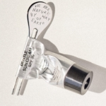
Midnight Cosmetics is, in so many ways, a brand that could be seen to be taking the absolute opposite approach. Founded in Barcelona in 2019 by Nina Urgell and Marc Ciudad, it’s a natural, vegan, science-first cosmetics brand that has built its entire identity around restraint: monospaced lowercase type set in the hyper-impersonal, but aesthetically very lovely Simplon Mono by Swiss Typefaces; a palette of black, white and grey; ruthlessly minimal packaging design.
It’s all very elegant and beautiful and seemingly quite serious – but not serious enough that it doesn’t know how to have a good time, as proven by a somewhat unexpected, but brilliant, and rather hilarious collaboration with the aforementioned petcare brand HotDog.
The resulting product is a limited-edition ‘dog fur mist’, which apparently hydrates, softens and refreshes hounds’ hair. Do dogs need a mist? No, they don’t. Do we love this anyway? Yes, we absolutely do. As SMLXL, which has studios in New York and Barcelona points out, the two brands exist in opposite visual worlds: Midnight is “minimal and sophisticated”, while HotDog is “expressive and irreverent”.

SMLXL, then, was tasked with the not-insignificant challenge of seamlessly uniting two brands with absolutely no shared visual vocabulary, and making them work together on the same packaging. The solution isn’t to throw either furbaby out with the dogbath water: instead, it’s a very obvious answer – and all the cleverer because of it.
Midnight’s black-and-white packaging stays entirely intact; all that careful, minimalist, pared-back restraint is left completely alone. Until, that is, the dogs arrive.
As with the original SMLXL branding for HotDog’s overarching identity, said dogs are gloriously gouache-painted, hand-wrought, colour-saturated little balls of energy and joy. The way SMLXL has approached these dog illustrations is to capture the creatures seemingly in moments of pure sensory pleasure: fur flying everywhere, pure ecstasy, as if they’ve achieved some sort of spiritual dog-nirvana (‘dog’ spelled backwards, after all, is ‘god’.)
Against all the monochrome that’s central to the Midnight look and feel, the colour hits like a klaxon – a contrast that brings the whole design system to life, capturing the tension between Midnight’s composure and HotDog’s exuberance perfectly, and making that strange, abstract space the very crux of the aesthetic.
The illustration choices also serve to subtly indicate the nature of the product itself: the mist’s entire reason for existing – softness, hydration, that particular floatiness of fur doing exactly what you want it to – is, by its nature, invisible (or at the very least, nigh-on impossible to photograph). So instead of attempting to represent it, SMLXL painted what the product does: dogs mid-bliss, hair billowing in a way that marries the exuberance of hair metal high-camp 80s rock music videos with the sheen and ridiculousness of Pantene ads.
The gouache-like effect in the brushstrokes of the illustrations does a lot of the heavy lifting: those bold, saturated pigments and rich, textural surfaces communicate warmth and softness in a way that a cleaner, more digital medium simply wouldn’t. The packaging is, as it should be, deliciously tactile, both in its design and materiality.

The campaign photography shot by Barcelona/Paris/Milan-based photographer Martin Gatti features Pomeranians holding the bottles, apparently shot from underneath, as if they’re suspended above the viewers’ heads. As should go without saying, this is an absolute masterstroke.
When two very distinctive but very different brand identities come together in a collaboration, among the worst results is surely just an unhappy medium of the two – a compromise-ish averaging-out of two visual languages, something safe and inoffensive that represents neither party, pleases nobody and is all-too-easily forgotten.
This, thankfully, is the total opposite. Midnight is still completely, uncompromisingly Midnight. HotDog is still entirely, exhaustingly, gloriously HotDog. This wonderfully unnecessary but incredibly cute collab is a limited-edition, single product – one executed with such design precision that it just exudes craft, care and attention.