Perky Bros puts restrained Southern hospitality before shouty branding in its identity for Tennessee resort Southall
Opinion by Emily Gosling Posted 18 August 2026
Branding parlance often deifies qualities like ‘boldness’ – being ‘brave’, ‘zigging when others zag’, ‘disruption,’ and so on and so forth.
Some projects, however, demand and deserve the absolute opposite; the sign of a good designer, perhaps, is to intuitively know which one is which.
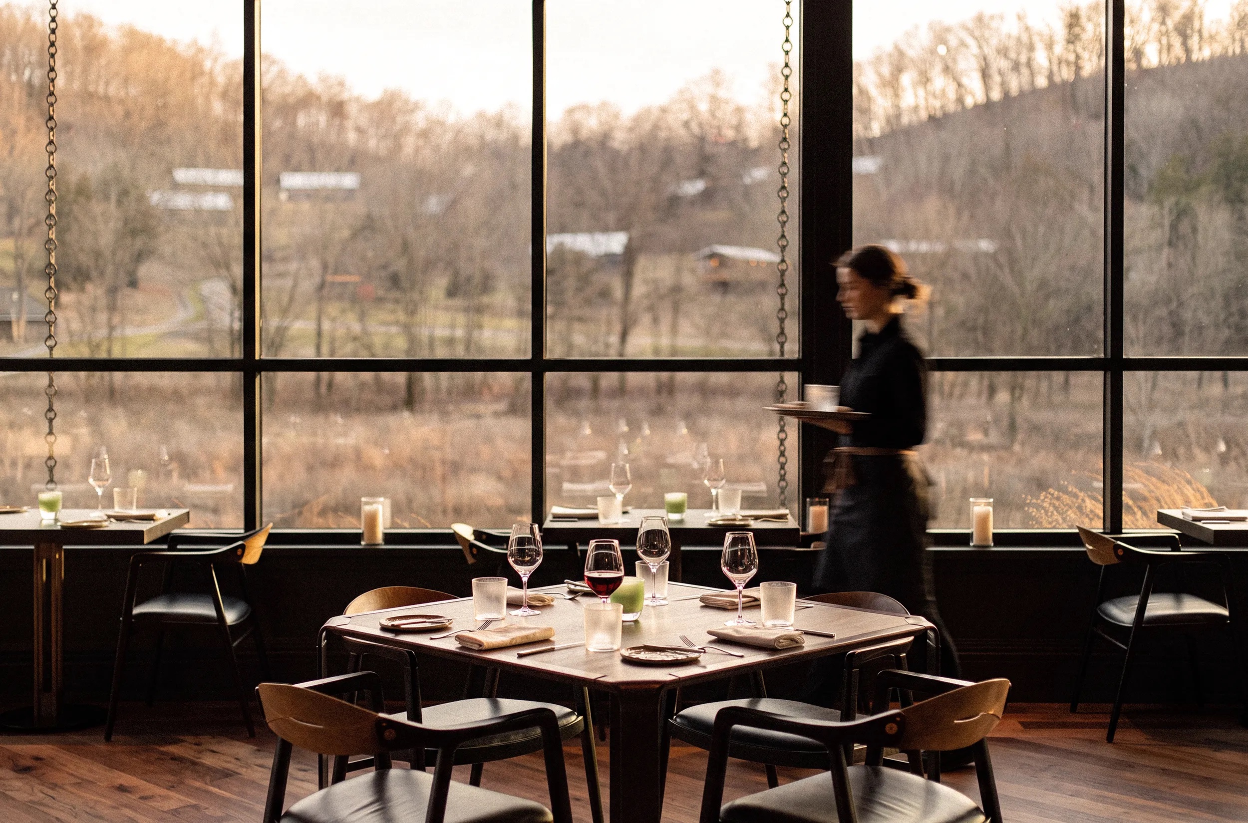
This is one such project. Southall is resort set across 325 acres just outside Franklin, Tennessee, comprising a working farm, hotel, spa, and a Michelin starred restaurant called January which – like the other eateries on the site – specialises in “farm-driven dining”, according to Nashville, Tennessee brand design agency Perky Bros (Public Pool, Shy Bird, Tembo), which is behind Southall’s new identity.
Perky Bros worked across the entire visual and verbal language for Southall, including its naming, logo, web design, motion design and more. At the heart of everything, according to Perky Bros, is a certain balancing act – one between “nature and refinement, tradition and progress, working farm and welcoming inn”.

It’s polite; refined; classy. It’s all thoroughly grown up. It’s the kind of identity you could undoubtedly take home to your parents.
And that’s exactly what’s needed here: if, as Perky Bros has put it, Southall offers a “renewed expression of Southern hospitality,” then politeness is central. No boundaries, or envelopes are being pushed here – because they shouldn’t be.
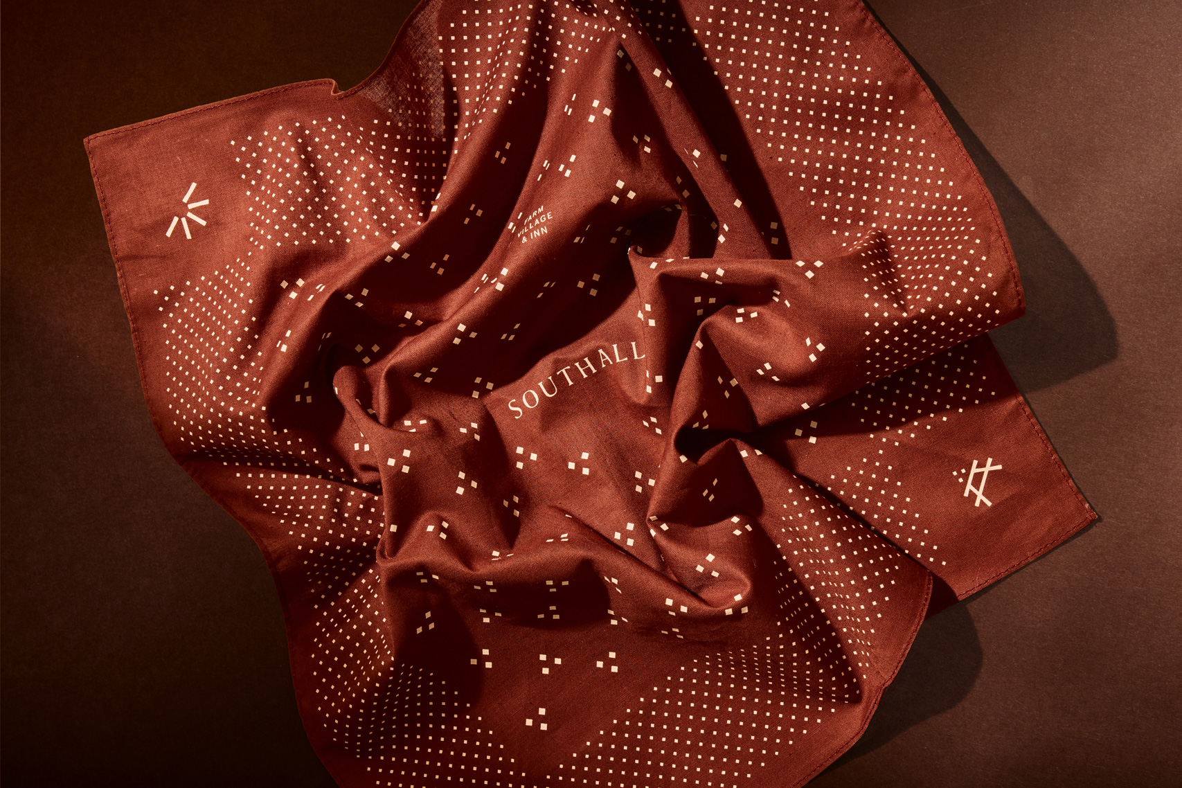
Instead, this is an identity that sits back, does what it needs to do, and does only what it needs to do. I do wonder if Perky Bros could have been a little more adventurous with this look and feel, but then I’ve never been to Franklin, Tennessee.
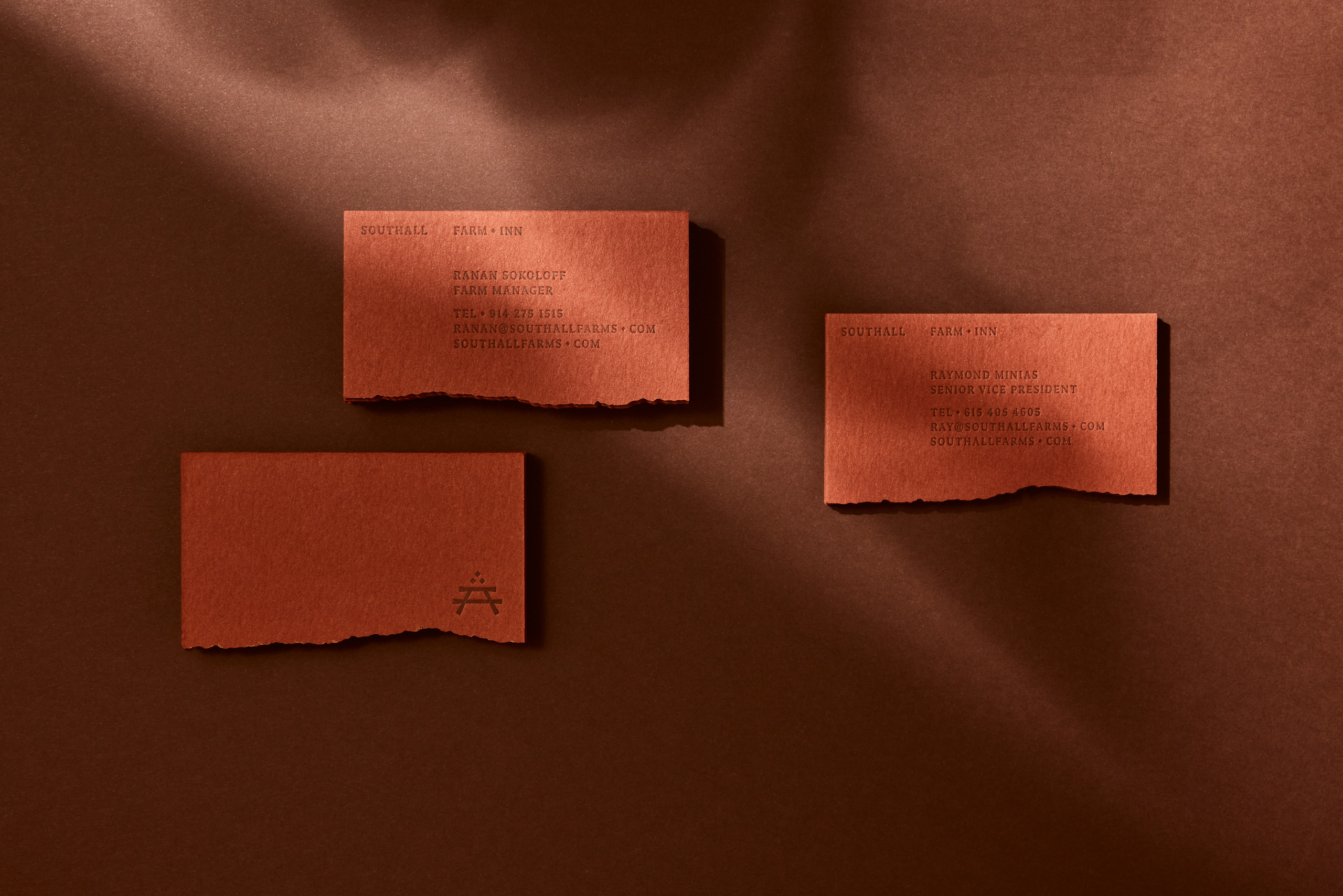
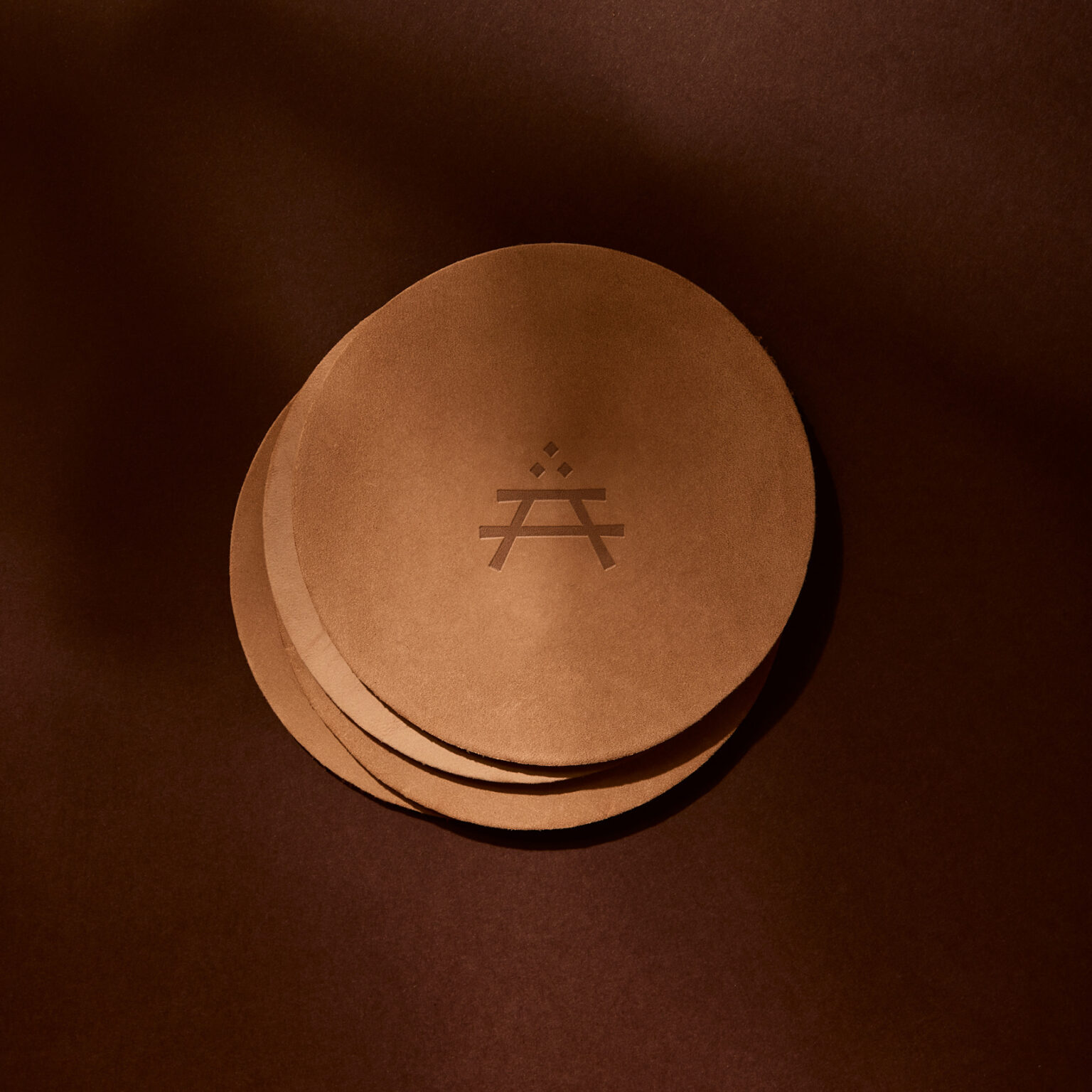
The central logo device here is a pared back table symbol – a deliberately simple motif that acts as a shorthand to many of the notions Southall looks to associate itself with, things like gathering, eating, and connection – “farm-to-table”, quite literally here.

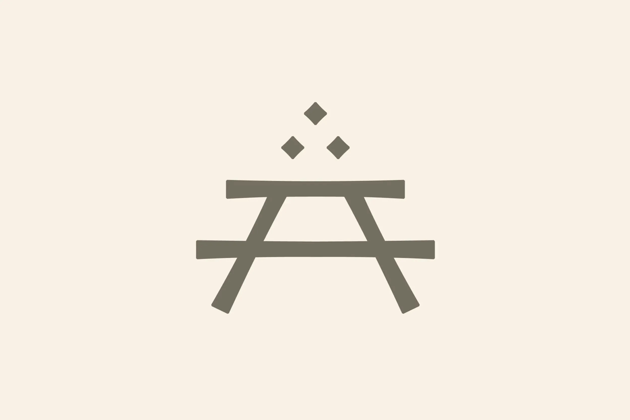
Three diamonds sit within the mark, representing the bounty of a successful Tennessee harvest; the number three also apparently has a more subtle connection to Southall’s history and its position in Middle Tennessee, according to Perky Bros, but it’s anyone’s guess what’s actually meant by that.
The logo and the brand’s suite of cute wee icons is inspired by the Arts and Crafts Movement – which is fascinating in itself, given how inherently British that movement is. For the uninitiated, the Arts and Crafts Movement was a design revolution of sorts that began in around 1880 as a reaction against mass production and the Industrial Revolution. It championed hand-crafted goods, simple and honest forms, and natural motifs inspired by medieval traditions; among its most famous associates are type designer (and not-nice-man) Eric Gill and much nicer man, artist, and designer William Morris.
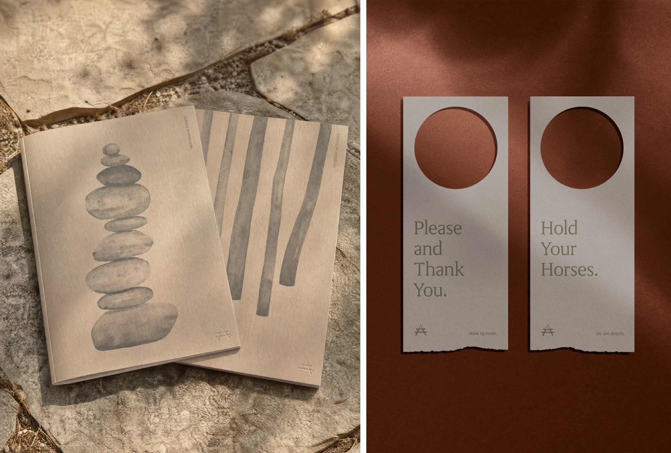
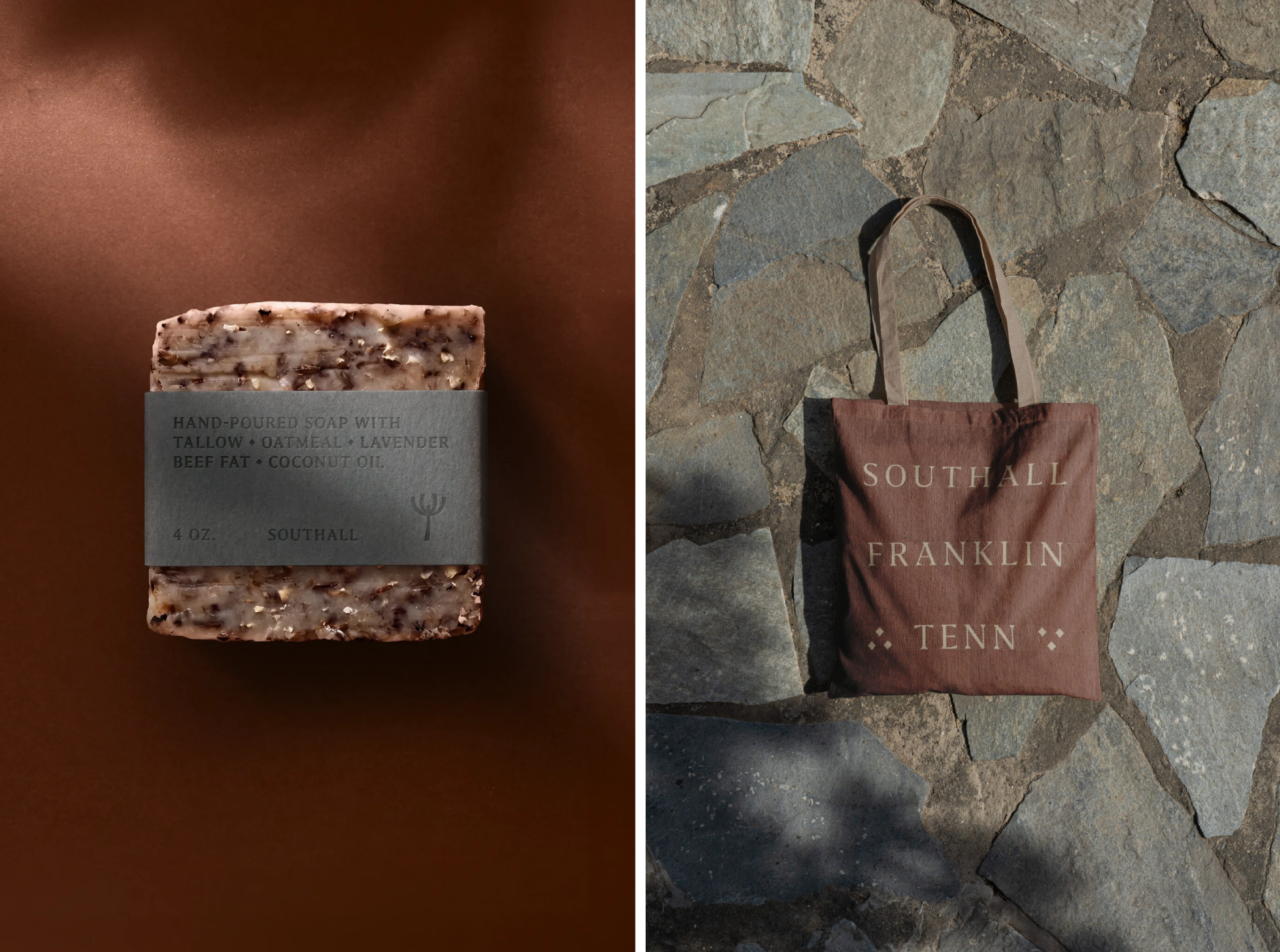
This reference point is likely what informed the more tactile, hand-drawn-looking aspects of the branding system – tiny little imperfections and quirks that rescue it from being corporate or cold in any way.
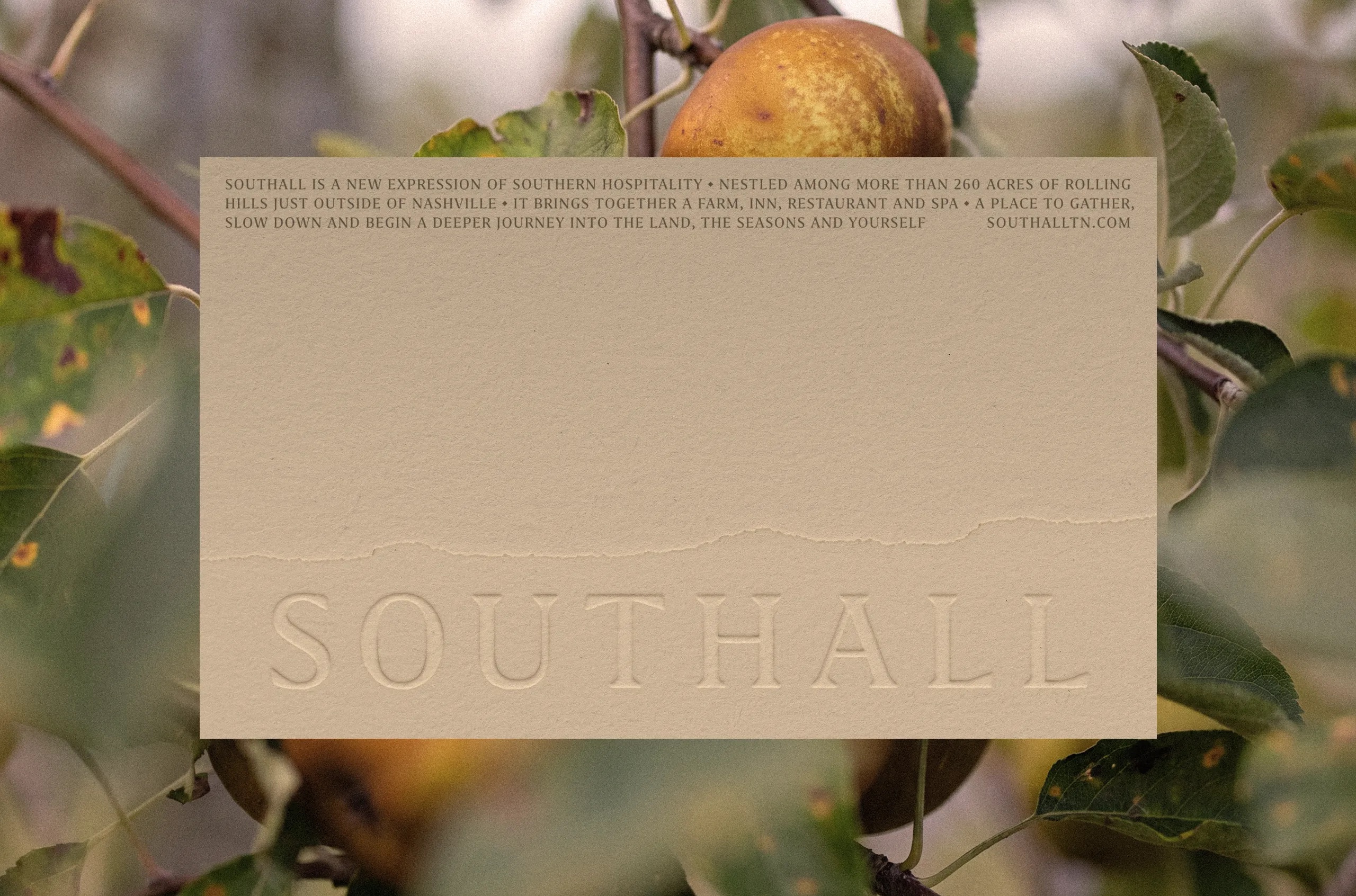
That idea of the handmade carries through into the physical expression of the identity. Richly textured papers, deeply impressed letterpress details, and laser-cut edges reference native shale – the fine-grained rock prevalent in Southall’s surroundings – making the brand feel materially connected to its locale.
None of this is particularly shouty – quite the opposite – but it gives the identity a sense of weight and tactility that the comparatively quiet digital expression perhaps doesn’t immediately convey.
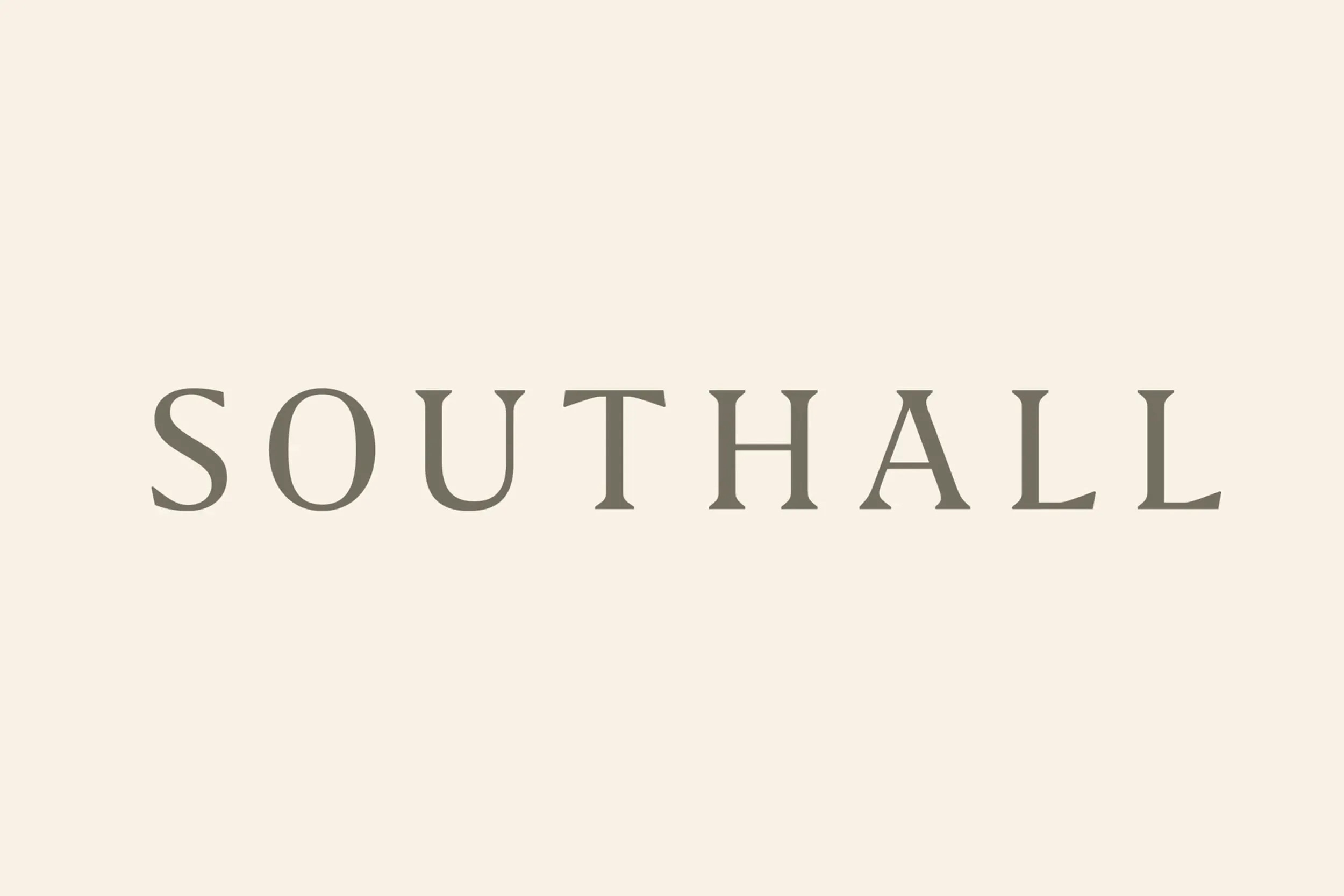
For the wordmark, Perky Bros customised Grifo S by Porto-based foundry R-Typography, retaining its sturdy, wedge-like serifs while opening up the spacing between the letters. The result is broad, calm and pleasantly old-fashioned; I love the distinctive ‘A’, with its tabletop-like form to echo the logo. Lovely stuff.
For the wider identity system, Grifo S is paired with Marr Sans from New York- and London-based foundry Commercial Type, which is used for supporting information and more functional communications. The pairing of these two makes sense: Grifo brings warmth, personality, and a sense of permanence, while Marr Sans provides the clarity needed for navigation, information and guest-facing applications. It means the identity can seamlessly flex across the world of hospitality – which naturally requires more text, more information, more navigation – and the demands of a 325-acre resort centering on a farm.
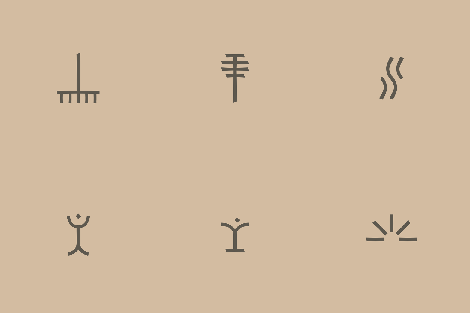
The iconography here is perhaps the most direct nod to Arts and Crafts – it feels almost Boy Scout-ish in its rustic straightforwardness. They’re a smart move for a brand like Southall: icons here have to do a lot of hard work, and genuinely communicate as illustrative shorthand, and these do the job beautifully. Here, Perky Bros has done a great job of using icons shrewdly to extend the visual language into wayfinding and environmental applications, acting as a useful conduit between the brand and the physical experience.
Nothing here is ever, ever trying too hard – I’d imagine that if you were staying at Southall, you’d barely clock the branding. That’s a good thing: you’re meant to enjoy the resort, not be visually stopped in your tracks by a flash of trendy neon Terminal Green or an out-there logotype.
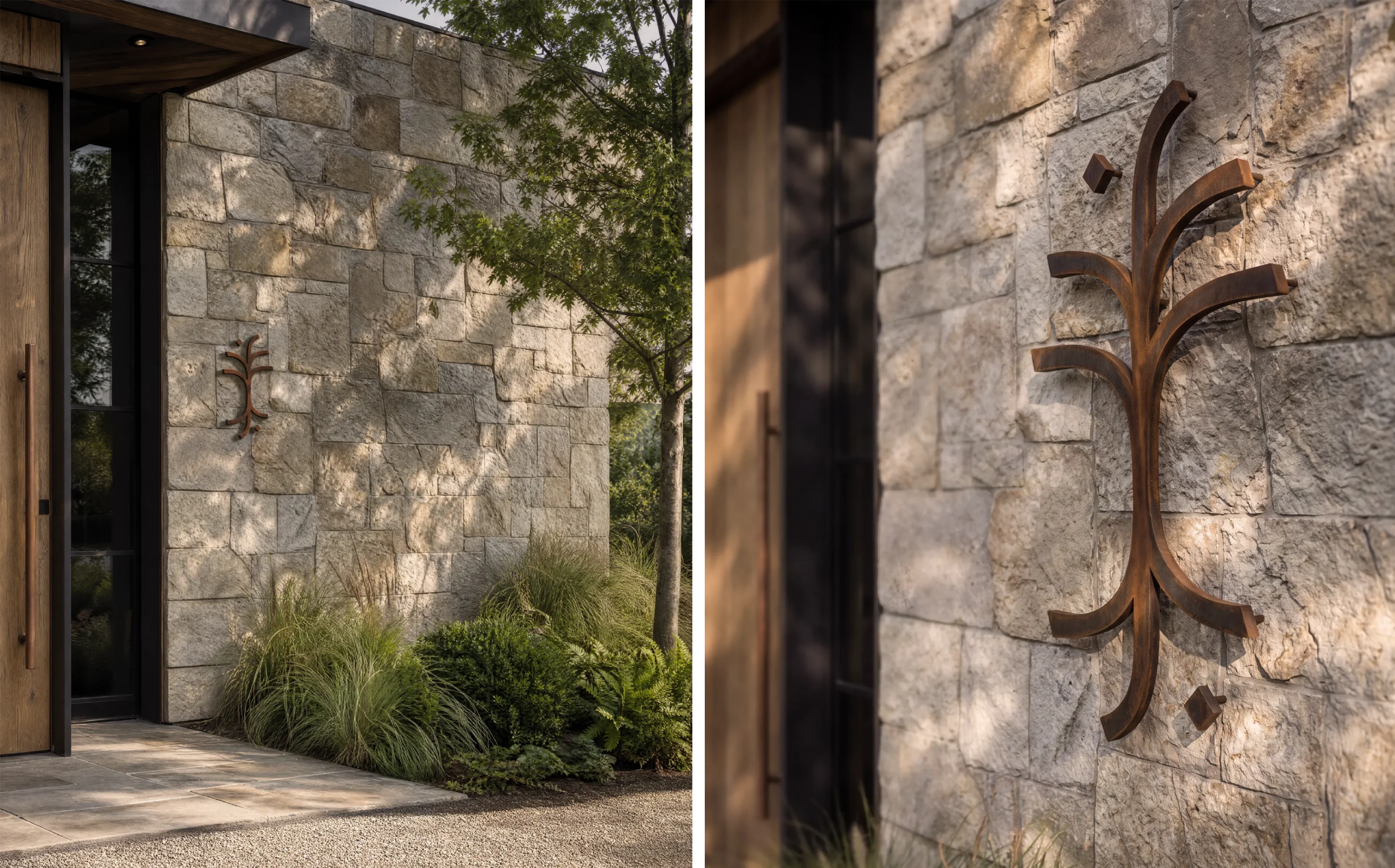
Indeed, this level of restraint feels like a relief – it’s all rather refreshing. Branding for hotels and resorts can so easily become an exercise in manufacturing a lifestyle – establishing a highly stylised world in which every chair, cocktail, tile and towel has to participate in the same Instagram-ready narrative. Southall seems less interested in doing that. Its identity is there, certainly, but it largely gets out of the way.
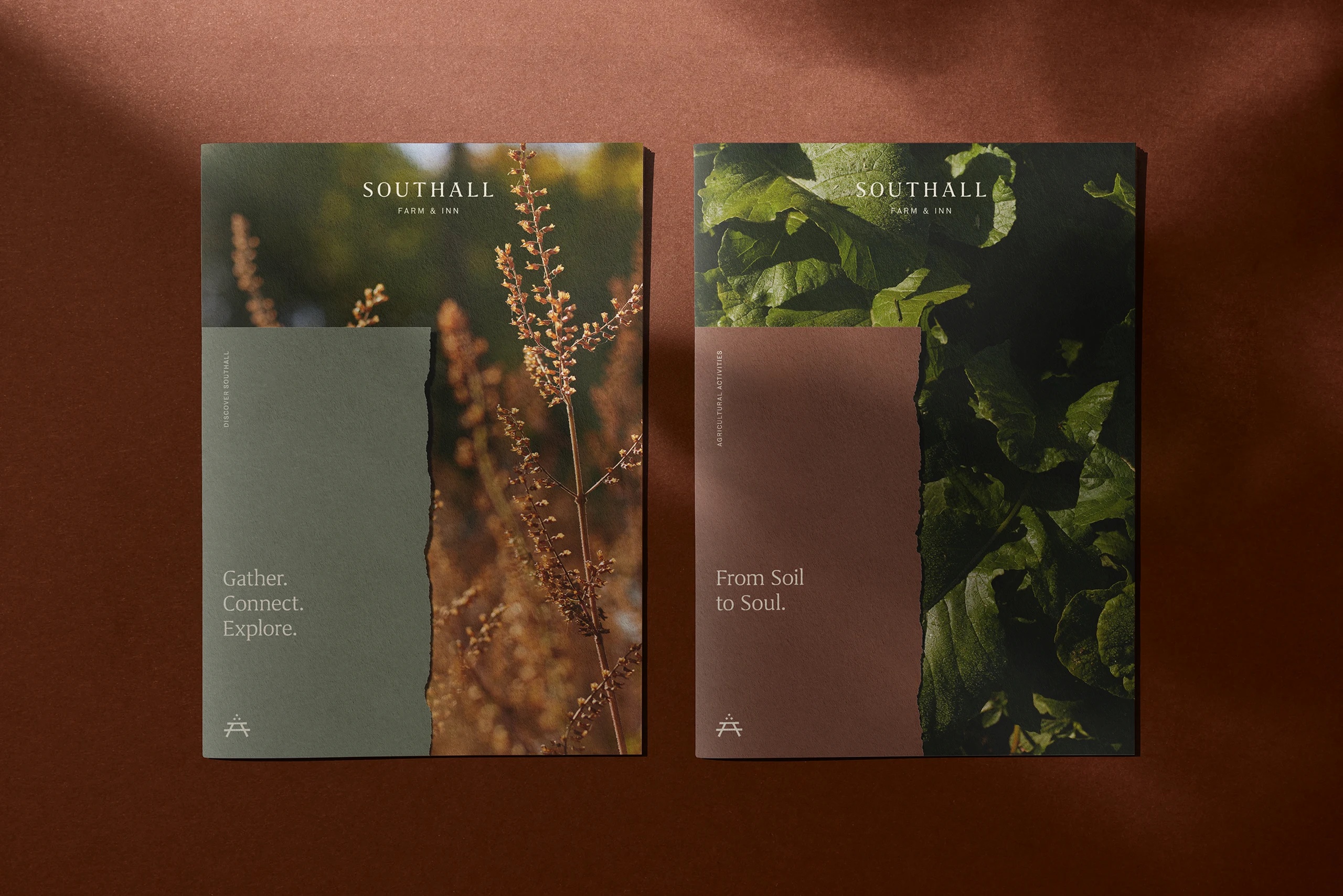
But – crucially – this is for a farm/inn in Tennessee. It’s not for me, or probably many of you, readers, so maybe conservatism and caution and slick, smart-casual is exactly the vibe that’s required.
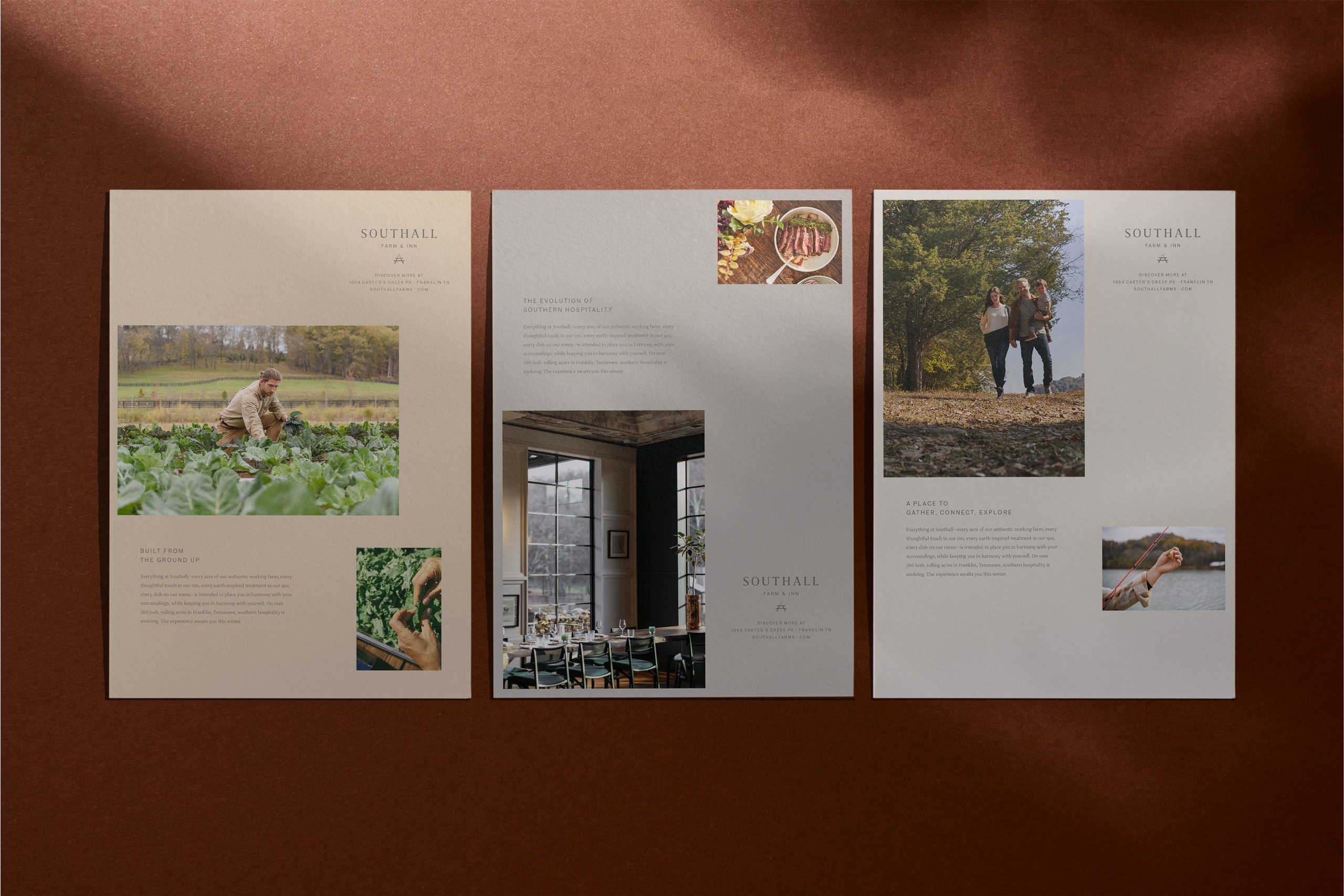
Photography explains in very literal ways what you can expect from Southall: it shows off the landscape, interiors, restaurant settings, the food. It’s explanatory and documentary more than style. And that’s probably exactly what the target audience wants: this isn’t about trying to use branding as a cunning way to make Southall appear as something it isn’t – something more hip, more youthful.
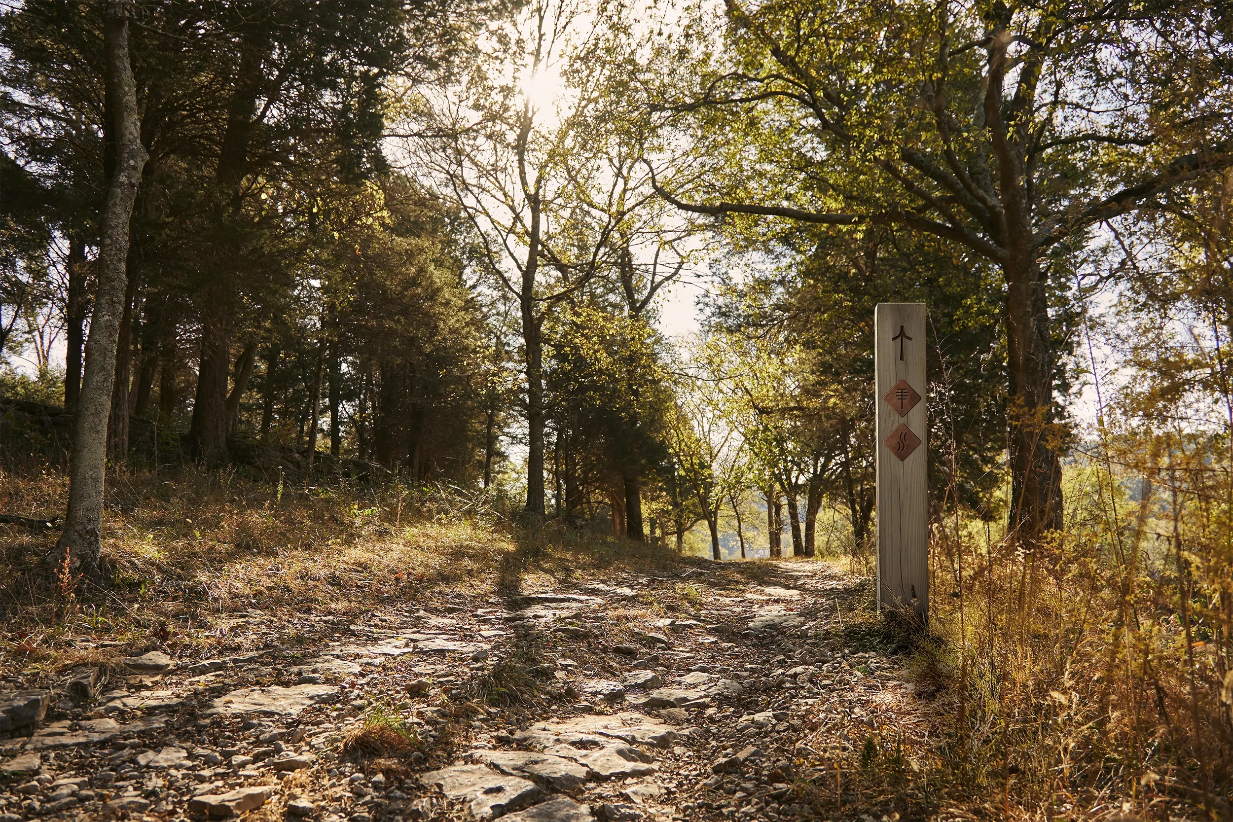
Instead, Perky Bros has created something that feels comfortable with the idea of permanence – an identity designed to sit alongside the land, the buildings, the food and the rituals of the resort rather than compete with them.
Ultimately, that seems like a sensible approach for a resort whose biggest asset is its adherence to the vacillations of nature. Because at the heart of this project isn’t branding, or nice photography, or any grasps at being anywhere near the zeitgeist – it’s the land itself, the farm, the seasons. The branding doesn’t have to speak for those things, because they can speak for themselves.