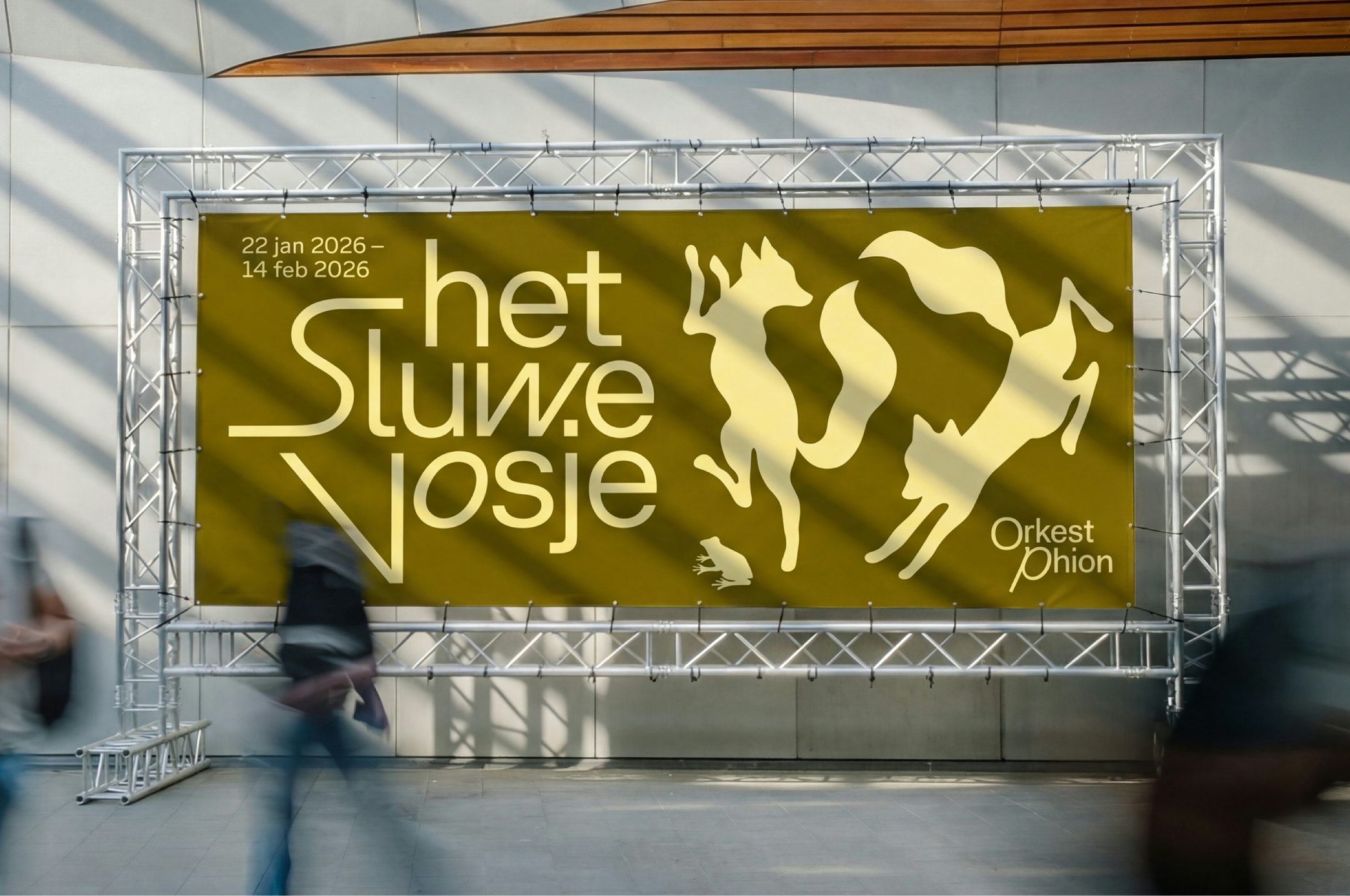
Thonik’s identity for Orkest Phion gives the symphony orchestra a brand that’s as ever-changing and itinerant as its programme
Opinion by Emily Gosling Posted 1 September 2026
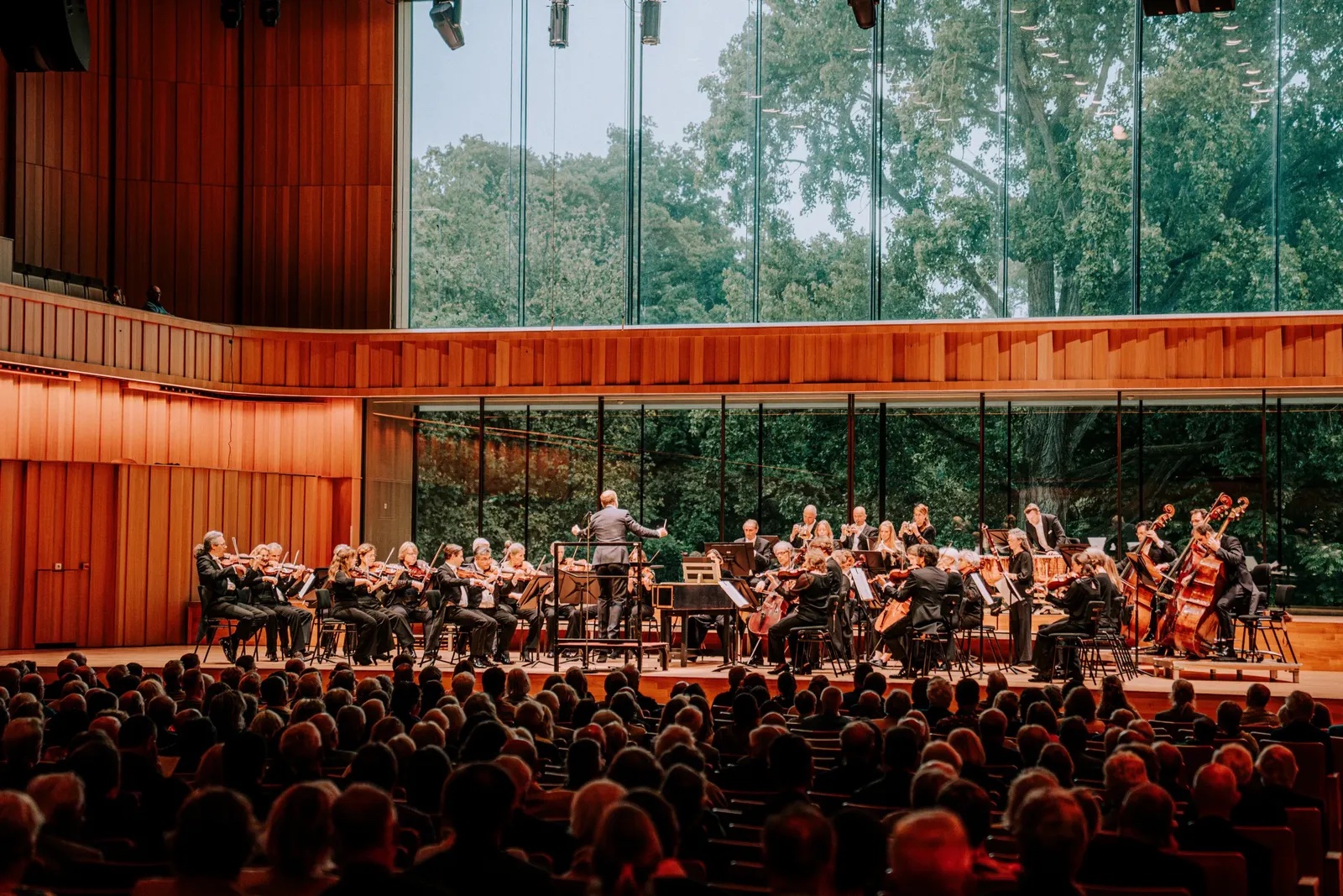
Orkest Phion – or Phion Symphony Orchestra in English – is a Dutch travelling symphony orchestra that was formed in 2019 through the merger of the Netherlands Symphony Orchestra and Het Gelders Orkest.
Based in the eastern Netherlands, it operates across the provinces of Gelderland and Overijssel, performing in different cities and venues rather than from a single permanent concert hall. Alongside its regular programme in the Netherlands, the orchestra also travels internationally.
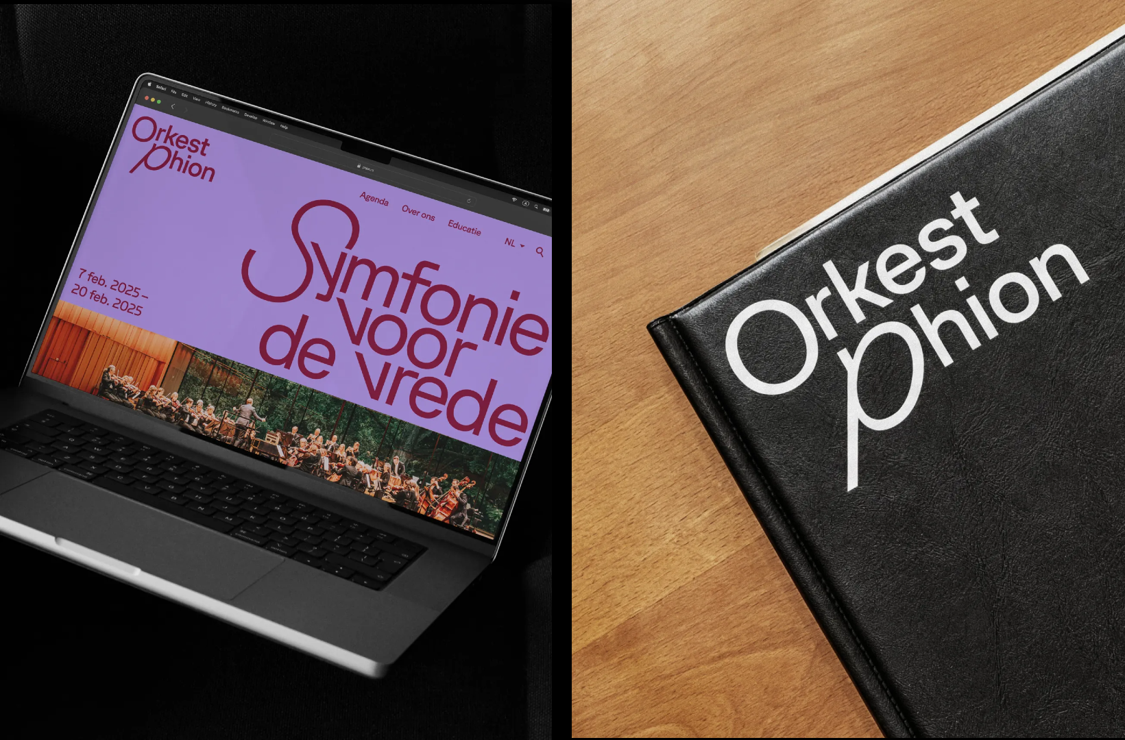
The inherently itinerant nature of the orchestra means that Phion is constantly having to communicate not only different concerts and programmes, but in different locations and to a range of different audiences.
As such, while it’s important that messaging and campaigns are distinctive and relevant to those aforementioned unique concerts, locations and audiences; as with any brand or entity, a sense of consistency and recognisability is vital.

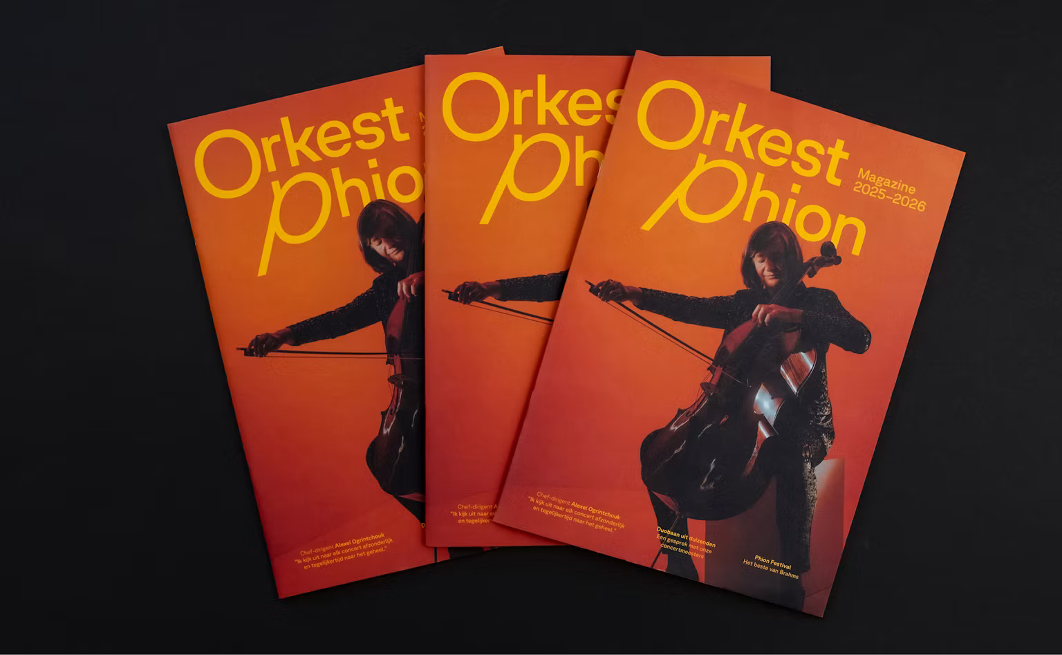
Amsterdam-based design studio Thonik was brought in to develop a visual system that could accommodate the constant change at the heart of this symphony orchestra that itself is always on the move; one that could grow with every new campaign without becoming repetitive or disconnected.
The studio’s answer was to make the music itself the foundation of the entire visual identity – expressed through a really gorgeous, expressive approach to lettering.
The crux of the entire brand is GT Planar from Swiss foundry Grilli Type, a font whose entire raison d’être is about combining functionality with a wild approach to movement: it not only has the usual full set of italics, but a whole alphabet of retalics – i.e. letters that slant backwards, instead of forwards. As such, it has a huge range of movement, “testing the limits of a 90-degree range, combining Retalic, Upright, and Italic styles into one continuous design space,” as its creators put it.
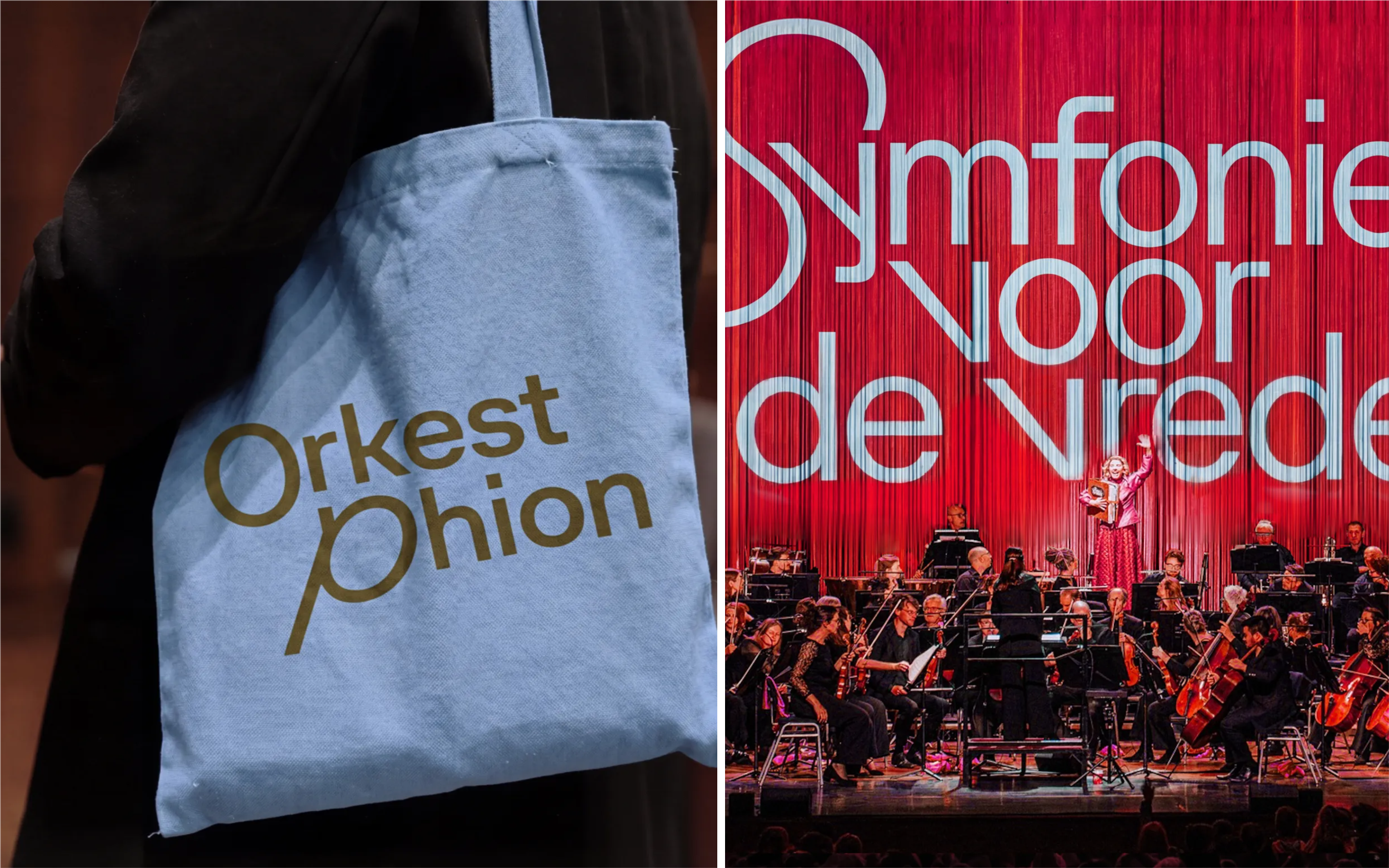
Just as music morphs in terms of mood and energy; tempo; rhythm; pitch; dynamics, and so on, the lettering here is ever-changing, and can seamlessly morph to express pretty much anything it needs to.
I love the way a single word can combine upright, italic and retalic lettering: it’s such a succinct way of saying a lot using very little – one font, nothing too flashy, the unassuming but supremely confident star of the show.

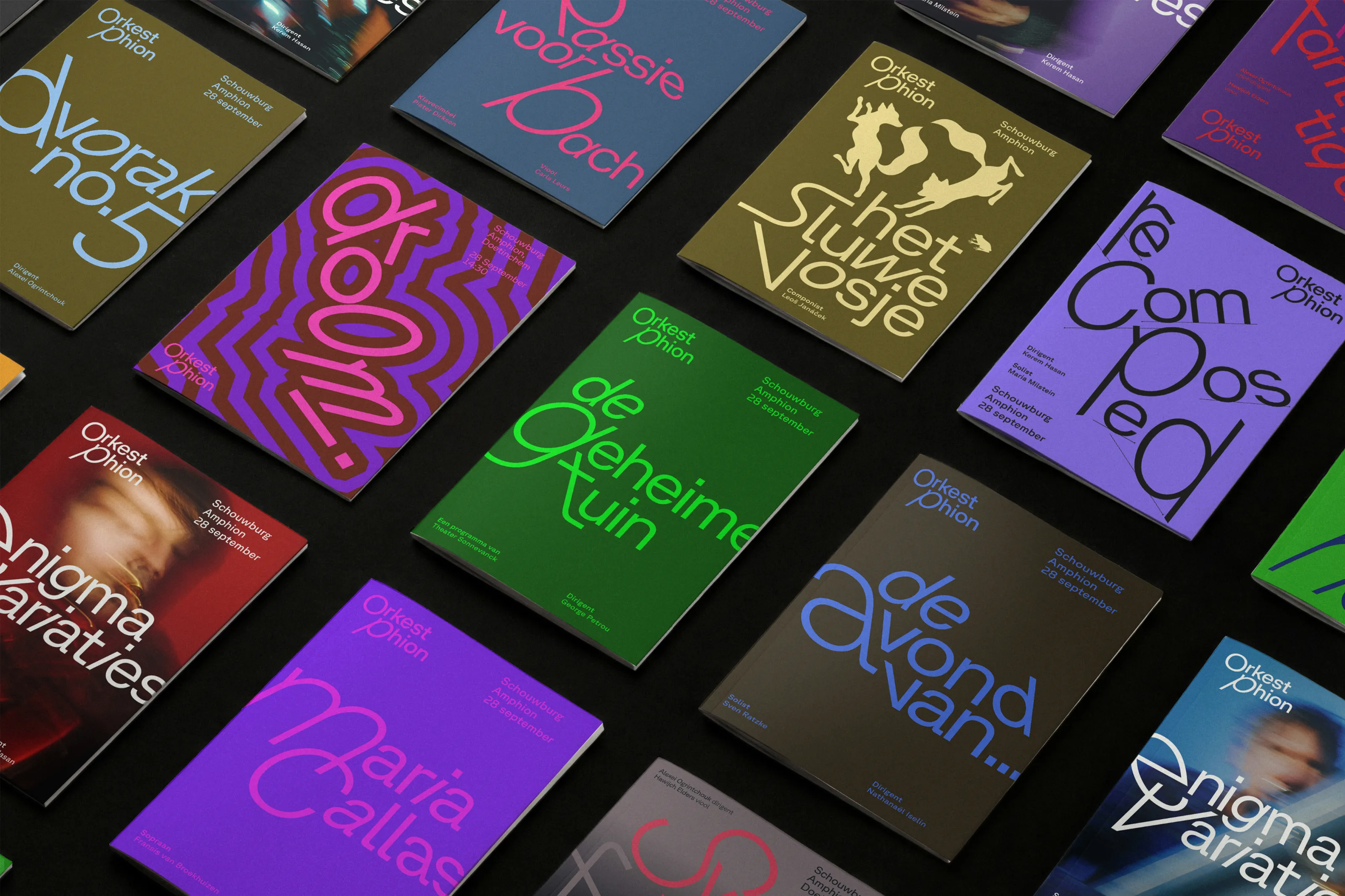
Form certainly follows function here, but more than that, it augments it: it’s almost as though the type itself is being conducted like the players in an orchestra.
Where Thonik has been especially skilful here is in not letting an identity that delights in kinetic possibilities ever feel unhinged. It’s done so through applying a simple rule that governs how type is used – the first letter of a heading establishes the direction and character of the movement for the rest of the word or phrase.
The dextrous combination of rigour and flexibility means that this system is robust, future-proof, and feels thoroughly timeless. Everything is distinctly ‘Phion’, but no two campaigns are the same. Instead, the character of the music determines the character of the typography: something calm can result in more restrained, open lettering, while a restless or dramatic piece can push the forms further apart or into more extreme angles.
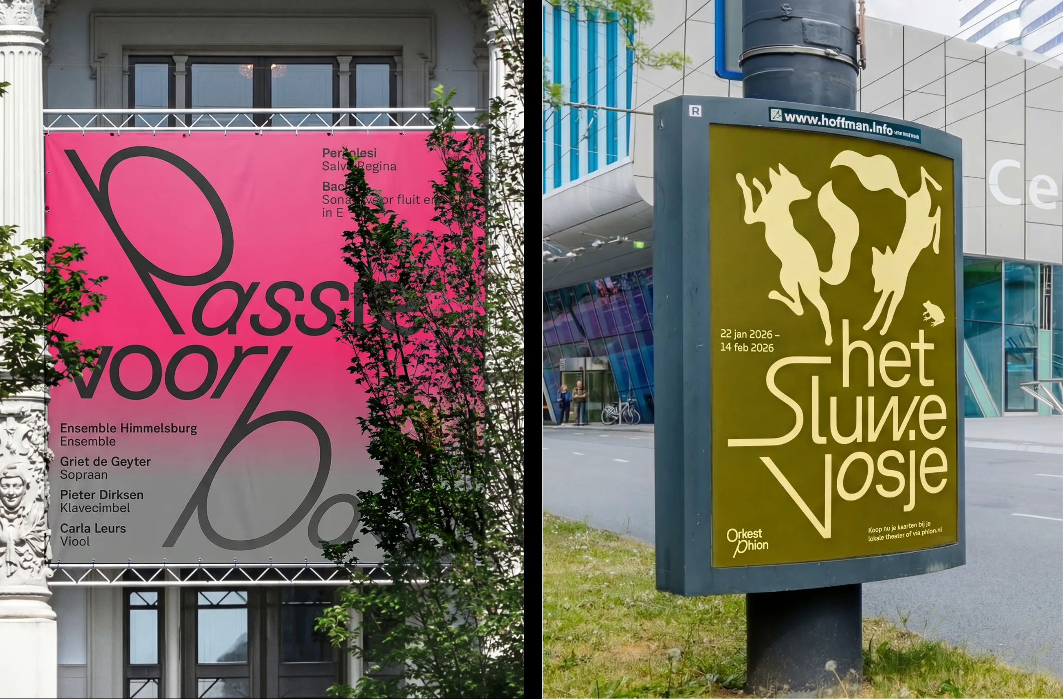
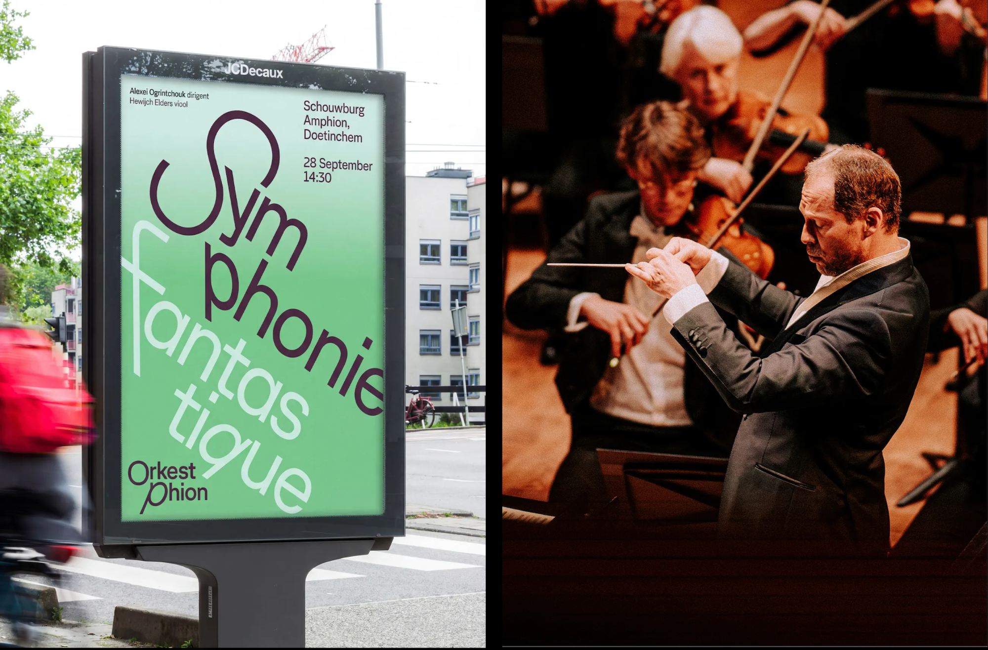
With type at the heart of the brand identity, it also, in a way, dictates basically everything else – it can yoke how framing is used, the delightfully modern and bright colour palette. It acts as illustration as much as communication thanks to the inherent expressiveness of the type, yet it retains a sense of formality and legibility throughout.
When it comes to colour, as with type, things are sprawling and flexible yet never blithely maximalist, or tipping into the territory of being ‘too much’. Thonik’s principle here was to take the dominant colour in each piece of photography for that specific piece of visual communication and apply it to the typography.
The result is a strong visual connection between image and type, while the repeated principle creates consistency across an otherwise changing series of campaigns.
So despite the multifarious possibilities in lettering and colour, they can’t ever get too busy or incoherent: large-scale typography is placed over concert photography and imagery of musicians, with the shifting letterforms becoming as much a visual feature as the image itself. In motion, the idea becomes even more literal, with type moving in relation to the performer and the music.
What really works here is that every single element works so very hard, and has been used for such a concrete and context-specific reason: things don’t move simply because animation is fun; lettering doesn’t distort simply because the designers wanted a go at really flexing with variable typography.
Each and every element of movement – whether in 2D graphic applications or live stage settings or actual motion design – are tied to what Phion is and does. That gives the system a particularly satisfying circularity: an orchestra makes music, the music determines the movement, and the movement gives each new piece of communication its own character – all within an overarching, consistent, totally distinctive and recognisable Phion brand.