Mother Design gives psychic platform Keen a 90s New Age sensibility for the digital age – and it works beautifully
Opinion by Emily Gosling Posted 15 September 2026
Arguably, we’re approaching a time that could be seen to be ‘post-woo-woo’ – as in, those things that have long been dismissed as daft; the preserve of silly women and charlatans and people whose lives revolve around cats and an unmistakable whiff of Nag Champa – are becoming increasingly acceptable. With the concept of ‘wellness’ now well and truly established – an unremarkable facet of, and industry catering to, life in the 21st-century Western World – it makes sense that a platform to help connect people to their most relevant psychics would be something of a success.
The platform in question here is Keen, which describes itself as “a trusted network of talented spiritual advisors who are dedicated to empowering lives by helping people discover answers to their most pressing questions, gain closure, find their purpose in life, and more” (though the small print on the website covers its back by stating that “Keen is for entertainment purposes only.”).
Essentially it’s BetterHelp, but for psychics, Tarot readers, astrologers and so on instead of “therapists” (I have many, many issues with BetterHelp, but that’s another conversation for another time, unrelated to brand design).
The company started life way back in 1999 – in many ways, then, it was very ahead of its time – not least in understanding that there’s a market for spiritual advice, delivered online, in a time that predates even such elder millennial relics as Kazaa, and launching in the very same year that birthed MSN Messenger).

It makes sense that nearly three decades on, Keen was due a shakeup: in an era where things like Tarot, astrology, crystals and various other things that were once-niche, but are now hip with everyone from Gen Z to the veteran hippy boomer generation, seem to be absolutely booming, Keen feels perhaps more relevant than it’s ever been. And as a very early adopter in the world of online spiritualism, it deserves to have its share of that chakra-laden pie.
Who better, then, to drag Keen firmly into the 2020s than Mother Design (Brooklyn Org, Fhirst, Fork & Good), which undertook a comprehensive overhaul of the brand including working across its brand strategy, visual identity system, illustration, photography and art direction, motion design, and tone of voice.
Mother Design is no stranger to working with clients that might veer towards the more esoteric side of things: hypnosis app Reveri in 2024, but this is a far more lush, gorgeously illustrated affair entirely.
I feel like I mention UK high street has-been Past Times a bafflingly frequent amount on this site, clearly it made quite the impression on me as a child of the 90s – almost as influential as something like The Big Breakfast, which pops into my mind far more than it should (if you also reminisce about Zig and Zag, Queen Ladette Denise Van Outen, et al – and live in London – may I highly recommend cycling down the canal towards Bow and peeking through the hedge next to Old Ford Lock and you can see that iconic mansion IRL, just about).

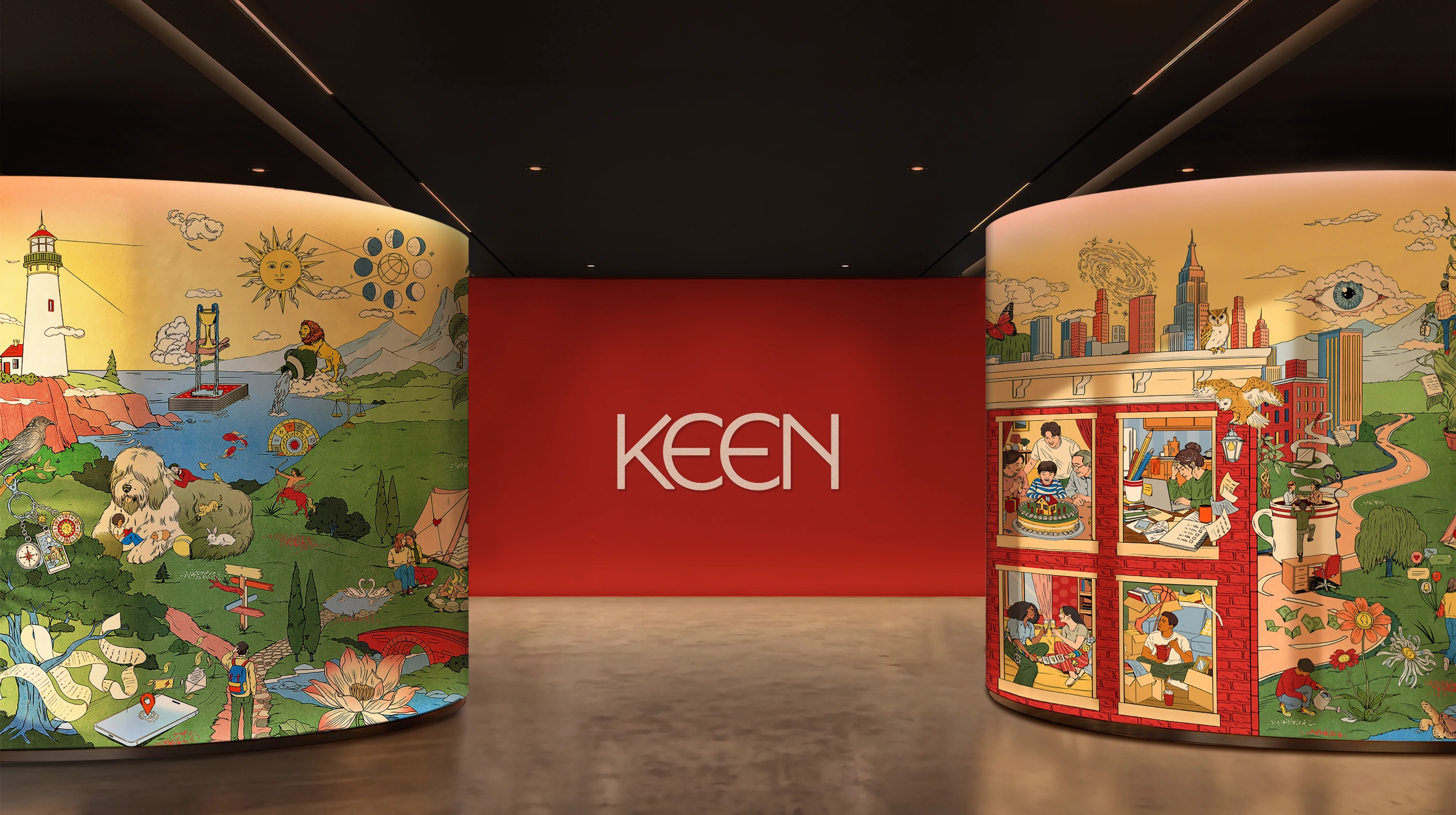
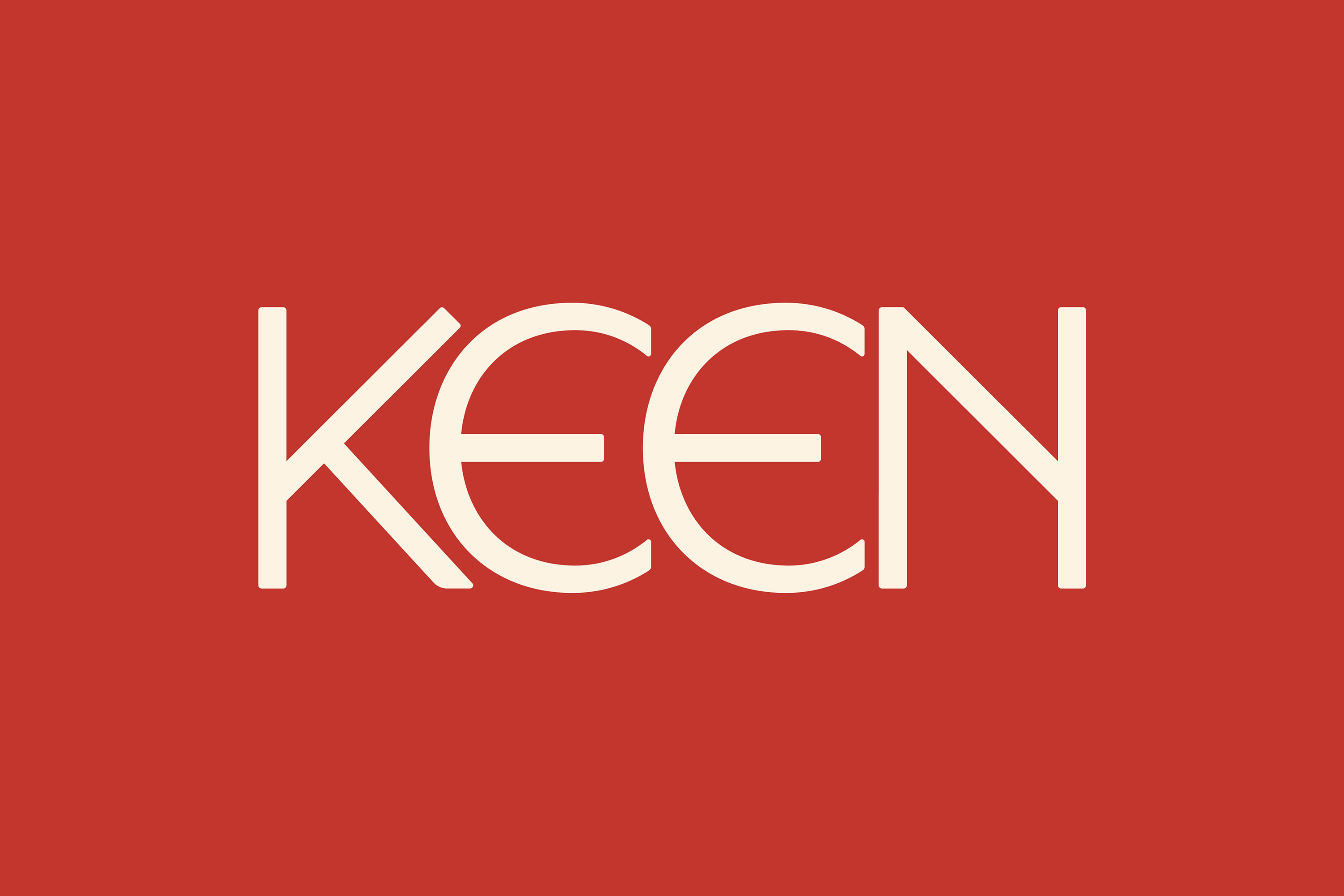
And I’m gonna do it again: those big, round, exaggerated ‘e’ shapes – made all the more exaggeratedly rotund-seeming in their doubling up, one next to the other; that dusty, regal shade of burgundyish red – it’s all very medieval, but in the way that the 90s New Age obsession viewed and stylised medieval things for a more modern, secular-but-seekerish age (i.e., Past Times’ entire raison d’etre, and aesthetic).
That’s not to say the wordmark isn’t good – quite the opposite. Its sweeping curves and symmetrical letterforms give the word ‘Keen’ a slightly strange, almost talismanic quality, while still feeling friendly enough for a digital service that ultimately centres on connecting people with other people they trust enough to tell them what their futures have in store.
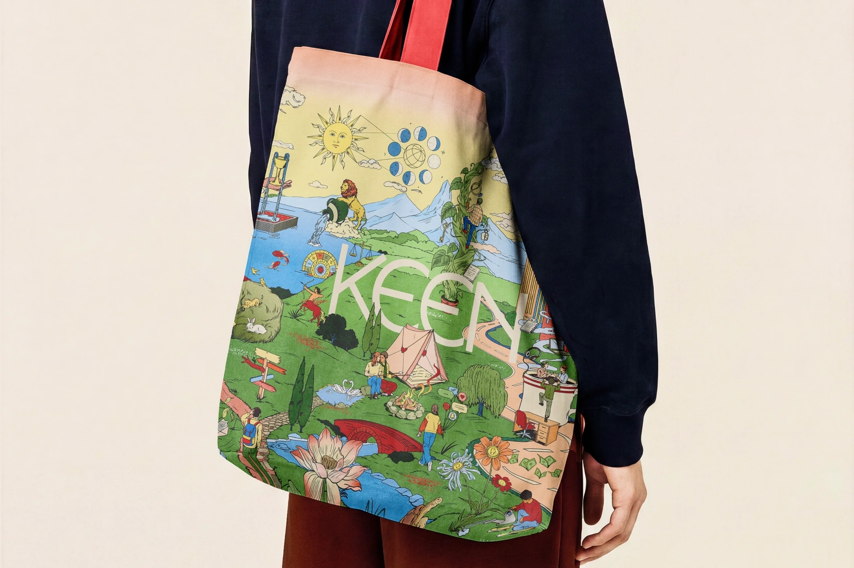
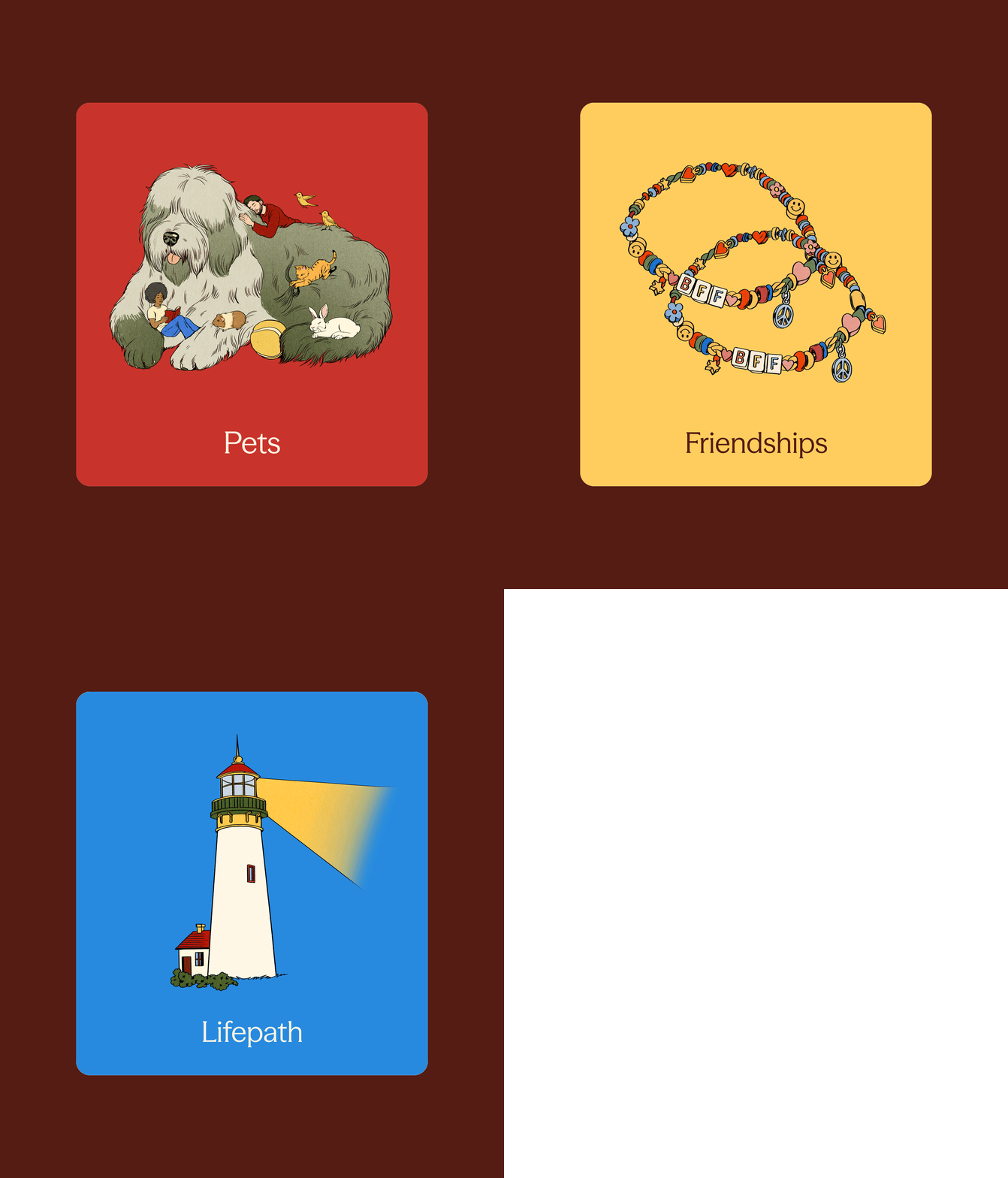
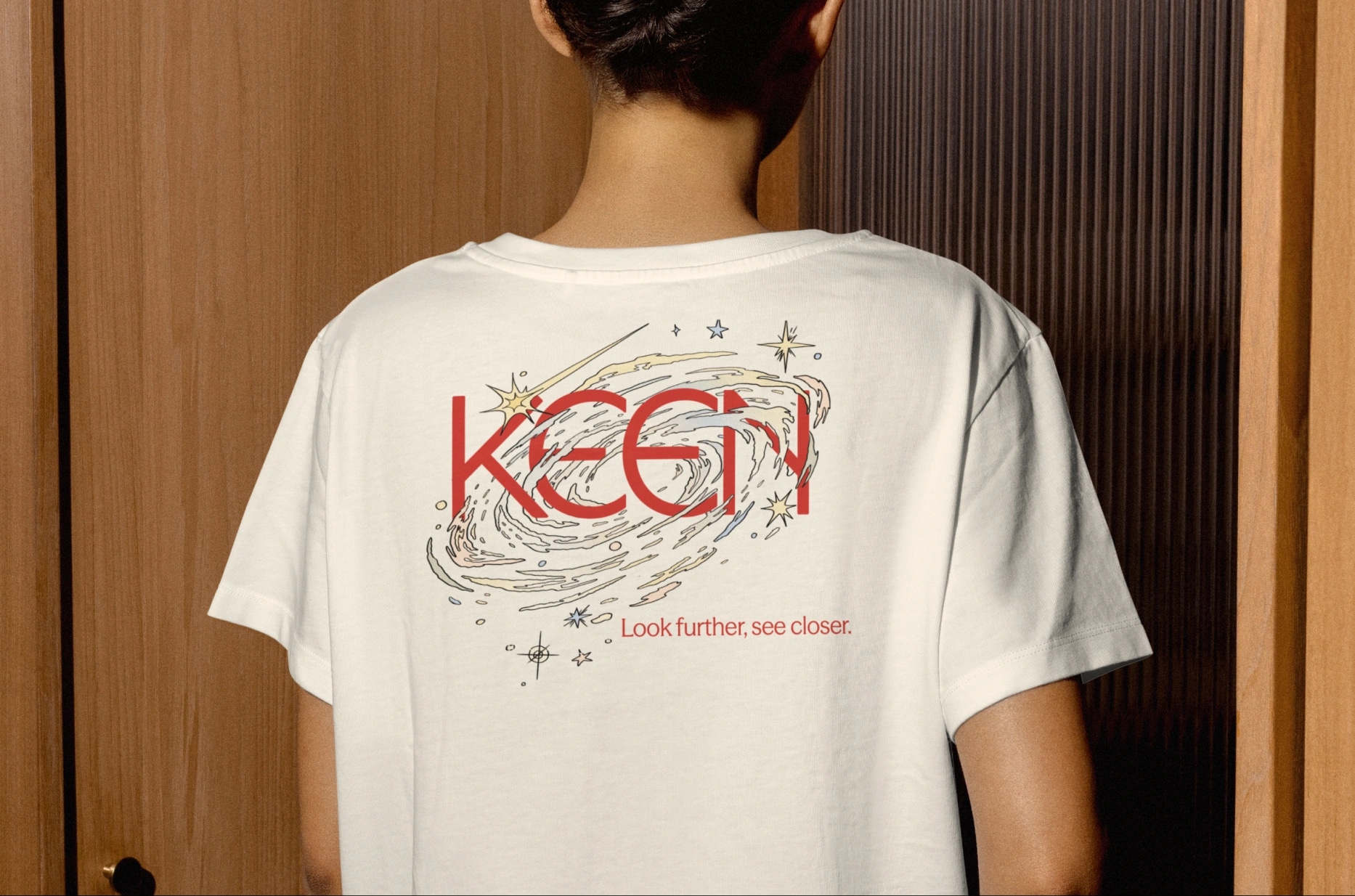
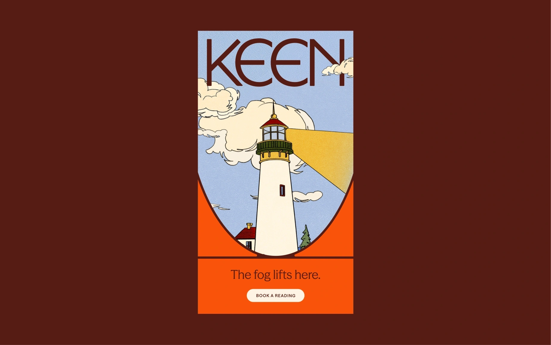
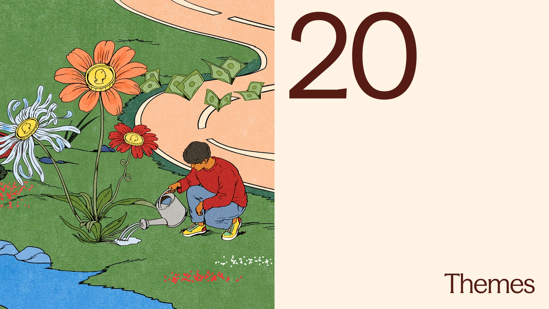
The illustration, created with very talented Chilean illustrator and designer María Jesús Contreras, is sublime – so beautifully crafted, with a 70s tactility and colours that teeter just on the brink of realism, but as viewed through faintly lysergic-tinted lenses.
The illustrative elements – of which, thankfully, there are many – feel beautifully tactile, despite the platform’s inherently digital nature. It’s as though you can smell the pages of an old Ladybird book: densely populated landscapes, strange little details, people, plants, animals and symbolic forms all coexisting in a world that feels simultaneously familiar and faintly impossible.
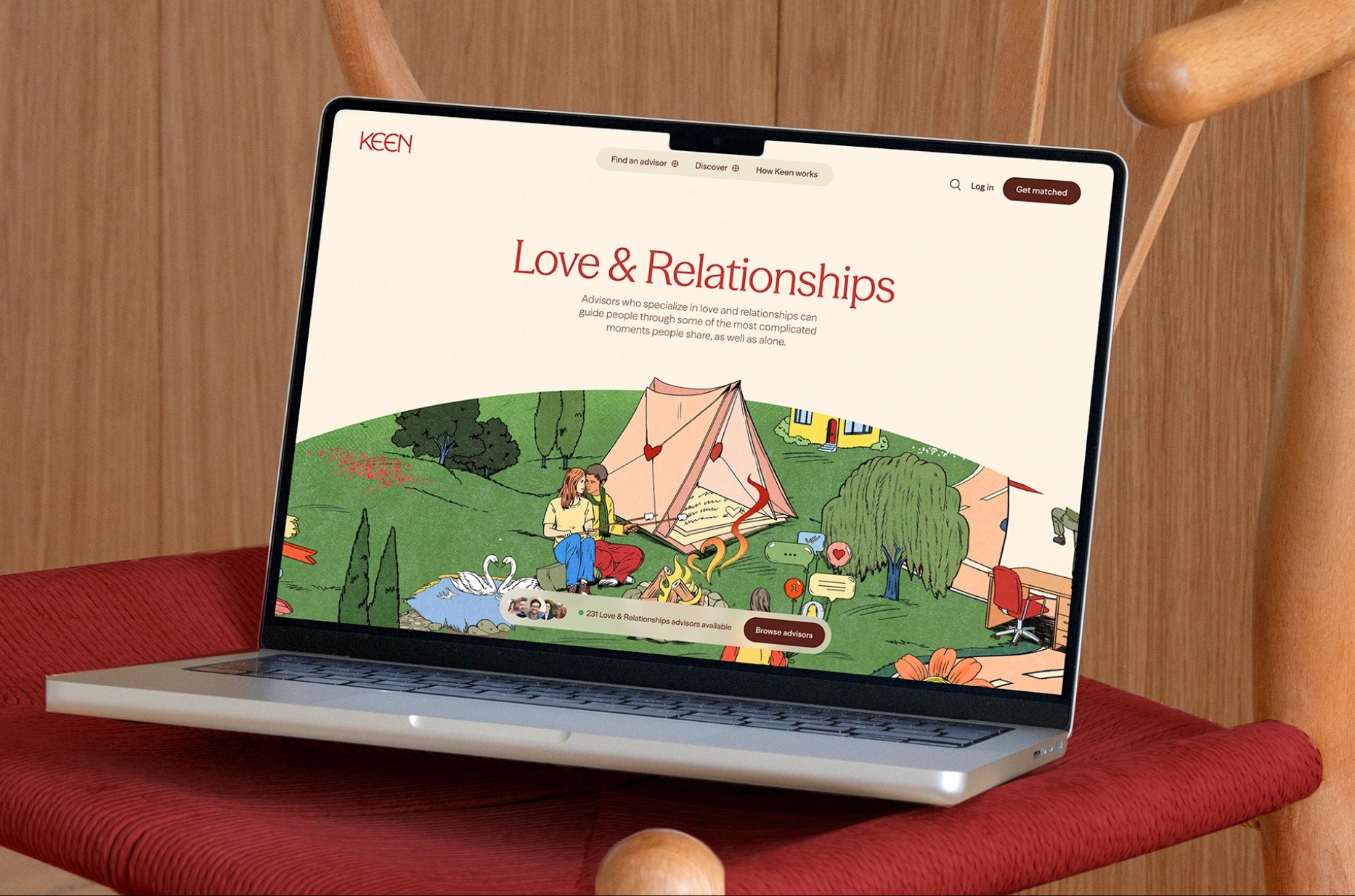
Illustrating Tarot-related things can’t be easy, either, given Tarot’s enduring status as one of those things whose visual language is almost as recognisable as its purpose. Cards, stars, moons, suns, hands, eyes and assorted mystical paraphernalia have been endlessly reproduced, parodied and commodified. Contreras’ illustrations avoid feeling like a generic pile-up of spiritual symbols by embedding them into a much broader visual world, where the esoteric sits alongside the timeless yet somewhat banal realities of everyday life in the here and now.
Where much of the wellness world has settled on the same basic visual prescription of pale colours, generous white space, rounded sans serifs and an aggressively serene absence of anything remotely challenging, Keen goes in the opposite direction. It’s busy, alive, a lot of things in a lot of places a lot of the time – and that approach works very, very well.
Mother Design has made some very smart choices for the brand’s new typography, exercising some clever restraint in this otherwise-slightly-outré visual system. The identity marries Season Mix with Season Sans, both by Prague-based Displaay Type Foundry. As such, there’s equal parts continuity and contrast: the serif brings that carved, slightly archaic quality, while the sans gives everything a more contemporary and functional edge.
The colour palette largely centres on earthy red tones, drawing on the history of red as one of humanity’s earliest pigments, and is supplemented by similarly autumnal tones – yellow, brown, orange – with flashes of a very nice shade of rich mid-blue. It’s nicely saturated without tipping into aggressively psychedelic territory.
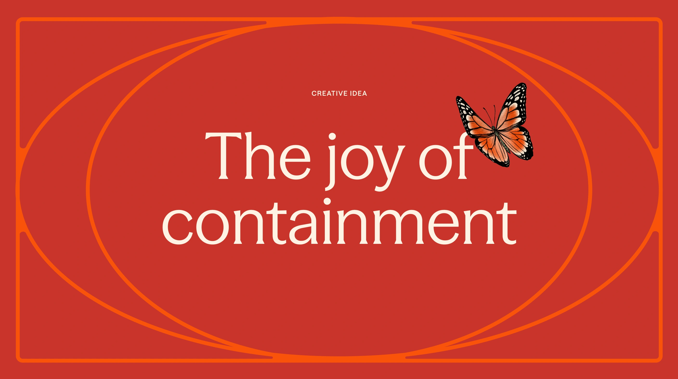
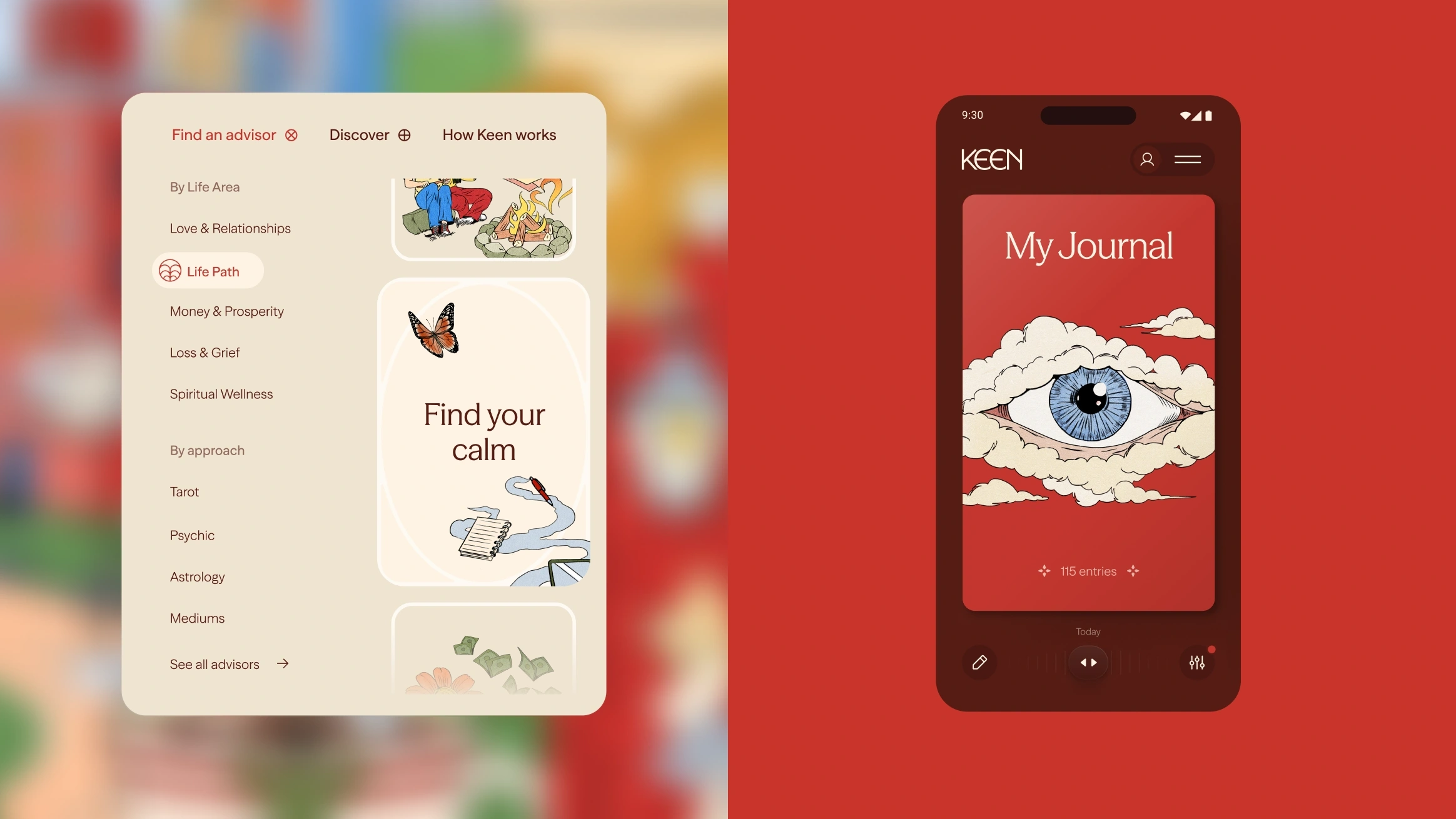
One of the cleverest elements of the identity, but also a rather subtle one, is the recurring use of circles, which act as framing devices and portals into the wider illustration-heavy brand world. These circles contain information, navigate crops and layouts, and intersect in a rather compelling way in motion and digital applications.
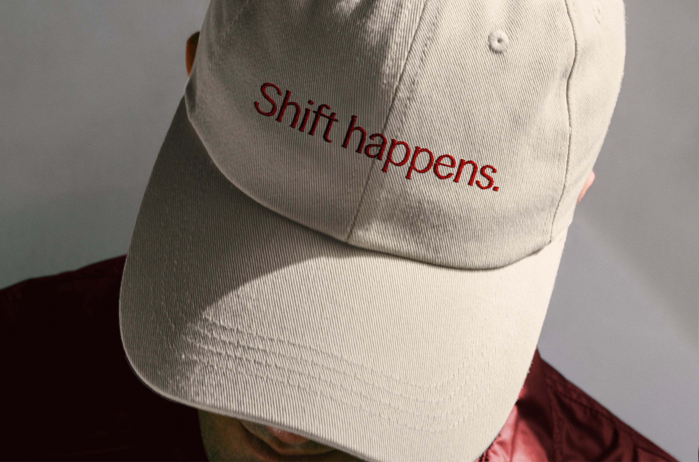
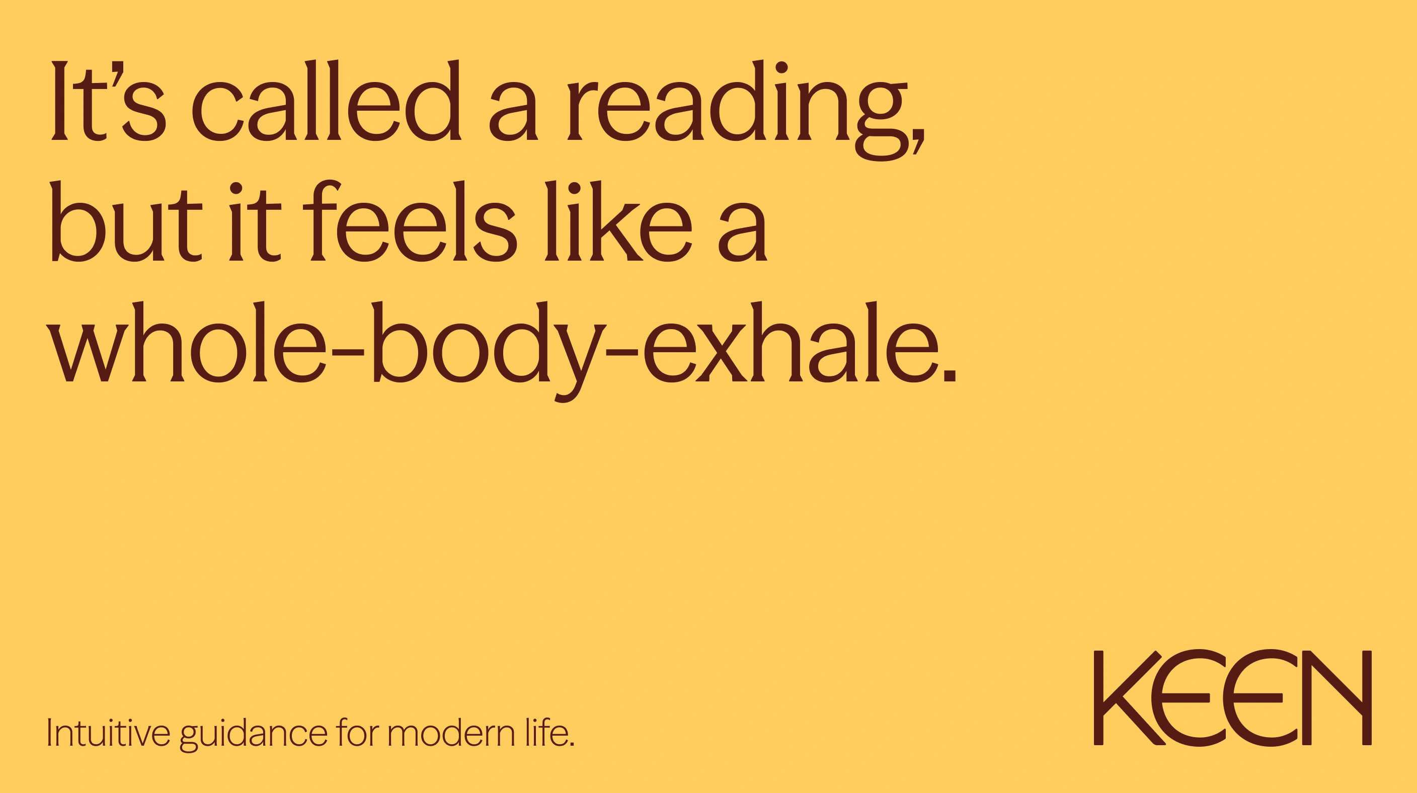
The copywriting is rather more sassy than the rest of the brand elements, with all their nice nods to all that’s folkloric and broad-brushstrokes-spiritual. It roots Keen firmly in modernity, which is no bad thing, though the copy is perhaps something of mixed bag in terms of what lands and what doesn’t. 
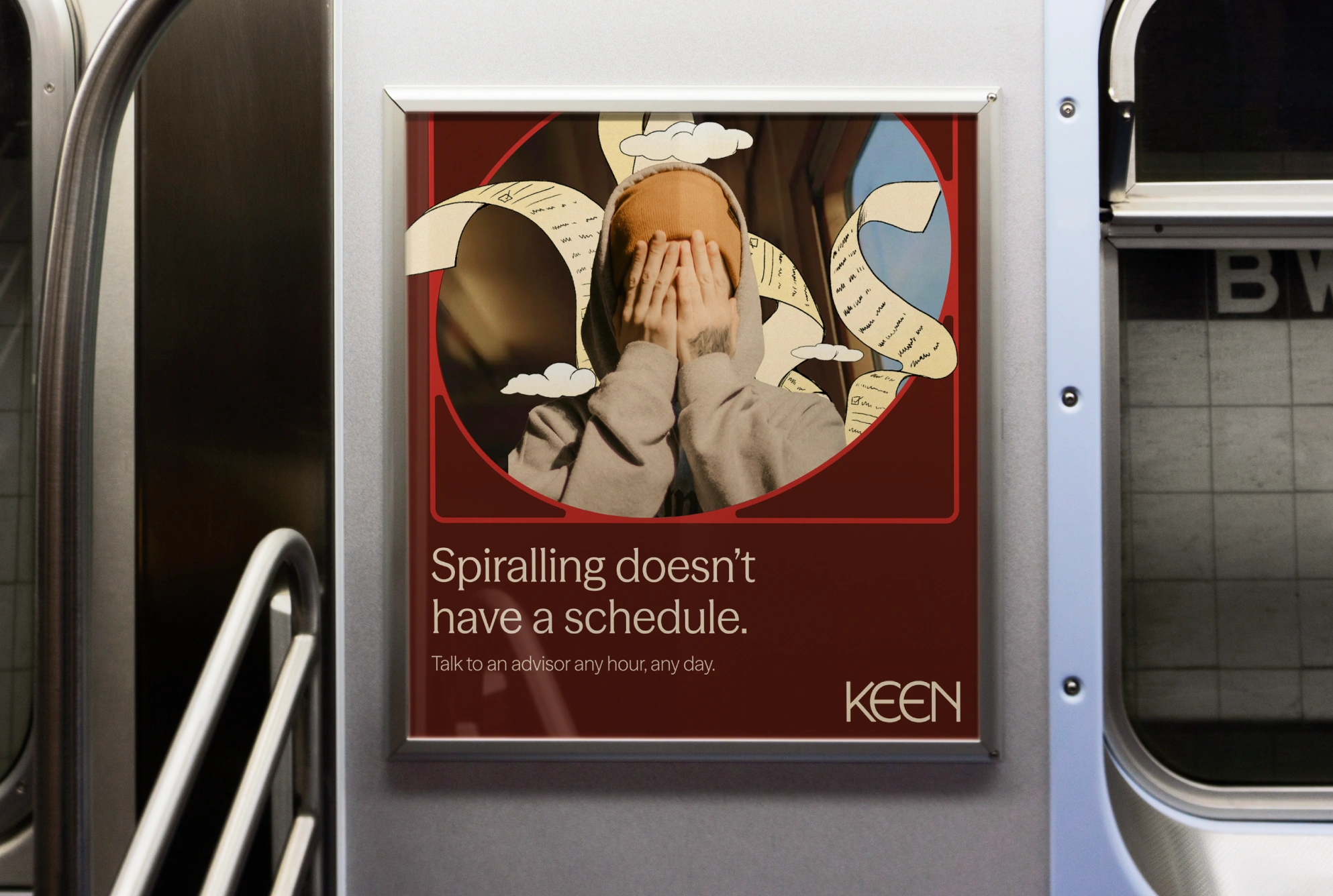
The only big thing I really don’t like is the photography – what’s in the images, how they’re shot, and how they’re used. Yes, many of these images are submitted. by the psychics touting their wares on Keen – but often they’re just downright creepy.
When brand photography is used on things like the ads and subway posters, to me, it seems to tarnish the really great bits of the identity – the lovely illustrations, when layered on these cheesy portraits, become a bit tacky, for instance.
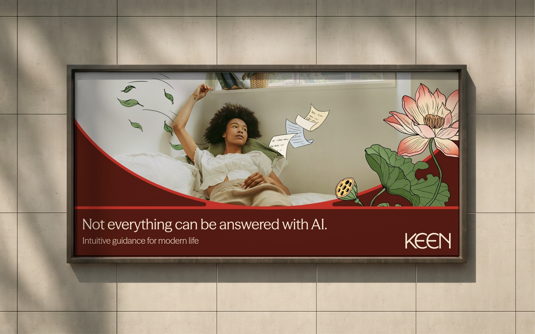
It’s a shame, and a small gripe really, since for the most part the identity is superb. Adding fairly conventional lifestyle photography – some of which feels flatly stock image-like – on top of things like those lovely illustrations, and sitting alongside that lovely typography, seems to diminish something that elsewhere has personality in spades.
Making psychic services feel relevant to a mass wellness audience could very easily have resulted in a design that was either blandly sanitised or drenched in predictable mystical clichés, but Mother Design has instead found a much more interesting middle ground – one that thankfully eschews lame also-ran takes on moons and crystals and pentagons and all that, and makes the unity of ancient spiritual wisdom and instant-gratification digital experiences seem effortless.