Vrints-Kolsteren’s gorgeous identity for pizza restaurant Napoli on the Road brings a little mischief to minimalism
Opinion by Emily Gosling Posted 1 October 2026
It’s not all that often you come across a project which I’m confident that 99.9% of people couldn’t possibly slate – or at least 99.9% of people with even the most flimsy interest in/awareness of graphic design, visual culture, or just generally looking at nice things.
>Such is the case, however, with this beautiful rare beast – a piece of design that feels instantly comfortable within the canon of Good Design.
All of that, for a humble pizza restaurant – or more precisely, a small chain of pizza restaurants: Napoli on the Road (shortened often to NotR), which has three outlets across London in Soho, Chiswick and Richmond.
This new brand identity was created by Antwerp-based brand design studio Vrints-Kolsteren, and it’s a real masterclass in how to do a hell of a lot with seemingly very little.
Napoli on the Road was founded in 2016 by pizza chef Michele Pascarella. It started life in a three-wheel Ape Piaggio truck equipped with a wood-fired oven, operating across London as a humble street food vendor at sites like farmers’ markets.
In the decade since, NotR has made a pretty big name for itself worldwide: the pizzeria was named Europe’s No.1 Pizzeria for three consecutive years (2024, 2025 and 2026), making it the top-ranked pizzeria in the UK, and was also recognised as the World’s 5th Best Pizzeria 2025 by the not-so-catchily titled 50 Top Pizza World Awards 2026.

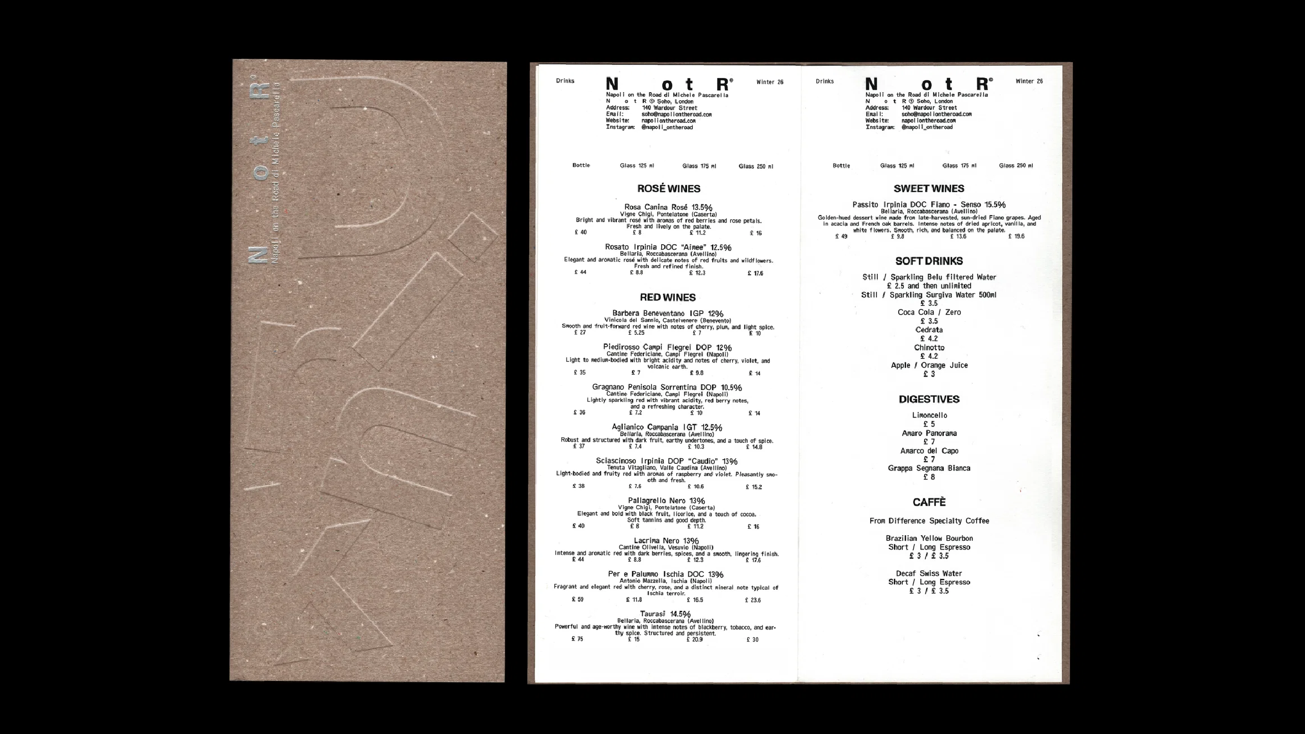
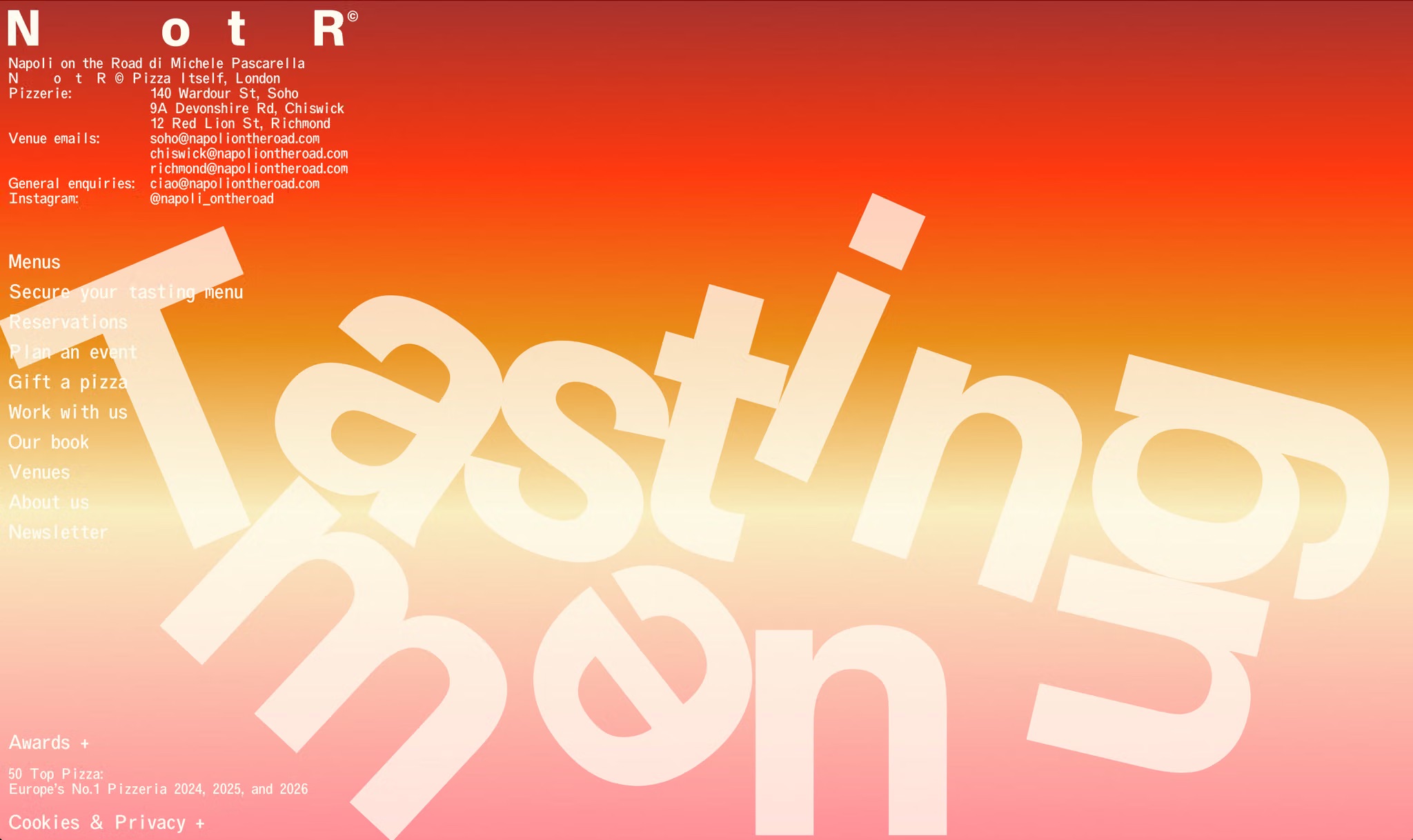
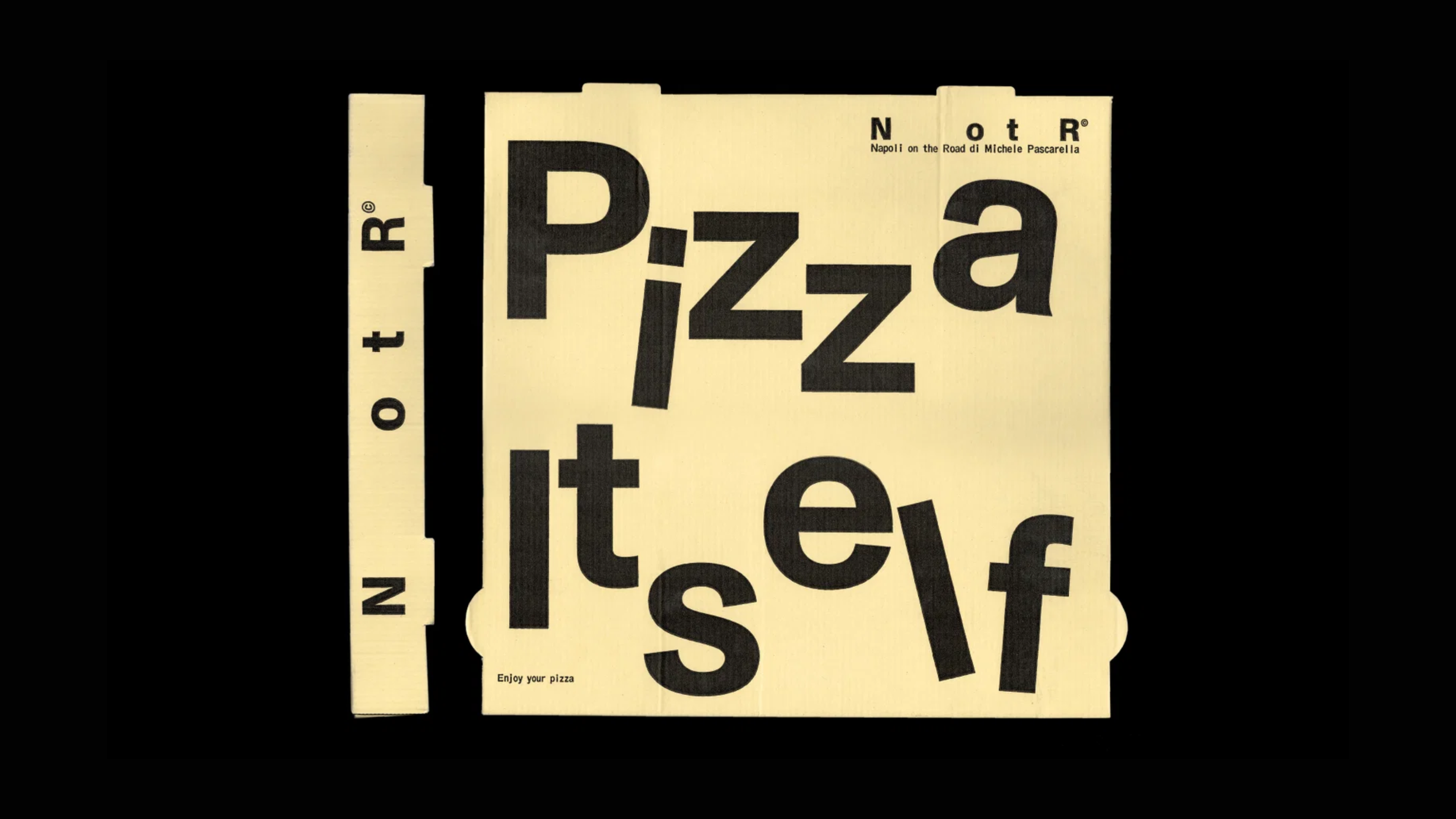
The idea of the brand’s history as something itinerant, always in motion on those little three wheels, formed the underlying concept for Vrints-Kolsteren’s new designs. And this comes to life succinctly in the absolute star of the show here: that delightful tumbling typography.
The way the letterforms joyfully jostle around one another isn’t just because of the idea of movement for the sake of movement: it’s the product of Vrints-Kolsteren’s decision to shorten the former rather long-winded name – Napoli on the Road – to the four letters NotR for most brand applications.
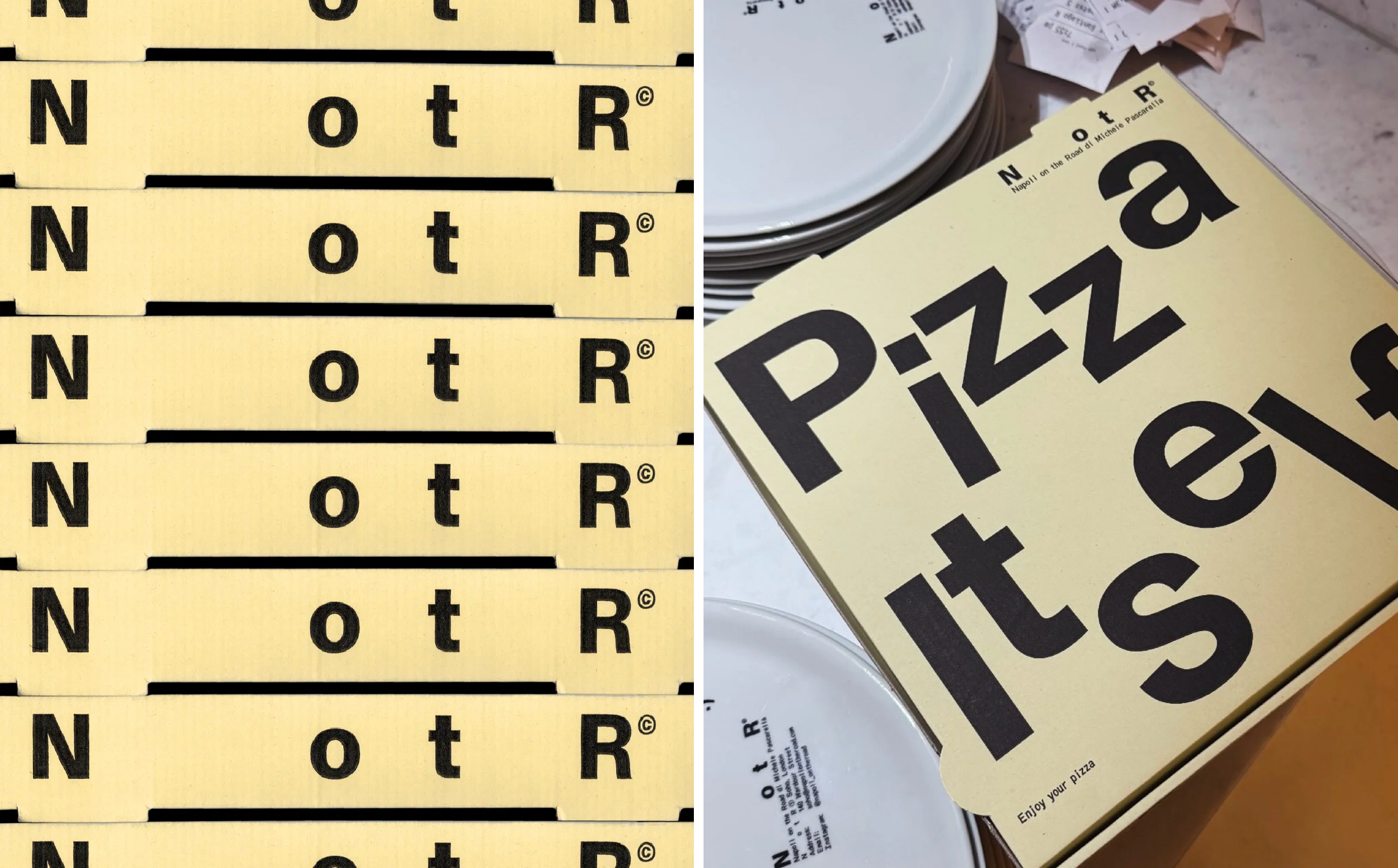
The spacing between those letters is unusually generous, giving the abbreviation a very obvious visual, physical sense of distance – things actively travelling between various points. That idea gives the identity a surprisingly large amount of room to play with. NotR can sit neatly within small stamp-like compositions, labels and blocks of information, while the same basic ingredients can be stretched out, repeated, cropped or given plenty of breathing space.
Again, this largely works because of just how pared back the type is, despite all that motion and playfulness. Throughout the identity Vrints-Kolsteren opted to use two fonts from Berlin-based foundry ABC Dinamo.
Firstly, there’s Monument Grotesk – a contemporary grotesque with a straightforward, unfussy sturdiness to it; paired with Oracle Triple, which brings something a wee bit more subtly strange to the party. Its monospaced, mechanical character immediately recalls the world of codes, labelling and industrial information systems – there’s something pleasingly utilitarian about it, yet it’s also packed with personality. As its designers put it, Oracle Triple is “an exploration of a strict rhythm with silly results” that takes the logic of monospaced letterforms to an extreme, thanks to the way each letter’s “bounding box has been segmented into units of thirds, with different characters taking up differing numbers of units”.

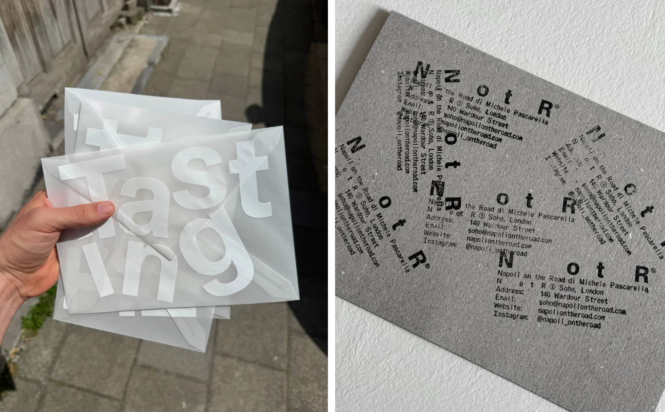
These understated but palpable references to industry (namely transport) play out in various ways throughout the branding. Once you start looking for them, there’s a whole world of visual references to the functional ephemera of travel: stamps, labels, codes, markings and various other nods to the idea of an ongoing journey – things being packed up, moved on, boxed up but not boxed in. The sort of graphic ephemera that suggests something has been packed up, moved somewhere and is now waiting to continue its journey.
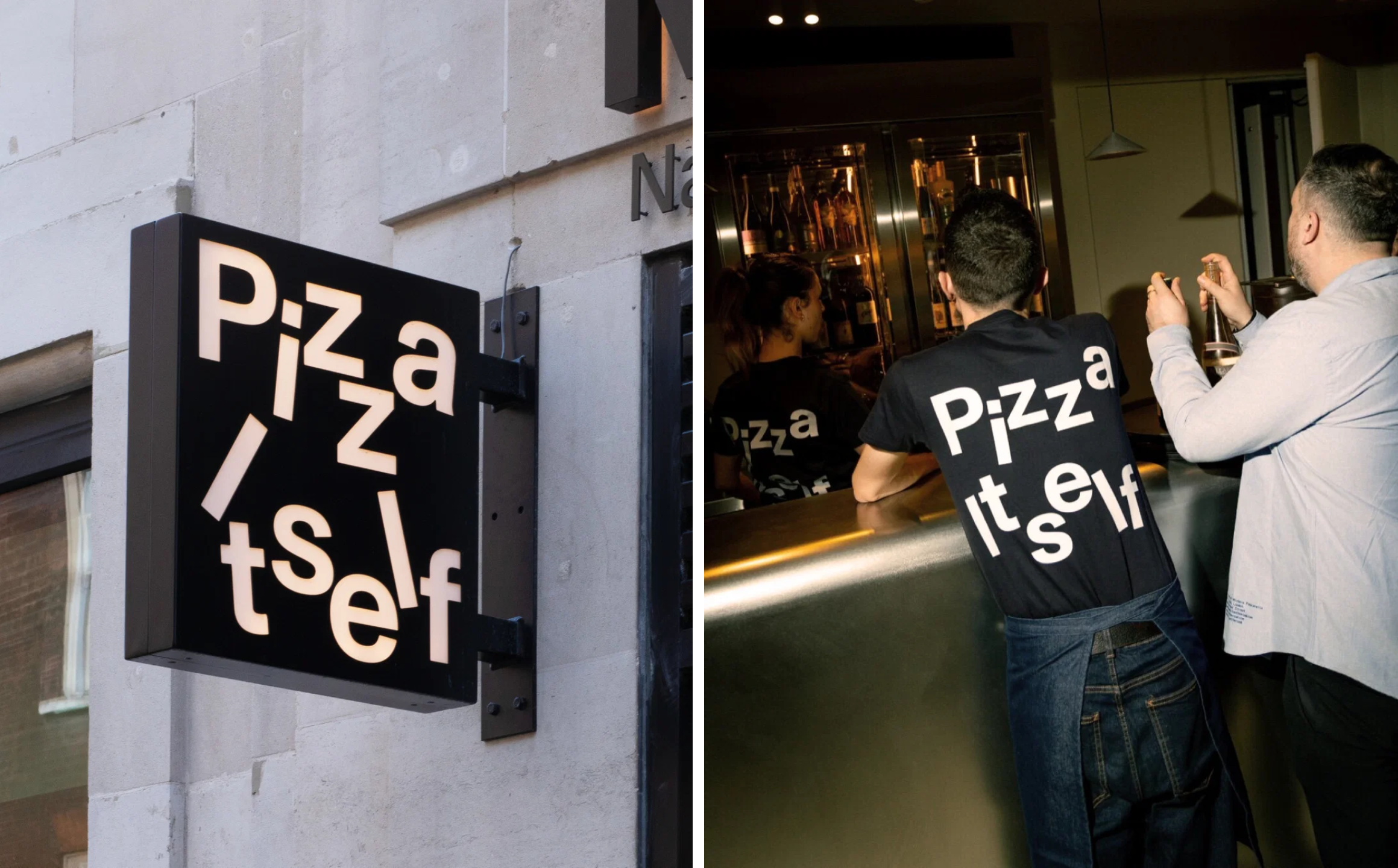
It’s perhaps a testament to how strong NotR has become as a name in the world of pizza and the strength of the visual identity that the name doesn’t really need to appear all that much at all, whether in its longform configuration or its shiny new acronym. Instead, even things like external signage bear more abstract copylines, like ‘Pizza Itself’. But it’s a sign of Vrints-Kolsteren’s skill here that whatever the words say, and to whatever degree they make much sense, everything feels absolutely, resolutely, recognisably NotR.
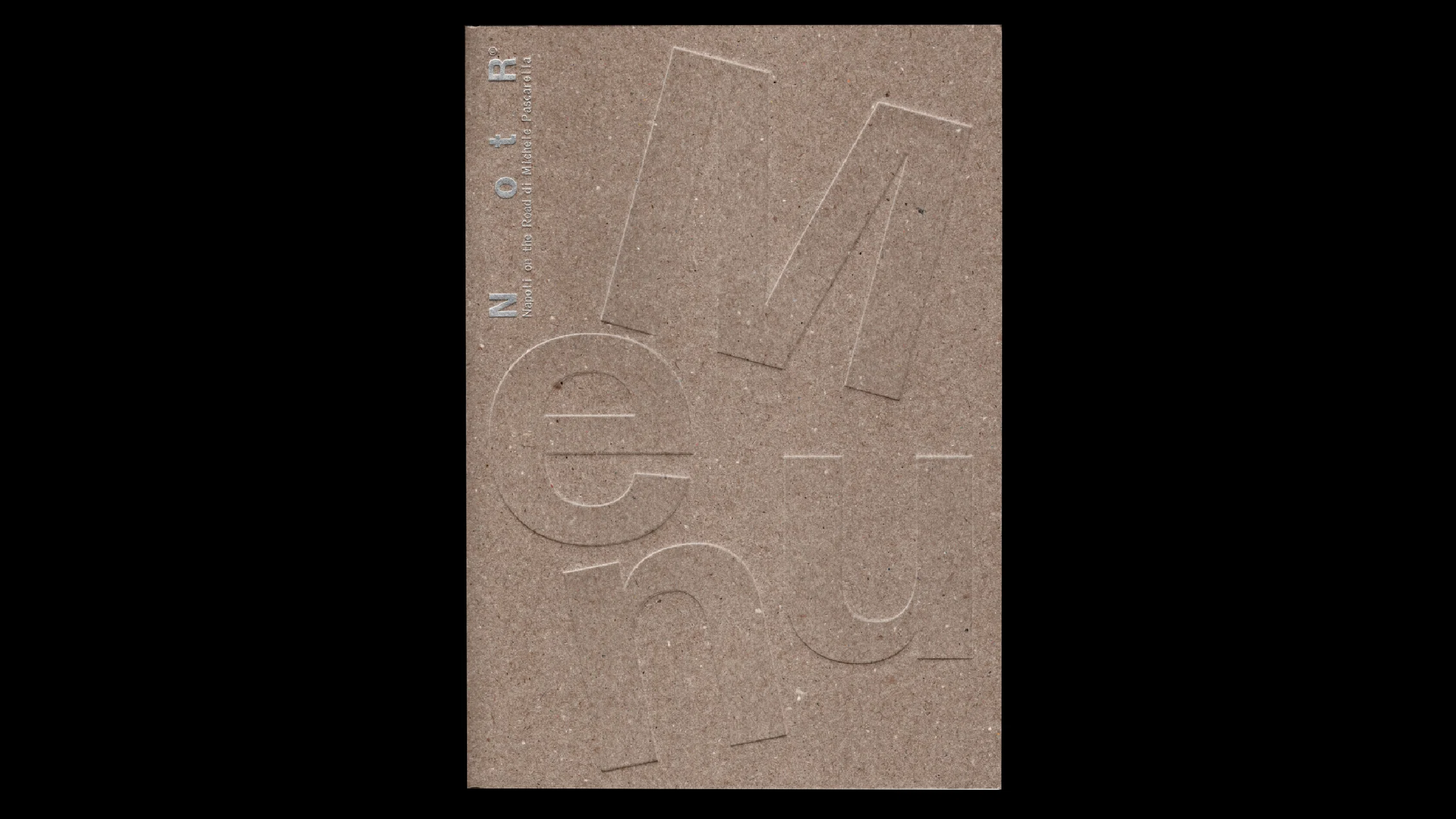
There’s something particularly refreshing about an identity for a restaurant that is wilfully un-restaurant-ish: remove the pizza boxes and menus from the equation and quite a lot of this could happily belong to a record label, an architecture practice, a fashion brand or some sort of east London art gallery. Which makes sense, really, since NotR has spoken of its ambitions to exist beyond food and into the broader worlds of music, art, fashion, travel and culture.
This identity is so incredibly thoughtful in its resolute marriage of simplicity and mischief. It’s brilliantly confident: timeless – at once ever so Swiss, so Mid Century, but so absolutely contemporary (i’d argue that this will never-not-feel-contemporary). It’s really very minimal (the entire colour palette consists only of black, white, and creamy off-white) yet ever-so-playful; undeniably striking but without a whiff of shoutiness.
More of this sort of thing please.