Eurostar by Design Studio
Opinion by Emily Gosling Posted 7 February 2023
Train related rebrands are often some of the most divisive when it comes to the design community Twittering classes. That’s perhaps unsurprising when you consider the ubiquity of Standards Manual books on design studio coffee tables – and the fact that they’re among the rare graphics projects that get broadsheet attention (for better or worse, as the swathes of National Rail rebrand coverage last year proved).
So it can’t have been easy for DesignStudio to take on this behemoth of a commission: creating a new brand and design system following the merger of international rail service Eurostar and French-Belgian high-speed train operator Thalys, with the intention of becoming a single brand by the end of 2023.
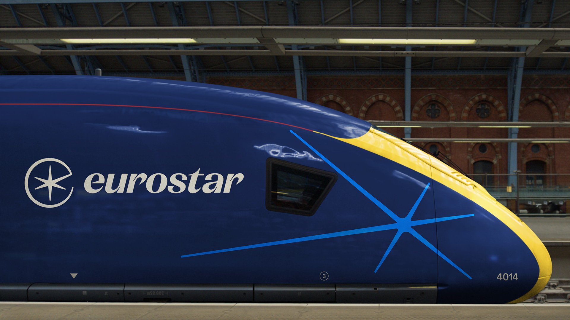
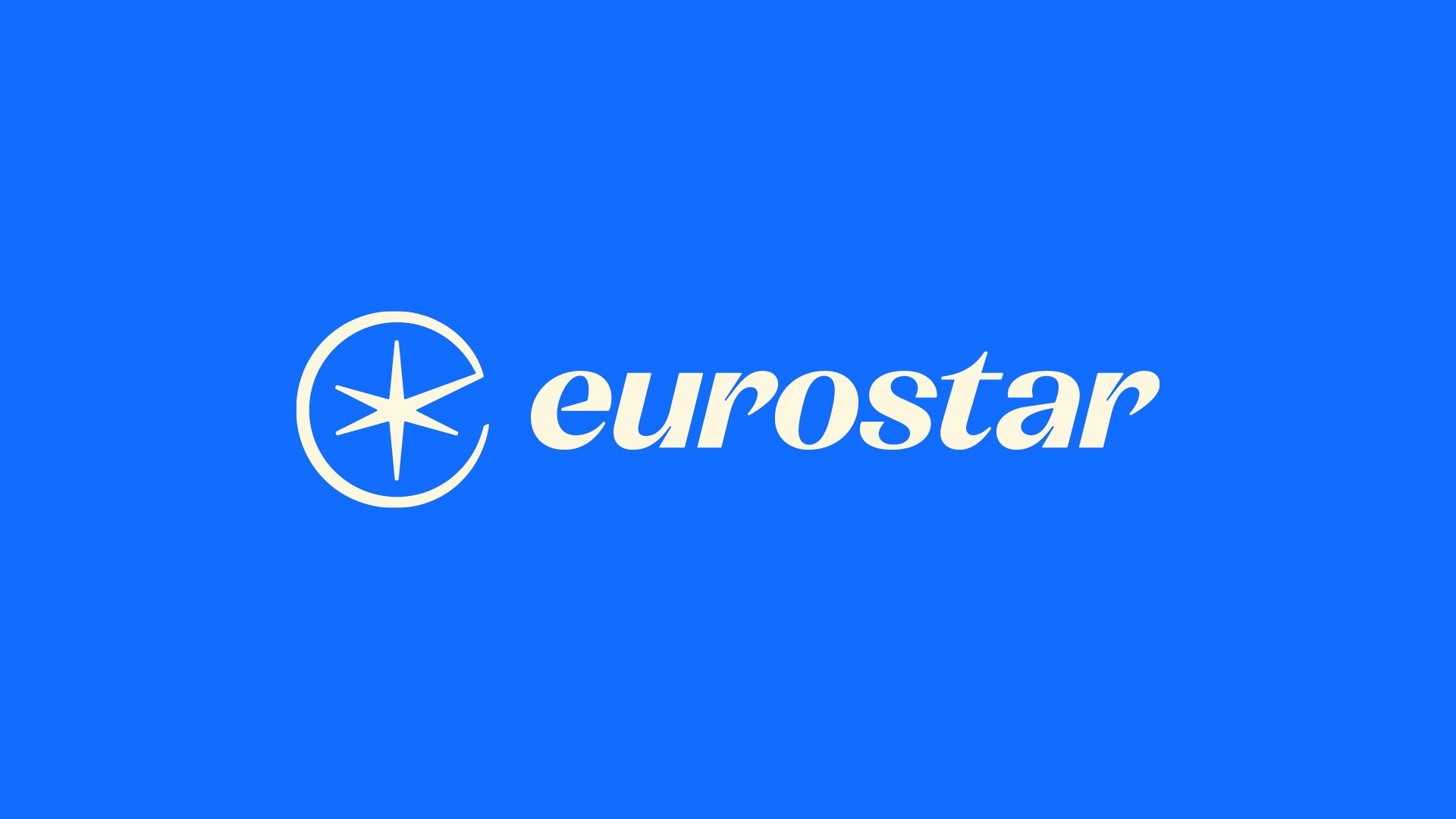
In order to understand the ‘heritage and essence’ of both Eurostar and Thalys, DesignStudio initiated a series of workshops with each company’s stakeholders. The branding looked to harness these aspects of the brands while evolving them for the future. ‘This is a significant moment in time for Eurostar to progress the way it operates, and the visual identity needed to make a bold leap to help the brand achieve its growth objectives and better reflect the role it plays in connecting people through train travel,’ says the agency.
The former Eurostar identity used a largely dark blue and yellow colour palette; while Thalys centred on deep red and white. DesignStudio sought to ‘modernise’ the look with a newly ‘punchy’ blue alongside deep navy; with six secondary colours that it says ‘take inspiration from the diversity and vibrancy of Europe’.
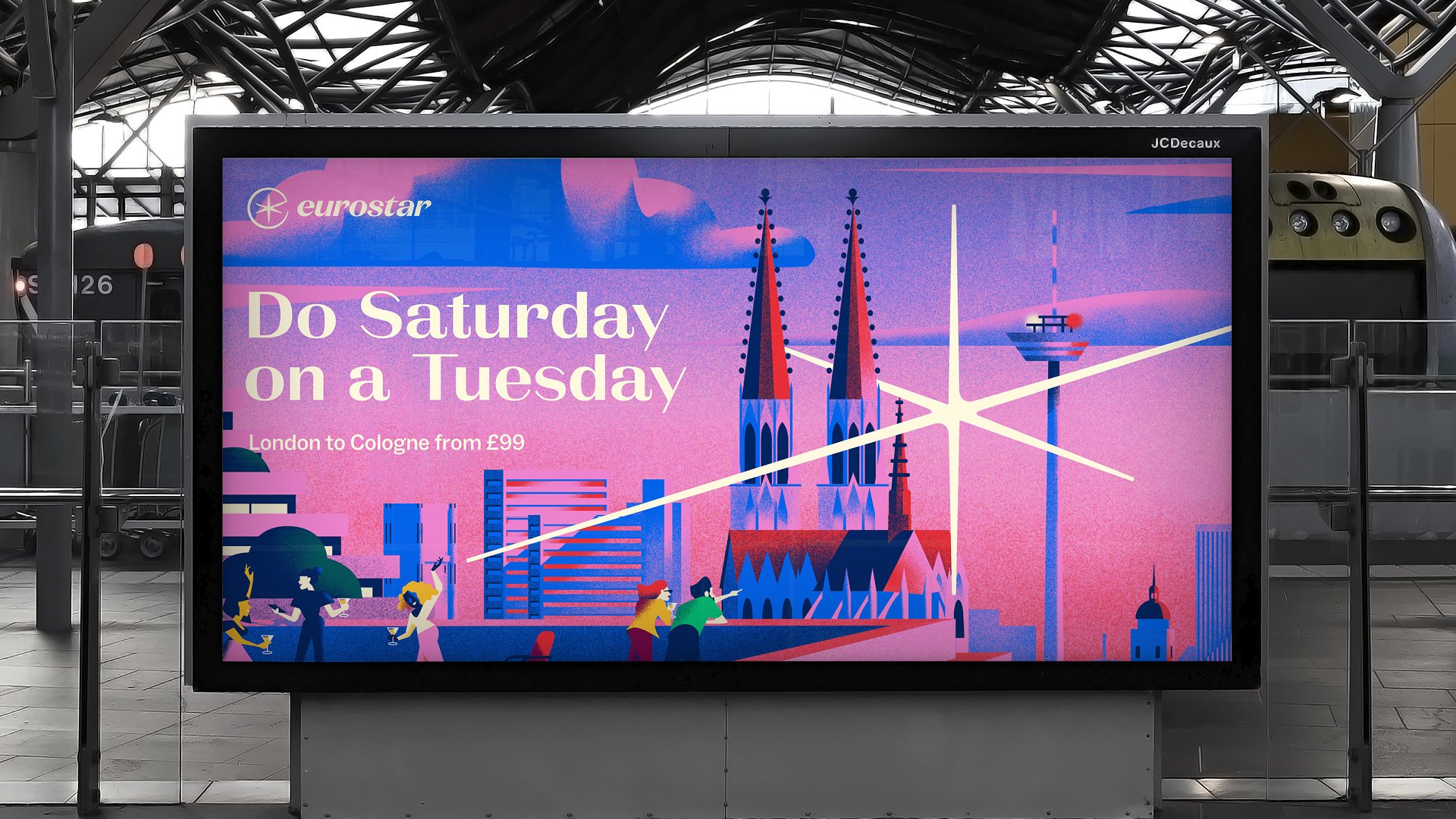
At the heart of the new identity is a graphic device dubbed a ‘spark’ – a circled star shape on some static applications such as train livery, and which carries across every brand touchpoint in various incarnations. In its circled form, the device marries the six-pronged icon with the lowercase ‘e’ of the new Eurostar wordmark.
The ‘spark’ references Eurostar’s history of using a star icon in its communications. This was dropped in 2011 in design studio SomeOne’s rebrand, which was based around a Eurostar brand sculpture and inspired in part by the work of the Futurists and architect Zaha Hadid.
The new star proves itself to be versatile, and subtly links itself with that most recent update: it takes on a sculptural form as a bronze coloured button badge and a decorative ceiling piece, for instance; and on social posts it’s shown elongated and animated.
The decision to use lowercase italicised lettering in the new Eurostar wordmark was again informed by Eurostar’s previous identities; recalling the original Eurostar lettering when it launched in 1994. DesignStudio worked with type designer Luke Prowse on the lettering side of the project, and opted to use La Pontaise – a quirky high contrast serif font by Icelandic type foundry Or Type chosen for its combination of elegance, warmth and impact – for the wordmark and other headline type. This is supported by secondary font ABC Social, a workhorse sans serif by Swiss foundry Dinamo, which DesignStudio selected thanks to its ‘subtle details that create a visual link with La Pontaise’.
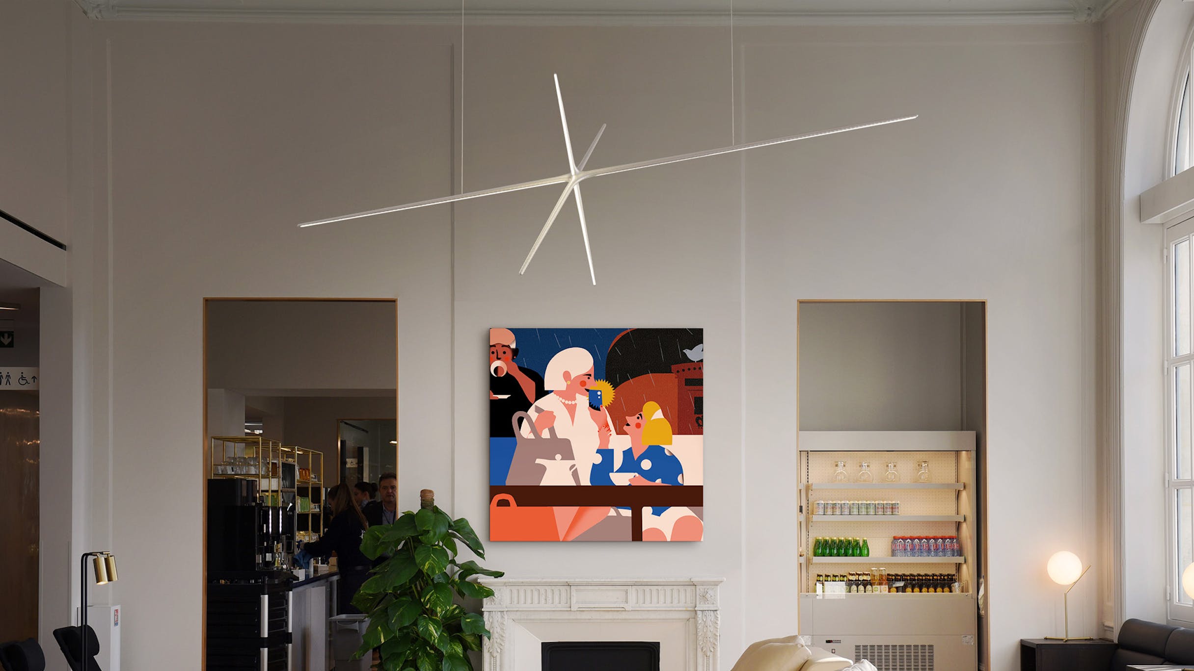
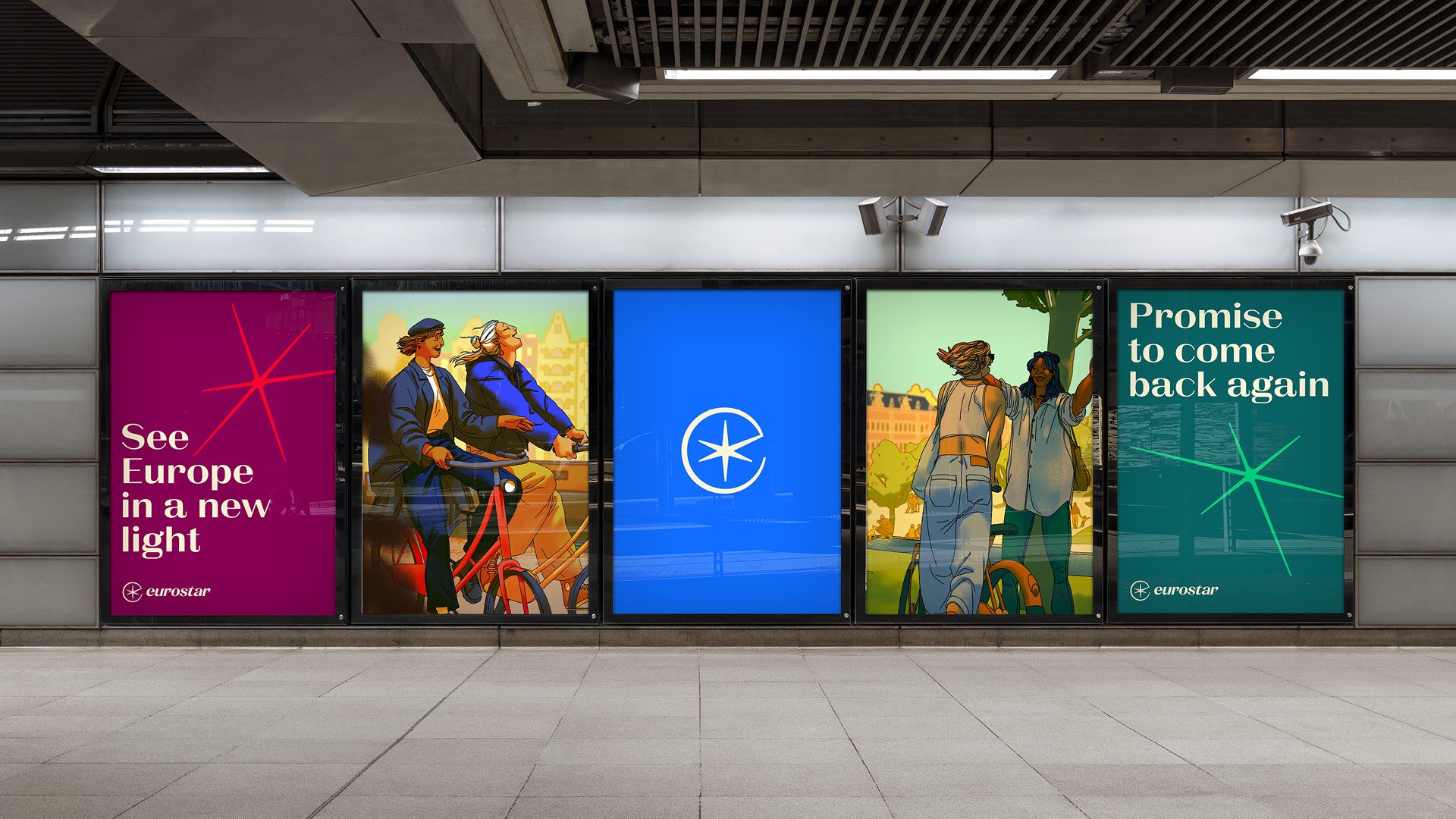
The agency commissioned seven illustrators who hail from or work across the five countries in the Eurostar network (France, Belgium, The Netherlands, the UK and Germany): Matt Saunders, Jordan Robertson, Jean Leblanc, Alice Des, Fagostudio, Vanessa Van Meerhaeghe), and Avalon Nuovo. They were briefed to create an image that celebrated and conveyed the unique aspects of each Eurostar destination.
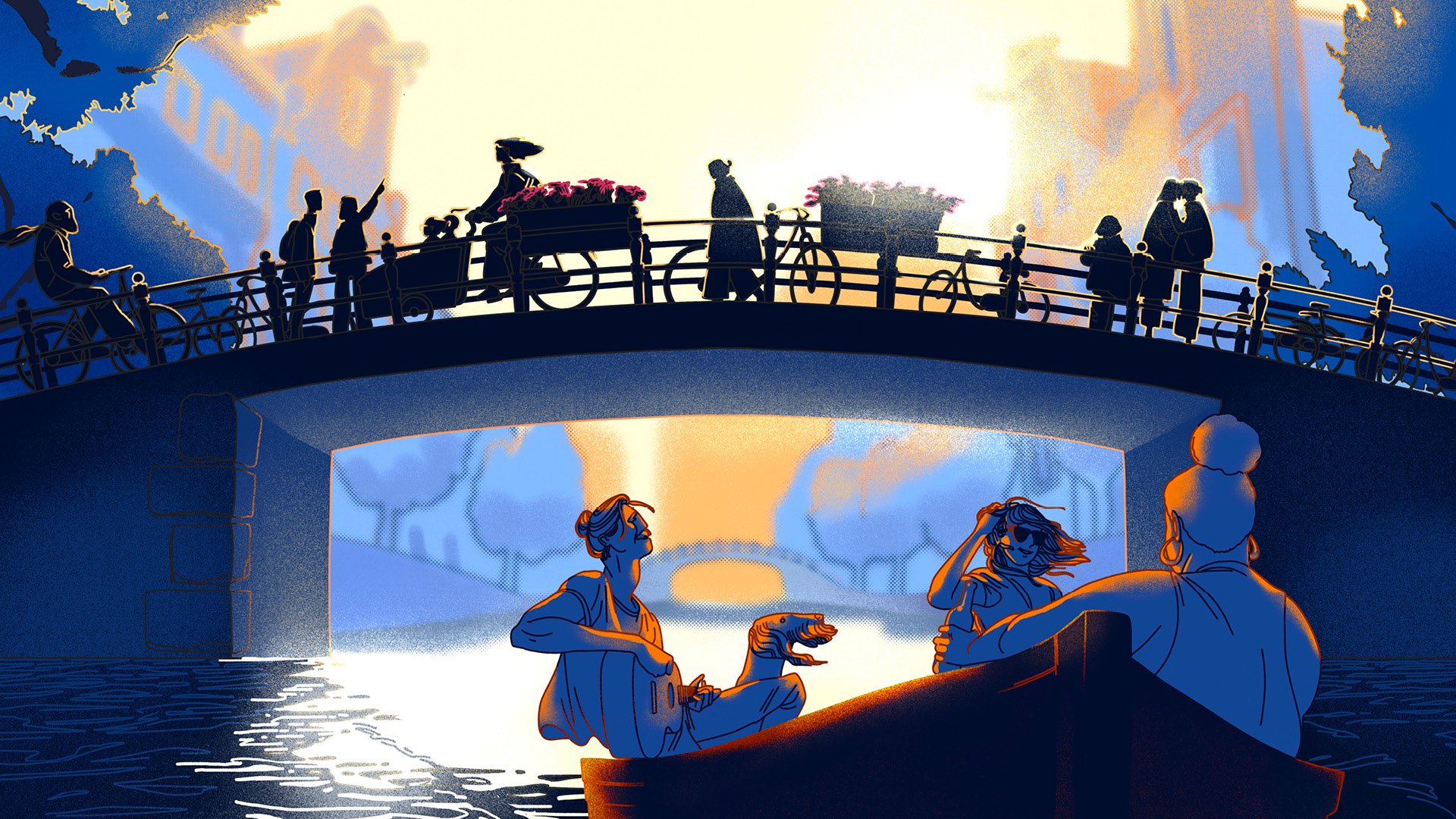
DesignStudio also art directed a suite of new brand photography shot by London-based photographer John Adrian, which aims to capture ‘the joy and spontaneity of discovery through travel’.
While the Eurostar rebrand hasn’t received the same level of vitriol as National Rail’s new look; it feels as though it might have been something of a poisoned chalice given the brand’s connotations with everything from Brexit to poor customer service (which many people online blasted when the rebrand news launched) – and that’s before you even consider how much people enjoy ripping such projects to shreds.
Despite the fact the rebrand follows Eurostar’s company merger with Thalys and looks to unite the two, the Eurostar name has been retained – and aside from the use of red tones in the secondary colour palette, there’s little evidence of Thalys in the new look at all. But the new brand does seem fresh – largely down to that brighter, more playful blue hue – and the use of various styles of illustration softens the edges of a brand that has historically felt quite serious in its aesthetic.
Get more with BP&O Plus
Read Extended Insights, start bookmarking, switch between light/dark modes, article and Gallery Views and support our writers. Subscribe here.


