Reveri by Mother
Opinion by Emily Gosling Posted 6 August 2024
There’s no denying the proliferation of all things that the more curmudgeonly crowds might deem ‘woowoo’ over recent years. Crystals, gong baths, singing bowls, silent retreats, tarot et al were once firmly languishing on the fringes of society, and are now de rigeur among the Stoke Newington set and TikTok classes alike.
This rise in self-help-led esotericism has run concurrently with a steep increase in the acceptance of ‘mindfulness’ as a genuinely useful tool to help everything from anxiety to workplace stress, overeating and other addictions, and generally feeling a bit more content. It’s even prescribed on the NHS; and it doesn’t hurt that online mindfulness programmes and apps offer a handy, cheap, effort-free avenue for employers looking to tick the ‘caring for employee’ mental health box.
But hypnosis – perhaps really not that different from mindfulness/meditation – has failed to reach the same level of widespread adoption, nor is it held in the same regard when it comes to credibility. And where Headspace and the like played a pretty significant role in bringing mindfulness to the masses, Reveri hopes to be doing the same for hypnosis.
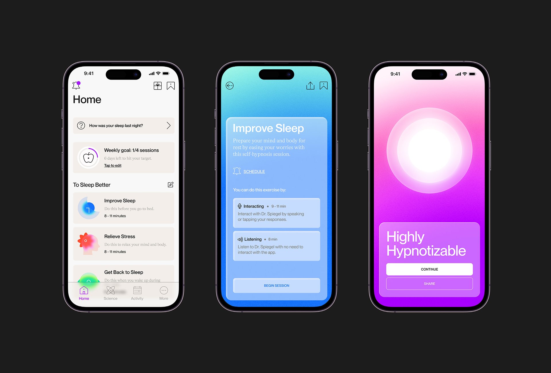
Self-hypnosis app Reveri began life in 2020 in California, and was co-founded by Stanford professor and psychiatrist Dr David Spiegel (‘the Godfather of hypnosis’, Reveri boldly claims). It states its mission as wanting to ‘make hypnosis mainstream and help hundreds of millions of people benefit from it by learning how to better manage stress, chronic pain, insomnia, overeating, and addiction’.
Last year Reveri wanted to expand its reach into the health-tech category in the UK, and brought in Mother Design to overhaul its branding to help it do so.
The agency was aware that hypnosis itself isn’t the easiest sell: this wasn’t just about new branding for this one company – for the rebrand to be successful, it had to think beyond that and look to achieve a ‘total shift in the cultural view of hypnosis’.
The agency looked to the nature of self-hypnosis itself to form the core of its new approach to the Reveri identity. ‘When you practise self-hypnosis, you achieve a state of hyper-focus that helps you hone in on reality and see things clearly’, says Mother, adding that ‘shifting perceptions of hypnosis away from the loss of control and instead, to a means of empowerment and growth’ was the underpinning of the new visual language, tone of voice and brand world.
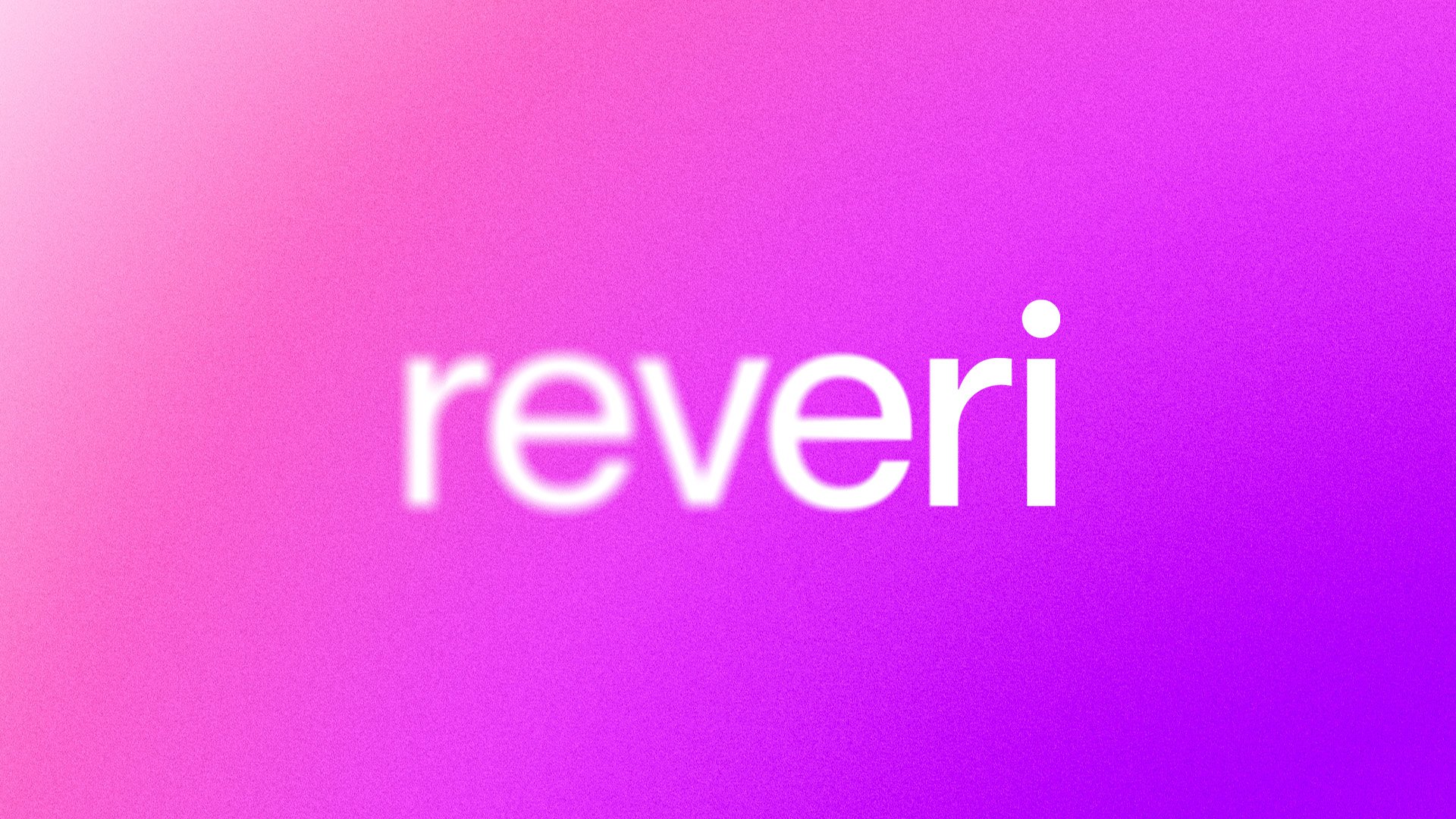
The new wordmark isn’t a lot to write home about in isolation. Set in all lower case (quelle surprise!) in a nondescript sans serif, it looks oddly kerned – the ‘v’ out of proportion to the ‘e’ before and after it; the dot of the ‘i’ overly precocious and shouty (though perhaps that’s a nod to the ‘I’ at the heart of self-hypnosis?). Somehow it just feels a bit jarring – though only when taken outside of the rest of the branding.
It’s an important distinction to make: the wordmark does work – in context – since its whole raison d’etre is to drive home the idea of going from ‘blurred to clear, representing the clarity that practising self-hypnosis can bring’, as Mother puts it. In other words, the lettering spelling out ‘reveri’ starts off very out of focus, and gradually becomes sharper – making that pesky ‘i’ feel even more pronounced. The rest of the identity shares that transitioning concept: everything is gradients and blurs and subtle little nods to the idea of hyperfocus that we’re told hypnosis can engender.
It doesn’t hurt, of course, that these very Y2K-leaning gradients are having a bit of a resurgence (‘How very trendy! How distinctly Gen Z!’ you can almost hear the definitely-not-Gen Z boardroom people exclaim).
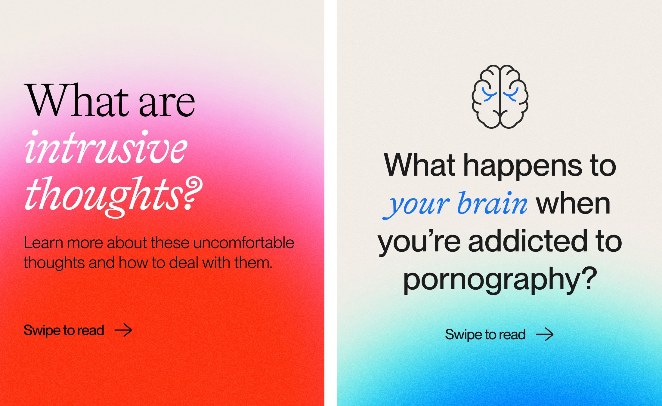
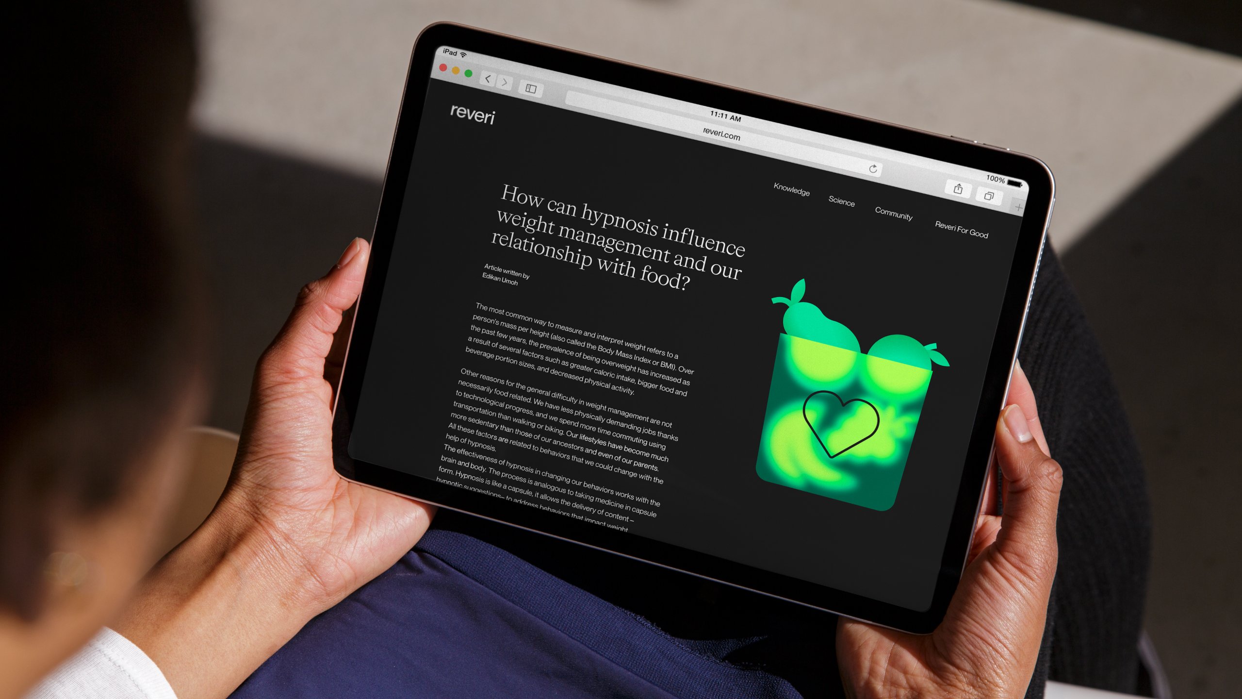
There’s more trendy stuff to be found elsewhere, not least in the use of 20-somethings’ favourite hue, terminal green, but nowhere does it seem too ‘lame attempt to be down with the kids’. One prime example is on the top left hand side of the Reveri homepage, where sans serifs and serifs collide in one sentence. Mother opted to use sans serif PP Neue Montreal by foundry Pangram Pangram (which is based in Montreal, funnily enough) next to the very gorgeous serif font Bradford by Swiss foundry Lineto, which really comes to life here in its italicised form.
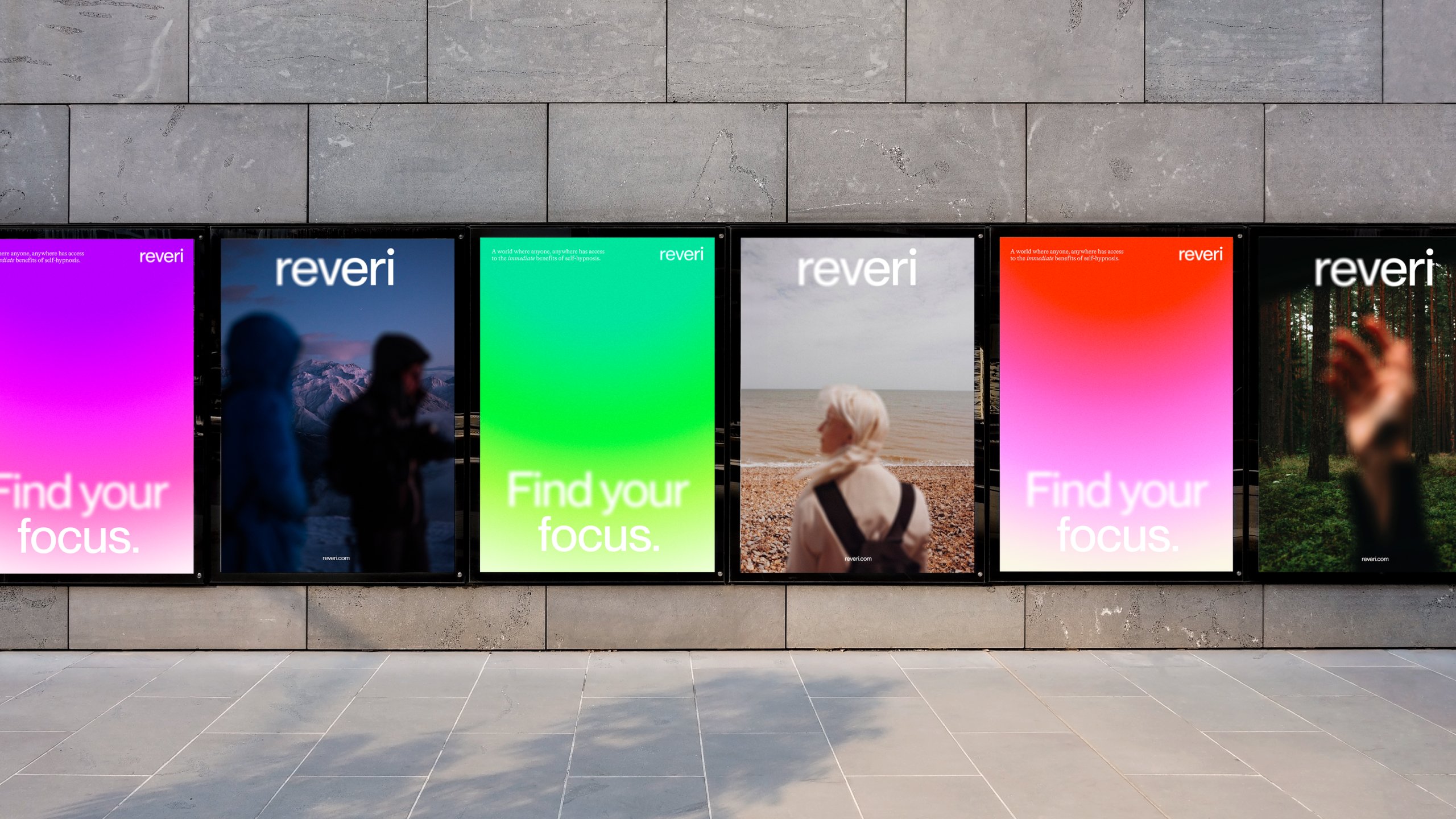
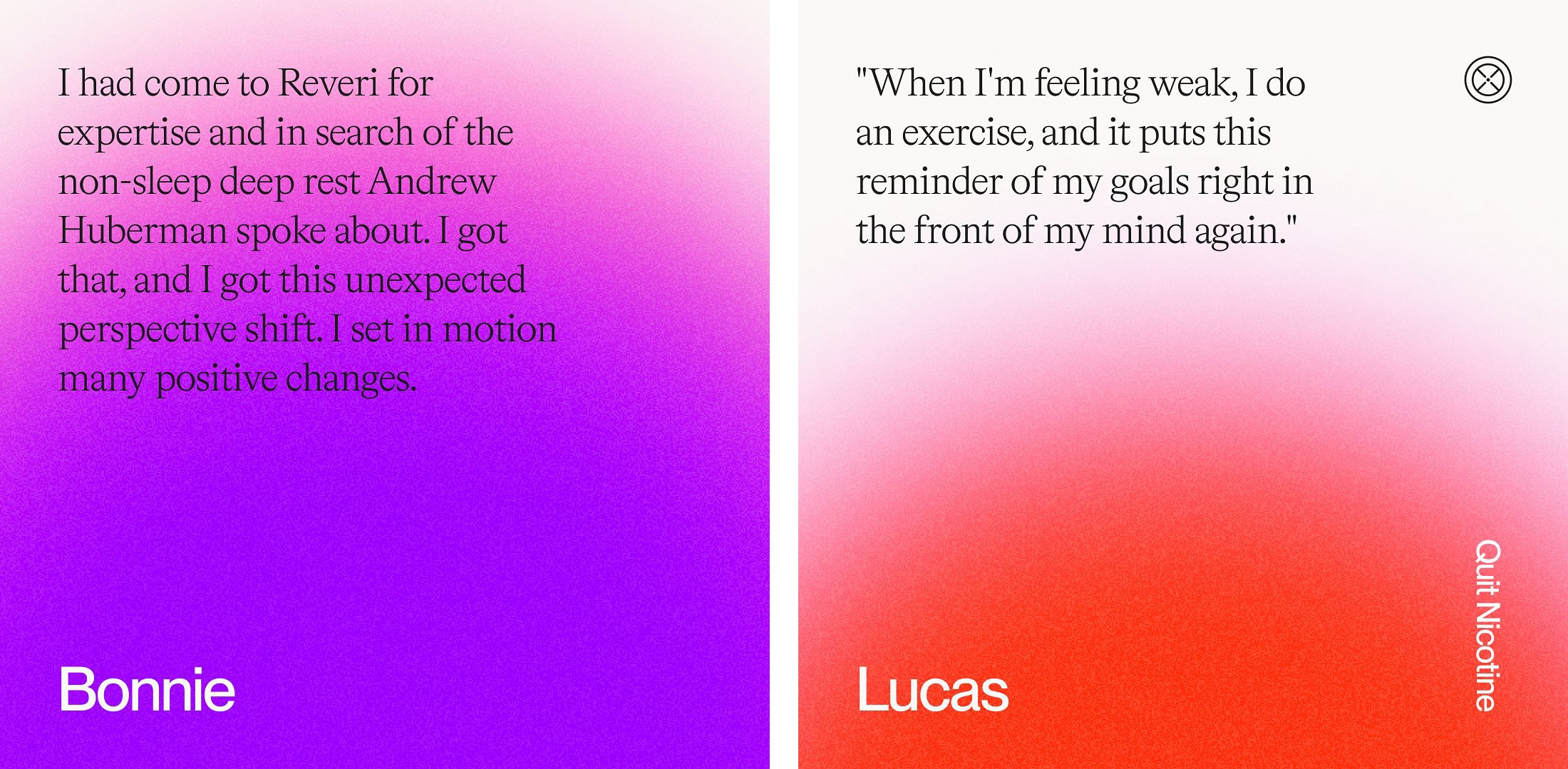
The colour palette is bright and eye-catching, largely based on a vivid purpley pink hue (in gradients, of course) and the aforementioned neon green. It works well, in that it not only looks striking, but also seems vaguely hypnotic. According to Mother, these colour choices were just one aspect of making the identity deliberately rail against the cliched ‘softer tropes of self-help tools’ alongside liberal use of ‘vibrant icons and bespoke illustrations to add richness and energy to each moment of the journey’.
Mother Design’s branding does a great job here of shattering category norms – exactly what’s needed when an identity necessitates not only drawing people to one product, but educating them more broadly in a field that’s little-understood and frequently dismissed. Who knows, maybe Reveri will turn the tide on perceptions of hypnosis, shifting things away from the realm of things like this chihuahua once and for all.


