Isle of Wight Tomatoes by B&B Studio
Opinion by Emily Gosling Posted 7 November 2024
Having grown up near Portsmouth, the Isle of Wight carries a certain resonance, though perhaps unfairly. Aged around 14, when getting served in off licences/particularly lax pubs wasn’t always a given, we’d sometimes pass the time watching the IoW ferry. It felt rather bleak, and somehow a bit futile, just bobbing back and forth between two destinations (Southampton and Cowes) that felt characterised by the distinctive undertone of something violent being just around the corner, and a distinct lack of things to do (hence, I suppose, killing time watching ferries).
As such, it’s impressive that B&B Studio’s (Superkeen, Superfly & Lone Wolf) work for the island’s premier tomato-peddlers hasn’t just done wonders for Isle of Wight Tomatoes as a company, but for the Isle of Wight more generally. It turns out that the Isle of Wight has more sunshine hours than anywhere else in the UK – and even the most cursory of Google image searches shows a place wildly different to my rather grey-tinted memories: beautiful sandy beaches, awe-inspiring landscapes, and most importantly, that abundant good weather.
It’s that last aspect that comes to the fore in B&B Studio’s Isle of Wight Tomatoes rebrand, which saw the agency working across everything from brand positioning to creative strategy, packaging design, copywriting, art direction, website design and more.
One of the most fundamental changes it made was the name: the brand was formerly known as The Tomato Stall, which is fine, if rather twee – it doesn’t sound all that confident, and seems to limit the brand’s aspirations thanks to its rather homespun, market-rooted connotations.
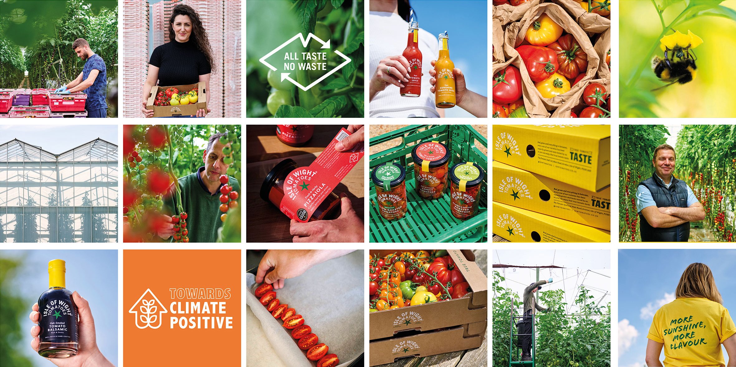
The new name is smart considering the times we’re living in: finally, it seems (or so we’d hope) that people are taking climate crisis into account a bit more when making purchasing decisions, so honing in on the idea of more local produce seems shrewd in that respect. It also chimes with the brand’s broader ethos around sustainability: Isle of Wight Tomatoes has a “no waste philosophy” – capturing rainwater to irrigate its crops, recycling all its tomato plants for compost and using natural predators to control pests in its greenhouse ecosystem – but this wasn’t really being articulated before.
Crucially though, the new name also highlights that aforementioned site-specific weather point to emphasise “the exceptional provenance that makes tomatoes grown on the Isle of Wight so special and delicious,” as B&B Studio puts it. “With more sunshine hours than anywhere else in the UK and a uniquely rich soil, the Isle of Wight has the perfect climate and terroir for tomatoes.”
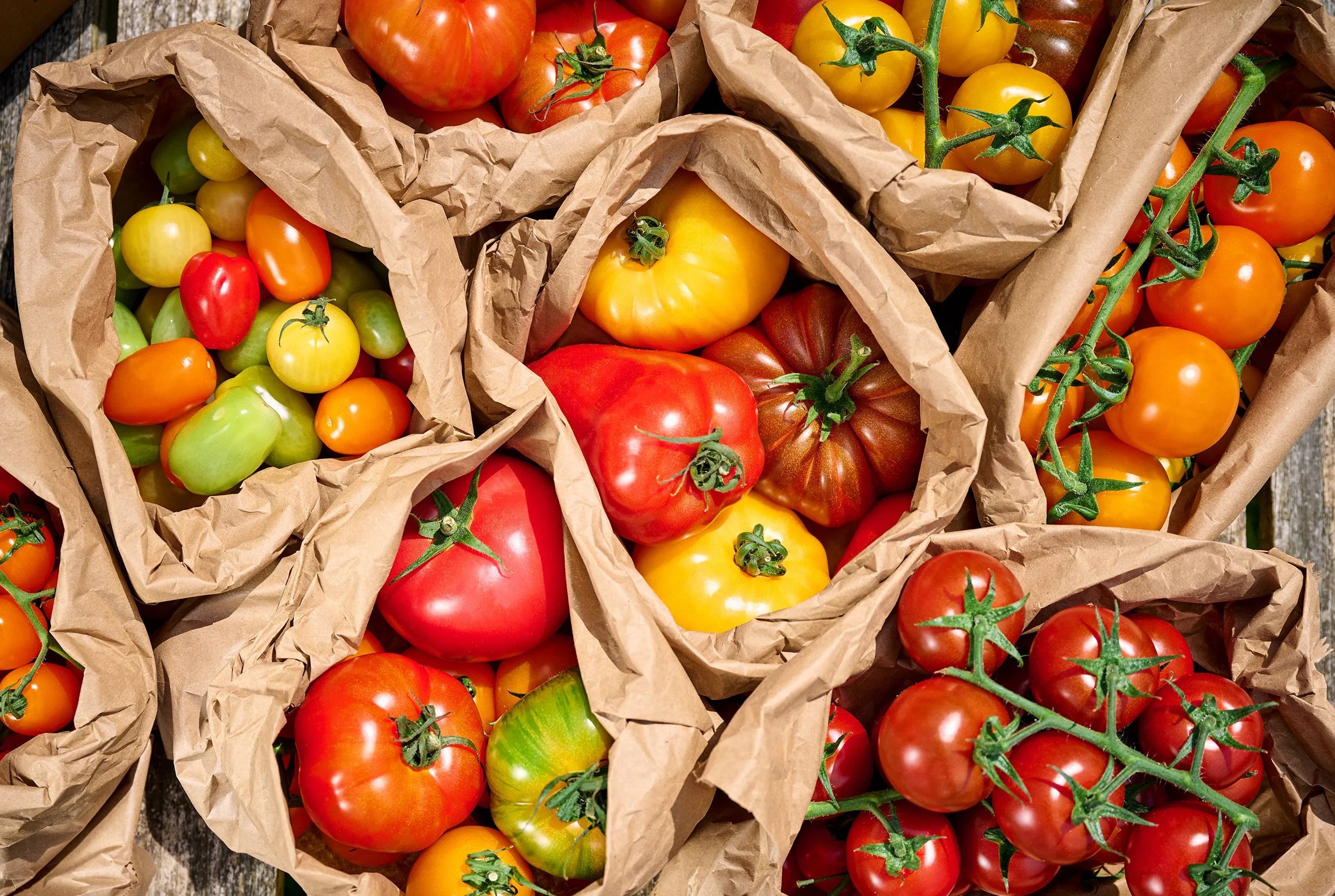
Back when it was The Tomato Stall, the company, which is based in the island’s Arreton Valley, was already using ‘Grown in the Isle of Wight’ as a sort of brand promise, which had “become a key signifier of quality and upweighting this claim to a brand name has cemented the brand’s difference from competitor products in the produce category,” the studio continues.
Now, it’s firmly at the heart of the brand, and is leveraged superbly for the overall positioning, strategy and look and feel. Red and green would usually be the go to for tomato-related products, and there’s no reason it shouldn’t be, for obvious reasons, but by leading on the sunshine theme and bringing bold yellow into the mix, the brand really sets itself apart and instantly conveys freshness and positivity.
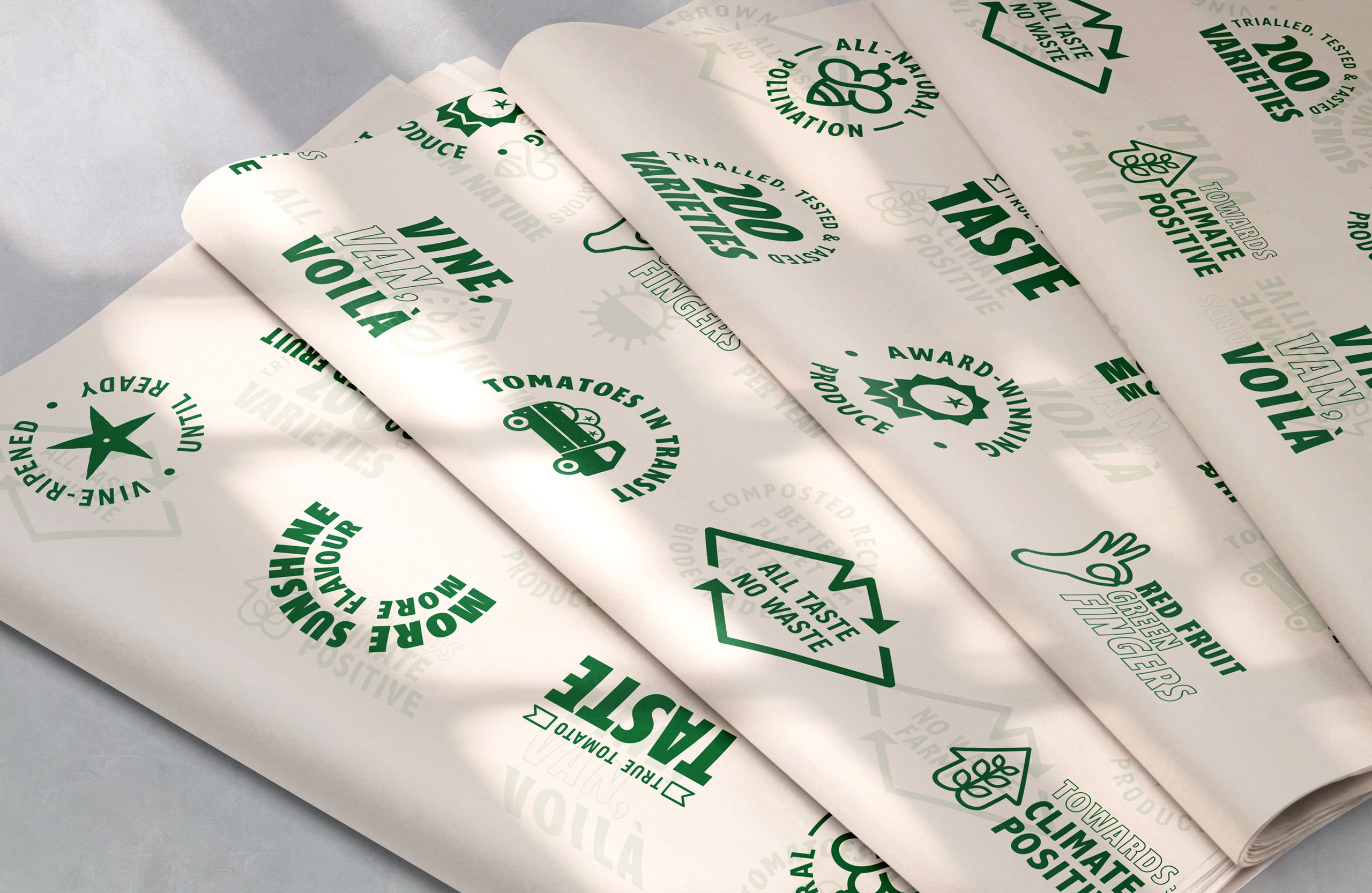
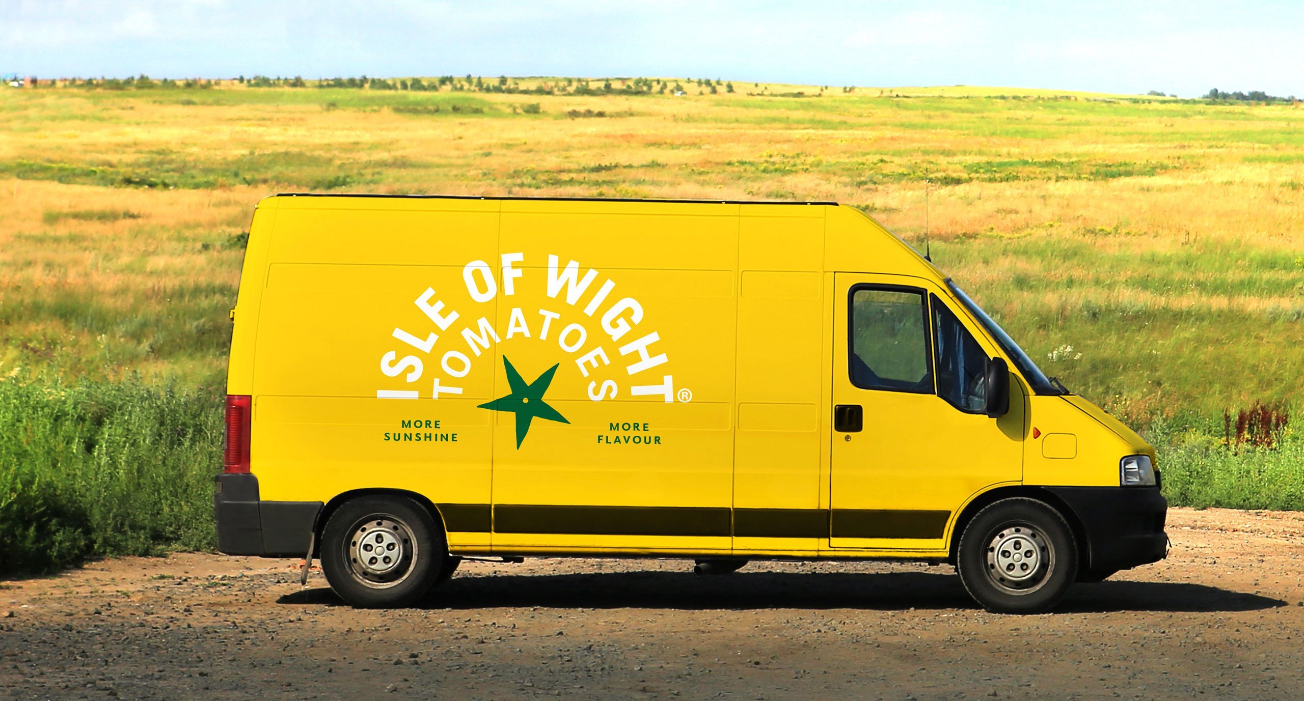
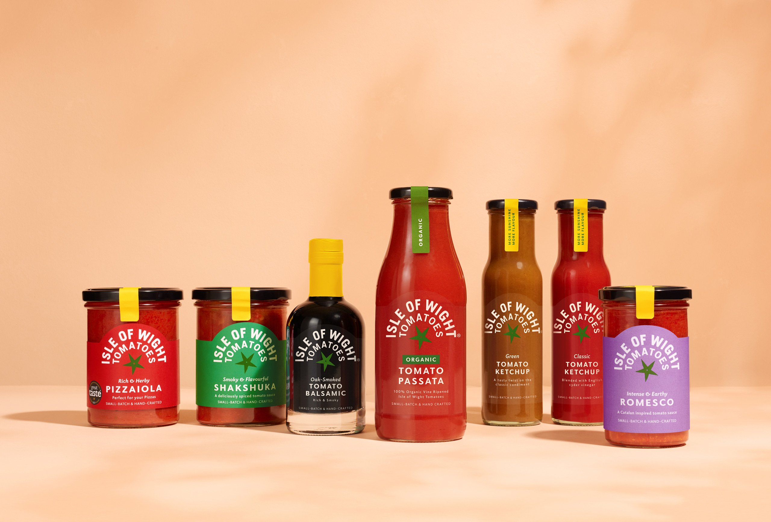
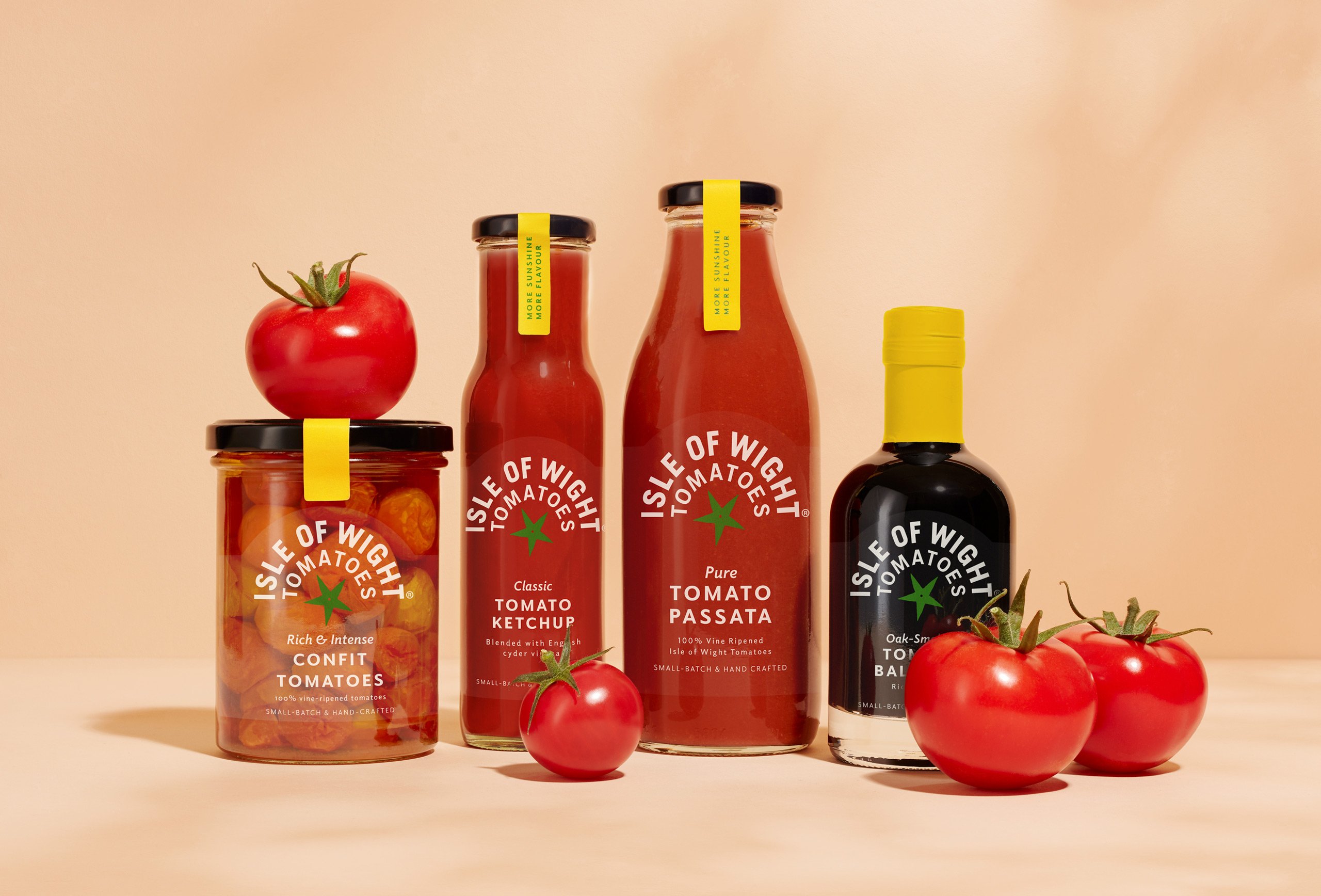
Yellow has become the core colour across all the brand’s touchpoints, appearing on jar labels, packs, stationery, merch such as t-shirts, van liveries, and more. Often, that yellow takes a back seat to let different flavours and variants come to the fore: on jars of confit tomatoes and ketchup bottles, for instance, the rich reds of the product take centre stage through the glass, but the yellow is used as an anchoring device on the labels to give the whole brand a sense of coherence and consistency.
While the brand now seems a lot more confident and authoritative, there’s still a lovely homespun quality about it all which works brilliantly for something like tomatoes – a brand that was too slick and clinical just wouldn’t work, and would detract from any sense of soil-grown goodness. This is in no small part down to the clever use of texture: the main logo feels very rustic even in flat 2D – you can almost feel the rough, organic qualities of a cardboard label.
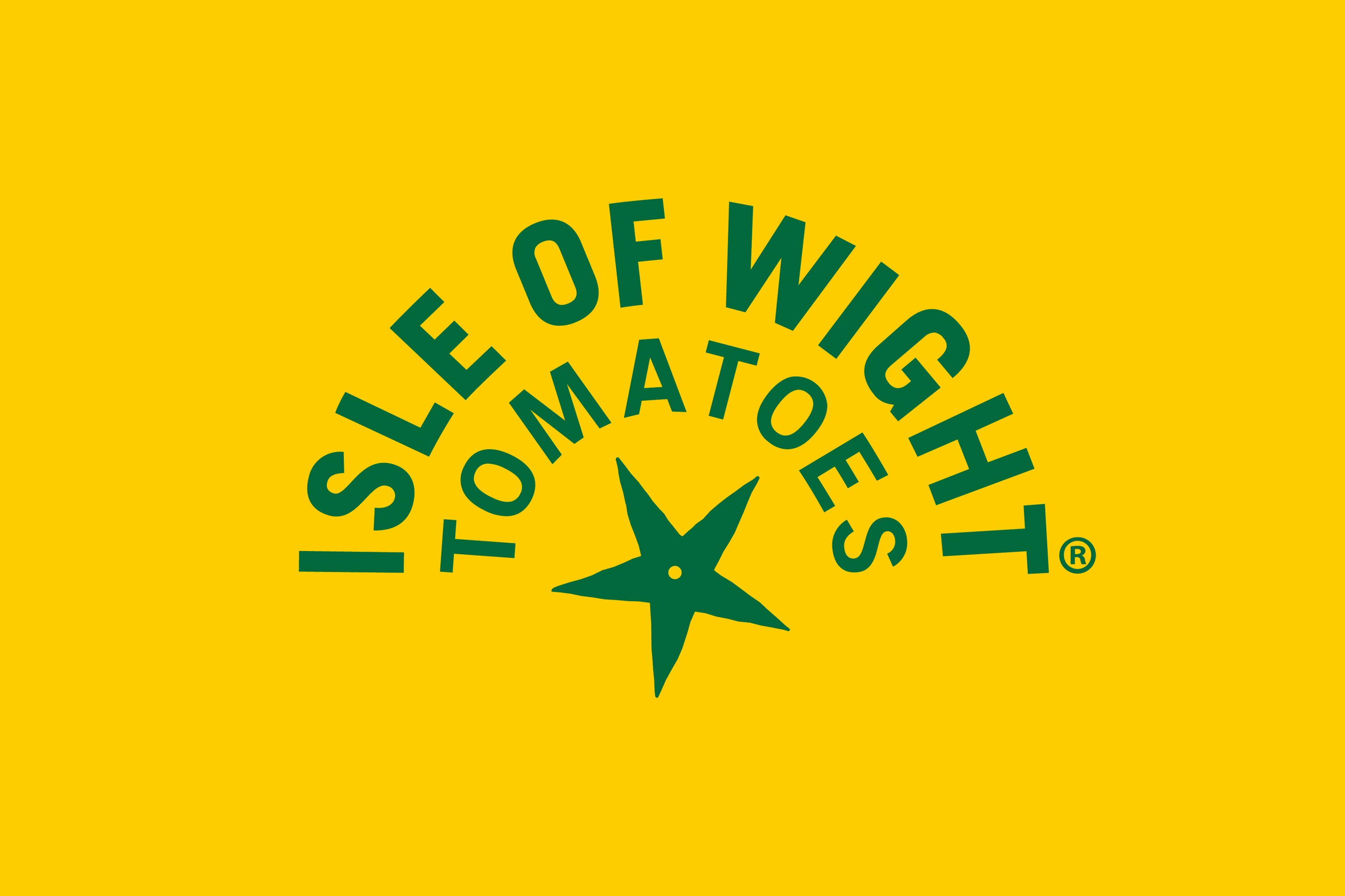
The wordmark is kept simple and further underscores the sunshine stuff, sitting in an arc, like a rainbow, and deftly getting round any potential issues of the rather long name so that it works just as well on tiny jar labels as on larger applications.
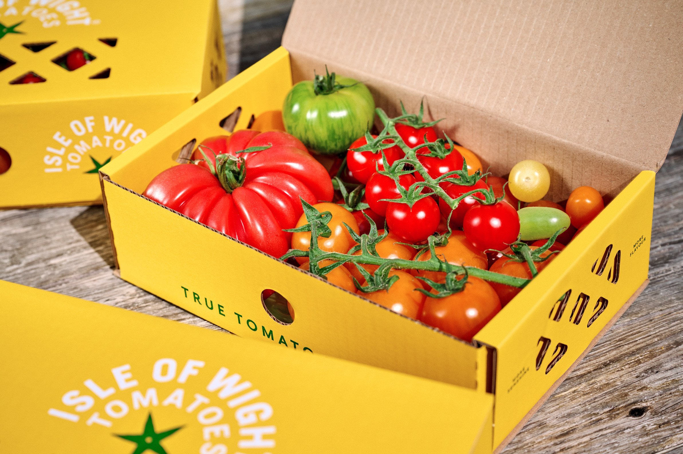
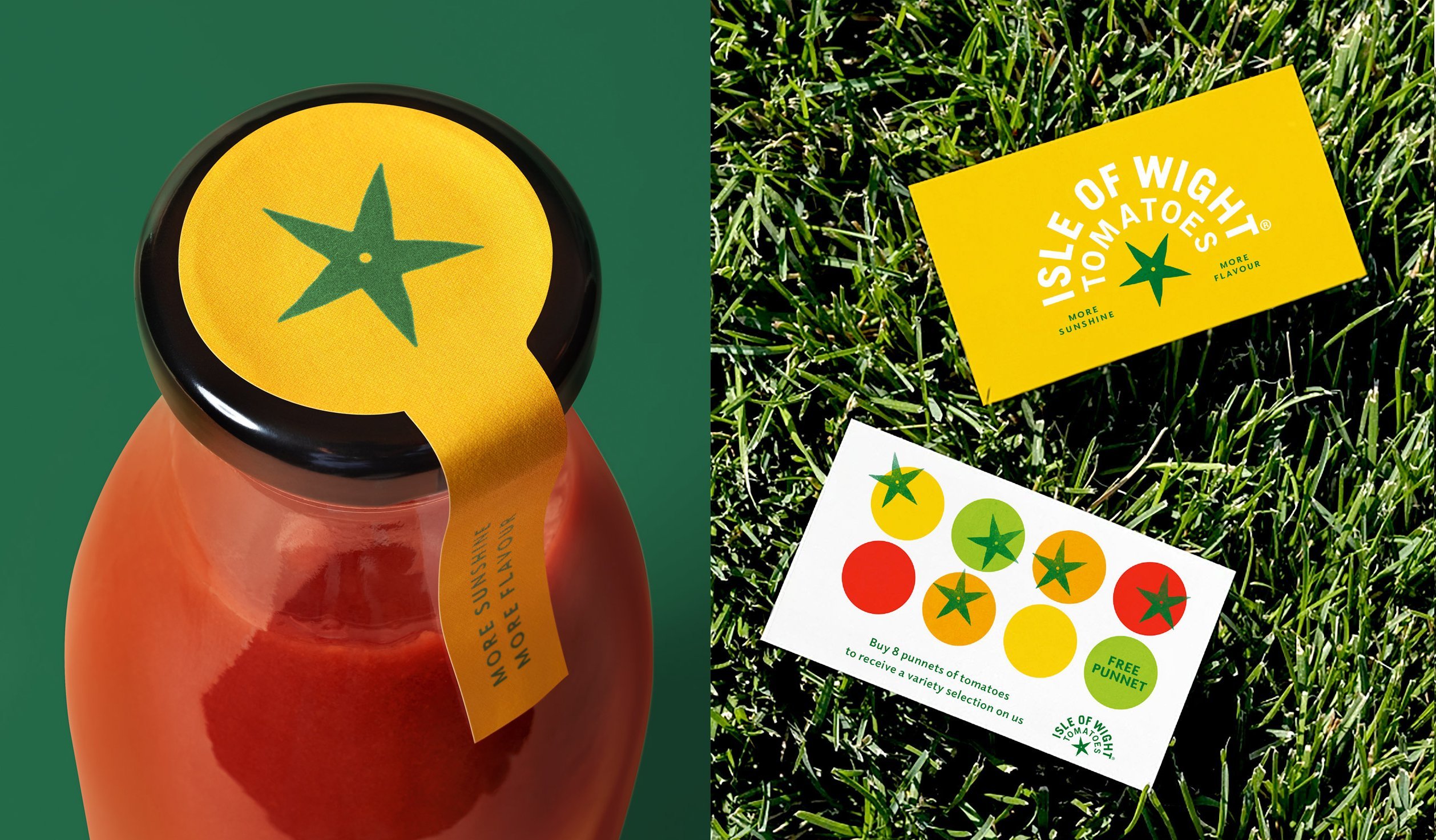
The typography is mostly kept very simple, using quirky sans serif Elido by Kontour in wide spacing for the ‘MORE SUNSHINE’ and ‘MORE FLAVOUR’ messaging that often appears with the logo. The handwrought vibe goes a little too hard for me on the website, where Joachim Müller-Lancé’s hand drawn Flood script is used: it feels a little overbearing – the ‘local produce’ thing is coming through loud and clear without the use of synthesised typographic brushstrokes.
B&B Studio introduced a new graphic device that it terms a ‘calyx,’ which sits alongside the wordmark to form the logo. Essentially a sweet little green star, this is drawn from the tomato plant itself: calyx simply means the outermost part of a flower, the shape that its sepals make. In its use on Isle of Wight Tomatoes products, the calyx becomes not just a brand mark, but a succinct signifier of quality.
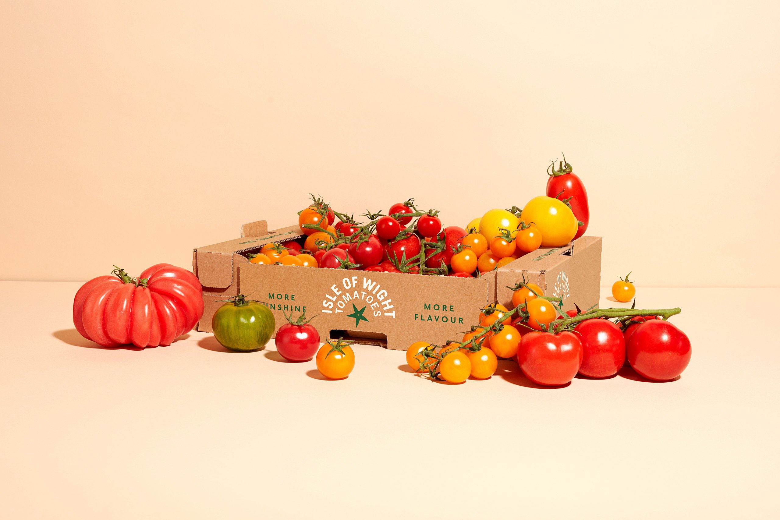

Everything around the identity feels very in step with the company’s ethos and operations, combining “age-old traditions with modern-day innovation… each variety specially selected for their unique flavour and picked only when perfectly ripe,” as Isle of Wight Tomatoes puts it.
The rebrand conveys this brilliantly: the whole identity has a distinctly independent grower, farmstore, foodie feel. It still leans on the market stall thing to some extent, but with a more grownup, gourmet sensibility that roots the brand in the Isle of Wight, but deftly broadens its appeal.
