Story Espresso by For the People
Opinion by Emily Gosling Posted 13 February 2025
The unity of coffee-boffins and great typographic choices seems to be having a moment right now on BP&O. Just the other week we covered the truly superb work for Dark Arts Coffee by Not Wieden + Kennedy. Now, though, we’re heading down under – specifically to the Sydney suburb of Lane Cove, home to Story Café.
Story Café opened in 2021, bringing together that marriage of lattes and letterforms and introducing a third strand – an ethos focused squarely on, as the name suggests, storytelling.
On the face of it, it doesn’t seem like the most likely triptych, but For The People (Blue Mountains & Be Equitable) which is behind the branding for the operation, would tell you otherwise: ‘For so many people, each day begins with a coffee – which means countless stories, no matter how action-packed, romantic or dramatic, all share a single origin. (Or, sometimes, a blend.)’ says the Sydney-based agency. ‘A conversation over a flat white might become a love affair, for example, or a croissant might become the treasured prize to fight over.’
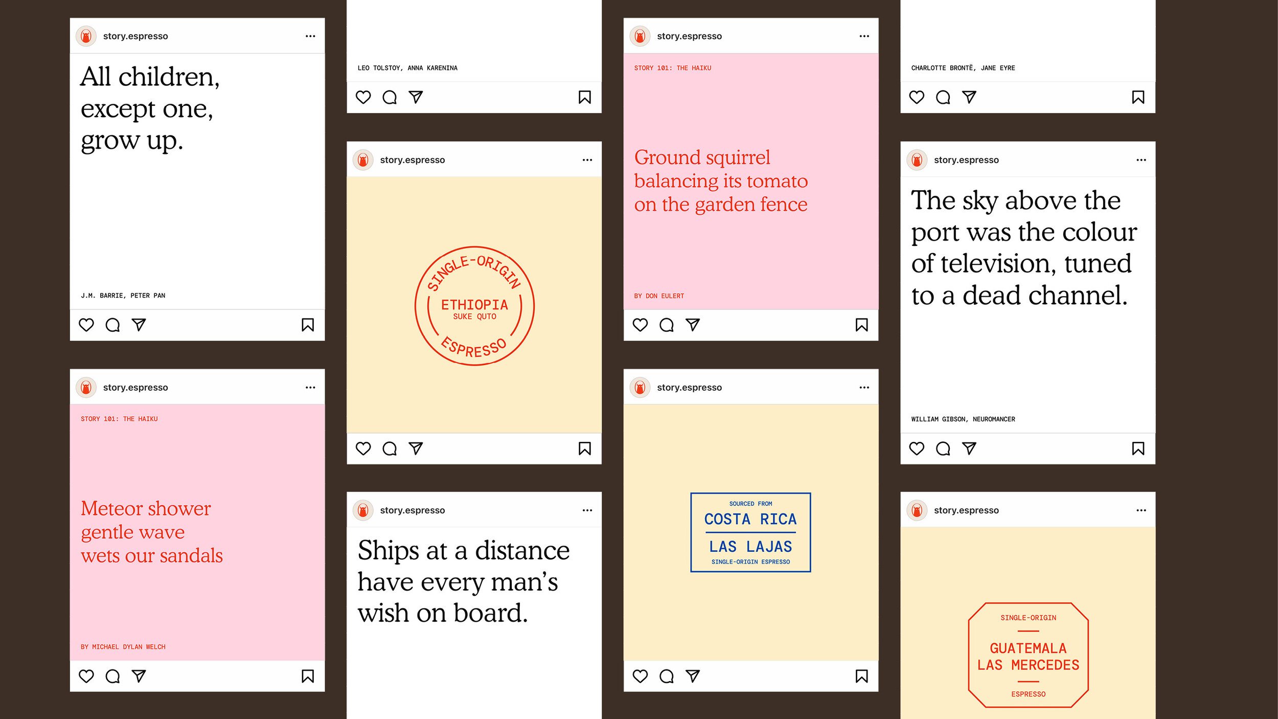
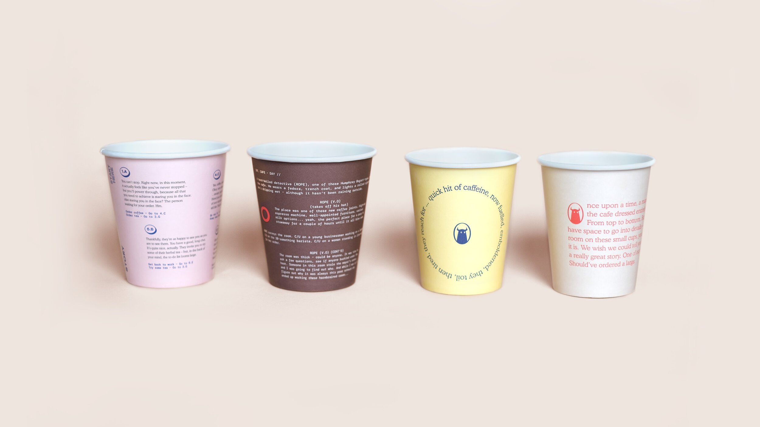
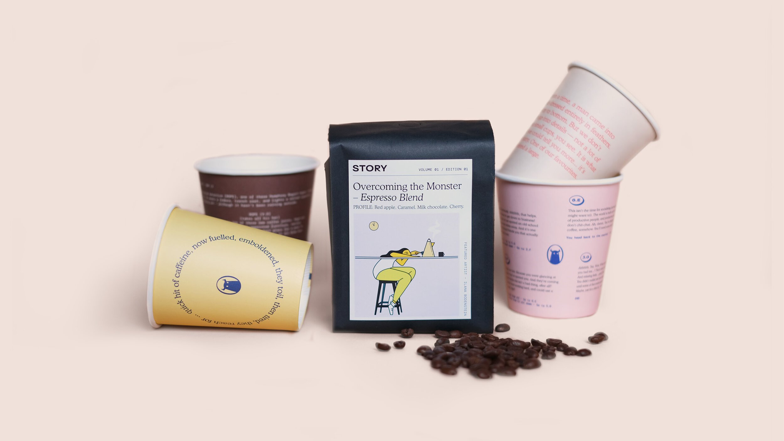
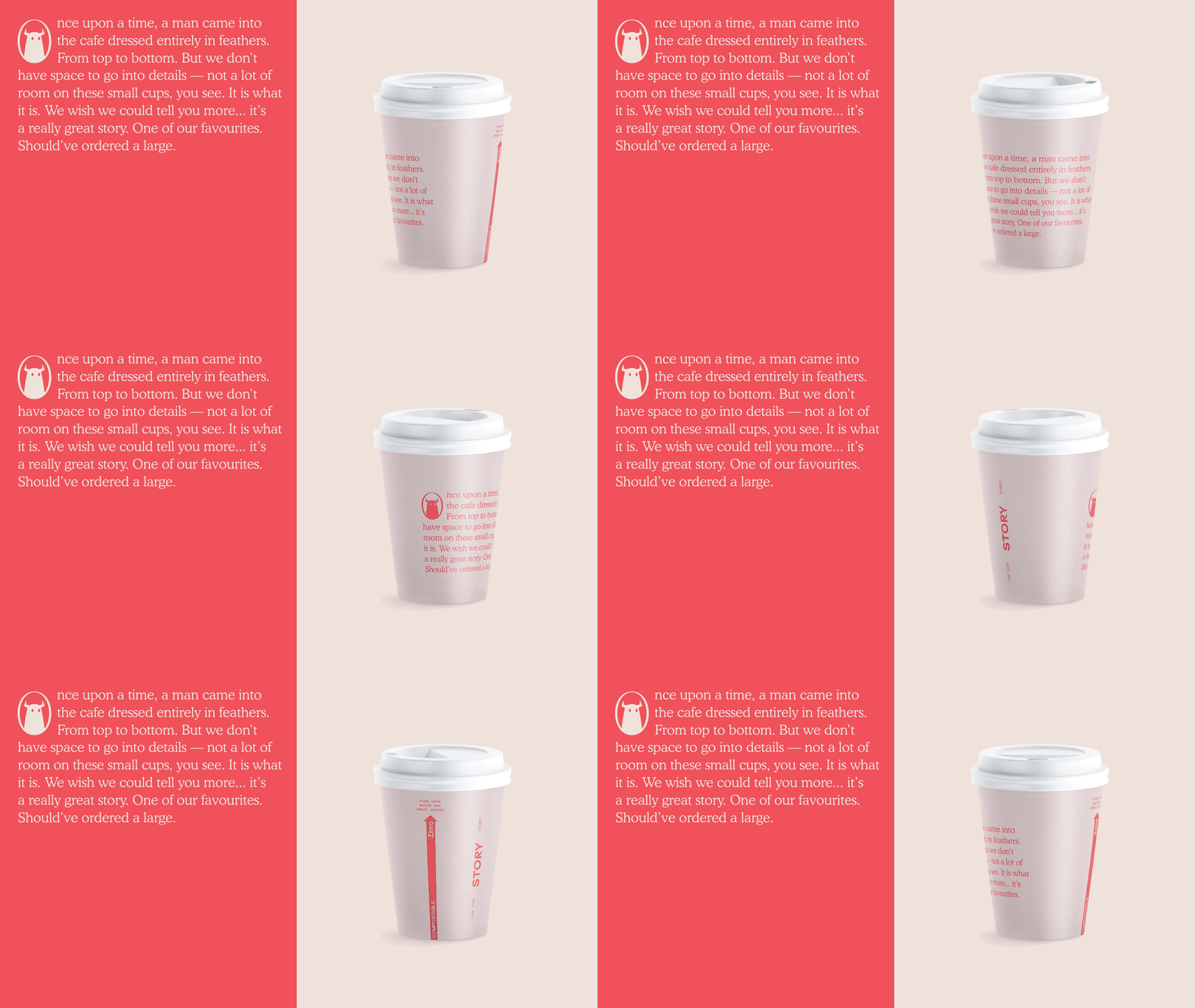
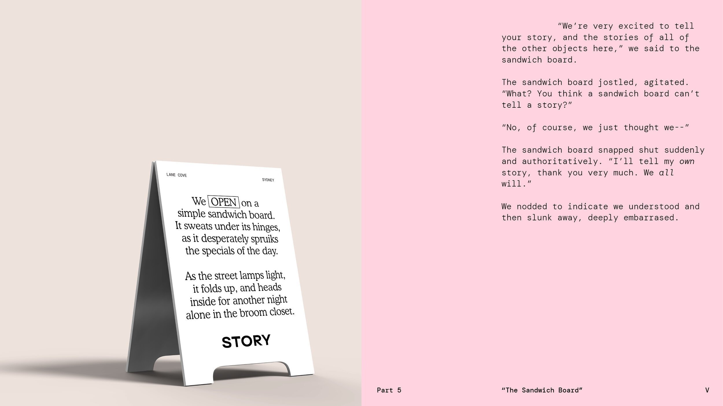
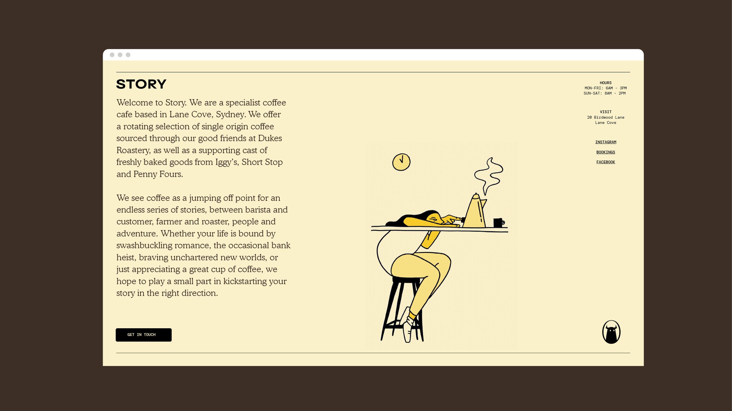
As such, the branding for Story Cafe looks to draw out this narrative-driven theme across everything from the cafe’s website to its takeaway cups, interiors, saucers, merch and more, ultimately ‘using every point of interaction as a jumping off point into a new type of story’.
It’s an interesting challenge in light of the nature of branding: to many people, such an endeavour might be seen to be more the preserve of copy-driven ad campaigns or social media strategies, but For The People has shown that visual identity can be just as powerful for telling not just that fabled ‘brand story’, but actual read-them-in-a-book type stories.
This is achieved through a variety of things: yes, copy is vital – making those gorgeous typography choices all the more crucial – with everything centring on numerous stories across surprising places, created by For The People writers Mat Groom and Daniel St Vincent.
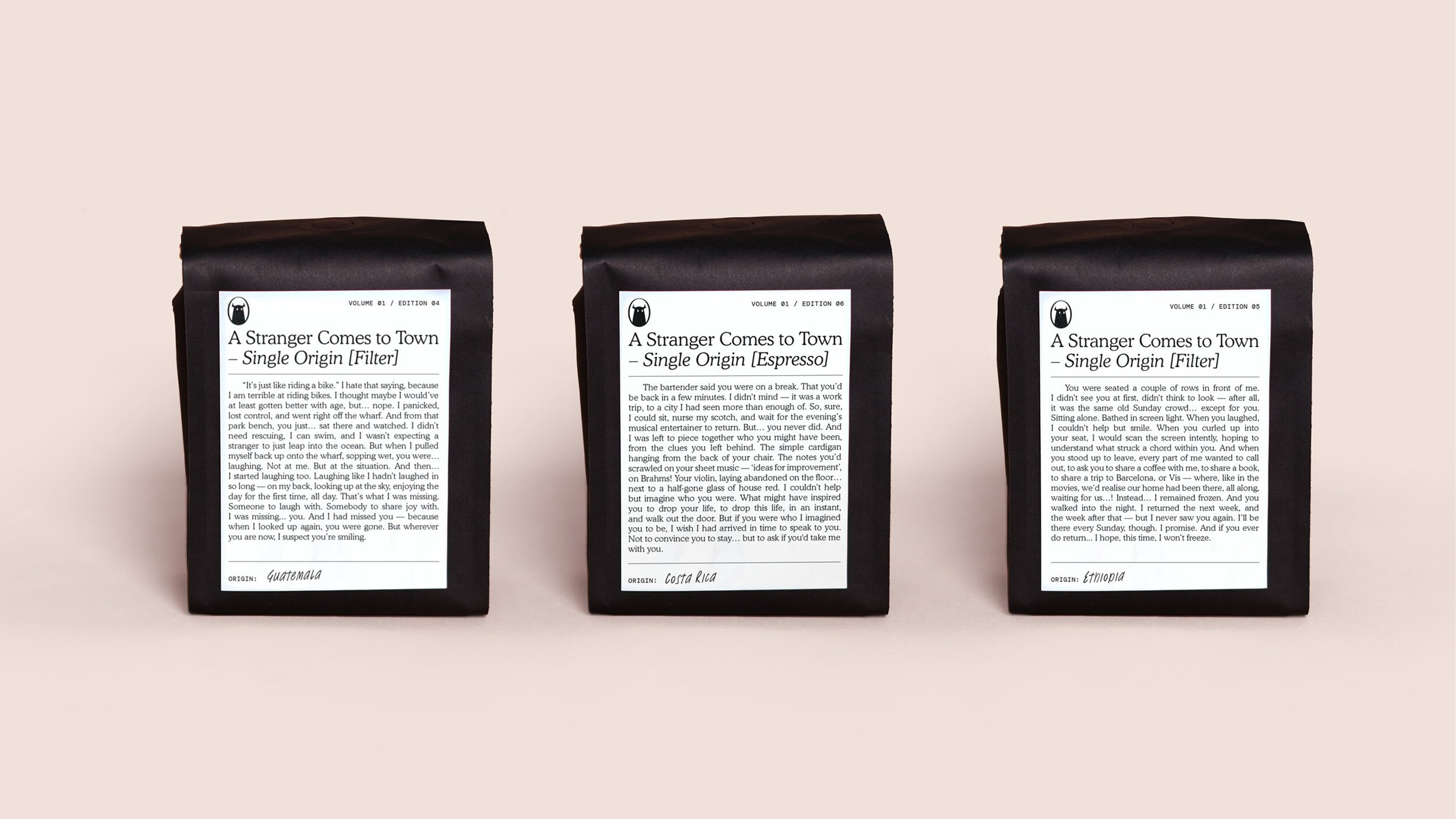
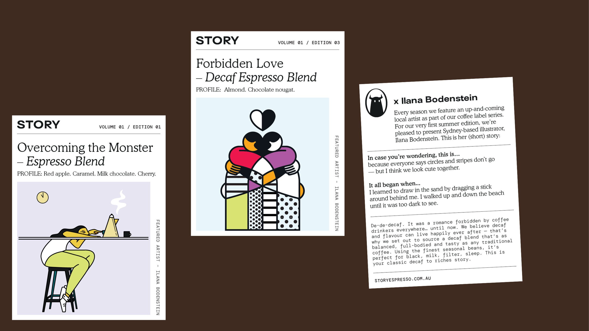
Illustrations often drive the narrative just as powerfully, though, when used on touchpoints like the limited-edition coffee bean packaging and mech. This is where the non-verbal storytelling really comes to life: rather than opting for a singular illustration style, For The People has opted to collaborate with different artists on different blends – with a standout being the crisp linework of illustrator Ilana Bodenstein (who is also based in Sydney).
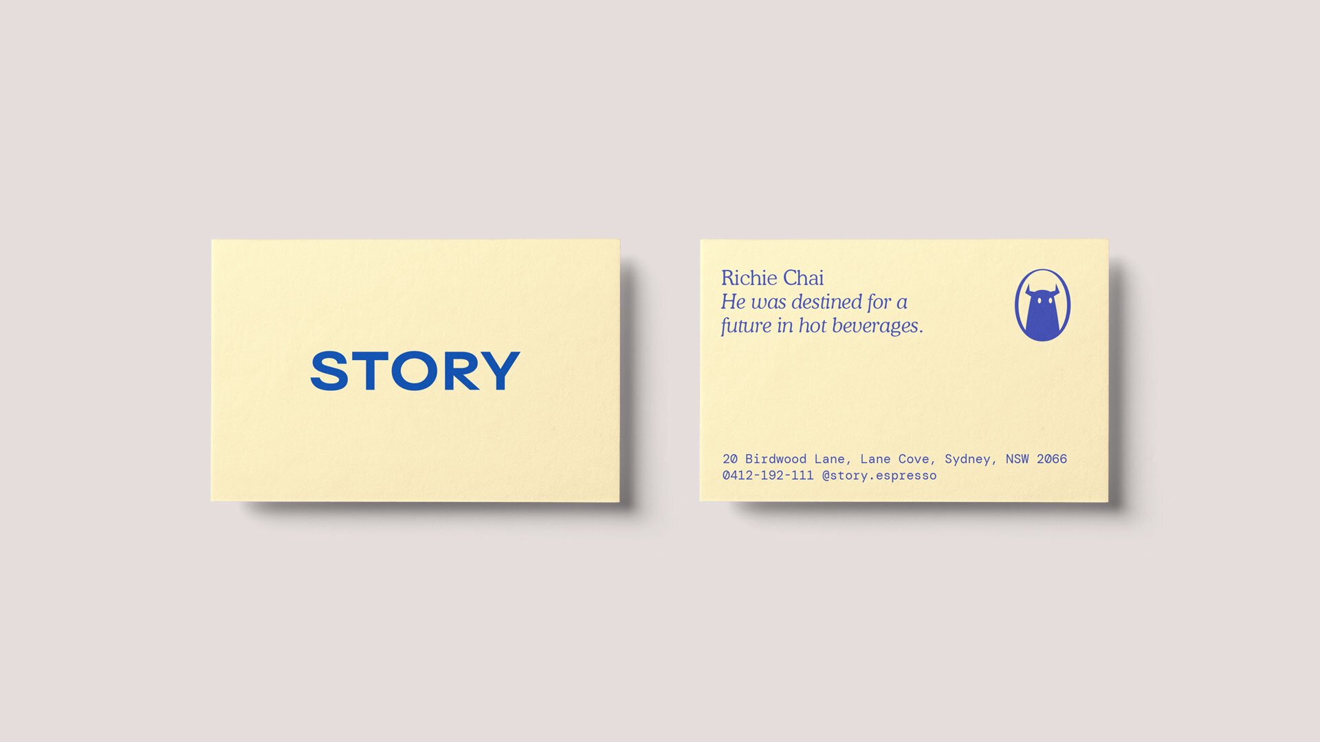
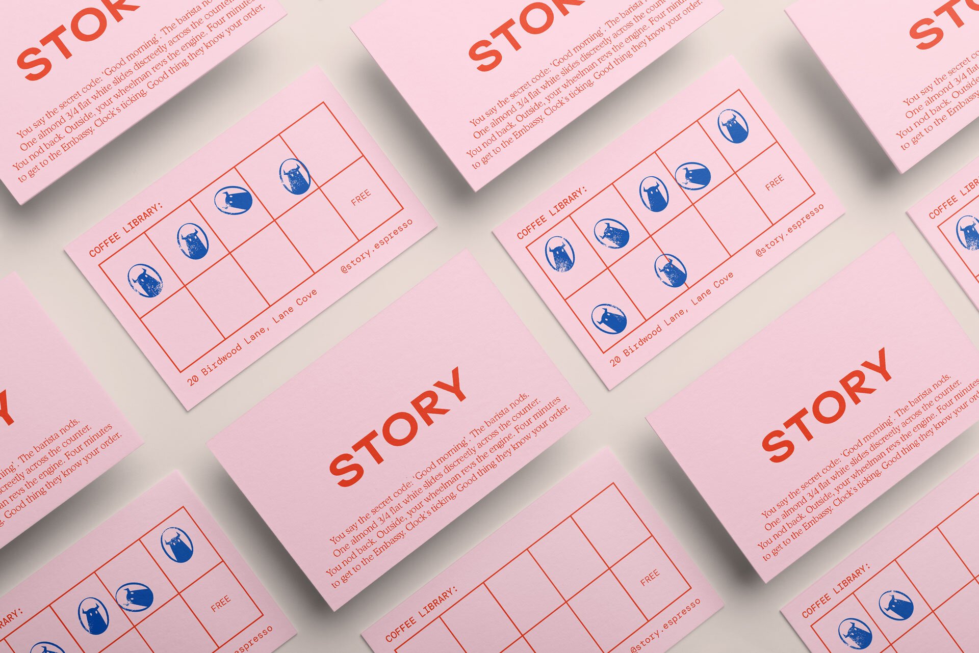
A lot of heavy lifting is also shouldered by the vibrant brand colour palette. The primary hue is a rich dark blue, while millennial pink also works wonders here alongside a chocolatey brown tone and fresh shade of pale yellow. They work really well, and feel appetising as well as once again referring back to literature; with the pink and yellow reminiscent of old library cards and the dark red and brown nodding to the sleeves of old school hardbacks.
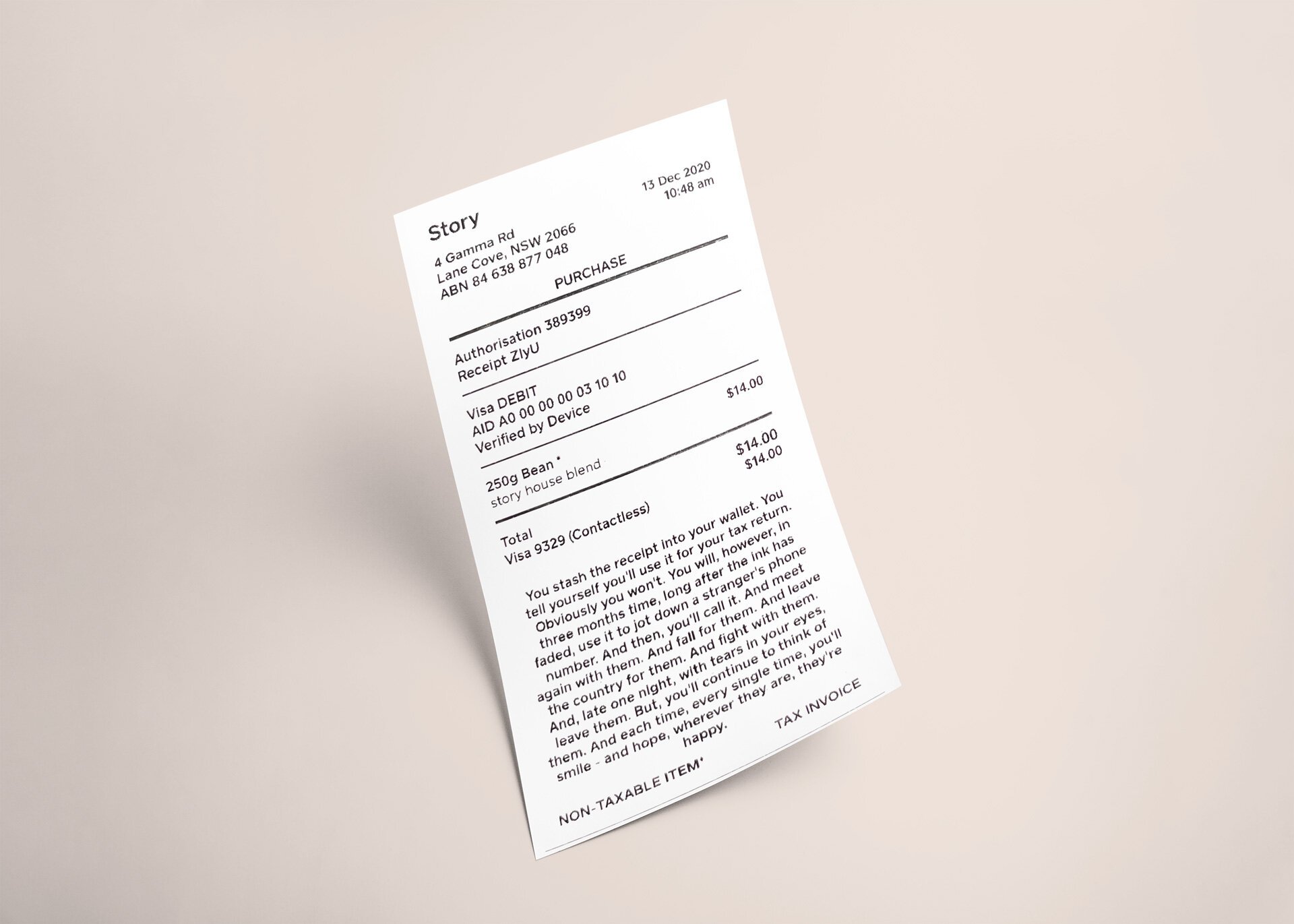
The storytelling stuff is great, and you can see that For The People delighted in exploring all the possible forms stories can take: ‘haikus, screenplays, and branching narratives… library-esque loyalty cards’. The way that menus, receipts, napkins, and even t-shirt tags become canvases for narratives makes the cafe as experiential as it is transactional.
More broadly speaking, it could be said that the branding plays with the idea that everyday moments – whether it’s just dashing in for a macchiato on the way to work or idly reading the text on the cup – can spark the imagination, or at least offer a little bit of joy to an otherwise potentially banal activity.
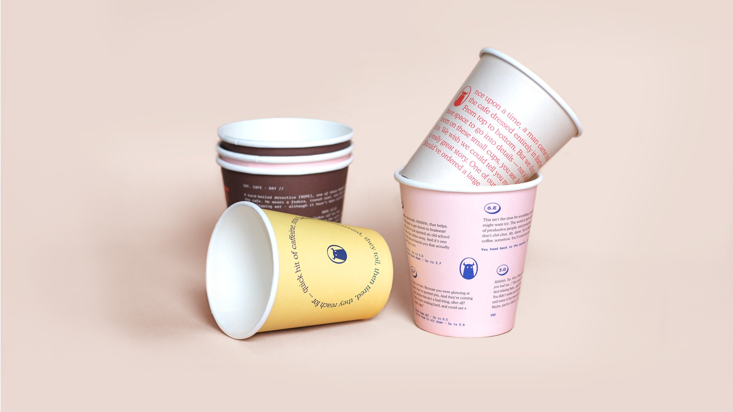
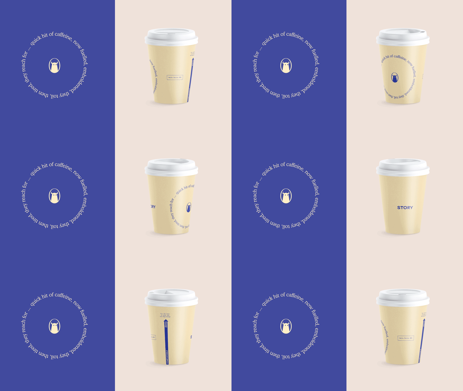
As mentioned previously, the type choice is really lovely, hitting the sweet spot between contemporary, classic, legible and slightly off kilter – namely in the case of the monospaced typewriter-esque DM Mono, originally designed for Google project DeepMind by Colophon Foundry. This is used alongside Blaze Type’s bold, contemporary sans serif Surt and the soft, rounded serifs of Cooper.
For The People cites literature its inspiration for choosing each font; and, never straying from the narrative narrative, the aim was to create a trio of fonts that work well together, but also have distinct personalities, behaving like characters in a story – working on their own as a sort of typographic monologue but also playing off one another as they would in a book.
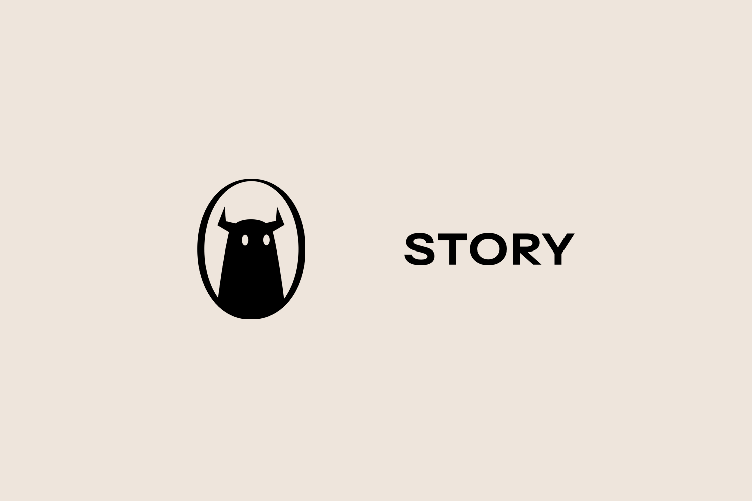
The project has been widely celebrated in the design world; picking up two graphite pencils in D&AD’s 2021 awards – one for Writing for Design and the other for Graphic Design. So maybe this is just me, but I can’t help feeling the identity falls short when it comes to the logo (or as For the People refers to it, the ‘mascot’). This takes the form of a horned monster, seen in blocky silhouette. It’s described by the agency as an ‘enigmatic character’ which ‘symbolizes the “great unknown of stories yet to be told,” serving as a guardian of the café’s myriad tales’.
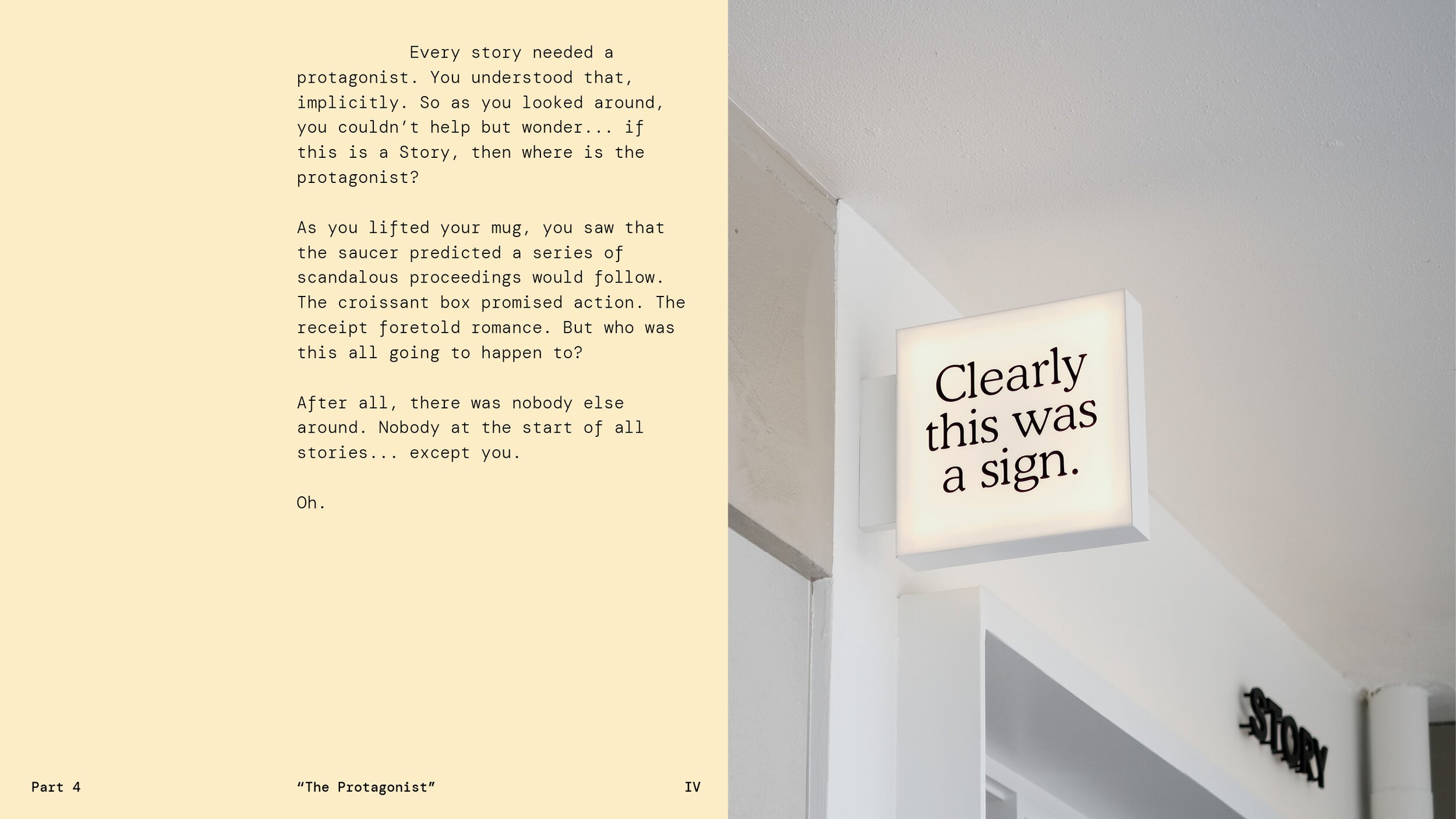
I really don’t get it though. It feels confusing and childish compared to the rest of the brand, and detracts from the gorgeously subtle but powerful suite of brand elements. Yes, it’s playful; but that’s about it: before I’d read the case study and looked at more images, the combination of the Story Café name and the monster had me assuming that this was a place where kids went to read (on reflection, I’m probably thinking of the Story Centre in Stratford).
The monster is a real red herring, IMO: both its style and significance seems to go against the grain of the rest of the branding, which seems to be all about intrigue and subtlety and discovery. Likewise, I can’t help but feel as though the wordmark as seen on the cafe exterior and elsewhere, doesn’t add a lot – but I suppose it doesn’t really have to, with the rest of the identity being so content-rich.
All that is to say, however, that overall For The People has nailed the tricky feat of telling actual stories through a holistic visual identity. The idea of a ‘brand narrative’ or story is bandied about so much as to have often lost its meaning completely; but here, it really means something to read, get lost in, and enjoy.
