Stuzzi by Perron-Roettinger
Opinion by Emily Gosling Posted 20 February 2025
Hot sauce branding has long been dominated by certain overarching tropes: there’s the hyper-trad (Cholula, Tabasco, Sriracha et al); the twee of the kitchen-table-scale small-batch brigade; and the I WILL RIP YOUR HEAD OFF! camp where products have names like ‘death’.
In the first and second of those camps in particular, there’s a lot of decent branding. But this new project for hot sauce brand Stuzzi from Los Angeles-based studio Perron-Roettinger neatly sidesteps all established tropes and looks truly original: fresh, striking, just all-out gorgeous.
Stuzzi is the brainchild of Carla and Richard Betts – who made a name for themselves in the wine world – alongside chefs Ethel Hoon and Jakob Zeller.
The hot sauce launched last year, and is billed, variously, as ‘Hot sauce in its most perfect form’; ‘the apogee of three thoughtfully chosen ingredients’ (fresh and dried peppers, distilled vinegar and a dash of salt); and, most brazenly, ‘Not better than sex – but close’.
Such promises feel totally on brand: no-nonsense, bold but never brash, relentlessly Italian. The name is taken from the Italian word stuzzicare: ‘to stimulate, to excite, to tease.’ Which maybe sheds some light on that copywriting – to take it totally seriously is surely to miss the point. We’d wager that the chilli-burning tongue is placed firmly in cheek here.
The packaging reflects all that beautifully, drawing inspiration from both classic European design language and gently subversive contemporary design aesthetics.
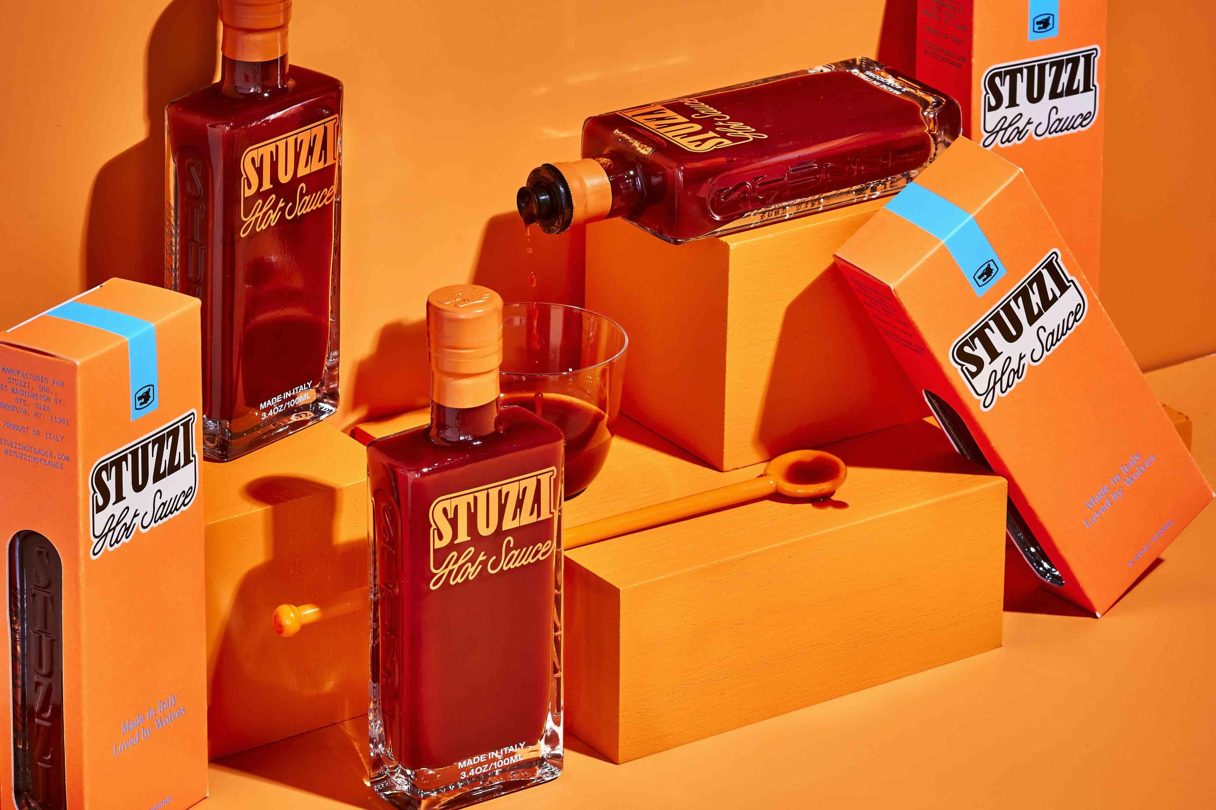
Everything feels so brilliantly considered and above all, confident. Nothing is there by accident, or designed by committee, or apologetic, or a compromise. Much of this boils down to its simplicity: the colour palette is limited to a gorgeously deep, rich orange – a shade that immediately evokes the golden era of Italian brand design through its Campari connotations, firmly anchoring the brand in its cultural provenance – which is complemented by a punchy pastel pale blue for secondary applications like on-pack copy.
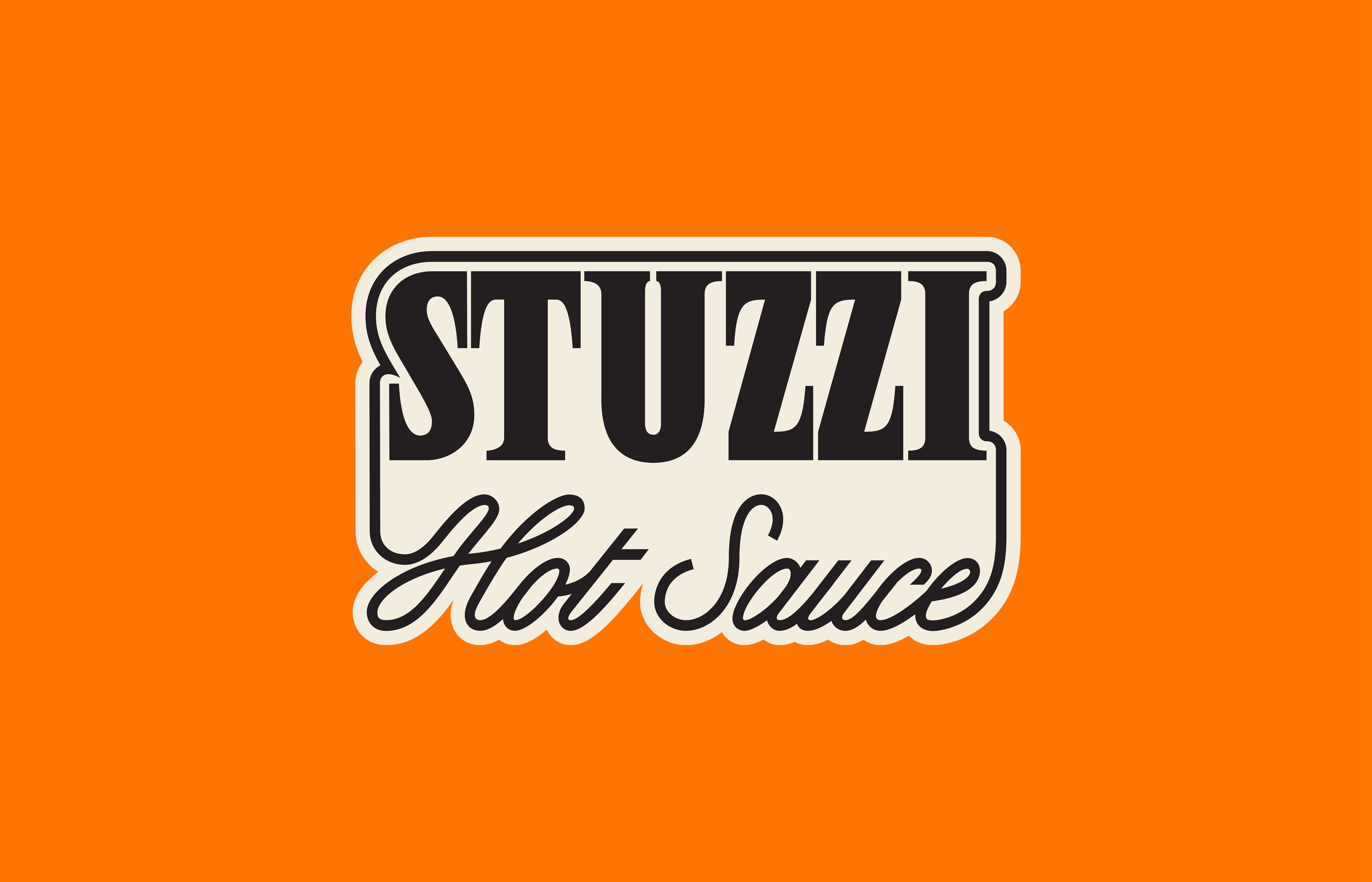
The final colour is the fiery red of the product itself, which shines through thanks to the smart structural packaging design. The bottles themselves are totally transparent, making the word mark and brand colours feel all the more punchy; but are totally ownable thanks to a stacked wordmark, housed within a lozenge-shaped lockup, embossed on the side.
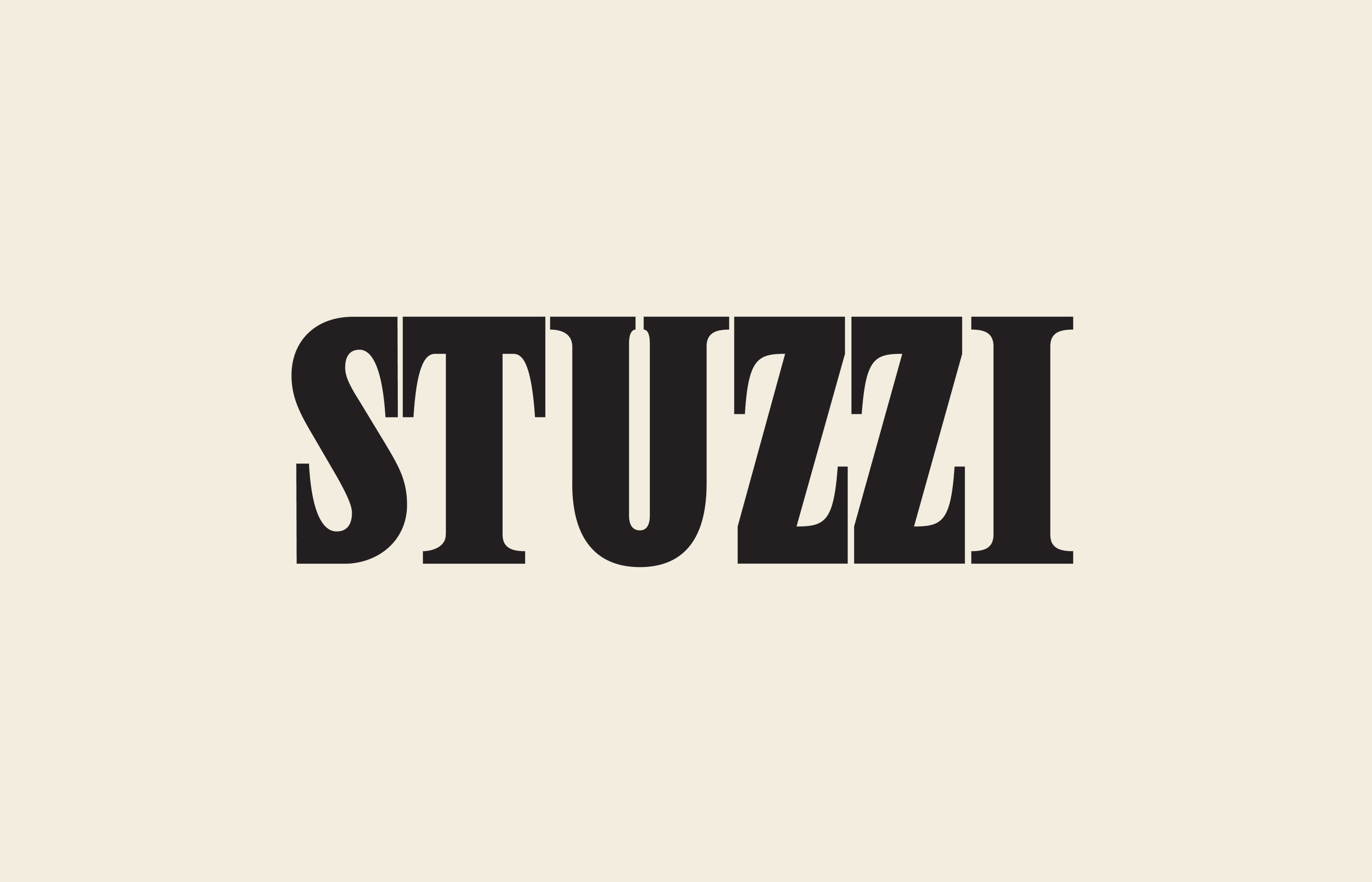
I’m guessing the typography on the wordmark is bespoke, but whatever it might be, it’s superb. The wordmark sees ‘Stuzzi’ set in an all-caps serif; while the ‘hot sauce’ appears below in a script handwriting font that uses its flourishes at the start of ‘hot’ and the end of ‘sauce’ to form a lockup device of sorts that overlines the main brand name. It feels so fluid and fresh, but somehow like it’s been here forever.
Elsewhere, Perron-Roettinger opted for Denton Condensed by Peregrin Studio as the primary typeface, a display serif inspired by the bold, tightly kerned headlines of the 1970s and its now-iconic editorial print ads (like these). It’s a typeface full of warmth and character, bringing an expressive, almost cinematic feel to the brand.
Supporting this is Theinhardt, a grotesque sans-serif that lends a contemporary balance to the more exuberant primary type. Designed by François Rappo, Theinhardt has a rich lineage, drawing from the first wave of neo-grotesque typefaces that emerged in Swiss design in the mid-20th century.
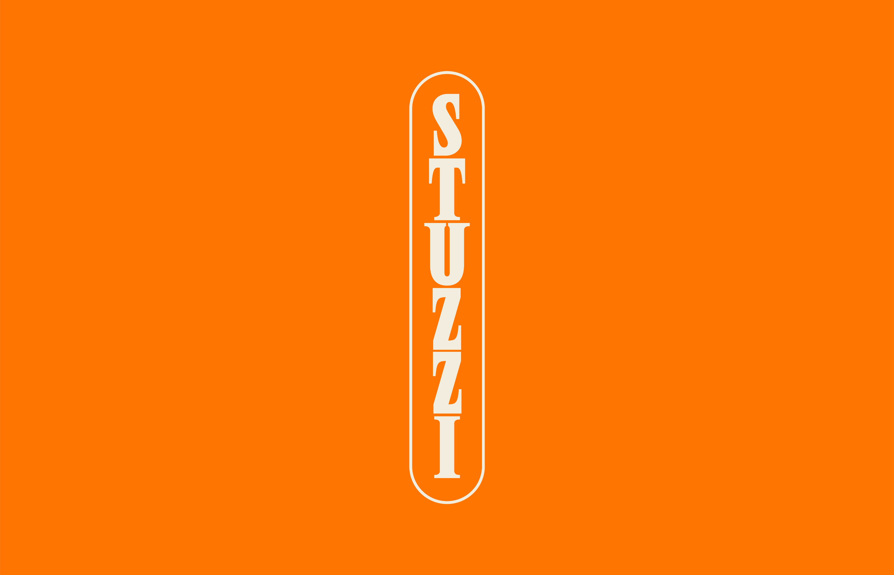
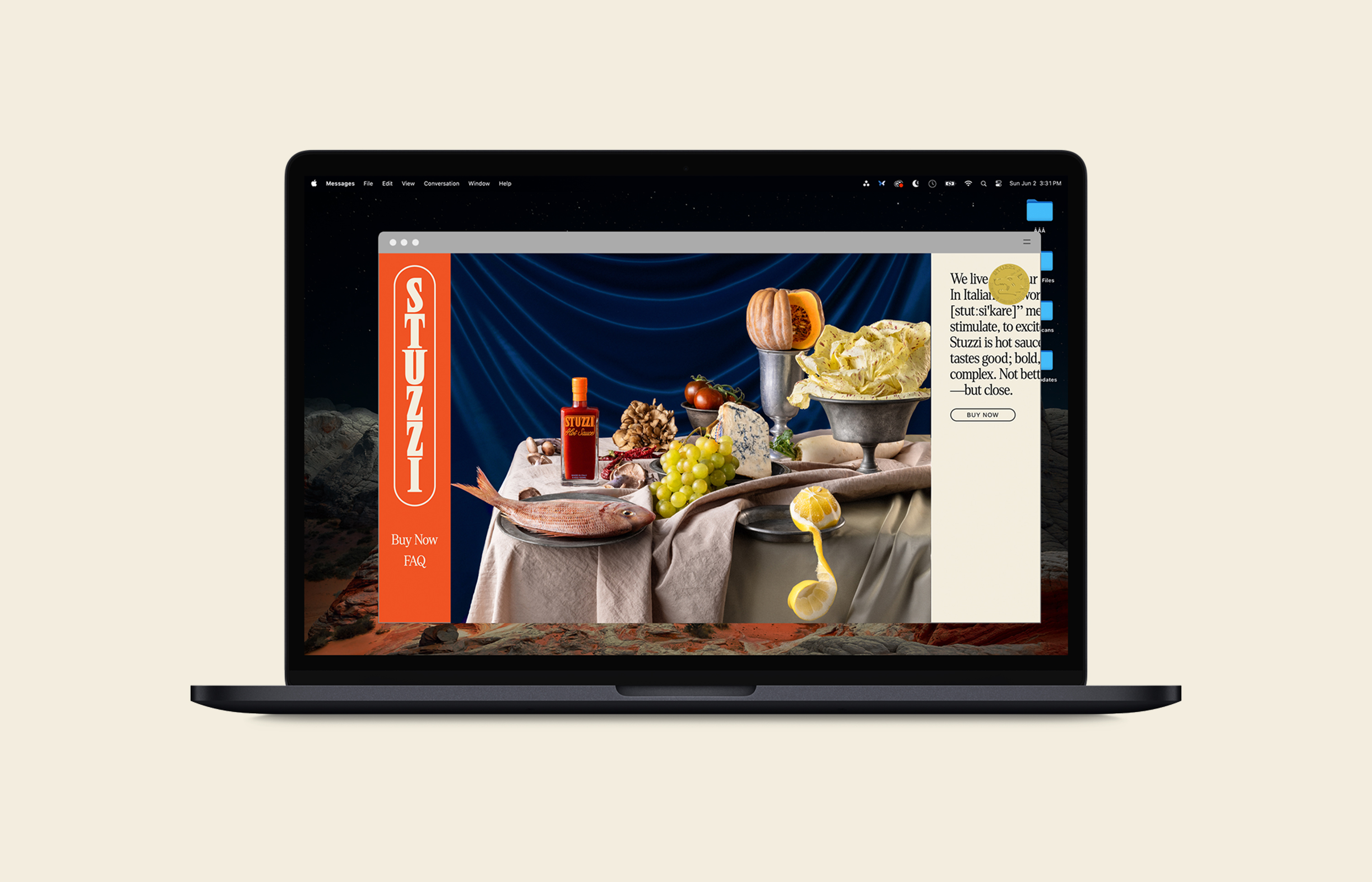
While Stuzzi’s visual identity embraces retro influences, it never veers into mimicry or pastiche. It’s firmly built for today. A brand so rooted in product and physicality might well be forgiven for plumping for a basic website with just the bare bones facts and maybe an online store. Not so here: the website in part reflects the bottle itself, adopting the stacked version of the wordmark, but it also includes some weirdly wonderful little flourishes, like an animated, photorealistic wolf that casually strolls across the screen – only to vanish as if it were just a strange daydream.
I’m not sure I fully understand the wolf thing that underpins the tagline (‘Made in Italy. Loved by wolves’) and the gold-seal-like logo, which shows a slightly daft looking lupine head in profile.
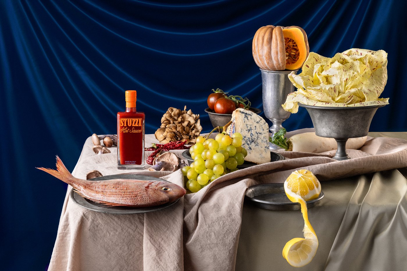
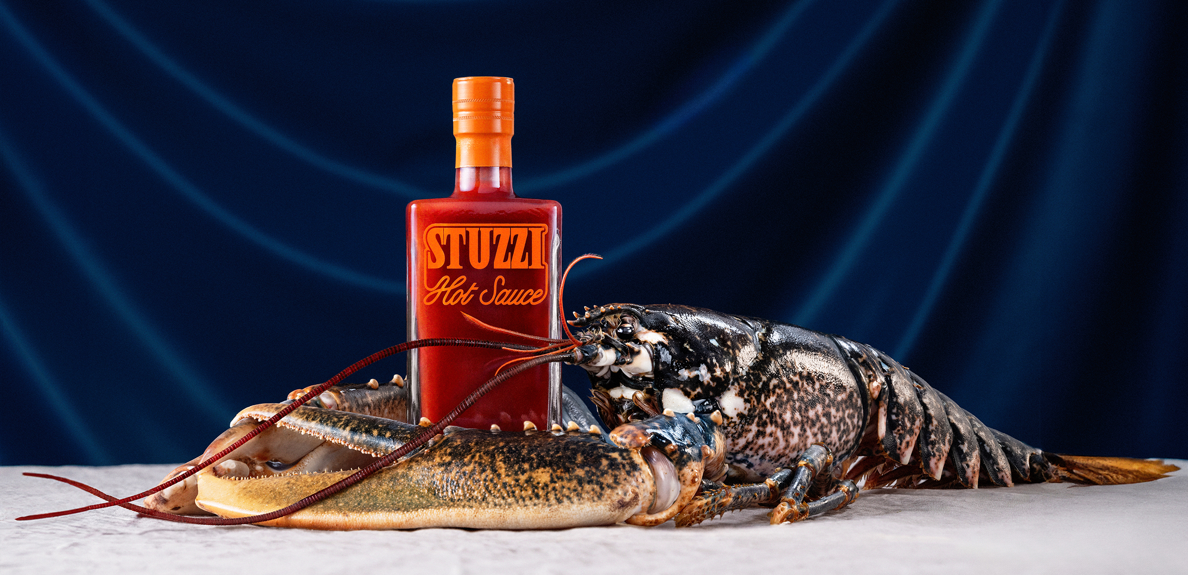
Stuzzi seems to take hot sauce very seriously, but never itself; as the visual identity so deftly communicates. This sensibility is exemplified in the Toiletpaper Magazine-esque hyper-stylised art direction for the brand photography. Again, it’s all very Italian – flamboyant and decadent, but never shouty, showy, ‘luxury’. At times it reminds me of the chaotic food fight scene in Czech New Wave classic Daisies – all chaos and confusion and glee that somehow makes sense.

