Agua de Madre by Chris Chapman
Opinion by Emily Gosling Posted 13 May 2025
It seems you can’t move for well-designed, wellness-adjacent alcohol-free drinks brands right now. In the past couple of months alone we’ve covered a nightlife inspired Yerba Maté that went hard on Big Drink NRG and Rolus, a new botanically enhanced entry into the (apparently) burgeoning ‘braincare beverage’ category.
Making it a hat-trick is London-brewed water kefir brand Agua de Madre’s bold rebrand, led by creative director and designer Chris Chapman with a team including creative director Xander Hart and designer Anya Landolt.
While I was loosely aware of kefir, I’d assumed the word always signified something to do with yoghurt, or at least dairy. I had no idea water kefir even existed. It is, in fact, a lightly sparkling fermented drink created by culturing water and sugar with water kefir grains – a cluster of bacteria and yeast often referred to as a ‘mother culture’ or SCOBY (hence the Agua de Madre name, which translates as ‘mother water’ from Spanish).
Thanks to that fermentation process, like kombucha and kimchi and likely some other things beginning with ‘k’, kefir water is said to be great for gut health. But unlike kombucha, it isn’t tea-based; nor does it have that faintly vinegary tinge. Instead, it’s said to be a bit more like a traditional fizzy, citrusy soda, just minus all the aspartame/sugar/other carcinogens.
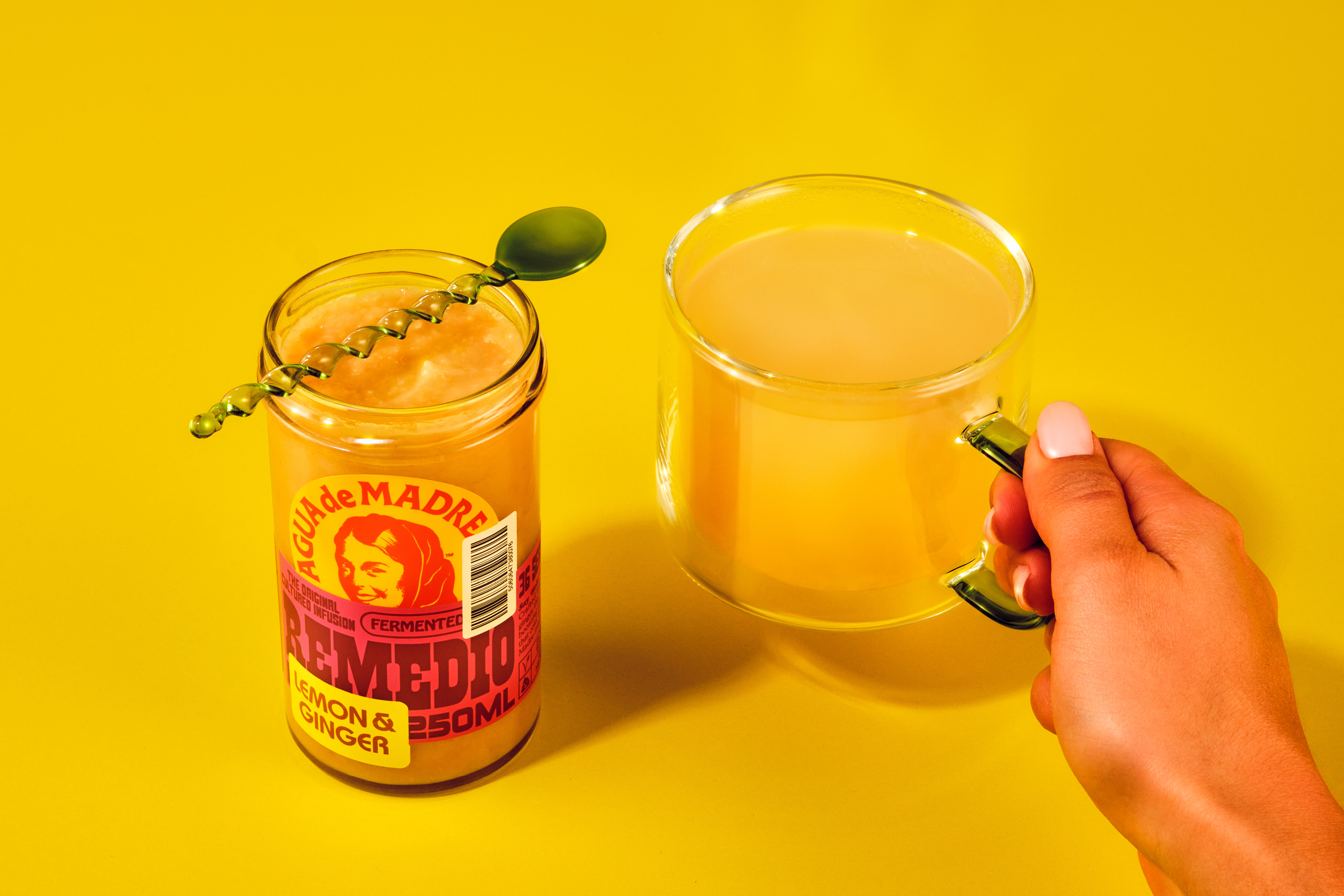
Where Agua de Madre’s new designs really shine is that for all of these health credentials, the branding doesn’t scrimp on fun or maximalism – in fact, it doubles down on them, setting out to reclaim the spirited joy of soft drinks while staying firmly rooted in the sophistication of its gut-loving, sugar-light product.
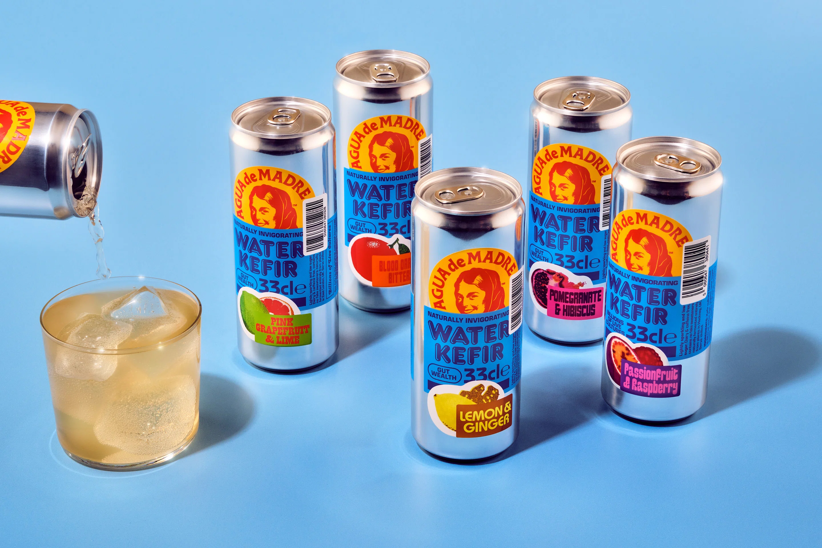
Agua de Madre was founded in 2017 by Nicola Hart, who began brewing the water kefir in her East London kitchen. Originally launched with an illustration-led identity and a charming, somewhat esoteric feel, the brand’s initial visual identity featured an illustration of the ‘Madre’ figure and a distinctive wordmark. The rebrand retained both of these elements: the use of the original wordmark keeps the brand firmly tied to its origins, and besides that aspect of not-alienating existing fans, it’s just really nice. As is the Madre herself – it would feel churlish to do away with that really, especially since one of the central goals of the rebrand brief was to ‘honour the spirit of the madre’.
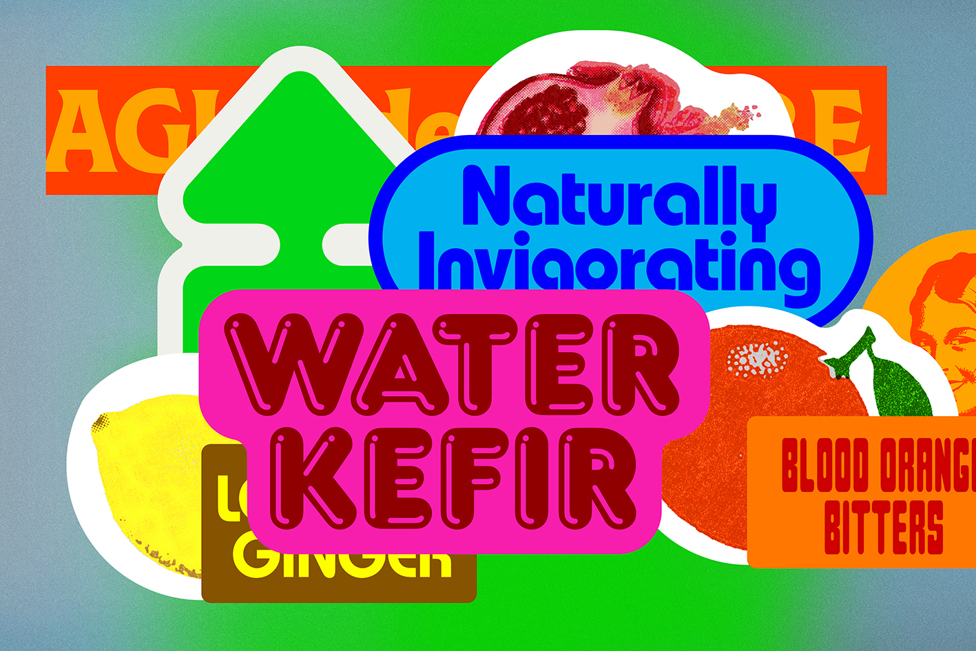
The other was to communicate taste, which Chapman’s designs do with absolute gusto thanks to the introduction of an expansive and vibrant new colour palette; a glorious mishmash of typefaces; and a visual identity that plays out through a dizzying array of sticker-like graphics, which delight in overlapping and obfuscating and shouting for our attention.
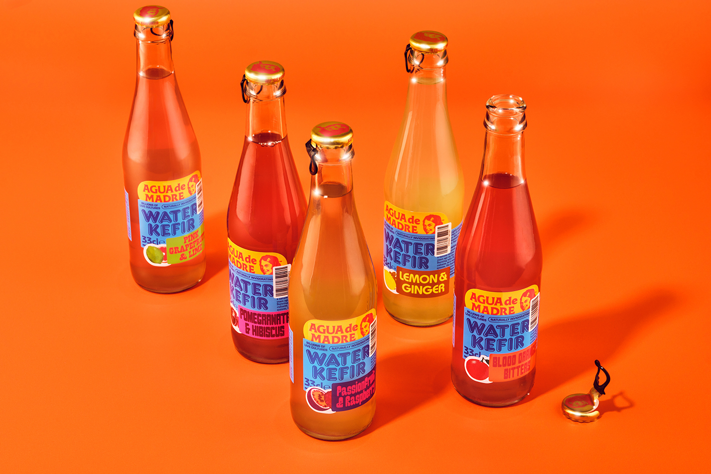
The concept of a visual ‘jostle’ is at the heart of the new identity, but the layering sticker-bomb effect is more than just attention-grabbing decorative flourish: it evokes a specific kind of joy that spans generations – an unselfconscious exuberance of childhood. It’s the distinctive smell of a suburban newsagent – it’s Happy Shopper paper bags and Golden Wonder crisps and Little Chef breakfasts and pick ‘n’ mix and Beano subscriptions and Panda Pops and Tazos and Salt ‘n’ Shake and Fruit Salad sweets that cost just one pence.
Indeed there’s definitely a lot that could be described as ‘retro’, as icky as that word’s arguably become – it’s inevitable, thanks to the old-school lunchbox connotations of the stickers, and the use of fonts that veer from Xanadu-esque ’80s roller disco vibes to those that would be more than comfortable on b-movie-sci-fi movie posters, with a decent smattering of old favourite Cooper Black for good measure. Po-faced this is not.
However, Agua de Madre’s new look is a far cry from pastiche or lazy rose-tinted retro-stalgia: the identity looks forward just as much as it glances back, if not more so. The stickers manage to convey ideas of the past, but the way they’re choreographed keeps the overall look and feel very much future-facing, or at least situated in the here-and-now: their frequently chaotic arrangements often dance on the edge of legibility, a calculated design risk that adds tension and modernity. ‘Overlapping the stickers in a way that threatens to obscure information was important to creating a contemporary feel’, says Chapman.
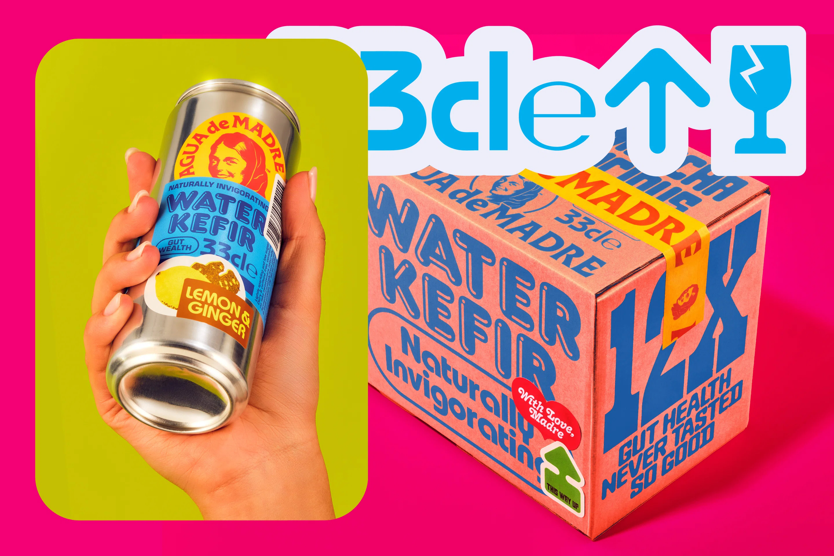
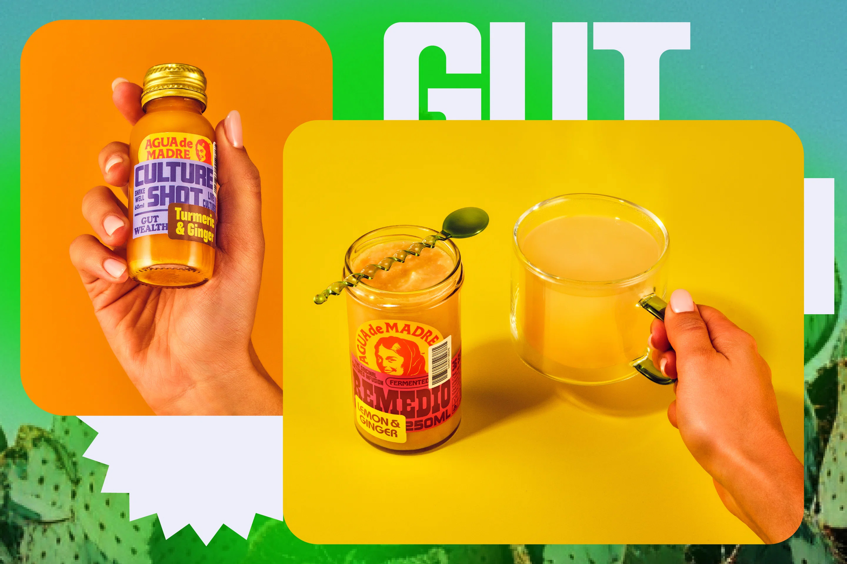
The new colour palette pulses with life – a heady mix of vibrant tangerines, electric turquoises, hot pinks, lemon yellows. Every hue seems to be positioned for maximum sensory impact, conveying the acid fruitiness of the drink itself while also deftly distinguishing Agua de Madre from its close cousins in the drinks space. While kombucha has frequently leaned into mysticism and minimalism, and alcohol-free offerings often overcompensate with seriousness, Agua de Madre firmly situates itself in the grown-up soft drinks aisle.
Likewise, the multifarious fonts are a superb touch – it’s a daring move that really pays off. Among the standouts used across can designs, packaging and online are Moore, a gorgeously doughy rounded display typeface by Eliott Grunewald’s foundry OTT (Ornamental & Title Type); the sublimely off-kilter Baste, designed by Image Format for Lift Type; Cooper BT (it had to be there somewhere, in one weight or another, didn’t it); and ITC Bauhaus, designed by none other than Victor Caruso, Herbert Bayer, and Ed Benguiat.
Frankfurter Highlight, a font released by the Letraset foundry in 1978, could very easily look just a bit too silly: its balloon-ish forms capture light in a way that’s so shiny and plastic that you can almost hear it squeaking. But somehow, it works – even for a brand as ‘serious’ as kefir water.
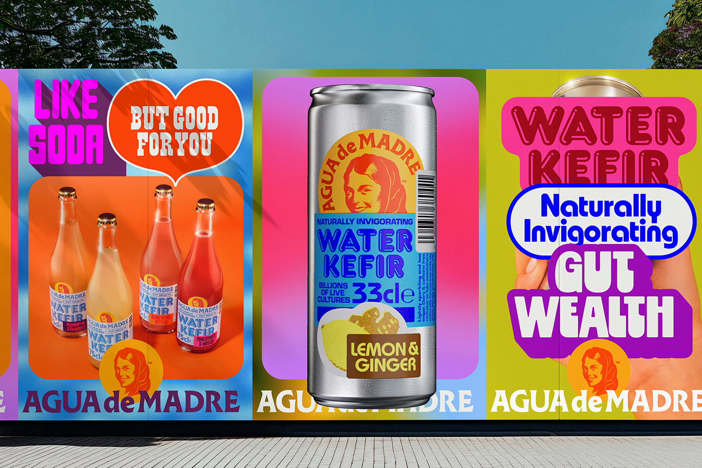
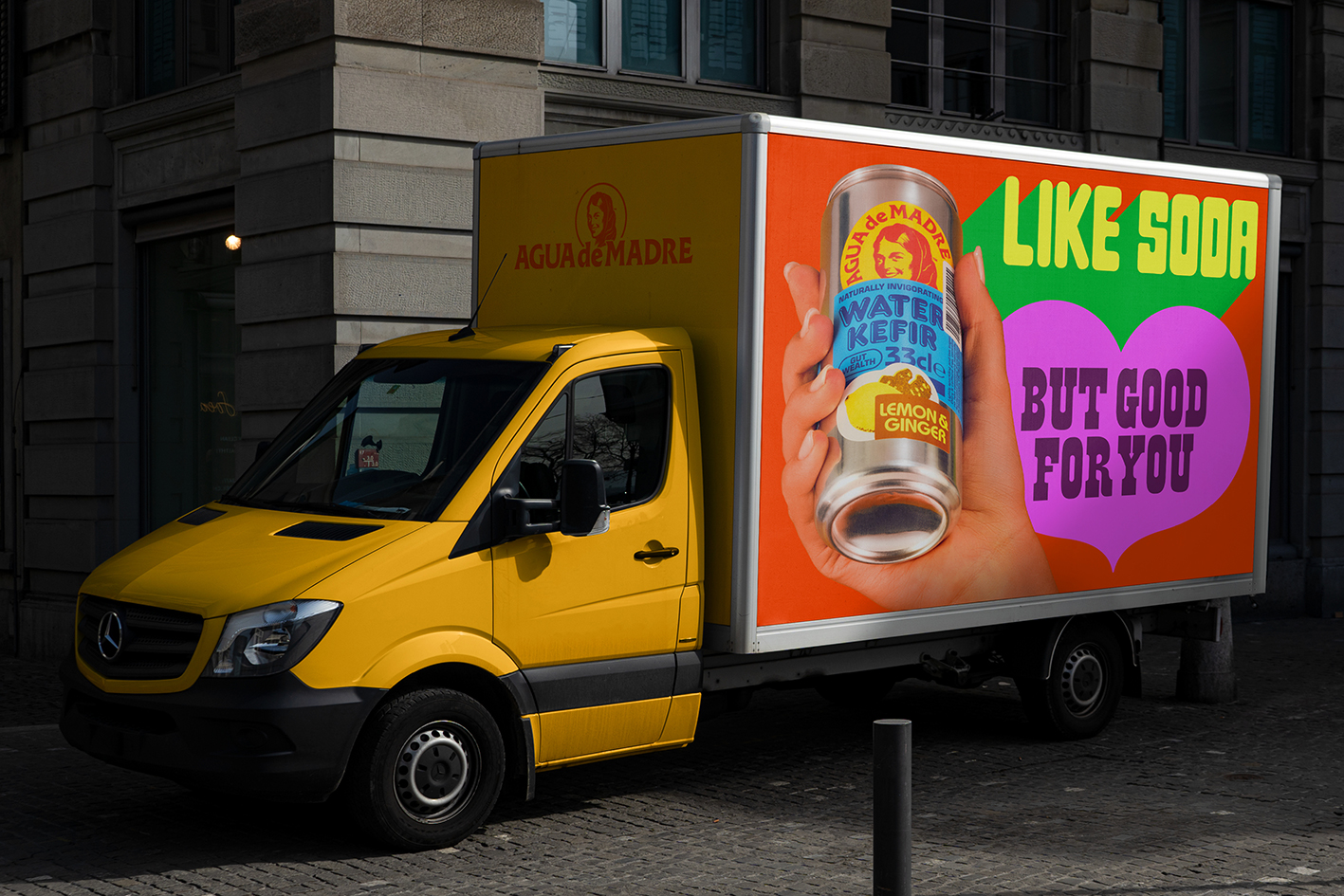
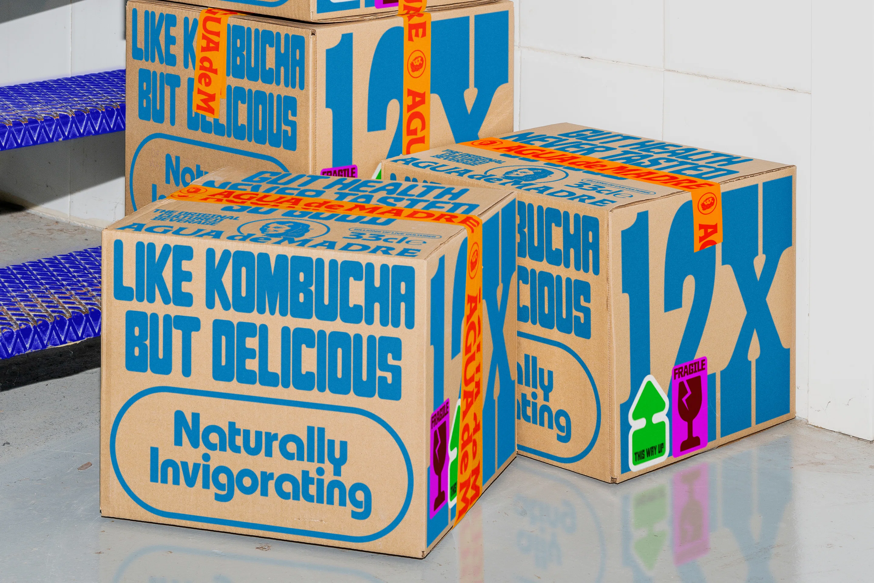
The real-world expressions of the identity delight in their physical form with tactility at the fore throughout the labels, and the interplay of matte and gloss finishes adding depth to the sticker motif. Meanwhile for digital applications, Seb Hartzell’s 3D renders capture the brand’s tactility brilliantly for web, social and motion design applications; and director and animator Caitlin McCarthy brings the stickers to life on-screen – here, they rhythmically bounce, spin, tumble and magnetically reconfigure.
Indeed they underscore the central element of Agua de Madre – the living, breathing, moving ‘mother’ that creates kefir in the first place. Across touchpoints like social media, campaigns and more, Addie Chinn’s photography situates the drink in lush, real-world scenes that lean heavily into lifestyle territory.
In a category dominated by kombucha browns, minimalist serifs, and general piety, Chapman’s rebrand of Agua de Madre is a glorious act of visual disobedience. It celebrates health rather than simply selling it, reframing fermentation as something vibrant, characterful, and alive. And in doing so, it totally rewrites the rules of designing for ‘health’ brands – this is pure maximalist joy; a riot of fizz, colour, emotional excess. It’s an approach that shuns category norms and leads with intuition – or, perhaps, gut feeling.
