Klangwelt Toggenburg by Studio Marcus Kraft
Opinion by Emily Gosling Posted 19 June 2025
Klangwelt Toggenburg (which translates as ‘sound world Toggenburg’) is a cultural organisation that manages to marry a devotion to the experience and exploration of (you guessed it) sound, with breathtakingly gorgeous (as far as I can tell from Google Images, anyway) mountainous natural landscapes of the Swiss Alps, and some serious architectural chops to boot.
Klangwelt Toggenburg began life more than 20 years ago, starting out as a regional initiative built around a popular hiking trail that looked to open up and enhance people’s experiences relating to sound, resonance, tradition, and voice, with a deep connection in particular to the Swiss music and singing culture of the Toggenburg region, nestled in the Alps.
That hiking trail inspired the foundational element of the organisation – the Klangweg (or sound walk) – a trail which stretches from Alp Sellamatt via Iltios to Oberdorf and is described by the organisation as “the flagship of the Klangwelt Toggenburg and a success story that is known far beyond the borders of Switzerland”.
Dotted along the trail is a total of 27 sound installations exploring themes such as nature, soundscape, ecology, climate and mindfulness by both Swiss and international sound artists – all of which are open for visitors to explore, interact with and, of course, listen to.
The Klangweg underwent a comprehensive overhaul and restoration last year, which is where this quietly powerful, resolutely Swiss, and resonantly sound-led identity by Studio Marcus Kraft got its first outing into the world.
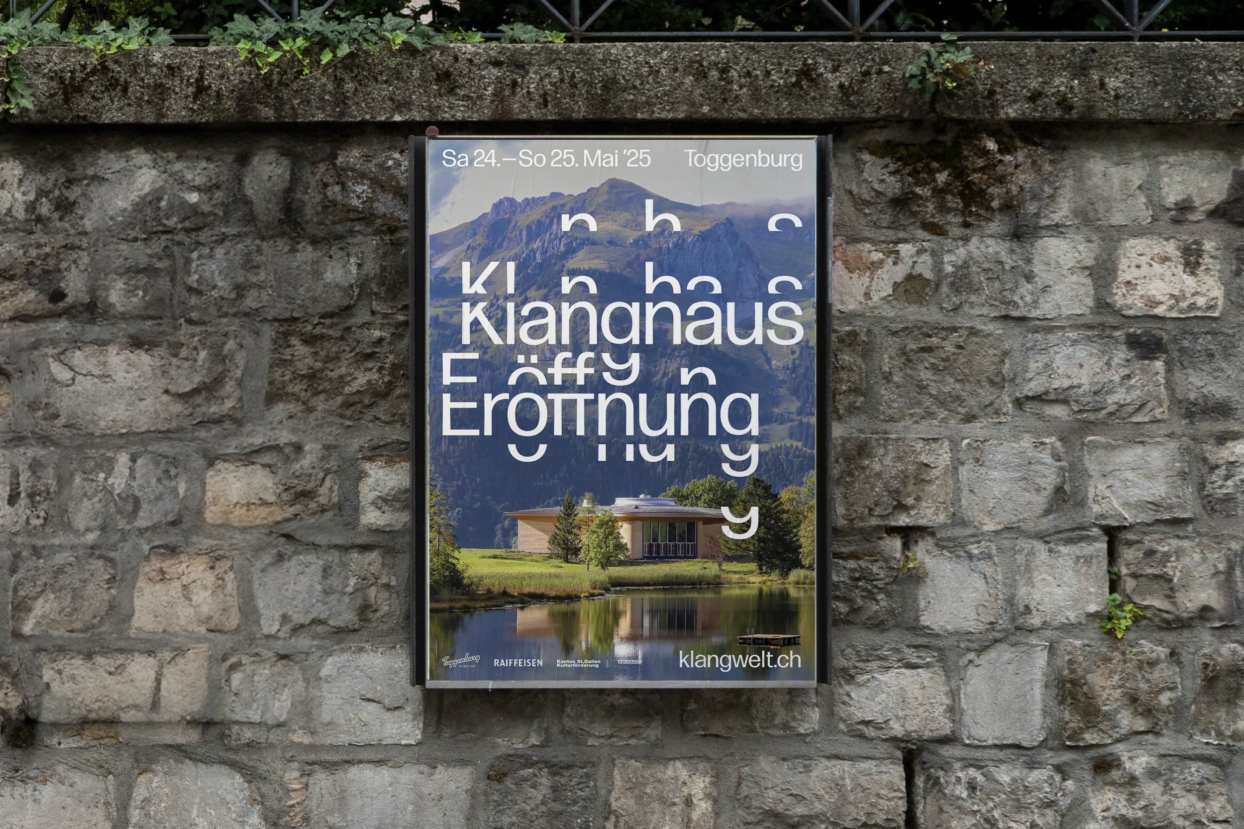
This year the identity was unveiled in full to coincide with the opening of Klangwelt’s Klanghaus (or ‘sound house’), a unique architectural project located near Lake Schwendi which was designed by Meili Peter and Staufer & Hasler architects. Aiming to serve as a centre for “natural-tone music” that integrates architecture, nature, and sound, the Klanghaus features four acoustically tunable sound chambers and two outdoor stages, making it both a “walk-in instrument” and performance space for musicians, singers, and choirs for performances, rehearsals, and courses.
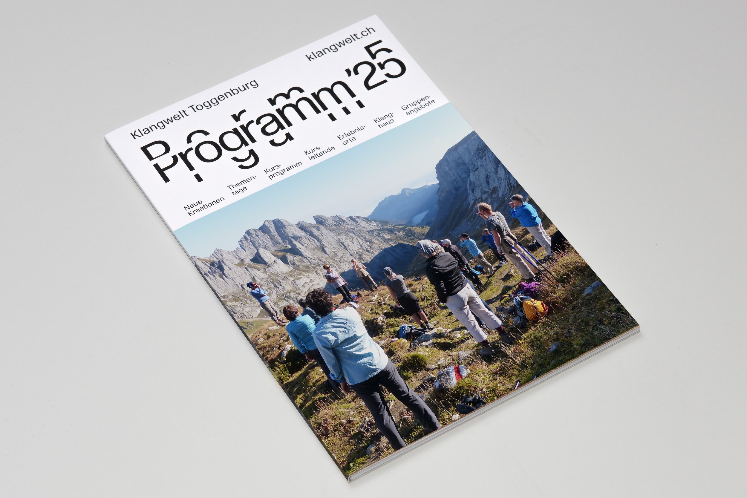
Zurich-based Studio Marcus Kraft began working with Klangwelt more than three years ago, having been commissioned to develop a comprehensive new identity that would give the organisation a coherent voice across each aspect of its sprawling physical presence spanning the Klanghaus, the Klangweg sound trail, the Klangschmiede forge and multiple performance spaces, as well as all the other usual branding touchpoints like merch, graphics, signage and wayfinding, website (which was built by Vitamin 2), motion, and – of course – a brilliant little piece of sonic branding in the form of a brand new ‘sound logo’ developed in collaboration with musician and artistic director Christian Zehnder.
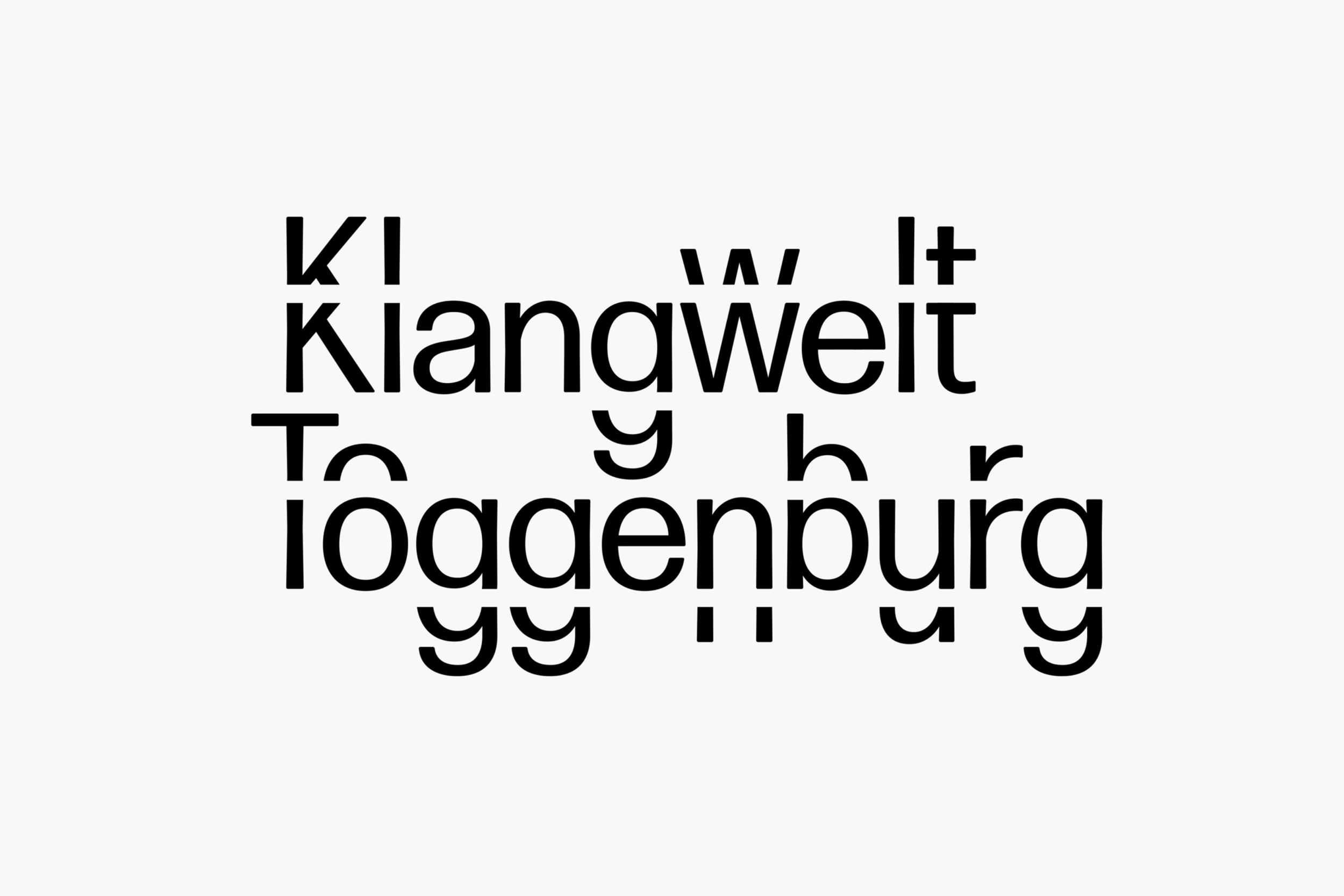
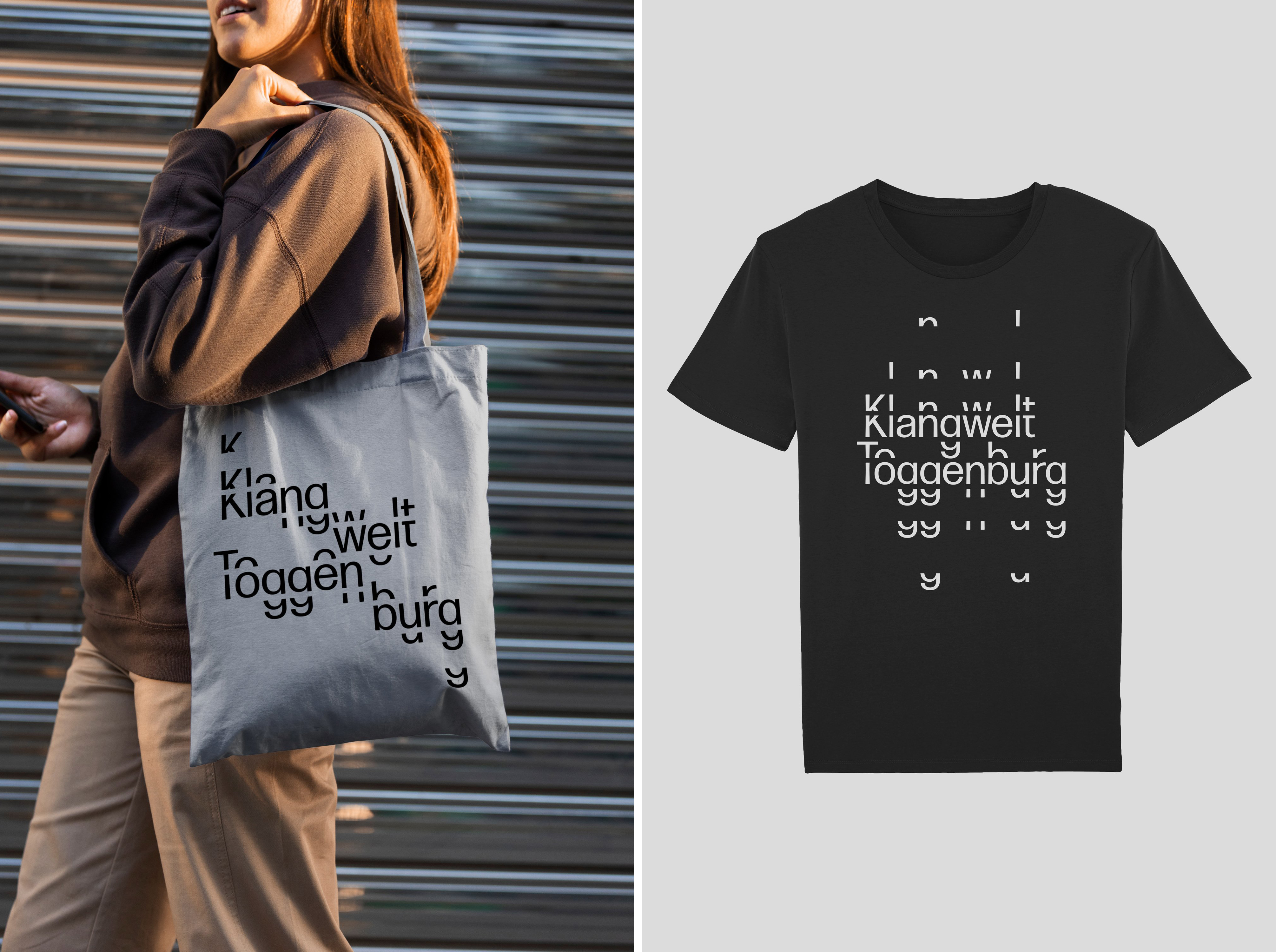
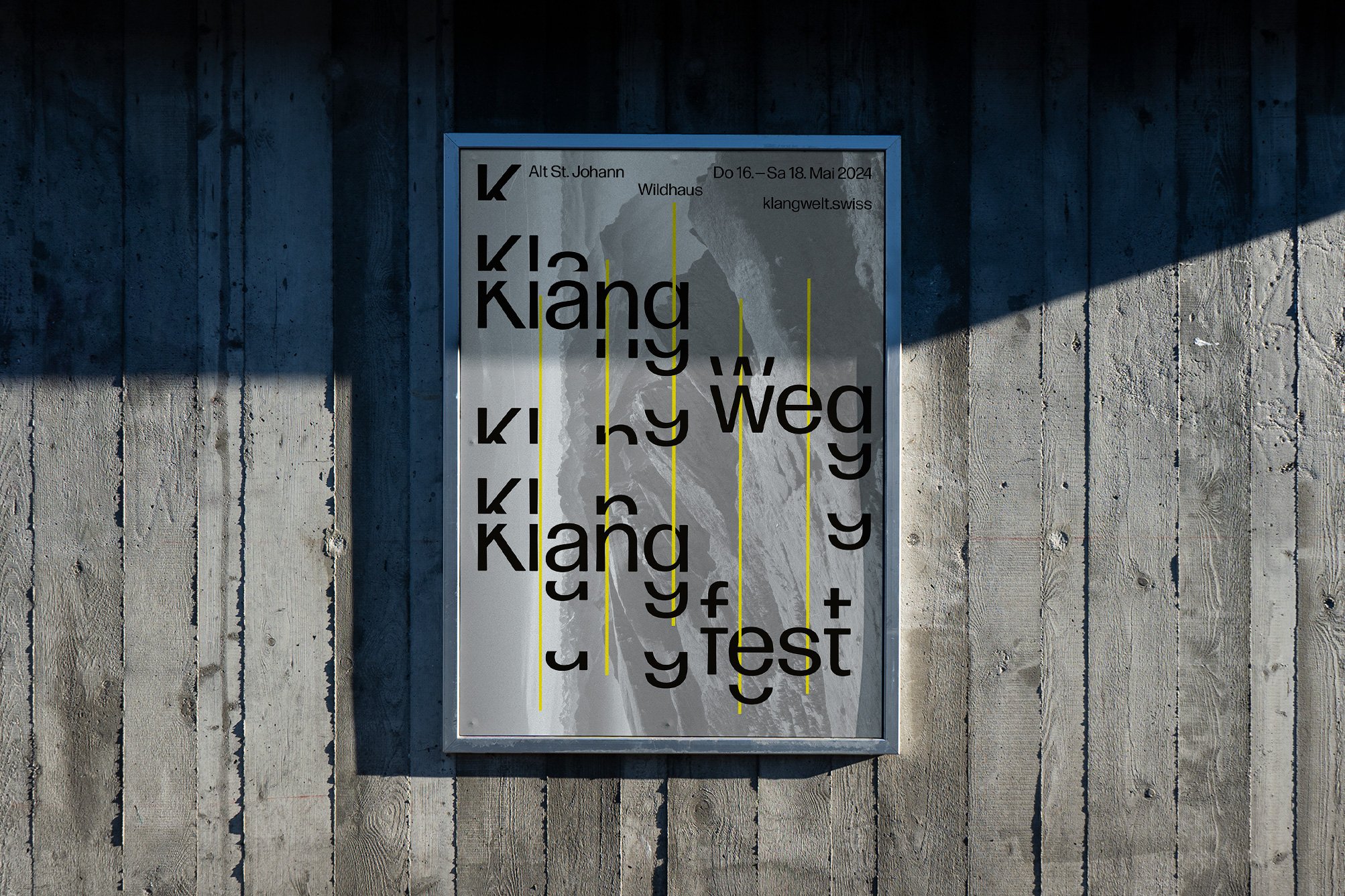
This new visual language, much like Klangwelt itself, manages to succinctly translate physical grandeur (mountains, architecture, installations, forges) and more abstract sensorial entities (overtones, resonance, echoes) into a singular, cohesive voice (pardon the pun) that exudes Swiss tradition in its graphic precision. Nothing is superfluous; the apparent disorder of letters chopped and dripped and layered is executed within an order that would make the mid-century modernists very proud indeed. It’s a superb contemporary example of an exercise in typographic rigour and sensory clarity.
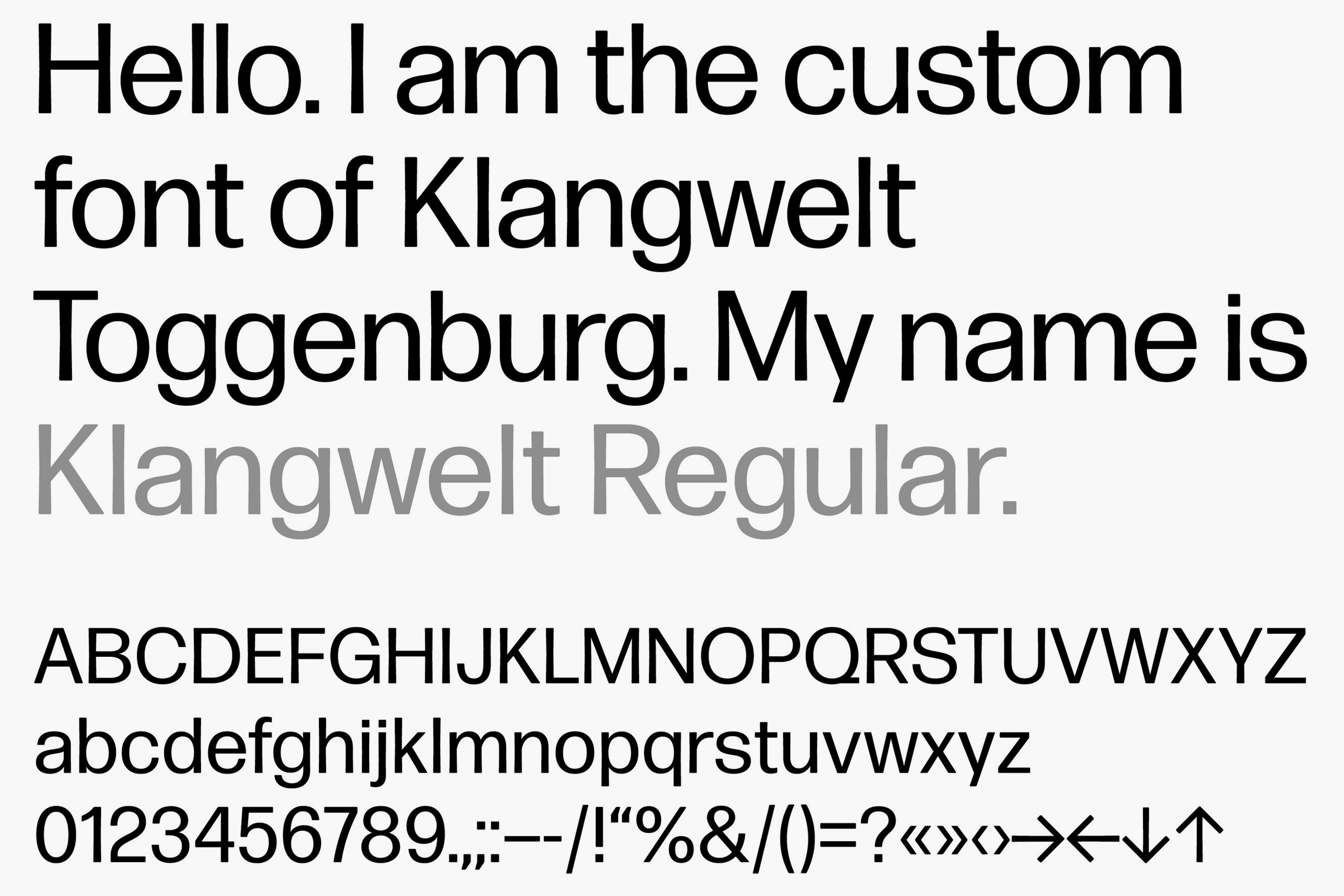
At the core of the identity is the custom-designed typeface Klangwelt Regular, a modular sans which is based on the font Forma DJR by Massachusetts-based designer David Jonathan Ross. On the face of it, Klangwelt Regular is a typically calm neo-grotesk sans font – but the way that the glyphs have been manipulated into a dynamic system makes the whole thing feel like an echo of the acoustic phenomena Klangwelt celebrates – overtones, resonances, vibrations come to the fore in the way the forms are layered and chopped, and also arguably reflect the undulating mountains and valleys of this unique region.
But for all the playing with half-letters, there’s always a deliberate restraint at play: the typeface is used exclusively in its regular weight (no modulating versions, no extended cut, not even any bolds or italics), even in its most expressive applications. Proof if ever it was needed that the cliché about creativity flourishing in limitations exists for a reason.
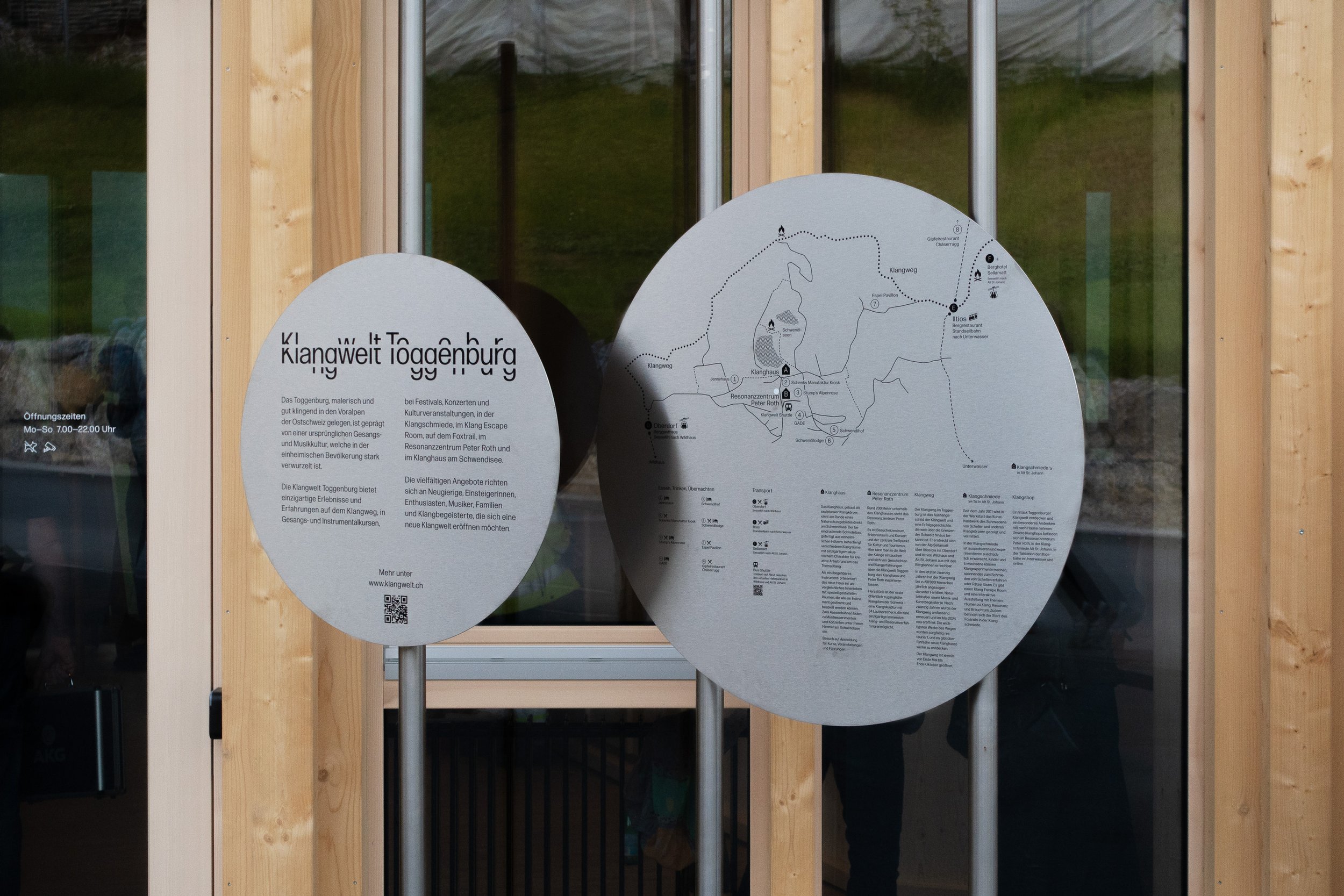
However, that’s not to say type is used in expected or traditional ways – it becomes almost a graphic instrument in itself, fizzing with synaesthetic potential. It resonates both visually and metaphorically in the way that it’s used across layouts for stationery, printed materials, online and more – with everything coming back to subtle but palpable reflections of concepts like sound waves and frequencies.
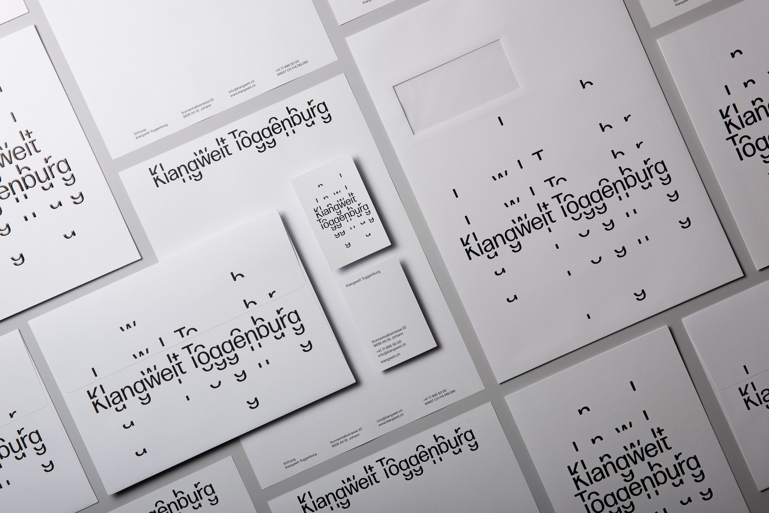
In its digital kinetic forms, the subtle shifts in the letterforms create an echo-like pulse that gestures toward the aural focus of the institution. Elsewhere, the typography remains stark and unmoving, forming a more grounded counterpoint to the melodic or lyrical components of the system.
That balance between formal simplicity and expressive detail is the fulcrum for the entire identity system, which is tied together a bit like jazz – a distinctive visual rhythm with a tonne of room for improvisation and unexpected twists and turns. This is largely thanks to the use of modular grids that underpin the layouts, especially across printed materials, which also delight in the interplay of a generous amount of negative space with the graphic elements that have to be there out of necessity.
Again, the colour palette is pared back to the point of stark – just black and white and the occasional grey, with very occasional sharp accents of a singular colour to elevate some key touchpoints. As such, the branding lets the imagery of the landscapes and artworks come to the fore and simultaneously works to underscore the focus on sound – both heard, and ‘seen’ in the case of the graphics here.
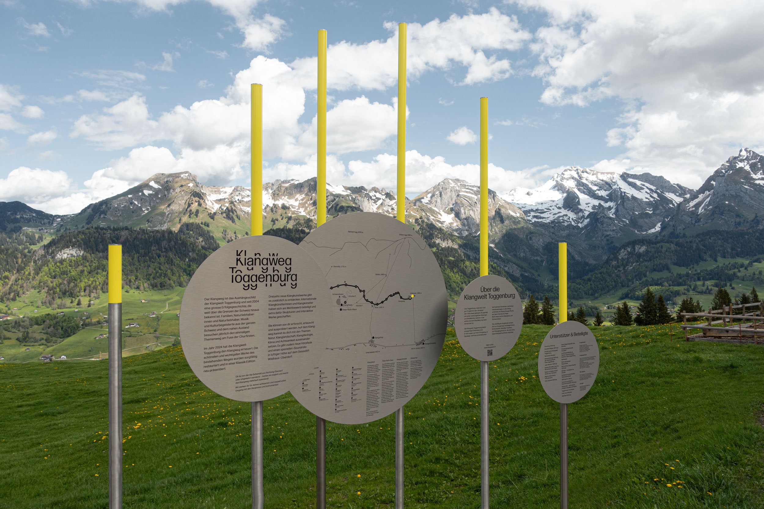
One of the most notable exceptions to the monochrome is some well-placed flashes of yellow on the Klangweg signage system. Dotted throughout the trail’s stunning outdoor route, the signposts are a bit like very stylish lollipops in using a long pole and a circular metal form to display the information about each installation: recalling the look of alpine ski markers and snowplough guides, the signs combine minimalist style long-distance markers with rounded metal forms that work together to mimic musical notation, making the mountain paths themselves into a bold, physical musical score that the likes of John Cage would surely be impressed by. Here, the yellow is both an aesthetic and practical choice – few colours are all that visible against nature’s very own Pantone chart of greens and blues and whites, especially from the longish distances between each of the trail stops. It’s a quiet but confident way of embedding graphic identity into place, working with rather than against its awe-inspiring backdrop.
Despite its stark black and white and singular typographic fulcrum, the identity feels poetic. It also manages to broach the far-from-easy balancing act between expressiveness and being totally grounded in Klangwelt’s physical environment, and the heritage of the area – the music traditions of Toggenburg, the acoustic properties of the landscape, the architectural clarity of the new Klanghaus.
This is a beautifully sensitive, but evocative identity system. No soundwave clichés, nothing busy, nothing overtly technical or too clever for its own good, nothing distracting – branding that’s truly arresting, but utterly functional and utterly suited to the institution it represents right down to the millimetre.
Discover more Klangwelt Toggenburg brand assets on Brand Archive.
