Tsukiyo by The Colour Club
Opinion by Emily Gosling Posted 26 June 2025

I’d never really heard of Osaka’s Dotonbori district before encountering this project, let alone been there. Neither, I’d guess, have many of the patrons of Tsukiyo, a modern Japanese street food restaurant inspired by the area and based in Sydney’s Darling Square.
But the power of great branding is such that even just looking at the identity in 2D, on a screen, thousands of miles away from both Osaka and Sydney, you sort of feel like you know what it’s all about. Sure, you can almost taste and smell the food at the heart of Tsukiyo, but even more crucially, you can sense the essence of the place that inspired it – somewhere that moments ago was totally unfamiliar.
The studio behind the branding is Sydney and Byron Bay- based The Colour Club, which designed the full identity system including branding, packaging, signage, menus, social media templates, and uniforms.
It’s worth mentioning here that London-based Daydream Studio also features the project in its portfolio as having worked on the brand identity and packaging, and that’s because its founder, Kelsen Findlay, had worked on the project when he was freelancing at TCC back in early 2022 when it began work on the project (the first Tsukiyo location opened in around June that same year).


The word ‘Tsukiyo’– which translates to ‘moonlit night’ – provided a strong conceptual underpinning from which to anchor the visual identity and tone of voice. ‘Designed for quick service and high impact, it’s a brand that comes alive at night – bold, bright, and full of personality’, says The Colour Club creative director Nick Mitchell. ‘The goal was to create a brand that captured the chaos and charm of Japanese street food culture – expressive and atmospheric.’
He adds that it was key to communicate these more dynamic, site-specific cues – creating a brand that felt distinctly Japanese – with a healthy dose of restraint, and a total eschewel of cliché. Every single element also had to be adaptable across a huge range of applications and sizes, from neon restaurant signage to fast-moving packaging.
That bold, personality-packed, semi-nocturnal spirit is echoed in every corner of the design system, from the typographic choices to the subtly kinetic logo and the packaging that shimmers like a lantern-lit canal. But rather than focusing on brash flashing lights and in-yer-face shouty nightlife culture, TCC opted for a more poetic reading of ‘moonlit night’, erring on the side of celestial rather than debaucherous. From there, the studio explored ideas around rhythm, movement, and contrast: ‘qualities that naturally echo the pace of street food’, as Mitchell puts it.
![]()

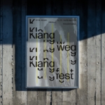
This comes to the fore in the logo design, especially in its motion applications. Here, the kinetic aspects draw on the movement of the moon across the sky, set in a circular, rotating layout. Meanwhile the standalone icon, a minimal crescent form, becomes a visual shorthand for the brand across packaging, uniforms, and digital.
The horizontal lock-up uses a circular typographic layout, and like everything across the brand, it’s set in GT Maru Mono Regular from the ever-superb Swiss foundry Grilli Type. It’s a monospaced font with rounded terminals and a softness that balances the more rigid, almost cold aspects of the type – a duality echoing both Japanese craft heritage and contemporary urban signage.
Crucially, using a font like this, with the ordered inherent neatness that a monospaced design proffers, introduces a grid-like consistency that feels at home in signage and menus while still allowing for expressive typographic treatments on digital and print applications. ‘There’s a quiet playfulness to it – precise yet warm – that felt right for Tsukiyo’s world: a brand rooted in tradition but built for the present’, says Mitchell.


The colours are perhaps the most overt nod to Japanese urban nightscapes, drawing inspiration from the saturated signage of city streets. According to Mitchell, there’s a particular nod to ‘Osaka’s famous Glico Running Man sign’ – a large, illuminated billboard featuring a running man on a blue track. The sign was originally installed in 1935 as an advertisement for Glico, the Japanese confectionery company behind products like Pocky; it has become an unusual but distinctive local landmark and wildly popular photo spot for tourists, and here, an interesting reference point for Tsukiyo – a near-century old brand icon inspiring a brand inspired by the place it’s situated in.
Elsewhere, the core colours of blue, red and pink blend high-impact primaries with pastel softness ‘evoking both neon-lit nights and the warm glow of nostalgia’. Liberal use of gradients across patterns and packaging adds depth and movement, aiming to give the system ‘a lively, layered feel’.
A signature element of the brand is a blue to pink gradient wave graphic: the soft, flowing form references both moonlight reflections and the movement of water through the Dotonbori canal while bringing ‘a sense of calm and contrast to the bolder elements of the system, and helps create visual continuity across packaging, signage, and digital touchpoints’.


It all succinctly comes back to the ideas of what goes on after dark – the unpredictable but singular movements of crowds; an air of mystery and encountering the unexpected; the interplay of light and shadow – indeed, the whole ‘moonlit night’ vibe at the heart of the concept.
One of the standout aspects of the identity is the packaging: form and function unite beautifully in items such as the custom boxes for takoyaki and other street food items, which marry the rotating moon logo, gradient wave patterning, and sharp colour blocking to brilliant effect. Even in the case study imagery, the tactility of the packs is such that you can almost feel them and smell them; all warm to the touch, the energy of eating on the go while navigating the streets at night.
For digital applications the brand plays with texture and layering: again, typographically it’s all about centred, all-caps GT Maru Mono, lending a sense of precision and calm to a raft of rich photographic imagery. The suite of images is drawn from found photography and public domain shots depicting Japanese markets and street life, which The Colour Club then treated using multiple blend modes and subtle layering techniques. Such treatments could easily veer into trying-a-bit-too-hard territory, but it’s done delicately here and with nuance – the mood is dreamlike, bordering on surreal in some instances, curated but never overly polished, moody without affectation.

In designs for the restaurant space itself, The Colour Club collaborated with interior designers to apply the branding to the physical environment. The sense of rhythm and contrasts that underpin the 2D brand design work are reflected in layered signage, ambient lighting, and precise colour applications that neatly encapsulate the energy of Dotonbori that inspired it all.
The Colour Club’s work on Tsukiyo draws on cultural references sensitively, working with abstractions and colour cues to distill the kinetic energy of Donburi without overtly pilfering its visual signifiers. The identity is a feat in managing contrasts through conceptual rigour: bold but not brash, nostalgic without being saccharine, minimal yet rich in meaning – it deftly walks the tightrope between tradition and razor-sharp modernity.