12 by Base Design
Opinion by Emily Gosling Posted 17 July 2025
If New York really is the city that never sleeps, that’s in no small part thanks to coffee – and now, increasingly, a newer entrant to the socially acceptable uppers scene, matcha.
Capitalising on the growing interest in the sludgy green pick-me-up is 12, a new-ish matcha-centric café and retail store that opened last year in Manhattan’s NoHo area. Sited at 54 Bond St and founded by entrepreneur Alan Jiang, 12’s identity was taken on by Base Design (Hanbury, Devine Farmer, Murray’s Cheese) which worked across everything from its brand strategy to art direction, copywriting, digital strategy and design, naming, motion design, packaging, uniforms and merch.
At the heart of 12 is quality, simplicity and the sort of polished poise that so often goes hand in hand with those. Yes, matcha is heavily caffeinated, but here it becomes about contemporising but honouring tradition, artistry, and craftsmanship.
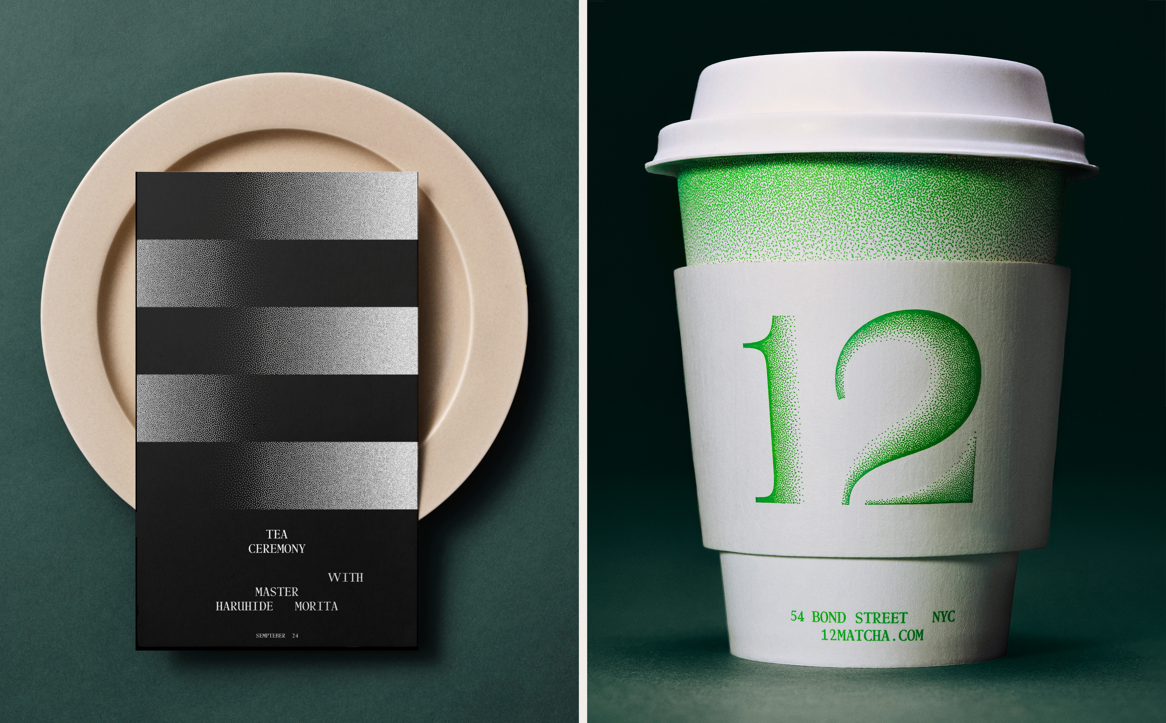
Sourcing from some of the finest tea harvesters in Uji, so we’re told, 12 worked closely with Japanese ‘tea master’ Haruhide Morita to perfect its blend, and other collaborators include award-winning chef Francisco Migoya and ‘flavour scientist’ Dr. Christopher Loss. The space itself was designed by Parisian architects Ciguë, while industrial designer Michael Young ‘redefined product innovation’.
The role of Base, then, was to create an identity that binds every sensory and material element into a coherent brand language and ‘elevate matcha with 360° mastery’. The agency says it didn’t just create the brand – it ‘helped assemble the ecosystem around it’, including aiding in the assemblage of the aforementioned ‘collective of masters’, ‘refining every layer of the experience to craft a brand unlike any other’.

Embracing both tradition and reinvention, much of the approach nods to the idea of ritual. This is demonstrated in the name, 12, a word so short that it’s a number – monosyllabic, enigmatic – 12 could be nodding to twelve hours, twelve months, twelve steps, or even 12Hz, the brainwave frequency linked with calm focus. It’s open to interpretation of course, but like everything else here, feels intentional.
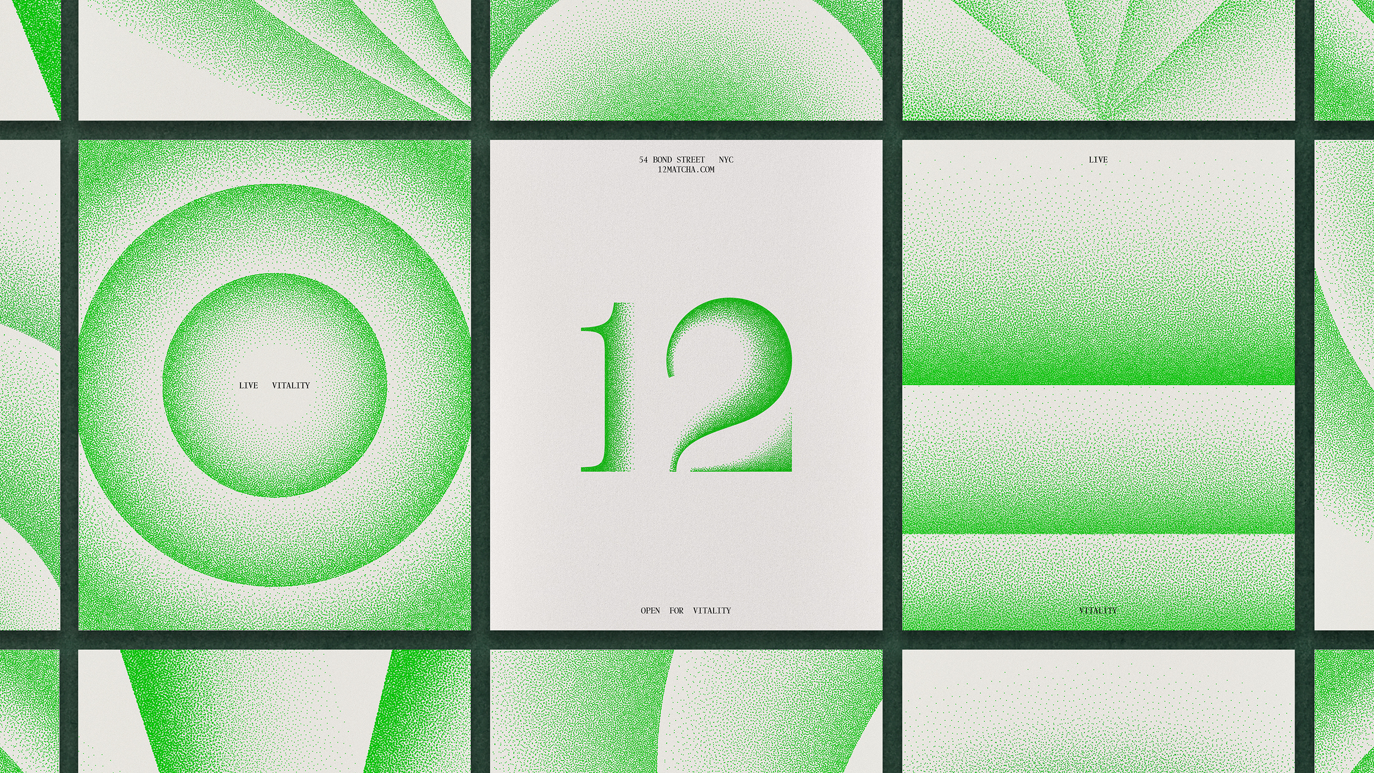
The logomark takes the form of a stylised, handwritten numeral that hovers between calligraphy and contemporary restraint, once again merging time-old tradition and modernity. This duality is echoed in the typography. Two typefaces are used in the brand that act as nice counterpoints to one another; both calm, legible, nothing too wild or shouty or jostling for attention.
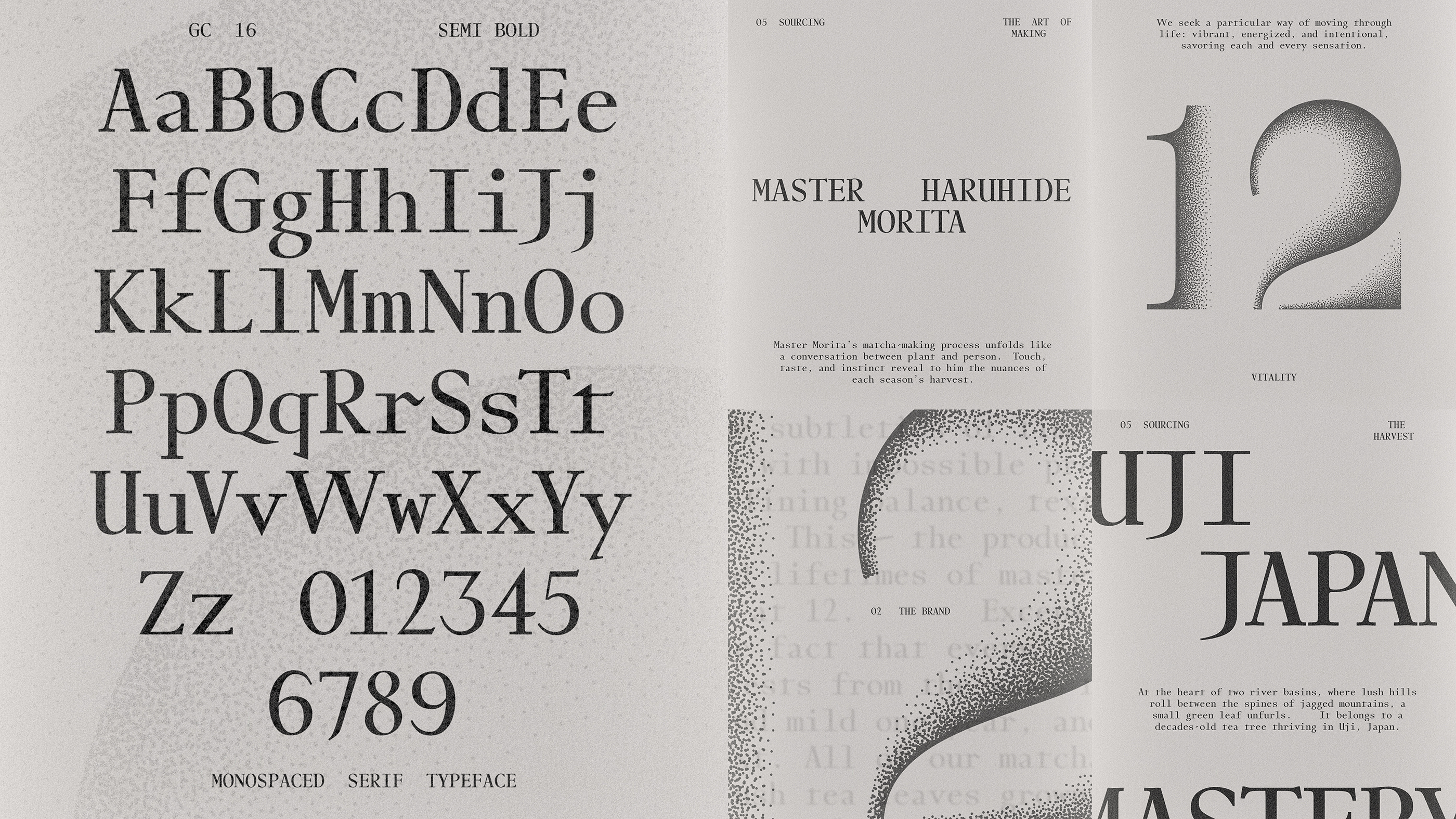
Base opted for Swiss foundry Dinamo’s ABC Diatype, a ‘warm yet sharp grotesque ideal for text and reading on screen’, as its creators put it. This is used alongside an exceptionally charming font, GC-16. The monospaced serif typeface by Amsterdam’s Bold Decisions has some delicious little quirks to it, with more emerging the closer you look. Used for most brand applications, it’s idiosyncratic but functional, offering structure and clarity for everything from signage and menus to digital UI.
This interplay between hard and soft, logic and intuition, mirrors the broader identity of 12 itself as grounded in precision and temporality, but never cold or unfeeling.
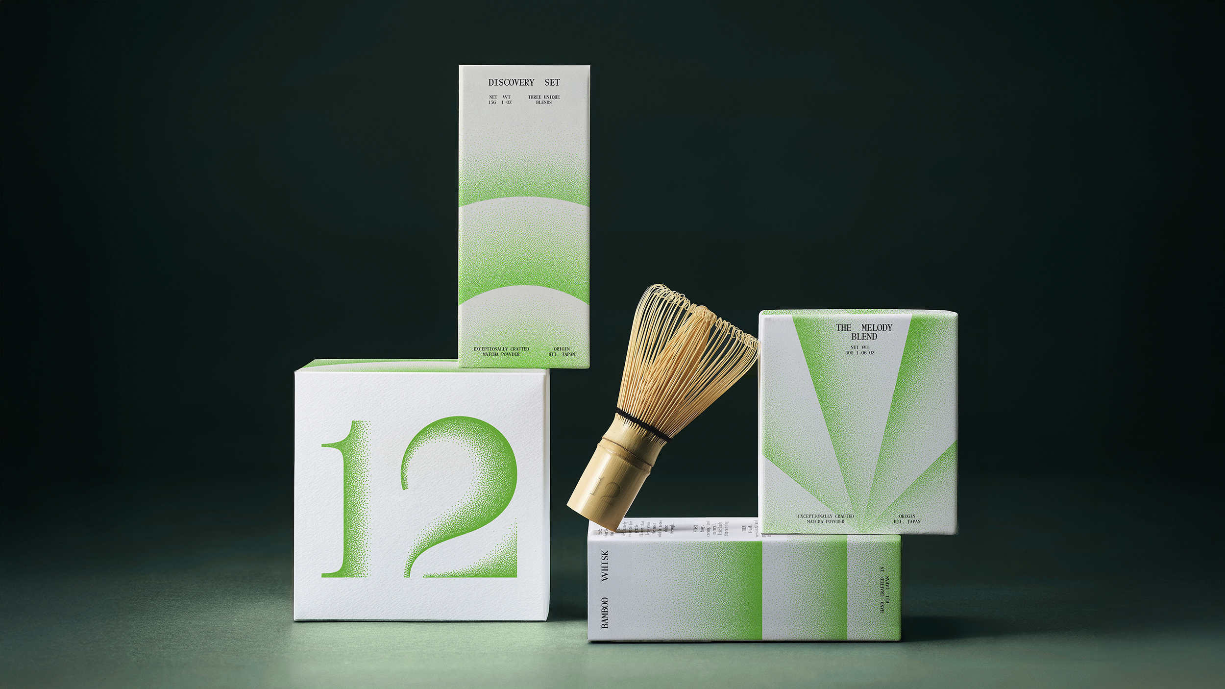
Colour, predictably, centres around matcha’s best-known characteristic: its greenness. Here, however, Base says the tone acts ‘as a symbol of vitality and serenity’. Across the brand, various shades of green – volcanic, vegetal, mossy, almost smoky in places – are used in sensitive, smart ways that show the breadth of the overarching 12 brand tone of voice. This chromatic range is grounded with soft greys, chalky off-whites and exposed textures in materials like glass, paper, and unfinished wood.
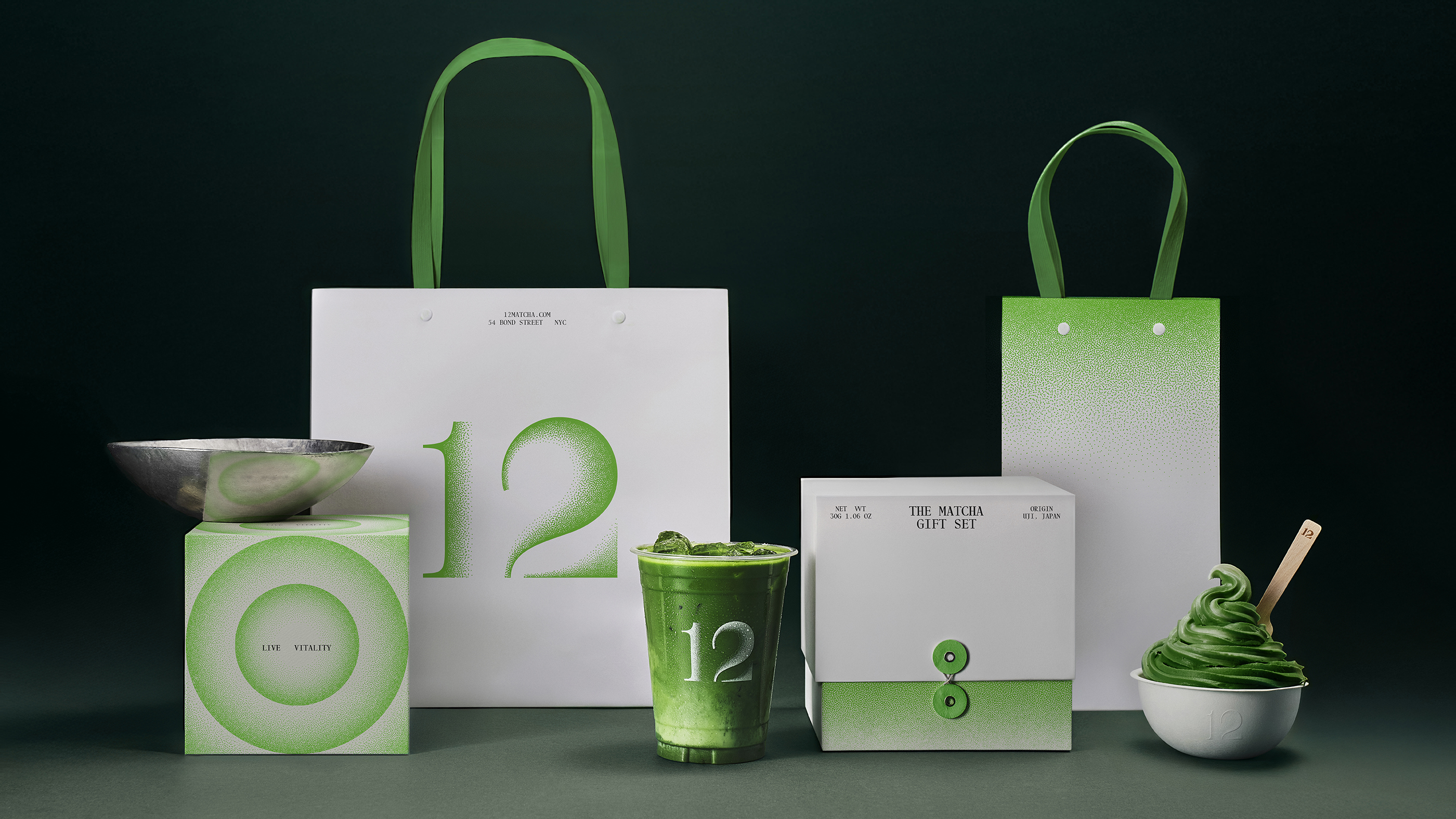
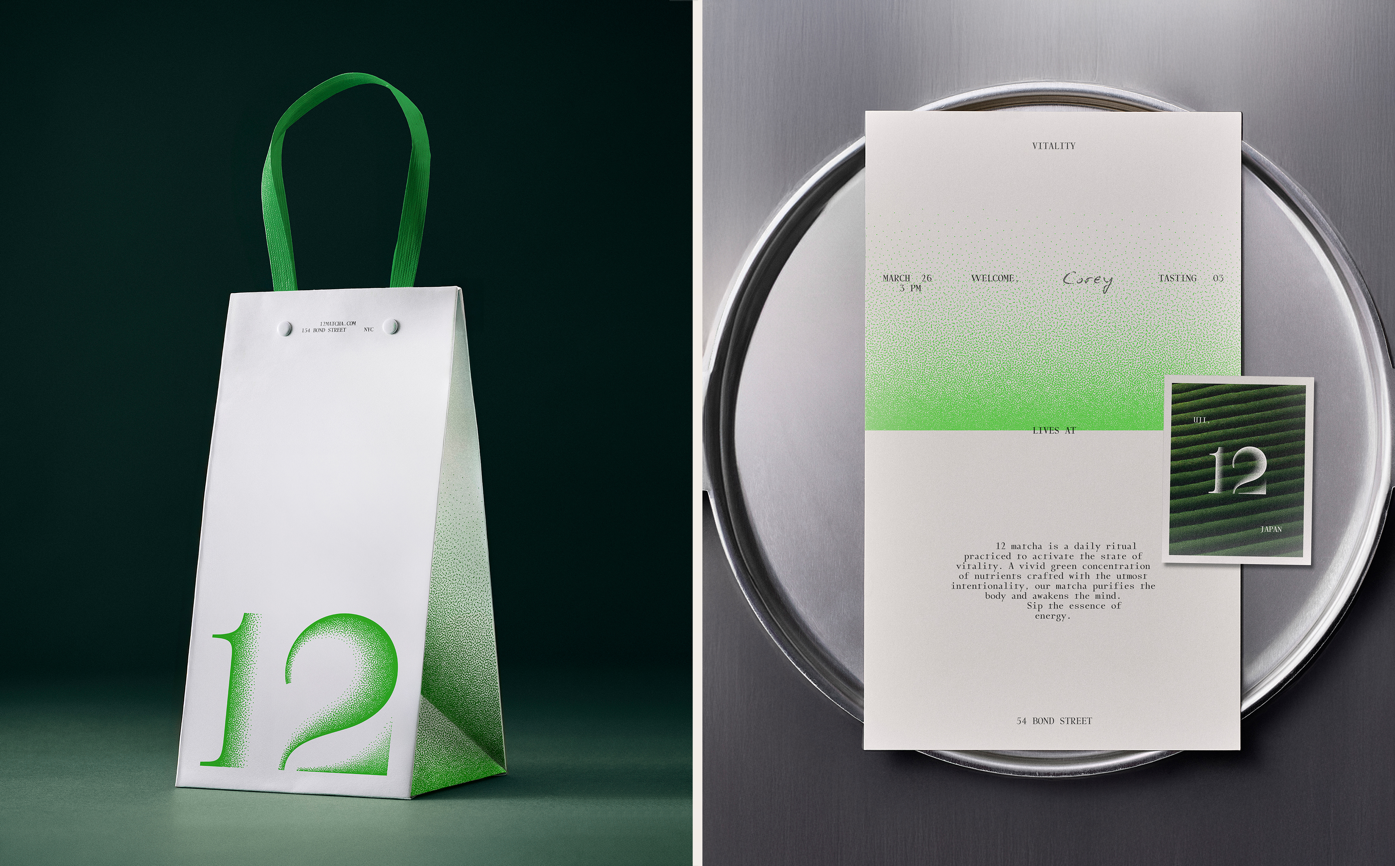
The packaging design echoes these cues – every atom feels totally considered and precise, with absolutely nothing left to chance or compromise. For the most part, the packs feel more like objets d’art than containers, with the matcha housed in refillable spherical glass vessels with soft matte finishes and minimal labelling.
Label design privileges space and alignment, with die-cut seals that echo the meditative pause before opening. The different blends are denoted by a subtle system of colour coding: white for classic, grey for reserve, a forest green for seasonal or limited releases. No photography, no lifestyle posturing – just refined materials, lots of negative space, and typographic clarity.
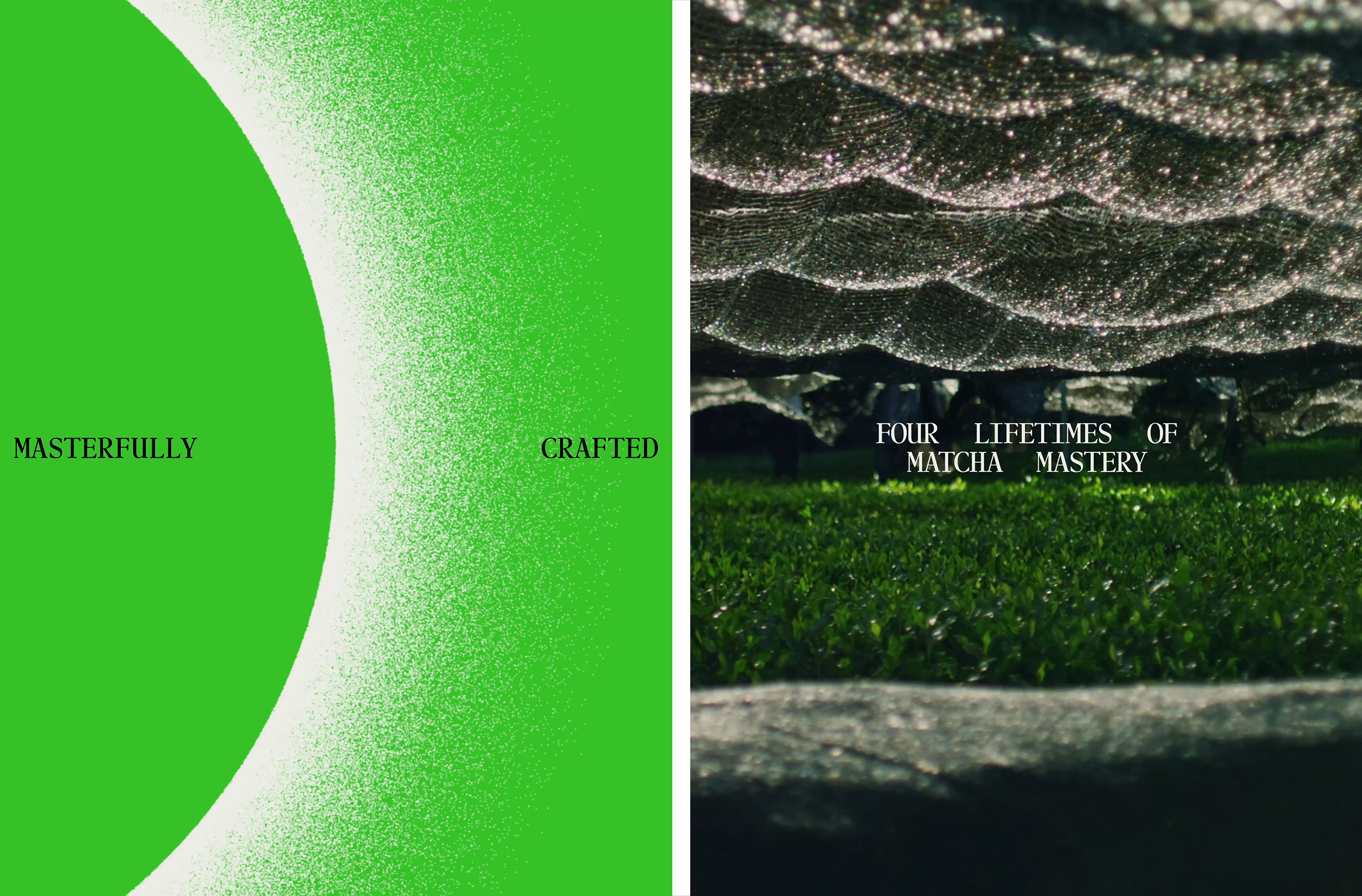
The way the brand acts in motion is gorgeous: the handwritten 12 mark disintegrates into micro-particles like the moment when tea itself meets water, and any animation is sparing and slow-paced. On the 12 website, there’s a lovely touch in how the ‘12’ mark changes from white to a bright terminal green shade as you scroll down and the background colour shifts. It’s these subtle little moments that underscore the way that in both still form and in motion, it’s a brand that speaks deliberately, but softly.
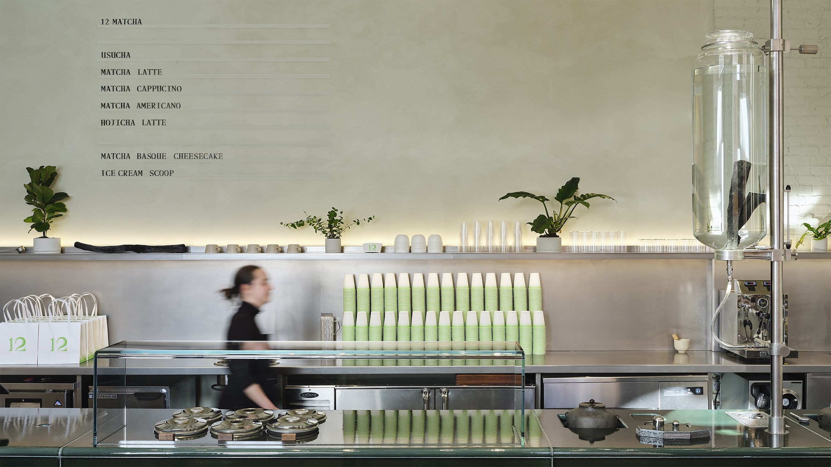
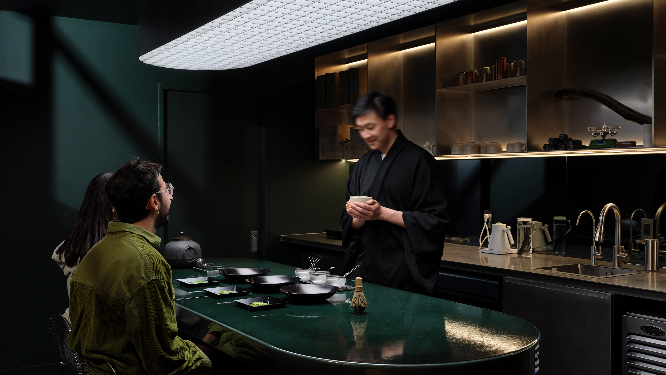
As for Base’s approach to the brand within its physical space, everything acts in accordance with the striking interiors. Signage is minimal to the point of vanishing: barely-there vinyl, blind debossing, tonal embroidery; uniforms become more like lab coats than staffwear.
My only concern with this sort of identity is that it can be so refined and quiet as to risk veering into unremarkable in certain applications. It speaks of a new sort of brand language when it comes to luxury: but just as certain old-school signifiers of ‘high-end’ (ostentation, gold, scripty serifs et al) can now instead signal ‘tacky’, I wonder if once this quieter approach gets more widely adopted it might start to do the same. But I’m nitpicking here – Base has created a superbly fitting identity here that’s brave in its subtlety.
If girls were historically told to be seen and not heard, today’s high-end NYC matcha brands, so Base proves, are often best just-about-seen, just-about-heard, but keenly felt. As the agency puts it, ’12 was never meant to be just another option on the menu – it was conceived as a moment of calm, a reset, a way to bring vitality back into daily life’. In a world where noise so often seems to be seen as a good thing when it comes to brands, 12 offers a rare quiet.
Discover more brand assets from 12 on Brand Archive.
