Muse Group by Collins
Opinion by Richard Baird Posted 5 August 2025

Muse Group exists as a collection of digital products covering all aspects of the creative process in music. This reviewer is familiar with Audacity and has used it in the past, but other platforms include Ultimate Guitar, MuseClass, MuseScore, and MuseHub. These tools are used by a range of professional musicians, budding amateurs, and everyone in between, working across all genres to learn, play, and create.
Despite the integral nature of these products to musical creation, the Muse brand itself was largely invisible, lacking a clear identity, a shared voice, or a central purpose to unify its digital suite.
Collins (San Francisco Symphony, Crane & Sustana) was tasked with consolidating these individual products under a single brand (which makes sense) – described by the studio as a ‘Creative Fluency Company’ (decidedly less so). Specifically, the ambition was to help ‘anyone reach a state where musical expression becomes second nature, where creation flows freely and musicians are able to express themselves with as little friction as possible’. Better.

With this new positioning in mind, creative musical expression and liberation become central to the new Muse Group visual identity, establishing a consistent visual language across the products through new symbols and a resolved, formalised system to promote these assets.
From the foundational principles of music – musical motifs, the real nuts and bolts of musical communication – Collins has built a sense of boisterous improvisation and spontaneous musical expansion. That’s not to say the result is undisciplined. Yes, it’s full of life, expression, passion, and agency, but it’s also supported by a functional underlying system that builds recognition through repeating patterns and motifs – just like a jazz session or jam.
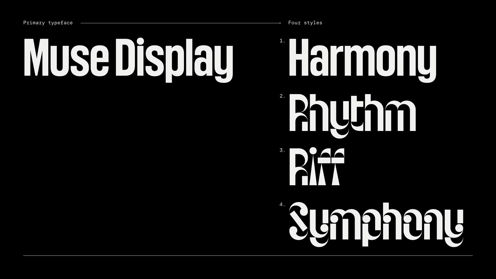
There are two clearly delineated parts to this work. First, the foundational elements that operate at the smallest level, representing the brand in restricted spaces (Instagram, for example). These include the new product symbols, a black background, and the top and bottom lines of the five-lined staff (or stave), which anchor type and bring structure to space – along with four styles of Muse Display, a new corporate typeface.
The logos offer a clearer stylistic continuity. By limiting them to Muse Display’s most expressive shapes, some are more successful than others. However, collectively they play with tension, harmony, balance, and energy – elements of graphic design that neatly align with musical principles.

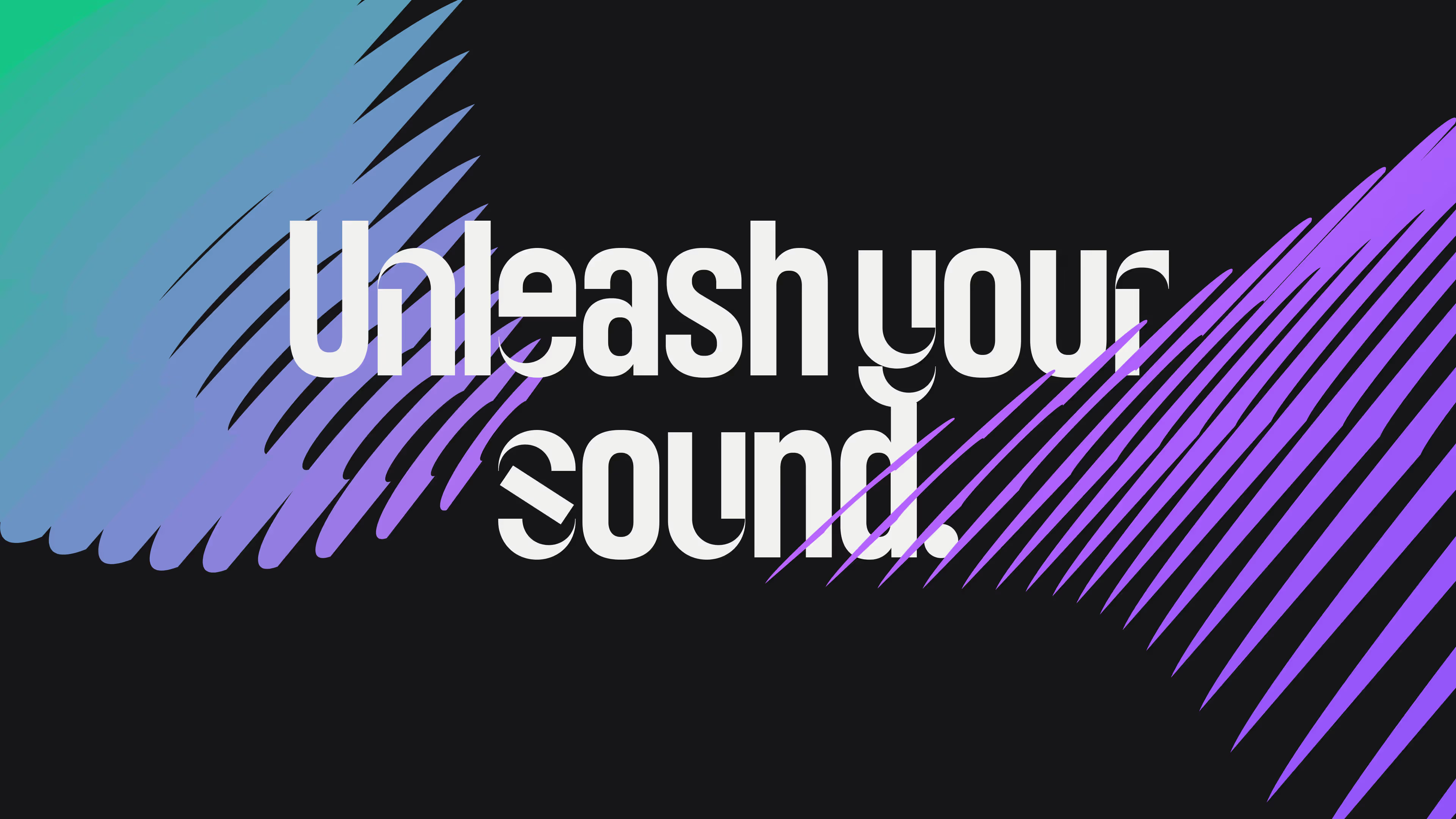
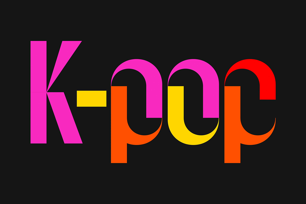
The custom typeface delivers much of Muse’s character. Harmony, Rhythm, Riff, and Symphony share similar proportions, but through abstraction and the use of elemental modular geometric forms, they become more about feeling than literal meaning. This is amplified in motion, expanding outwards like sound waves and responding to audio cues. Here, Collins’s collaboration with SFS shines – functioning in much the same way to convey the energy of a musical performance, even when static.
Where words are too much, a waveform device has been added (also animated), used to give brand character to assets like Muse’s Linkedin banner. This adds scope but feels somewhat disconnected from the typography.
These kinds of intersections – musicality and motion, combined with the technology to skilfully realise their graphic potential – are what separate studios today, much like dynamic and programmatic identities did in the early 2010s. AI may reduce that gap, but it still takes significant experience to make living assets work cohesively across platforms.
What remains a challenge is the rollout. While the team at Collins clearly has expertise and craft, the abilities and/or proclivities of the in-house team remain to be seen. I’ve seen this skills divide play out recently, where in-house teams question why the work doesn’t look as good – often due to not following guidelines, the guidelines not being robust enough, or simply lacking experience crafting different types of work in a studio context. Sometimes, the disparity between concept, technology, and platform is simply too great.

This issue becomes especially acute during everyday communication, when big, genre-specific typography isn’t appropriate (you use ‘Jazz’ and it doesn’t speak to the RnB producer). What’s left is a black background, two lines, and the least expressive version of a corporate typeface. The websites are largely fine (but no expressive type or motion), except for Audacity, which has yet to make the change. Muse’s social presence is still a mess, though there’s still time to resolve this.


