Cashflow Vodka by Marx Design
Opinion by Emily Gosling Posted 7 August 2025

Few brands dare to break the fourth wall, and all too often those that do, do it badly. Some smash through that wall Mr Blobby style – sure, it’s fun, but it’s so bold that it feels a little ridiculous, à la Brewdog’s ADVERT adverts by Uncommon. Some try to be a ickle-wickle bit clever but land on saccharinely twee: Oatly and Innocent, we’re looking at you, and that much-aped approach which has long past its ‘here’s the boring bit!’ sell-by date.
But for the most part, any sort of fourth-wall-destruction isn’t in brand, but in marketing. And when it is brand-based, it’s reserved for on-pack or campaign-centric copywriting rather than the entire brand – pack design, logo, visual as well as verbal TOV, et al, stay well hemmed in by all four walls.
But finally a project has come along that’s totally smashed the art of Brand-Goes-Brechtian: fourth wall well and truly decimated, but with skill, nuance, pathos, bathos, and a stunning line in deadpan humour that owes as much to the masters of that difficult art like Nathan Fielder or Stewart Lee as it does the world of packaging design. I truly, truly love it.
The project in question is a new launch from Departed Spirits called Cashflow Vodka, with branding from New Zealand’s ever-excellent Marx Design (Everybird, Tipple Topper, Yes You Can). Anyone with even a passing interest in the world of brands, packaging design, and spirits has more than likely heard of Departed Spirits: its design proved to be a masterclass in originality, wit, and a peculiar branch of industrial, utilitarian beauty.
Launched in Australia in 2023 with a debut range comprising Yuzu Gin, Green Apple Vodka, and Pineapple Jalapeño Agave, Departed Spirits looked to firmly reject the overly intricate, ‘craft’ aesthetic that was then saturating the industry with a voice that was as dryly funny as it was different, leading with mantras like ‘top-shelf spirits for bottom-shelf people’.
But over and above the copy, it was the jerry can-like design for the bottles that summed up the brand and formed the standout aspect of the visual identity Marx Design created from the outset – one inspired by 1950s branding, including that of NASA. As I wrote about the branding back then, the utilitarian tin flasks are ‘a far cry from a high-end glass bottle, designed to be looked at and savoured and ultimately gather dust as it waits for a “special occasion” that may never come’ (as well as being far more eco-friendly than the usual glass receptacles).
Nearly two years later however – despite the fact that Departed Spirits’ designs were much-lauded by the creative press, and held up by many as a much-needed breakthrough in an often staid category – the brand was having a few problems, largely that it wasn’t making enough money.
That was thanks to a few things: ‘mezcal was having a moment and vodka wasn’t invited’, Marx Design explains: ‘Sales were slowing, a recession was looming, and two years into building a challenger brand, the budget was cooked but the ambition wasn’t. So, we did what any self-aware, semi-broke brand would do – we got brutally honest.’ The agency continues, ‘Cashflow Vodka was born from lean times and a refusal to fake it, turning financial stress into design opportunity.’
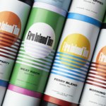
And seize that opportunity it did. The identity is based purely around a starkly simple strategy: stay in business. Cashflow Vodka is made from surplus stock, but rather than hiding the fact that it’s the product of a team ‘running on fumes’ and grasping onto an ailing business, it goes hard on its lack of budget and the desperation behind it all. Yes, it’s about struggle, but it doesn’t play the underdog card. Instead, it’s bright, candid, and deliberately messes with us – largely by up-ending the usual expectations of its category. Vodka has always meant clear bottles; here, it uses brown – the ‘perfect middle finger to the category’s sterile, frosted-glass sameness’, says Marx.
![]()

The original Departed Spirits line used Swiss style sans serif typography – Neue Montreal in widely spaced all caps as both a nod to the 1950s aesthetic that inspired the original line and to offer a visual punch of no-nonsense clarity. At launch, the designs were about merging nostalgic and futuristic; playful yet useful. Now, however, it’s all about the here and now, the utilitarian, the $$$$ – in short, as the name suggests, it’s all about the financial issues that preceded Cashflow Vodka’s entire existence.
That means inspiration is no longer from NASA, but from boring old receipts. It’s pixels not Swiss Modernism; fiscal follows function. Everything is about ‘brutal honesty’ as Marx puts it: ‘In a category full of frosted glass and fake stories, we kept it real… Because good product doesn’t need a big budget, just the boldness to say it how it is.’ And as such, the type itself (Therma by Astrae Studio) is Brutalist: blocky, cold, bearing little if any trace of anything squishy or nice or human.

The approach to design is lo-fi through and through, but in a Web 1.0 way rather than that slightly wearing ‘craft’ type approach littered with deliberate ‘mistakes’ that feel as trite as they do tired. The palette uses just black, white, and terminal green – that brash neonish shade that felt ubiquitous around six or seven years ago, beloved by both Gen Z pop culture (Eilish) and the self-referential inner circles of the design world (Kommunikationsdesign in Deutschland).
It’s an interesting choice of hue here: there’s no missing it, for one thing – it ain’t a shade for a brand that’s looking to speak quietly, or feign sophistication. But it also has a sort of almost audible static hum to it, like the buzz of a receipt printer barely in earshot. Like Cashflow Vodka itself, the shade of terminal green has its roots in the purely functional. It was the shade that defined the early days of personal computers thanks to the way their monitors worked: pixels were produced by cathode ray tubes shooting electron beams at green phosphor dots behind the screen, which were easier on the eye and more legible than the other feasible option of white type on a black background.


The name, like the tone more broadly, is brilliantly, utterly deadpan: Cashflow hides nothing, says everything. It eschews the need for a lengthy backstory or a narrative that tries to suggest anything other than that this is vodka made to make money, not sell you any sort of aspirational lifestyle (indeed, quite the opposite).
Marx Design has described the designs as a ‘reminder that authenticity is refreshing’. It’s a reminder that couldn’t have come at a better time: brands and brand designers have bandied the ‘a’ word around so much lately that it’s come to mean anything but – for the most part, ‘authenticity’ has lately seemed to be a catch-all for everything and nothing. Here, though, it’s meaningful: a brand that’s absolutely on-its-arse desperate, and tells us so; one that’s all about what every brand is all about but pretends not to be – making money, selling us stuff we don’t really need.
And aside from it looking superb (as per with both Departed Spirits and Marx), it’s exactly the sort of refreshment we need right now: the visual identity equivalent of the universal hand gesture for ‘wanker’, waved right up close in the face of the smoke and mirrors and pretence of the world of brand design.

