Fire Island Tea by Stephen Moss
Opinion by Emily Gosling Posted 12 August 2025

Fire Island has always seemed far more a mythical utopia than a real, physical geographical, location to me; in part simply because of its name: Fire Island seems wrenched straight out of Greek legend – elemental, fearsome, alluring, almost a contradiction as surrounded by water yet inherently burning.
But mostly, it’s thanks to Frank O’Hara, whose mid-20th-century poetry eschewed the formality of stanzas, feet, and all those fusty parameters by instead striving to write as though poems were a telephone conversation – chatty, sometimes catty, camp in places, frequently funny, always conspiratorial, but always including us as readers within the coterie. Fire Island is the star of one of O’Hara’s most exemplary conversational poems, the gorgeous A True Account Of Talking To The Sun At Fire Island; tragically, it was also a stones throw from where he died, struck by a jeep on Mastic Beach in the wee hours of the morning in July 1966. He was just 40 years old.
Safe to say then, if it wasn’t already obvious, I’ve never actually been to Fire Island. But anyone who has heard of it knows that this little strip of land that parallels the south shore of Long Island (near New York, to put it very simply) has long been a mecca for both NY and global LGBTQ+ communities. Naturally this only bolsters the image I have of the place as almost too gorgeous to actually exist.
But exist it does, and celebrating Fire Island is queer storytelling platform Fire Island Tea. Starting out as an annual print publication in 2023, Fire Island Tea is named after one of the area’s most iconic traditions: the Tea Dance, a weekly gathering that became a cornerstone of queer expression and liberation in the 1960s. The platform has since expanded into a podcast called Fire Island: The Tea (get it? as in spilling?), which features interviews with artists, activists, and other individuals connected to the area and its history,

Perhaps it seemed only natural that, beyond the editorial, The Tea would venture into, well tea. Now, Fire Island Tea is also a range of six tea blends, each of which gives a cheeky nod to different aspects of this thriving queer haven. There’s Ferry Blend, ‘paying homage to the decades-old tradition of riding the ferry across the Great South Bay’; Cherry Popped, which honours the Cherry Grove community; Dune Grass, referencing the natural land formations that provide a barrier from the ocean; Meat Rack, named after a section of National Seashore that separates Cherry Grove and the Pine, ‘where secluded corners have a history of cruising and anonymous sexual encounters’, according to the brand’s founders; Dark Room, nodding to ‘an important, mysterious space in queer culture’; and finally, Morning Party, which takes its name from ‘the predecessor to today’s Pines Party… the famed GMHC Morning Party’, Fire Island Tea explains.
In many ways then, Fire Island Tea is a publishing project disguised as a tea brand. The six variants are as much chapters in a collective queer memory as they are flavours, each steeped in history, humour, and place. ‘Fire Island Tea is more than a publication. It’s an archive. A love letter. An act of resistance. A beautiful, messy, intentional offering to the queer world…’ says Fire Island Tea publication’s editor-in-chief Marc R. Christensen. ‘We believe in storytelling as ceremony. In truth-telling as design. In beauty as survival.’
There’s something both wonderfully unlikely and perfectly inevitable about Fire Island Tea, a queer editorial platform becoming a line of teas that feel as much cultural artefact as consumer product. Designed by Stephen Moss, the brand’s visual identity deftly channels the mood, materiality and memory of Fire Island itself.
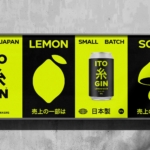
![]()


The design language is ordered and consistent: there’s definitely a subtle playfulness here, but it’s rewarded when you look more deeply. A central oval or badge motif acts as a frame for the logotype and blend title. Below that, text is laid out with almost apothecary-like precision, recalling vintage grocery labels, but without even a whiff of pastiche. Moss has said he drew inspiration from a 1979 Fire Island beach party poster widely known on the island, which he loves largely for its simplicity and understated modernism – two qualities that are unmistakably at the fore throughout the system.
The packs take the form of elegant embossed cylindrical tins, and each blend is associated with its own signature trio of colours. These are bold without being shouty, variously seeming to draw on sunbleached posters, vintage beach house paintwork, or the hazy hues of Fire Island sunsets, to name a few. From the baby blue backdrop and sunshine yellow roundel on Dune Grass to the deep, suggestive red, orange and black backdropped Dark Room packs, the palette is richly considered without being didactic.


The tins themselves are meticulously constructed, featuring embossed graphics and a blind debossed icon on the lid. This icon, a teapot, is where the cheekiness comes in: look closely, and it’s hiding a butt plug, a subtle wink to a central totem of Fire Island’s community. It’s a playful, private gesture – a moment of coded intimacy that reflects the island’s long-standing embrace of openness, pleasure, and subcultural symbolism.
I absolutely love the Fire Island Tea wordmark, which is rendered in a character-packed but resolutely classic condensed sans serif font. It feels absolutely timeless and totally contemporary, evoking mid-century design icons, highbrow art book spines, vintage clothing labels and basically anything else that’s been done really well over the past century or so.


Supporting information such as blend details, flavour notes, origins seems to be set in Aktiv Grotesk by Dalton Maag – tightly spaced, weighty, and full of quiet authority. The overarching theme of the typography is a sublime marriage of flourish and function, befitting of the editorial origins of the whole thing – brand name as headline, blend as subheading, body copy sitting neatly in its right place.
There’s no overt rainbow flagging or glib Pride commodification to be found in Fire Island Tea. Instead, the design system works through a quiet choreography of editorial structure and richly referential visual codes.

From a functional perspective, it’s excellent packaging: the tins are reusable, the tea bags plant-based and compostable. But from a design perspective, this is as much editorial as pack design: like the best publications, Fire Island Tea doesn’t just look good – it builds a world which completely, holistically understands and respects its audience, because its creators are right there within it.
It’s a brand that engages with history with care and reverence; which, crucially, doesn’t shy away from queer beauty as an ongoing battle as much as an aesthetic choice. The timelessness isn’t just in things like the font choice, then, but the central concept – designed for ritual, for memorialising, and above all, for the simple pleasures of being alive.