Post Post Hotel by Studio Bruch
Opinion by Emily Gosling Posted 4 November 2025

If you’re reading BP&O, you’re more likely than most to be the type who knows their counters from their stems; their terminals from their tittles, and so on. In short, a TypeNerd – categorically one of the best kinds of nerd.
And what do nerds like? Hyper specific ‘injokes’ that aren’t exactly striving to be funny, perhaps you might call them Easter eggs (there’s probably a very long German word for this) — those sorts of details that few might notice, but which those who do – in this case, the fairly font-fanatical – truly appreciate. The inclusion of one of those is among the many reasons this project – the recent rebrand of Post Post Hotel by Studio Bruch – is so superb.
Post Post Hotel has stood proudly in the spa town of Bad Hofgastein in Salzburg, Austria, for more than 600 years – since 1421, to be precise. Until the hotel’s rebrand, it was known as Alte-Post, which translates as Old Post; both names are a reference to the building’s historical use as a post office.


As a four star hotel in the ski resort of the Gastein Valley, the new branding had to marry more high-end cues and traditional elements with modernity. Studio Bruch, which is based in Graz, Austria, has pulled off that tricky balancing act absolutely beautifully, through a stripped back but bright and highly distinctive colour palette, some lovely simple linework illustration and the hands-down, standout highlight of the whole thing – the absolutely gorgeous bespoke brand font, BR-Post.
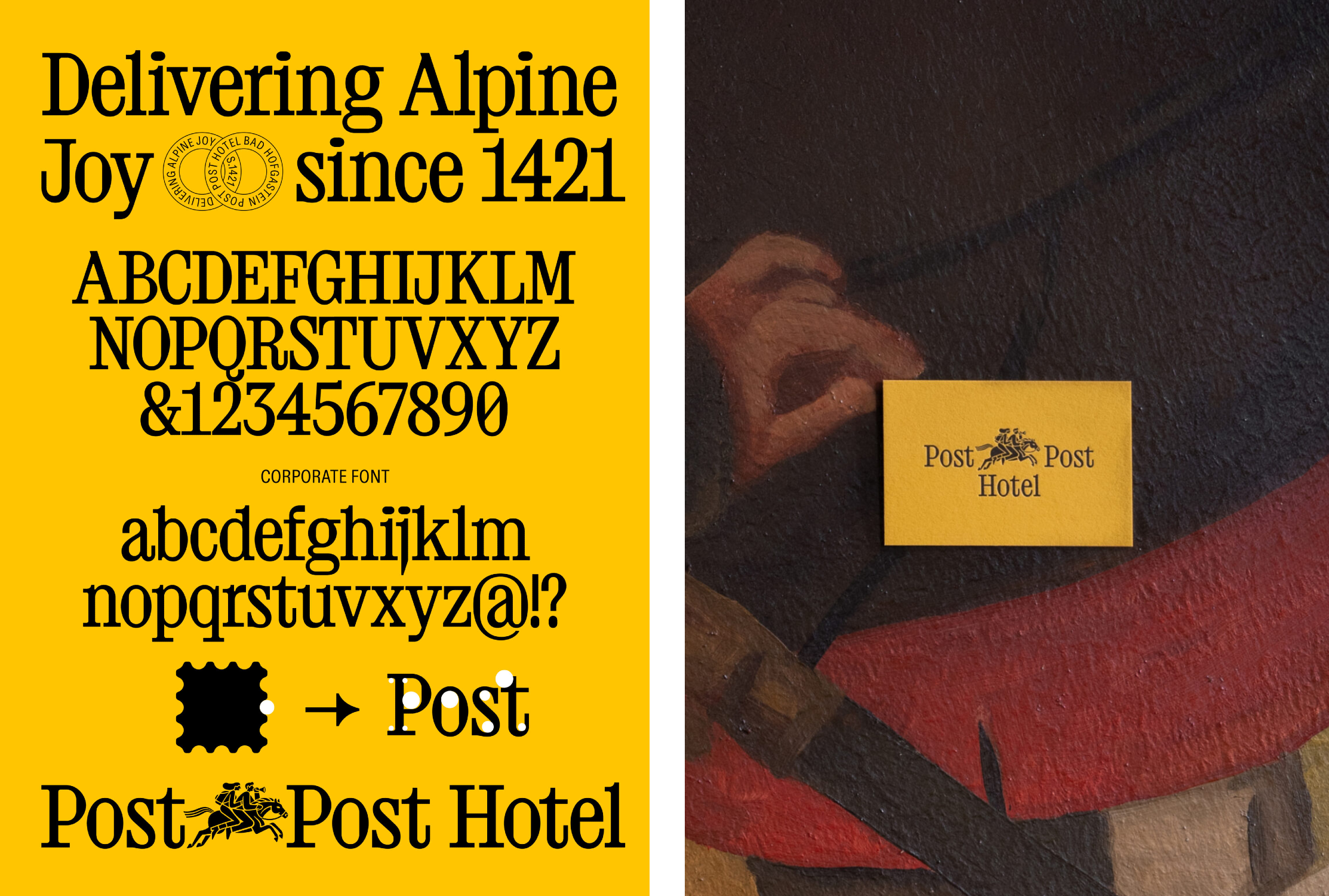
Created by Studio Bruch’s very own Kurt Glänzer, this striking serif font is where that aforementioned Easter-egg-type situation comes in: not only are its strange quirks and deliciously odd little nuances lovely to look at, they also serve to tie the typography firmly to the idea of the post office that underpins the entire identity concept.
![]()

As shown in the image laying out BR-Post’s upper and lower case lettering, the counters and flourishes in the letters play into the circular negative spaces left around the outside of a stamp. Or more accurately, the circles fit into them (for the most part – there’s a sliver of a gap in the case of the capital ‘P’, but honestly when it looks this good who cares).
The sense of geometry to it all feels like a nice nod to the more traditional aspects of the hotel, the seasons and routine and everything-in-its-right-placeness that you get a sense of from the new brand design. This is ameliorated by the secondary typeface that Studio Bruch opted for, the “warm yet sharp grotesque” ABC Diatype by Swiss foundry Dinamo.
Diatype’s sans is the perfect foil to BR-Post’s more elaborate serif shapes; the pairing makes for an identity that works beautifully online and on social, but which also really sings across the numerous tactile printed elements that come with branding a hotel.

That tactility aspect was clearly important to Studio Bruch: it’s obvious that hours have been poured into the decisions around materiality and physicality when it comes to things like stationery (look at that lovely stamp! The die-cuts!) and menu designs.
As for the logo, again, it’s about being a wee bit playful while keeping one eye firmly on the heritage and tradition that’s kept this hotel running for a whopping 600+ years. There seems to be a couple of marks – one is a nice monogram formed of two conjoined capital P letters in a lozenge-shaped lockup, the other is a reworked version of Der Postler (which translates as The Postman).
The latter is a witty, but still pretty illustration that feels thoroughly contemporary but also like it could have been born of a woodcut from way back when. As with the other brand illustrations, it was drawn by illustrator Daniel Triendl and sees the postman become the post people – in a nice twist on what’s apparently a pretty common symbol (there’s no shortage of ‘post hotels’ in Austria it seems) we have a couple riding off towards some sort of adventure. The blocky black linework across all the brand illustrations is a fitting style here – not too out there, not too safe and staid.


Likewise the colour palette leans on and borrows from certain heritage elements, but feels super modern. Limited to a mustardy but vibrant yellow and a powdery baby blue, it all feels very ownable to Post Post Hotel but without being overtly shouty or totally throwing out category conventions for the sake of it.
Finally, that name: I’m a big fan. Just as there’s a lot to be said for the argument that post-punk is better than punk in many ways (I’ll let the Modernism v PostModernism v PostPostModernism fight play out elsewhere), Post Post is a big improvement on its predecessor ‘Old Post’. The new name is self referential without being too clever-clever – it’s smart and catchy and witty and crucially, like the rest of the identity, it feels secure in just being good without ever seeming to try too hard.
![]()