Olive + Gourmando by Caserne
Opinion by Emily Gosling Posted 13 November 2025
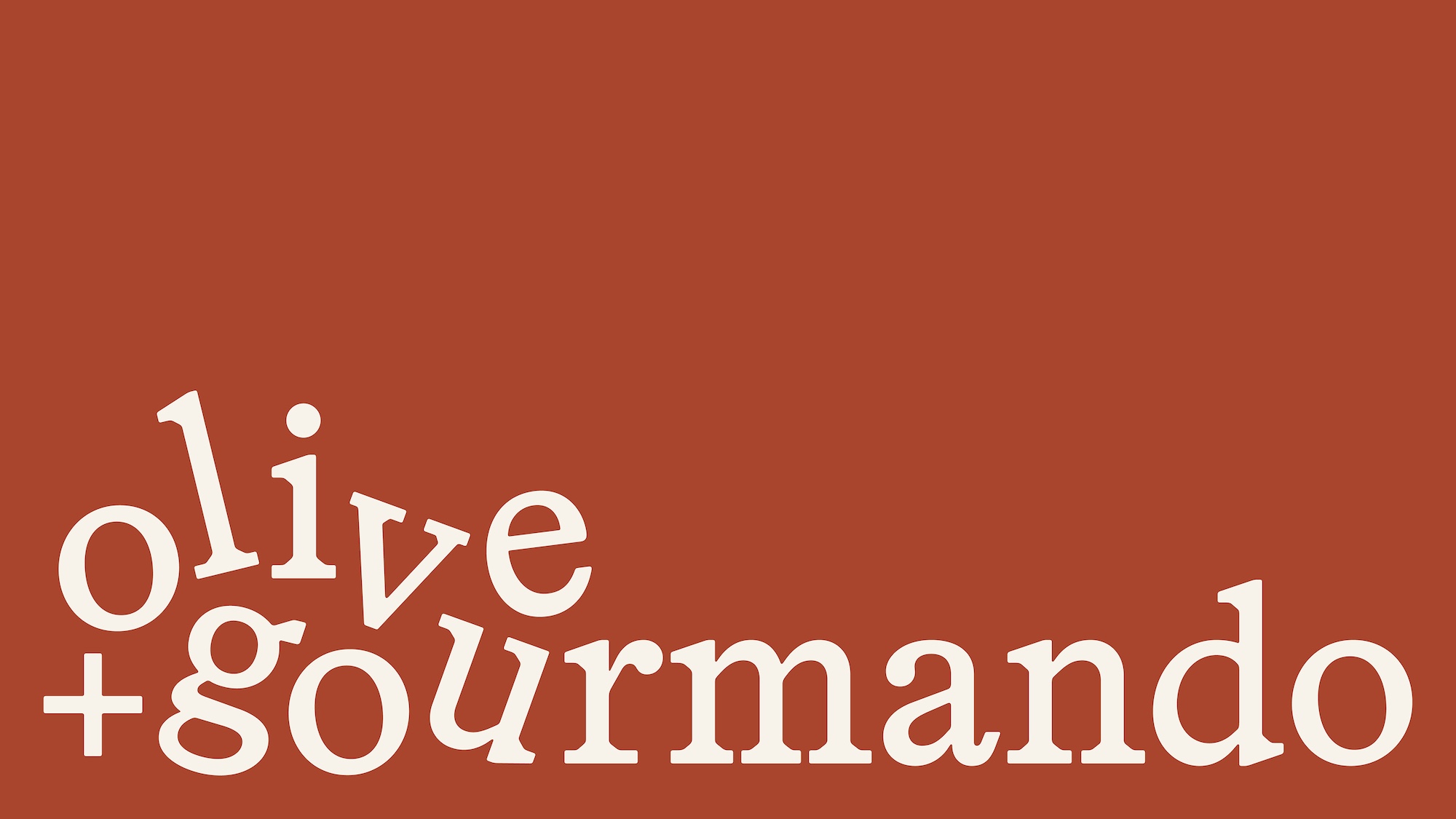
Olive + Gourmando is a Montréal bakery, café, and restaurant that opened its doors in 1998 and has since become something of a culinary institution. With its expansion to a second location, Caserne – a design studio also based in Montréal – was brought in to refresh its identity.
The aim of the project, according to Caserne, was to “support growth while keeping [Olive + Gourmando’s] warm, artisanal charm”.
At first glance, the new wordmark doesn’t look all that remarkable – almost a little childlike in its static, standalone form. The typeface is strong, but initially it doesn’t seem to quite hit the mark. Yet across the wider identity, the design begins to make sense. The strength lies in how it flexes: on packaging, signage, menus, and other touchpoints, it feels coherent and confident and wholly befitting of the brand it communicates.
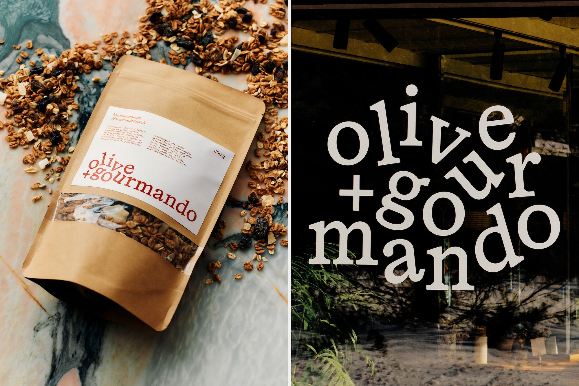
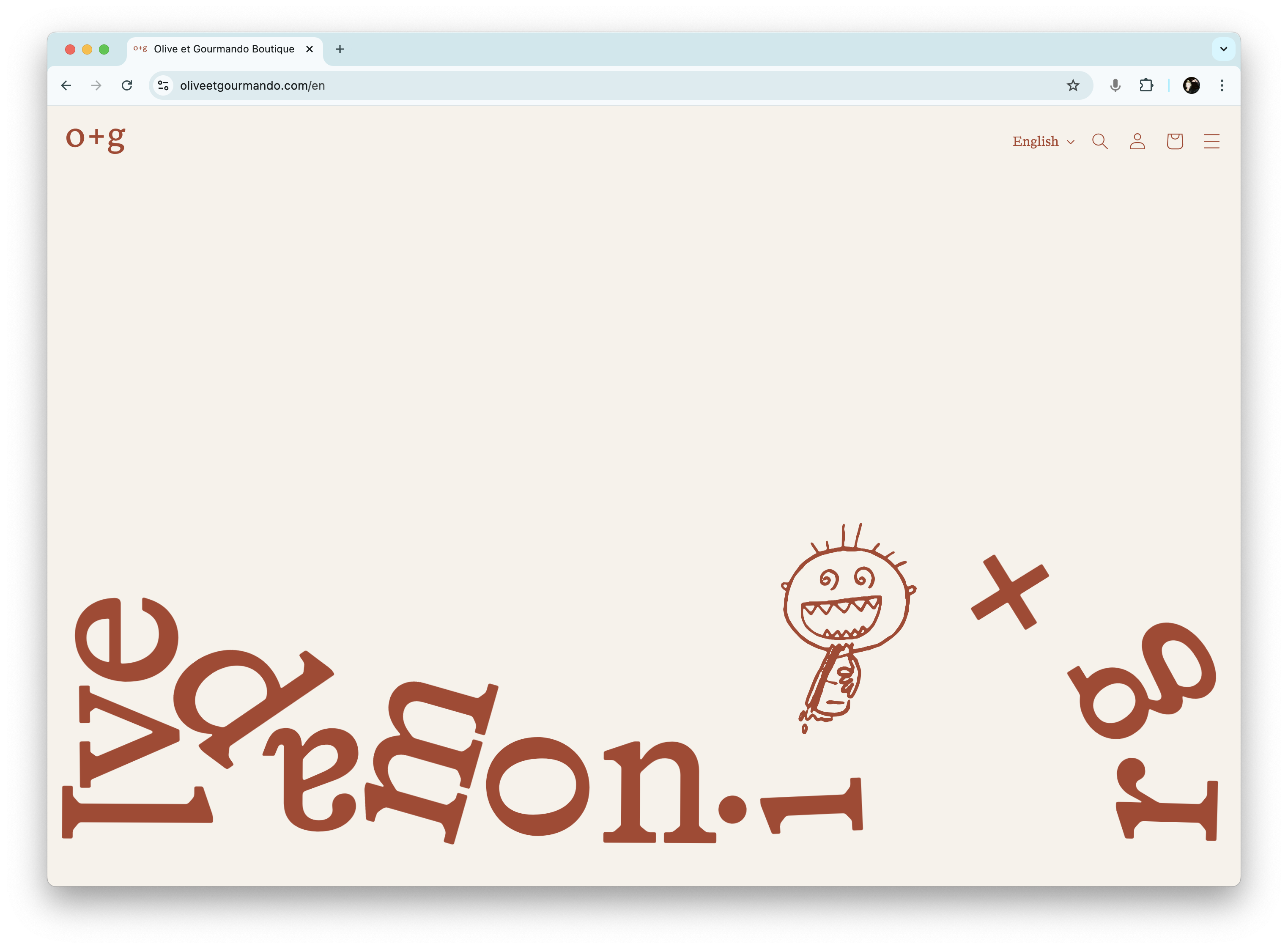
Caserne rethought the concept of the wordmark itself by allowing it freedom of movement. The letters have no fixed position – in some applications they tumble and scatter in playful freefall, while in others they line up neatly in horizontal formation. This elasticity keeps the identity feeling alive and spontaneous, echoing the restaurant’s bustling, convivial atmosphere. It’s a clever device that maintains recognisability without rigidity.
The wordmark uses HAL Timezone, a serif typeface by Berlin foundry HAL Typefaces, which describes it as “aesthetically inspired by early digital fonts, freshly transitioned from the phototype era”. It’s low-contrast and weighty, giving it presence without shouting.
For a brand like Olive + Gourmando, that restraint is exactly what’s needed. This isn’t a brash newcomer or a disruptive ‘challenger’; it’s a beloved fixture of Montréal’s food scene. The type doesn’t need to be loud – it needs to be timeless, grounded, and warm. As HAL Typefaces puts it, HAL Timezone is “a robust text font with high visibility and slightly rounded edges”, which perfectly captures that balance between approachability and durability.
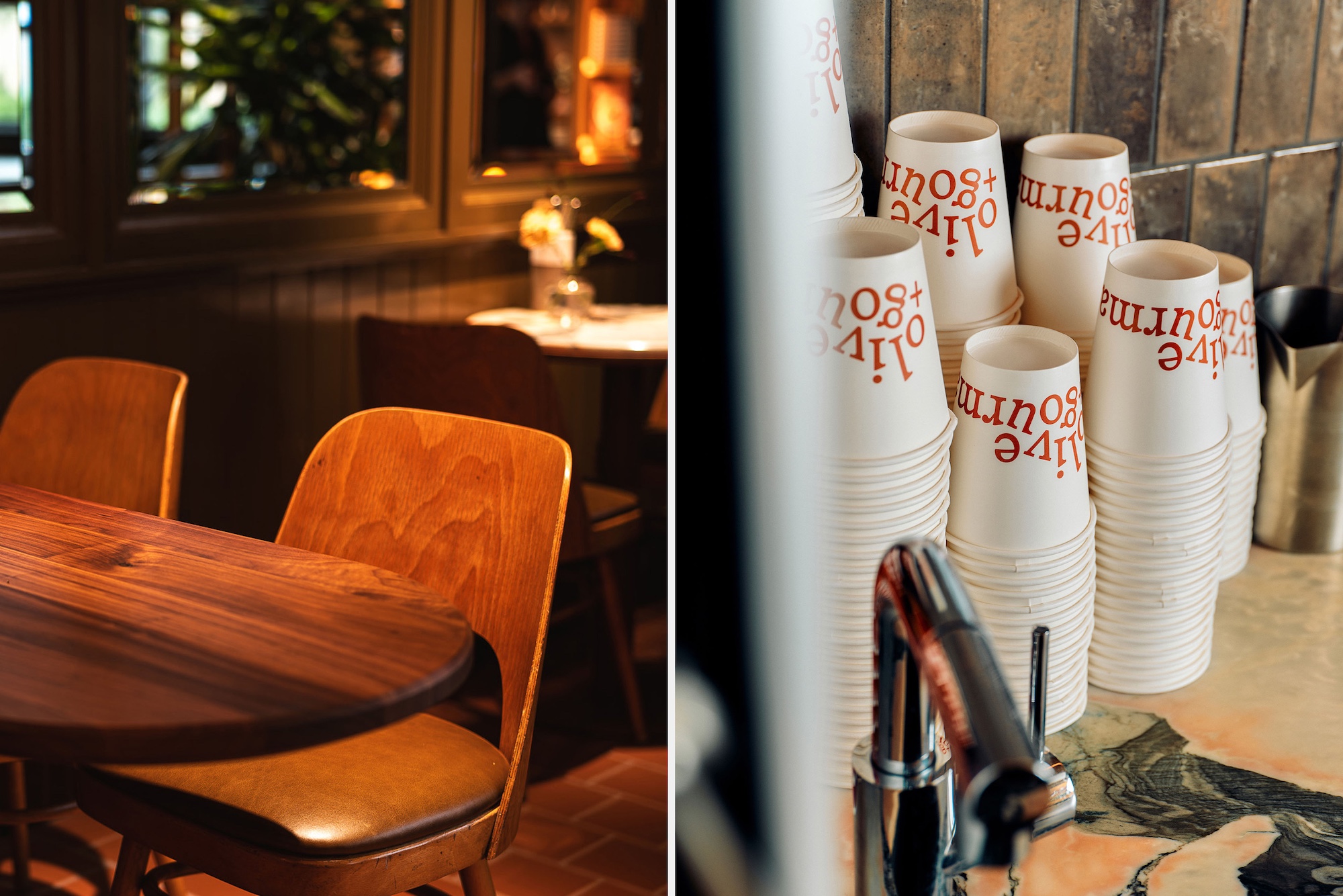
As for the secondary typeface, Caserne opted to use another HAL font – the sans serif Four Grotesk. It’s a nice counterpart to Timezone, and flexes nicely across the menus, online, and other applications with lengthier texts.
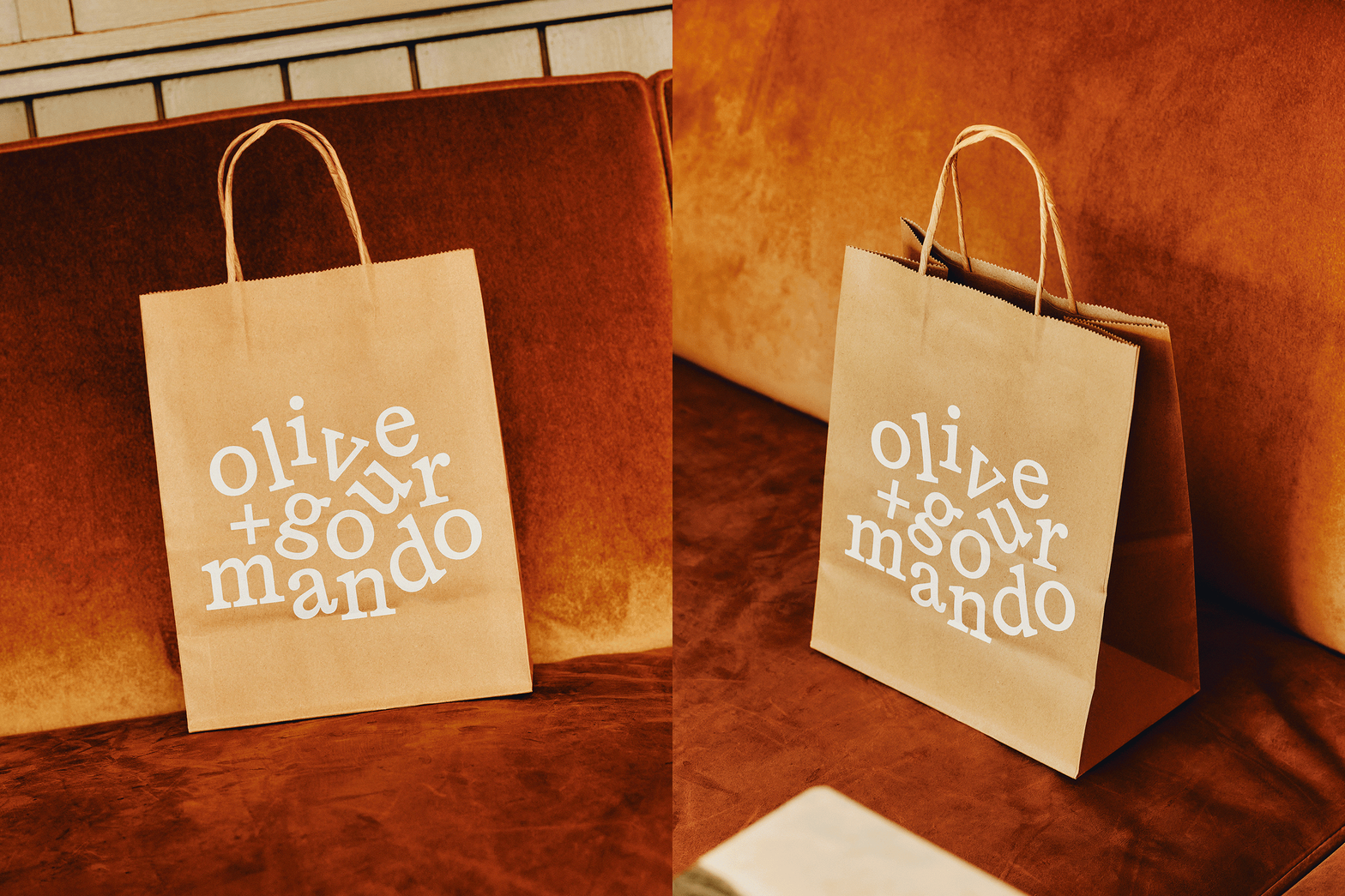
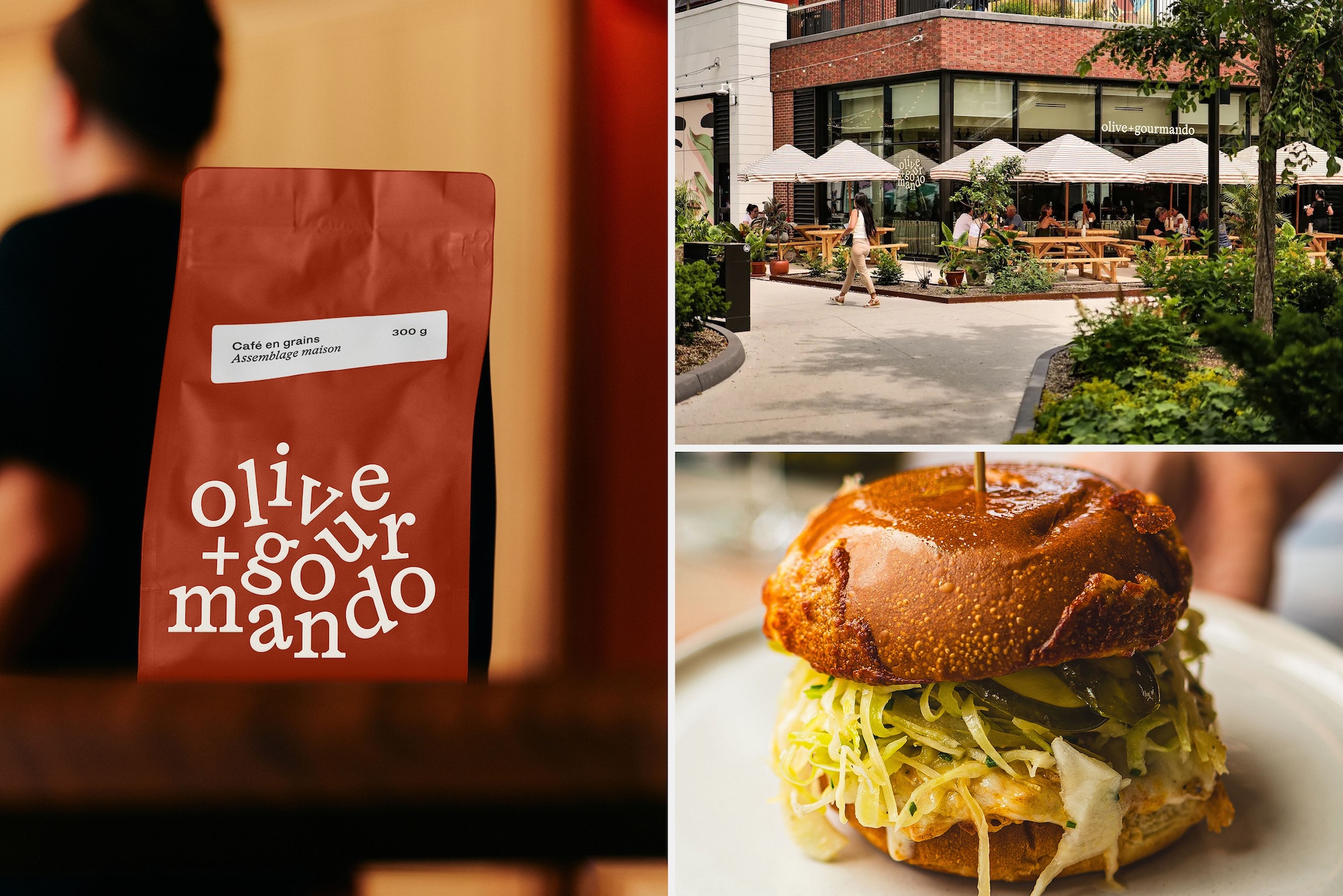
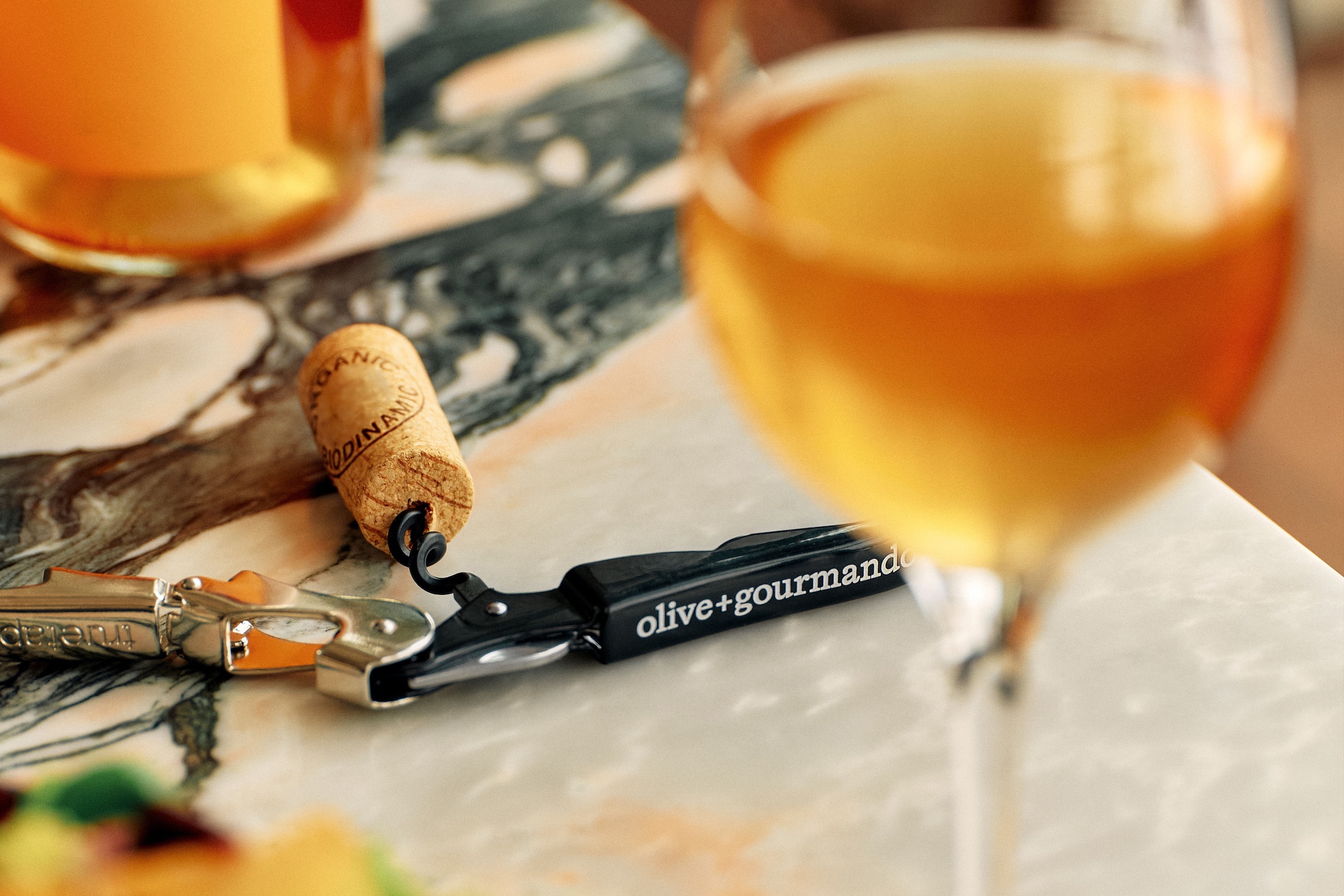
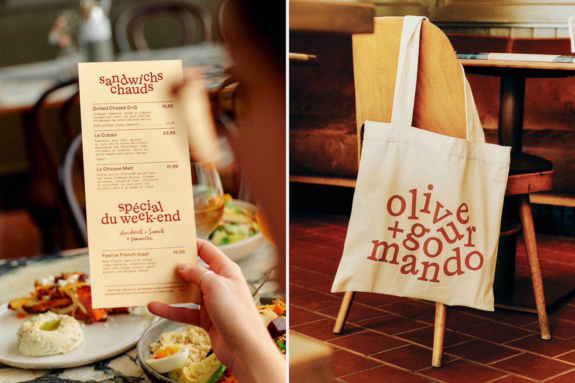
An identity like this needs to perform across a multitude of touchpoints: the generous scale of storefront awnings, a corkscrew handle, on the perennially ubiquitous tote bag, and in digital formats.
Caserne has managed this balancing act beautifully. The brand feels consistent without being predictable, with each iteration carrying its own quiet charm. It works superbly with the tactility of the packaging for products like granola, where materiality feels considered and wholly appropriate, giving the sense that everything is sort of good for you, because it’s probably natural, because it’s in brown paper bags.
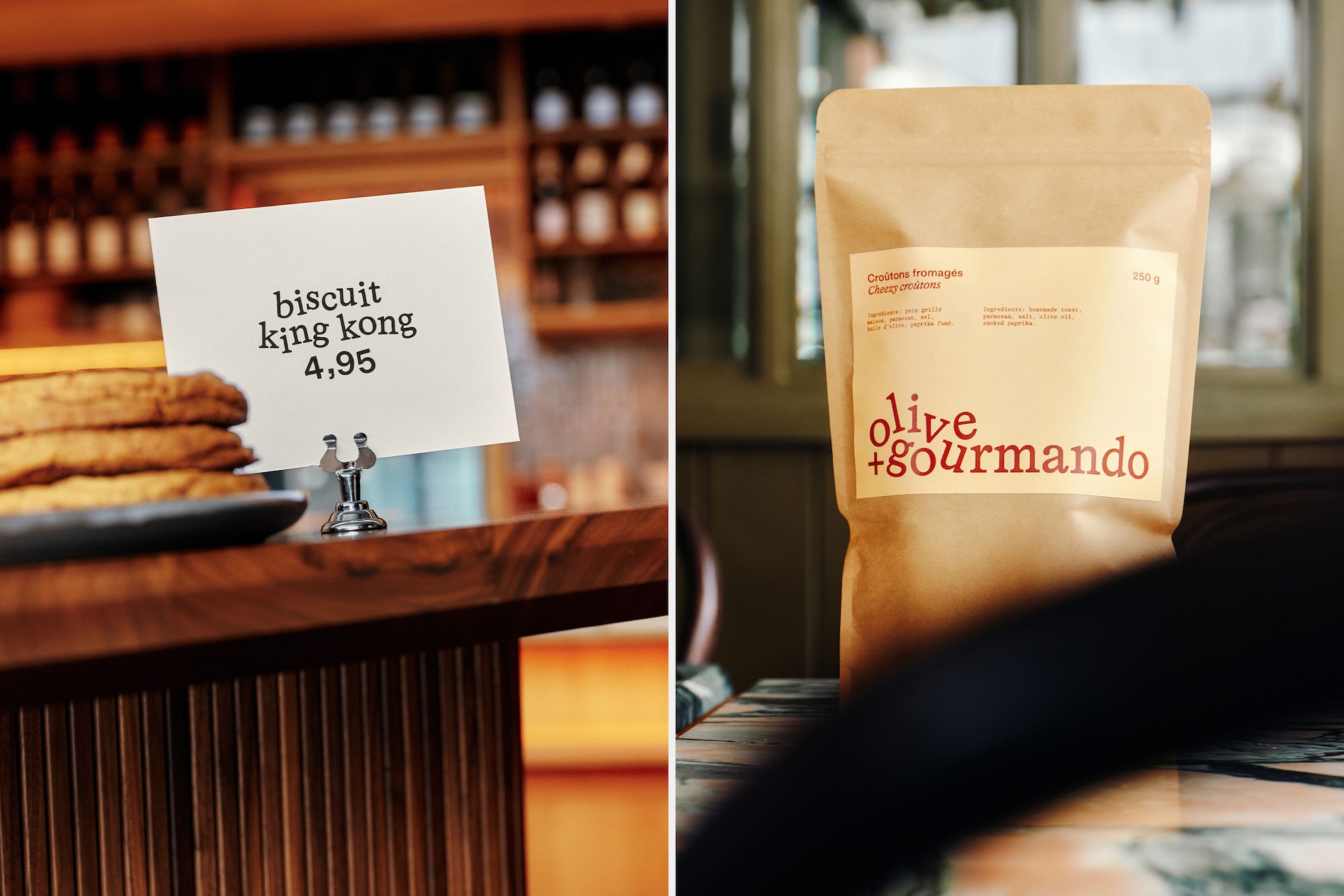
The colour palette is similarly restrained – a clean mix of white and brown, reflecting the baked goods and the brown paper packaging they come in, alongside a rich, rusty red that adds depth and warmth. It feels earthy and organic and wholesome and honest, evocative of the café’s artisanal character – just as the brief required.
I absolutely love the website, for which Caserne worked with web developer Philip Malboeuf. The cursor is just brilliantly silly and fun: on the website, it becomes a mischievous little character that nudges, kicks, and dances around the tumbling, scattering letterforms of the wordmark like a toddler skipping through autumn leaves.
It’s a delightful touch that reinforces the sense of charm and movement established in the print materials. The fonts carry over seamlessly, ensuring a sense of cohesion between digital and physical expressions of the brand.
Illustrations are used sparingly, but where they appear, they’re lovely – loose, faux-naïf line drawings by Marie-Hélène Lemarbre, who also shot the brand photography. The simplicity of her work adds to the understated warmth of the identity, never feeling forced or ornamental.
With this project, Caserne demonstrates beautifully that it wholly understands what aspects of a brand need to be kept straight, and which elements can wander off into weirder territories.
The studio says that the new logo looks to capture Olive + Gourmando’s “lively, organised chaos and inviting energy” – and it does exactly that. It’s easy to dismiss such identities as the preserve of a certain ‘Walthamstow yummy mummy’ aesthetic, all Time Out-endorsed brunch queues and tasteful neutrals and white t-shirts from Sunspel that cost about a hundred quid. But some clichés endure because they work.
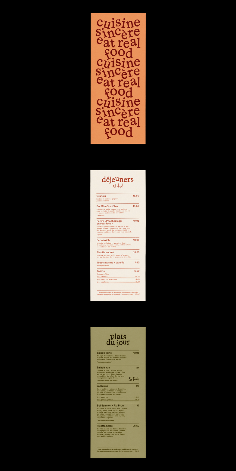
Olive + Gourmando’s new look is overwhelmingly tasteful – almost cute but still classy; never twee – the graphic design equivalent of those weird little pedal-less wooden bikes for the kids of said yummy mummies, toys that unlike gauche plastic kitchens et al will sit nicely alongside the Mid Century Modern furniture in a house somewhere in E17/Dulwich which secretly aspires to the pages of Elle Decor.
But like those little balance bikes, this identity will endure because it’s not only tasteful – balancing warmth with modernity in a way that feels entirely natural – but irresistibly well made.
