Eternal Research by Cotton
Opinion by Emily Gosling Posted 3 December 2025
Niche/difficult electronic music types and brand design nerds are rarely found too far from one another; often, indeed, they’re one in the same. It’s little surprise really when you look at the typographic wonders to be found across the spectrum of things like vintage synthesisers – the sublime curves of ‘Omnichord’ or the strangely pagan-ish letterforms on a Prophet-5, to name just a couple.
Newer synth brands seem almost deliberately aimed at the graphics crowd, like Teenage Engineering. Yet the industry standard almost entirely looks to a stripped-back, Standards Manual-style precision: no fuss, no frills, all buttons and knobs. So it’s a delight when something comes along in this space that totally rewrites the rulebook and goes full-on wild, such is the case with this thoroughly bewitching brand identity for Eternal Research.

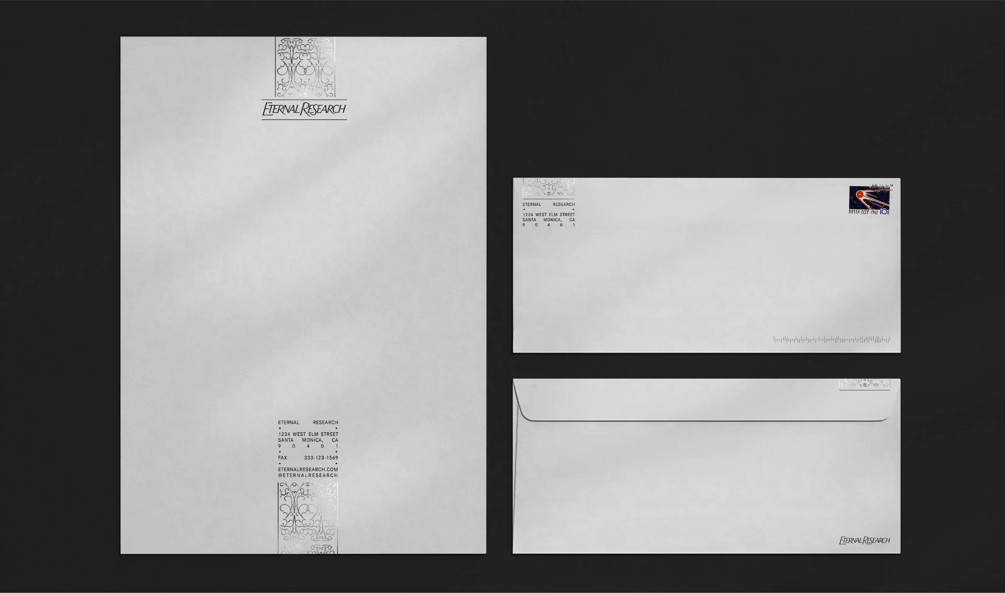
New York studio Cotton is behind this expansive identity, which is used across pretty much everything Eternal Research, from its website to packaging to merch, posters, billboards, and the rest of the usual marketing materials to the diagrams explaining the hardware and even the instrument interface itself.
Founded by artist-engineer Alexandra Fierra, LA-based Eternal Research only seems to be selling its flagship instrument, the Demon Box (though it seems much more is in the pipeline).
![]()
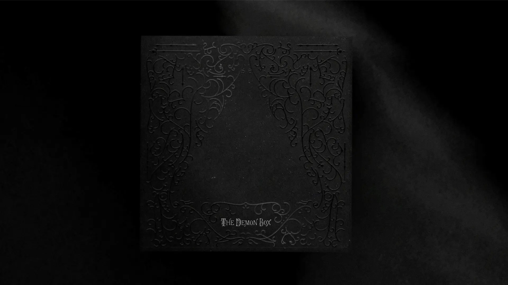
The Demon Box seems to be a key inspiration for the overarching design aesthetic, both in name and function: it takes the invisible and inaudible (ghost-like, you could argue) electromagnetic fields we’re surrounded by every day and uses them to create musical compositions.
What’s normally imperceptible becomes a textured, often unruly source of sound; a refrigerator’s soft aura might resemble a far-off choir, while the jittery field around a cordless drill erupts into abrasive rhythm. In a way, it draws together scientific precision and a more esoteric curiosity – how can we hear the things we cannot, and what are the possibilities of what we can make with these untapped entities?

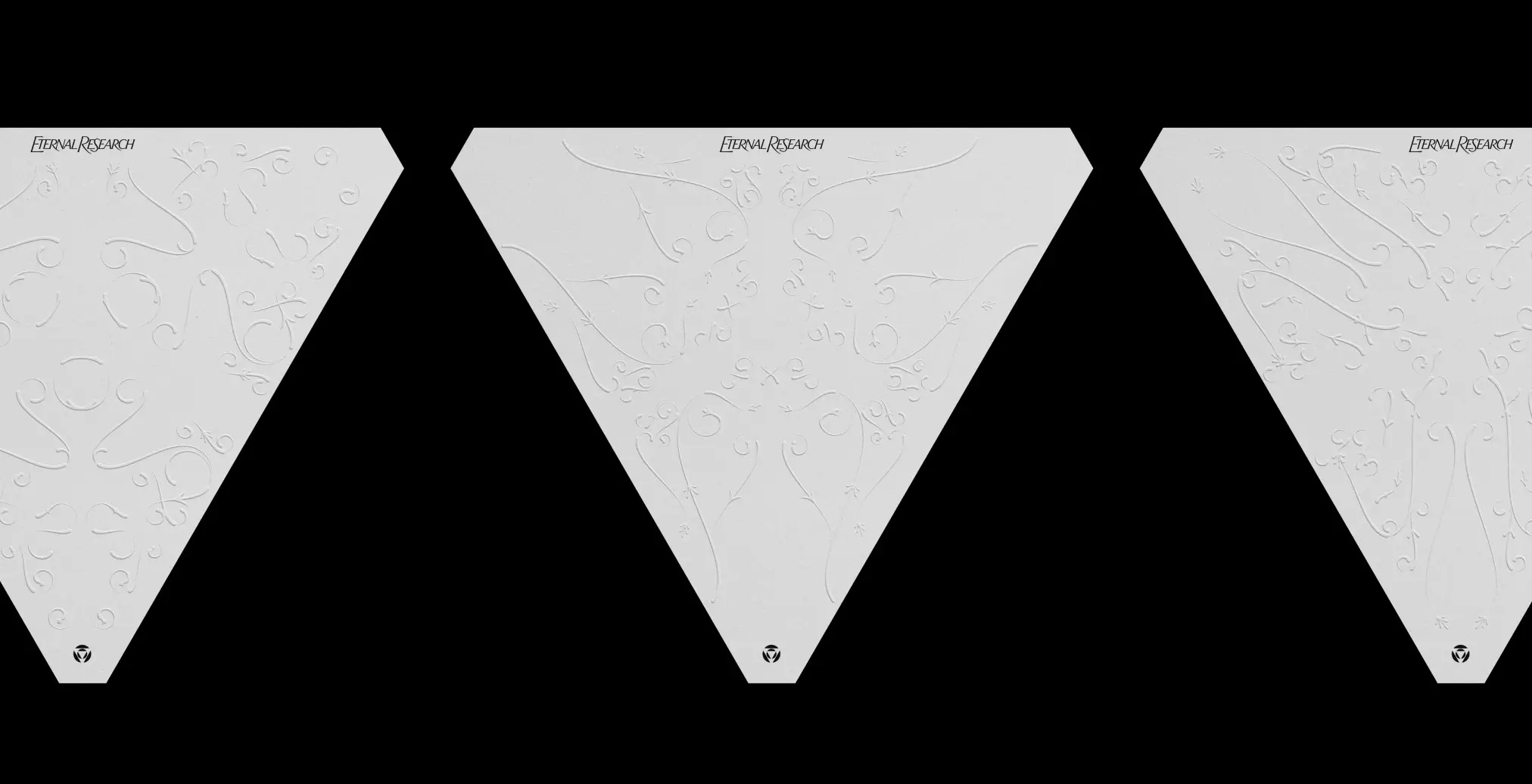
That duality of data-led and demonic seems to sit at the heart of Cotton’s identity: it looks to redefine “how we see and hear sound,” as the studio puts it. Cotton continues, “Rooted in the intricacy of Victorian ornamentation yet powered by advanced generative code, [the identity] balances precision with experimentation – an homage to old-world elegance paired with a love for innovation.”
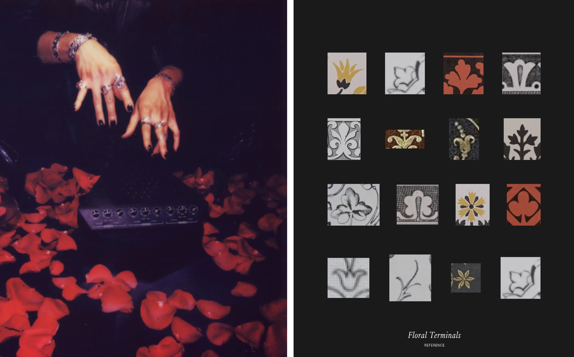
Cotton “studied hundreds of archival Victorian patterns,” decoding both their shared structures and their idiosyncrasies. The result is not one master pattern but an infinite family of historically accurate motifs; each ornate, each subtly different, all expressing the craft-driven values of the brand.
![]()
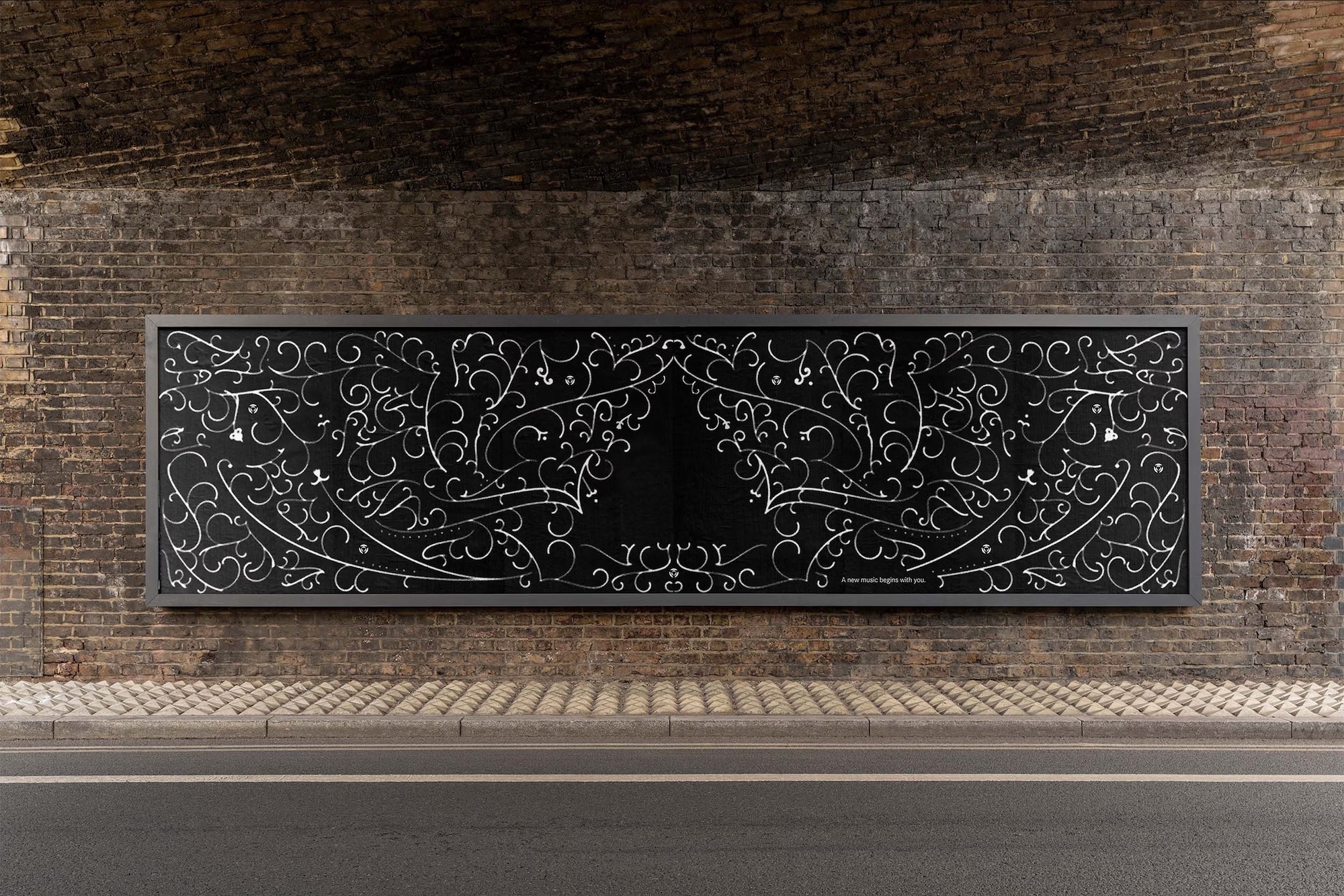
This marriage of tradition and modernity explains the central thrust of the identity: an ornamental, Victorian style patterning system created using generative technology. Cotton describes the era’s motifs as products of a mindset where “attention to detail was celebrated, creation was deliberate and often slow, and intricacy conferred value” – one mirrored exquisitely by Eternal Research’s products and branding alike.
Because Eternal Research is an auditory company at its core, Cotton took the obvious next step: the patterns aren’t just generative, they’re audioreactive. The system listens to timbre, mid-ranges, relative extremes, roughness, airiness. Sharp tones create serrated, angular details; soft tones become smooth, diffuse ornament.
As Cotton puts it, the visuals must “express that same intricacy” as the sound itself. And critically, they must be different every time since “no two experiences of listening are ever the same.” The audiovisual tool built for the Demon Box does exactly that: a Victorian filigree that writhes, blooms, and fractures in real-time.
The wordmark sits nicely in opposition to all that ornamentation. It uses a custom-drawn version of Trust, a collection of display fonts by Los Angeles-based type foundry and design studio MCKL. Here, Trust is made to seem as though it’s been set in stone, with the introduction of subtle irregularities “evok[ing] the tactile permanence of engraving,” says Cotton.

As for the rest of the type throughout the identity, Cotton leans hard into the Victorian era’s maximalist appetite for variety. The result is a deliberately unruly library of not one, not two, not even three but ELEVEN other typefaces – a sort of cabinet of curiosities as much as a font system.
There’s the friendly wide proportions of TT Globs by international type design studio TypeType; the undeniably romantic forms of the gorgeous Windsor-revival New Spirit Condensed by London foundry Newlyn, “an Arcadian typeface… from an artistic vision of stability, abundance and harmony with nature,” as its creator puts it; Louize, in its Regular and Italic forms, from Lyon-based 205TF; Corporate S by URW.
Two of the typefaces are from New York foundry P22, which specialises in historic revivals and original designs for contemporary typography. Cotton opted to use P22 Clementine (“a bit of Victoriana whimsy” with “undulating curves, swirly terminals, and bifurcated semi-serifs”) and P22 Salon, a modern take on distinctly Art Nouveau influences.

Elsewhere, Eternal Research’s identity uses – in no particular order – Germania One, designed by John Vargas Beltrán; Pentz, a gorgeous Blackletter by Athens, Georgia’s Fort Foundry; and Glyptic DJR by David Jonathan Ross, a revival of 1878 font Glyptic, an ornamented Latin serif first issued by the Philadelphia type foundry Mackellar, Smiths and Jordan.
Finally, two very different fonts: the elegant but playful Rosella Flourish, inspired by the sorts of late 19th century typefaces that mimic the delicate and ornate hairlines of steel and copperplate engraving; and Arial Narrow – an almost comically restrained addition to the mix, the lone sober voice in a room full of eccentrics and a gentle reminder that Eternal Research doesn’t reject clarity, it just refuses to let it dominate its aesthetic.

I absolutely cannot get enough of the art direction here. It flies in the face of the usual more clinical approach to synth and synth-adjacent imagery: here, photography delights in the sumptuous almost eroticised style of gothic that feels more like the sort of thing that would advertise expensive booze or perfumes. All in all a gorgeous riposte to the functional and, let’s face it, nerdily masculine focus we’d usually find accompanying hardware for sound.
Cotton has absolutely excelled here in articulating a brand that sits squarely within a series of dichotomies: archaic and futuristic; spiritual/demonic and technological reality; precision and experimentation; structure and fluidity. It has done so through an identity that so often throws out the rule book, but which adheres to rules of its own and in doing so, feels totally ownable and reliable through its cohesiveness. More of this sort of thing, please.