3TEMP by Studio NARI
Opinion by Emily Gosling Posted 12 February 2026
If you had to guess what 3TEMP is and does, it’s hard to imagine many people would come up with the right answer: with no prior knowledge of the company, it sounds like the sort of thing a half-arsed episode of Black Mirror could come up with – some kind of temping agency but everyone is actually AI, or perhaps a dating app for a nice audience of those seeking short-term thrupples.
It is, however, a manufacturer of specialty coffee equipment that started out in 2013 in Arvika, Sweden, which recently had its identity overhauled by London-based Studio NARI (Blueberry, Living Things, Tenzing).
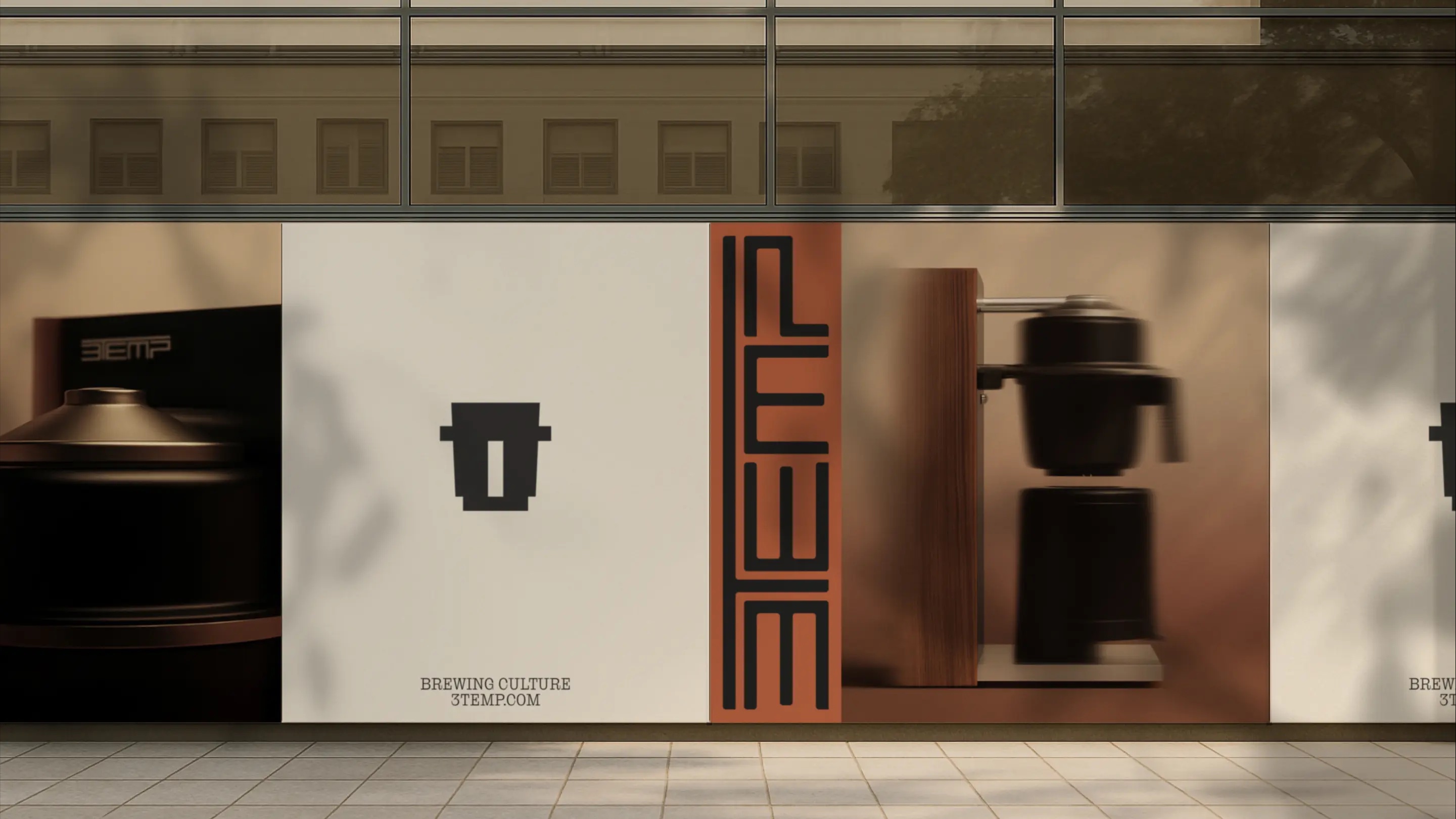
Studio NARI worked across the brand strategy and positioning, including developing the brand framework and garnering audience and cultural insights; going on to create new identity systems, art direction and visual language, verbal identity, packaging design, digital design, and brand design elements spanning 3TEMP’s physical environments and activations.
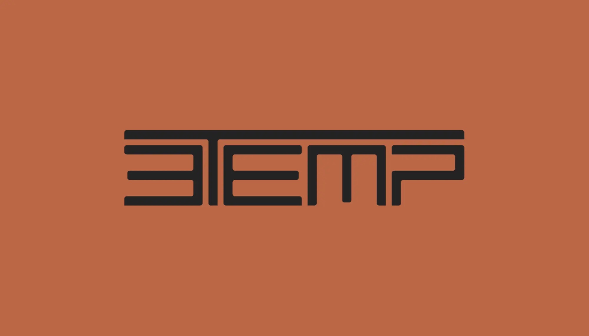
What it did not touch was the name, nor the wordmark. I initially hated the name, thanks not only to the confusion outlined in the intro to the piece, but because it also just seemed weird – sort of like a very dated vision of a sci-fi-ish future – and for the purely aesthetic reason that it’s just a bit ugly, with its jarring mixture of numeral and capitals.
The wordmark almost makes it work within the context of what 3TEMP is and does, however – not quite, but almost. Having scrolled way back through 3TEMP’s Instagram account, it seems that the wordmark isn’t new – it’s featured on posts dating back to at least 2020, and despite some digging around I’m unsure who’s behind its design.
Studio NARI had to work with that existing logo, however, as its senior designer Dom Vine outlines: “One of the main challenges was working with 3TEMP’s existing linear logotype,” he explains. “The task was building a full brand world around it that felt cohesive rather than layered on.”
Vine continues, “To do this, we leaned into the modular logic of the logo itself, allowing it to inform the wider system, from layout structures to typographic detailing. At the same time, we deliberately contrasted its technical precision with textural typographic choices, a rich colour palette and art direction grounded in real spaces and materials.”
Therein lies Studio NARI’s skill: the identity almost retrofits the wordmark and makes it look good within the rest of the brand world. It no longer feels jarring – it feels fitting within its context – modern rather than dated, slick rather than cartoonishly futuristic.
The brief centered on moving 3TEMP on from focusing solely on communicating its technical prowess and translating the now-proven capabilities of its machines into a more human, cultural space.
As such, Studio NARI says it “positioned 3TEMP around Brewing Culture, a belief that brewing is not just a technical process but a form of expression and identity.” It continues, “…the strategy reframed the product from a piece of equipment into a platform for choice, rhythm and creative control. This allowed 3TEMP to move beyond function and claim a role in shaping how coffee culture looks, feels and behaves.”
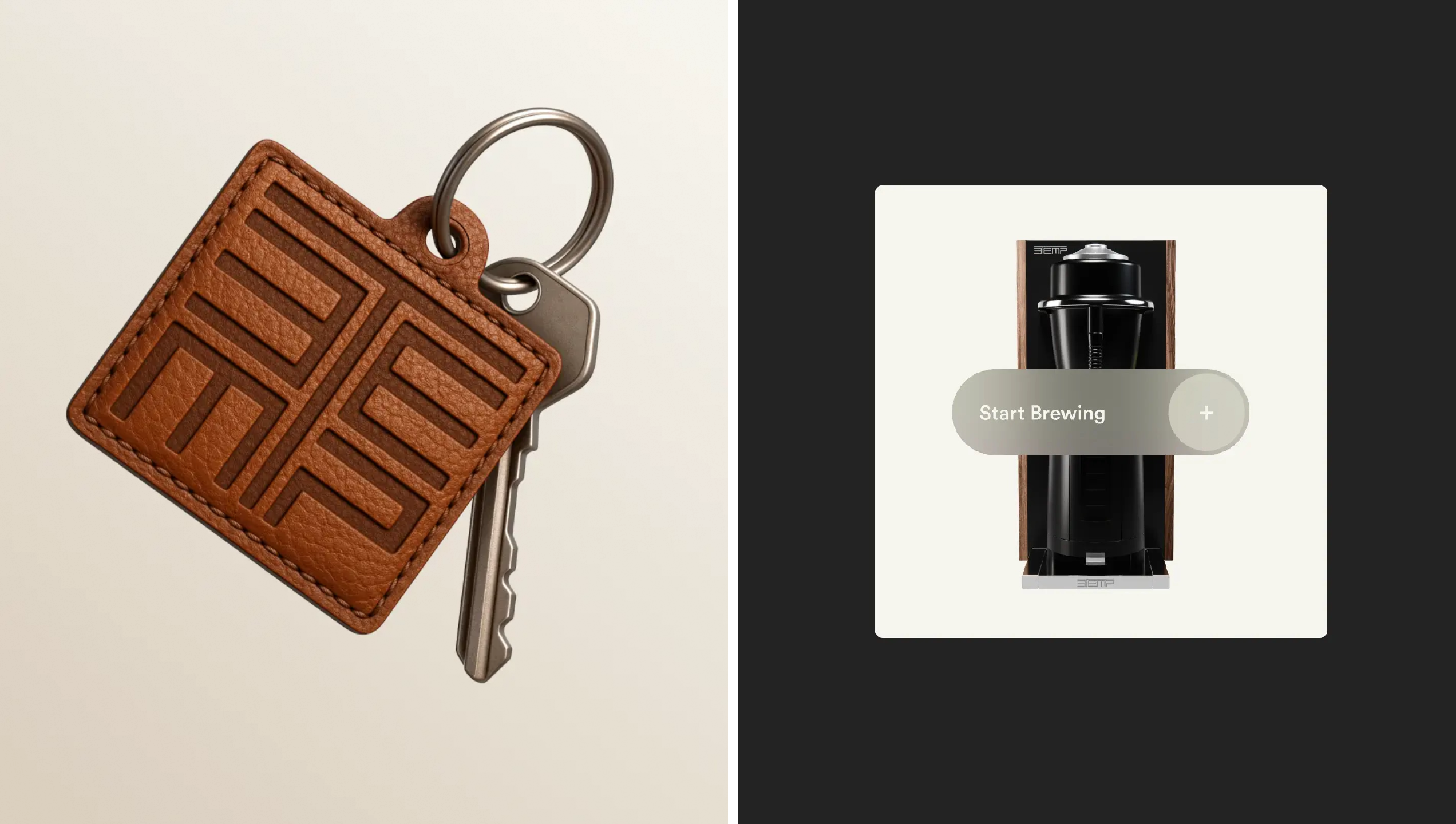
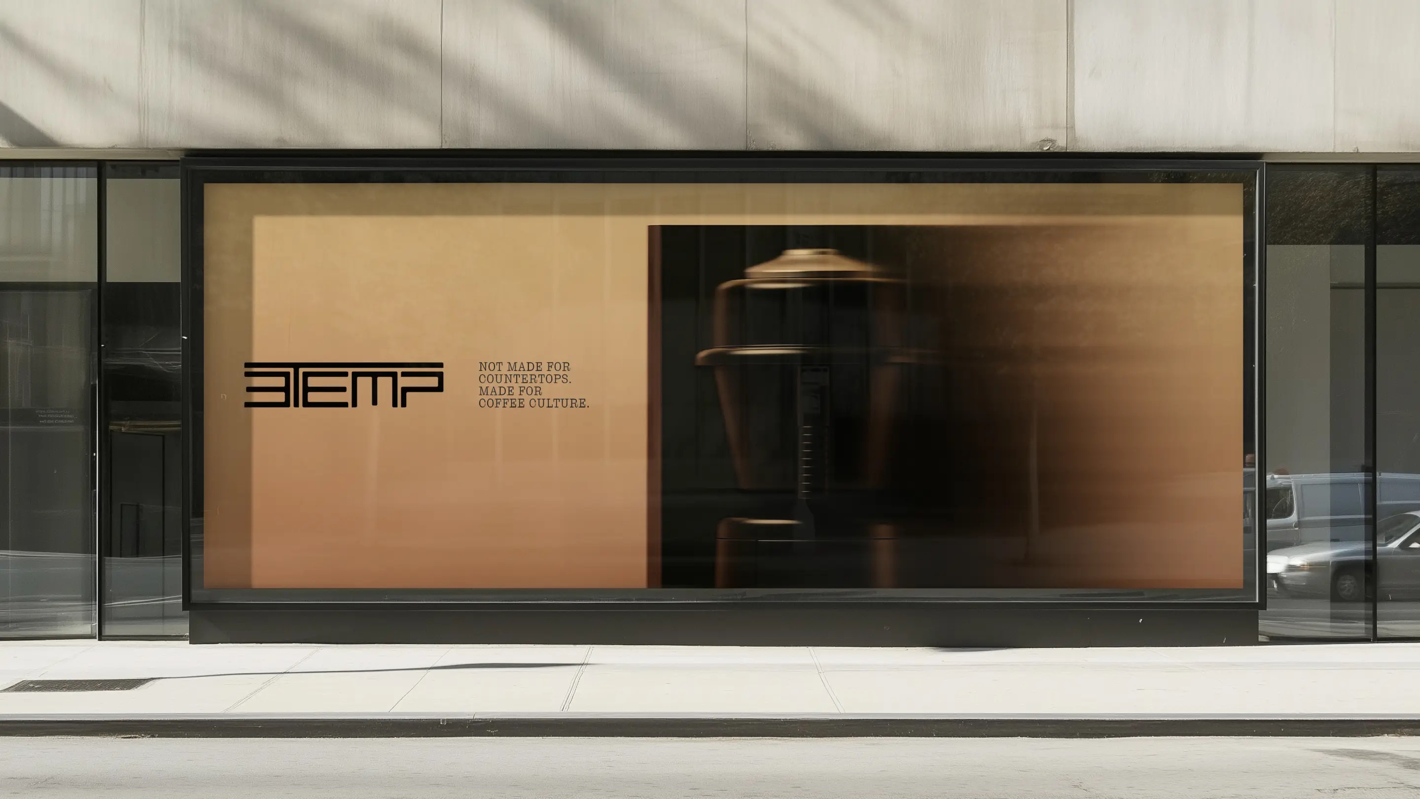
If the concept is about taking a genuinely innovative approach to branding for the category – i.e. focusing on the coffee itself, rather than the high tech functionality of the machine that makes it – then the masterstroke here is that technological functionality and mechanical prowess feel absolutely inherent rather than central.
The brand seems to be incredibly proud of its Swedish roots – indeed, its site copy goes unabashedly hard on how very Scandinavian it is, flag graphics and all. But again, NARI’s skill is in baking that into everything to the point of never needing to literally flag it or yell about it.
Studio NARI’s new identity design manages to succinctly communicate that mixture of slick Scandi professionalism, humanity and cultural nous impeccably, elevating 3TEMP through a deft stripping back of it all to unearth the ways in which the brand can connect with real people.
It’s worth noting here that 3TEMP’s machines aren’t for home use: they’re specialised for high-end, professional use, as reflected in their hefty price points (machines range from around £5,500–£8,300 depending on the model). The branding had to ensure, however, that 3TEMP was speaking as clearly to design-led independent coffee shops as it was to global hospitality groups. And again, that comes back to making it all feel a bit more human.
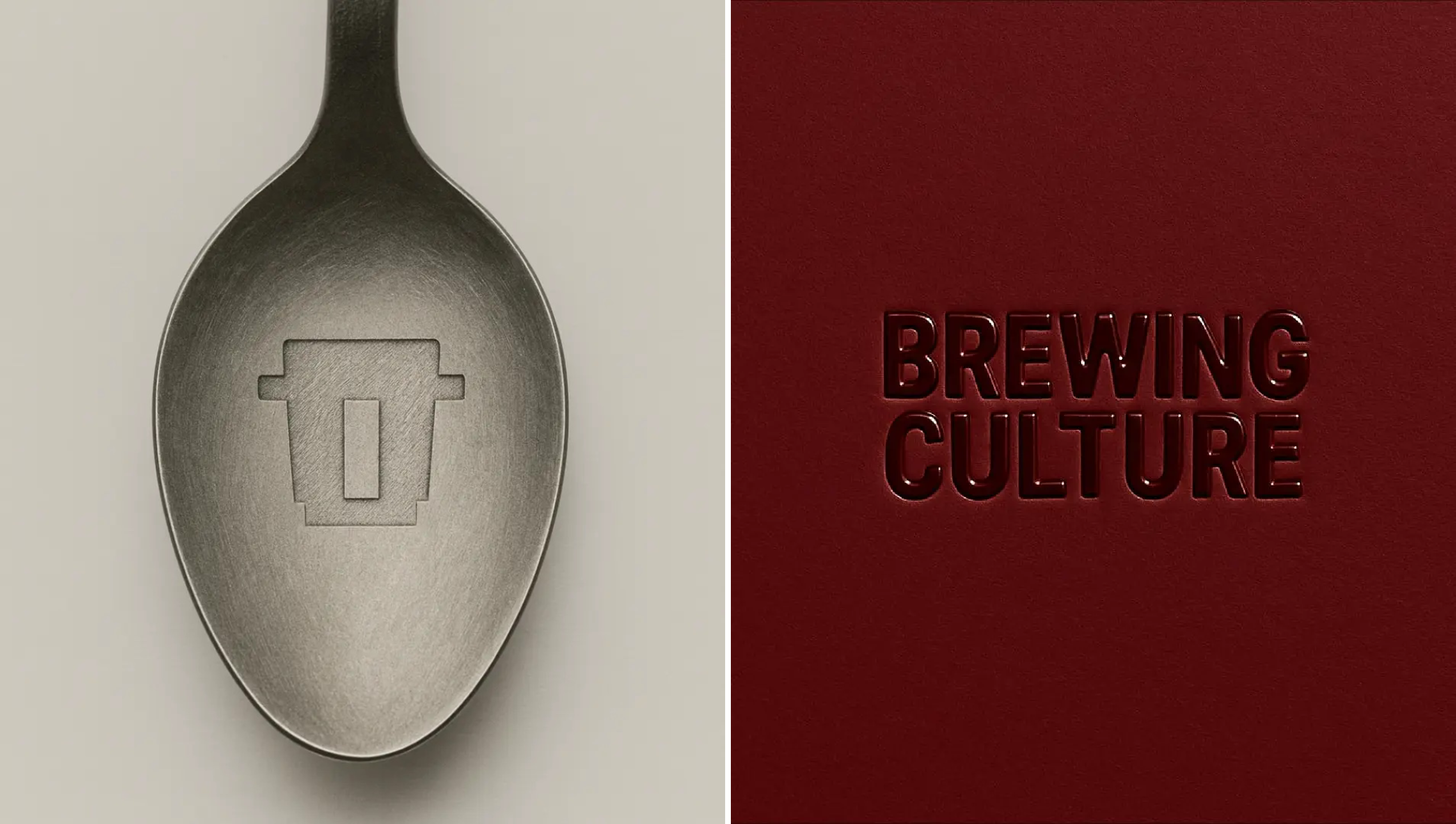
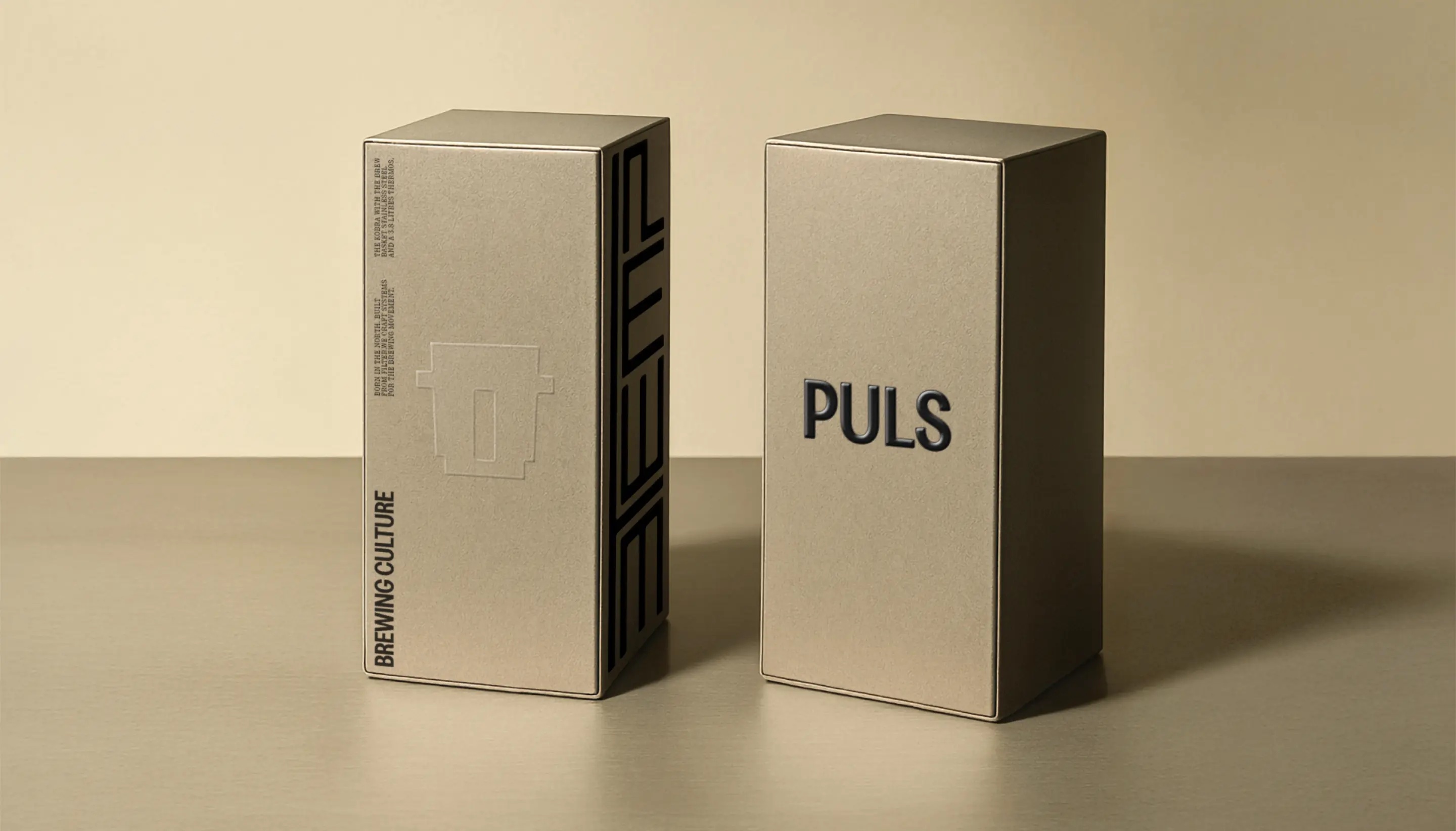
The most notable way in which Studio NARI has achieved that shift towards humanity is subtle but powerful – texture. Yes, the colour palette is all very nice, with its mutedly elegant mixture of browns, deep reds and orange, with a very occasional flash of minty turquoise.
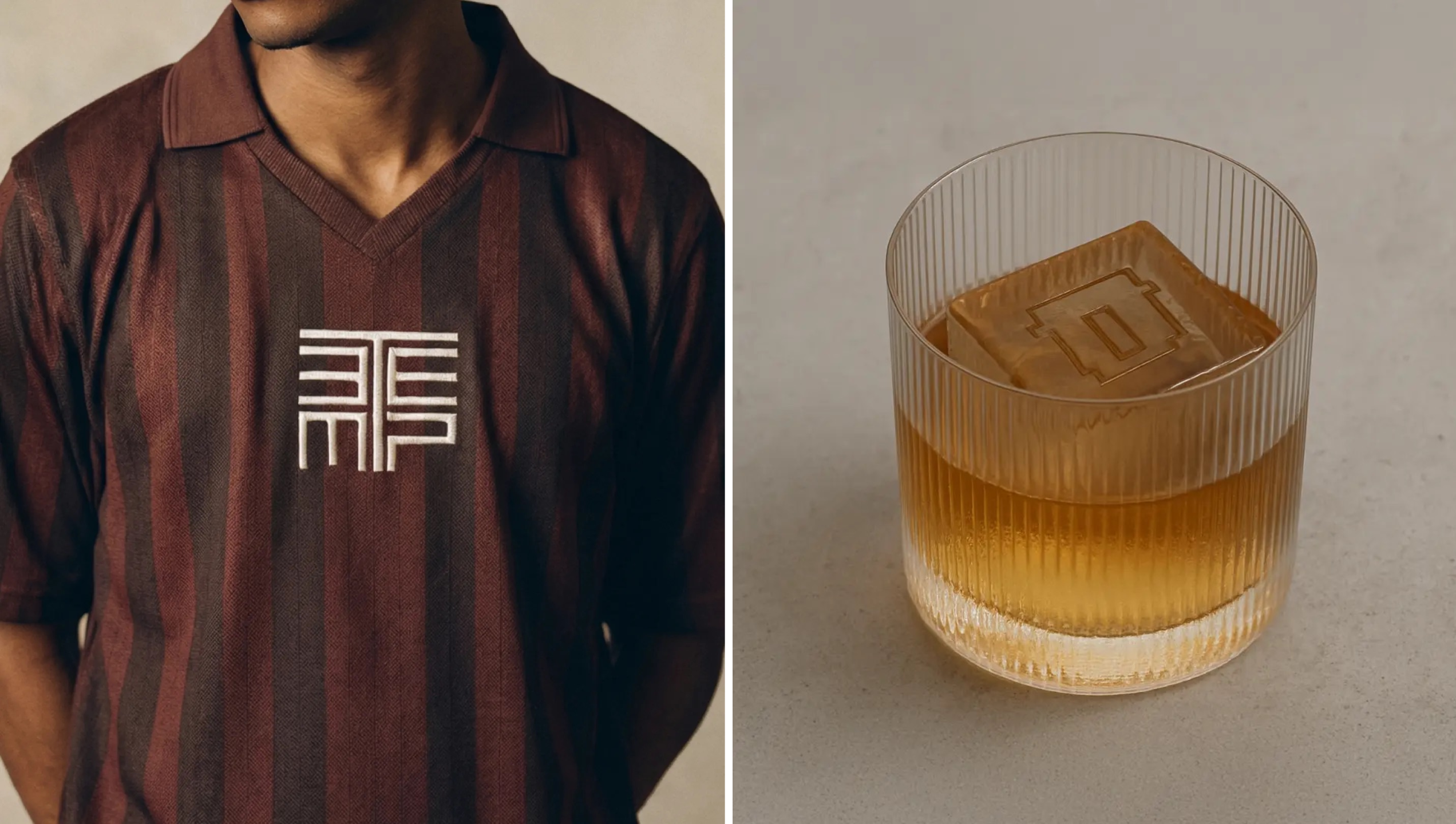
But it’s the details – the embossing, debossing, the superbly considered materiality that’s the masterstroke here, grounding 3TEMP firmly in real-world contexts by drawing from “editorial design, streetwear and industrial form,” as Studio NARI puts it. That expansive palette of influences has clearly been instrumental, but is never made too overt or obvious – and that’s a good thing.
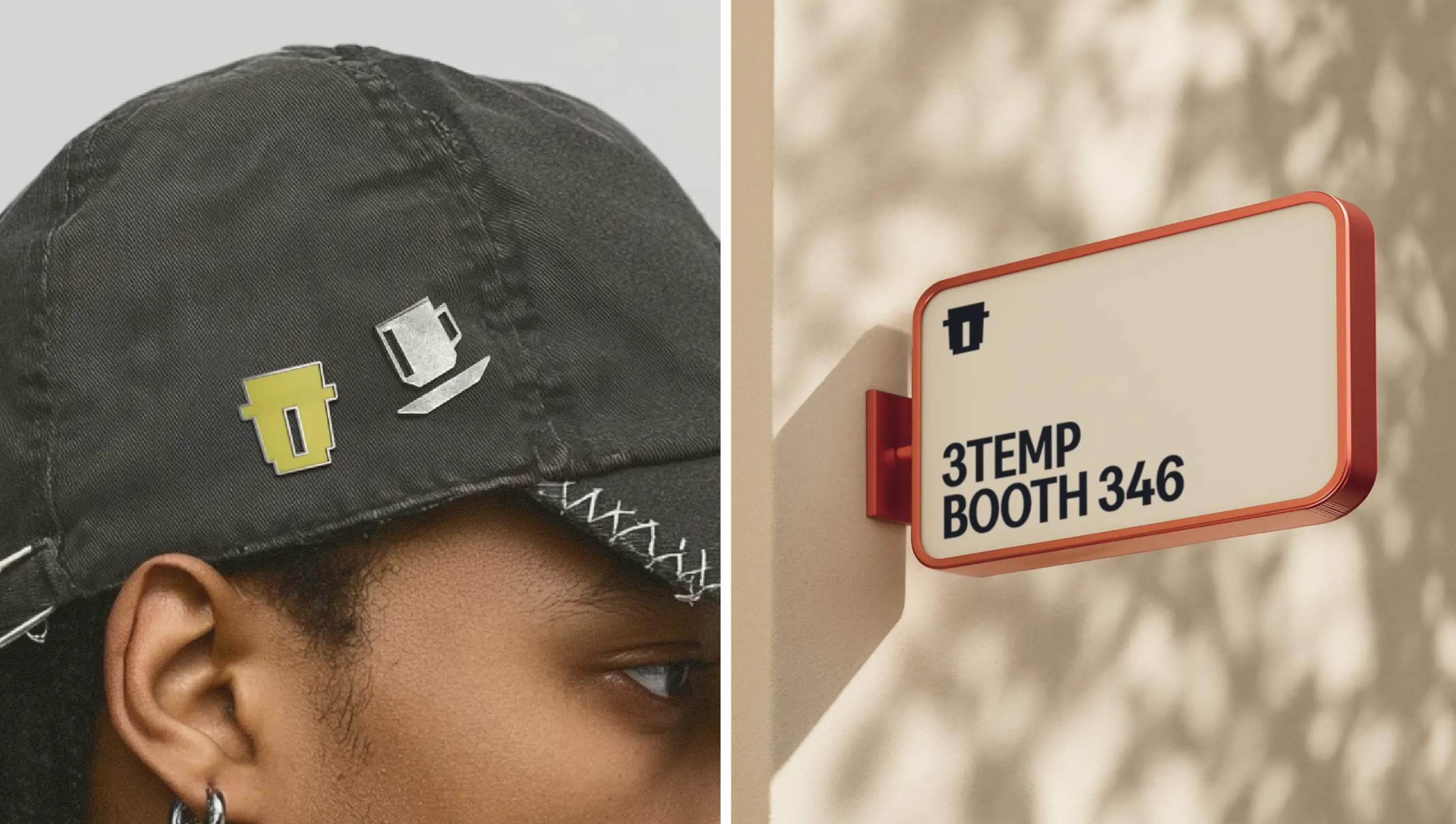
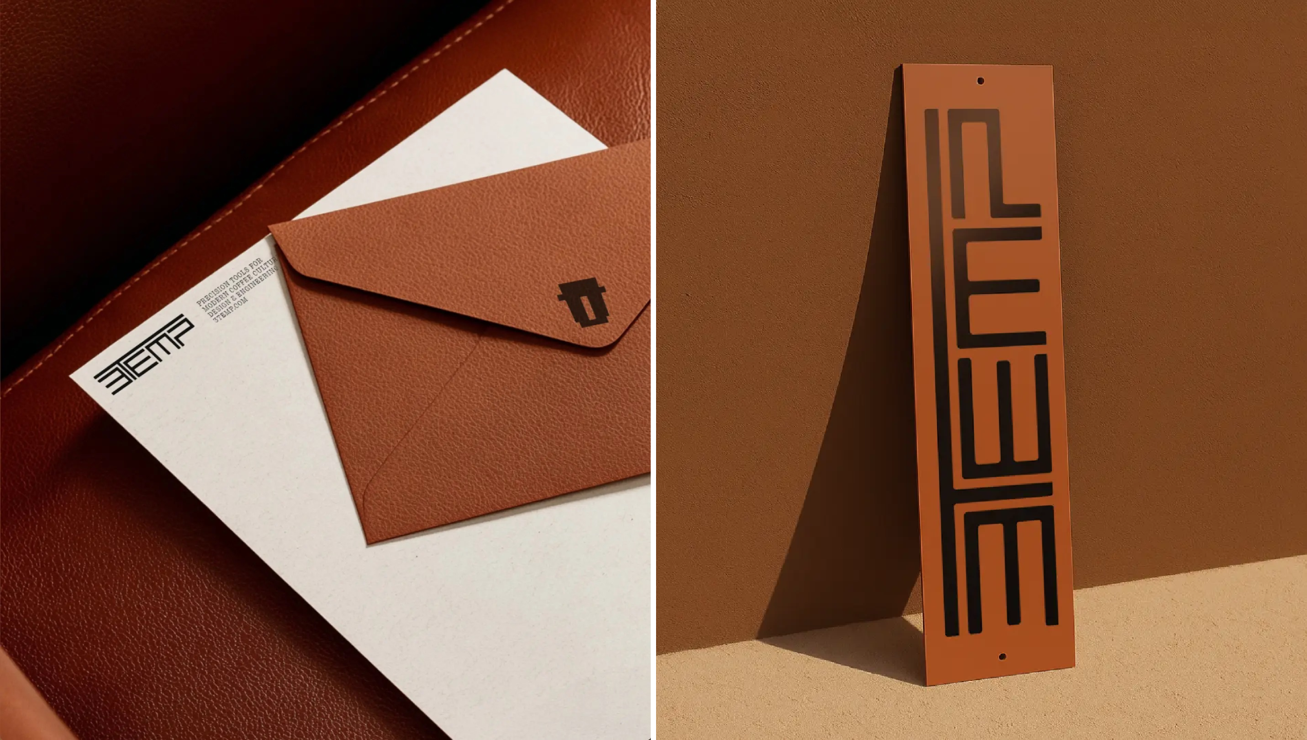
The understated but powerful use of tactility and the broader, non-sector-related influences that underpin both 3TEMP’s strategy and visual identity have ensured that elements such as the hyper-minimal icons, really come into their own and work seamlessly across a huge range of scales and touchpoints, from sleek packaging boxes to trade show materials to social posts.
There’s no doubt NARI has more than succeeded in answering the brief to make 3TEMP a part of real-world culture: icons become cute little pin badges on caps and other merch; they add a hint of cute to signage alongside the starker wordmark.
Despite the arguably pretty poor naming here, NARI has managed to make 3TEMP a brand that effortlessly conveys its high-tech functionality and professional capabilities – but crucially, to paraphrase a Kraftwerk album title, is as much about man as it is about machine.
