Gloopy, bubbly, occasionally borderline illegible
Opinion by Emily Gosling Posted 24 March 2026
It’s always confusing, surprising and slightly disappointing when you come across art or design-focused brands, agencies, platforms, publications or organisations that seem to have a total disregard for what they look like – as though their own central premise and raison d’etre is at odds with their look and feel. I won’t name names, because that feels both mean and unnecessary, but I have no doubt that if you’re reading this, a few examples will spring to mind.
One organisation that absolutely does not have this problem is LAB Institute of Design and Fine Arts, thanks to some excellent new brand design work by Bond (Norrin, Siuru, Veikkausliiga), which started out with its Helsinki office and now has teams across Dubai, New York, and San Francisco.
Known as LAB Muotoiluinstituutti in Finnish, LAB Institute of Design and Fine Arts is part of LAB University of Applied Sciences based in Lahti, and is the largest BA level design educator in Finland, offering a wide variety of programmes in the fields of design, fine arts and visual communication.
Bond worked across LAB Institute of Design and Fine Arts’ new brand strategy, storytelling, logo design and motion design, aiming to strengthen the institute’s position “in an increasingly competitive higher-education landscape”, says Bond, as well as looking to “clarify its role within the larger LAB organisation, and reignite its appeal among future designers, artists and creative professionals – both in Finland and internationally.”

What’s so powerful about the new branding is that it feels genuinely daring and different: many a higher education organisation would surely find that gloopy, bubbly, occasionally borderline illegible central wordmark far too out-there. But this is an art and design institution: if it’s teaching its students to take risks, and think differently, then that’s reflected succinctly in the visual identity that it puts out into the world.
According to Bond, the identity needed to embody LAB Institute of Design and Fine Arts’ “core philosophy: to reform, rethink, and reshape”. The agency continues, “The strategic shift was to move from describing education to defining transformation. Instead of presenting the Institute as a place to study design, we positioned it as a launchpad for a new kind of creative professional – individuals who actively reshape their field, their surroundings and themselves.”

This led the designers to arrive at a core idea to underpin the whole brand identity – brace yourselves for a hell of a lot of vowels (and consonants tbh) here – “Muotoillaanpa se toisin”. Apparently this carries a double meaning in Finnish: it means both “Let’s design it differently” and “Let’s reformulate that.”
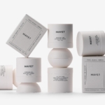
Both doing something differently and that premise of reformulation is abundantly evident in that gorgeous aforementioned wordmark and the logo device that accompanies it: both are squishy, mutable, and constantly shape-shifting – especially evident in the sublimely liquid-like animations and other motion formats, but also – and this is testament to Bond’s deftness with form and type – in static applications like posters; merch such as t-shirts, tote bags and baseball caps; stationery; and printed publications.
To support this flexibility, Bond created a bespoke dynamic typeface for the institute. As such, the typography alone is strong enough to carry the brand, “allowing the school to communicate powerfully using just a single word,” says the agency.
What’s especially smart in terms of form not just following function, but function actively and constantly dictating said forms, is the identity’s accompanying custom digital tool. This acts as an ongoing invitation to the very students studying design to shape the design of the institution where they’re studying it, allowing them to reshape any letter in the identity. As such, they’re actively engaging with the brand itself, not just passively using or observing it – they become a central part of not just their place of study, but its identity.
It feels like an obvious point, but this really makes the whole thing feel alive – that notion of higher education as being inherently about potential, and learning how to fulfil it, is made manifest. As Bond puts it, it’s a “living identity for a living discipline”.
This could all easily become rather unwieldy, but that possibility is neatly tempered by careful use of a very stripped back palette – black and white at its core, with splashes of bright green and primary school paintbox shades of blue and red.

Likewise, while the logo and wordmark are inherently malleable, there’s a rigorous system underpinning the whole thing. The foundational aspects of the branding – logo and wordmark – work super hard here, not just informing but becoming each and every other element. Patterns, framing devices and illustrative flourishes are all born from these central components through smart use of negative space and crops of various parts of the logo
This ensures that despite the fact the identity is ever-shape-shifting, barely ever repeated in the same form, there’s very much a distinctive and unified sensibility across absolutely every touchpoint and application.
“The identity had to embody reform – not merely state it,” says Bond – something it’s achieved beautifully here. The agency continues, sagely, “… reform does not mean chaos. And creativity does not reject structure.”