Pink! pink! everywhere!
Opinion by Emily Gosling Posted 2 April 2026
Wine company Nice started life in 2019, and ever since, has aimed to be a far more straightforward alternative to the wildly confusing, jargon-packed, somewhat stuffy world of wine.
In Nice’s words, the whole idea is to “liberate drinkers from wine headaches” both literal and metaphorical, “whether it’s inflexible packaging, confusing labels or next day regret”…
Now after more than six years in business, the Nice team brought in east London-based Earthling Studio (Jaffa, Top of the Mornin’ Coffee) to overhaul the brand design, working across everything from brand strategy and positioning to animation, art direction, a new wordmark and packaging designs, tone of voice and typography.

According to Earthling, the redesign looks to offer a “clearer, more confident take on a complex category, with a bold design system that works seamlessly across every touchpoint… simplifying choice while elevating the brand’s premium credentials”.
The studio continues, “The result is a brighter, more expressive identity that feels fresh, fearless and built for modern wine.”

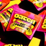
The new designs retain the former branding’s signature pink hue (more on which later, as Nice is a resolutely, unwaveringly ‘pink’ brand), but add a new claret shade alongside it, as well as a sunshiney yellow for the Sauvignon Blanc.
It would have been nuts to chuck out that pink: Nice is ALL about pink. It’s beautifully, unabashedly huns-that-bottomless-brunch-coded. And in keeping with that, it insists it’s actually pretty classy, thanks very much for asking, babe.

The colour palette is definitely bright – there’s absolutely no doubt this is going to stand out on the shelf – but Earthling has done a great job here of paring things right back so that it doesn’t go too maximal.
There’s nothing wrong with maximal of course – I ADORE maximal – but the whole vibe would feel at odds with Nice, both as a word and as a brand in terms of where it sits in the category, and the audience it seems to want to be communicating with.
To anchor the new brand platform, Earthling came up with the overarching idea ‘Wine in New Light’, which as both a writer and a bit of a grammar pedant, irks me a bit. I kept thinking it was a typo – surely it should be ‘wine in a new light’?
Apparently not, though, but I’m still struggling to get my head around how it makes sense: it still doesn’t really scan whether you use wine as a noun or a verb (which Nice as a brand so often does).
While I’m unconvinced on some of the copy itself in terms of its content, I am sold on the new approach to typography. I’m not sure exactly which typeface has been used for the wordmark, but I love the confident, chunky, all-caps letterforms – especially the quirky ‘C’, with its satisfying contrast of fat, rounded form and subtle cutouts beneath.
For supporting type, Earthling has opted to use Spirits by Chile-based foundry Latinotype for larger headline copy and Firelli by Vienna-based foundry Typejockeys for smaller, longer swathes of text.

While it’s a smart, slick brand, Nice is all so thoroughly Millennial coded, both for better (pink! pink! everywhere!) and for worse – namely ‘wine’ so often used as a verb in that hideous way ‘adult’ became ‘adulting’ (shudder).
It’s holibobs and picky bits and ‘treats’; it’s being a ‘girls’ girl’ and saying ‘rose all day’ and urns in the shape of pineapples studded with oversized diamante; it’s nice-top-and-jeans, All Bar One, Be At One, Lloyds’ over Wetherspoons.
Earthling’s new designs have retained that audience – it’s allowed Nice as a brand to grow up with Nice’s audience. While the branding is never tacky, nor ‘too much’, it never takes itself too seriously either. It’s still Mummy’s Wine o’clock’, tins on the train on the way there, tin in one hand shoes in the other on the way home.
And none of that is bad, unless you’re a total killjoy. It’s fun. It’s harmless. It is absolutely, never not nice. And that’s why it works so well here.