Free your mouth
Opinion by Emily Gosling Posted 7 April 2026
You don’t really hear the word ‘quip’ all that often – it feels somewhat antiquanted in a way, a little eccentric, somehow very English. The sort of thing gracing the cover of the sort of book someone bought as a gift for someone they don’t really know very well, nor particularly care about – maybe 101 of Oscar Wilde’s Wittiest Quips – the kind of thinnish volumes piled up near the all at Waterstones, baiting exasperated panic-buying Christmas Eve shoppers, a tome to be both given and received with a wan smile that wants to suggest that ‘it’s the thought that counts’, without bothering with any actual thought.
There’s that, quip’s more literal meaning, but looking at the word purely as an abstraction – a sum of its lettering parts devoid of semiotics – it looks almost space age, with its brevity and its ‘qu’, a more unusual duo in the English language.

It feels almost futuristic, but in the way that 70s sci-fi viewed what we mean by futuristic. And so when it comes to what sort of brands might borrow ‘quip’ as a moniker, for me at least, it feels like software perhaps, or some sort of high-tech device, like a knock off GoPro or a miniature Bluetooth-powered hoover, or something.
Toothcare is not the most obvious sector for a brand called quip, I would argue – that’s not to say it doesn’t work, but it’s not to say it absolutely does, either. Quip feels a bit jocular, jokey, almost smug – none of which are qualities I’d warrant most people want to associate with preventing tooth decay, and so on.

But a toothcare brand quip is: one founded in 2015 “in a Brooklyn dentist’s chair,” according to the brand. Its cofounders – with backgrounds in industrial design – found themselves looking for an “entry-level electronic toothbrush”, so set out to make one. But rather than focusing on product alone, they were also about creating better habits (“two minutes, twice a day”) and “addressing common mistakes” such as brushing too hard, too briefly, or using toothbrushes with worn bristles”.
While I’m still not sure on that name, there’s no doubt that usually, styled in all lowercase, there’s something enormously satisfying about the mirroring of the ‘q’ and ‘p’, with a neat little ‘ui’ snugly sandwiched in between. And that wordmark is thanks to Center (Swimclub, Ayoh!, Magic Spoon), which recently rebranded quip a decade since it first launched – or as the Brooklyn-based agency puts it, since it “redefined oral care with a single toothbrush’.

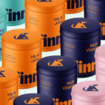
In the ten years since, Center says that quip had “grown into a full ecosystem of products, but its brand hadn’t kept pace”. As such, it was tasked with working across typography, colour palettes, packaging designs, and overarching tone of voice to create a newly “flexible, expressive identity system… to elevate it into a robust oral health brand”.
The wordmark and the vast majority of the rest of the brand’s type is set in a custom typeface called quip Sans, which Center created with foundry Burn Type, which like both Center and quip, is also based in Brooklyn. It’s a lovely font – so resolutely Bauhaus it almost, but crucially never does, veer into pastiche.

It feels a lot like a few things, but namely Herbert Bayer’s Universal Typeface designs from 1925, through which he proposed an all-lower case alphabet that’s both rounded and rational, friendly but resolutely geometric type, and thoroughly in line with principles central to Bauhaus and quip alike – functionality, visual clarity, and industrial efficiency.
Quip Sans also got a touch of Adrian Frutiger’s Univers about it, too – that very sensible neo-grotesque sans serif that’s beautifully form-following-function, no frills, so mid-century yet so timeless.
Something that works really beautifully here is the colour palette: it’s fresh, modern, a bit different, and definitely feels befitting of a youngish brand that’s looking to bring something new to a sector that so often defaults to a bland, purely scientific approach to marketing itself. I love the mixture of minty fresh greens, cute pale lilac purple, pink and more muted, earthy shades that look like stone, or pale moss.
A holding device the brand designers have dubbed a ‘pill’ appears in various sizes across the brand, acting as a frame – usually for the wordmark, but also online and on-pack to house other key words, such as to aid online navigation or indicate the specific product within the box. This works for sure: it’s neat, clear, and nods to the idea of a trustworthy, scientifically sound product, which is really exactly what you want from an electric toothbrush.

The verbal tone of voice is nice and crisp – not trying to be too cool (because really, how hip can a toothbrush really be, or need to be?) It’s simple, to the point, and does the job without overreaching or becoming a bit try-hard/embarrassing – a trap that many-a-brand falls into when trying to make something that’s really quite stoically functional into a more lifestylish thing.
Copylines include some nicely succinct, simple phrasing: “quick clean”, “fresh start”, “brush better” – which all do the heavy lifting to tell us what the brand actually is, where the name itself does not. Others go a little more out-there – “free your mouth,” for instance, which begs the response,“and your ass will follow”.