Nu-clear your skin
Opinion by Emily Gosling Posted 30 April 2026
Juana is a Dubai-based company creating CBD-based “bioactive” skincare, founded by Yann Moujawaz Martini, a French-born entrepreneur with Syrian roots and a background in brand strategy or – as he himself put it in an interview – “a decade designing multibillion-dollar wellness and medical tourism mega-projects for governments and Fortune 500s”, after which, he says, he “flipped the script” and decided to make Juana.
Why face cream and stuff? Well, apparently because it’s the sort of space in which he can merge his interest in scientific innovation, his personal medical heritage (he was raised in a family of surgeons) and his reverence for “ancestral wellness practices”, as well as something to do with olive groves a few generations back (this is brought up a lot, and it’s nigh-on impossible to understand why).
The role of Moujawaz’s own personal history in building the brand is reflected very directly: Juana is named after his mother, a figure who he’s claimed showed him that scientific and surgical rigour can work together with, rather than in opposition to, the world of all that’s botanical and organic.
Made Thought (G . F Smith, Feeld, The Center for Art and Advocacy), which has studios in London and New York, was brought in to create the visual identity and brand design for the brand, preparing it for a launch on the global stage. “Juana is a special combination: half product of family traditions, half symbol of skincare innovation… a unique fusion of ancient wisdom and scientific innovation,” says Made Thought.

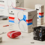
![]()
But it faced a few challenges: a big one being the fact that, as the studio puts it, “the CBD skincare market is oversaturated and loaded with false claims”. It continues, “How could Juana disrupt the noise?”
Turns out, by doing exactly the opposite – by going about things quietly. This branding is a real masterclass in dialling things back, and simultaneously taking risks when it comes to a category by, counter-intuitively, leaning on the very conventions most would shun as being tired or cliched. I’m specifically referring to the use of colour here: conventional brand wisdom would decry using greens and yellows for a CBD-based brand, but when it’s done well, and in a way that’s very slightly off-kilter as it is here, it works brilliantly.

It can’t be easy making a brand look both organic and genuinely, scientifically innovative, but Made Thought has pulled it off – and I think that has a lot to do with how it’s used that particularly luminescent, almost nuclear-waste shade of yellow/green (Hex #E4E928, for the real heads).
It’s a smart and brave move to keep the range of colours limited to just a few hues, all from the same close knit family of browns, greens and yellows; with some autumnal orange shades and reddish glimmers thrown in for the art direction. With the beauty category, less is more often than not more, and things are no different for Juana. All that connotes ‘classy’ now, it seems, is still resolutely minimalist
“Everything was built in service to Yann’s journey, shaping a brand of integrity in a world of hype,” according to Made Thought. The opposite of hype, after all, is calm – and if this brand is anything, it’s definitely calm when it needs to be.
And that screams confidence: Juana feels established, trusted and bedded-in despite its relative newness. The brevity of the name helps, too – nothing ridiculous, not too tricky to pronounce, not too many syllables – it both flies under the radar and smugly cuts through it without needing to flap about or do anything ridiculous.
![]()
At first glance the logo reminded me a lot of the symbol used by German experimental/noise band Einstürzende Neubauten. I now see that was a bit of a stretch, perhaps sort of seeing what I wanted to see. I then assumed that Juana’s symbol is maybe a sort of vague nod to, er, organic things, in that very 90s way that New Age stuff was probably a nod to something ancient and/or spiritual – possibly it’s some sort of DNA structure for hemp, or something.
However, according to Made Thought, the symbol – which only appears hidden inside packaging rather than as an outward-facing graphic device – is a “biological Neuron”. Why, I have no idea – after all, this is skin cream, I’m pretty confident that for all its benefits, Juana serum et al have little to no impact on us on a neurological level, on our actual nerve cells. Nae bother, eh, not everything has to make sense. Isolated, the mark not all that, but as part of the overarching holistic brand world, it fits, for sure. Plus, it’s always nice to have those little elements of surprise, only visible on opening a box.

One thing that really irks me about this project is the copywriting: it honestly feels like a somewhat nauseating mish-mash of a whole raft of meaningless but buzzy words put together into neat little phrases, lacking anything that might forge semantic sense-making or aid communication. “Power up your skin,” for instance. “Own your prime” (?!?) “Optimise”. Something to do with “inflammation”.
Then there’s the stuff that sounds like, but may not be, pseudoscience straight out of the L’Oreal/Boswellox handbook. I do get that even if this is actually rigorous science-based stuff, no one really wants to read peer-reviewed papers when buying facecream, but still – surely, SURELY, we’re all sick to death of wishy-washy, totally vague promises about things like “potent botanicals” and “targeted, deep-acting actives” by now?
So much of the stuff here copy-wise feels as though nabbed straight out of a hideous 17-second ‘motivational’ YouTube short, optimised for making us think something important is being said, but – got ya! – it’s just another meaningless piece of moving image content, to be reproduced in similar formats and forms, again and again, like a snake eating its own tail.
However, the visual identity work is undoubtedly very strong. I love the singular use of typography: just one font for the wordmark, headlines, and the rest of the copy. For this, Made Thought chose the rather quietly lovely Rules by Marseilles-based foundry Blaze Type. Rules is a great choice here: all Swiss Modern type tradition, pared back elegance and so on, but with some interesting little quirks here and there – I love the strange curves of the counter in the lowercase ‘a’, the unusually squared endings on the letterforms, the effortless adaptability offered by so many variables and weights. Rules is, as Blaze Type puts it, “a modern neo-grotesque font family with an edge”.
Crucially, it’s a font that feels formal enough to feel resolutely trustworthy – something that’s absolutely vital for a skincare brand, especially one like Juana which is both new, and at a slightly higher price point. But it doesn’t feel stuffy: it sits just as nicely on the carefully curated shelves of a shiny department store as those of a niche boutique-ish shoppy shop, catering for those in it for the CBD over the science.
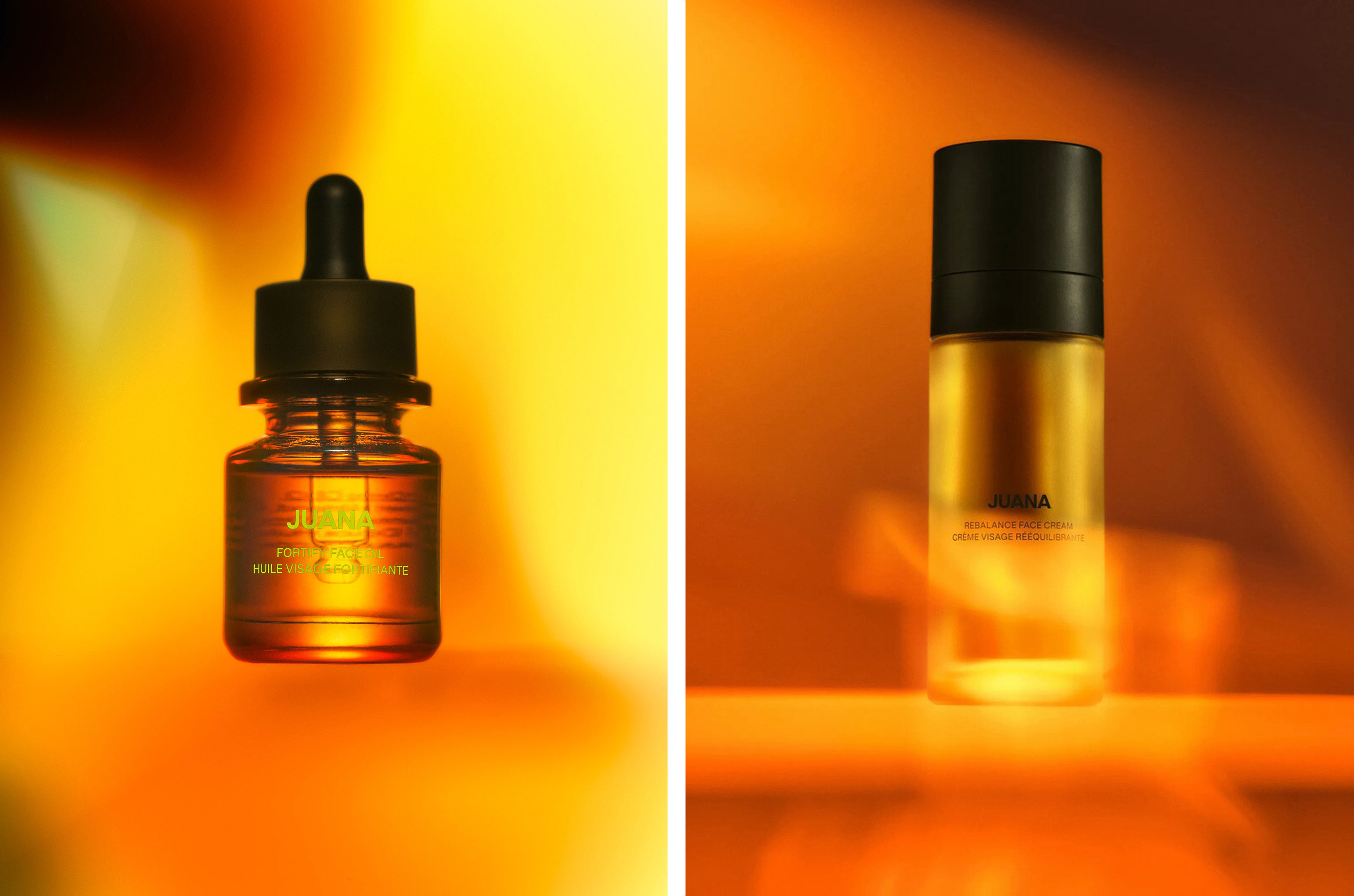
For all my previous grumbling, I love a lot of things here, but in particular, the art direction: it feels genuinely different, and looks truly beautiful – all weird misty vibes and strange gradients and fiery reds that really make it all come alive.
Some great, weird, somehow-out-of-place-but-somehow-really-working gifs here, too, which I imagine work super well on social; as well as the skilful product photography by London-based photographer Rowan Corr.
Since Made Thought’s brand design, Juana has launched across the world selling its range of products including a body butter costing just under a hundred quid, and a £90 “rejuvenate face cream”. While branding alone surely can’t justify these arguably snakeoilish price points, it might as well try – and this really is overall a really strong brand identity (once you get past “own your prime”, that is).