NoomaLooma by Cotton
Opinion by Emily Gosling Posted 14 May 2026
NoomaLooma is described as a “platform built around small moments of making”. As far as I can tell, it’s an app in its early stages (at the moment, it’s just for iPhone), and it’s launched with a brand identity created by New York studio Cotton (the design team behind the excellent identity for Eternal Research).
The platform was created by Refinery 29 co-founder Piera Gelardi and Lakshmi Narayanee, who has a background as a tech product exec, having spent more than ten years at Amazon.
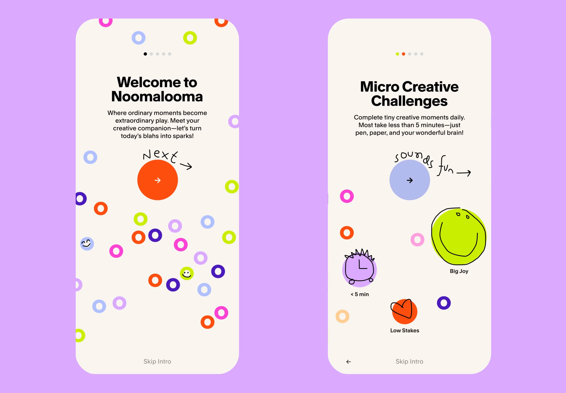
NoomaLooma sort of sits within the wellness space – a little like the raft of apps that tell you to breathe or meditate, etc. – but instead is centered on the idea of reigniting creativity in short, accessible bursts.
It gives users a prompt for a three-minute-long task, aiming to be a more fun, useful phone-based dopamine hit than doomscrolling or mindless consumption – be that of the mind-numbing, bafflingly banal relentless stream of content-for-the-sake-of-content, or good old-fashioned ‘buying stuff you don’t need’.

Cotton was brought in to create the brand identity and initial product language for NoomaLooma, and the look and feel is about as playful as you can get – those chunky, brightly coloured plastic alphabet fridge magnets spring to mind – and delights in flexibility. Everything is there to be fiddled with, it seems: the website boasts a very charming wordmark/logo which is honestly is a lot of fun to play with, while the patterning across the identity is almost entirely based on the ‘o’ letterforms so prevalent in the name NoomaLooma.
Personally, I’m not a fan of that name – don’t get me wrong, I don’t think everything should be po-faced and serious all the time, but for me this veers a tad too far into daft territory – it all feels a bit Dick and Dom in da Bungalow, and I’m not sure that’s really where something that could genuinely be quite useful, and is rooted in science that suggests so, should be sitting.

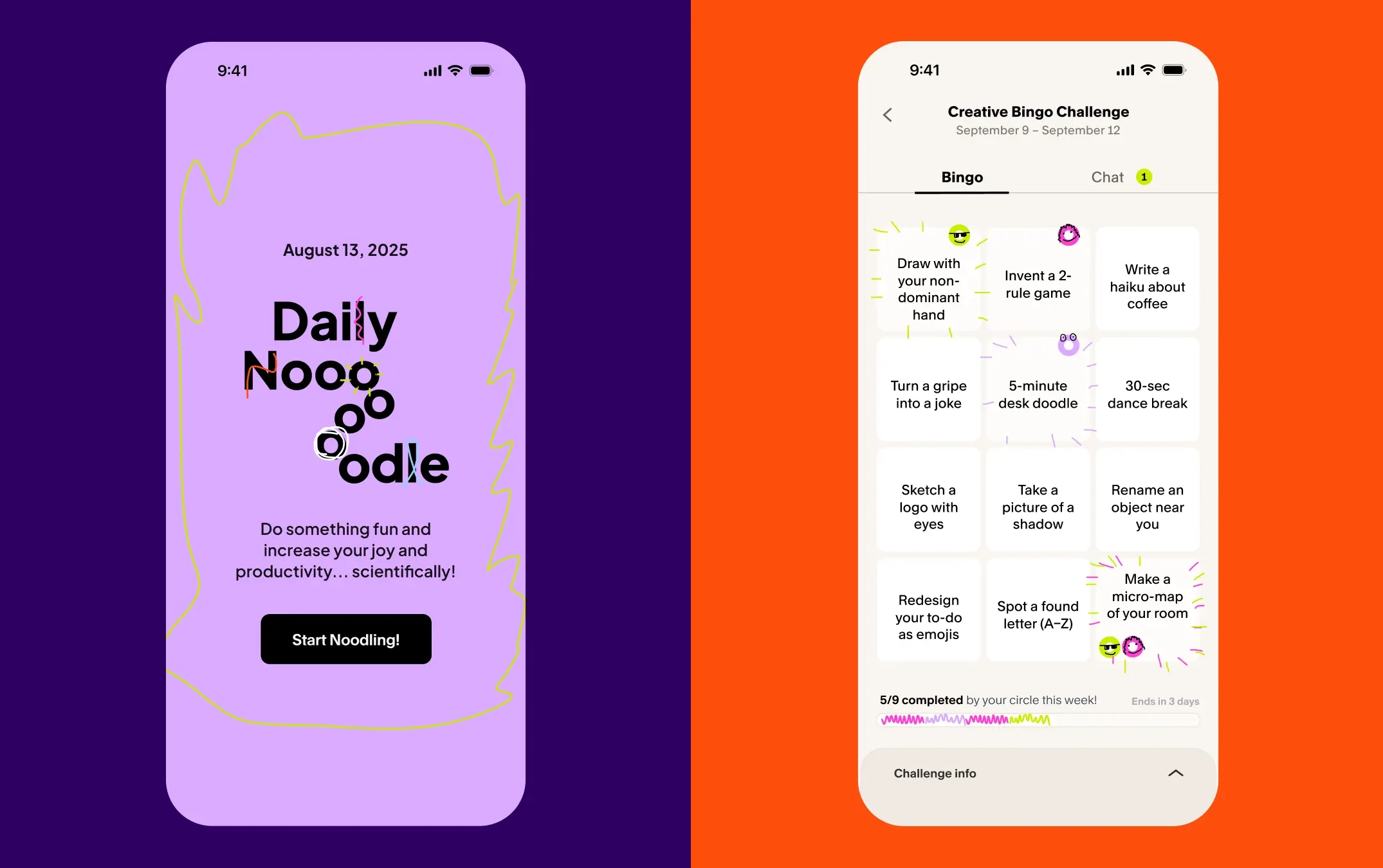
The whole design system is based around those generative “o” forms, as well as “malleable typography, loose scribbles, and tactile interactions that could move between brand and product,” as Cotton puts it. “The identity helped define the tone and flow of NoomaLooma’s first release: a low-stakes, high-joy creative experience built around short daily prompts designed to bring play back into everyday life.”
The use of colour is smart here: yes, there are a fair few breezy, bold hues, but everything is kept just about pared back enough as to create a coherent, ownable brand experience rather than just a hotchpotch of everything everywhere all at once.

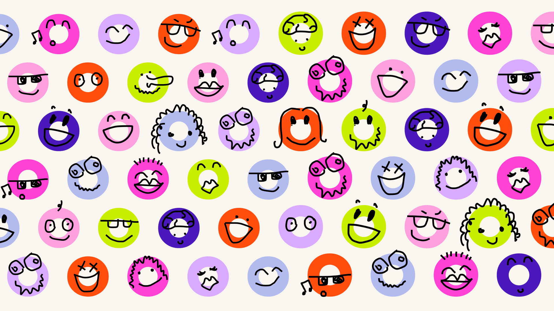
Indeed, there’s a lot to like: the palette, the wordmark, the inbuilt interaction which feels very natural and seamless rather than tacked on for the sake of it. I love how Cotton has done a hell of a lot with a little – the ‘o’ motif repeated throughout is very deft, and even extends into character design with the ‘Noomies’ (again, terrible naming IMO) – “playful avatars that the community builds through an exquisite-corpse-style builder,” as Cotton explains. “Users assemble characters from colours, eyes, noses, hair, and accessories – some whistling, some bow-wearing, all a little strange and joyful.”
The use of typography on the website is decent, but not remarkable: aside from the wordmark, Cotton has opted to use two fonts – a sans used across headlines and body copy in the form of League Spartan by The League of Moveable Type complemented by very sparse use of Google font Source Serif 4. This is livened up by a cute little modification: the dots on the ‘i’ forms online blink through the brand colours in a nice little moment of, as they say, ‘surprise and delight’.
The playfulness inherent to both product and design here is all well and good, but I do feel that sometimes it feels a touch too childish: it looks like a genuinely useful platform and tool, but it’s hard to take it seriously or really trust that it’s worth your time – even though it’s free – with so many ‘wellness’ tools out there making all sorts of promises (usually, ironically, a phone app all about stepping back from tech/screens) there isn’t a lot to make this one stand out above the others.
At first glance, I’d really thought this was something for kids – before I’d read about what the platform actually is, it seemed very much like some sort of primary school-age game, or maybe a sort of iPad type thing for children. That doesn’t seem like a good thing, but perhaps it is: if the whole idea is about making us boring old stuffy adults – with our bills and our dicey knees and our overwhelming existential ennui – actually be a bit more playful and fun and maybe even silly (only in three minute bursts though, of course), perhaps an infantile-leaning design is exactly what’s in order.