Koto breathes new life into Floridian arts institution The Norton
Opinion by Emily Gosling Posted 2 June 2026
The Norton Museum of Art began life in 1941 in West Palm Beach, Florida, and in the near-century since, its whole raison d’être has been based around its role as a place where “art and life meet as a part of everyday art”.
As such, it acts as more than a look-don’t-touch-style gallery space: the garden, gallery and restaurant are seen as a holistic entity, all of which to be enjoyed at the same time. Art not jus as life, then, but as an aspirational sort of lifestyle – less hushed white walls, more floaty dresses and lawns and palm trees and expensive-looking faces (or ‘Florida’, for short).
As well as housing a permanent collection, The Norton also features rotating exhibitions, performances, events such as its Art After Dark series, and education programmes.
![]()
This year, Koto (Uniqode, Yazio, Marblex) was brought in to help the museum connect with new audiences and become more prominent in terms of its national presence through the creation of new branding that could encapsulate all the Norton wants to do and does, demonstrate its heritage and history, and which can grow with its needs into the future.
The brand strategy underpinning the entirety of the new identity is simple and works really well here in summing everything The Norton is about in succinct, accessible terms: ‘Where Art Meets Life’.
The new voice across both visual and verbal touchpoints is, again, all about that idea of a space that’s more about being welcoming than being exclusive or too ‘art world’; shaped by what Koto found during the discovery phase of the project, during which they did things like take guided tours, which revealed that guides prioritised personal and more human interpretations of art over cold, hard art-historical facts and figures.

![]()
However, where Koto has been really skilful here is not veering too far into the ‘attracting new audiences, touchy feely, don’t worry too much about boring old facts stuff’: this identity, like The Norton itself, takes itself seriously – as it should, after all, this being an art gallery at its core, showing some pretty hefty and important pieces.
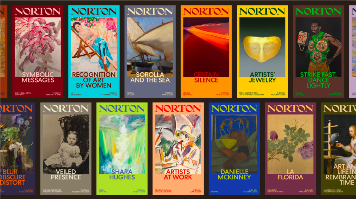
That sense of prestige, tradition, and a storied (but never stuffy) history is reflected beautifully in the new wordmark. It not only looks nice, but also reinforces the idea of The Norton’s heritage, having been drawn directly from the museum’s archive. Koto then refined the lettering into a strong, bold, but suitably sophisticated mark which works really well as part of the newly robust, more contemporary brand identity.
Aside from the wordmark, the identity uses Centra no. 2 by Sharp Type, a modernist geometric sans chosen, according to Koto, for the way its clean look and “welcoming” circular forms echo The Norton Museum of Art’s architecture – namely that of its 2019 expansion designed by Foster + Partners. 2019 expansion.

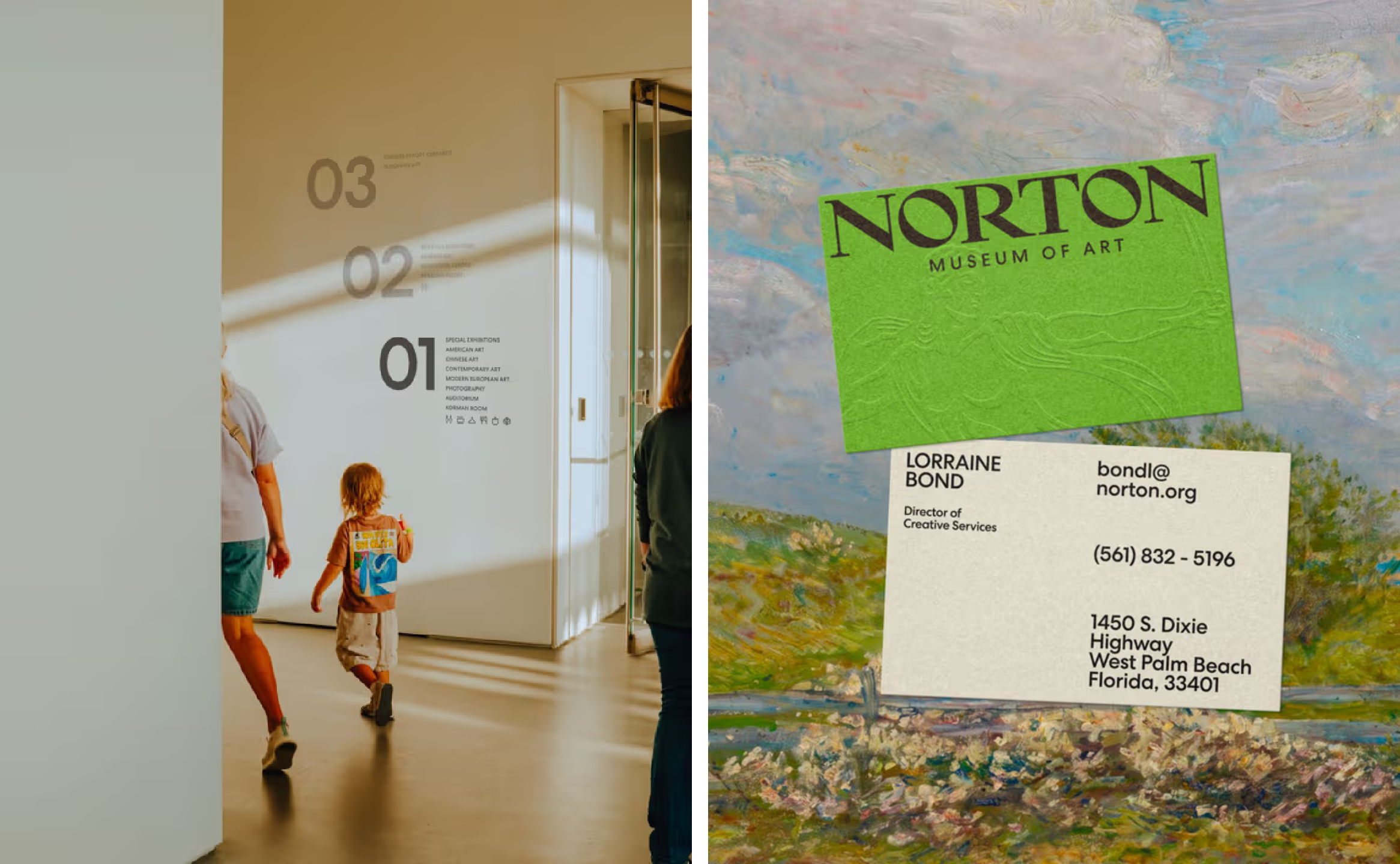
The revived wordmark is joined by another archival element in the form of the Diana Seal, adapted from the museum’s 50th anniversary mark and rooted in Paul Manship’s Diana sculpture, originally commissioned by founder Ralph Norton in 1941. Wisely, Koto has resisted the temptation to overuse it – the seal appears sparingly, giving it more levity and a greater sense of significance, and specialness.
The wider visual system introduces a graphic slash motif that acts as a literal expression of intersection: the point where art meets life again, the whole ethos behind the identity design in the first place. It’s a simple device, but an effective one.
Colour is perhaps the aspect of the branding that does the most heavy lifting when it comes to creating a sense of openness, modernity and vitality. The palette draws from both the museum’s collection and its Florida surroundings, pairing bright yellows, sky blues and oranges with deeper tones such as a very Yves Klein-ish blue (my absolute favourite colour in the world), olive green and black.
The extended secondary colour system is especially lovely, taking its tones directly from artworks and exhibitions, and in doing so, enabling the identity to shift and evolve over time while remaining connected to the art itself.
There’s a real emphasis here on the idea of how, as people, we experience art – rather than solely focusing on, or showcasing, the art itself. This is made very clear in the art direction, which shows people’s emotional reactions to art, their gestures and encounters, moments in the garden as well as in front of paintings.
This focus on experience extends into the verbal identity, which takes its cues directly from the museum’s curators and ‘docents’, or the knowledgeable volunteers you often find in such spaces. Warm, knowledgeable and conversational, the tone of voice reflects the way people already speak about art within the institution itself, according to Koto, with a friendly tone but one that still maintains a sense of authority and expertise.
What’s particularly successful about this project is that it never feels as though Koto has imposed a concept onto the institution. The Norton’s new identity succeeds because it recognises that museums today need to be many things at once – they aren’t just places that hold objects and artworks to be admired from a distance, but social spaces, educational resources, and cultural destinations. By embracing those dualities rather than trying to resolve them, Koto has created a system that feels appropriately expansive, alive and genuinely reflective of The Norton itself.