Base’s brand for smalltown ’80s seafood spot Ray’s is a masterclass in earnestness done well
Opinion by Emily Gosling Posted 18 June 2026
It’s always a joy to see an international design agency lavish the same respect, care, and craft on a relatively unknown, thoroughly local, but much-beloved brand as they would on, say, a household name product or world-renowned institution. And that’s exactly what Base Design (Kanal, 4P’s, The Huntington) – which has outposts in New York, Brussels, Melbourne, Geneva, and Saigon – has done here for Ray’s Waterfront, a family-run restaurant in Seward, Alaska with a population of just 2,735.
Everything here is just so carefully, lovingly done – and that shines through in every touchpoint. Even for those with zero connection to – or even interest in – small-town Alaska or seafood, let alone Ray’s specifically, this whole thing just radiates joy. You can’t help but smile when you see this brand identity, and learn about the eatery through what it communicates.
Base worked across Ray’s Waterfront’s new brand strategy and identity; digital and motion design; copywriting; signage; uniform and merch design. And while that’s a fairly hefty and all-encompassing overhaul, no babies have been thrown out with any bathwater (seawater?) whatsoever.
The restaurant started life in 1988, and this new look and feel doesn’t deny that: instead, it celebrates it, and builds upon that heritage and the legacy that’s been forged in the near-four decades since Ray’s first opened its doors.
Founded by Ray Simutis (a former taxi driver and stockbroker from New York) and his wife Leslie Simutis (a Seattle native with a background in scientific illustration), Ray’s is now Seward’s oldest family-owned restaurant. The pair ended up in Alaska having met there while working in a fishery one summer, both having been seeking a respite from their usual rather different day-to-day lives by escaping into nature and a little adventure along the way.
Both had vague aspirations around fish, however, and more specifically, eating fish: Ray went on to become a commercial fisherman, while Leslie honed her culinary skills at the Culinary Institute of America, having long dreamed of one day owning a restaurant.
Today, Ray’s is run by the couple’s daughters, Anna and Janina, and it continues the Simutis family’s legacy of serving fresh, locally sourced seafood with house-made sauces.

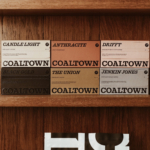
The branding elements largely draw on the physical site itself: the wordmark, with all its curves and flourishes and unabashed earnestness, is pure wholesome charisma; while the colourways, kept super simple as various shades of red, white and cream, manage to do as much as any complex selection of primary and secondary brand colours ever could.
It’s simple, but it’s absolutely not minimal: Ray’s Waterfront’s identity is absolutely packed with personality. And there are so many cute, subtle little bits of what can only be described as – and this is cheesy as hell, but applicable – surprise and delight.
I love the way the motion version of the wordmark takes the form of swirling rope, for instance, an absolutely unsubtle but undeniably effective way of anchoring Ray’s right back in the sea (pardon the pun, which wasn’t entirely deliberate, promise).
And just as the acts of fishing, and of eating seafood, are thoroughly physical pursuits, the identity is strongest when it leans on physicality: the print design is superb, as are the more tactile touchpoints like the gorgeous little branded matchbook.
The postcards are a really lovely touch, too – again, rooting Ray’s firmly into not only its place on the coast, but its place in people’s hearts as being all about holiday vibes, relaxing, ‘wish you were here’ type stuff. It’s old-school, but without being old-fashioned; utterly earnest, but somehow never insufferable or twee. You’d have to be a misanthropic person indeed to not see the joy in this identity.

The only aspect of this project I’m not 100% sold on is the website: where the choice of brand font – Caslon’s Egyptian by Boston-based foundry Font Bureau (which is now under the Monotype umbrella) – works great on things like menu design, online it can look a smidge cheap. But this isn’t a brand that lives online: it thrives in the salty, messy real world where it belongs.
The whole look and feel is everything a decent seaside outing should be: a little rough around the edges; an unselfconscious, happy-accidental eschewal of all the trappings of modernity; a sense of rugged earnestness that can’t be faked.
Everyone harps on about ‘authenticity’ – sometimes to the point where insisting on how ‘authentic’ something is only serves to prove the exact opposite – but this really is it. Base, then, has done an excellent job of truly uncovering what Ray’s is all about, its history, its place in the here and now and into the future, and moulding that into a brilliantly thoughtful piece of brand design that does all that justice. It prods and polishes everything that was already there, and makes it work – hard.
Often, this is a literal uncovering of Ray’s existing design and its history: as well as centering the brand on the old window sign, Base looked to Ray’s actual architecture, and its blending of “maritime references, harbourside diner charm and small-town Alaskan pragmatism”.
Everything is true to Ray’s, and to historical design tropes: the new sign was inspired by the founders’ 1980s family photos, which show the original red neon lettering. To recreate said letterforms, Base worked with Tim Zamberlin of National Sign Corp (“Seattle’s oldest and most trusted sign maker,” apparently) for a new sign on the restaurant’s façade – one which both mirrors and signals the welcoming vibe inside that Ray’s has become known for over the decades.
This translates not just across the brand touchpoints on the exterior of the building, within the space, and on printed pieces such as menus and stationery, but less obvious elements that communicate those abstract sensibilities around that particular small-town marriage of hospitality and no-nonsense practicality. The gorgeous illustrations by Jake Foreman do a lot of that communicating, going far beyond the decorative and into the realm of vital, ownable brand assets that are as flexible as they are ruggedly cute.
The photography and its art direction are equally evocative: Base Design made a shrewd decision here in commissioning the very skilled hands and lens of Jack Bool, who has created a truly beautiful suite of brand imagery.
The photographs feel more like those shot by a curious documentarian than someone brought in to capture a brand, or to sell something – they’re not just lifestyle imagery, they seem truly invested in capturing a place, the passage of time and space within that place, and the people who make it what it is.
Yes, you could argue it’s pastichey as hell at times – but honestly who cares when it looks this lovely and feels so genuinely warm and fuzzy? This identity is so strong that even from so far away, behind the glow of a computer screen, you can basically smell the sea; taste the cold beer; hear the hearty slap of a thigh that provides the percussion for the hearty, rumbling chuckle of a restaurant regular.
And I say this as a person who’s never eaten seafood, nor fish that resembles fish – the closest I’ve ever got to such things is eating fishfingers, and the occasional fishcake, and that was well over two decades ago. But still, I love this, and feel a weird fondness for something that in reality, I’m not very fond of at all.