How & How takes a smart, bright collage-based approach to overhauling Bristol Dockyards
Opinion by Emily Gosling Posted 23 June 2026
 For those outside of Bristol, it’s all too easy to assume that the city is merely a place where Triphop and Dubstep were born; a Mecca for trustafarian types on a perennial ‘gap yahhh’ wearing those trousers that make people look as if they’ve had some sort of toilet issue; a place where the streets are paved with ketamine and all too many people have eschewed having a personality in favour of having a polycule.
But there’s so much more to it than that: there’s Turbo Island – hands down my favourite illustration-led niche music-centric design brand, and an actual, physical, fascinating place.
But Turbo Island and trousers and toffs talking about their time in Thailand aside, Bristol is rich in culture – and rich in history.
Take Bristol Dockyards, for instance: a cultural destination that until very recently was undoubtedly best known as the home of the SS Great Britain. Launched in 1843, the SS Great Britain was the world’s first ocean-going, iron-hulled, screw-propelled ship, designed by Isambard Kingdom Brunel and built in Bristol’s Great Western Dockyard.
 Over the following century and a half she served as an ocean liner, troopship, and cargo vessel, spent decades beached in the Falkland Islands as a coal hulk, and was eventually salvaged and returned to Bristol in 1970 – to the very dry dock in which she was built.
Now, however, Bristol Dockyards is looking to expand its cultural reach and what it’s known for – it’s more than just SSGB, after all – and also encompasses the Being Brunel Museum and the Brunel Institute’s maritime archive. 
![]()
 Bristol and London-based creative agency How&How (Yum Bun, Big Cartel, Chester Zoo) was brought in to sort out that somewhat confusing brand architecture, and to help the site’s struggles with things like falling ticket sales, ageing audiences, and the fact that visitors weren’t connecting the three experiences into a coherent reason to make the trip down the quayside.
How&How was tasked with arguably more than what would be suggested by a mere ‘rebrand’: the agency was in charge of the site’s new naming; brand narrative and architecture; visual and verbal identity; animation; and website design and build.
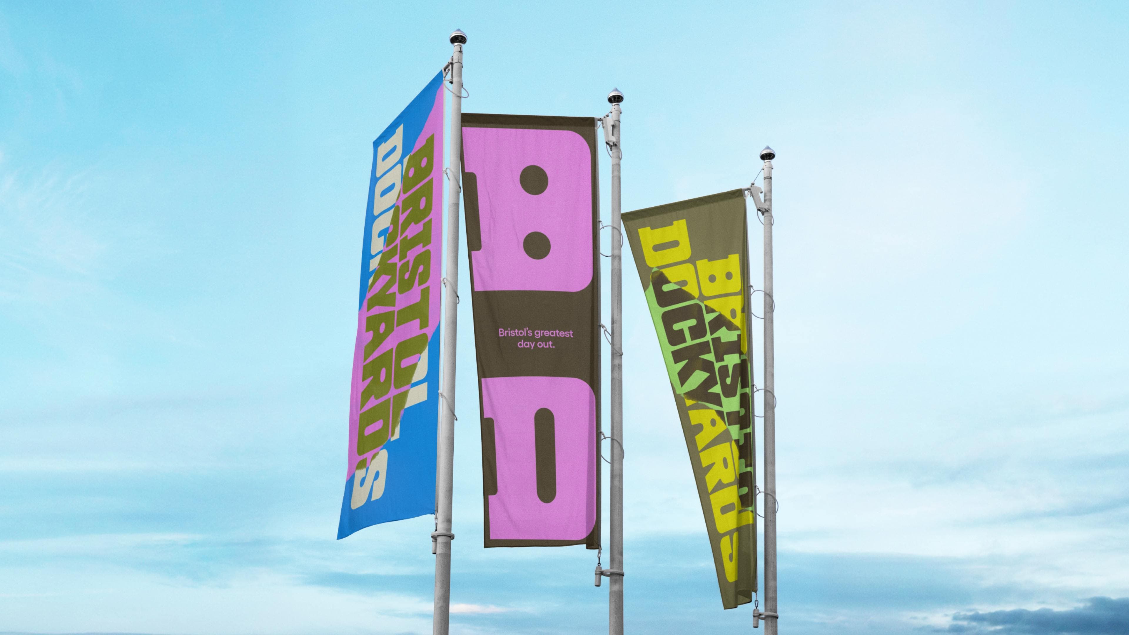
Perhaps the most obvious overhaul here is structural: a new overarching identity under the name Bristol Dockyards now sits above the gates, broad enough to frame a full destination rather than a single attraction.
Beneath it, the Being Brunel Museum, the Brunel Institute, and the SS Great Britain each operate as distinct sub-brands with room to articulate their own offer independently.
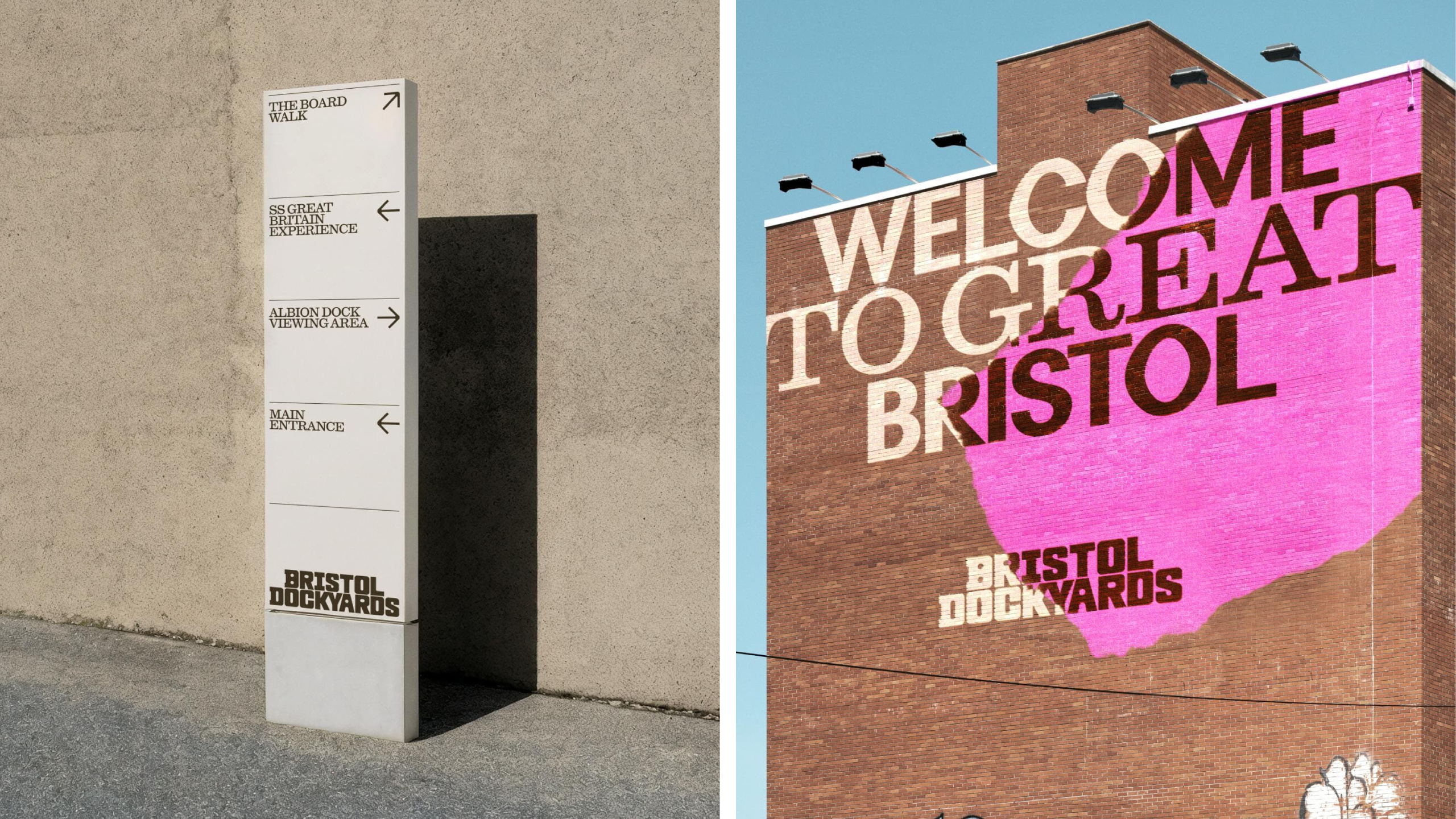
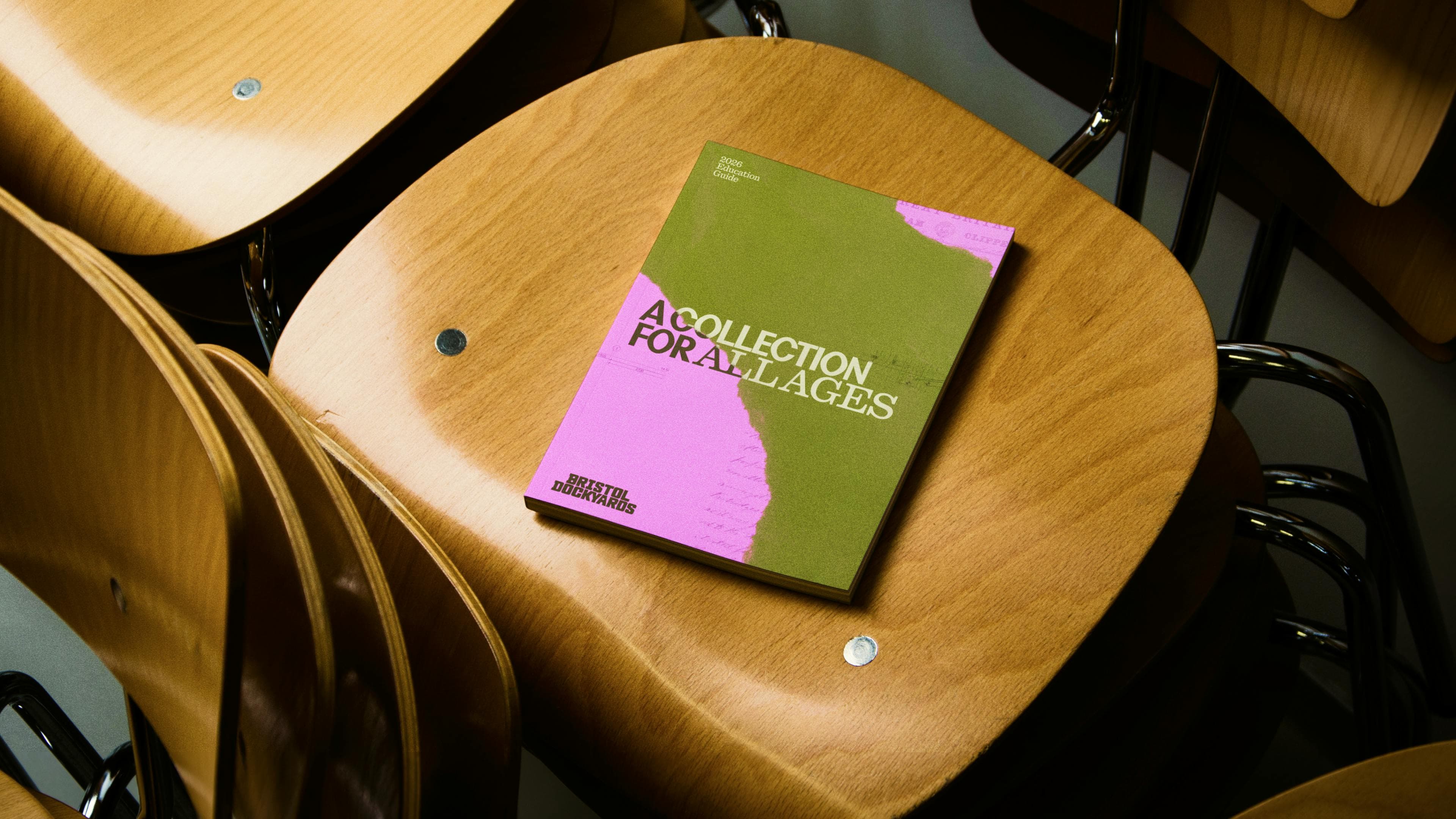
The visual system is built around a really smart collage approach that pulls together archival photography, typographic fragments, surface textures, and objects from the Dockyard itself into layered compositions.
It’s very clever in just how flexible the system is: it can be super obvious when it needs to be, telling as much as showing; and more pared back and decorative when communication is less pressing, or dealt with by other aspects of the identity.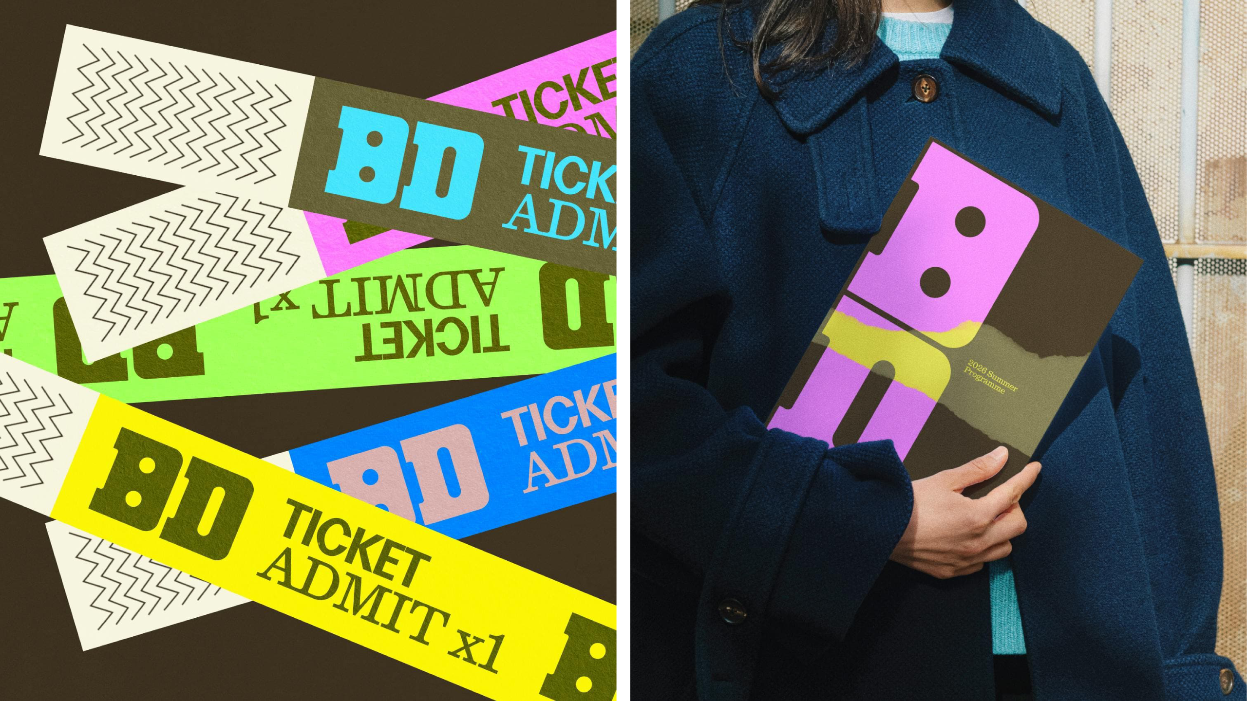
What’s also lovely about opting for collage is the sublime sense of tactility the whole thing so effortless conveys: after all, this is a living, breathing piece of history where physicality is absolutely central to every narrative – it makes sense for all that to be reflected visually in the brand identity, too.
Where How&How shows its dexterity is in using collage – an inherently busy, potentially messy format, if ever there was one – but making everything so clear and legible.
Given the site’s position on the harbourside, visible across the water from much of the city centre, the system also needed to hold up at a significant distance, which it does beautifully – while also looking great on small printed touchpoints, merch and online, too.
![]() The main brand typeface is similarly heavy on the tactility – just about striking the balance between tradition and modernity. Here, How&How opted to use a gorgeously stocky, playful display font, with countless elements that are so offkilter that it all feels very playful: some counters are huge, others tiny; serifs vary wildy, the whole thing screams handpainted and handwrought and very much a salty old seadog of lettering, if ever there was one. It’s peculiar, for sure, but I’m into it – here, it really works.
The main brand typeface is similarly heavy on the tactility – just about striking the balance between tradition and modernity. Here, How&How opted to use a gorgeously stocky, playful display font, with countless elements that are so offkilter that it all feels very playful: some counters are huge, others tiny; serifs vary wildy, the whole thing screams handpainted and handwrought and very much a salty old seadog of lettering, if ever there was one. It’s peculiar, for sure, but I’m into it – here, it really works.
Three other typefaces support the main wordmark. Gellix from Prague-based Displaay Type Foundry functions as the primary workhorse: a geometric sans-serif with sufficient warmth and range to operate across environmental, digital, and print applications.
Perfektta, also from Displaay, is deployed as the display face. It’s a geometrically constructed typeface but one with a retrofuturist quality that resists easy period placement, so here it’s used for more high-impact moments – the statements that need to land fast on signage, posters, and boards.
Finally, Quadrant – a classical serif from Melbourne-based type foundry Matter of Sorts – provides a sort of more sensible counterpoint. More measured and authoritative, its inclusion in the system makes for a suite of typefaces that effortlessly move between formal and expressive, contemporary and archival, as is befitting of each application or touchpoint.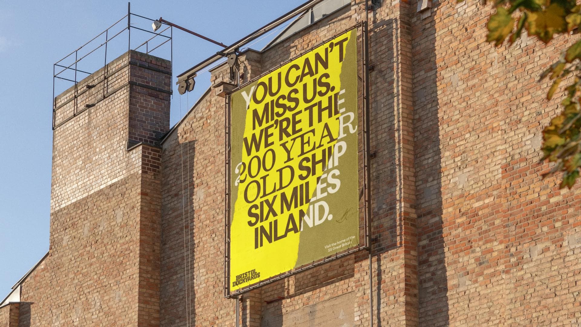
The copywriting voice, like the typographic decisions, is direct and merges a sense of accessibility and playfulness with historical heft. The copy reflects the city’s character without attempting to replicate its vernacular.
One of the standout aspects of the identity for me is the choice of colour palette. I love the striking, almost defiantly un-nautical pink here, which How&How says was inspired by the brightly painted terraces of Totterdown – a Bristol suburb famous for its colourful houses.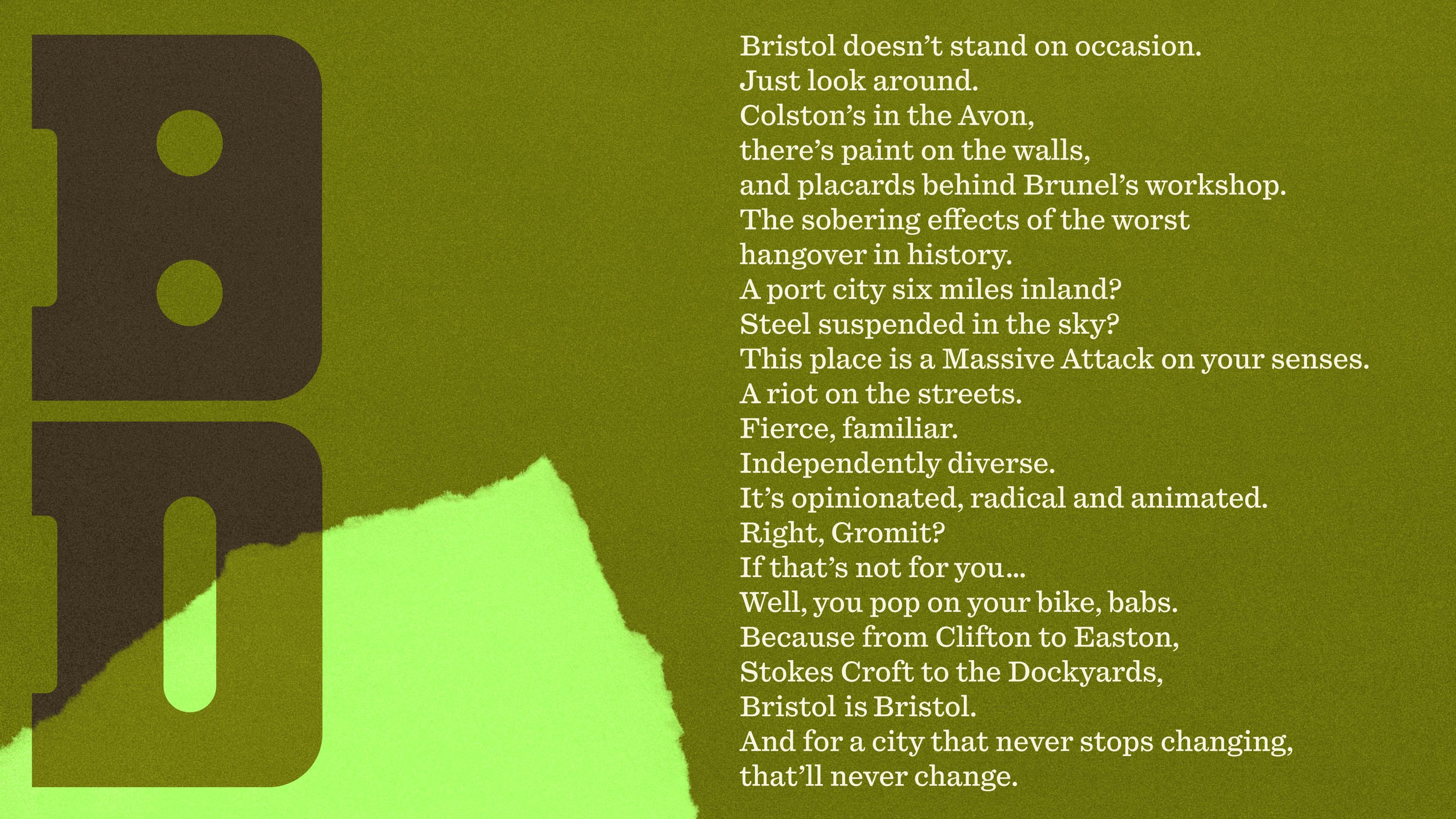
The palette draws a lot from this area – elsewhere, How&How has used vivid yellows, oranges and greens, forming a palette that roots the project firmly within Bristol’s contemporary cultural landscape. It feels fun and eyecatching without becoming overly twee or whimsical; confident without being too shouty; contemporary and modern without ever seeming to overreach or commit the deadly sin of ‘trying too hard’.
Overall, How&How has navigated a tricky brief with superb eloquence and grace here: it brings history to the fore without alienating younger audiences; and all the while ensuring this identity still draws in the older-skewing audiences that the site has relied on over the years.
It’s unexpected, but not shocking; bold but reassuring – a difficult balance to strike, but one that looks effortless in the hands of How&How.![]()