Industrial, conceptual, and starkly beautiful: DutchScot’s branding for SF sauna and cold plunge, Fjord
Opinion by Emily Gosling Posted 16 July 2026
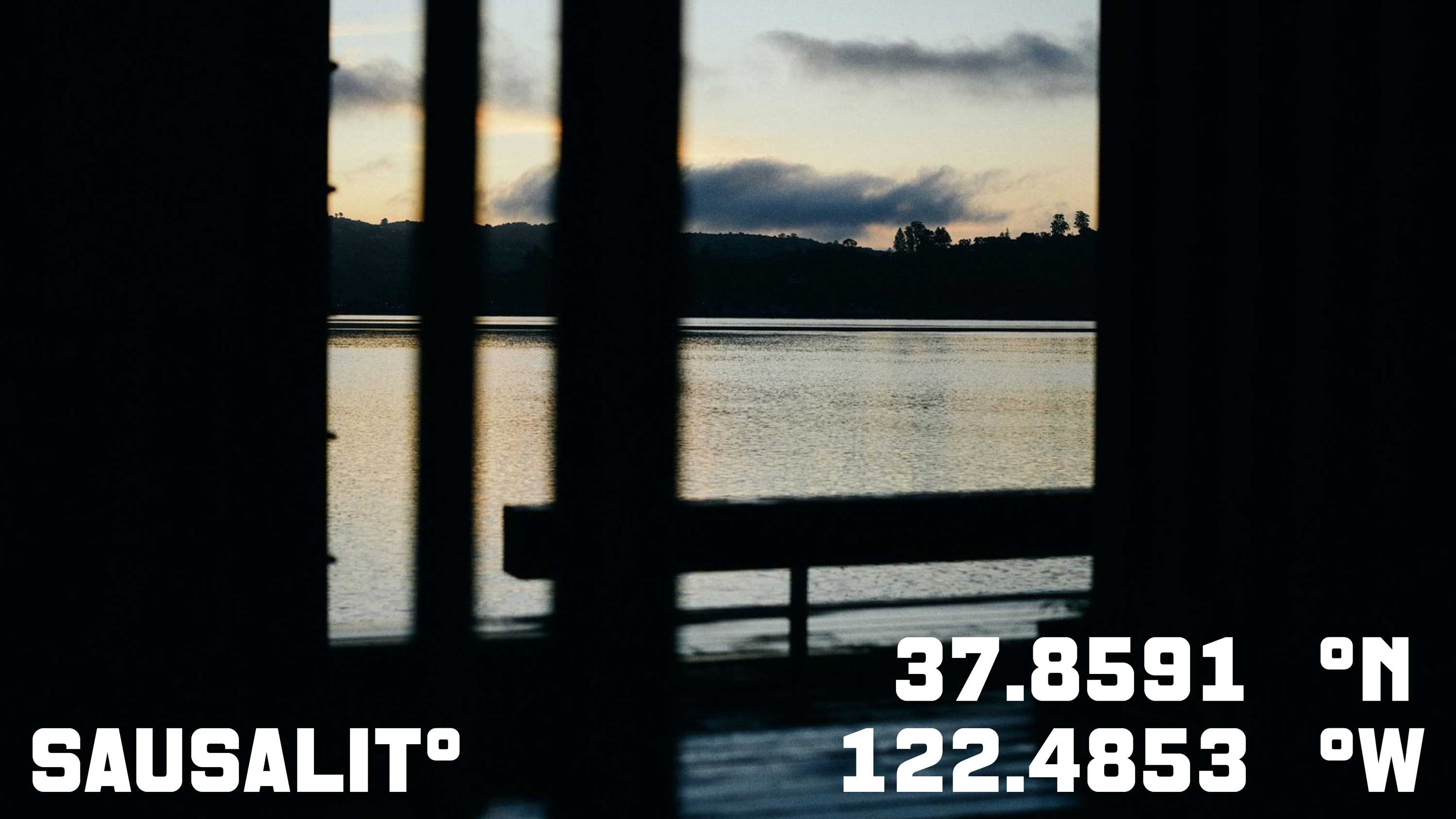
Fjord is a new floating sauna and cold-water plunge experience moored in San Francisco Bay’s Sausalito area. Rather than being exclusively positioned as a wellness-type experience, instead it looks to float, as it were, somewhere between architecture, hospitality and outdoor recreation.
It’s a very modern take on the centuries-old tradition of saunas and how they’re used – the shift between heat and icy water – in this case, that of the Pacific Ocean and its surrounding chilly open air. It’s a lot more brutal as an experience than something like a spa – all nicey-nice treatment rooms and panpipe music and aromatherapy and so on and so forth. It directly utilises the stark contrasts right there in nature all along, and literally encourages people to immerse themselves within them.
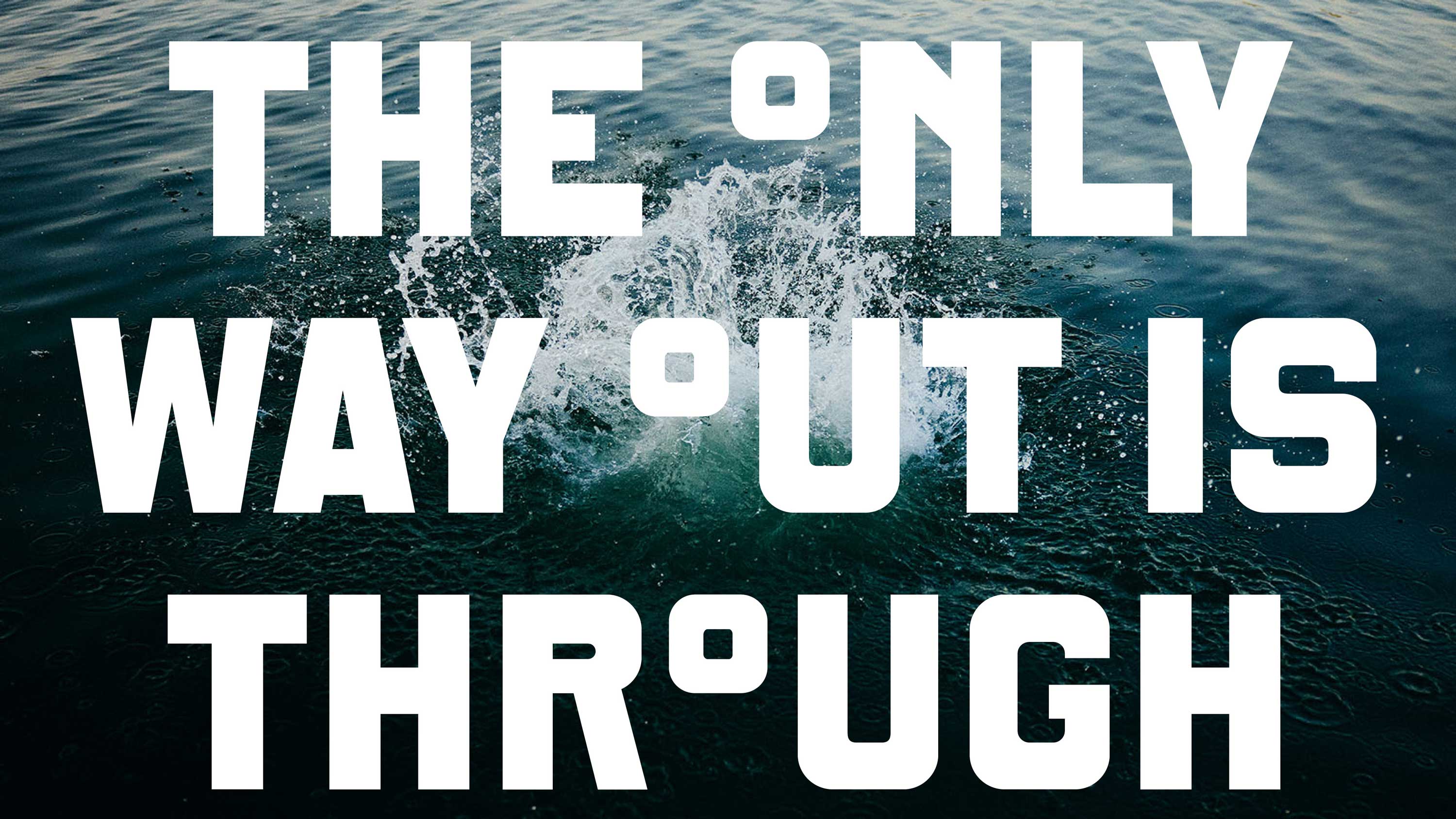
As such, Fjord as a brand positions itself less as a luxury escape than as a social, self-directed encounter with the landscape itself; all about the environment around it, and the physiological extremes that come with alternating temperatures. That rejection of conventional wellness cues forms the foundation for DutchScot’s identity, which responds with a brand system that is stripped back, robust and deliciously industrial – nothing sensual here, and all the better for it.
This isn’t purely a design decision based on eschewal of category norms: it’s a direct reference to Sausalito’s industrial history, borrowing from the functional, starker visual cues of working waterfronts, dockside infrastructure and utilitarian signage. The result feels solid and unembellished, yet never austere; its restraint leaves enough room for the experience itself to remain the focal point.

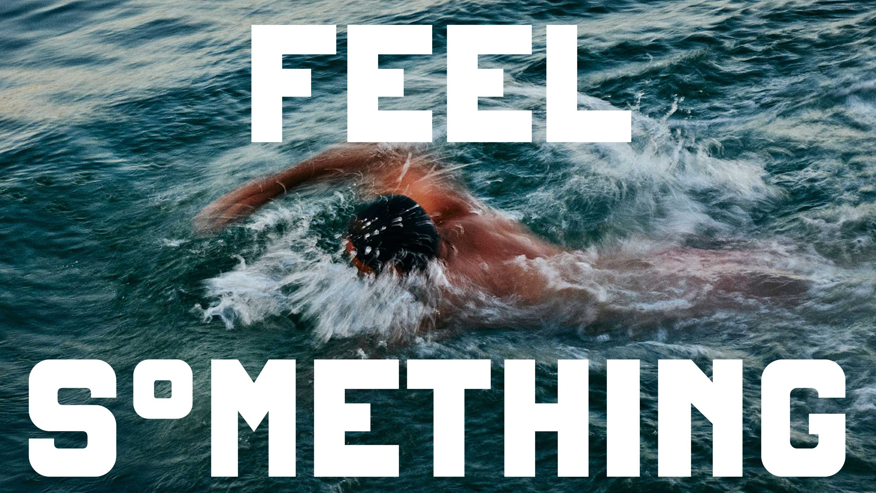
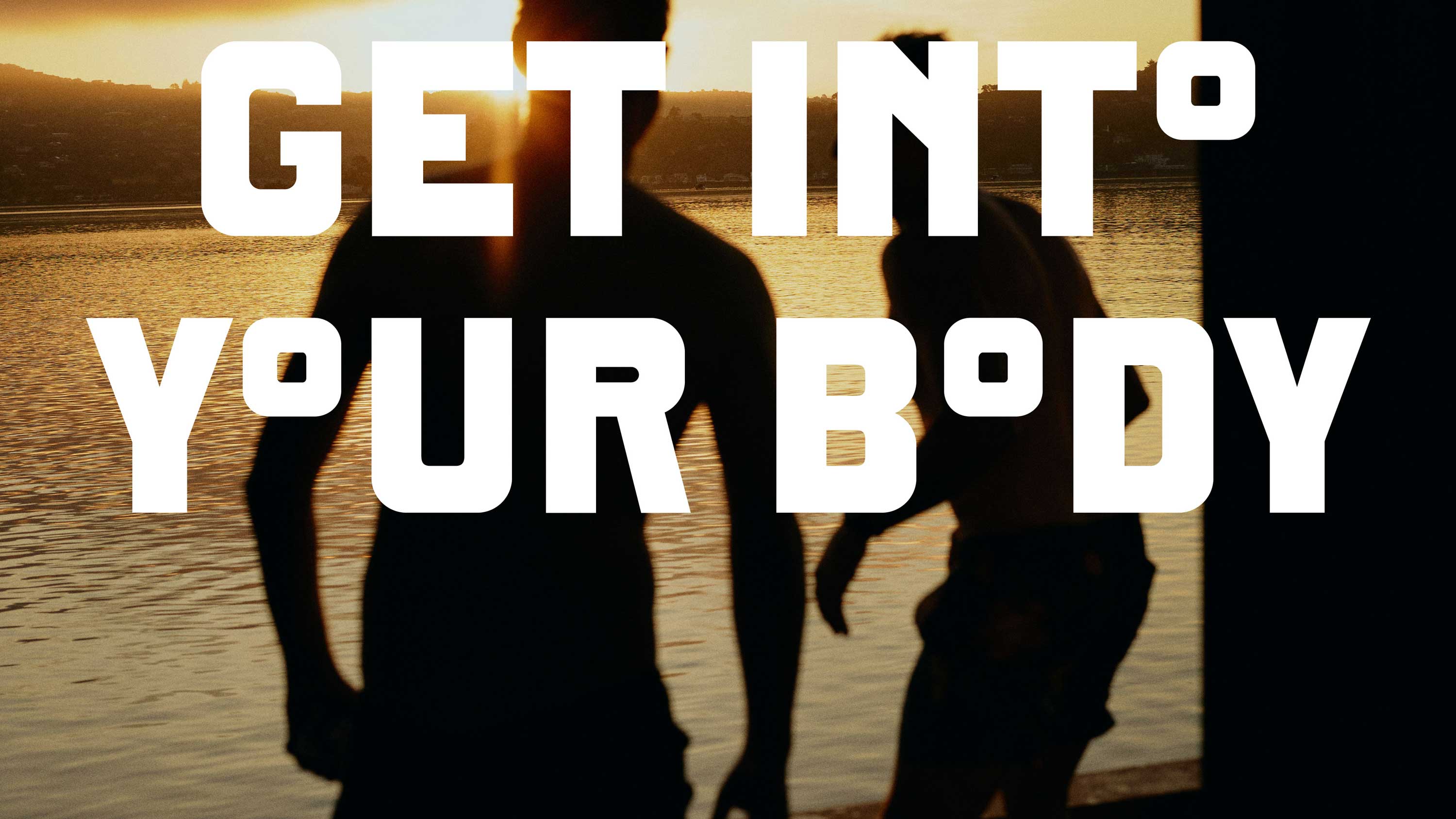
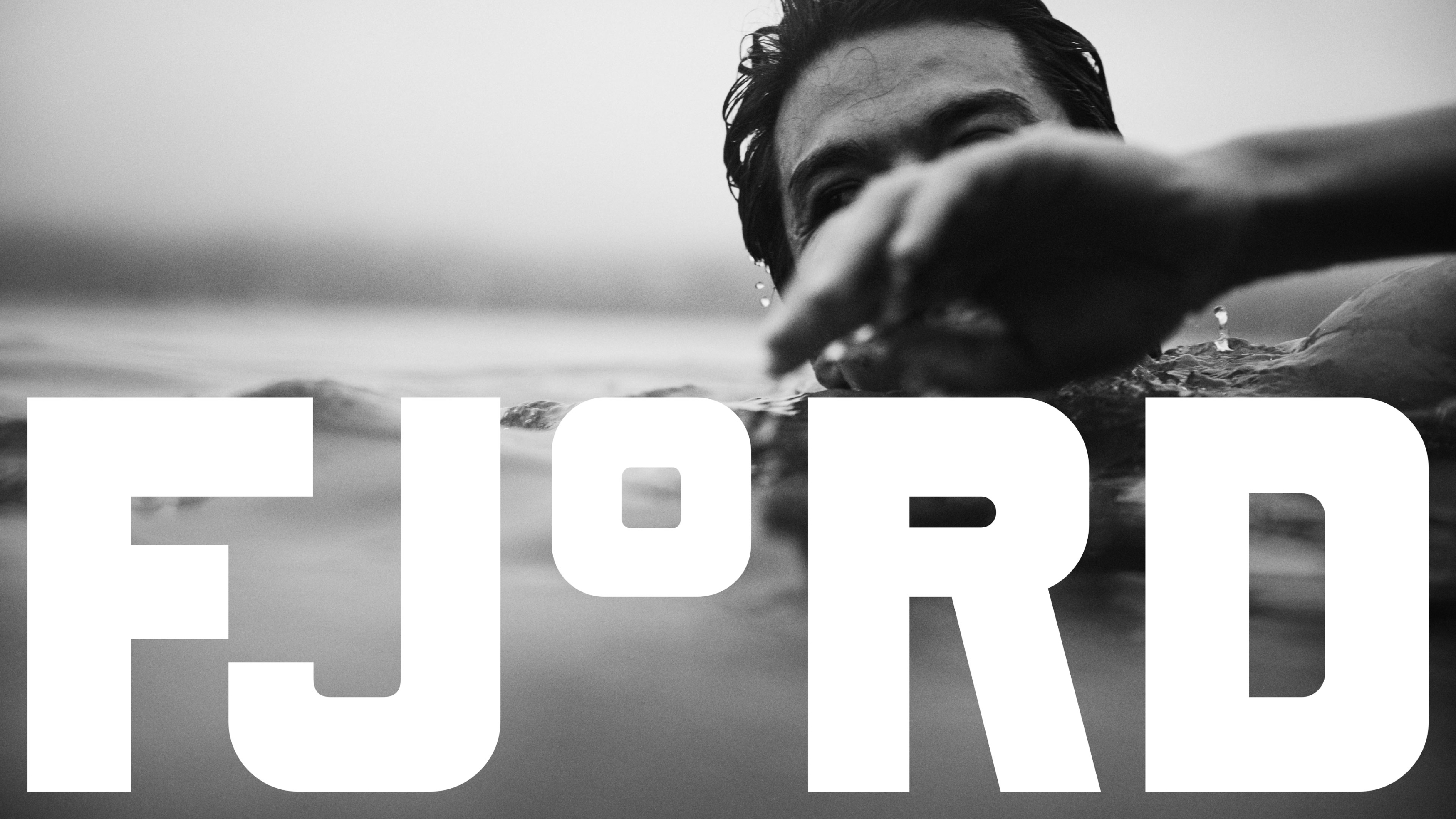
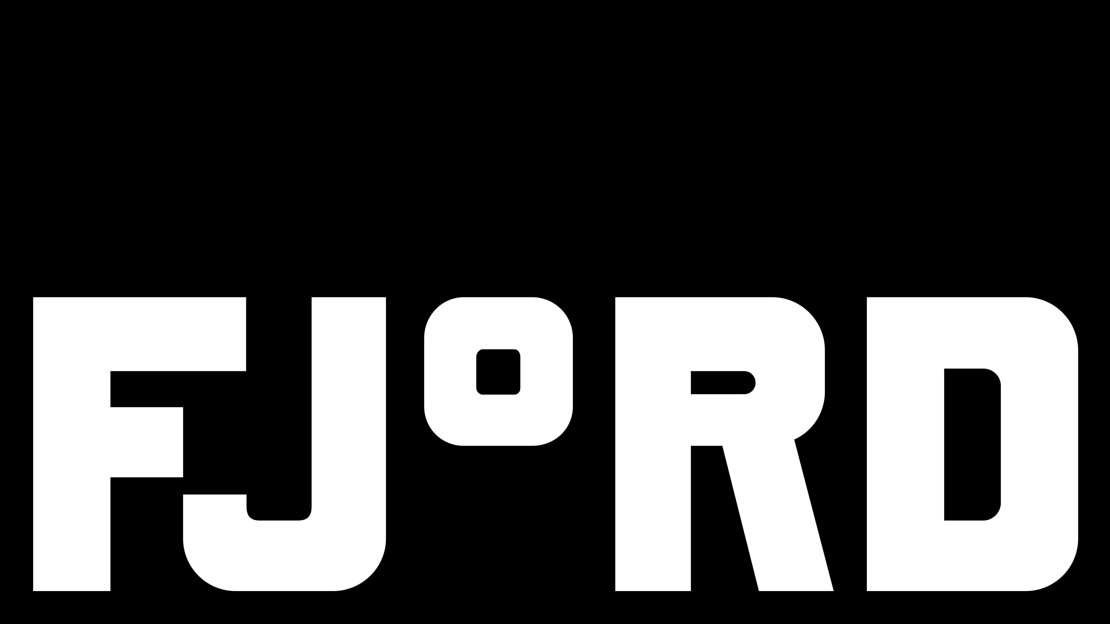
For the central brand typeface, DutchScot worked with Danish type foundry Playtype to create a bespoke lettering system which I absolutely adore. It’s very much a display typeface, and thoroughly ownable, thanks to one skilful little quirk that grounds everything in the idea of temperature, and of contrast: while the font is entirely upper case, the ‘o’ is replaced by a notably much smaller degree symbol, which sits high on the line rather than on the baseline like a conventional lowercase letter.
It’s both an elegant conceptual device and a visually lovely design element: obviously it references and drives home the idea of temperature which defines the sauna/cold plunge dichotomy. But it also introduces a visual interruption into otherwise uncompromising uppercase typography, injecting a subtle moment of tension that echoes the oscillation between hot and cold.
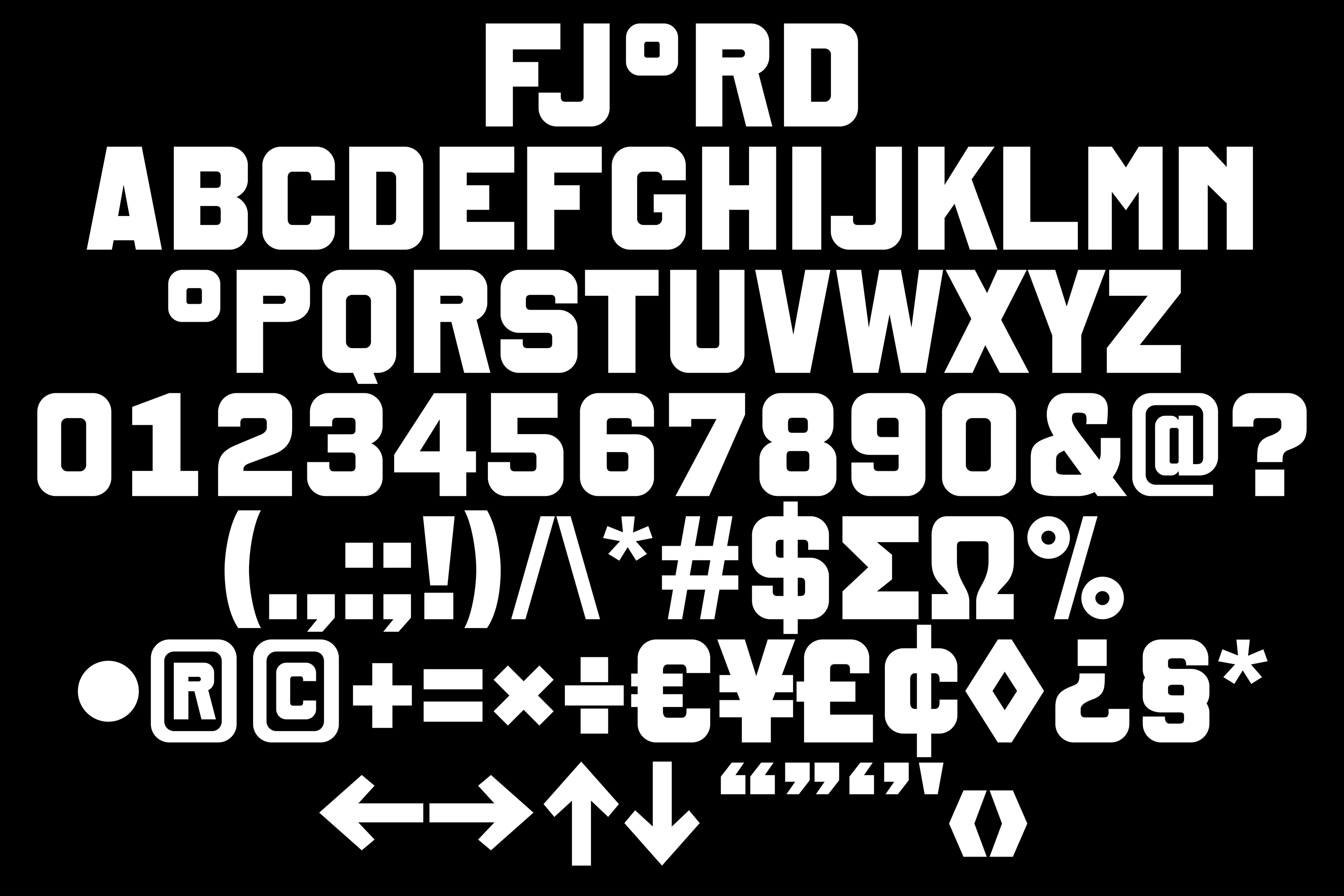
I love the way this whole thing works in ways that are both subtle and glaringly obvious, once you spot it. The degree symbol becomes part of the language itself; headlines appear industrial and commanding at first glance, only revealing their peculiarity on closer inspection. The lowered scale of the circular symbol gives the typography an unexpected rhythm, disrupting the uniformity of block capitals while maintaining clarity and impact. One of DutchScot’s many masterstrokes here, then, is in creating a piece of brand design that rewards attention rather than demanding it.
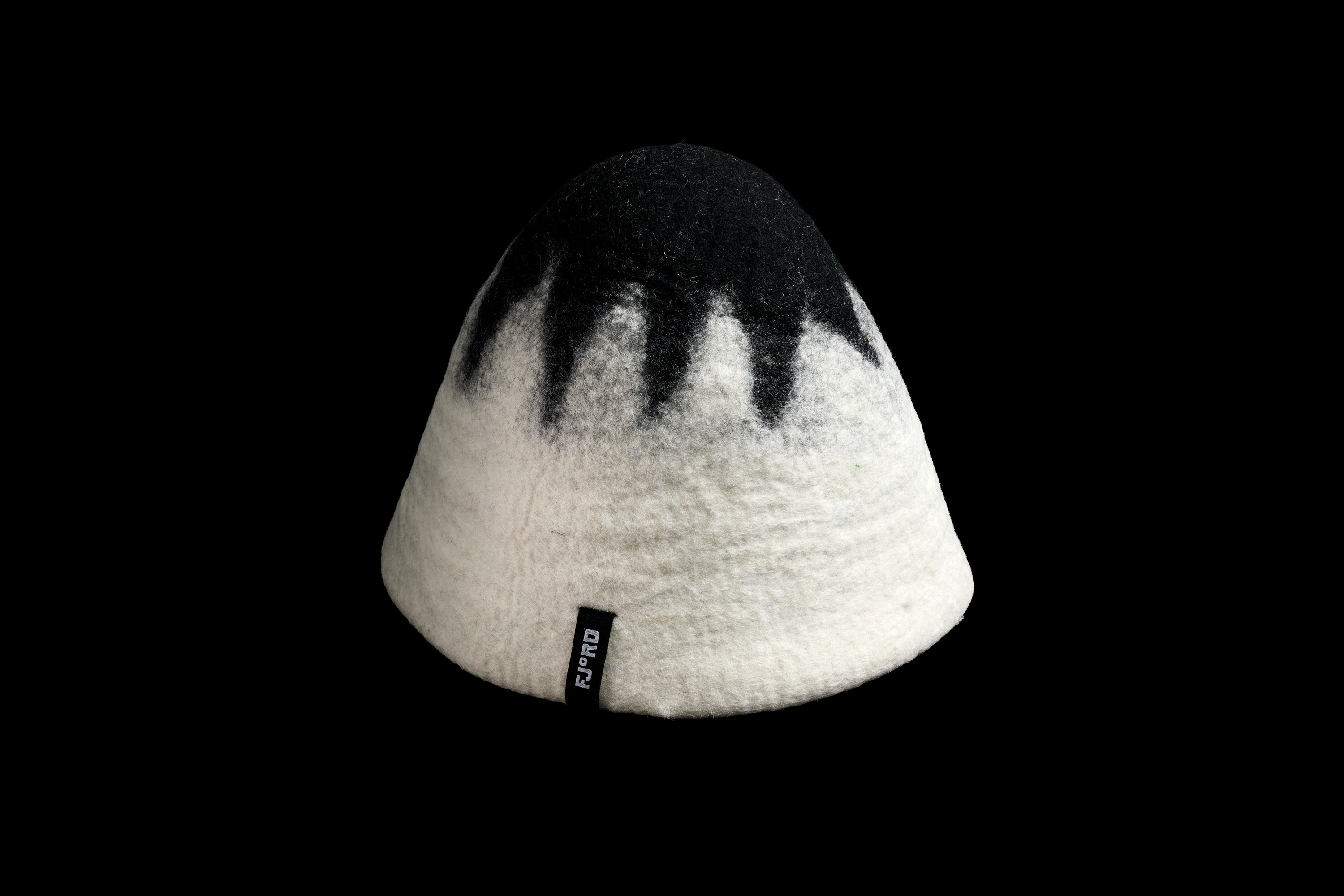
Exit Fjord is used primarily for large-scale messaging where its idiosyncrasies have room to breathe, such as on signage, printed materials such as soap packaging, and on merchandise such as some cosy-looking sauna hats.
img class=”aligncenter wp-image-133469 size-full” title=”DutchScot Fjord branding identity design bpo review logo degrees” src=”https://bpando.org/wp-content/uploads/DutchScot-Fjord-branding-identity-design-bpo-review-logo-degrees.jpg” alt=”DutchScot Fjord branding identity design bpo review logo degrees” width=”3000″ height=”1688″ />For the secondary typeface used on longer swathes of copy, DutchScot opted to use Saans by Prague-based foundry Displaay – a resolutely, uncompromisingly neutral sans serif grotesque described by its designers as bearing a “design that is universal and untitled… a consistent and moderate option”. It goes without saying, then, that it’s utterly neutral – it feels all very ‘Scandi’, design-wise, tying in nicely with the brand’s Fjord moniker itself, as well as the obvious Scandinavian heritage of its entire offer.
The colour palette is similarly pared back, striking, and confident – just black, white and maroon. All the more industrial, all the more sensible; again, honing in on that idea of contrast – hot red against cold, hard monochromatic black and white.
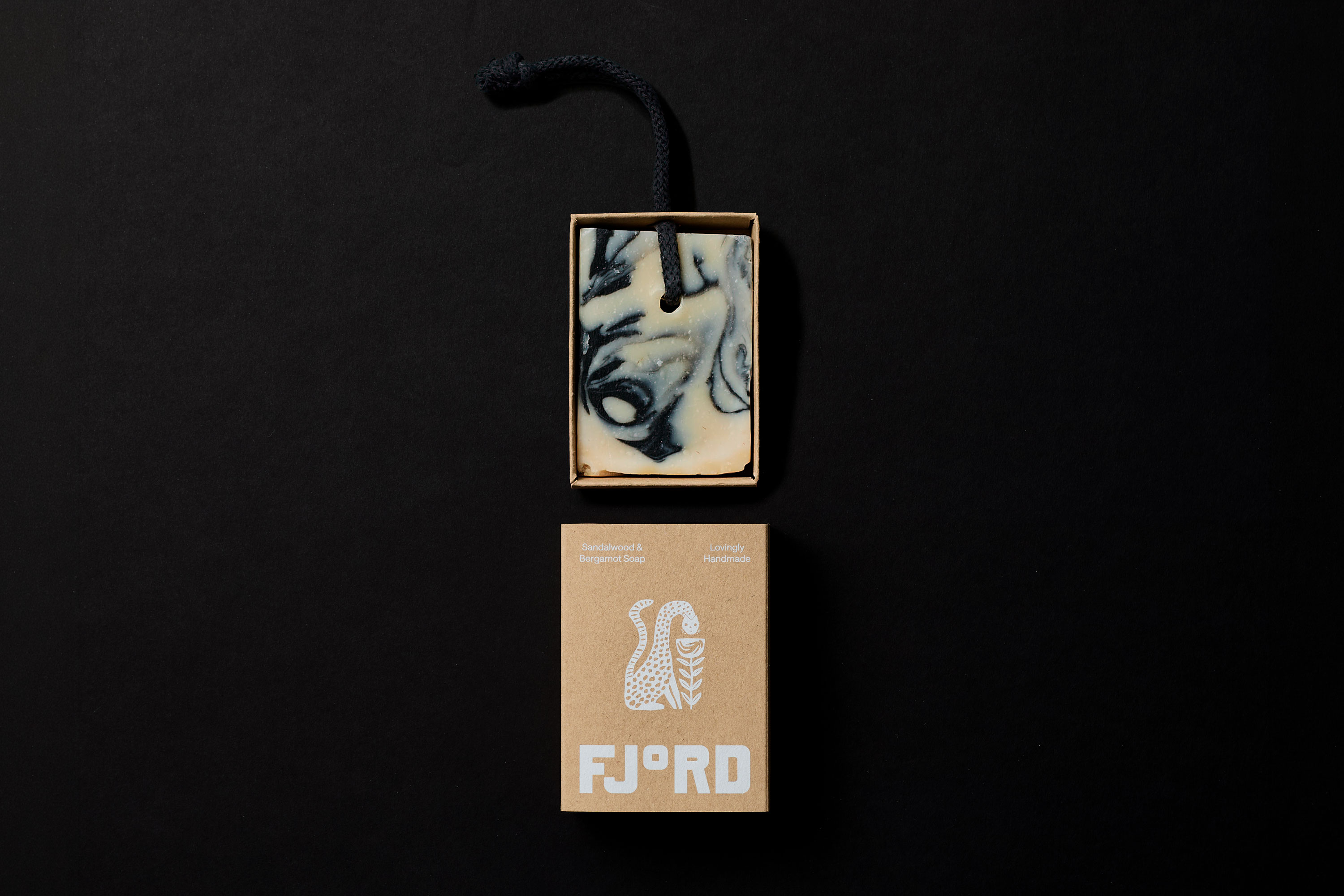
As with the rest of the identity, the palette clearly makes a departure from category conventions when it comes to all things wellness – which makes sense, since this brand is a departure from wellness and spas and all that too. The maroon is a smart choice here: not just warmer, but perhaps a richer tone to hint at things like heated timber, or flushed skin, without being too obviously on-the-nose.
Throughout the identity, everything is about a particularly factory floor-ish restraint: sort of minimal, but almost too bold to be considered as such.
Take the logo, for instance: it simply takes the fundamentals of the Fjord wordmark – its capital ‘F’ and degree symbol ‘o’, and erases the rest of the word to create a logomark/monogram. It’s as much a sort of shorthand as it is a logo, and it works superbly.
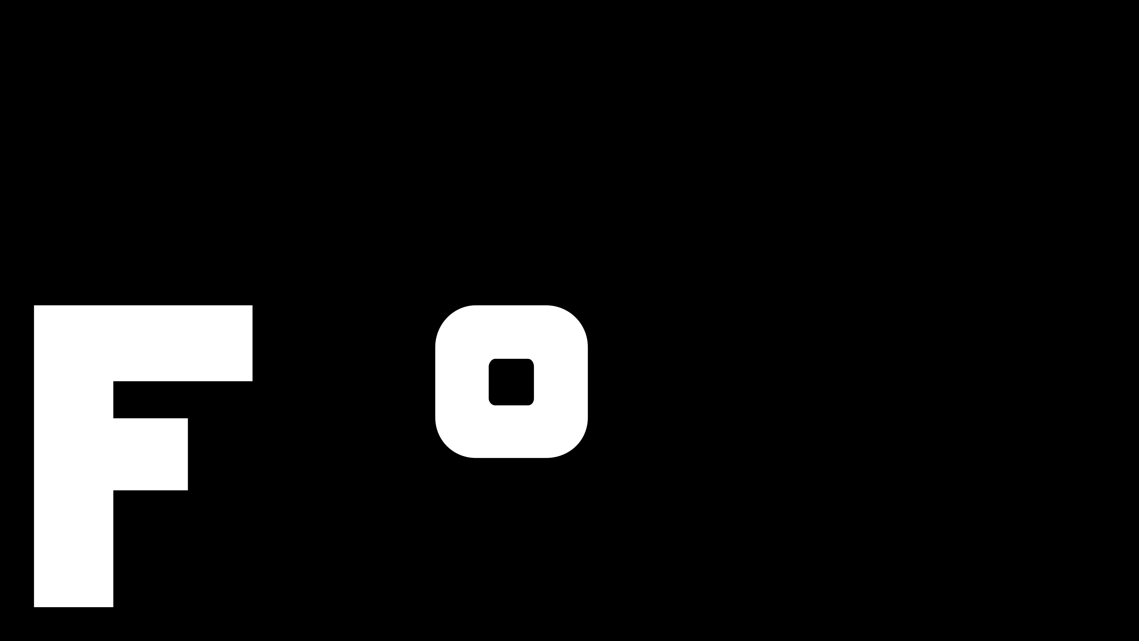
The effectiveness with that logo – as with the rest of the identity – is in the way DutchScot so expertly wields economy. Economy of type, of colour, of application – yet without ever seeming quiet, or smugly, dryly minimalist. It sort of makes you work, but also doesn’t force you to do any decoding: the conceptual weight and visual rigour throughout is all totally ownable to Fjord, and instantly recognisable.
When it comes to patterning and supporting graphics, the idea of translating physical sensations and scientific phenomena (i.e. the way water particles work, and their transition from liquid to gas) comes to the fore.
What this looks like is two abstract pattern systems which reference the contrasting environmental states that define the experience: one appears denser and more tightly packed, evoking the compact molecular structure associated with colder temperatures; the other becomes noticeably more dispersed, suggesting expanding steam and rising heat.
What is perhaps most successful about the project is the consistency with which every formal decision circles back to the central proposition. Temperature is never illustrated directly, yet it permeates every element of the identity – the typography, the shorthand-led symbol, the graphic patterning, the tension between the austere monochrome palette and the warmer burgundy accent.
It’s an exemplary identity in how it’s built watertight coherence (pardon the pun) from a deliberately limited visual vocabulary: no excessive or clumsily obvious visual storytelling, no reliance on Scandinavian clichés, just a confident reliance on reduction to carry the narrative and essence of the brand itself.