I used to work for Nestlé in Croydon. Not the trendiest postcode in the UK, but a Brutalist treasure in its own right.
Every morning I walked from East Croydon Station past Suffolk House and the “fifty pence” building, the NLA Tower, up to the thirteenth floor of Nestlé House. Concrete framed every step of that journey. Sheer walls, sharp cantilevers and silhouettes that looked unforgiving and oddly magnificent at the same time. I still have a print of the “fifty pence” building hanging in my office.
Croydon has been compared to Alphaville. It’s been called soulless, grey and “New York built in Poland.” Forty-five office blocks, most built before 1974, still dominate the town centre.
Brutalism gets misread, partly because of the name. It comes from béton brut, Le Corbusier’s term for raw concrete. The exposed concrete, visible structure and absence of ornament were deliberate design choices rather than signs of aggression.
After a decade of pastel gradients, soft-focus typography and packaging that looked like it had been sprayed with a fine mist of wellness, design has reached a different register. Neo-brutalism has become one of the clearest packaging trends of the past two years. Heavy condensed type, industrial textures, high-contrast layouts and limited colour palettes are replacing softness in categories where everything had started to look the same.

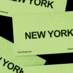
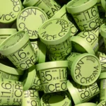
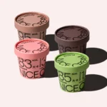
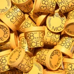
Han Gao’s concept NICE CREAM is a good example. Bright, blocky and direct, it cuts through the freezer aisle. Nutrition takes the lead and the layout stays disciplined.
The approach isn’t new, even if the label is. Long before anyone started talking about neo-brutalism, Canada’s No Name range had already proved the point. Black Helvetica on yellow has been sitting on supermarket shelves since 1978. Nearly fifty years later it’s still one of the most recognisable identities in grocery because almost everything on the pack has a purpose.
Research into nostalgic packaging points in the same direction. People respond more positively to designs rooted in recognisable history than to nostalgia built from familiar visual references.
Brutalism has always divided opinion, whether it’s a tower block in Croydon or an ice cream tub in the freezer. That’s probably why it keeps coming back.
Can less really be more in today’s overcomplicated world? Anyone stepping out of East Croydon Station and looking up already knows the answer.