Pentagram nails controlled chaos in its identity for Manhattan “shophouse” style Thai restaurant LenLen
Opinion by Emily Gosling Posted 4 August 2026
It’s not easy to make an identity look genuinely effortless – more often than not, the very intention to do so renders the result looking the exact opposite. And nothing, no one, ever wants to be levelled with the accusation of appearing to be ‘trying too hard’.
However, Pentagram New York’s partner Andrea Trabucco-Campos and team has succeeded in that trickiest of tasks in its designs for LenLen, a new-ish Thai bar and restaurant in Manhattan’s Flatiron district with an identity that genuinely does feel like it was scrawled together in the most joyful way imaginable.
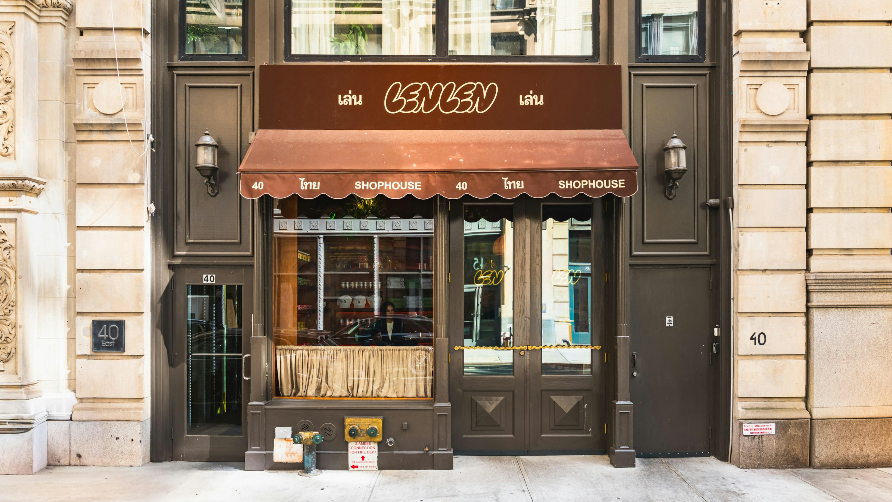
LenLen opened at 40 East 20th St in February this year, and is the brainchild of couple Wanisa Torboonsitikorn and chef Peter Ki Suk Tondreau, together with hospitality veteran Tim Stuyts.
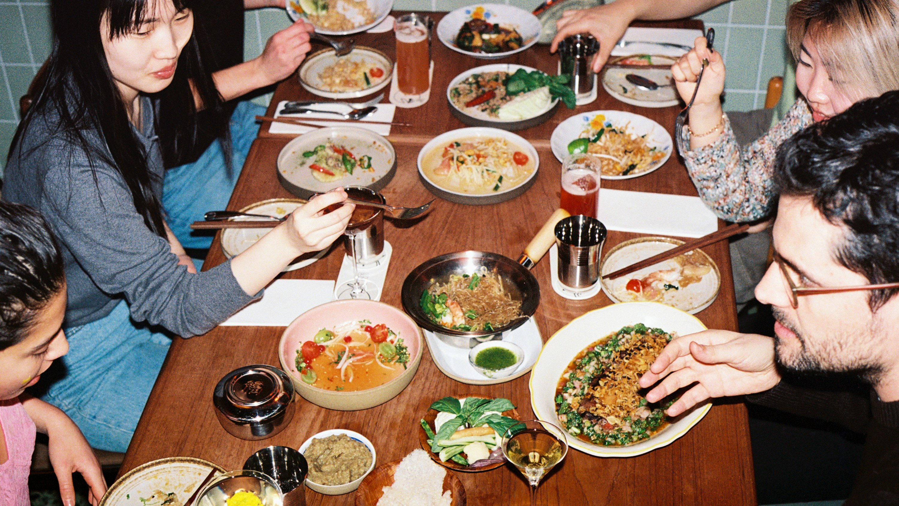
The concept riffs on the 1970s Bangkok shophouses of Torboonsitikorn’s childhood – the kind of place where the family business happens downstairs and life happens upstairs, with a very blurry line between the two.
That family-centric, gloriously haphazard approach to dining is at the heart of LenLen and its identity from Pentagram (Rugiet, MoN Takanawa, Super Peach): essentially, the site comprises a front-of-house retail nook selling Thai pantry staples and snacks, which gives way to a 50-seat dining room dressed in mismatched vintage furniture, tiled walls and a soundtrack of 1960s Thai psychedelic funk.
But mismatched certainly does not mean shonky: LenLen has landed itself a spot in the 2026 Michelin Guide, so it’s definitely up there in the higher echelons of culinary nous, lest we forget that in all the apparent all-over-the-shop-ness.

That’s rather deliberate, of course: in Thai, “เล่นเล่น” (LenLen) means “just for fun” – an idea that’s central to both the restaurant and Pentagram’s design concept for it.
There are a lot of things here which really shouldn’t work – the sludgey brown at the heart of the colour palette; the bonkers mix of typographic styles; the scrappiness of the illustration for a restaurant that prides itself on “culinary rigour and excellence”.
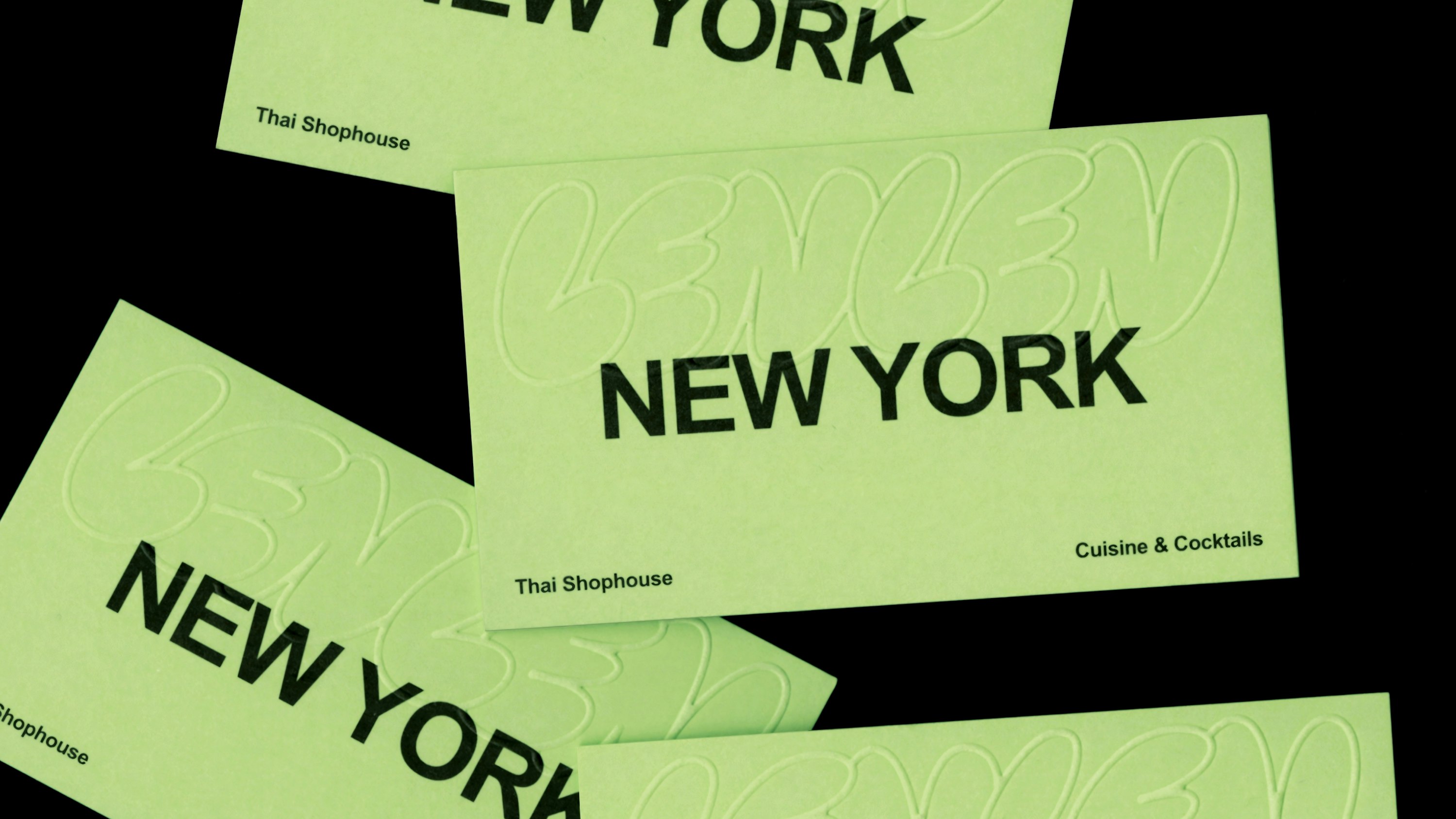
That tension between rigour and scrappiness is really the heart of the whole identity here: Pentagram aimed to evoke the “warmth and spontaneity of Thai hospitality”, and it’s absolutely done that, nailing its evocation of LenLen as a “living expression of Thai creativity and connection”.
It’s not easy to create something that’s both a functional, seamless and flexible identity system and which centres itself on the idea of “casual imperfection,” but Pentagram has nailed it here.

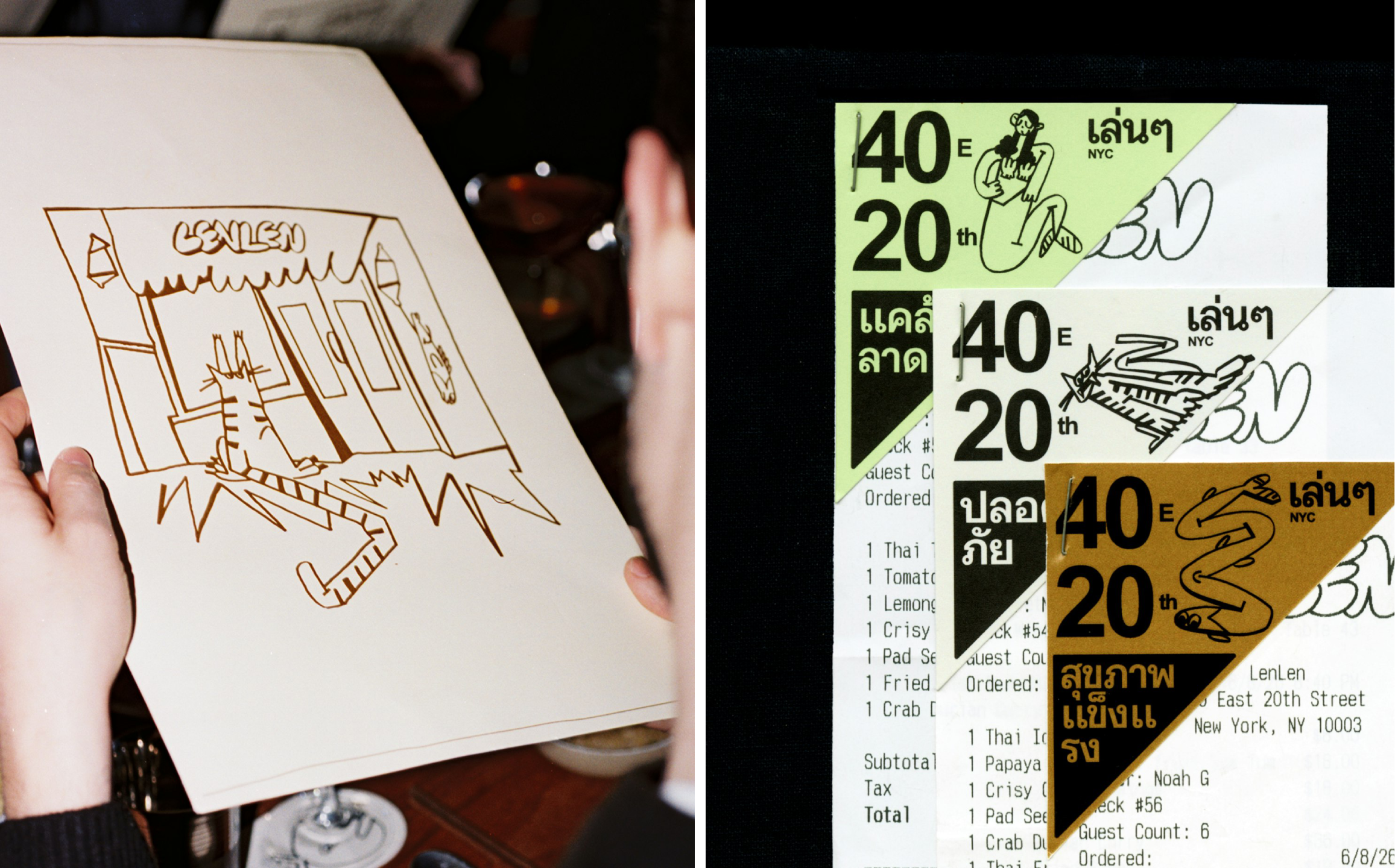
I absolutely love the illustrations – all hand-drawn, almost childlike sketchiness. These pull from the icons and imagery of everyday Thai life – plastic stools, noodle bowls, tiger-cats – and splice them with collaged family photos from co-founder Wanisa Torboonsitikorn’s own archive.
Within the interiors of the restaurant, these brand illustrations come to life through everything from murals to menus, on merch/uniforms such as caps and t-shirts, as well as some beautiful little touches on printed materials like receipts.
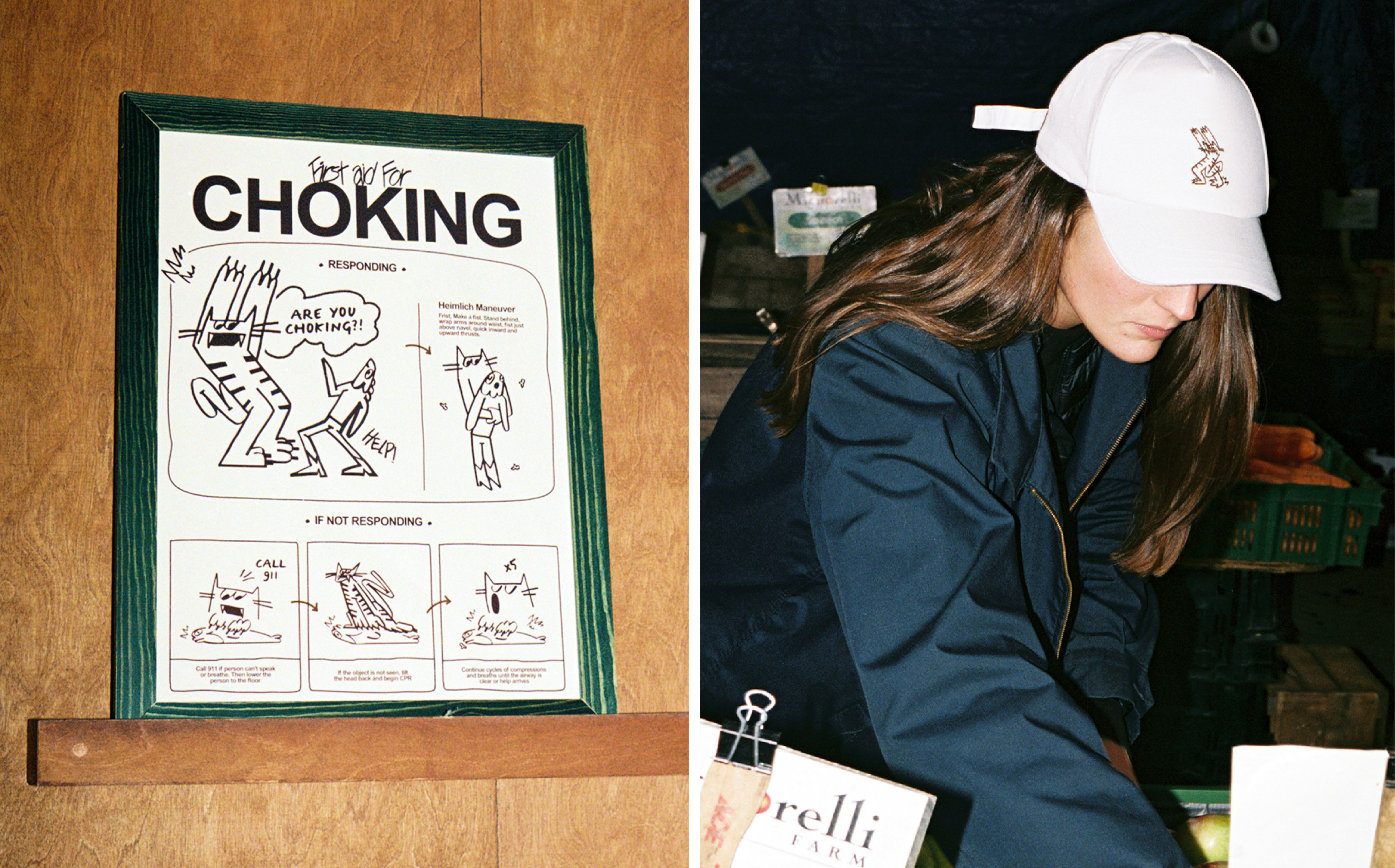
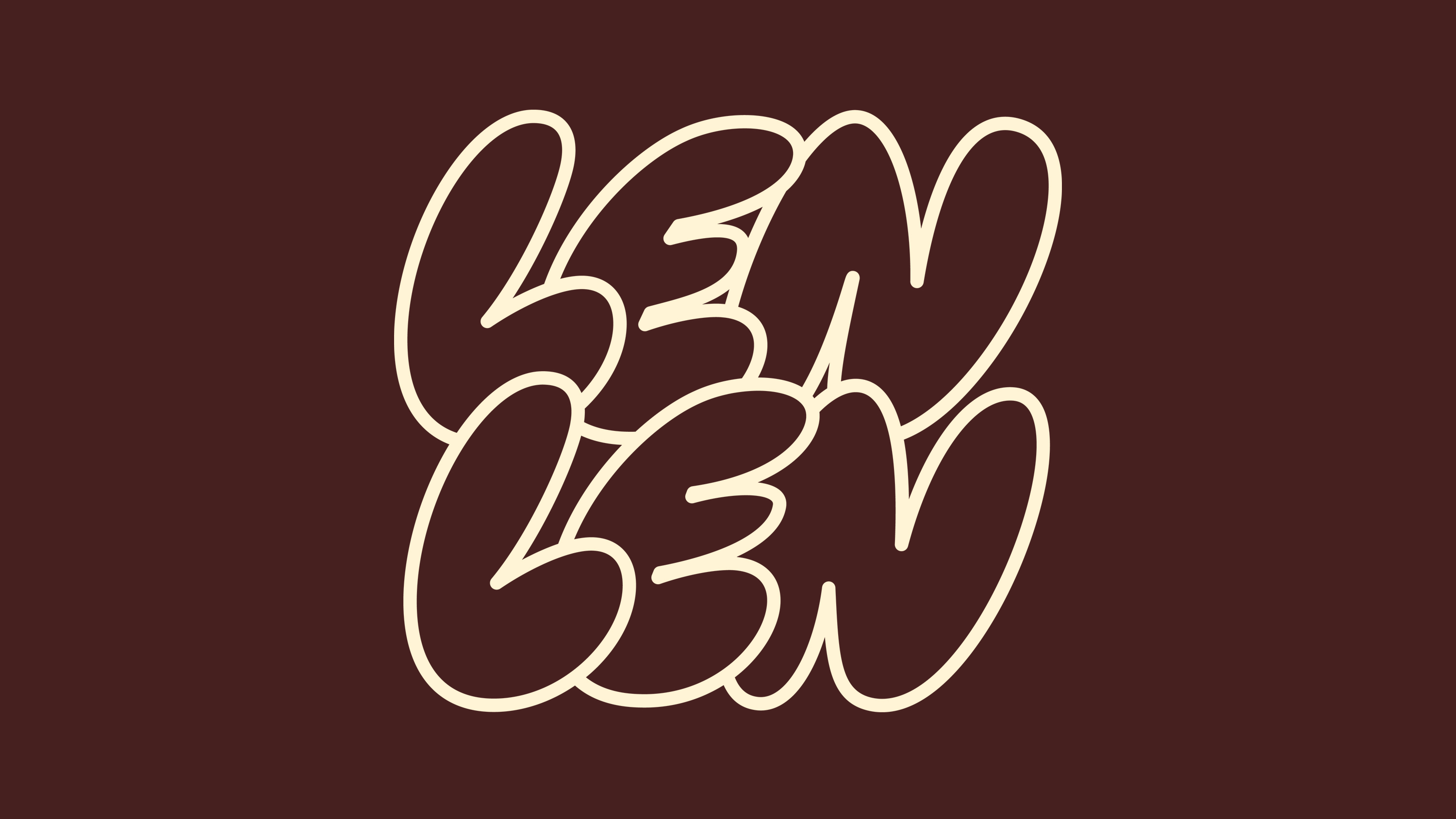
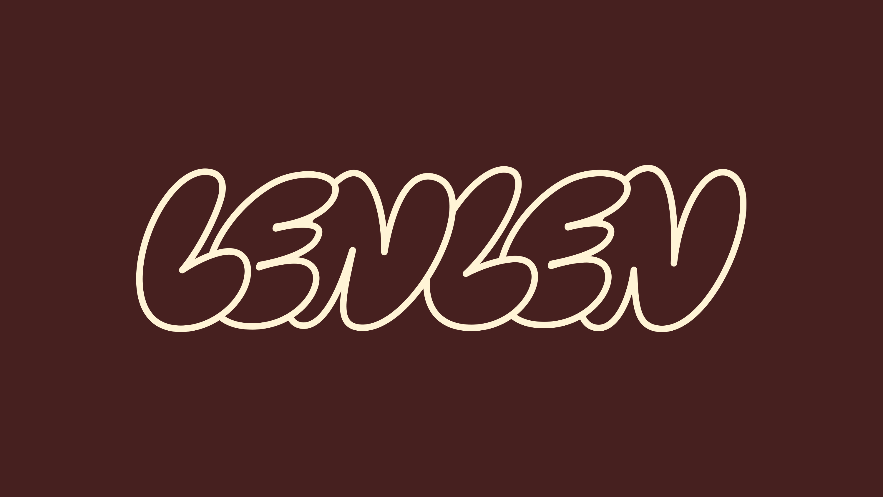
The absolute star of the show, however, is the type system, which is doing an awful lot of heavy lifting. Pentagram describes it as having four distinct voices: the main wordmark/logo uses custom hand-drawn bubble-style type, giving the whole thing a lively, jovial energy that just about remains on the right side of daftness; a set of slanted, fluid strokes that nod to the freehand street lettering you’d find in Bangkok, all nostalgia and humour; Manu, a typeface from Typotheque, brought in to mimic loose, informal handwriting; and then finally, doing the unglamorous work of holding it all together as body copy, Arial.
The most shocking thing here is just how great Pentagram has managed to make humble old Arial look. Yes, Arial: the most default of defaults; the most systemic of system fonts; the unassuming workhorse that’s so ubiquitous we barely register it as a piece of type design at all.
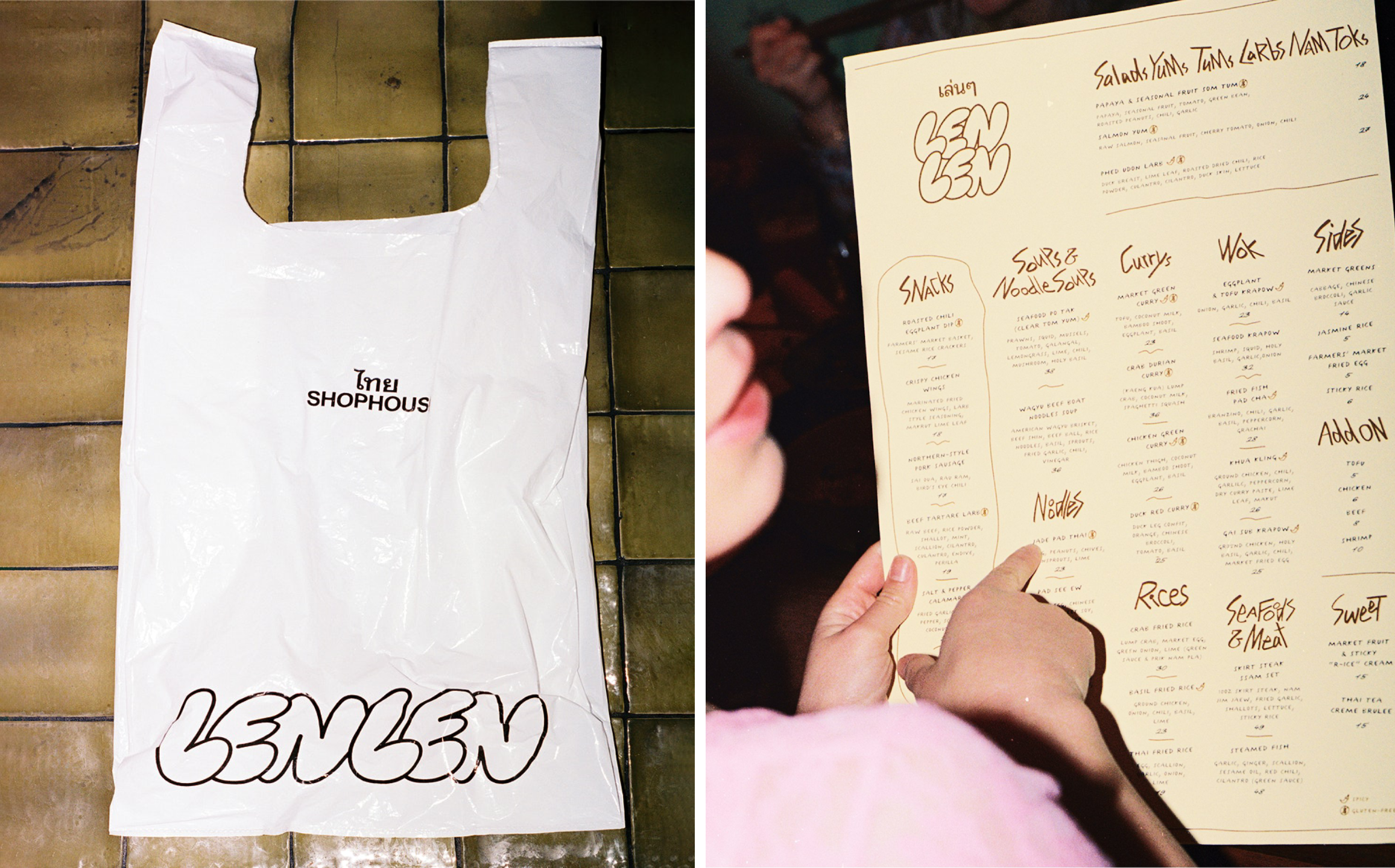
Here, however, it’s the sensible counterpart to the rest of the lettering-based madness – but not just that, or how legible it is, but it genuinely looks really good.
What’s also impressive is how skilfully Pentagram has managed to elevate a wordmark which is essentially the sort of thing you’d scrawl on the front of your school bag in Tippex – all bubbly and offkilter and slapdash.
Digitally, the identity carries that same handmade, slightly chaotic warmth without losing legibility – the website’s set in Manrope and Rethink Sans, both far cleaner and more contemporary than the hand-drawn marks they sit alongside, which gives the whole thing a nice bit of ballast.
The website is super fun, and exemplifies how this branding does a hell of a lot with the little touches: the scrawled bee character that serves as the cursor is truly delightful, and I love the way it draws a raggedy old line behind it as you scroll around the homepage.
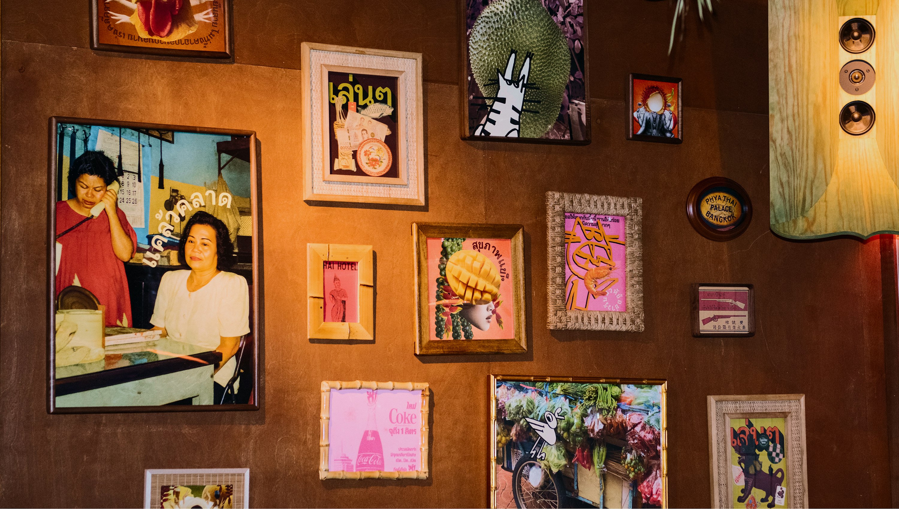
What works so nicely here is Pentagram’s deliberate rejection of the polished, minimal restaurant-branding house style that often dominates the higher end of culinary outfits. Here, the strategy is focused on making every brand touchpoint, from menus to signage, feel personal, tactile, and full of character – all in all, a very on-point reflection of the ambition for LenLen’s patrons to feel more like pals hanging out in someone’s living room than customers in a stuffy eatery environment (despite those Michelin stars).
“Casual imperfection” is one of those phrases that’s all too easy to state as being central to a concept and arguably even easier to go way off-target with, tipping into chintzy, tweely over-designed faux-naivety or just a plain old mess. LenLen’s identity manages it – I’m not all that sure how, what with the nonsensical type, outright ugly colour palette, and illustration so scrappy it’s borderline kindergarten – but it does.