All Purpose ditches wine clichés in its lurid new identity for natural wine importer Ancestrel
Opinion by Emily Gosling Posted 6 August 2026

Based in leafy yummy-mummyish south London enclave Forest Hill, Ancestrel (yes that’s a deliberate misspelling) is a wine shop and so much more – it’s proudly the first company in the UK to import natural wine.
Having started life in 2016, Ancestrel has spent the decade since making a name for itself as a renowned importer, wholesaler, and retailer of natural and artisanal wine; supplying a wide range of top restaurants and sellers across the UK.
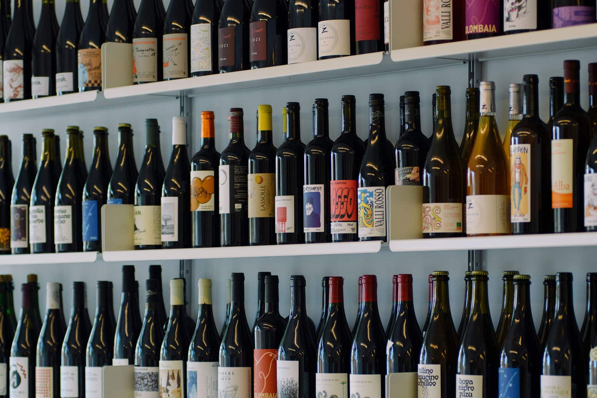
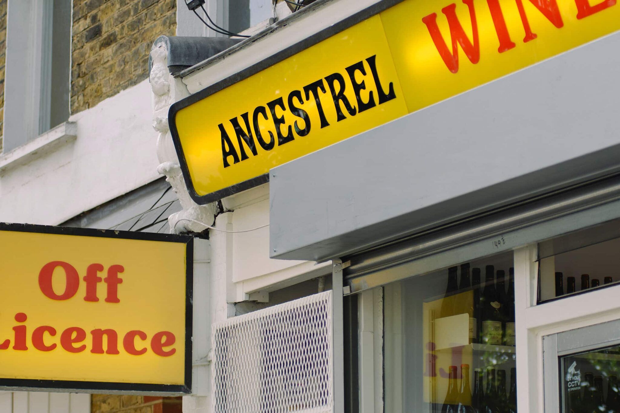
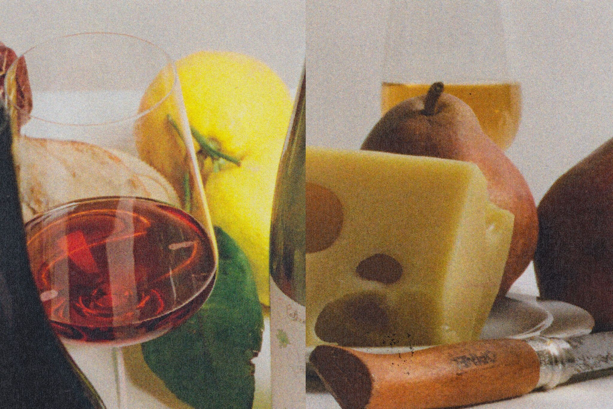
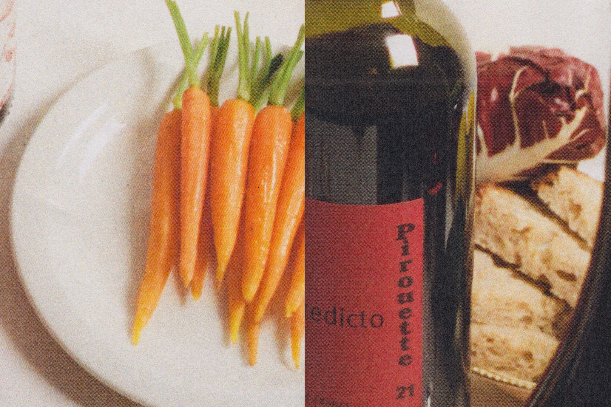
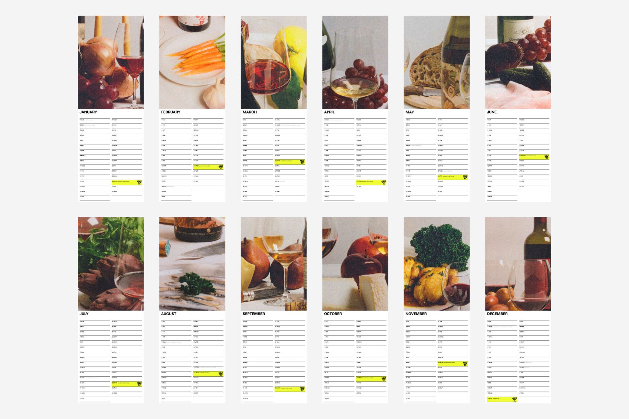
Around the time of its tenth birthday, in late 2025 Ancestrel unveiled new designs created by London studio All Purpose, which worked across a comprehensive rebrand including website development, industry event marketing, packaging, and merchandise.
It makes a lot of sense that All Purpose would work on this project – a wine identity that rejects and reinvents the conventions of what wine branding ‘should’ be, instead exploring what it could be – when you consider that it was also behind the redesign of hyper-hip wine mag Noble Rot.
That editorial project spoke volumes about what All Purpose seems to do really well – and what it’s done really well with Ancestrel, too. Bespoke typefaces were built from scratch; each issue bore limited-edition screen-printed covers that delight in the tactility of print; there’s a sense of respecting heritage and quality and authority but simultaneously poking and prodding at all the visual cues we’d typically use to signify those.
The designs for Ancestrel take similar routes: there’s a gorgeous new wordmark, set in a deliciously sort of gloopy looking bespoke typeface, which gently nods to the idea of all that’s artisanal while never being too on the nose about it – nothing here is ardently, irritatingly harping on about ‘authenticity’, either in copy or the design sensibilities usually used to signpost it.

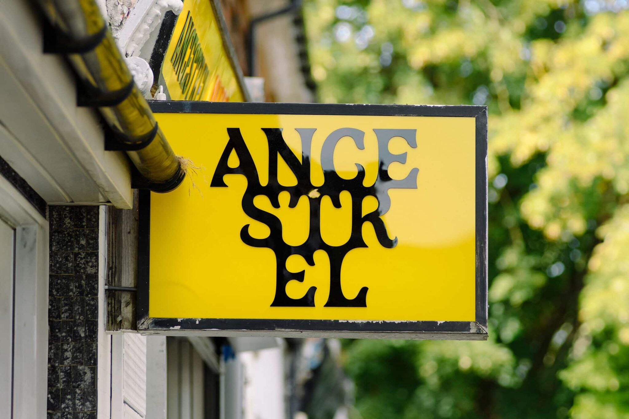
It’s weirdly Medieval in a way that I really love – not LARP-level Medieval, but teetering on silver goblet type Medieval. And the wordmark looks truly excellent in its tripartite split level format – especially on the shop’s exterior sign, all thick black letterforms against no-nonsense, almost warning-sign bright yellow with a sharp black rectangular frame.
I adore the way that the letterforms drip into each other, colliding and morphing and generally glooping together like syrup, or tar. This ultimately forms the logo, and it’s not just a lovely piece of type design – it’s also a smart, but rather subtle representation of a bunch of grapes.
However, it does well to not take an illustrative route: here, it reads more as gesture than illustration, and is designed to ‘hang’ from the top of any given application – a nicely understated reference to the vines this all comes from in the first place.
In terms of the rest of the typography, the identity is anchored by OT Rima, a grotesque sans serif from Swiss type foundry Omnitype. It’s a smart pick for a brand walking the line Ancestrel is trying to walk: Rima has enough geometric confidence to feel considered and design-literate, but its proportions stay warm and human rather than tipping into anything too cold or corporate.
Then there’s the colour. I love the vibrant range of fluoro shades throughout this identity that fly in the face of all that’s stuffy and traditional – i.e. the sort of thing you’d usually associate with wine brands, even bougie ‘natural’ ones.

Rather than reaching for the usual burgundies, forest greens, and cream label stock that so much of the wine world defaults to as shorthand for ‘quality’, All Purpose has gone much more daring – all lurid, playful colour that’s borderline psychedelic, and feels a million miles away from things like wine pairings and ‘sommeliers’ and tasting notes.
Indeed, fluoro has proven to be something All Purpose has a proven history of deploying skillfully – it’s worth noting its almost sickly-bright shade of yellowy green that works so well for Two Tribes Brewing, which it rebranded this year.
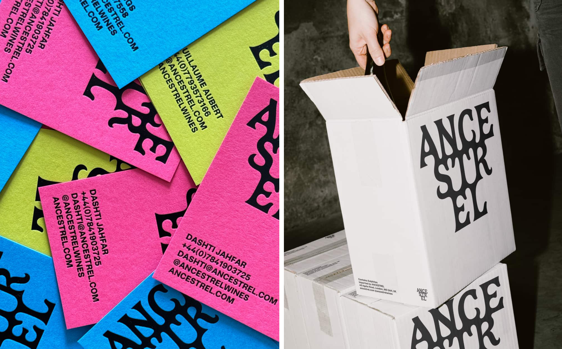
There’s clearly a throughline in the studio’s practice here: a willingness to use colour in genuinely different, unexpected ways, delighting in the borderline-uncomfortable in service of standing out.
For a company based around the idea of wine made with minimal intervention – the antithesis of industrial, mass-produced booze – All Purpose has done a superb job of giving Ancestrel a visual voice that’s confident without ever taking itself too seriously.
And I really like that. As a person who knows next to nothing about wine – I’ve long said my favourite wine is cherry Lambrini, and I’m only half-joking – I’ve always found the people that harp on about ‘natural wine’ both quite smug and incredibly boring.
This identity is absolutely never smug, nor ever boring. It’s fun, it’s lovely to look at, and it genuinely reflects a company that’s rather forward thinking, but also seemingly quite neighbourhood-ly. And who knows, maybe natural wine doesn’t all taste like vinegar after all.