Studio South merges rigour and ridiculousness in the best way possible in its superb identity for noodle joint Oodles
Opinion by Emily Gosling Posted 10 September 2026
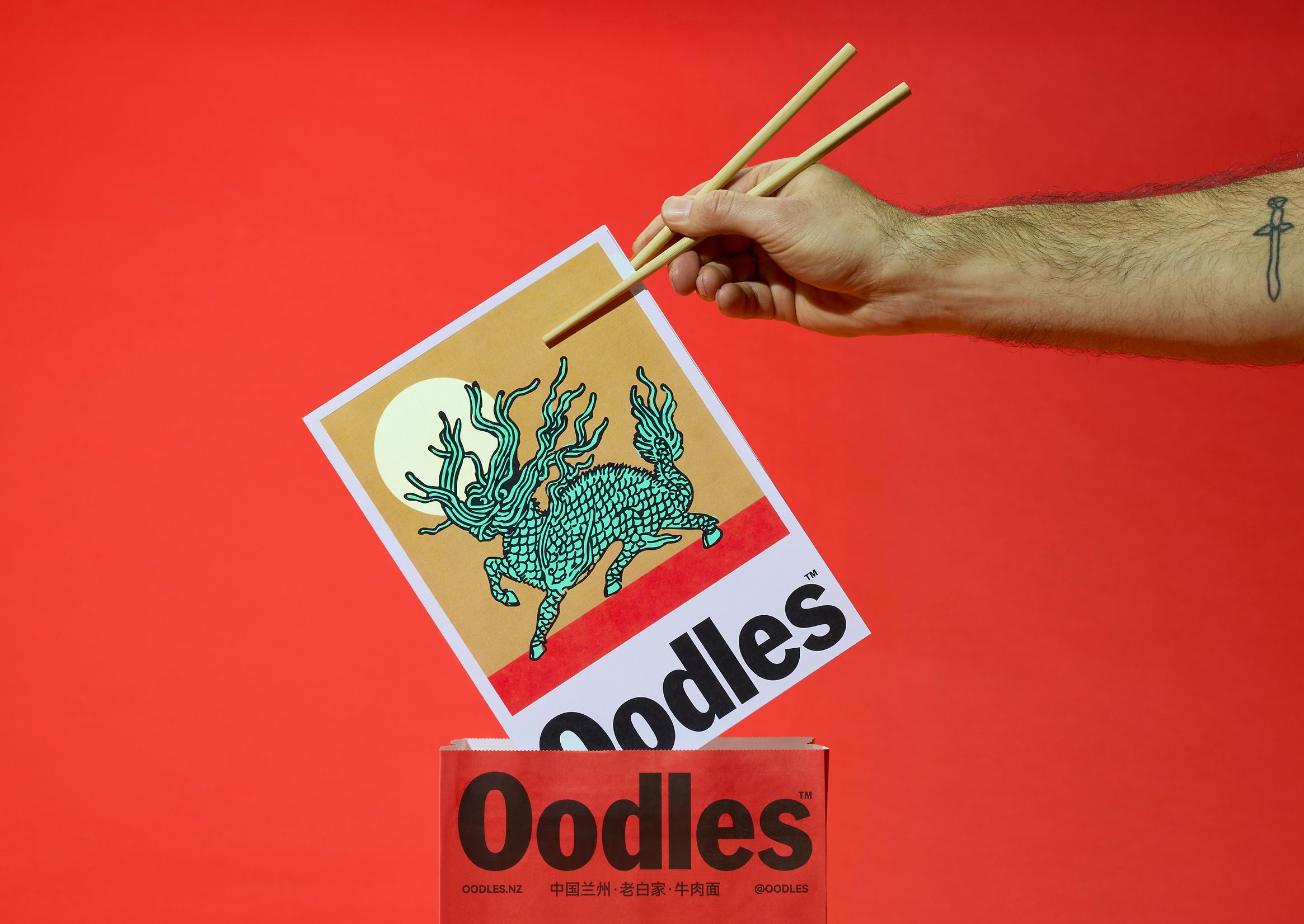
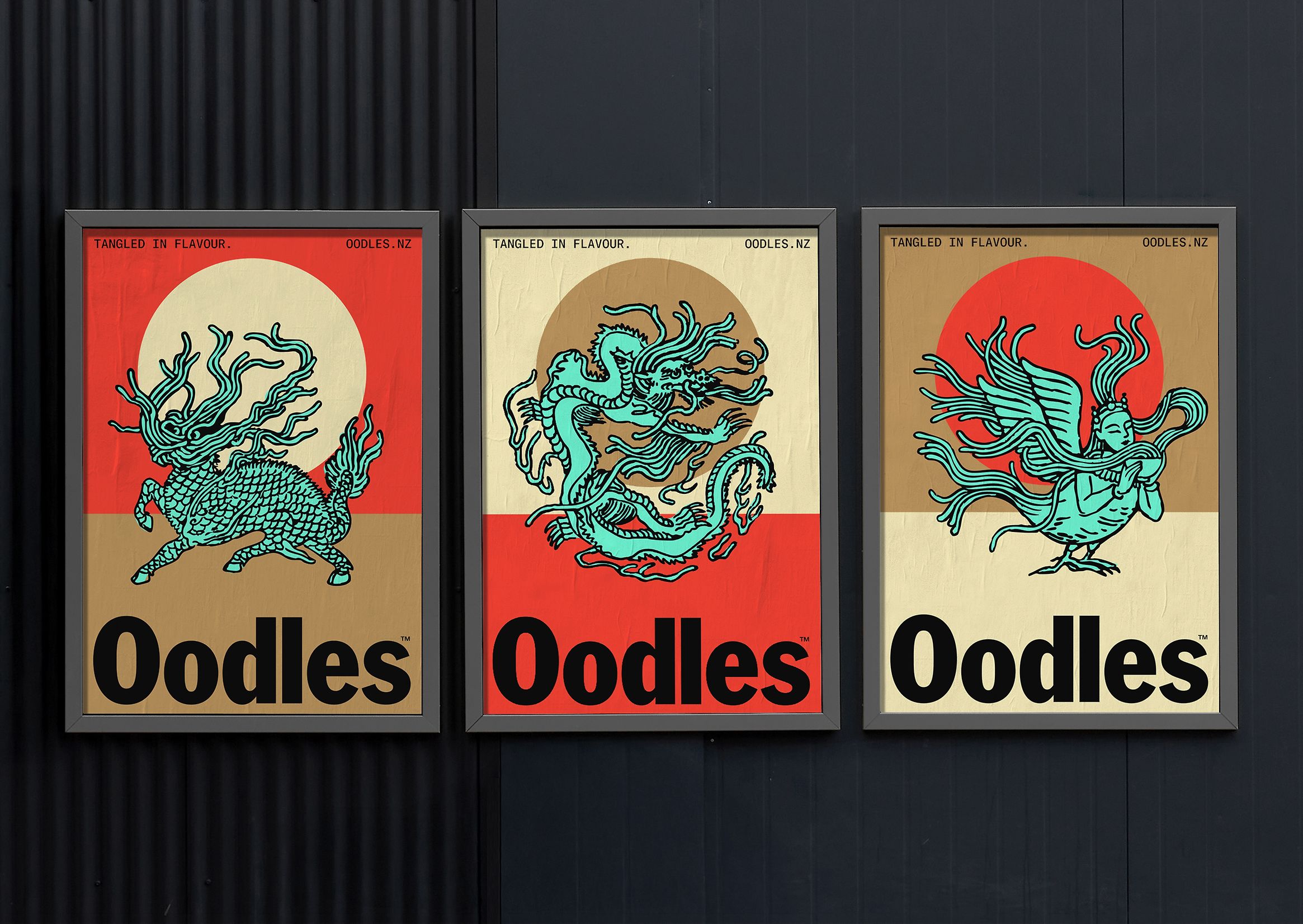
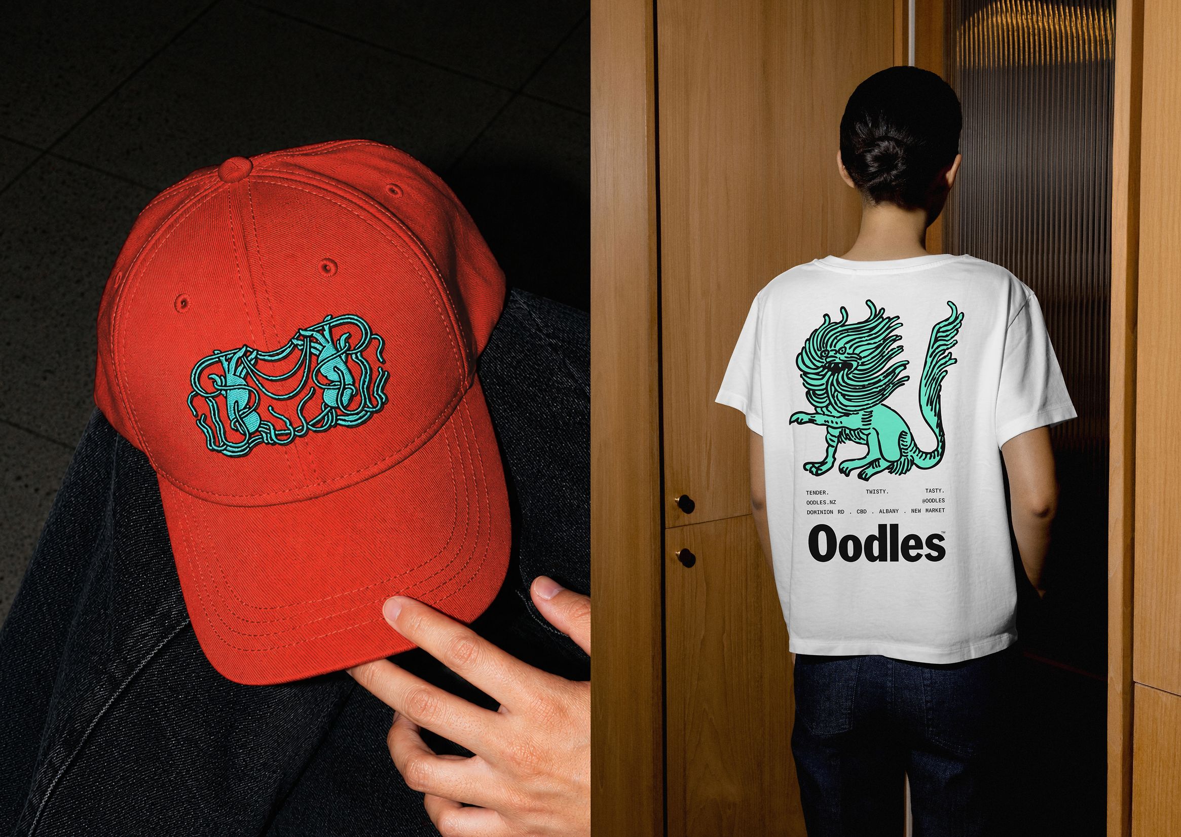
There’s so much to love about this identity – not least that it manages to make a noodle joint look like a perennially hip skate brand (yes, I am obviously talking about Supreme – all no-nonsense stocky black lettering on postbox red backgrounds).
The identity in question is that for the delectably named Oodles – more on that moniker shortly – by Studio South (Old Elephant House, Outline, 246 Queen), which is based in Auckland, New Zealand.
Working across the brand strategy, new naming, brand identity, illustration and copywriting, Studio South was brought in to work with the outlet now known as Oodles – formerly the rather not-catchy No.1 Beef Ramen – as the brand sought to evolve with the opening of its new flagship restaurant in Newmarket, a retail hub in Auckland.
According to Studio South, the restaurant brand was and is renowned for its authentic Northwestern Chinese cuisine and hand-pulled Lanzhou beef noodles – yet its previous beef-centric name wasn’t really doing it justice (also it was, objectively, terrible, reading more like a review than the name of an eatery).

So yes, the name was quite rightly overhauled. And what a name to have chosen. Oodles is, in my opinion, excellent. It’s delicious, abundant, fun and round and strange and crucially, very memorable indeed.
Those sensibilities around deliciousness, abundance, fun and being strikingly memorable play out throughout the entirety of this identity – but not always in the ways you’d expect, nor the obvious shorthands or shortcuts to convey them.
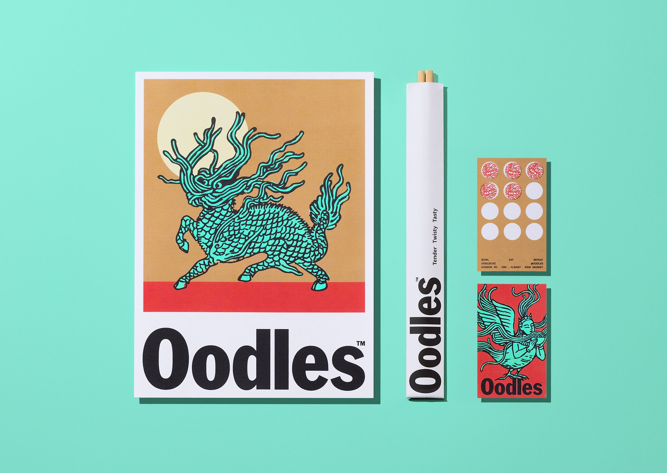
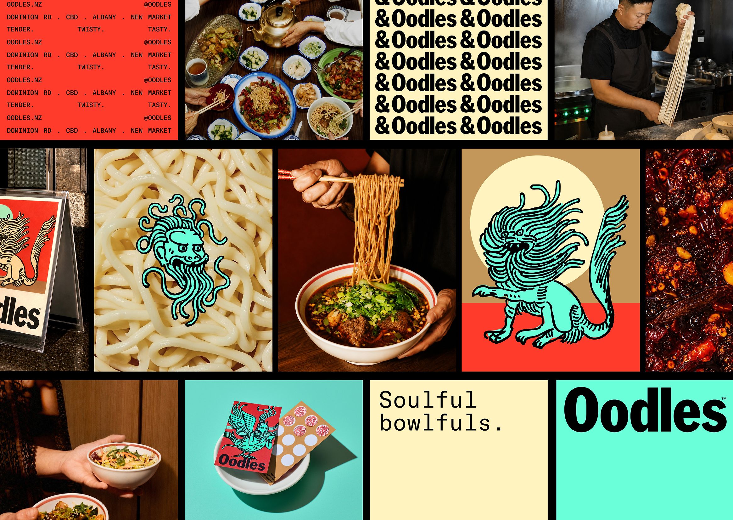
It feels delicious because it feels fresh: the photography is starkly documentarian, never opting for the overtly stylised, frankly unrealistic tropes all too often used when shooting food or restaurant imagery.
It feels abundant almost precisely because of the restraint: the colour palette is punchy as hell, but strictly limited to paintbox primary red and vibrant turquoise against neutrals of light caramelish brown and a peachy shade – a really nice, thoroughly contemporary combination that’s both rather unusual perhaps in the context of food, but which never detracts from the idea of high quality dinners and top notch taste.
And it feels fun and memorable in the best possible ways: not by being overly zany, or wacky, or out there, but simply by being really well crafted – bright, legible, playful, but very much a carefully rigorous brand that’s timeless as anything and eye-catching as hell.
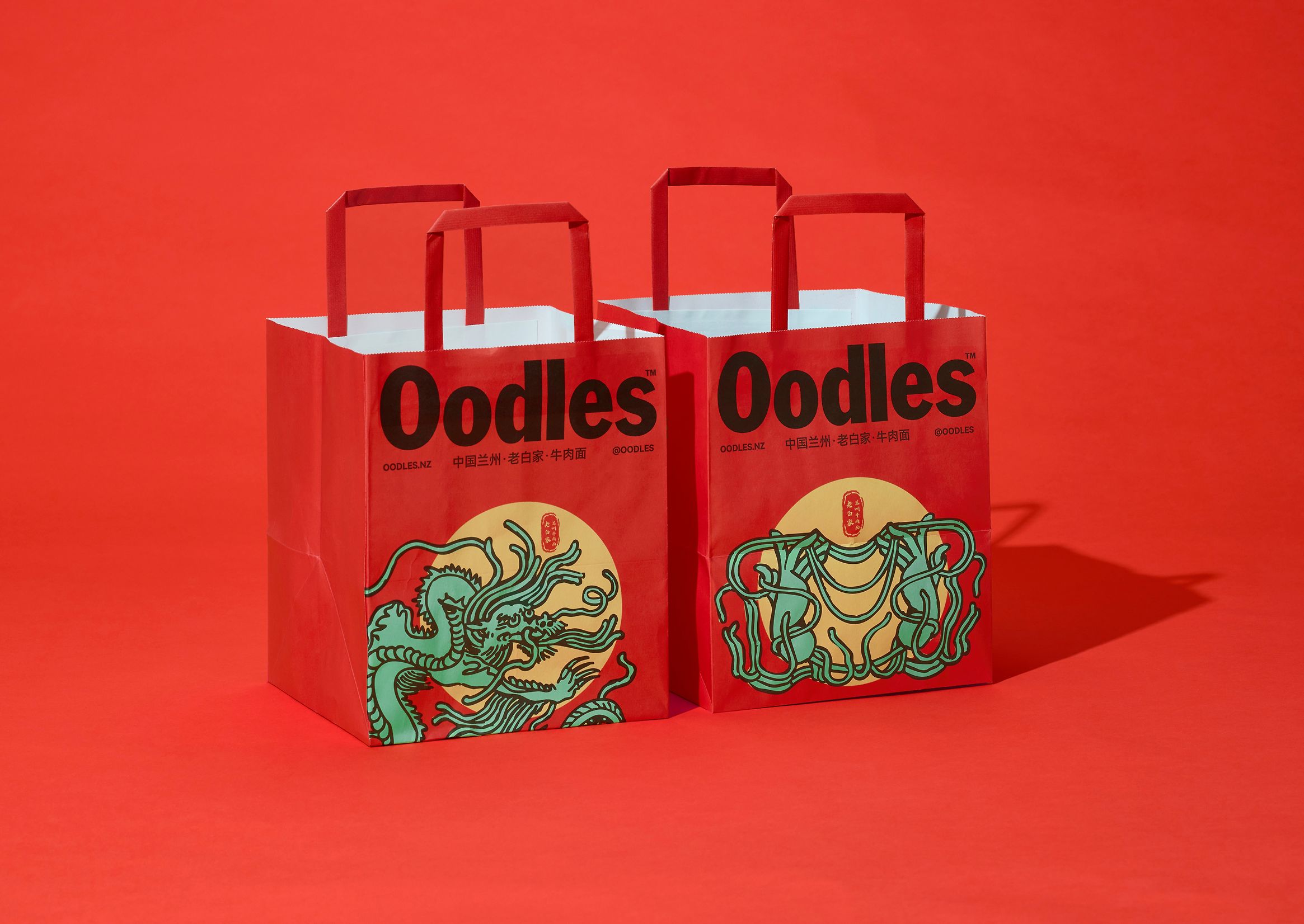
The more striking qualities of the identity are in many senses thanks to that aforementioned colour palette, but are equally down to the deft use of typography here.
For the main brand font Studio South opted to use American Grotesk by Wellington, New Zealand-based Klim Type Foundry, a reprisal of Franklin Gothic and retaining its forefather font’s unshakeable prowess when it comes to “persuasive communication,” as Klim puts it.
A secondary typeface is used for a few applications and touchpoints, both in sentence case and all caps: I’m not sure exactly what this font is, but it’s a nicely digital-feeling, legible, monospaced sans-serif with an overarchingly clean, modern typewriter aesthetic. Everything about this font feels technical and geometric, but with a charming, humanistic touch thanks to distinctive details like the wide loop of the lowercase ‘a’ and the elongated, curved terminal of the ‘r’. The overall effect is a perfect balance between industrial precision and retro minimalism, making it feel both almost archival and resolutely contemporary – and the perfect counterpoint to the butch, no-messing letterforms of American Grotesk.
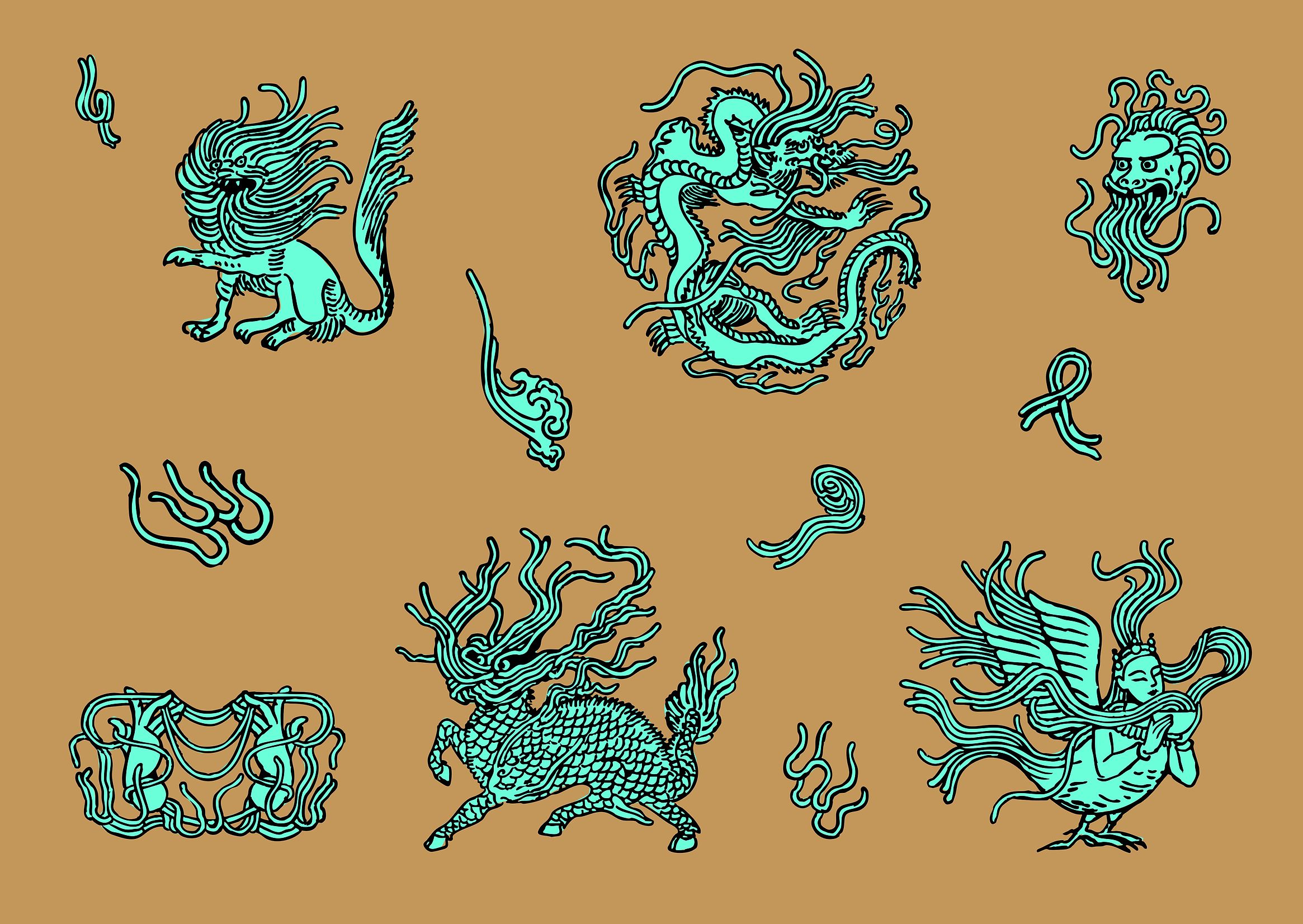
The identity also makes use of a number of charming illustrative flourishes which Studio South says draw inspiration from vintage Chinese animal motifs and the ancient Dunhuang murals – a collection of Buddhist wall paintings spanning over 45,000 square metres across the Mogao Caves in Gansu, China, dating from between the 4th and 14th centuries AD.
From those starting points, the studio drew a series of newly created “mythical creatures” – their own takes on the sinewy, swirling organic forms of Chinese dragons, griffins, and so on. In the wrong hands this could feel a bit ‘off’, or perhaps even inappropriate, but here it’s definitely more reverent than rip-off.
And where the illustrations really come to life is in how they seamlessly morph and twist into patterning as well as imagery: the way the forms flow and converge into and throughout one another gently recalls the noodles themselves, as well as becoming neatly dextrous and flexible brand assets that can be used across touchpoints of pretty much any scale, size or dimension.
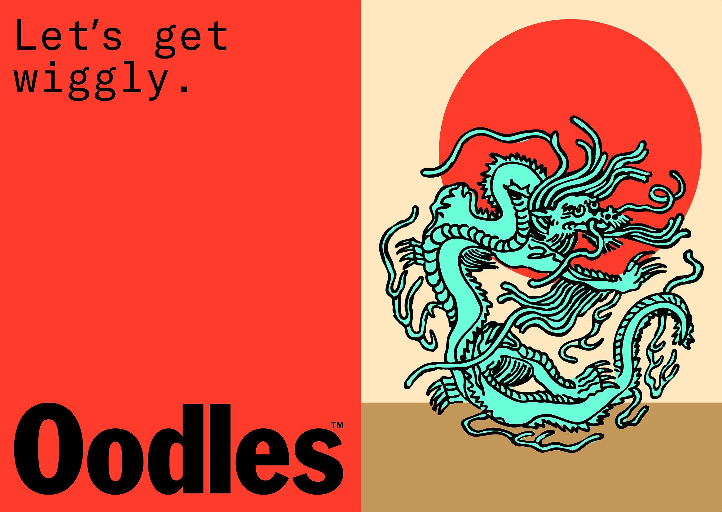
The overall concept, according to Studio South, was to create a contemporary identity that centres on “expressive storytelling” to “celebrate generations of culinary heritage while introducing authentic Northwestern Chinese cuisine to a new generation of diners.”
Undoubtedly this has been achieved, but with some adorable, gently off-the-wall finishing touches. Copywriting-wise, for instance, I could not more wholeheartedly endorse this frankly ridiculous, but thoroughly lovable strapline: ‘Let’s Get Wiggly’. As I say, it’s ridiculous – so perfectly, gorgeously silly; so utterly memorable; so strangely clever.
After all, noodles are (cooked, at least) if nothing else, absolutely wiggly. Wiggly is fun. Wiggly is fun to say, fun to read, fun to write, so oddly and succinctly onomatopoeic somehow. For a brand named Oodles, I honestly don’t think anyone could conceivably come up with a better strapline than ‘let’s get wiggly’.
The copy elsewhere is, likewise, superb. Short, to the point, never taking itself too seriously yet somehow never undermining the brand either – things like “Big Slurp Energy” and “Bowl. Eat. Repeat.”
For all its ridiculousness, the copywriting here is so deft that you still very much believe in the quality of the product – I’m not entirely sure how Studio South has managed to achieve this strangely singular marriage of daft as hell and never-not-communicating a top-notch eating experience, but it’s managed it. Some sort of wiggly witchcraft perhaps; some wiggly ol’ wizardry. Who knows, and honestly, who cares when it’s this strong.