Wedge’s Bastét toothpaste brand design makes absolutely no sense for its category – and perhaps that’s what makes it so utterly gorgeous
Opinion by Emily Gosling Posted 18 September 2026
 “Nano-hydroxyapatite” isn’t exactly memorable – it takes a few tries to even attempt to figure out how to say it, and I’d wager that there aren’t too many people who can tell you what on earth it is, beyond “some sort of chemical, probably?”
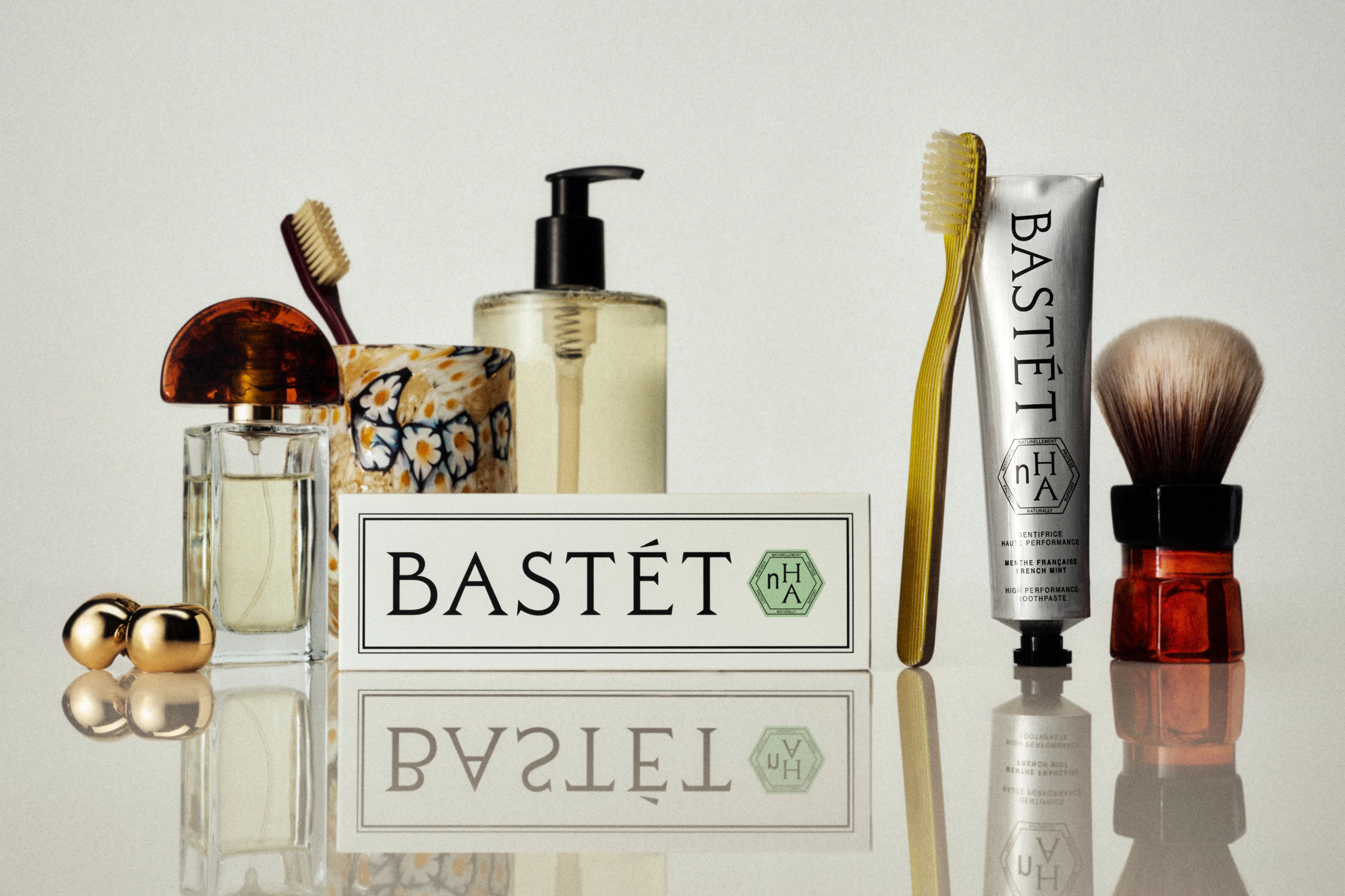
One thing that is memorable, however, is the brand identity for Bastét – a new oral care company that makes toothpaste, a product that’s almost the definition of quotidien and functional, truly beautiful.
Said brand identity design was created by Los Angeles- and Montréal-based creative studio Wedge (Matheson Food Company, Ami Ami), which has a decent history in reinventing the wheel of nasher-care: earlier this year we covered its vibrant take on dental floss with Cocolab. And sure, that work was nice – but Bastét is a whole new level of nice.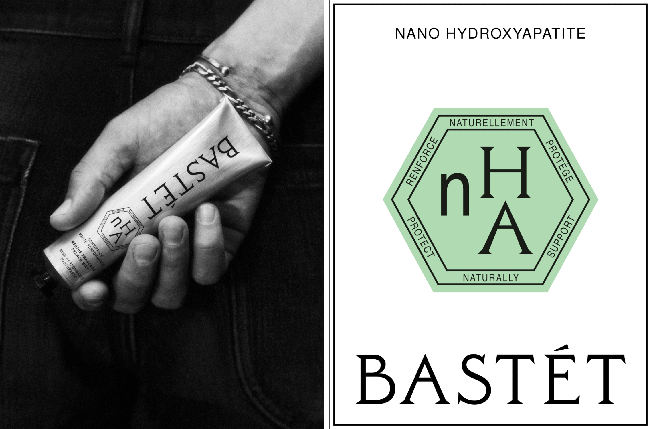
Wedge was brought in to work across the naming; brand strategy and narrative; visual identity system; packaging architecture and design; and brand guidelines for Bastét – essentially commissioned to “turn a product idea into a total brand vision”, according to the studio. “Their mission was to build a premium, high performance oral care company that earns its place on the beauty counter,” Wedge adds.
And earn its place on the beauty counter it certainly does. This is more L’Occitane en Provence than Colgate – Bastét is miles apart from pretty much everything you’d find in the dental aisle, in fact.
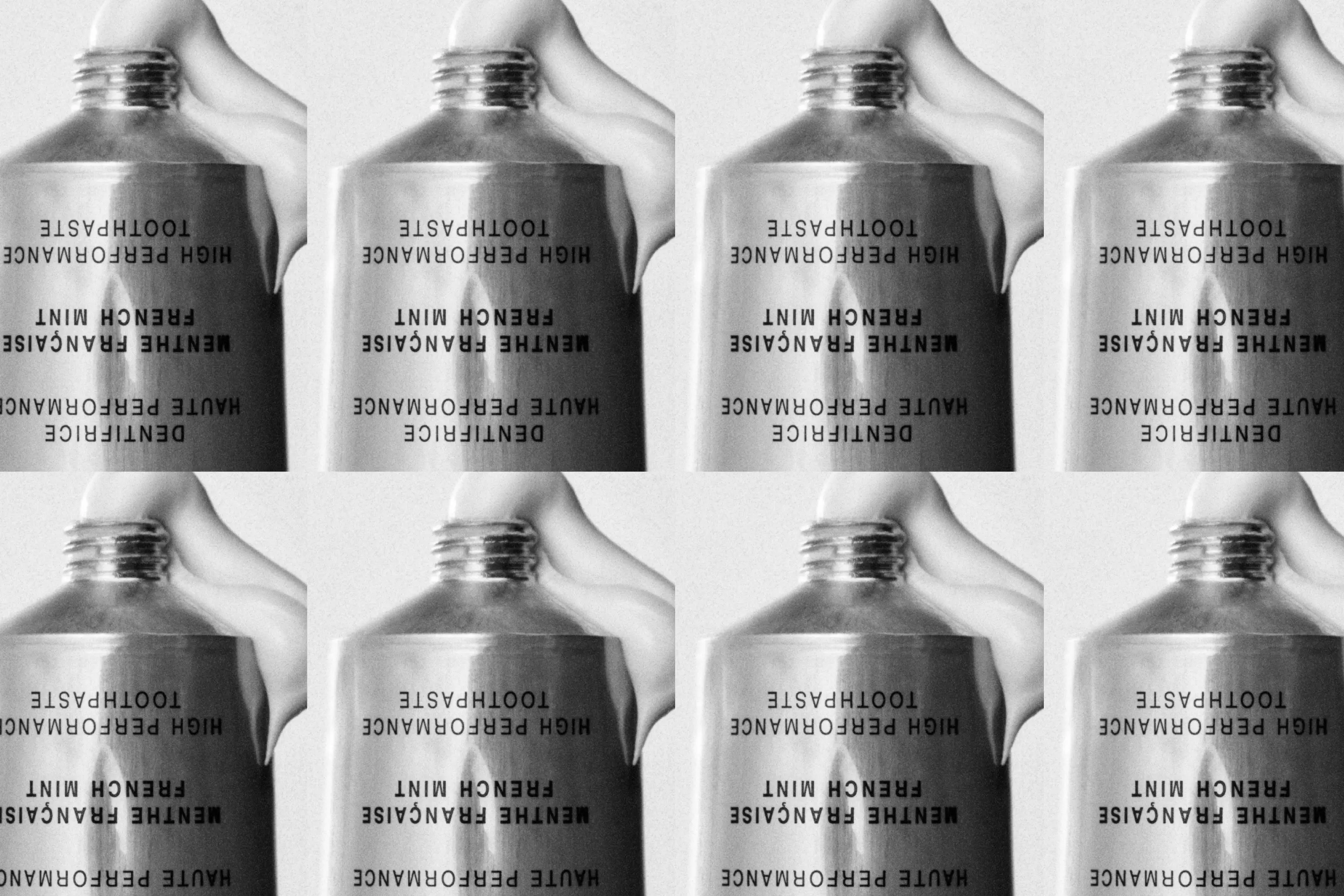
It’s a glorious demonstration of defying a category’s norms and showing that just because certain design conventions exist – and certain visual tropes have become a shorthand for not just what a product is, but its trustworthiness (red, white and blue on both packaging and product as a signifier for ‘toothpaste we know will probably work’, for instance) – it doesn’t mean you can’t absolutely build a successful brand by shattering the rules that should have been questioned long ago.
To return to that eight-syllable-strong term where we started, what largely sets Bastét’s toothpaste apart on an ingredient level is its centering on nHA (nano hydroxyapatite), a synthetic, biocompatible form of calcium and phosphate that mimics the natural mineral which makes 97% of human tooth enamel.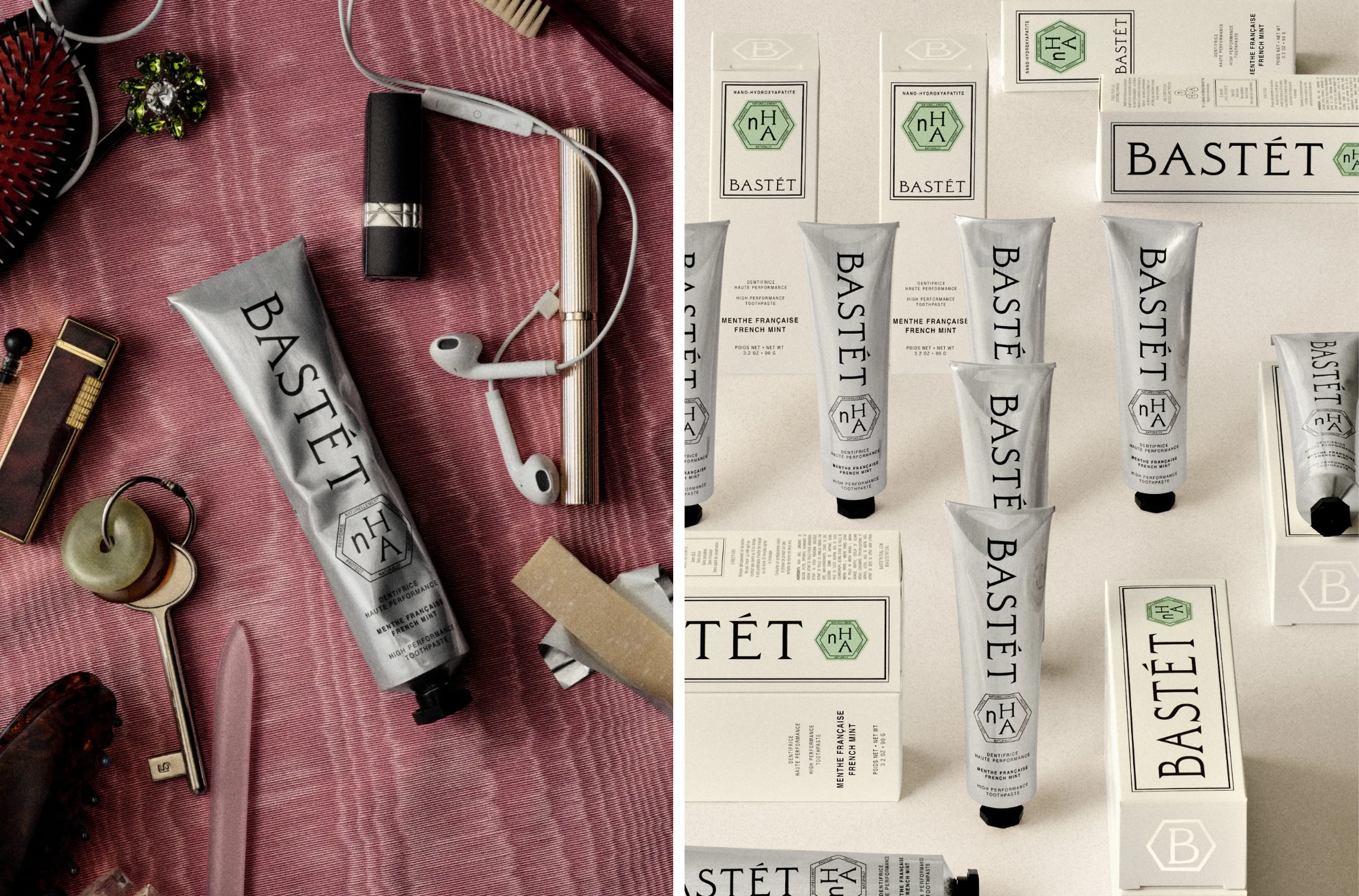
Aside from that 10% nHA promise, the other 90% is described by Wedge as being “clean ingredients” – and the product packaging itself proudly states the lack of various elements few of us could truly define (no SLS [!?!], no silica, no parabens, no triclosan [no idea]) and also no preservatives, a more normal word in a sea of jargon.
Indeed, “clean” is a rather loose, amorphous, and flimsy promise at best (especially considering the fact that ‘hero ingredient’ nHA is itself synthetic), but it’s hard to care about what the hell that means when the brand looks this good.
Apparently it was nHA’s proven ability to support the remineralization of teeth that really got Wedge going in terms of how to consider the brand’s positioning as something “restorative,” based around the ideas of physical and emotional well-being.
This led to the central brand idea “A Ritual for Renewal” – something which absolutely underscores that idea of a brand with functionality at its core, but the beauty counter in its heart. I’m not sure about this whole self-care thing, but Wedge’s statements around creating something ”where rigour meets pleasure” makes so much sense from a visual perspective: it’s clean but off-kilter; shiny but sort of industrial in the decision to use aluminium tubes, geometric shape logo but with a shade of turquoise that feels right at home within established codes of luxury.
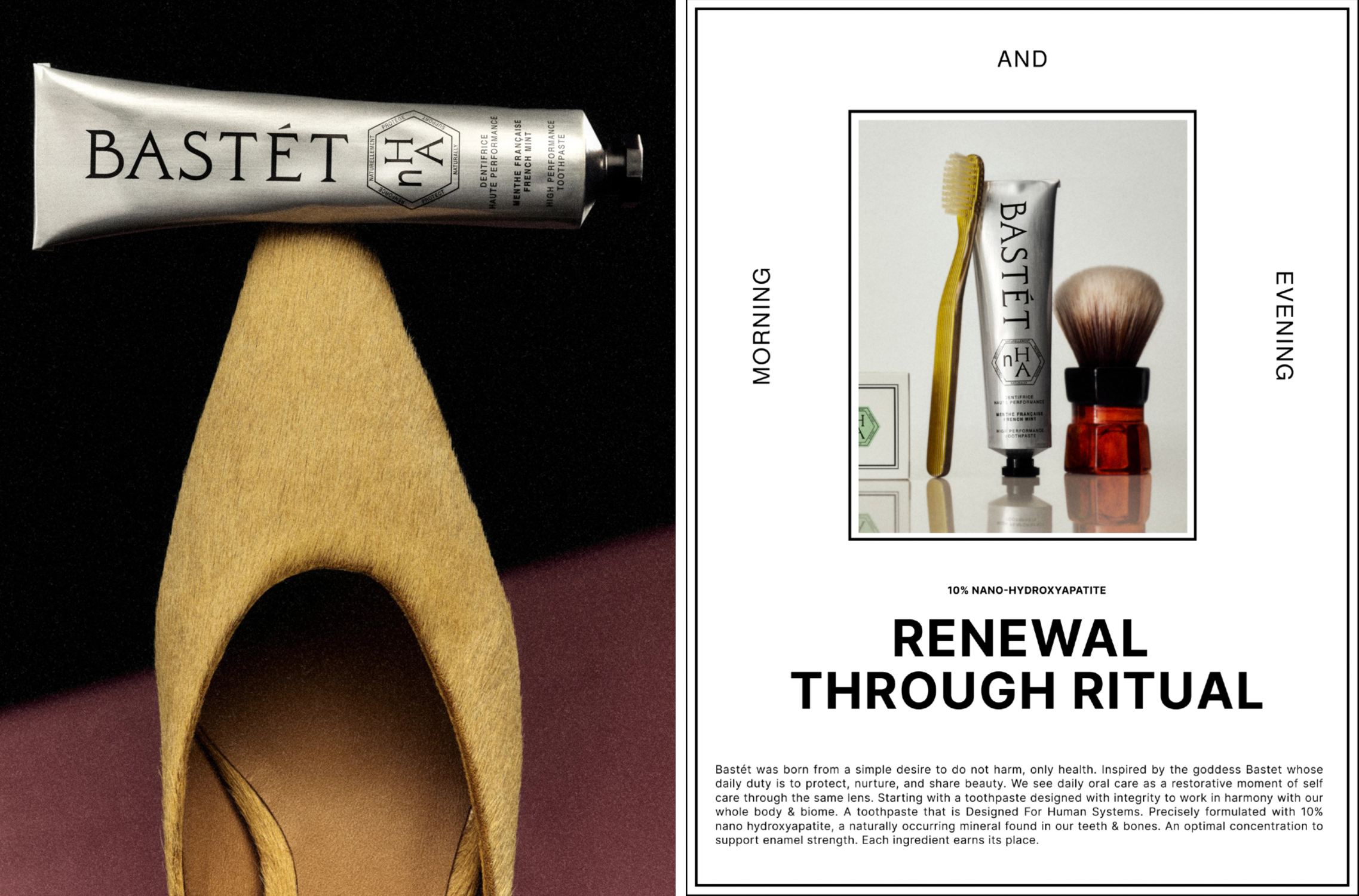
The name itself is also very much in the realm of high-end beauty: the accented ‘é’ alone connotes “French” to even those with sub–Encore Tricolore language proficiency – and what does French connote? Well, high-end beauty products, among other things (wine, berets, baguettes, and so on). Sure, it helps that the product itself was founded in French-speaking Montreal, Canada – and its packaging is bilingual, with both French and English on every panel, but nonetheless, the Frenchness of the brand name certainly does it no harm in terms of upping the stakes when it comes to succinctly conveying classiness.
However, the name packs a much deeper meaning: Bastet (without the accent) is the moniker of the ancient Egyptian goddess of home, domesticity, fertility, and protection, best known for her evolution from a fierce lioness warrior into a gentle cat-headed deity.
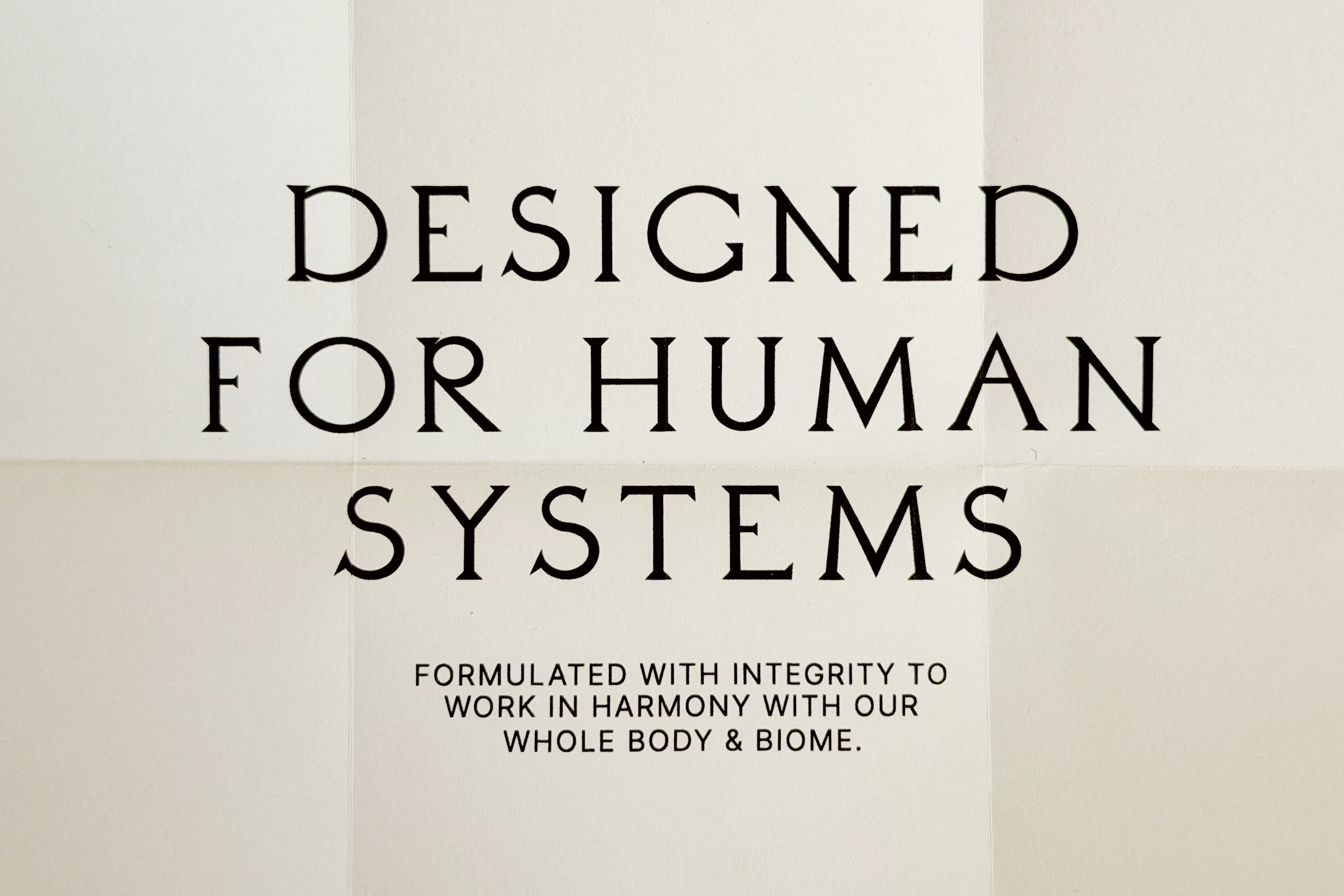 For Wedge, the cat/fertility/warrior stuff was by the by; it focused on that idea of ‘protection’ – a central promise for a decent toothcare brand. The packaging itself gets rather poetic in its copywriting style – arguably a little too wanky, for want of a better term: “Inspired by the goddess Bastet whose daily duty is to protect, nurture, and share beauty,” it states. “We see daily oral care as a restorative moment of self care through the same lens.”
The copy continues to say that the toothpaste is “designed with integrity to work in harmony with our whole body and biome…” Then it gets weirdly sci-fi: “Designed for human systems”. Let’s be honest: too far, Bastét. But all of that rather over-the-top copywriting – at the end of the day, this is, after all, boring old toothpaste – is really my only gripe in an otherwise sublime piece of brand design and packaging.
What first made me adore this work, however, is the main brand typography: it’s absolutely incongruous to its category – sort of Art Deco in its gentle ornamentation, all antiquated like stone-carved letters – but it works not in spite of being outlandish compared to its peers, but most likely precisely because of it.
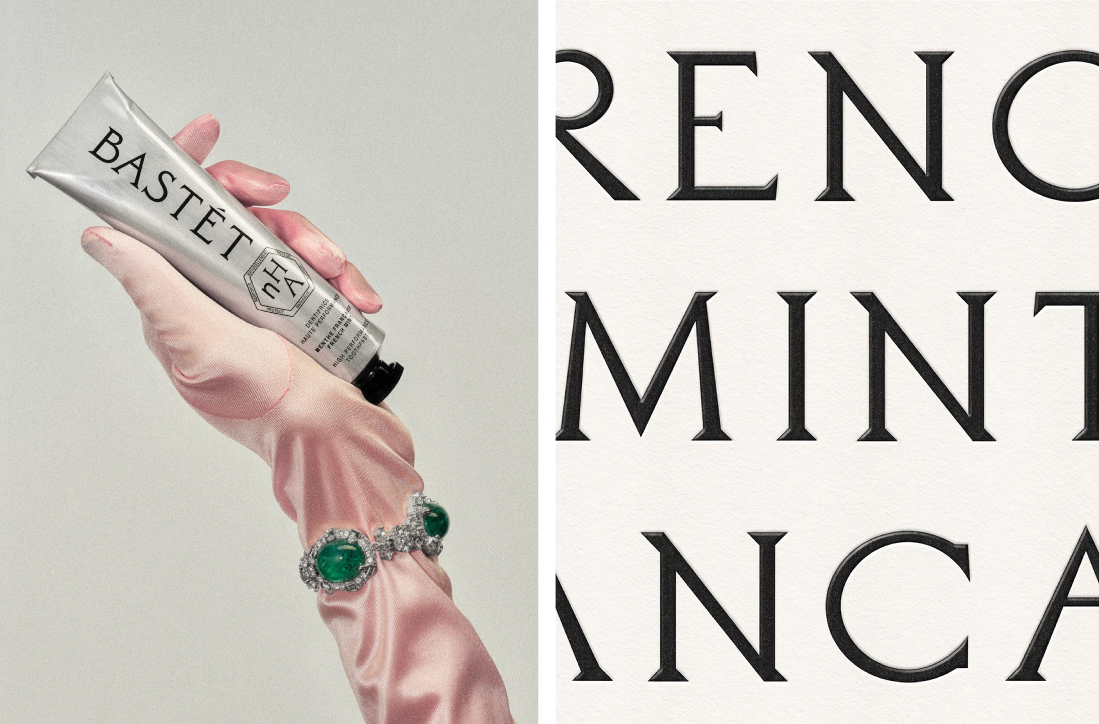 Daubenton, a high-contrast serif display typeface designed by Olivier Dolbeau of Paris-based type foundry Velvetyne. The typeface is a revival based on the lettering found carved into the stone sited on the façade of the Great Evolution Gallery (and surrounding streets like Rue Daubenton) at the National Museum of Natural History in Paris. So its fin-de-siècle glory makes sense. Does it make sense for toothpaste? Not really. Does it work? Absolutely.
I’m also a huge fan of the art direction: in places it’s downright ridiculous, in the best possible way. That satin pink glove, adorned in mad-big costume jewellery gems! If it weren’t so camp, it would almost be sexy – but if it was sexy, tbh I’d be fine with that. But camp and ridiculous are, after all, just as good as sexy. And probably more fun at parties.
I truly love this branding: on a purely aesthetic level, it’s just really lovely to look at – stylish can often seem to be used as a byword for ‘minimalist’, which is arguably (in the wrong hands at least) a synonym for ‘plain’, which in even less-flattering terms ultimately means ‘boring’. So this is stylish in its truest sense – like a well-worn tooth-gap, it’s the barely perceptible quirks and strange bits and things that downright shouldn’t work, but absolutely do, which makes this project so strong. There’s a gentle sort of grit here which truly makes the pearl; indeed, the pearly whites, to end on a terrible Dad joke-ish pun.