All Purpose’s identity for Two Tribes Brewing is resolutely ‘craft’, while also turning its back on all which that signifies
Opinion by Emily Gosling Posted 8 October 2026
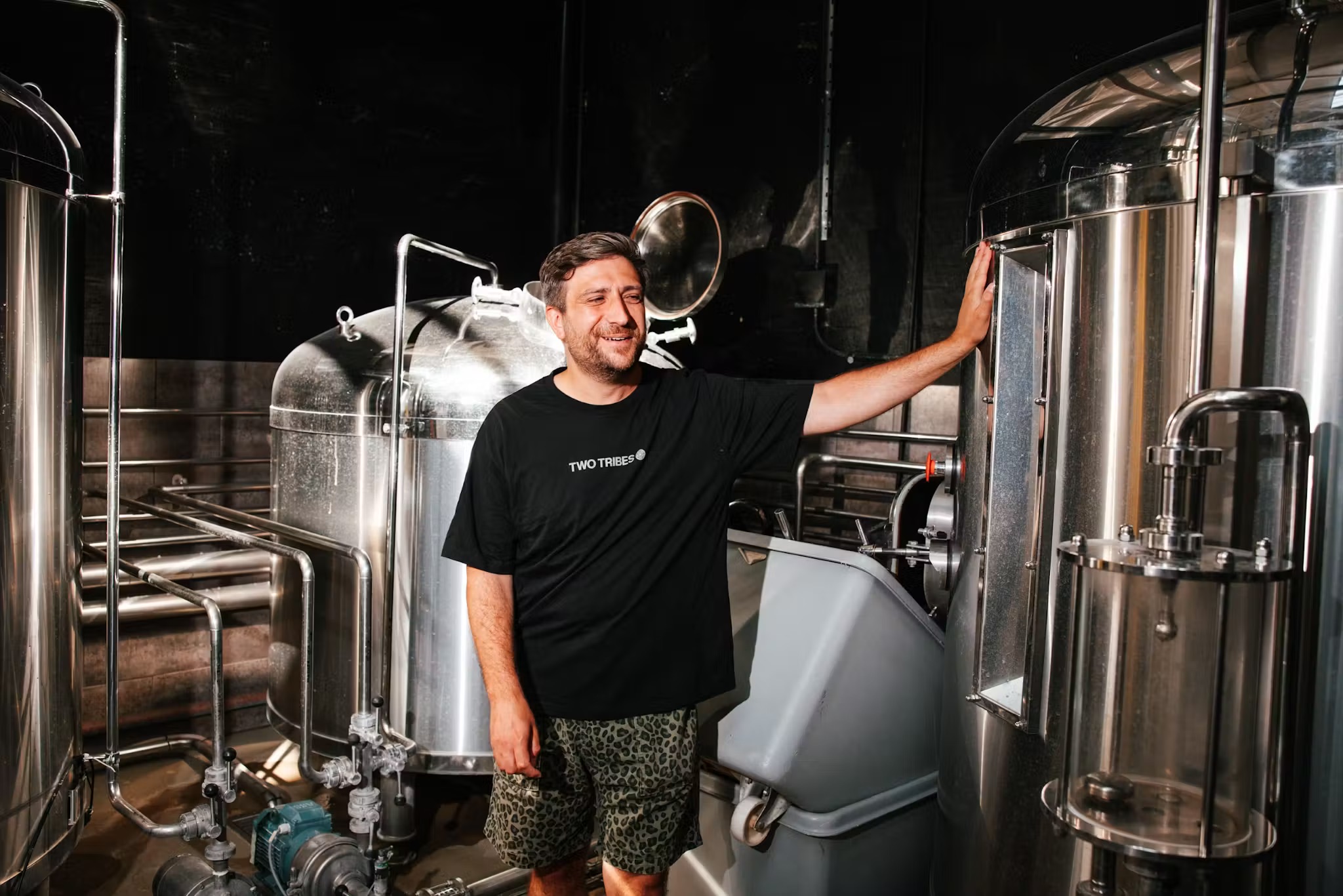
Founded in 2017 by veterans of London’s 1990s club scene, craft beer company Two Tribes is based at Tileyard in King’s Cross, where its brewery and taproom – dubbed Campfire – also function as a venue for music, food and all that other usual jazz you find in the sort of newish site that springs up all shiny and new in an area desperate to shake off its rather more seedy historical reputation.
Earlier this year, Two Tribes was rebranded by London-based studio All Purpose. Just a few months back, we were celebrating the studio’s superb branding for south London wine-purveyors Ancestrel.
I was particularly taken with Ancestrel’s unusual, but undeniably effective use of lurid, retina-searing, acid-bright yellow. I’m going to say pretty much the same here about Two Tribes.
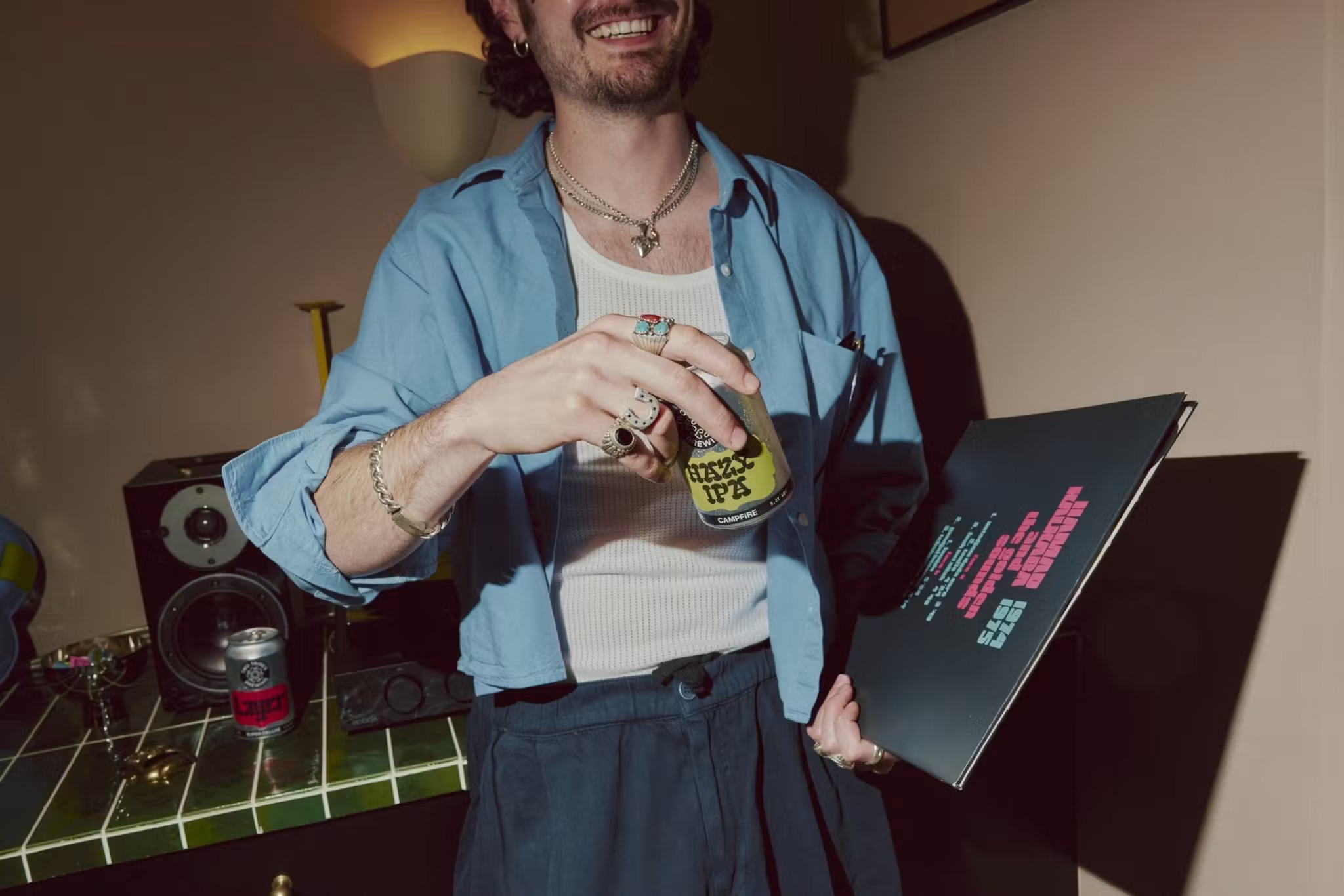
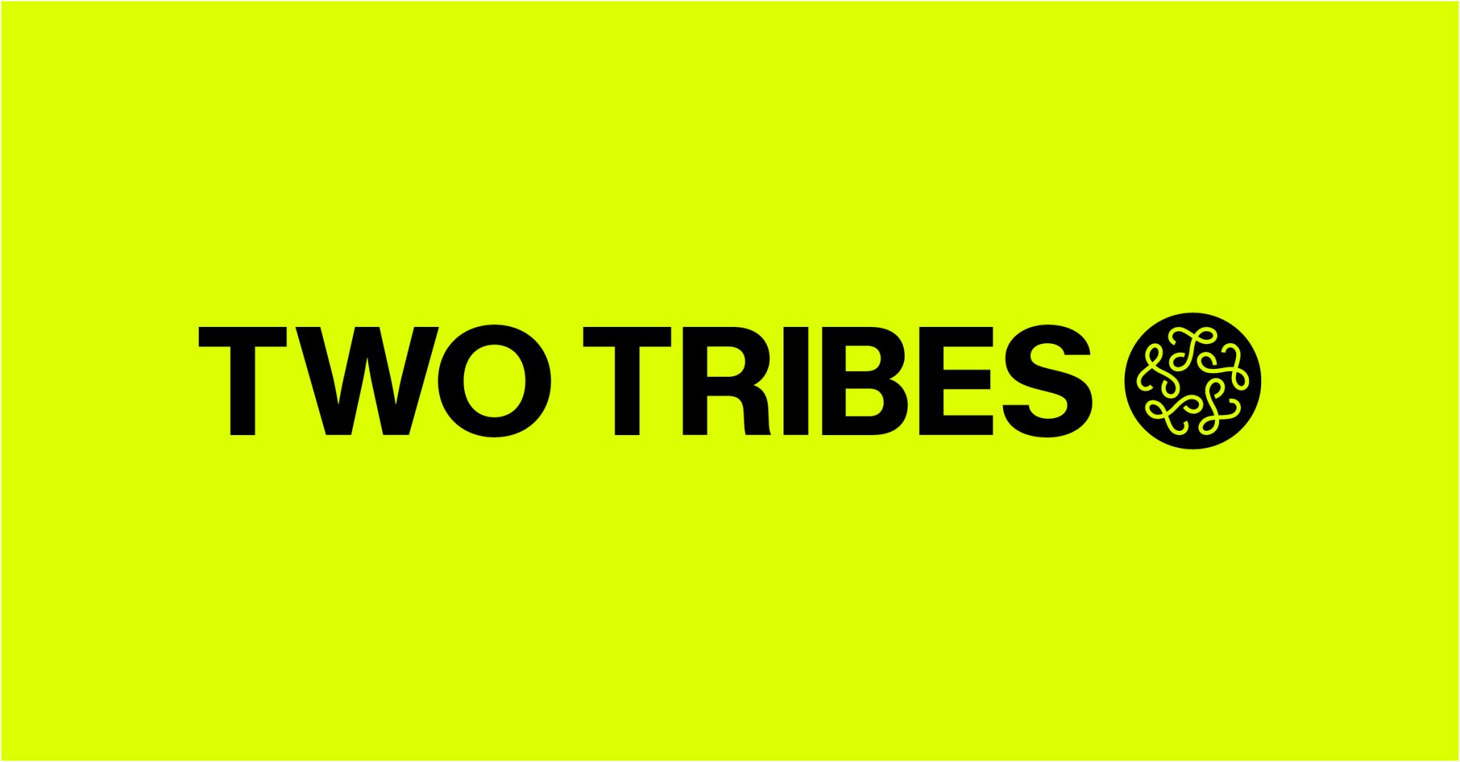
Indeed, here, All Purpose has similarly looked to overhaul Two Tribes with a helluva powerful palette of neon yellow against black, for the most part. It’s great, and one of the main reasons it’s great is because it largely goes against the grain of all we’ve come to expect from the varied, yet often somehow still so predictable world of craft beer branding.
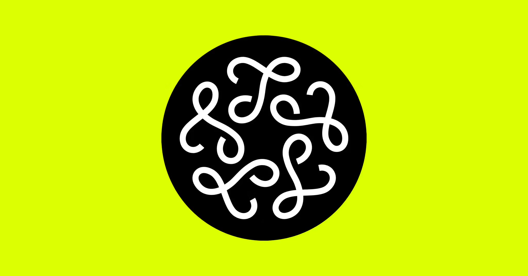
At the centre of the identity is a wonderfully odd little symbol. Five looping, ribbon-like forms twist around one another inside a circle, each resembling a highly abstracted letter, doodle or bit of decorative calligraphy. There’s something pleasingly unresolved about it: the forms feel individual but connected; you can spend a few seconds trying to work out exactly what you are looking at, only to realise that the ambiguity is rather the point.

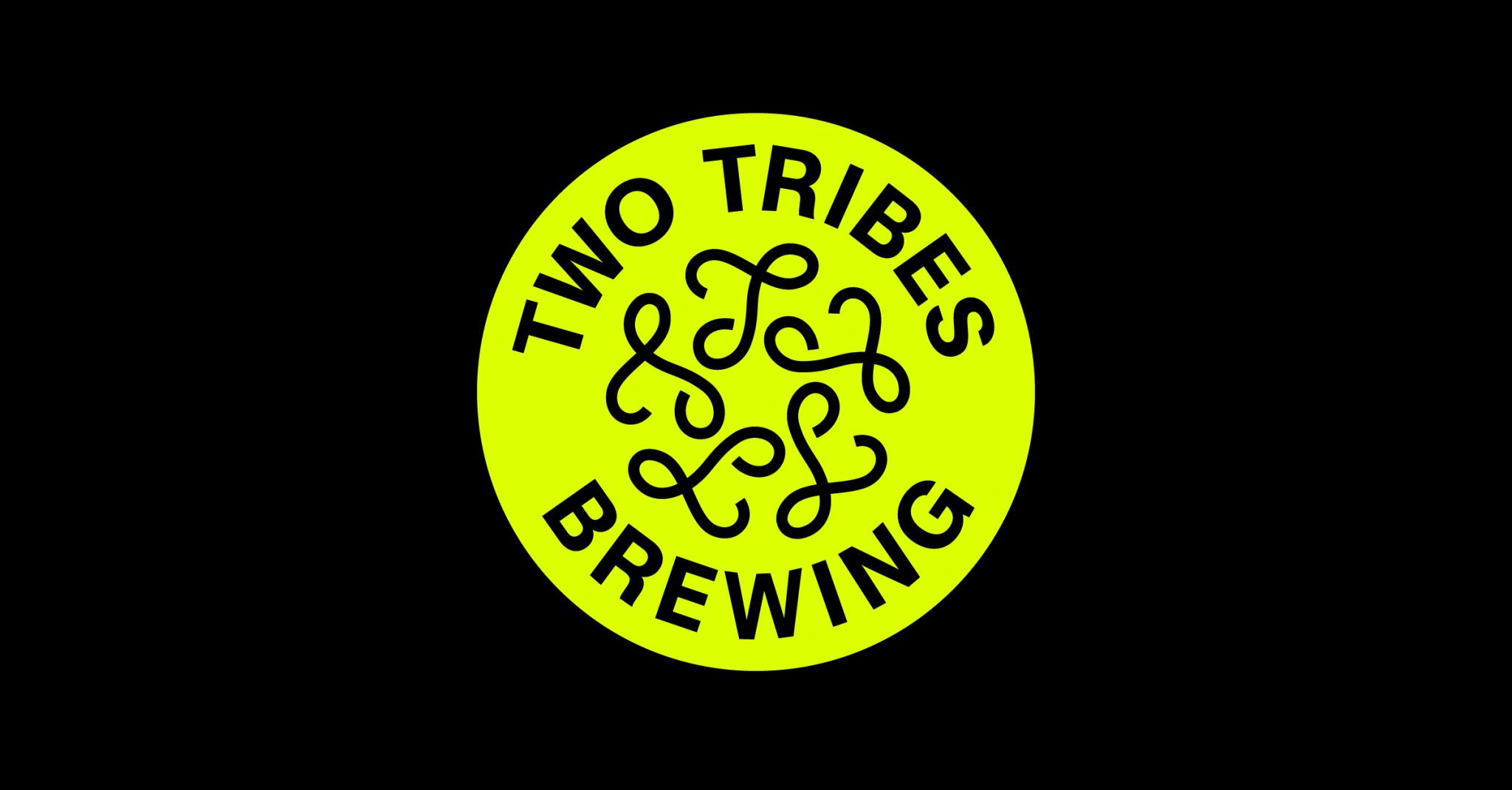
The circular device also becomes a useful container for the wordmark, in which ‘TWO TRIBES BREWING’ is set around the perimeter in a heavy sans serif, following the curve of the circle, with the looping symbol sitting inside it. The construction recalls the badges and seals that have long appeared on beer packaging, but its oversized, blunt typography and fluorescent colour give the format a distinctly less heritage-minded personality.
That acid colour gives the otherwise fairly traditional circular badge – a form used for both the wordmark and the symbols alone – a jolt of real dynamism.
The main brand typeface here is Melange Grotesk by Munich-based foundry Kimera, a lovely little font which combines characteristics associated with early, neo- and geometric grotesques, with slightly geometric proportions, open terminals and a low-contrast construction.
A secondary typeface, OCR-X by Swiss foundry Maxitype in collaboration with Eurostandard, brings another layer of character to the system. As a monospaced variable typeface that revisits the classic 1966 OCR-A system, its origins in machine-readable lettering introduce a more technical, utilitarian voice alongside Melange Grotesk’s modernist qualities.
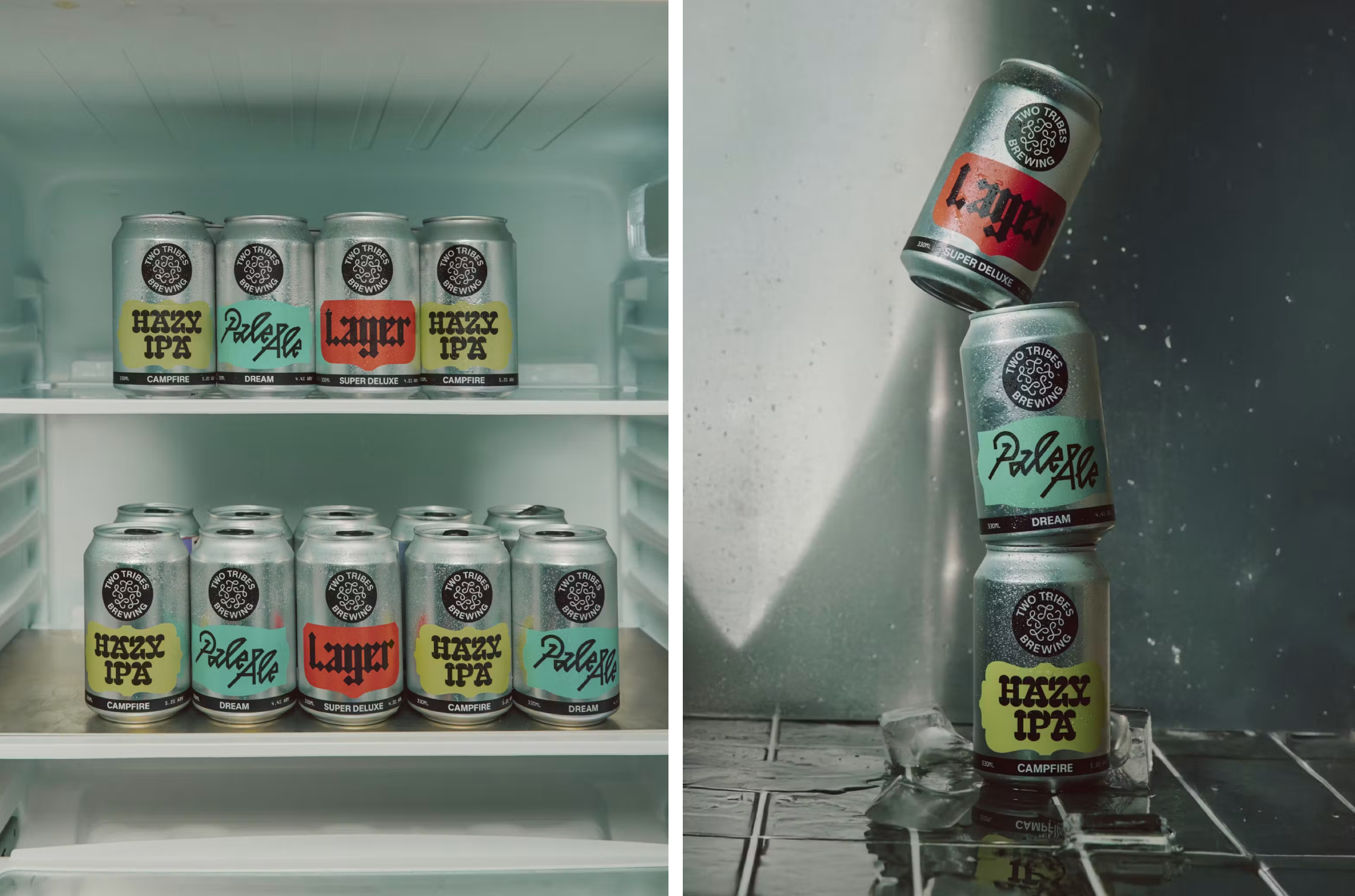
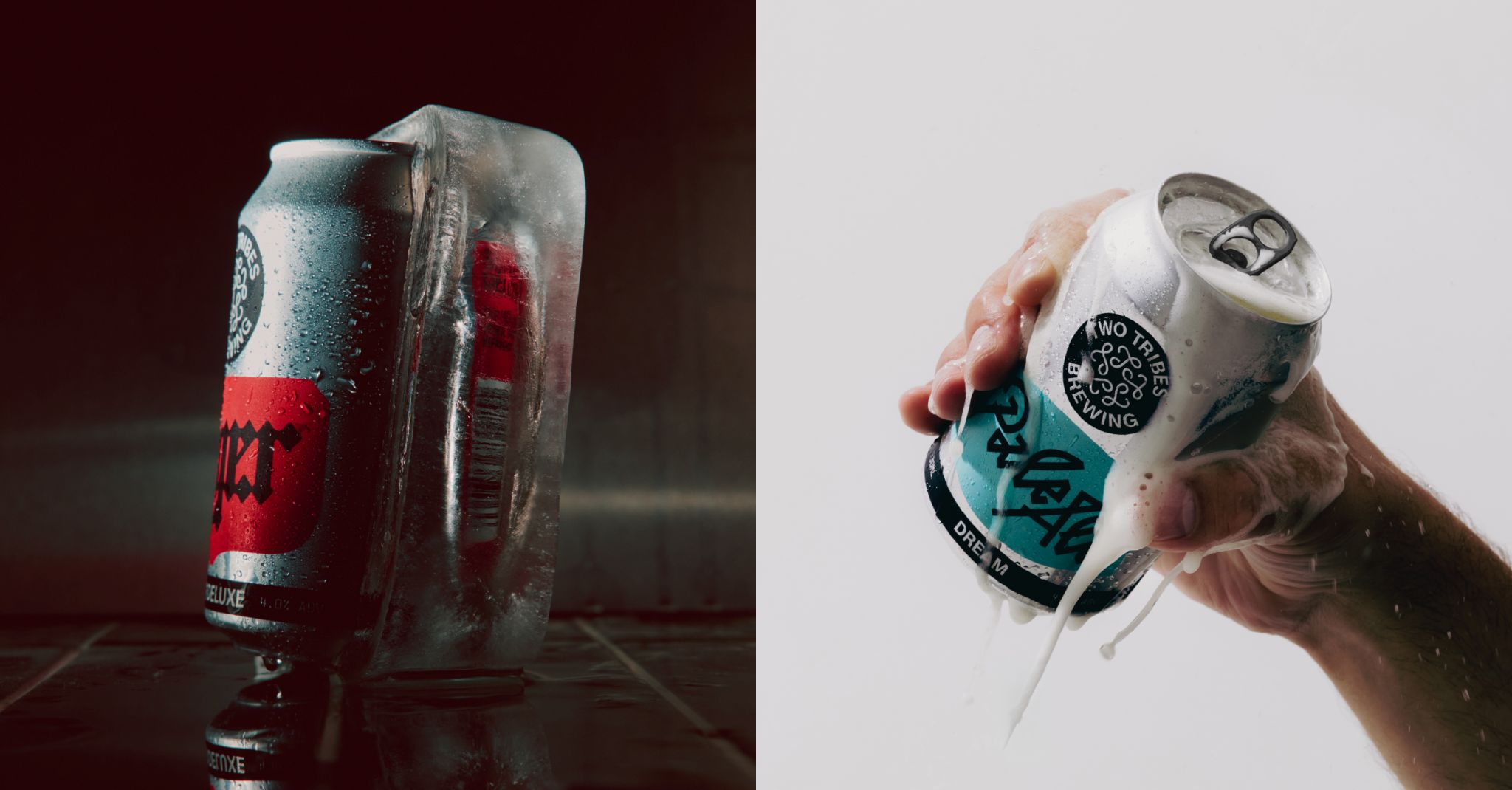
As such, there’s an appealing tension here between the ordered geometry of the grotesk and the unruly quality of the logo. Melange Grotesk provides a rational backbone, while the symbol seems to gleefully wriggle away from it. That same push and pull carries into the wider packaging system, where each beer gets its own typographic treatment, colour combination and geometric framing while remaining recognisably part of the same family.
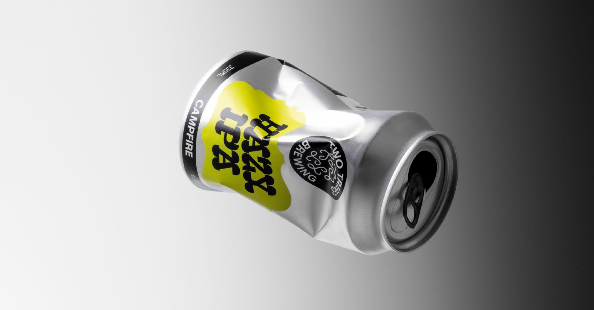
What I find slightly frustrating about this identity is how different the main touchpoints – the wordmark, roundel, logo, brand colours and so on – feel to the actual packaging.
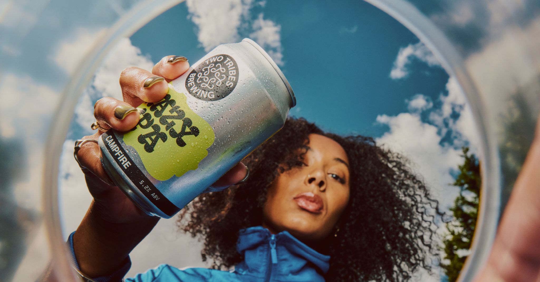
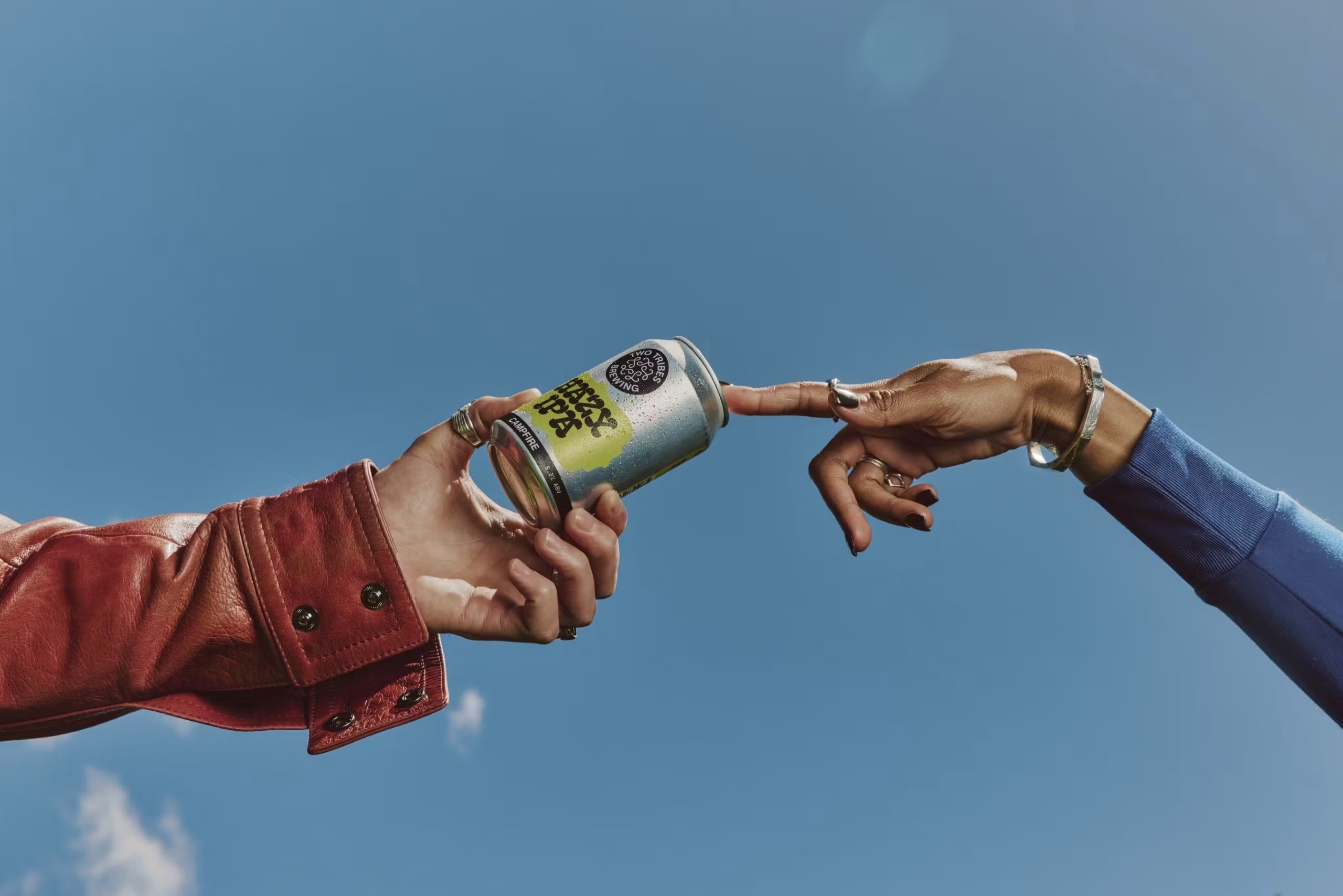
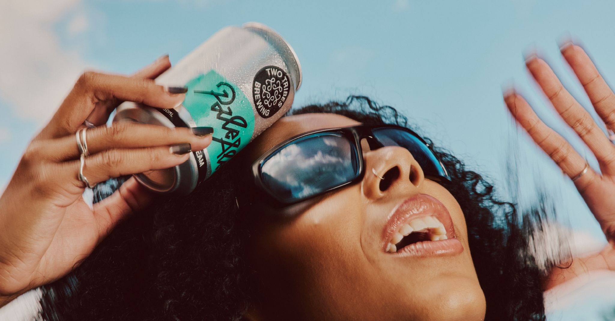
It struck me half way through writing this piece, on a Eurostar train, that I was actually drinking a can of Two Tribes IPA while doing so. But the cans themselves seem so entirely different to the rest of the system – potentially both a good and a bad thing.

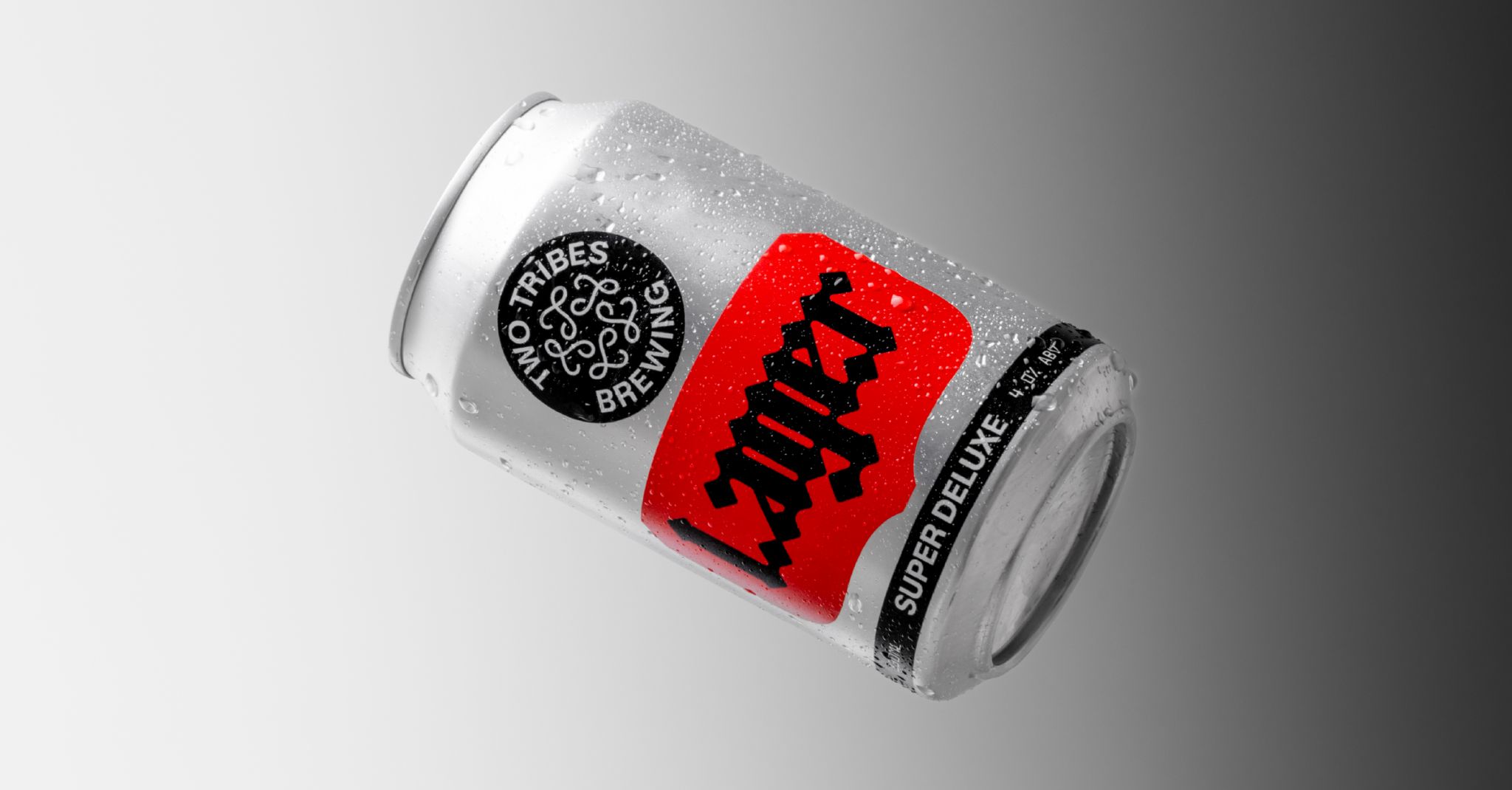
The cans are, after all, very nice: the combination of fonts works really well here in particular. And while it’s great to have such wildly bold signifiers as a key part of the overarching identity, perhaps keeping the cans a little more aligned with ‘craft’ tradition has been done for a reason.
And what I especially like about the work is that All Purpose has found a way to make the brewery feel independent without making independence itself the visual subject.
The identity borrows from familiar beer-label structures, then scrambles them through colour, typography and that wonderfully peculiar knot of a logo. It gives Two Tribes something that can stretch across beer cans, venues and cultural activity, while retaining enough weirdness to make you want to look at it twice.