Order creates a delightfully design history-steeped identity for Salt Lick on Salt Creek – but what actually is it?
Opinion by Emily Gosling Posted 13 October 2026
It’s not all too often that it takes more than a minute or two of looking at a brand design case study to know what the brand actually is. It’s not rocket science – for FMCG, any product or packaging shots usually give it away (with some obvious category-defying exceptions of course, like when toothpaste masquerades as high-end beauty products, or eyewear gets bizarrely Shakespearean). Sometimes, but not as often as you might think, the clue is in the name.
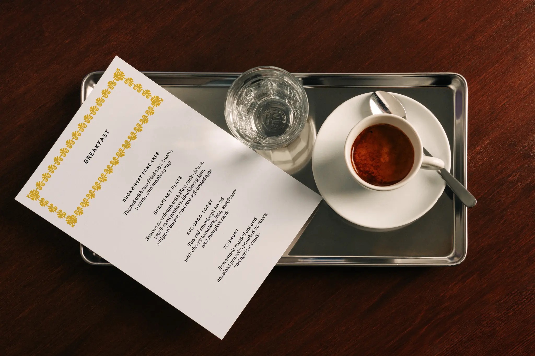
But it’s normally more prosaic than that: if you’re looking at menus, it’s probably branding for a restaurant; shots of big, legible interior signage and you can probably guess it’s a museum, or some other cultural institution.
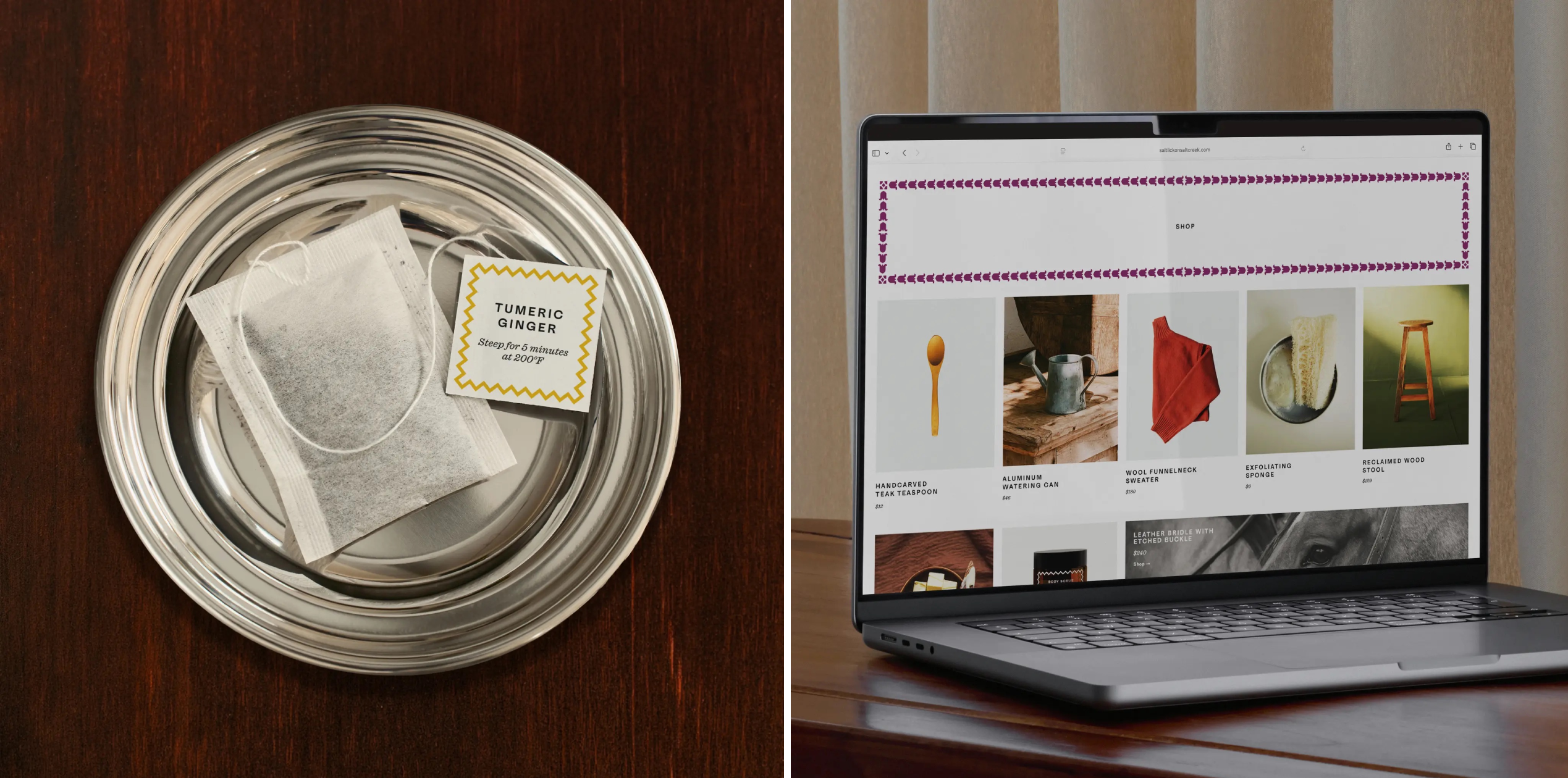
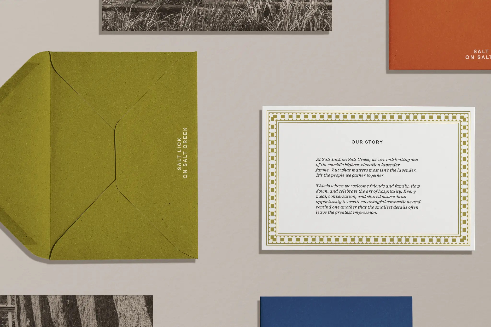
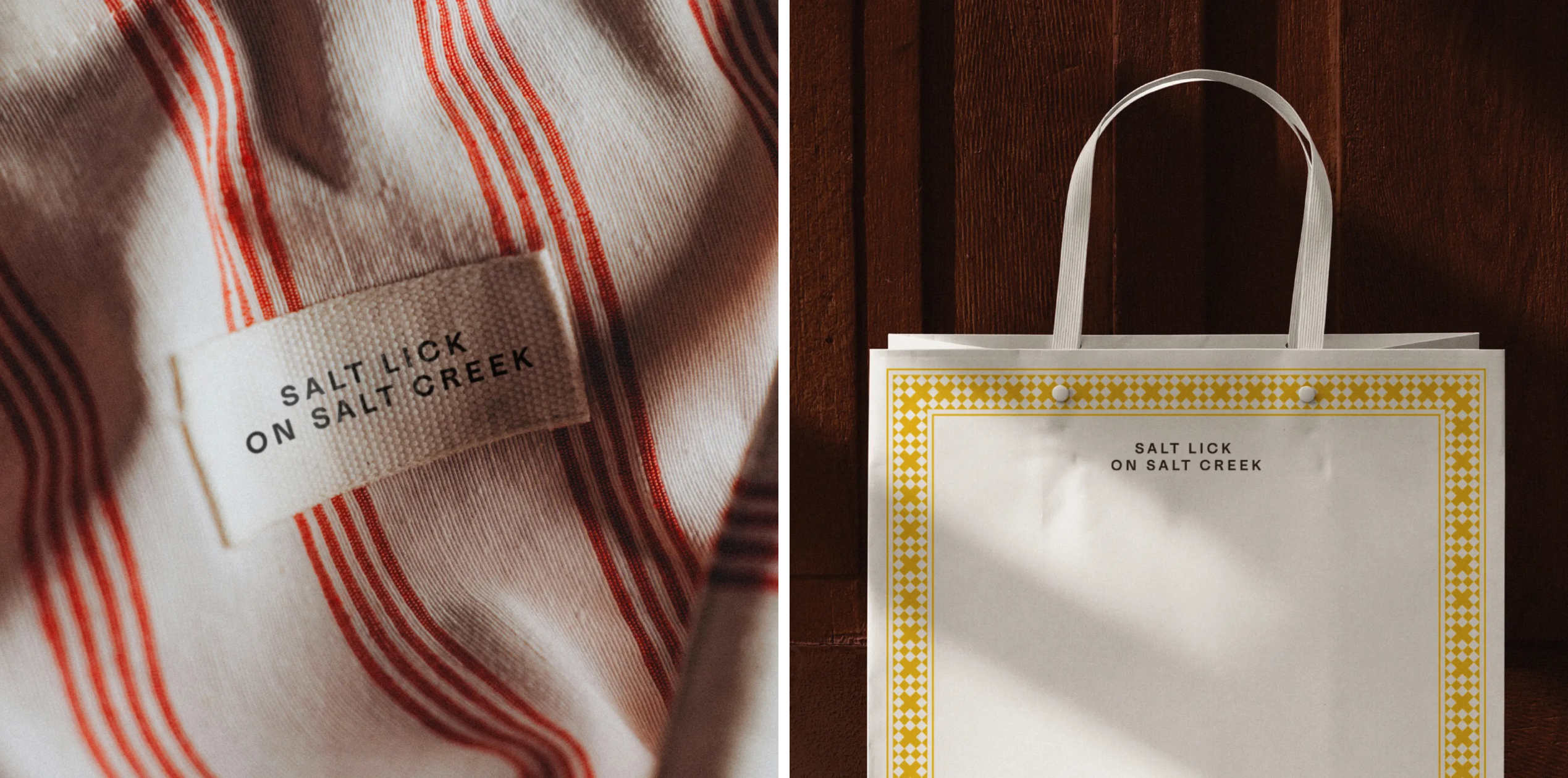
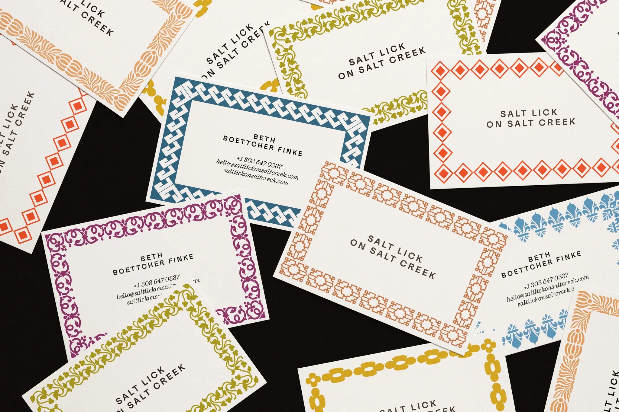
But with this tricksy little riddle of a project, it took a while to figure out what I was actually looking at. There’s menus. Business cards. Artsy black and white photography of horses, with romance novel-quality flowing tails. There’s tea bags, fabric labels, cardboard swing tags.
All this, and the name seems to obfuscate more than it elucidates: Salt Lick on Salt Creek.
You what, pal?
The name might suggest a Channel 5 soap, or a film with the earnestness of something desperate to be lauded at Sundance, however Salt Lick on Salt Creek is neither of these things.
It is, in fact, a lavender farm in the Colorado mountains – one of the highest-elevation lavender farms in the world, no less – sited southwest of Vail Valley.
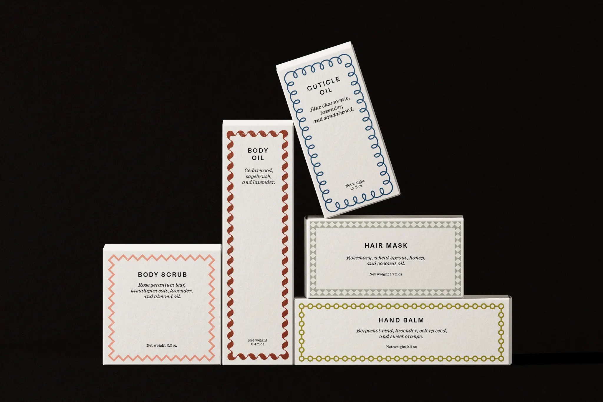
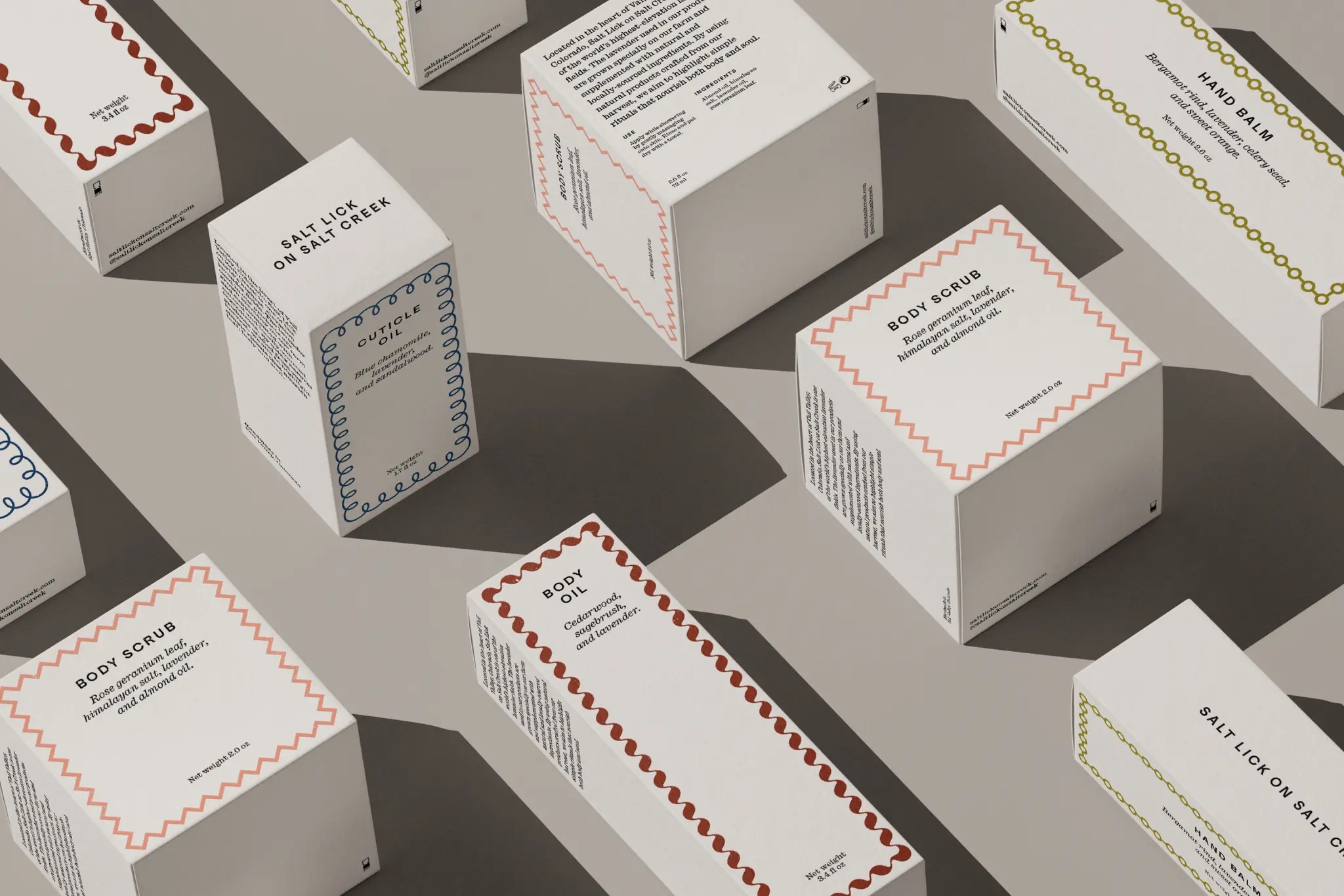
Said lavender is used to create a range of personal care products such as cuticle oil, body oil, face moisturiser, body scrub and “hair moisturiser” (surely conditioner, by any other name? Who knows).
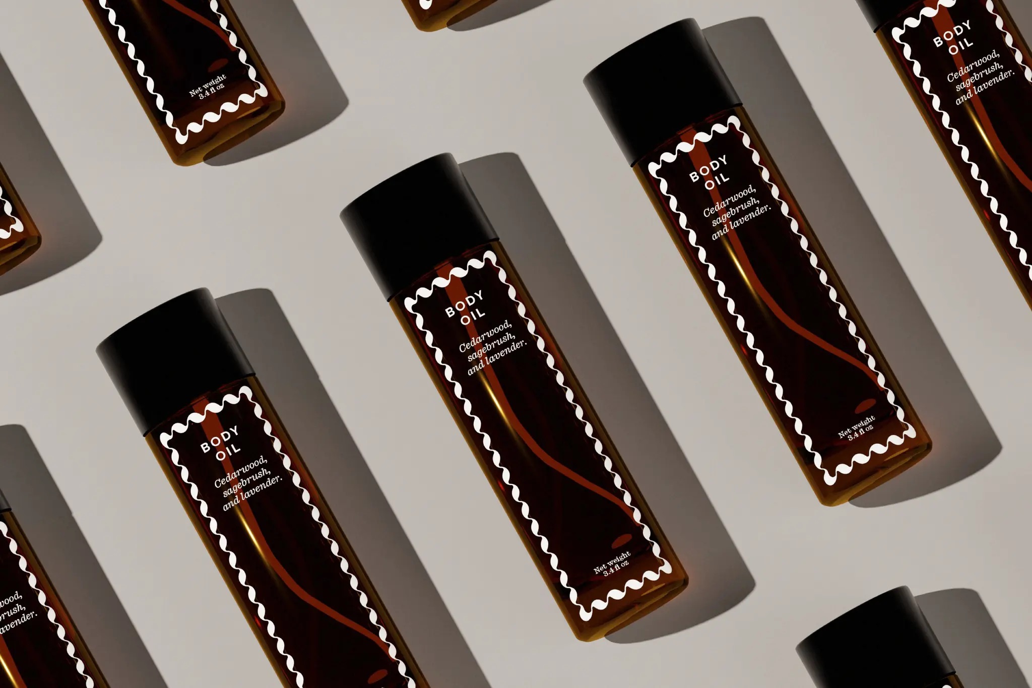
However, Salt Lick on Salt Creek owner Beth Boettcher Finke has aspirations and interests far beyond the smellies category, if the website is to be believed – but I’m honestly stumped as to exactly what this business is and does, aside from the product stuff. It’s all very confusing: a lot of the brand copy seems to focus on telling us how much the brand is about “the people we gather together” and “elevated hospitality”, but in the same breath, points out that it’s only really open to BBF’s friends and family.
It appears to be closed to visitors, yet seems intent on talking about being all people-y and welcoming and [shudder] ‘experiential’. What that means in practice, though, is anyone’s guess.

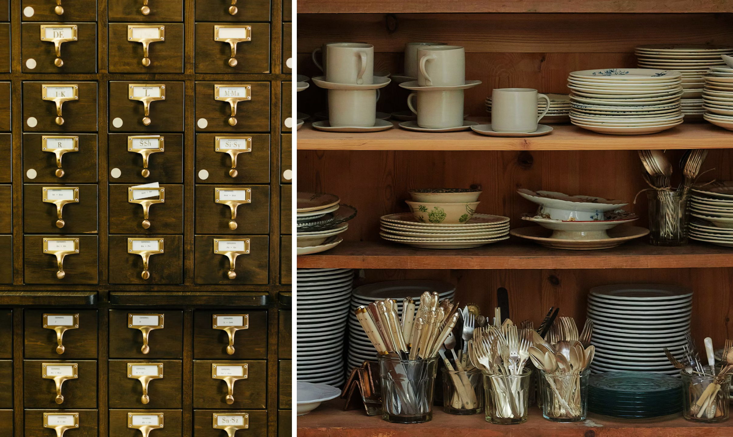
Whatever it is and does, what we do know is that Brooklyn-based studio Order was tasked with developing an identity for the farm and its product line, drawing on Colorado’s visual history and Finke’s eclectic ‘collections’. Again, this is confusing: as far as I can tell, her ‘collections’ are largely cutlery-centric. Which is disappointing, when it could have been, say, Happy Meal toys, or rubber ducks, or Pogs or even something culturally enriching like art or books. But yeah, looks like it’s knives and forks, perhaps some plates.
How all this manifests in visual terms is something very polite – utterly inoffensive, gently reverential to design history, nice and neat and tidy, with a faint whiff of something to do with the National Trust. None of this is a bad thing – the identity is overall considered, consistent and smart.
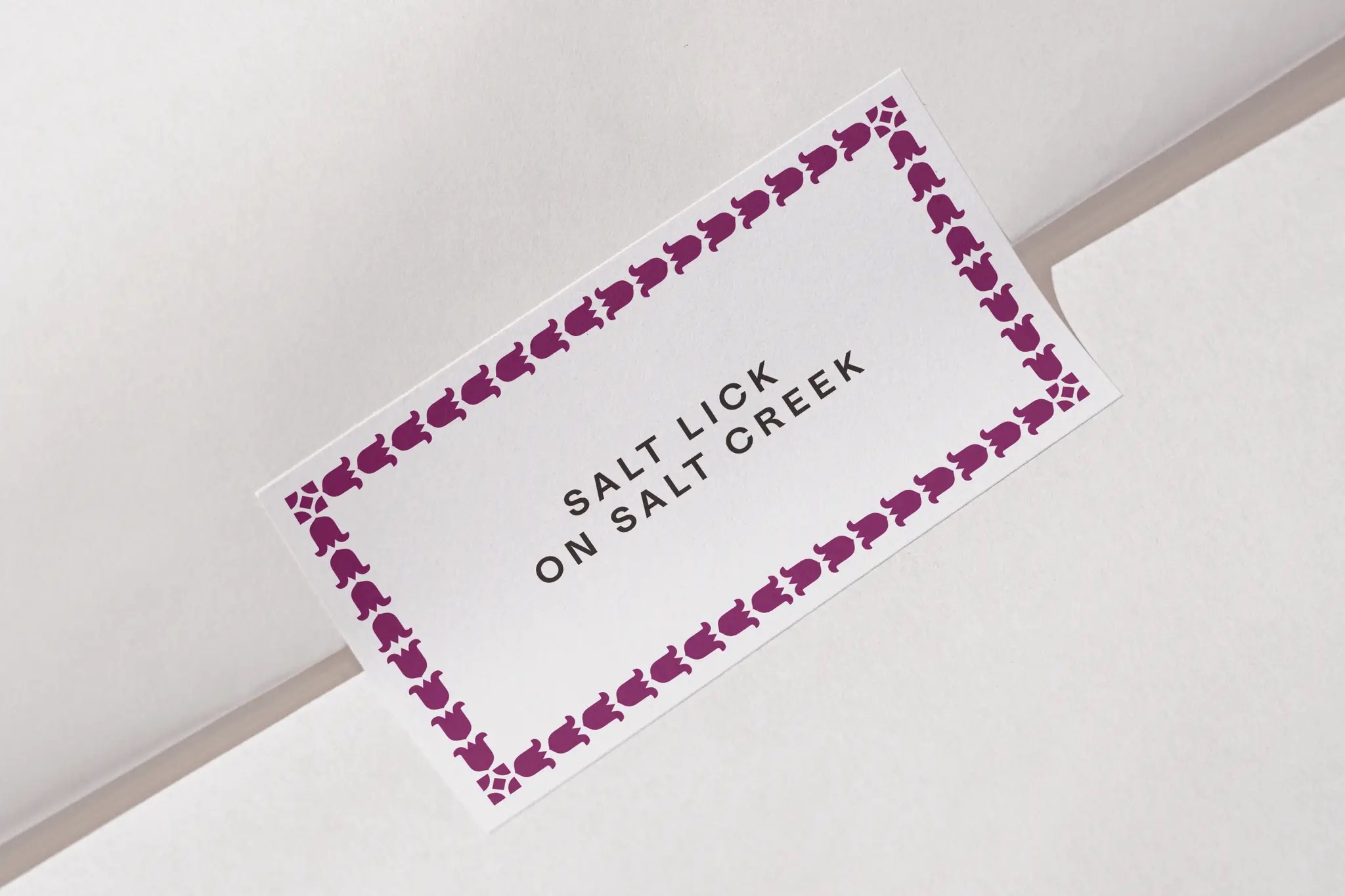
Much of that is thanks to the approach to typography and patterning, which is steeped in the sort of deliciously nerdy design history stuff I adore. Fonts-wise, Order opted to use Medium by Lineto and Caslon Ionic by Commercial Type in combination throughout the system.
This pairing gives the identity a pleasing tension between old-fashioned formality and something more functional: it has the air of something that might have appeared on an invitation to a party as imagined in a Jane Austen novel, but without becoming a pastiche-ish, cheesy take on fetishised ‘heritage’ stuff.
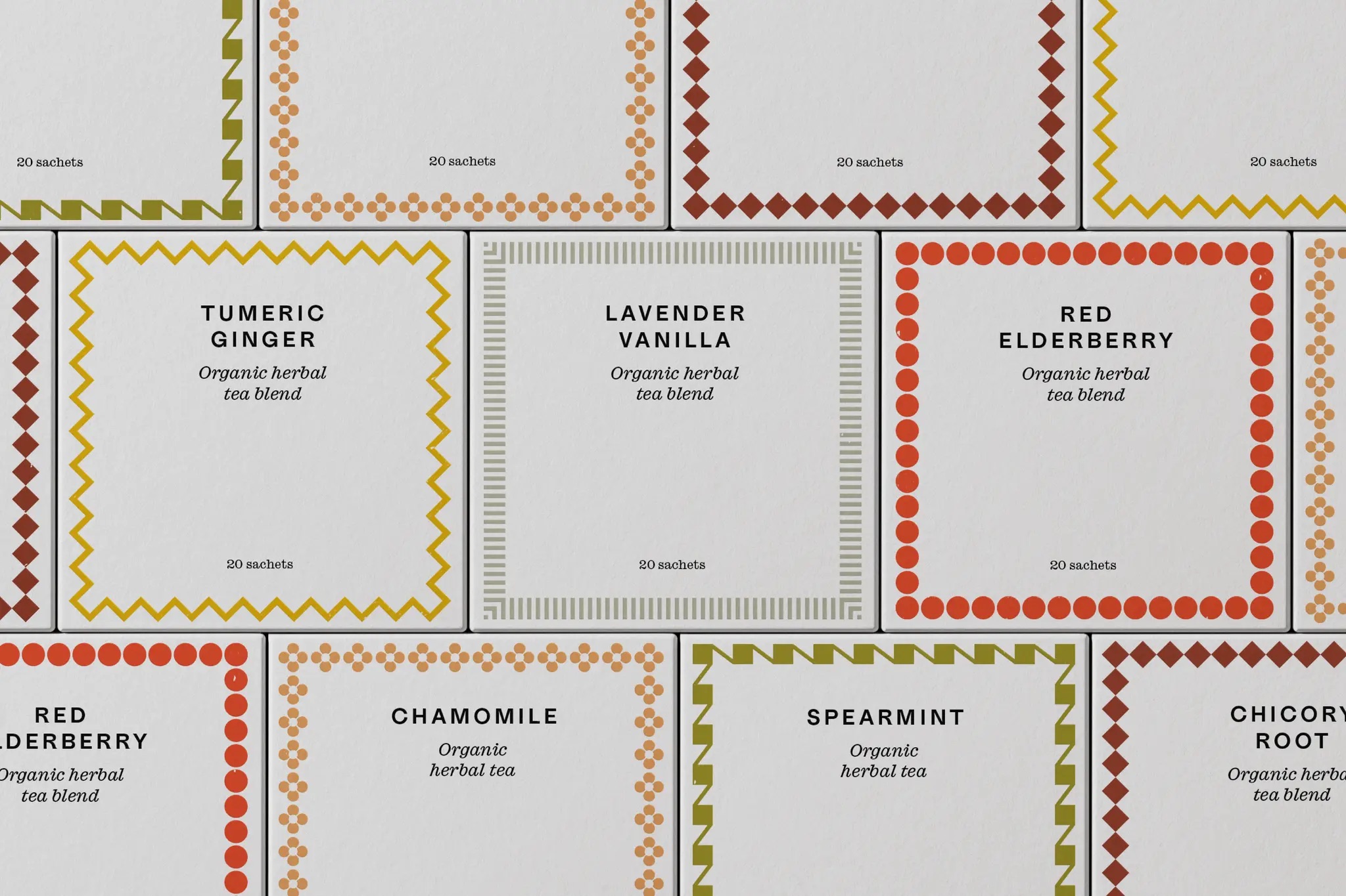
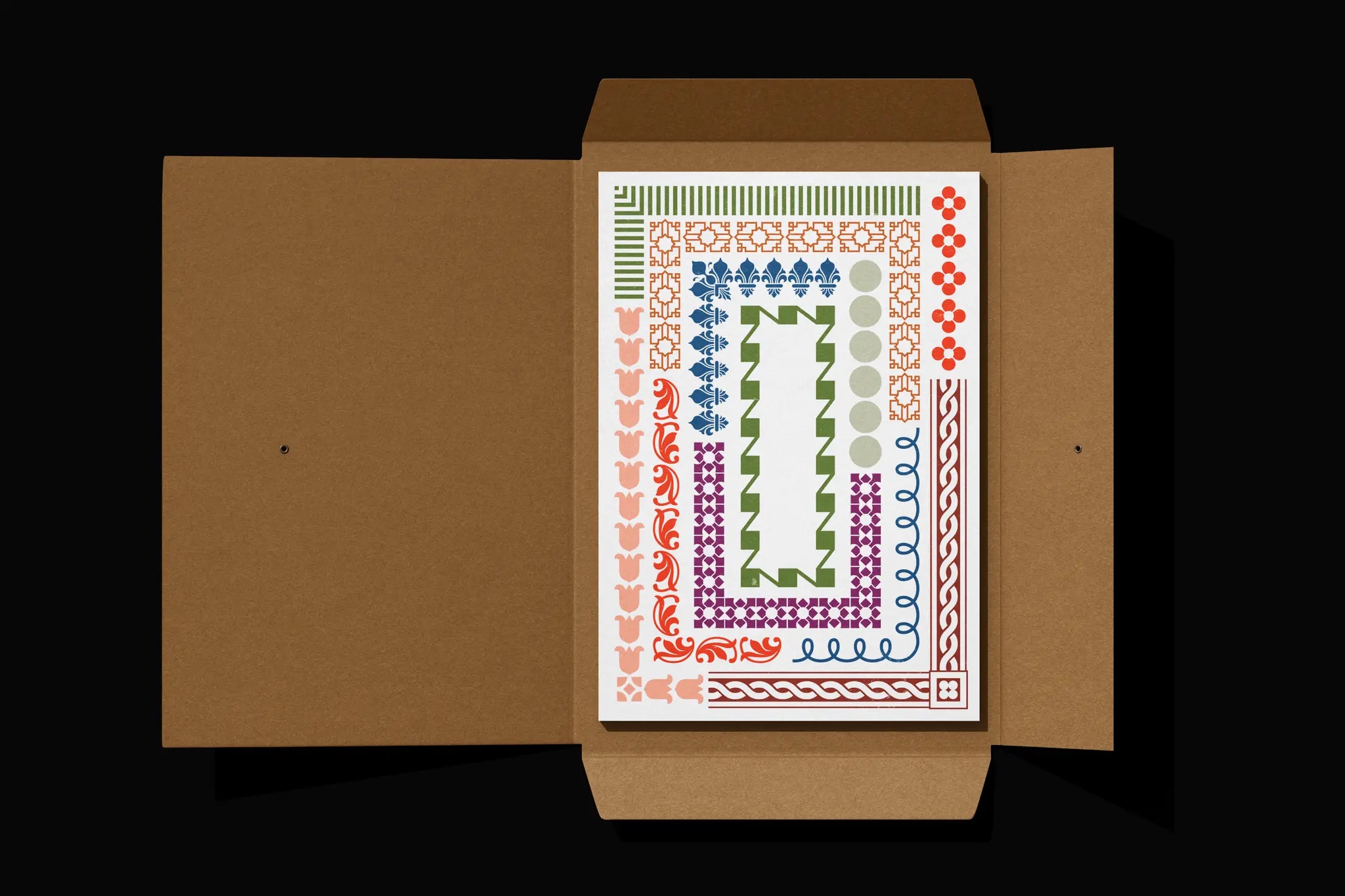
As for the patterning – namely used as frames and borders – Order sourced the original motifs from the American Type Founders Company’s Desk Book of Type Specimens from 1900, then digitised more than 50 borders for use throughout the identity. Their modular construction means they can be adapted, combined and rearranged to suit different formats, giving the system considerable variety without sacrificing coherence.
These borders are more than a decorative flourish: they give the system its distinctive character, creating a visual language that can be applied across everything from printed collateral to packaging and digital applications.
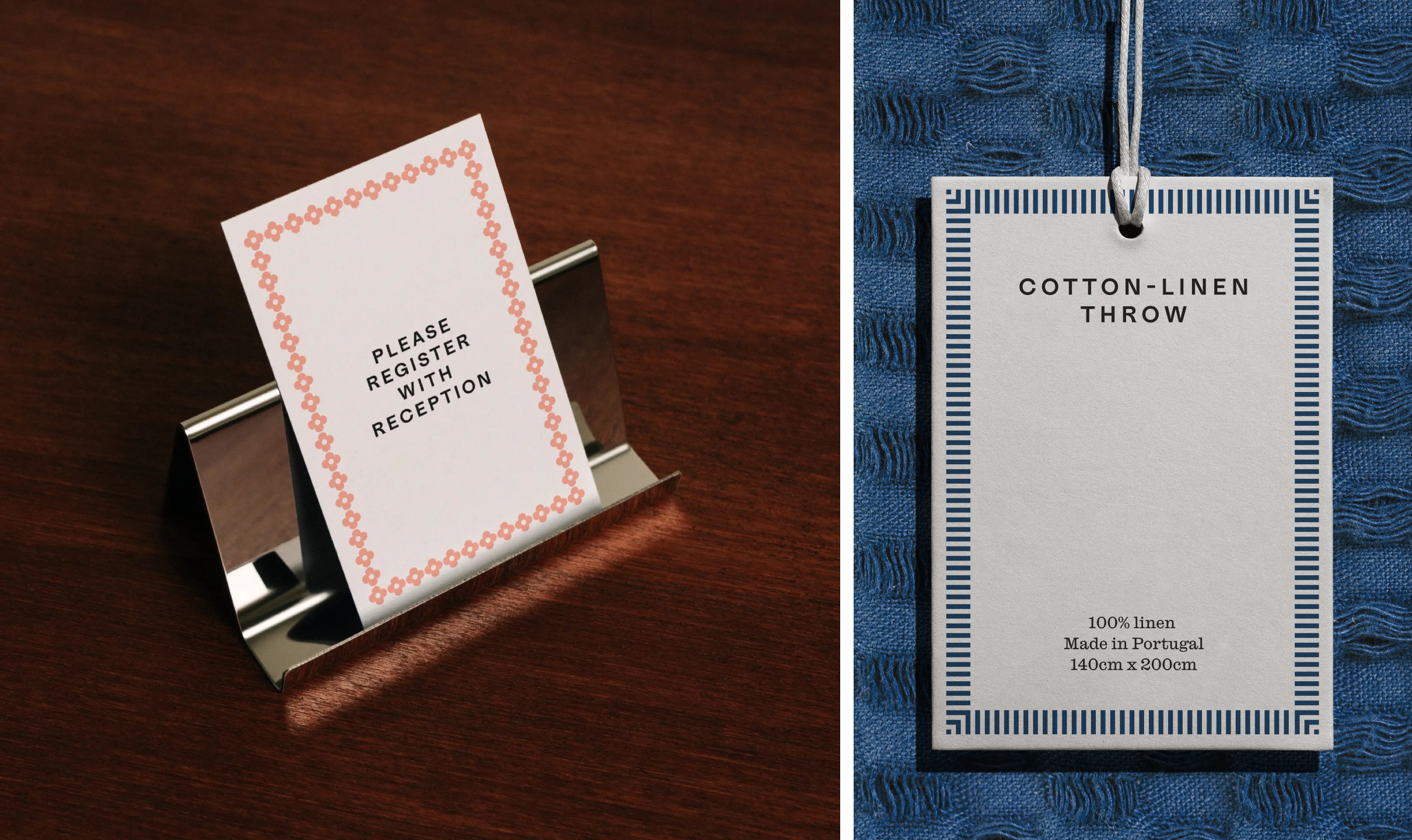
What works so beautifully here is just how considered these little touches that most people would likely totally overlook – arguably a hallmark of ‘good design’, as in, you only notice something when it’s horrible – are. The borders recall a period of American graphic design in which ornamentation and utility were not necessarily at odds, and in which the mechanics of printing could be as expressive as the lettering itself. The result is ornamental, but somehow never ostentatious or precious; detail-heavy but still super restrained.
The colour palette draws on the natural hues of the farm and its menu, with combinations selected to evoke the flavours, scents and textures of particular products where appropriate. No single colour is positioned as the dominant ‘brand colour’: the multifarious range of tones sees each shade take its own role within the overarching system.
The art direction feels a bit at odds with the rest of the identity, I’d argue. All the photography is in black and white, and feels a bit overly moody and dramatic – trying rather hard, somehow. The photos are lovely in their own right, but feel a bit weird here, somehow.

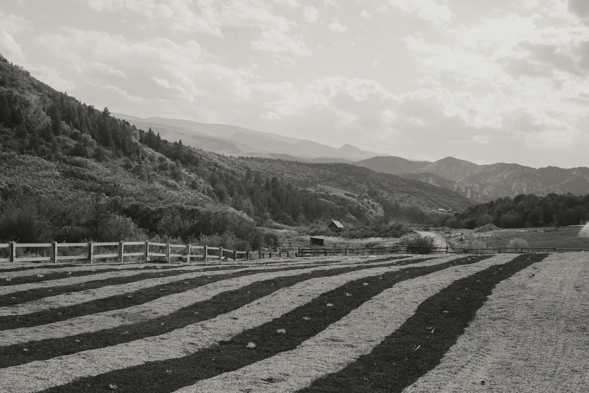
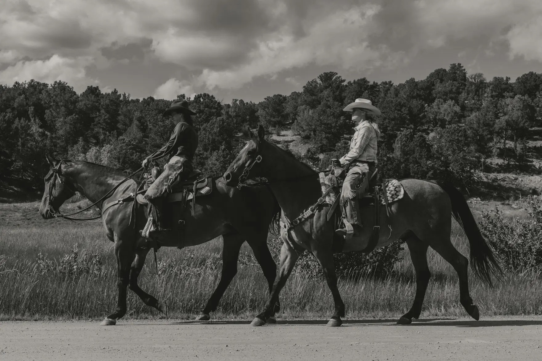
Shot by Kyle Johnson, a photographer based in the Pacific Northwest, the suite of images offers glimpses of the farm, its surroundings, and so on – those aforementioned horses with gloriously windswept manes; rural landscapes, and so on. It just all feels a bit too faux-romantic, cinematic, very earnestly ‘cheugy’, perhaps, if anyone still uses that word.
This sort of thing might well work if indeed Salt Lick on Salt Creek is in fact open to visitors – a rather crucial differentiation from a company selling a range of products, but one that remains out of reach. Much of this identity seems to speak of lifestyle stuff; people; atmosphere; landscapes: it’s selling more than lavender-derived lotions – to paraphrase Selling Sunset, it’s selling us a ‘lifestyle’.
The photography establishes the mood, while the typography, borders and colour carry that sensibility across the practical business of identifying products, packaging them and presenting them for sale. Website development by Joyful Talk brings the different strands together, incorporating the shop, booking system and story of the farm.
Where this brand design succeeds in my opinion is not only in its references to a very particular aspect of design history, but also in its refusal to rely on the obvious visual shorthand of its category. There’s lavender to be found in the story, of course, but the identity isn’t built around the expected purple palette, botanical illustrations or an airy, wellness-adjacent minimalism.
Instead, Order has drawn on a much broader set of influences, creating something with the personality of its owner and a strong sense of place, while allowing the system to stretch across a surprisingly varied collection of applications.
Sometimes, however, you need a few clues as to what a brand or company actually is and does, and I’m still woefully in the dark here
On the plus side, though, it’s undeniably a branding project that understands the value of the details, without losing sight of the bigger picture.