DNCO creates Vermont’s first dedicated consumer tourism brand, aiming to “turn affection into action”
Opinion by Emily Gosling Posted 15 October 2026
I’m sure I can’t be alone as someone (albeit someone from England) who would be utterly incapable of pointing to the whereabouts of Vermont on a map – and perhaps, like me, unsure as to whether it was a city or a state. Slightly embarrassing to admit, but I also wasn’t sure if it was in Canada or the US – I mean, it does sound sort of Canadian, doesn’t it? Doesn’t it…?!
All I knew is that it’s something to do with Bernie Sanders; that it’s meant to be very beautiful, nice and countrysideish, probably a decent place for roaming around somewhere arboreal and absentmindedly kicking piles of leaves around.
Many people, it seems, share a similar sentiment: we know Vermont’s probably very nice, but it wouldn’t exactly be top of the list of ‘places I’d visit if I happened to be in the region of North America’. Undoubtedly, it’s held in positive regard, but rarely does that regard translate into actual human footfall.
Vermont is very much a state, and very much in the US, it turns out (but you probably knew that already) – specifically, in the New England region, which also includes the states of Connecticut, Maine, Massachusetts, New Hampshire, and Rhode Island. It borders Canada to its north, Massachusetts to the south, New Hampshire to the east, and the state of New York to the west.

Apparently Vermont is well known for its, er, wooden bridges (call me controversial, but that doesn’t seem like the biggest of draws when it comes to tourism) and its maple syrup, producing more than 50% of all the sticky stuff created across the US (so far, so Canadian border).
So as might be fairly obvious from these scant facts about Vermont, it was having a touch of trouble drawing in visitors – a problem that had never been addressed by the usual routes such as a brand, or even a campaign. Until now, that is: enter DNCO (
Broadgate, Florentia Village, HUB Residential), a London- and New York-based agency that specifically focuses on place branding and wayfinding.

DNCO was brought in by the Vermont Department of Tourism and Marketing, which “saw an opportunity to turn affection into action”, according to the agency, which was essentially tasked with creating the state’s first dedicated consumer tourism brand. DNCO continues, “Vermont has become shorthand for idyllic New England: covered bridges, fall foliage, cows, rolling hills. While accurate, it doesn’t reflect the depth and complexity of the state’s experiences.”
As such, the project initially saw the agency undertake a tonne of research, travelling more than 400 miles and visiting 14 towns across the state, speaking with various stakeholders and visitors.
It discovered some pretty interesting stuff: according to DNCO, Vermont has the highest density of artists and writers in the country.
Vermont also, so the agency says, set the standard for farm-to-table long before it became a trend.
In short, Vermont has a couple of pretty powerful strings to its bow that were hitherto woefully hidden: a palpable culture of storytelling, and a quiet knack for being rather progressive – trendsetting, even.
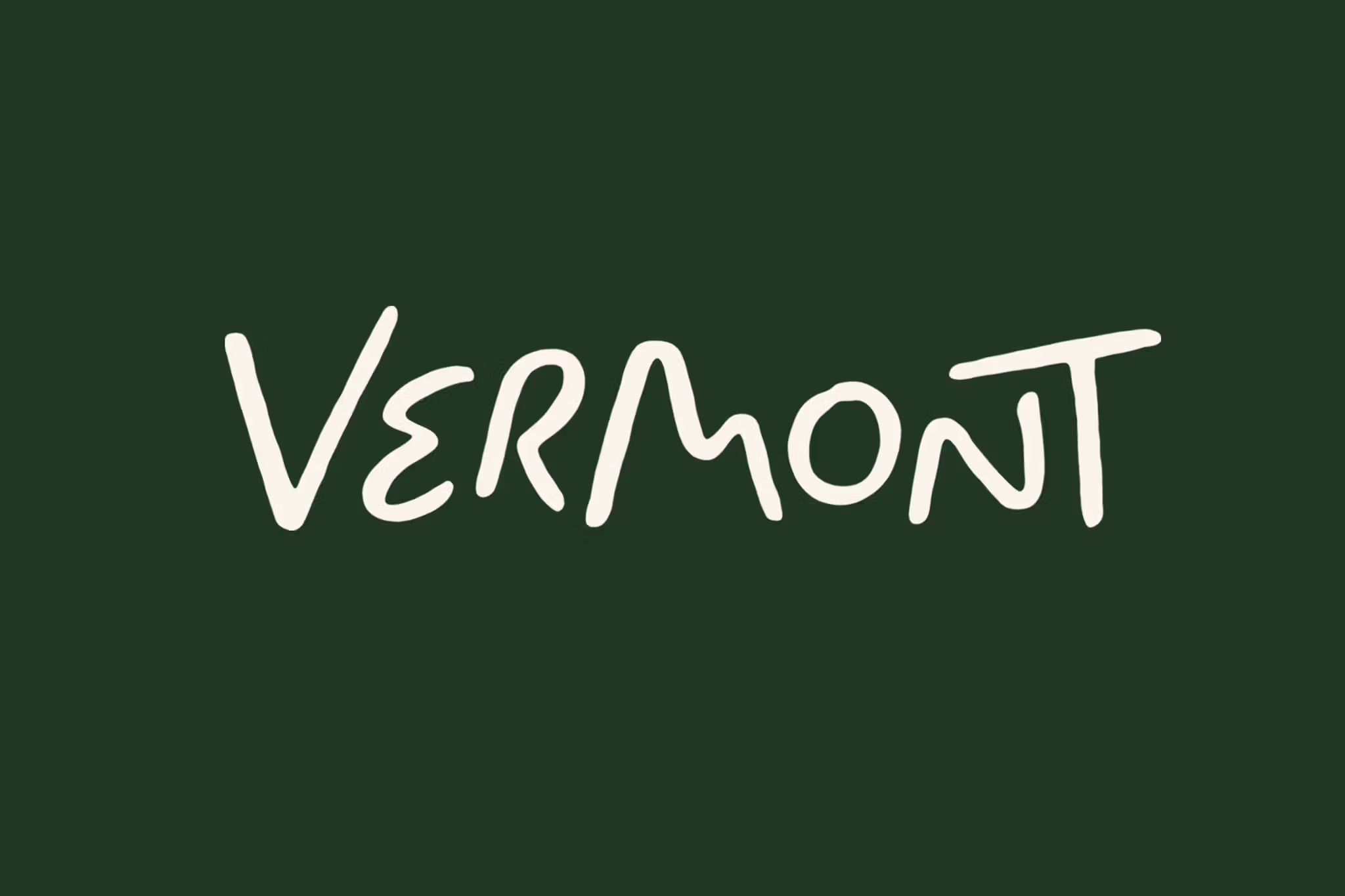
And for the most part, this new identity reflects that. However, I’m not 100 per cent sold on the wordmark, which was developed by DNCO and refined by lettering artist Rob Clarke. Apparently certain letterforms carry specific references: the ‘e’ “traces a winding road”, the ‘m’ “rises into the hills”, the ‘o’ “reads as moon over mountains, echoing the state administrative logo”.
Which is all very nice and clearly also very considered, but to me, the loosey goosey, almost infantile hand-lettering approach can veer a little too close to the territory of twee. If it weren’t for the rest of the brand elements, which are so smart and so strong, that sketchy ‘Vermont’ mark could easily make this a brand that you either don’t notice, or if you do, which you don’t really take seriously. It’s a bit Disney-ish, slightly too informal for my tastes.
However, DNCO has more than made up for that elsewhere in the identity: for me, the two stars of the show are as follows: the absolutely gorgeous suite of icons, and the non-wordmark typography.

DNCO opted to use just one typeface in varying weights: Meso, by London-based foundry Sociotype. It’s a supremely thoughtful choice here, recalling an abstract and loose sense of all that’s historical and storied but with a clever lack of specificity around eras, geography and so on. Perhaps that’s thanks to its odd combination of drawing influence from 1970s experimental serifs and the way it has the appearance of stone-carving. It’s both modern and without a doubt hinting at the concept of craftsmanship and all that’s handmade.
And the handmade thing is far from just a nice coincidence: it’s a key throughline for each and every element of the identity, with varying degrees of obviousness and obfuscation.
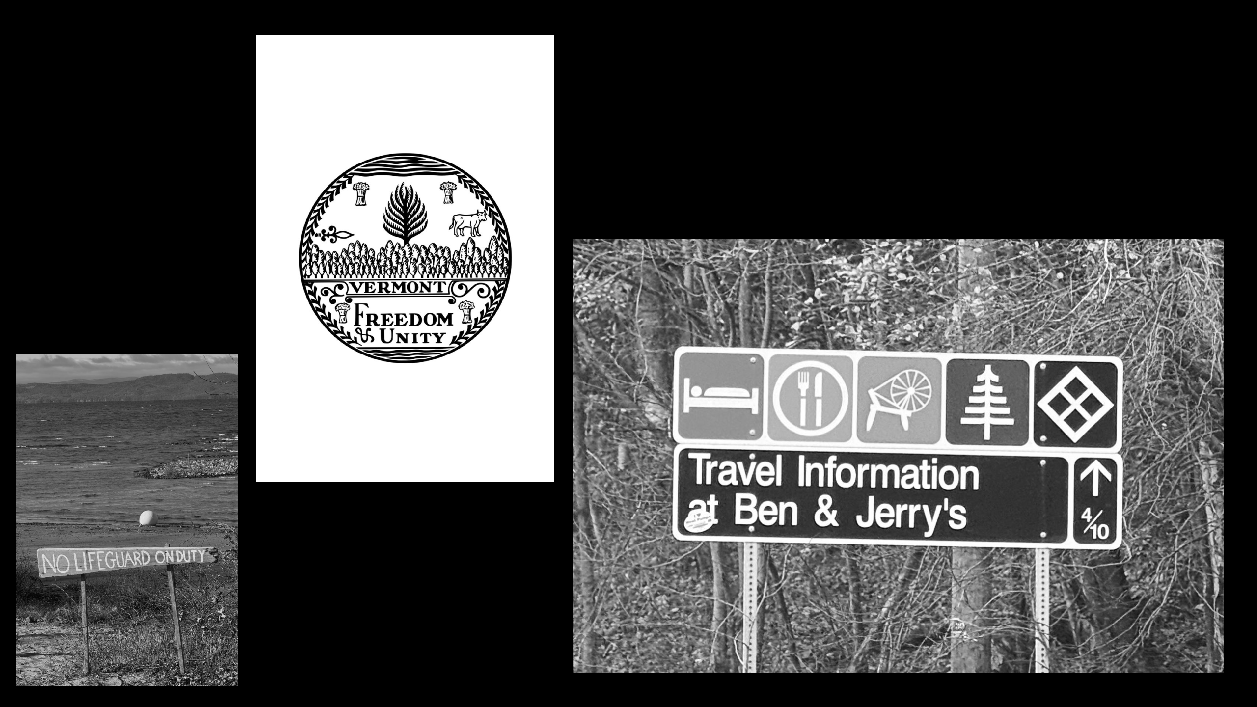
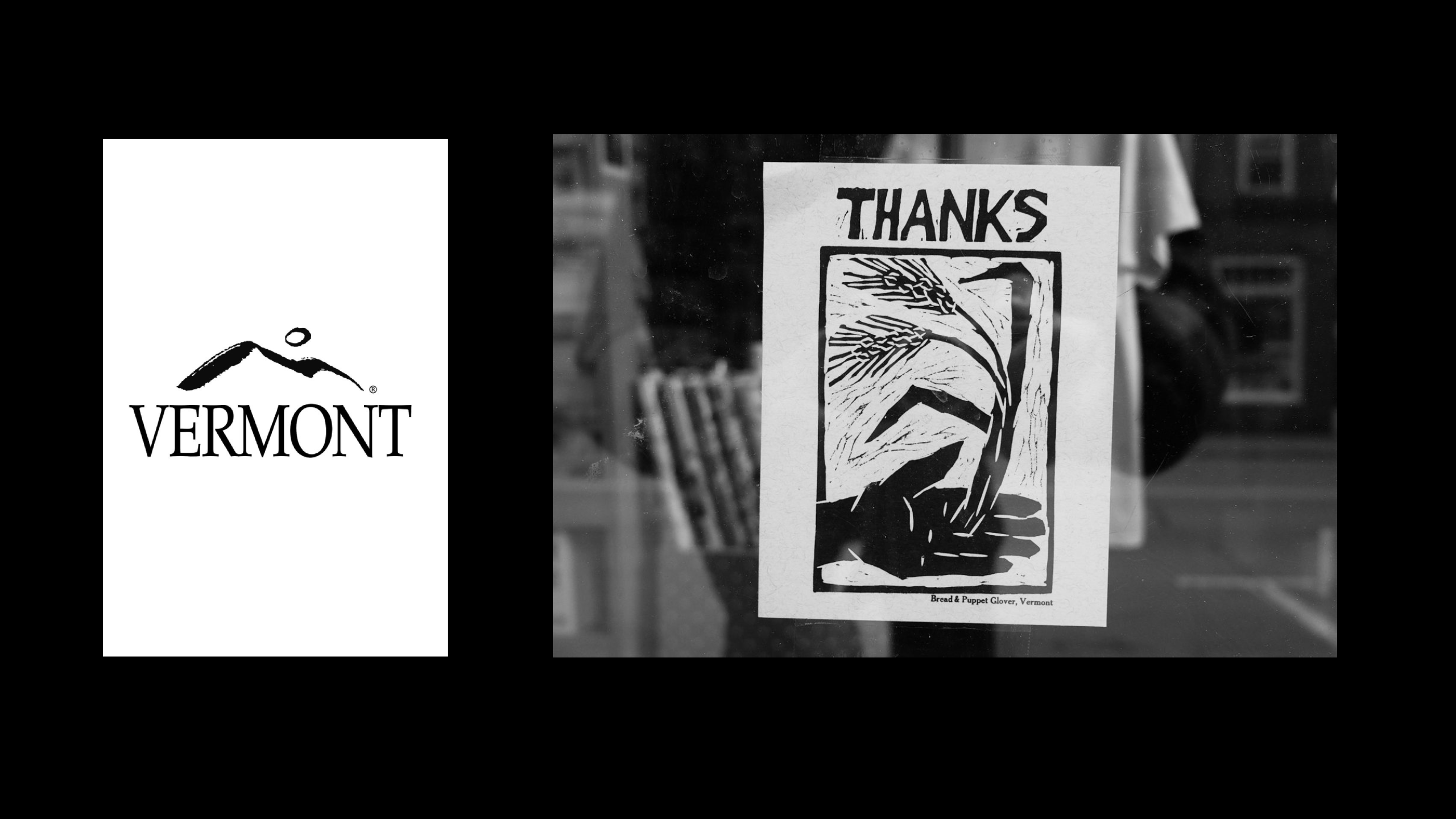 Much of the craft-type stuff is thanks to that big ol’ research phase of the project: when driving those hundreds of miles through the state, DNCO was captivated by its signage – and it’s not hard to see why.
These signs were the underpinning of that glorious aforementioned suite of icons, which I really can’t get enough of. Drawing on the existing symbols found across Vermont’s road signage system, state seal and administrative logo, alongside the typographic ornaments found in books by Vermont writers, they’re a lovely example of research – both visual and exploratory, geographical, literally just driving around – done well, and manifested beautifully.
Developed by artist Alyssa McCabe, who has long-standing ties to Vermont, the icon library covers food, landscape and culture, alongside more specific bits of local lore, including Champ, the supposed monster of Lake Champlain.
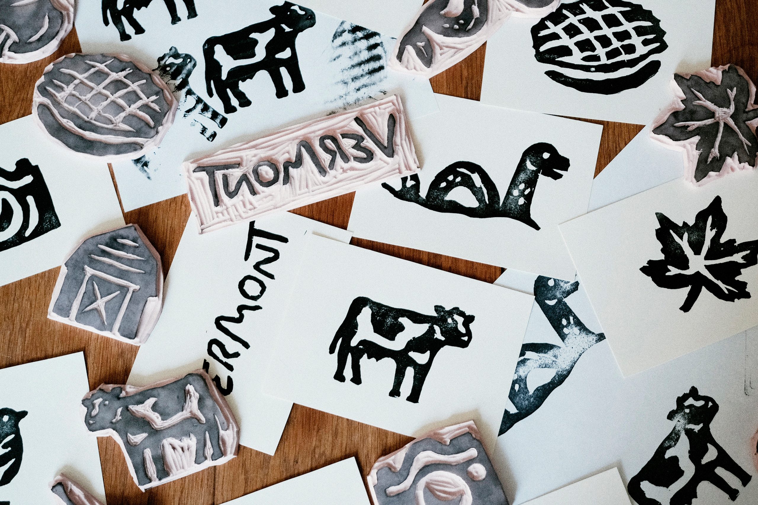
They’re specific enough to tell stories about Vermont, rather than simply tell us that it’s somewhere with a lot of countryside. And they’re executed in a way that’s just incredibly charming.
The colour palette takes its cues from Vermont’s changing seasons, shifting from spring greens to the deep reds and oranges of autumn foliage. It’s a fairly obvious starting point for a place so closely associated with its landscape, but one that makes sense here, particularly given the intention to create a system that changes with the seasons.
There’s a difference between using autumnal colours because they’re an easy way to communicate New England, and building a palette around the idea that Vermont is a place whose appearance, and the experiences it offers, change throughout the year. The latter gives the colour a reason to be there beyond simply looking nice.
My issue with the wordmark is a relatively small gripe in an identity with so much else going for it. DNCO’s work is super successful in giving Vermont a way to communicate something beyond the familiar picture of a bucolic New England escape. It’s a place with its own stories, its own visual language and, as DNCO’s research suggests, rather more going on than a few pretty hills and a decent supply of maple syrup. Which, given my admittedly limited prior knowledge of the state, is probably rather the point.