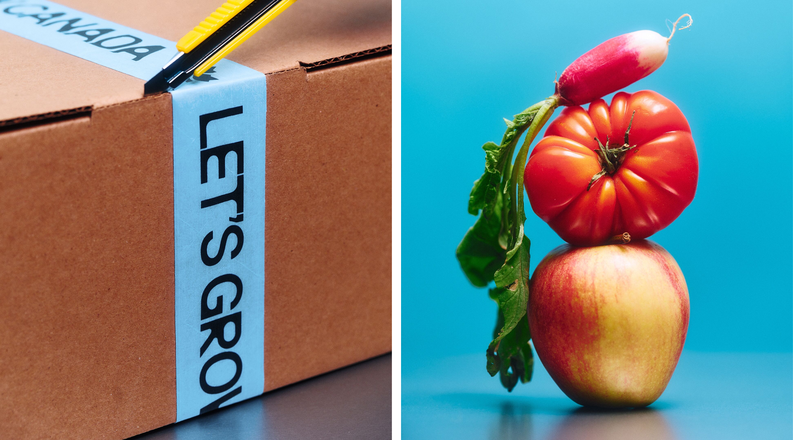
Caserne eschews worthy sentimentality in its gorgeously vibrant, unapologetically modern identity for Let’s Grow Canada
Opinion by Emily Gosling Posted 20 October 2026
It’s a rare delight to come across a brand identity project where I can honestly say I love everything about it – from the name to the logo, application, typography, the lot.
Such is the case, however, for this gorgeous new project from Montréal-based studio Caserne (Olive + Gourmando) for Let’s Grow Canada, a national movement initiated by Farm Credit Canada.
Caserne worked with agency Small Giants on the visual identity design and branding for Let’s Grow Canada, which aims to strengthen the connection between Canadians and the food that sustains them. It looks to do so by showcasing and celebrating the people that make said food; amplifying Canada’s strengths; “and inspiring the ideas, talent, and innovation that will shape the future of food,” as Caserne puts it.
Launched in February 2026, Let’s Grow Canada is intended as a long-term movement rather than a short-lived campaign, looking to change how Canadians think about agriculture and the wider food system.
It’s an ambitious brief, and one that could easily veer into earnest corporate messaging about sustainability, innovation and national pride. Thankfully, Caserne’s identity gives the whole thing a sense of personality and visual confidence that makes its optimism feel genuinely infectious rather than dry, dictatorial or – shudder – worthy.
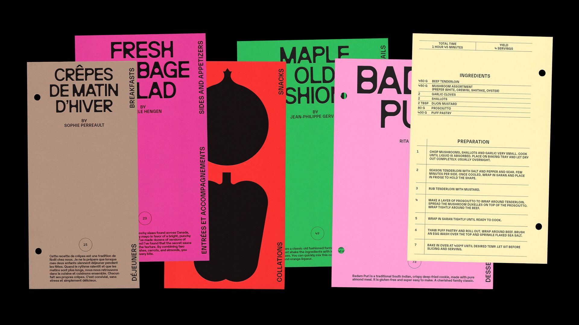
The name works nicely in my opinion – there’s that nice double meaning in ‘Grow’, the ‘Let’s’ is a succinct but not overtly commanding call-to-action; a positive and optimistic implication of Canadians inherently being all in this, together.
That sort of Kumbaya-ish CTA could all too easily tip into the territory of patronising, twee, or downright lame; however, the skill and dexterity Caserne has wielded throughout the entirety of this identity ensures that this isn’t even a remote possibility.

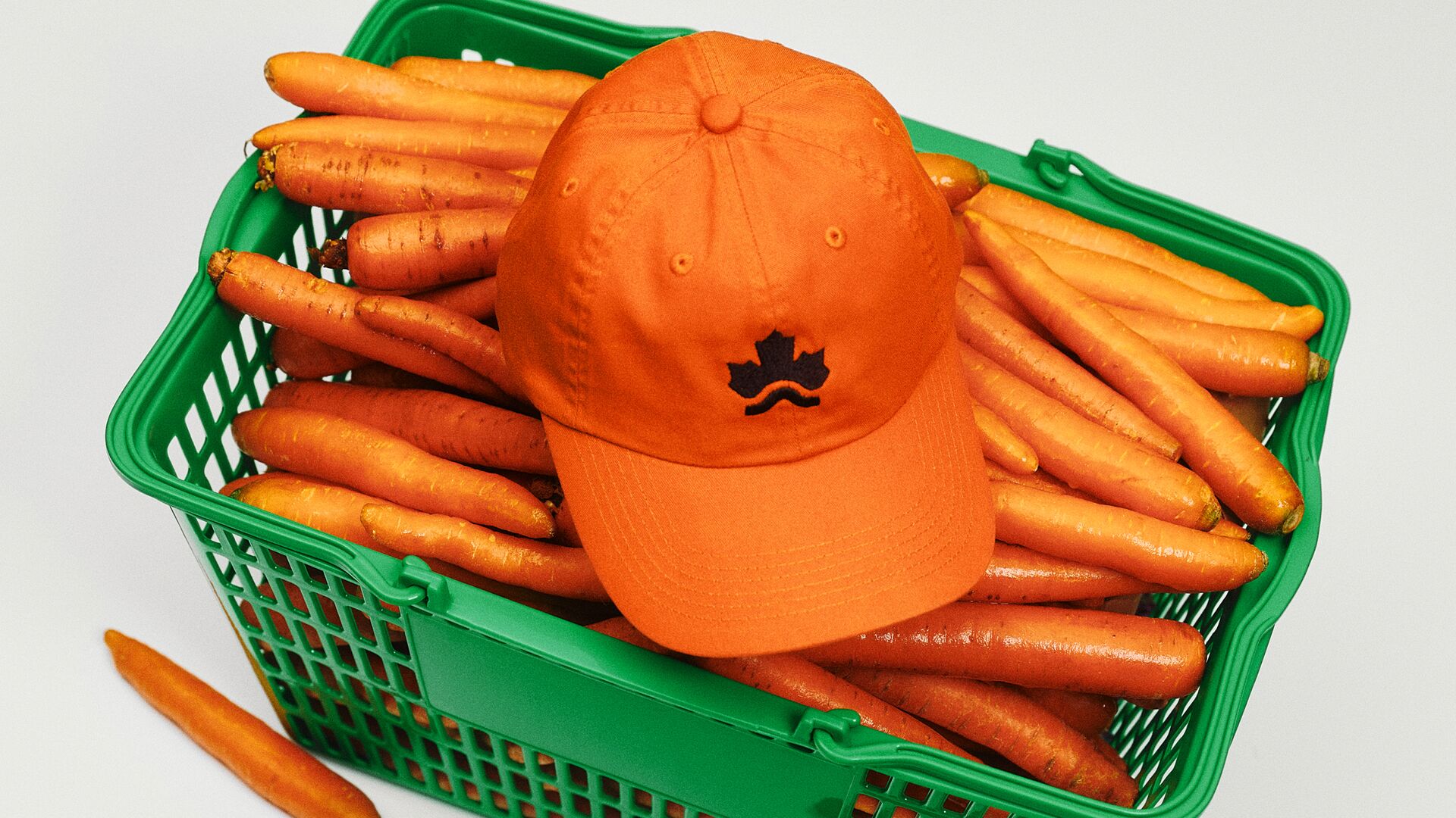
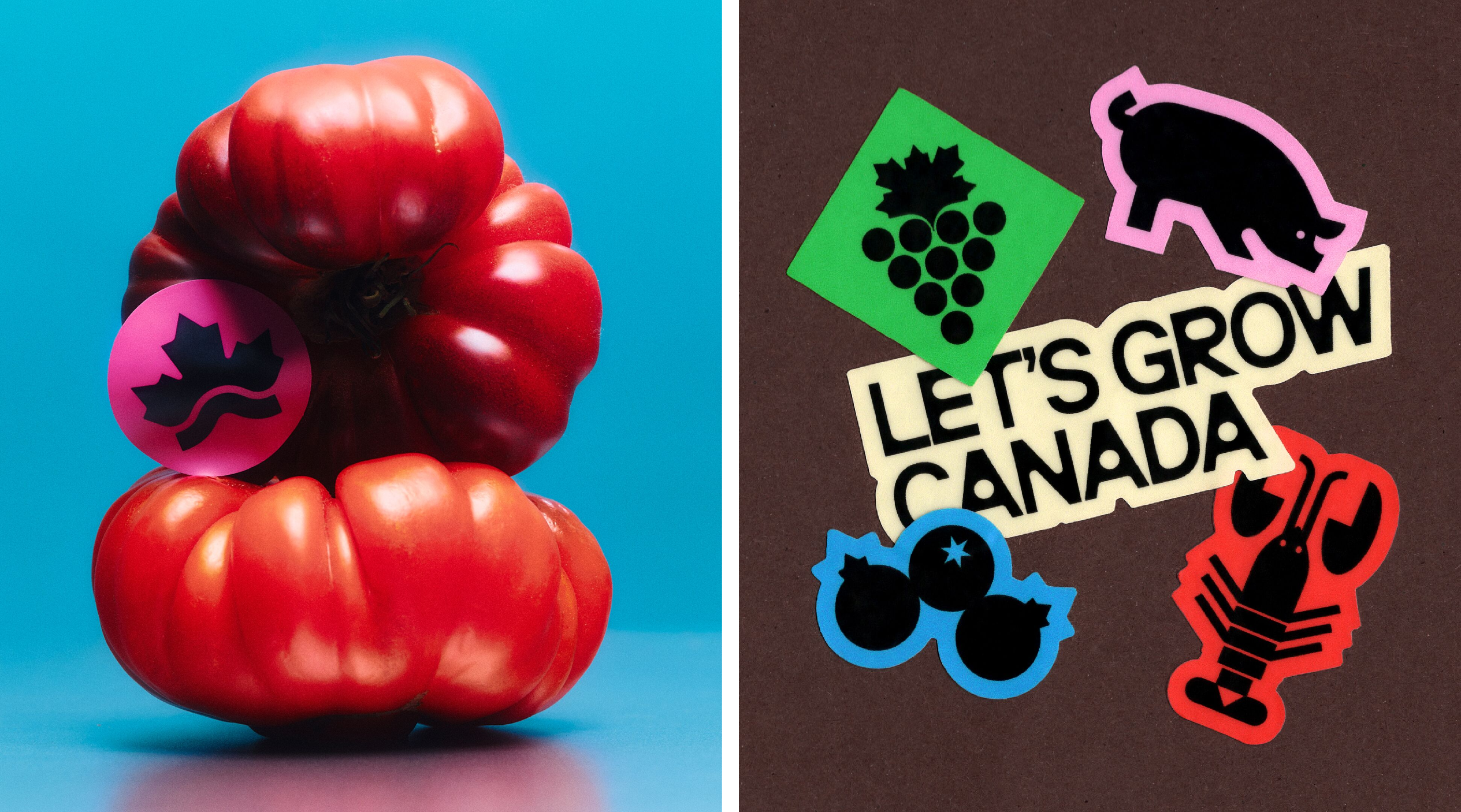
There’s so much to love about the design here, but let’s start with the main logo: a jaggedy, modern take on the traditional Canadian maple leaf.
The symbol sees the familiar leaf reimagined as a series of crisp, geometric forms, rising above a low, angular line that suggests both a hill and an expansive horizon. It’s a neat way of bringing together the country’s agricultural landscape and the idea of growth, while that extended line gives the mark a sense of breadth befitting a movement intended to span the nation.
It’s recognisably Canadian without simply reproducing the maple leaf as we know it, and has enough character to work as a standalone graphic element, too – the mark’s simple construction makes it versatile across everything from tiny digital applications to much larger campaign graphics.
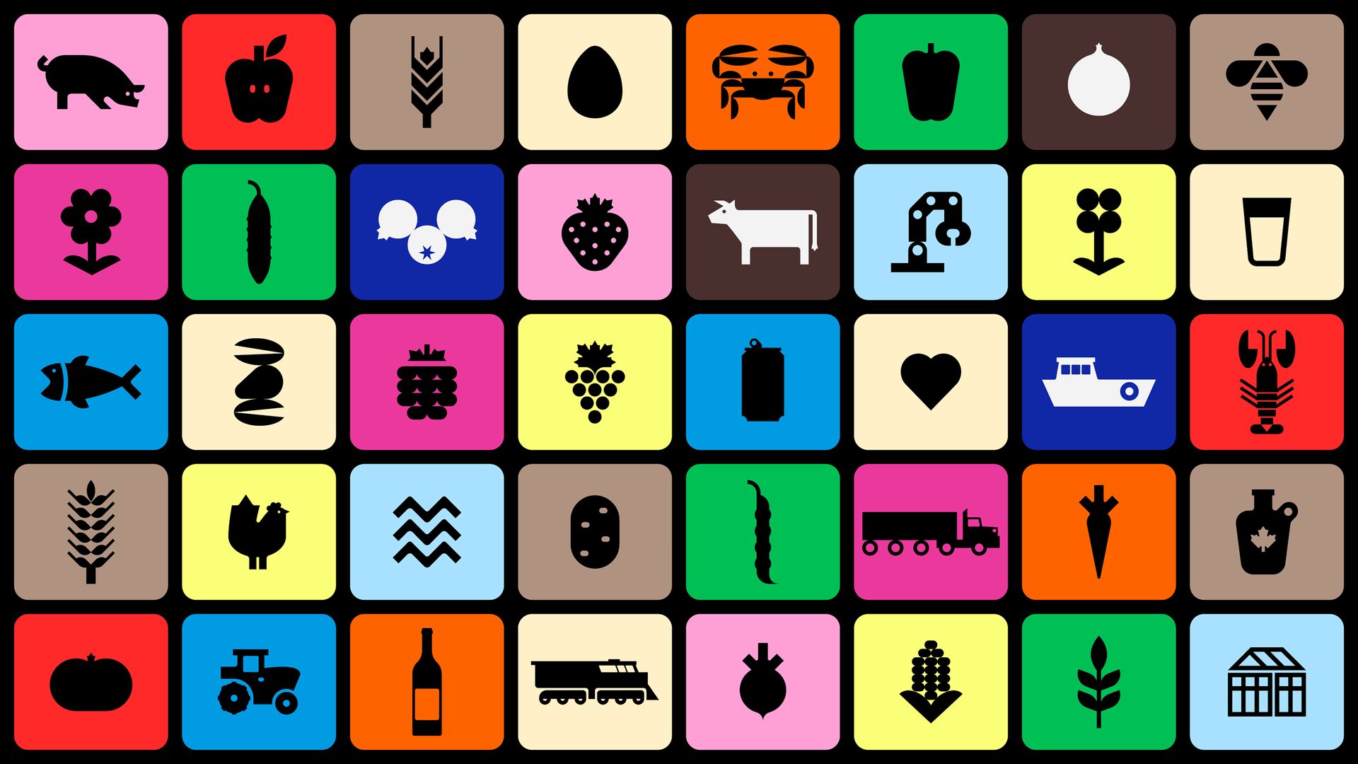
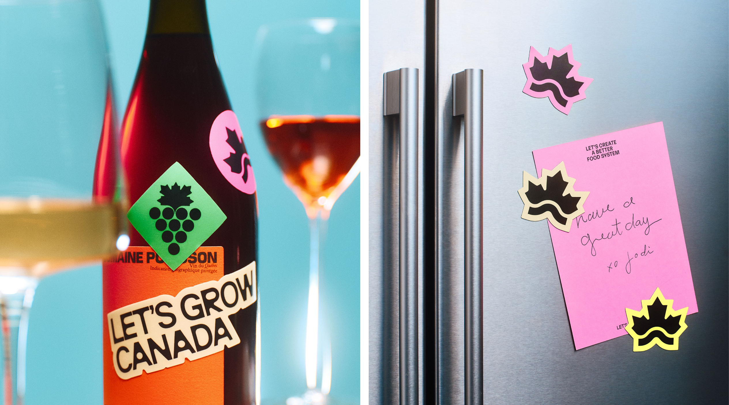
This is accompanied by a really gorgeous suite of icons, illustrated in collaboration with Benjamin Lamingo. With more than 40 individual symbols, the collection covers the breadth of the Canadian food system, from poultry and dairy to fish, aquaculture and greenhouse produce.
The aesthetics of these icons fall neatly in line with those of the mark, and also with the style of the type (more on which in a moment). Each feels very much part of a singular family: distinctive, playful, simple and almost instantly iconic, in more ways than the simple fact they are, quite literally, icons.
They’re immediately legible without being boring, and crucially, help make the movement’s rather expansive remit tangible: they demonstrate a key tenet here – that agriculture is about an entire network of people, produce and processes that probably impact on us more than we realise.

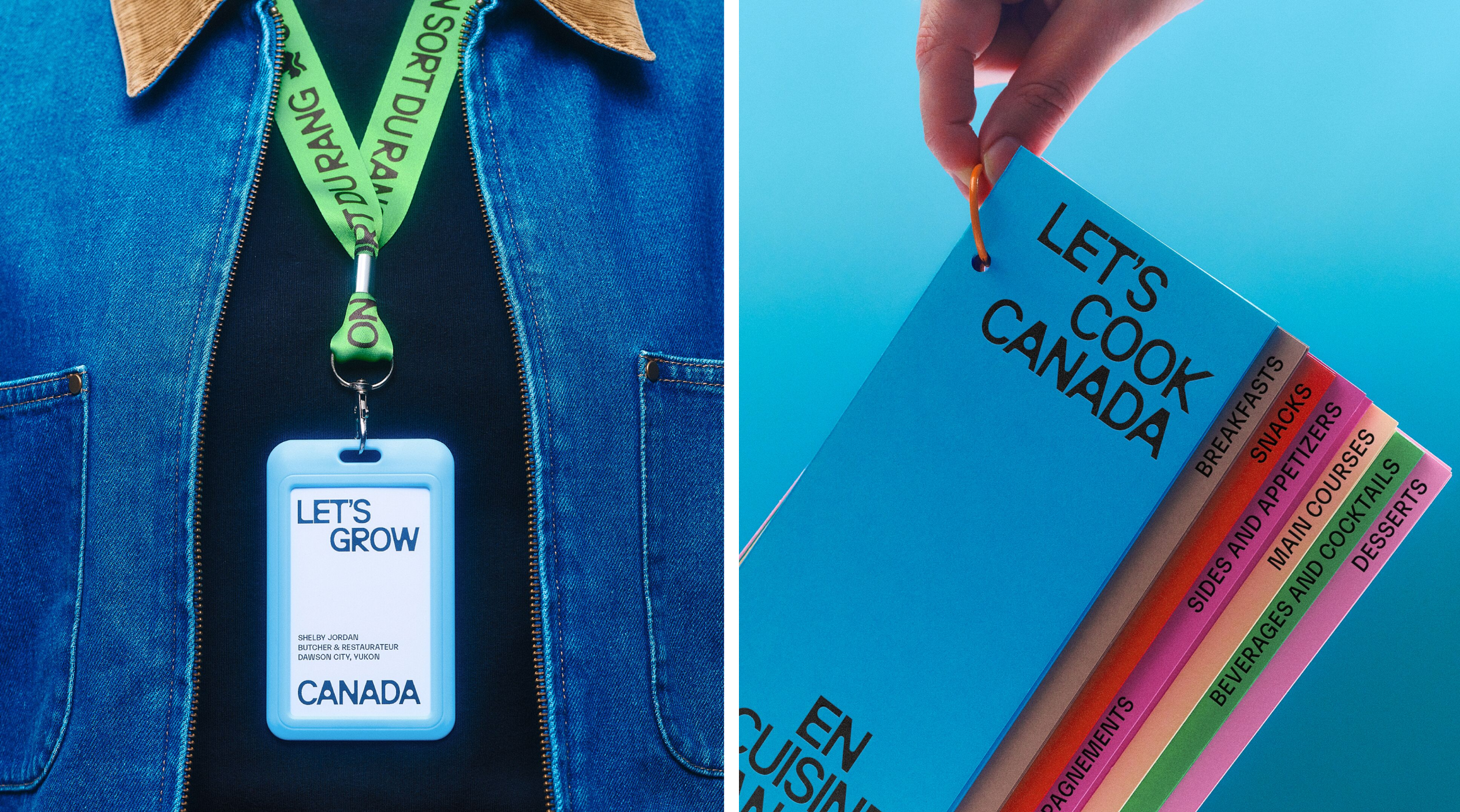
Back to that typography, which I absolutely adore: the main brand typeface almost shouldn’t work – at the very least, it’s unusual for this sort of project – but it looks superb. Said typeface is Neue Brücke by Italian foundry Studio Claus Due.
A condensed neo-grotesque with a distinctly geometric construction, Neue Brücke has the sort of dense, tightly spaced letterforms that give words real presence, particularly when scaled up for headlines.
What makes Neue Brücke work so well here is perhaps precisely what I mentioned previously – that it doesn’t look like the obvious choice for an agricultural initiative. There’s no folksy stuff, nothing rustic or sentimental or wellingtons-and-hay-bales sentimental about it: instead, the lettering is quite honestly a bit weird – bold and resolutely contemporary and unapologetically graphic. Its narrow proportions also allow the identity to fit plenty of information into relatively compact spaces, while the heavy, tightly set forms hold their own against the more expressive photography and illustrations.
Neue Brücke is supported by Karelia by Monokrom, a typeface that offers a rather different take on the neo-grotesque. Where Neue Brücke provides the identity with its dense, punchy headline treatment, Karelia introduces a different sort of rhythm and texture. Together, the two faces create a useful tension between the familiar and the unexpected, helping the identity feel contemporary and considered while retaining a degree of accessibility.
A more neutral typeface, Neue Haas Grotesk, rounds out the system, giving longer passages of text and more functional information a straightforward, readable voice. It’s a smart combination: each face has a clear role, which it serves beautifully.
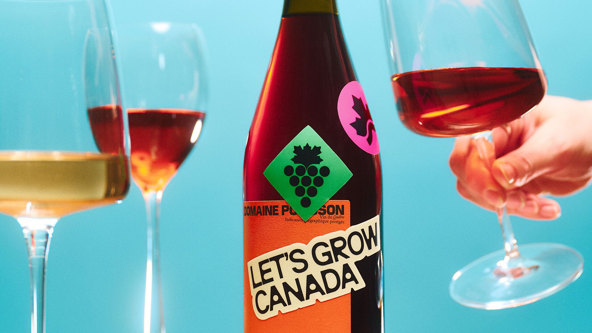
Likewise, the colour palette here is not only incredibly modern, sentimentality-shunning and vibrant, pairing bold, saturated hues with lighter, cleaner tones that let the photography and graphics breathe – none of the rustic reds or farmish greens and browns you might expect to see in an agriculture-centric project.
The palette also gives the system flexibility: colours can be used in punchy blocks, alongside the icons, or as backdrops for typography and photography, creating variety without the whole thing becoming visually chaotic. It’s another example of how the identity avoids leaning on the obvious visual shorthand for its subject matter, instead building a world that feels optimistic, inclusive, future-facing and forward-thinking.
The website really brings the identity to life, and to build it Caserne collaborated with Montreal-based Locomotive on the web design and Pure Cobalt (another Montreal agency) on the web development.
It would be all too easy for the photography element of a project like this to tip things into something a little more cheesy, but here, quite the opposite has happened: the art direction and image treatment are gloriously poppy – bright and shiny and almost editorial in their approach, whether shooting surreal-leaning stacks of gleaming fresh tomatoes or more broad-appeal landscape scenes (credits here to Nathan Lang, who was behind the studio photography, and set designer Sarah Lamarche).
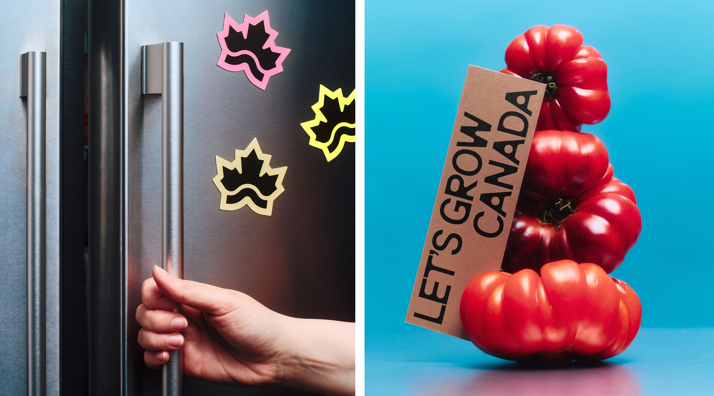
That sensibility carries through into the wider digital experience, where the identity has room to move, shift and respond to its content rather than simply being applied to a static collection of pages.
The website combines stories about the people behind Canadian food production with information about the country’s agricultural strengths, using photography, motion and typography to make a potentially sprawling subject feel approachable.
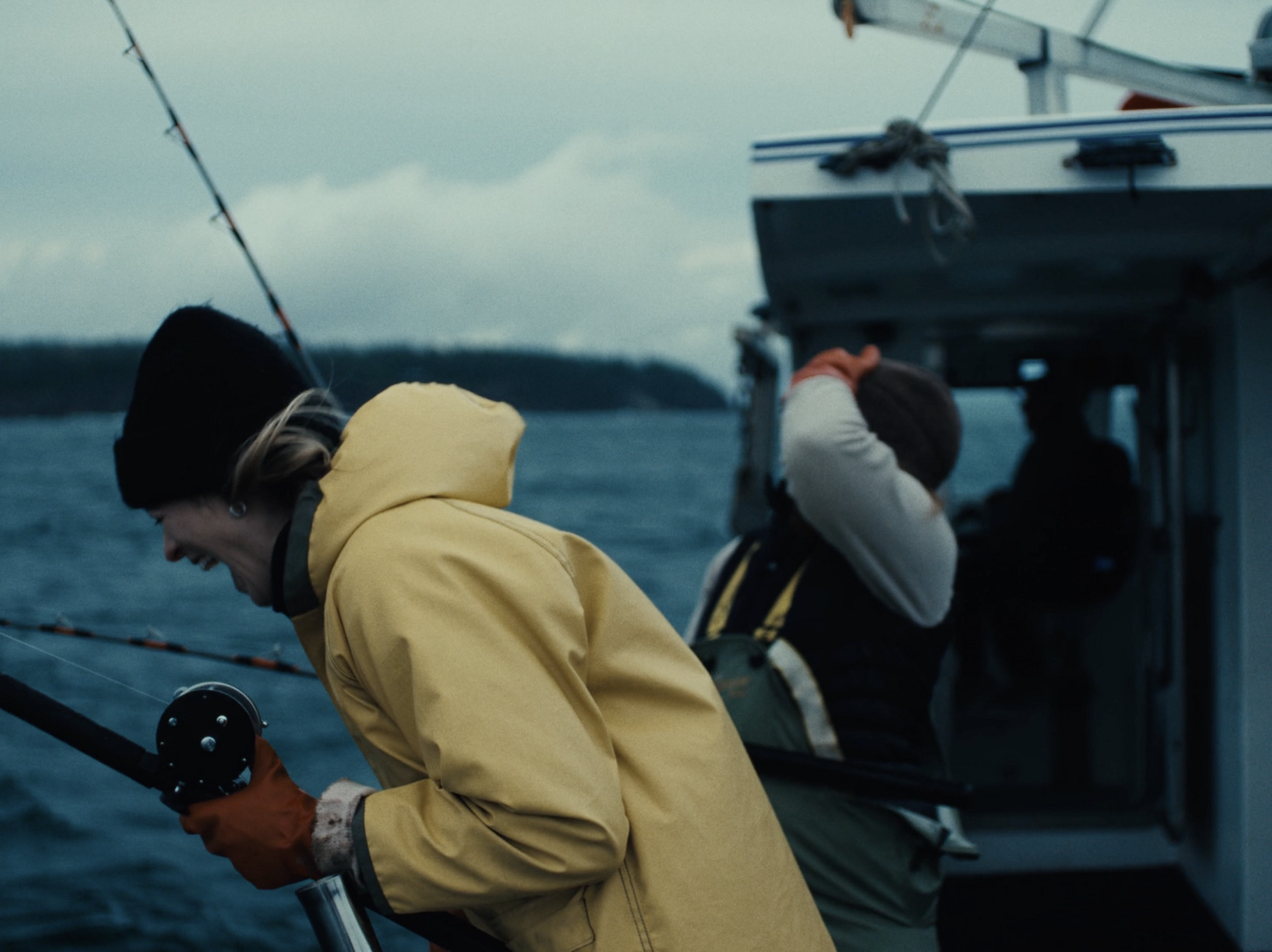
The launch film, directed by Vincent René-Lortie and produced with Small Giants, extends the same approach into moving image, putting the people behind the food system at the centre of the story.
Ultimately, what I love most about this identity is how it manages to be both clear in its intentions and genuinely enjoyable to look at. A movement concerned with food security, sustainability, agricultural innovation and national pride could easily end up with an identity that takes itself far too seriously, or one that relies on the sort of mushy imagery that makes the whole thing take the tone of a shrewdly soppy M&S Christmas ad. Caserne’s skill, deftness and bold approach to design have absolutely avoided either of those things, and produced something both genuinely memorable and absolutely fit for purpose.