Clifton Arms by Wash
Opinion by Richard Baird Posted 16 May 2012
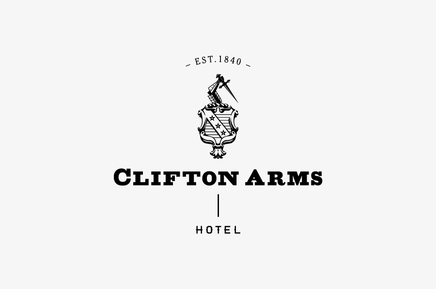
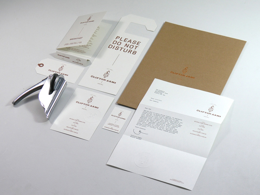
Clifton Arms is a hotel, restaurant, bar and brasserie situated within a grade two listed building at the heart of the UK seaside town of Lytham. The hotel has a rich heritage dating back to 1794 which includes a location change from Clifton Street to West Beach in 1840 and the reception of high profile guests such as Winston Churchill and The Beatles. Following a recent renovation, Preston based creative agency Wash, drawing inspiration from the hotel’s past, developed a new visual identity that includes a revised coat of arms, weighty slab serif logo-type and a warm copper colour palette.
“A brand refresh for the Clifton was requested as the hotel was in the process of refurbishment. With them wanting to look back to their heritage, we developed a new brand that was a hark back to their Victorian past. A new website, welcome packs were developed along with new photography.” – Wash
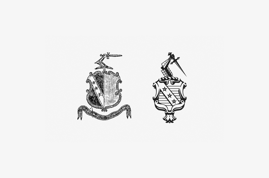
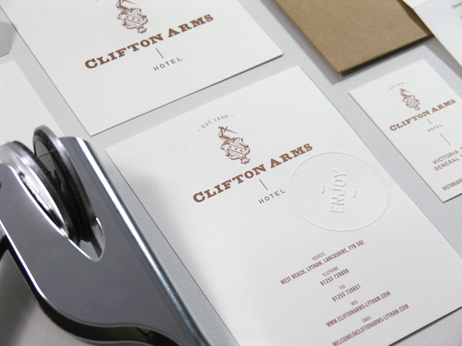
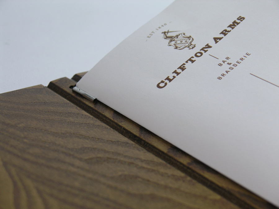
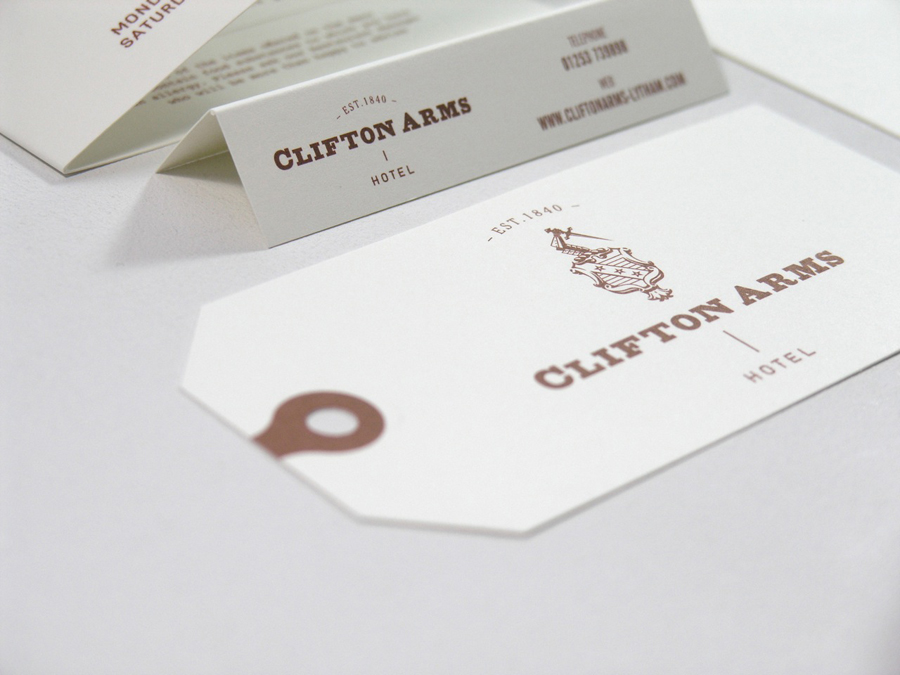
The conversion of etched Victorian illustration to contemporary vector line work has been really well done and appropriately reinterprets some of the classic heraldic cues while appropriately removing others. Wash have achieved a great sense of depth through some solid shading around the carved flourishes that look increasingly more authentic the smaller it is presented. The arm and sword appears a bit bizarre emerging from the shield and perhaps more contemporary in its execution (the lines are little too perfect) but its parallel direction neatly reflects that of the sash and introduces more of a quirky and proprietary character to a saturated shield format.
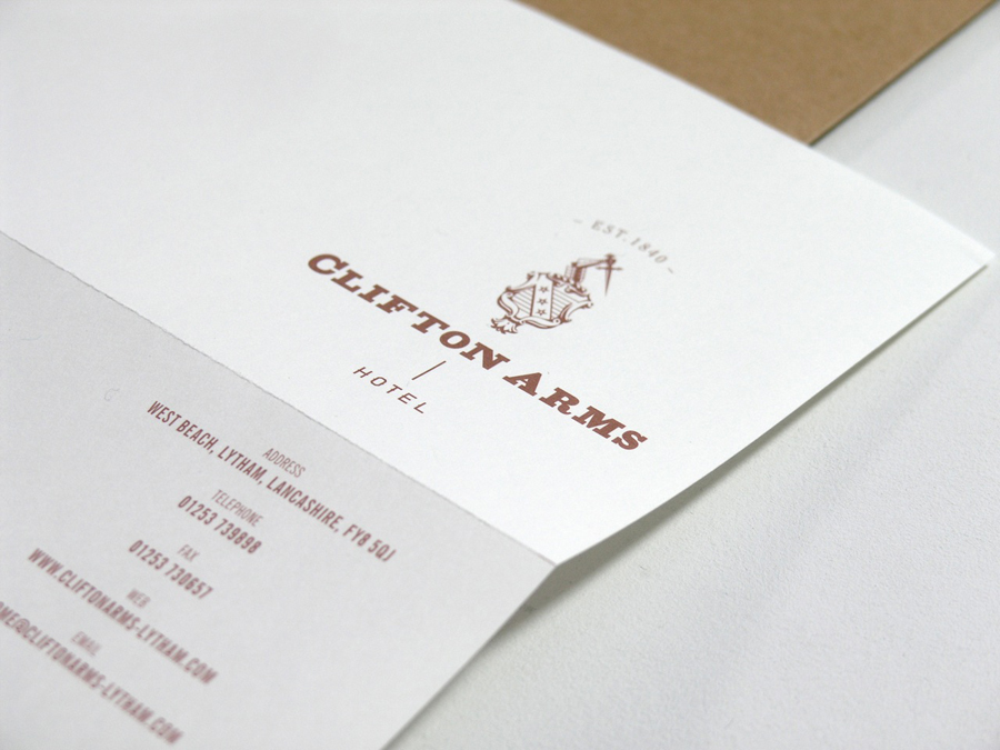
The slab serif logo-type, based on a piece of stonework from the oldest part of the building, intentionally retains the imperfections of its reference (apparent in the ‘ARM’ spacing, counter of the ‘A’ and the width of the ‘S’) to infuse further character and tie it to the history of the hotel. This also creates a nice contrast of weight next to the detail and fine line work of the shield. Its pairing with the sharp sans serif of ‘Hotel’ and the serif at the top makes for an intriguing and unusual mix but one that successfully combines classic ideals of quality with a contemporary eye for style and layout. Resolved the mark and type offer a confident union of line weights, fills and type styles and although it has quite a few components its unique composition establishes a smart vertical visual narrative through the collaterals.
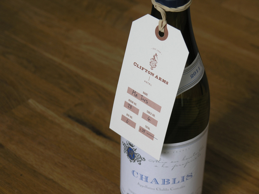
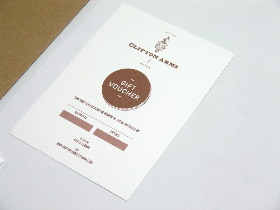
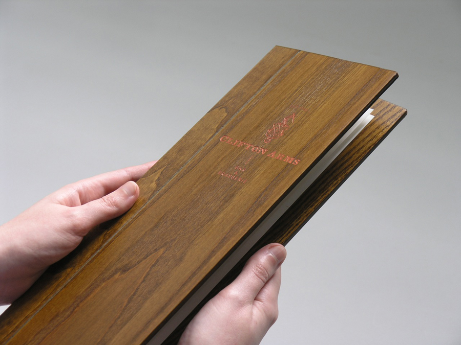
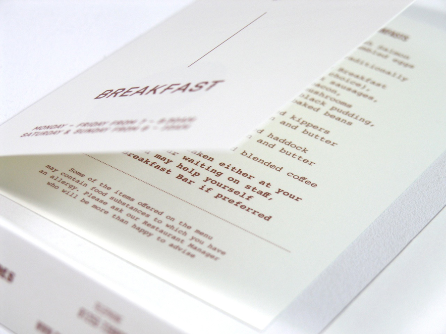
The cream uncoated substrate and veneered/wood panelled menu alongside the metallic copper, copper foil and embossed print-finishes really bind everything together while delivering a sense of warmth and luxury that compliments the heritage and experience conveyed throughout the identity.
