Home Depot
Opinion by Richard Baird Posted 30 March 2011

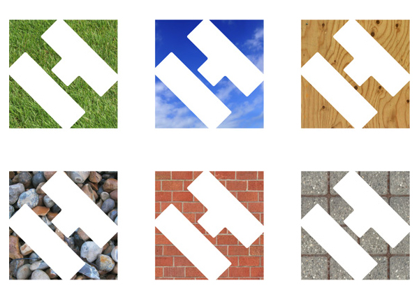
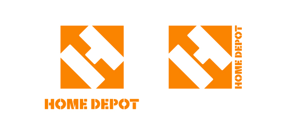
A photo taken of a Home Depot self-service checkout has emerged on Twitter that indicated there may be a change on the horizon. The new design appears to free the cramped typography from the box and opts for a simpler bolder ‘H’ logo-mark with a new version of their stencilled logo-type set underneath. This, however, turned out to be a neat April fools joke created by Matt Stevens for Brand New.


