Delfina Foundation by Spin
Opinion by Richard Baird Posted 10 October 2012
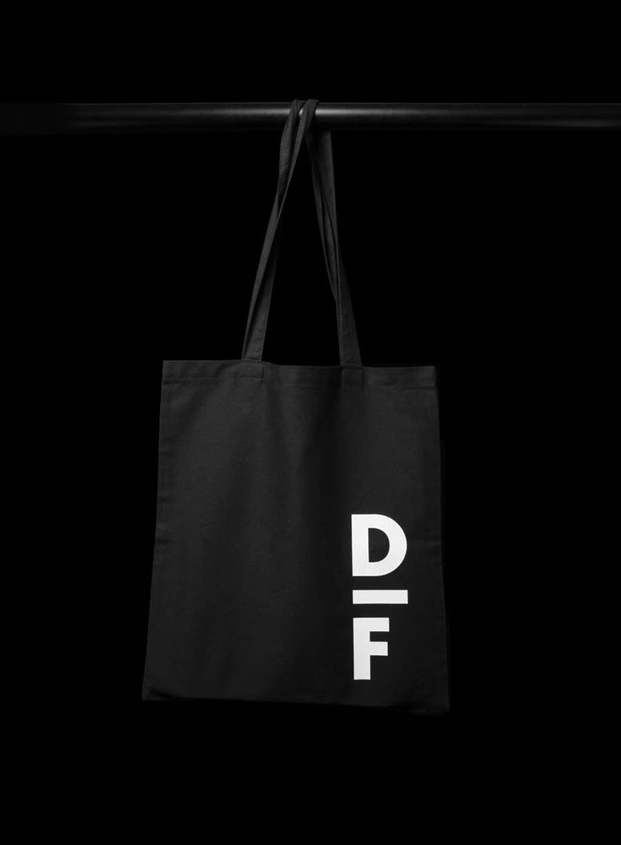
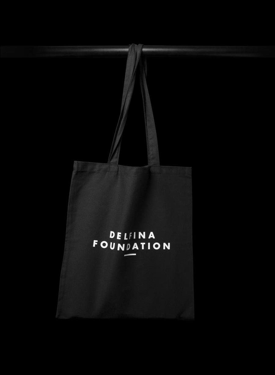
“Delfina Foundation is an independent, non-profit foundation dedicated to facilitating artistic exchange and developing creative practice through residencies, partnerships and public programming, with a special focus on international collaborations with the greater Middle East & North Africa”. The foundation’s visual identity, developed by London-based design agency Spin, mixes a bold typographic solution and underline detail, a modern take on a classic monogram, large images with wide borders and a pastel, black and white colour palette – delivering utility and functionality to contemporary arts and crafts.

Constructed from geometric, humanist, sans serif characters the logo-type establishes a clear sense of efficiency, neutrality and an uppercase formality that feels appropriate for a foundation supporting a broad creative remit extending across borders. Its broad spacing underline detail, central-alignment and monogrammatic abbreviation adds a more traditional dimensionality that borrows from institutes and academia.
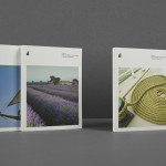
The typesetting of the invites – large headlines and fine detail – deliver contrast to the consistent and non-heirachical point size of the business cards while the slab serif, dividers and grids of the website reflect the functionality of the logo-type. The artwork is given a poster-like prominence with large borders across a fine newspaper substrate introducing an editorial sensibility which works really well in conjunction with the craft qualities of two pastel colour choices and a white screen print over black canvas and board.
On the surface it appears incredibly simple but its mixture of material, type and image manages to convey a sense of written and illustrated creativity framed by institutional discipline.