G . F Smith by Made Thought
Opinion by Richard Baird Posted 28 April 2014
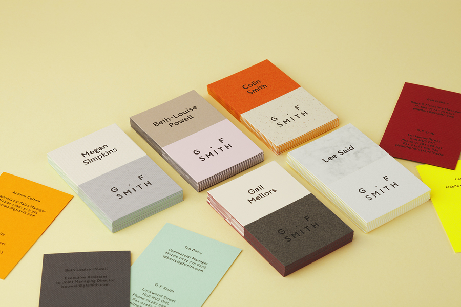
G . F Smith is an independent British paper merchant with a heritage dating back to 1885 and a loyal staff, some of whom have provided over 20 years of loyal service. Made Thought, the design studio behind the visual identity for G . F Smith’s distinctive Colorplan range, were recently commissioned to develop a new brand identity for the company that would better reflect the legacy, stature and future ambitions of the company. This included a new logo and logotype, sample and heritage booklets, stationery, pin badges and website.
Today’s review was written by Maisie Benson, a final year graphic design student studying at Falmouth university. Maisie has secured placements at renowned studios jkr, Smith & Milton and B&B Studio, and has a keen interest in brand identity and packaging design.
Almost every major rebrand gets some form of criticism when presented to the design world. There will inevitably be a number of people who will prefer the original design, just as there will be a selection of people criticising the design for either being too revolutionary or not revolutionary enough, and the recent G . F Smith rebrand is no exception.
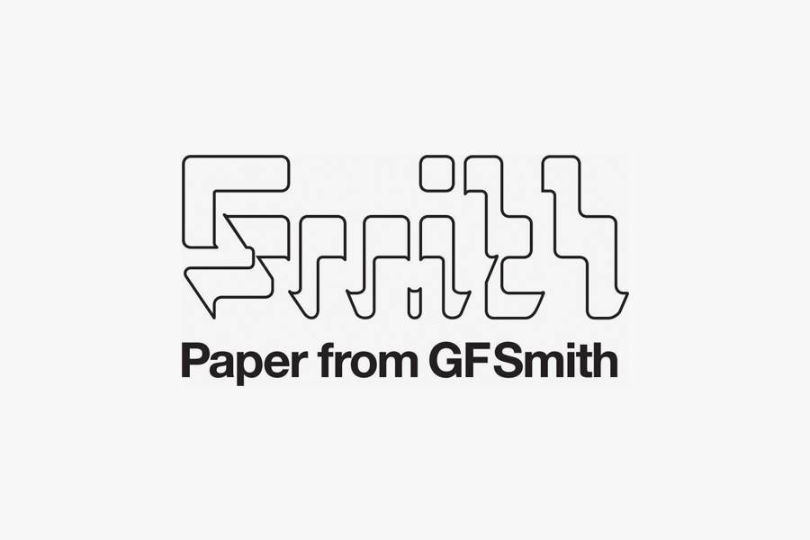
I have to admit, that before I read an article analysing the rebrand I had never really ‘got’ their old logotype. Created by SEA in 2003, it was designed to resemble paper passing through a paper machine. Once this had been explained to me I did see the justification for the mark but still didn’t find it overly aesthetically pleasing, therefore, when I saw the new logo I was perhaps more likely to embrace the change than someone who had enjoyed the subtle symbolism of the previous mark for the past ten years.
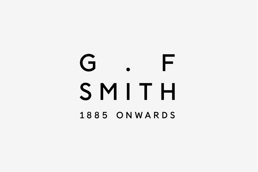
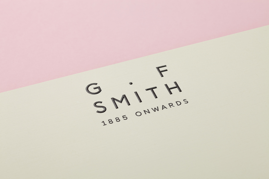
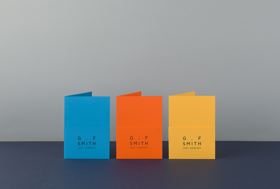
On first glance the new logo, designed by Made Thought, appears slightly awkward. The spacing between the justified ‘G’ and ‘F’ seems excessive and the period between the initials creating a tittle for the ‘I’ below appears a little contrived. However, the more I looked at the logo and tried not to analyse the tracking, the more appealing I found it. Even the ‘I’ began to make me smile and the balance of the ‘G’ and the ‘F’ works in a way that it perhaps technically shouldn’t. The tagline ‘1885 onwards’ makes a welcome change in my mind from the trend to mark every company as “Est.” (Including a Tesco store I recently saw branded as Est. 2002!) and, as Ben Parker from Made Thought rationalises, “It reflects the company’s past but also its … desire to look forward rather than back.” Which is a refreshing way to see, and embrace, a brand’s heritage.

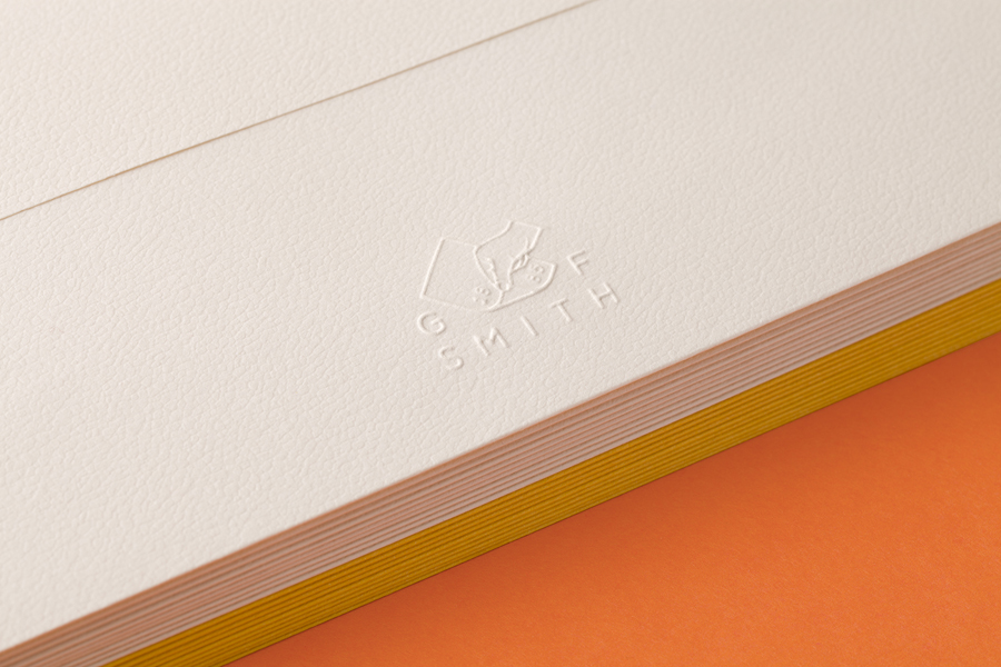
A secondary mark replaces the full stop with a hand turning a sheet of paper, symbolising the human touch to the company and the hand-crafted nature of their work. It also shows the tactility of the paper which G.F Smith are renowned for with their wide range of uncoated, surface embossed stocks. This symbol can be used in isolation without the wordmark and will be embossed as a sign of quality. It will be interesting to see how these two logos work together to create a cohesive brand identity.
The new typeface, which has been consistently used across print and digital touch points, is a humanist sans-serif designed by Colophon Foundry. Although Parker describes it as “a combination of the machine age and the more calligraphic line,” it perhaps might have been more effective at communicating this had the typeface had a more obvious contrast of stroke widths, accentuating the themes of handcraft and curation. However the double-storey ‘g’ and ‘a’ do create a soft, gentle feel which represents the brand well.
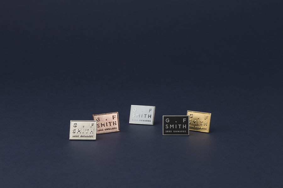
G.F Smith has quite a low staff turnover and, as a testament to their loyalty, Made Thought has designed a number of badges made in different materials to reward staff accordingly. These range from nickel, for relatively new recruits, to 24-carat gold for long-standing employees, each are packaged in jewel-like colorplan boxes.

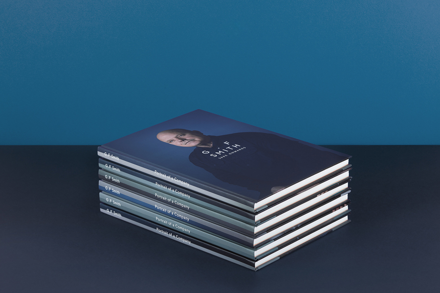
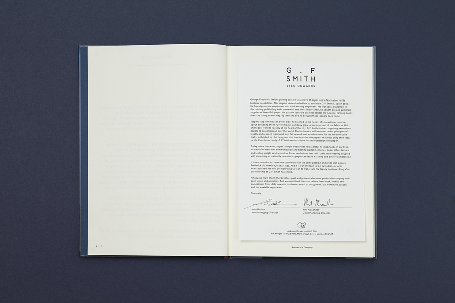
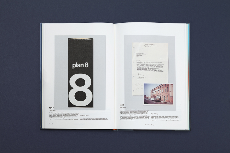
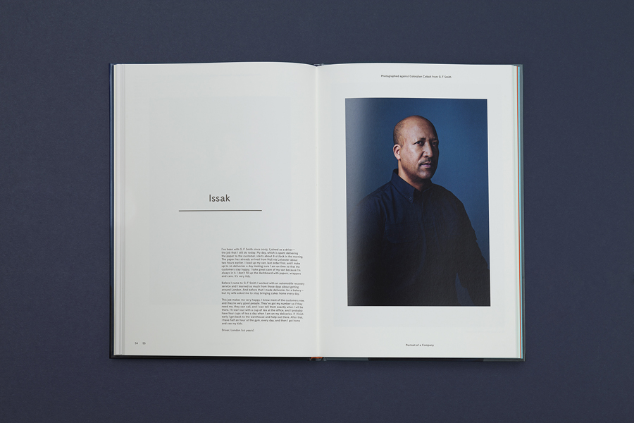
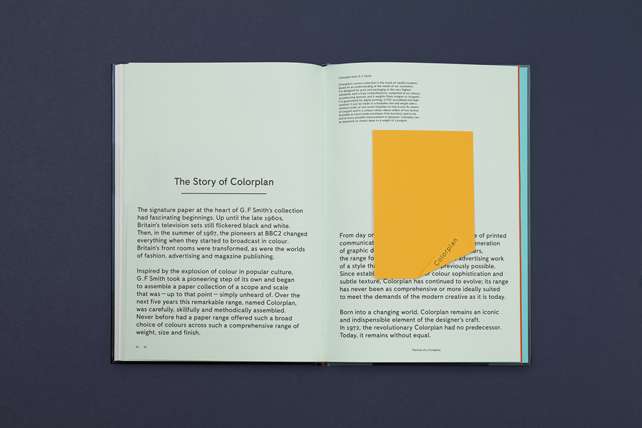
The staff and their contribution to the growth and character of the business is placed at the forefront of communication through ‘Portrait of a Company’, a publication that chronicles the history of G.F Smith. Drawing from their extensive archives, interviews with staff members and the use of well shot portrait photography as well as intelligently doubling as a sample book—highlighting the way ink works with 18 of their papers—the book is a compelling piece of design, seamlessly blending the functionality of paper, significant heritage and the human element that underpins good service.

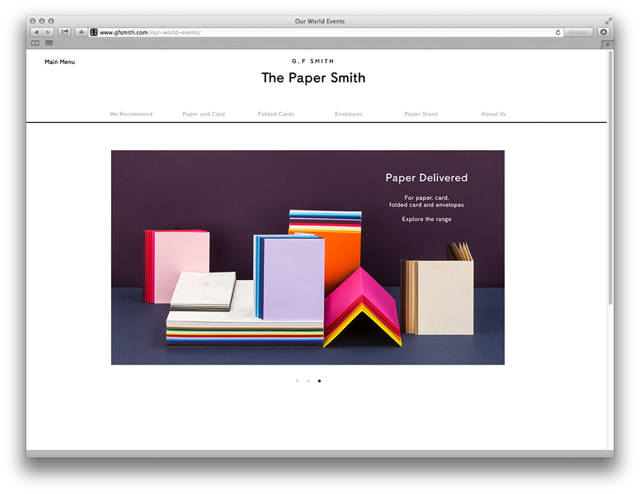
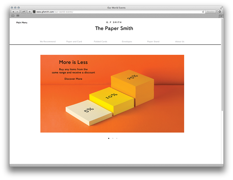
Made Thought has also designed an accompanying website, although it appears as though some pages feature an additional logo alternative with a one line, typed version of the brand name. With several different marks already designed the new branding may struggle to keep it’s coherency, however this could just be a holding logo before the rebrand is fully implemented so I will be intrigued to see how this evolves.

Assets such as business cards, which use an unusual paper marquetry technique to juxtapose different paper textures and colour, the finish of a blind emboss and a tear-away sample book effectively introduce creative, crafted and practical elements to the visual identity, broadening its communicative influence in a diverse yet cohesive manner.
Overall, I think the rebrand is a success. It modernises G.F Smith without losing the connotations of quality that they have established over many years. It effectively acknowledges the brand’s past, recognises that it needs to continue to update and innovate in order to contend with a changing industry and infuses these with a personality, functionality and a human quality to bring G.F Smith to life.
Design: Made Thought
Opinion: Maisie Benson


