Santeen by Studio MPLS
Opinion by Richard Baird Posted 17 June 2011
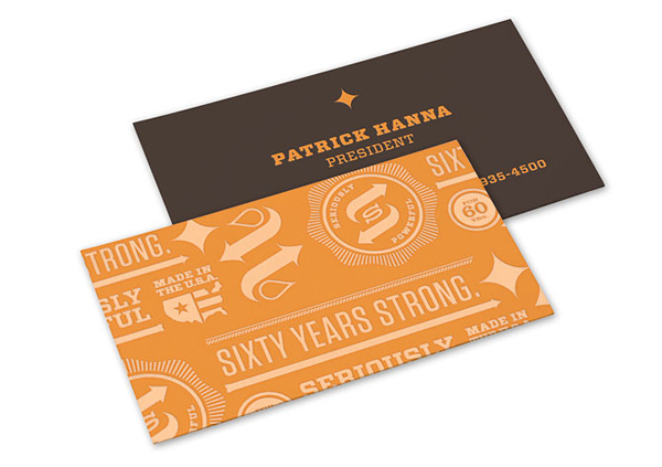
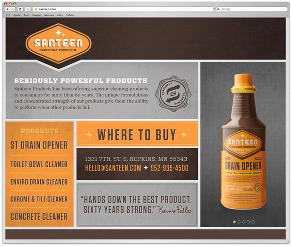
Santeen manufactures and distributes high-quality cleaning products to the professional market with a history dating back sixty years. They approached Minneapolis based Studio MPLS to develop a modern brand and product proposition while retaining their authentic values.
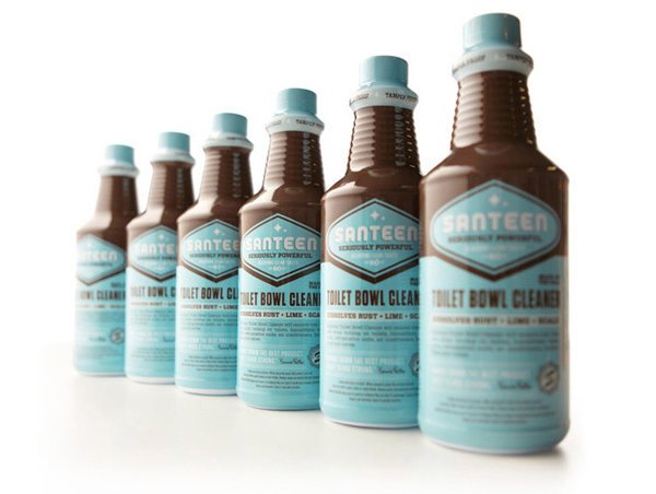
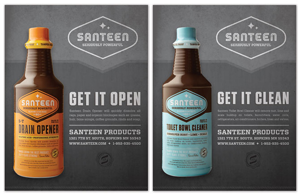
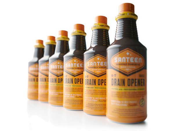
“Inspired by classic 1950’s package design, the new brand language conveys a sense of strength, pragmatism and work ethic with a no-nonsense yet modern graphic look and feel. The primary packaging also features a proprietary design that allows the product to be shelved and sold without the use of safety bags—making the product more recognizable, convenient and affordable.” – Studio MPLS
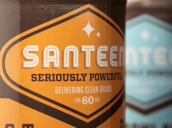
The packaging for a large proportion of products within this industry often receive little or no aesthetic consideration compared to household supermarket brands. As such they often take a utilitarian (standards based) direction, characterised by generic white bottles with blocks of information and labelled ‘A1’ cleaning fluid etc. Santeen aims to convey the same powerful, functional characteristics but utilised through a vintage styling that takes advantage of and communicates the brand’s values. The type choices, containers, details and icons appear carefully considered (and likely referenced) to create an authentic looking 50’s and 60’s Americana visual style cut with a more sophisticated eye for layout and packaging hierarchy. The colour choices and combinations are classic in their consideration and do not stray beyond three per product so neatly side step an overtly supermarket sensibility.
I really do like this style, the execution is solid throughout but I can’t help but feel this could be viewed as a retro supermarket proposition that lacks the industrial (strength) aesthetic cleaning companies have come to expect. This style is unique to this market and does mark it out as different but ultimately may distract and dilute the perceived strength of the product.
