Loot by Savvy
Opinion by Richard Baird Posted 18 September 2014

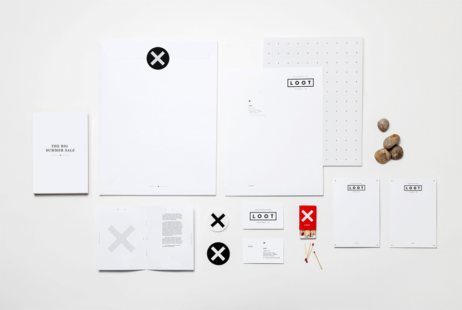
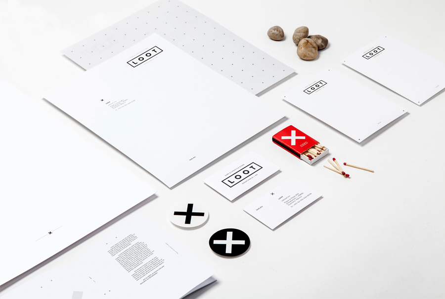
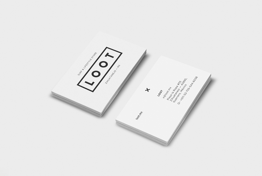
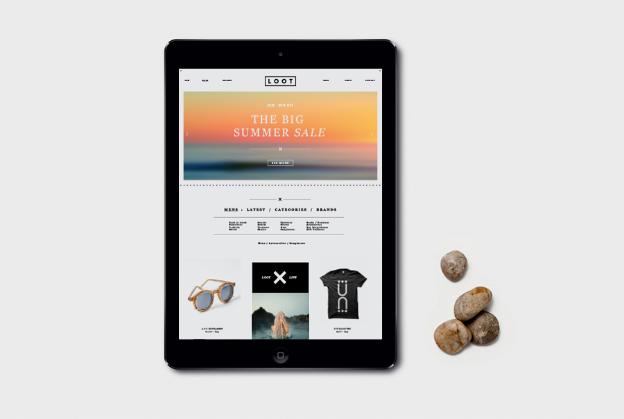
Loot is a surf and lifestyle store retailing distinctive products for a modern and global consumer and offers an alternative to the more commercial items from retailers typically found in its touristic location in the Mexican city of Zihuatanejo. Loot’s brand identity, designed by Savvy, draws its character and distinction from Zihuatanejo’s past as a hotspot for pirates, and visualised as a combination of regional historical elements and modern pop culture, allowing it to be relevant to both the local community and international shoppers.
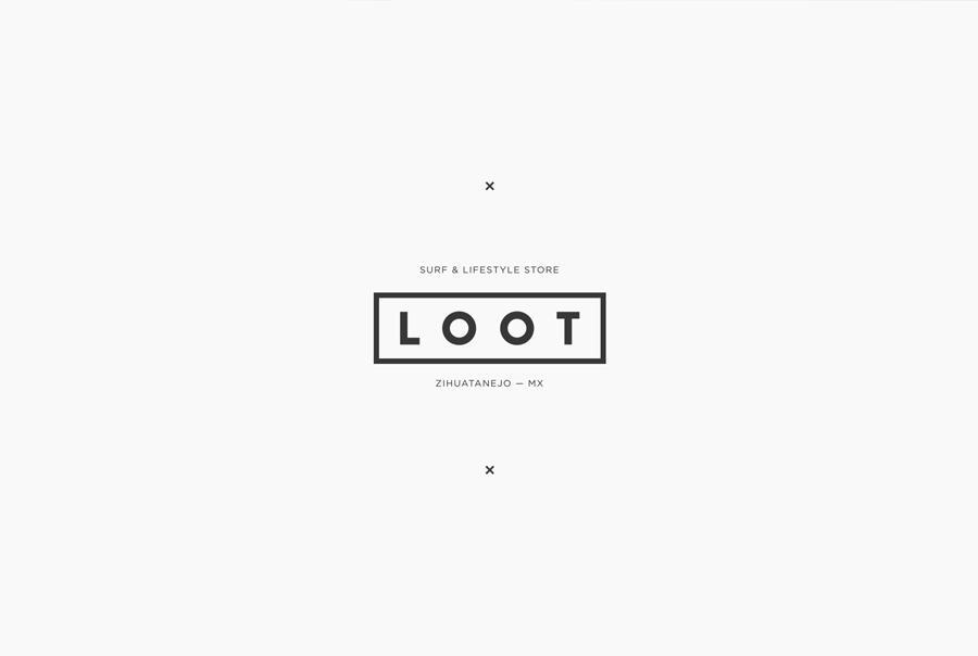
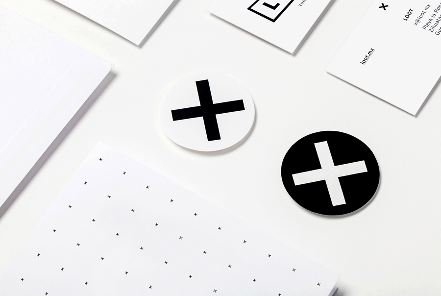
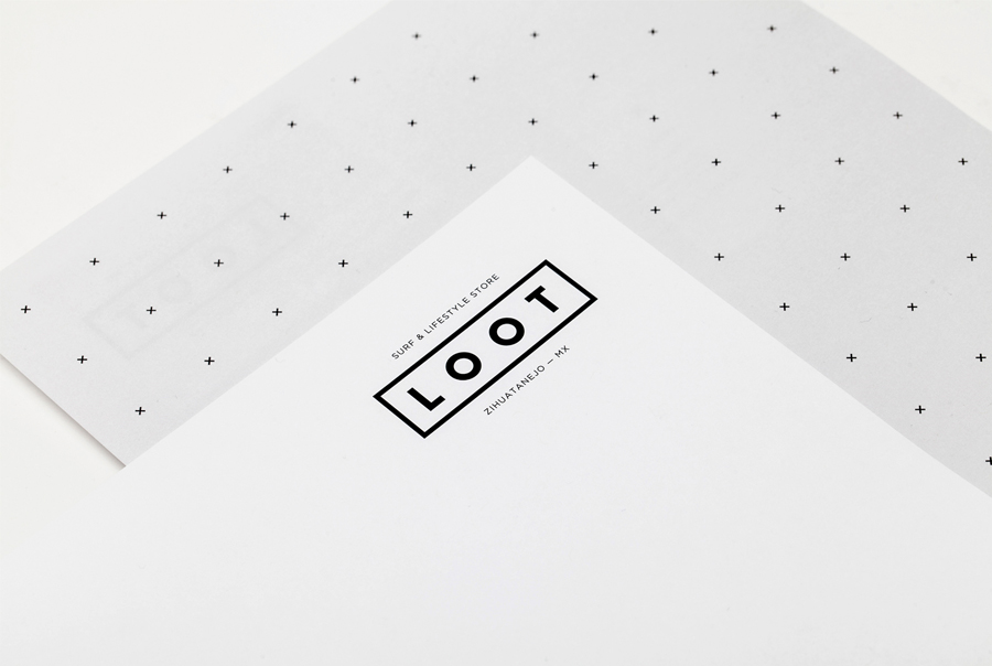
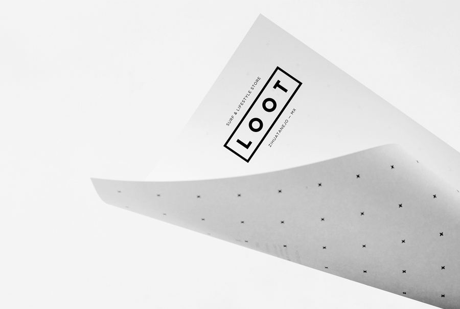
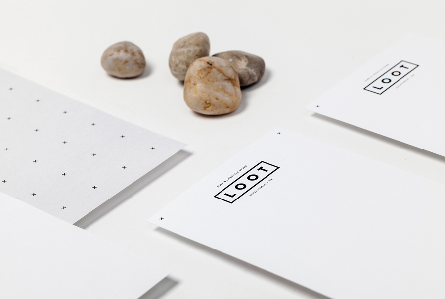
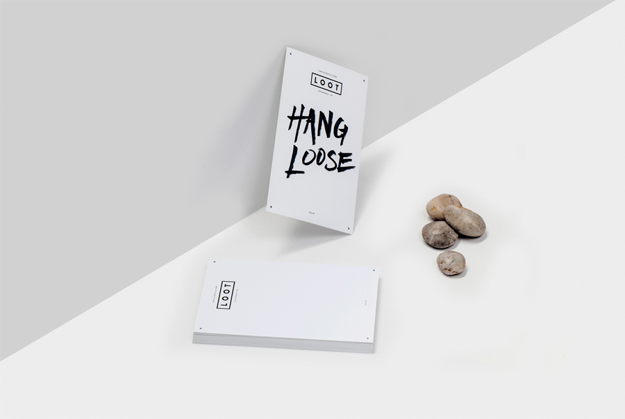
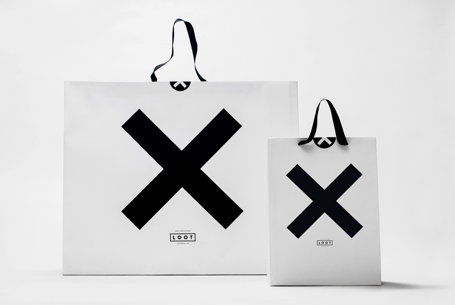
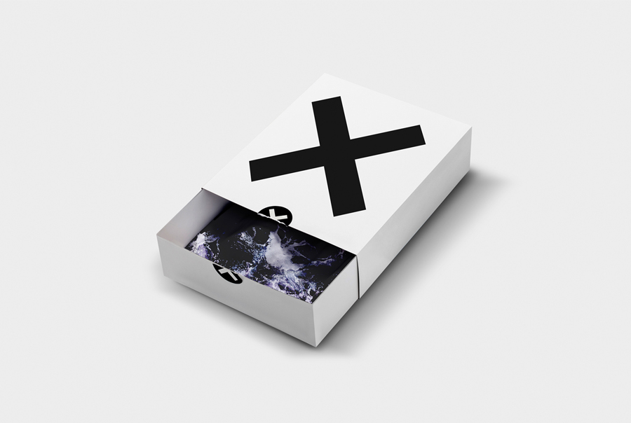
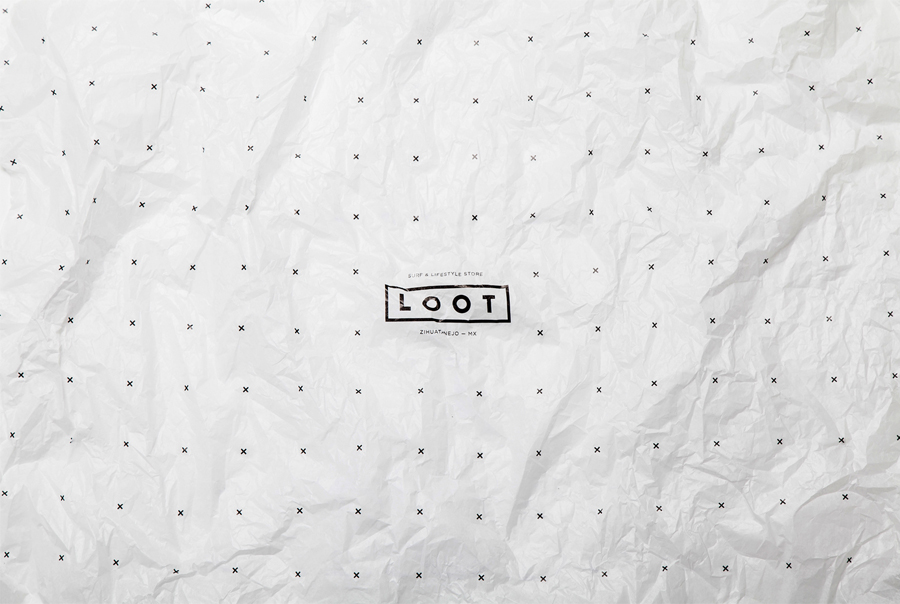
It is difficult to get a sense of the locality said to have informed the identity. Presumably this come through within the retail space. However, the concept of treasure and pirate maps, distilled down into a very simple graphic language of X marks the spot and grid reference, alongside the detail of sea imagery, and a limited colour palette — chosen to sit behind the individual nature of the objects rather than overwhelming them with shop identity — appears contemporary and well founded if a little abstract.
Aesthetic impact comes through in the contrast of large or the very small, be that type or X’S, from the large and iconic bags to the small patterned tissue paper. Unusually the mixed papers and print treatments we have come to expect from Savvy are absent in favour of a significantly paired-down, communicatively limited and economical solution that perhaps reflective of a tighter budget but certainly in service of a product first brief.
Design: Savvy
Opinion: Richard Baird
