Hiro Sake by Monday Collective
Opinion by Richard Baird Posted 18 July 2011

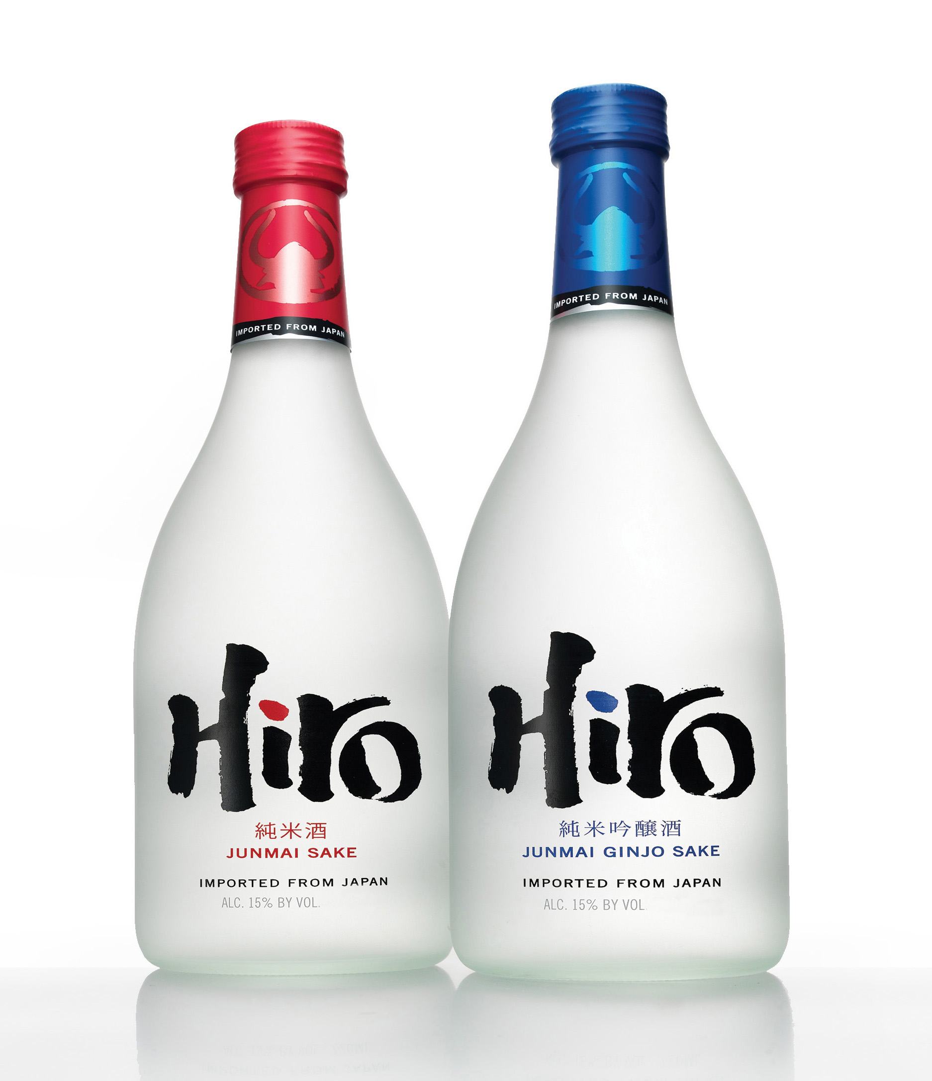
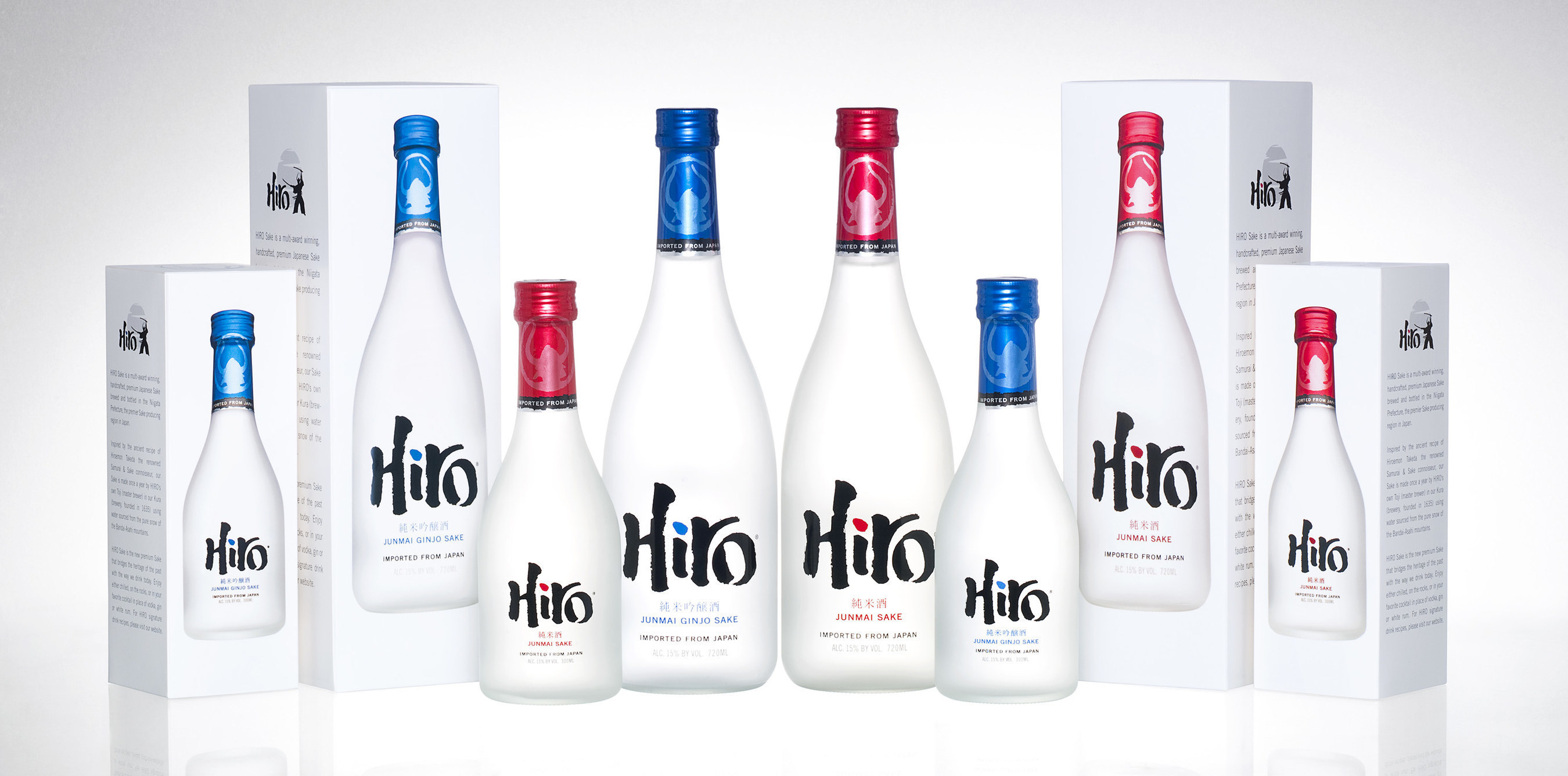
Hiro is an imported Japanese Sake that blends traditional and modern aesthetic styles with a compelling true story of samurai Hiroeman Takeda. New York based design agency Monday Collective was tasked with creating an identity and packaging solution that would convey the products high quality and position as the first premium saki product introduced onto the US market.

“The Sake spirits category, specifically, remains surrounded by mystery (also with the traditional Sake brands communicating in Japanese) and is often confusing for consumers that are unfamiliar with Sake and its unique rituals to understand (hot or cold, straight up or cocktail… even what to call it).”
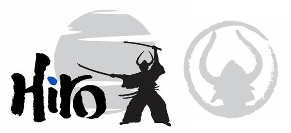
“A simple brand identity, inspired by traditional Japanese calligraphy, reflects the swift movement of the Samurai warrior in action; a Japanese designer provided cultural insight and inspiration and a Japanese calligrapher (both from Monday Collective’s group of experts) handcrafted the bold, authentic type style; a simple brand icon on the neck of the bottle captures the Samurai in his warrior helmet, as a mark of distinction; and the story extends to the back-of-pack with an illustration of the Samurai warrior in action.
The result differentiates Hiro Sake from both traditional and new spirits by simply expressing its cultural authenticity with a contemporary style that connects with today’s international spirits consumer.” – Monday Collective
The Hiroeman Takeda (a famous samurai warrior known to have produced a unique recipe for Saki over 200 years ago) provides an interesting platform from which to build a brand story that essentially creates heritage where none really exists. The logo-type is neatly executed with individual letters interacting in a natural and dynamic way suitably drawing on Japanese hand painted scripts to form the western characters. The use of actual Japanese scripts delivers an authentic visual characteristic and works with the logo-type to bridge the gap between tradition and a more modern and familiar proposition.

The silhouetted character illustration has quite a romantic sensibility that plays with the ideas of a more heroic and honourable time that is inspiring and aspirational. The visual assets are all drawn together and applied in a simple manner that stands out against the clean aesthetic of the bottle while the blue and red details generate differentiation between varieties and helps to underline the hot or cold nature of the drink.

The ‘back story’ and visual cues have all been aptly chosen and neatly rendered for the premium market and work well to add depth and a distinctive personality to the product’s proposition.


