Hatch Cold Brew Coffee by Tung
Opinion by Richard Baird Posted 27 October 2016
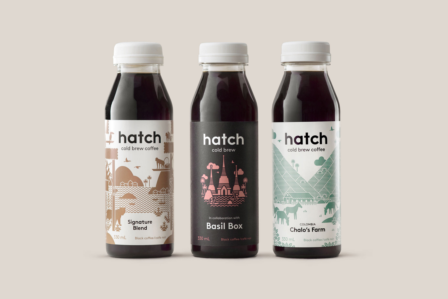
Toronto-based Hatch is a coffee roaster producing ready-to-drink cold brew coffee from high quality natural ingredients using a craft-oriented twice-filtered manufacturing process and a unique bottling technology to seal in fresh flavour. Hatch intends to bring cold brew coffee from a niche but growing market into the mainstream and worked with Canadian graphic design studio Tung to help them achieve this through brand identity and packaging.
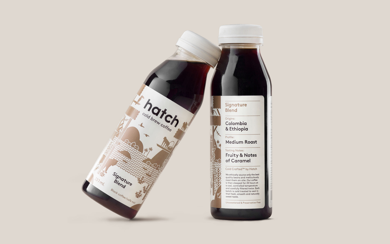
Hatch intends to appeal to the coffee connoisseur and the everyday consumer, and Tung looked to address this through a blend of illustration; grounded in foreign lands and discovery, the very current and accessible qualities of type, and, with a clear mind towards those looking for more insight, a structure that is clear in origin, flavour profile and roaster information. Satisfying two quite different consumer groups is difficult, the middle ground often not appealing to either, however, and bearing in mind the on the go and single serve nature of product, rather than a sit down and savour, Tung seems to have found a good balance.
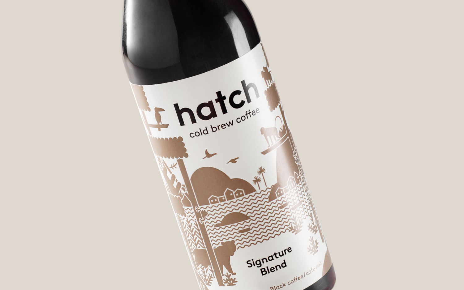
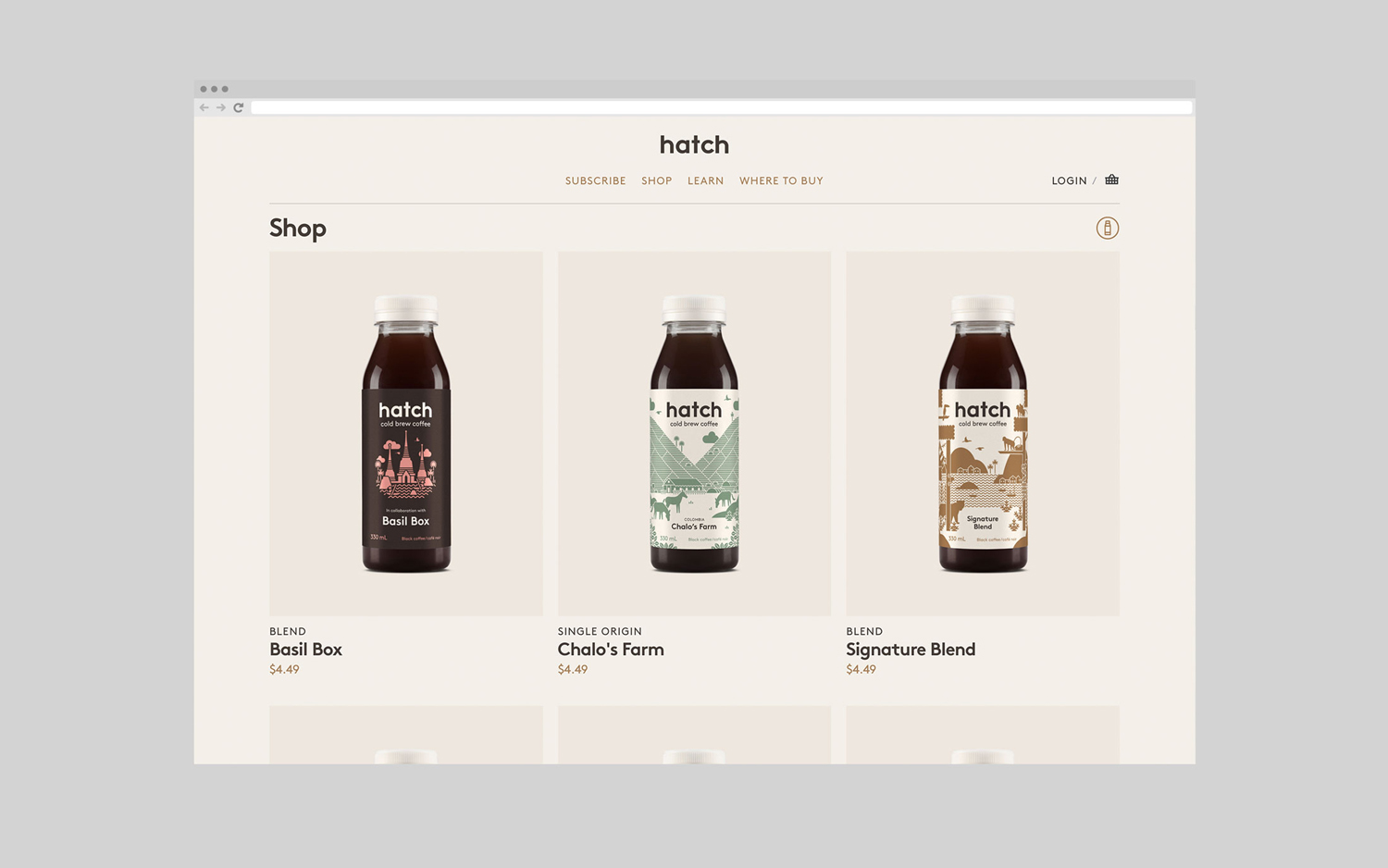
Illustrations are well-done, make a connection with craft in its drawing, provenance and exploration in its content. These are a nice mix of monolinear lines and silhouettes, a good balance of positive and negative space and have a fairly good sense of foreground, middle ground and background, even as a single colour. There is a pleasant visual texture from a distance, lots of small little details up close, and some stronger forms that help for quicker differentiation. Alongside a modest colour palette these feel distinctive, interesting and contemporary, and function to separate varieties.
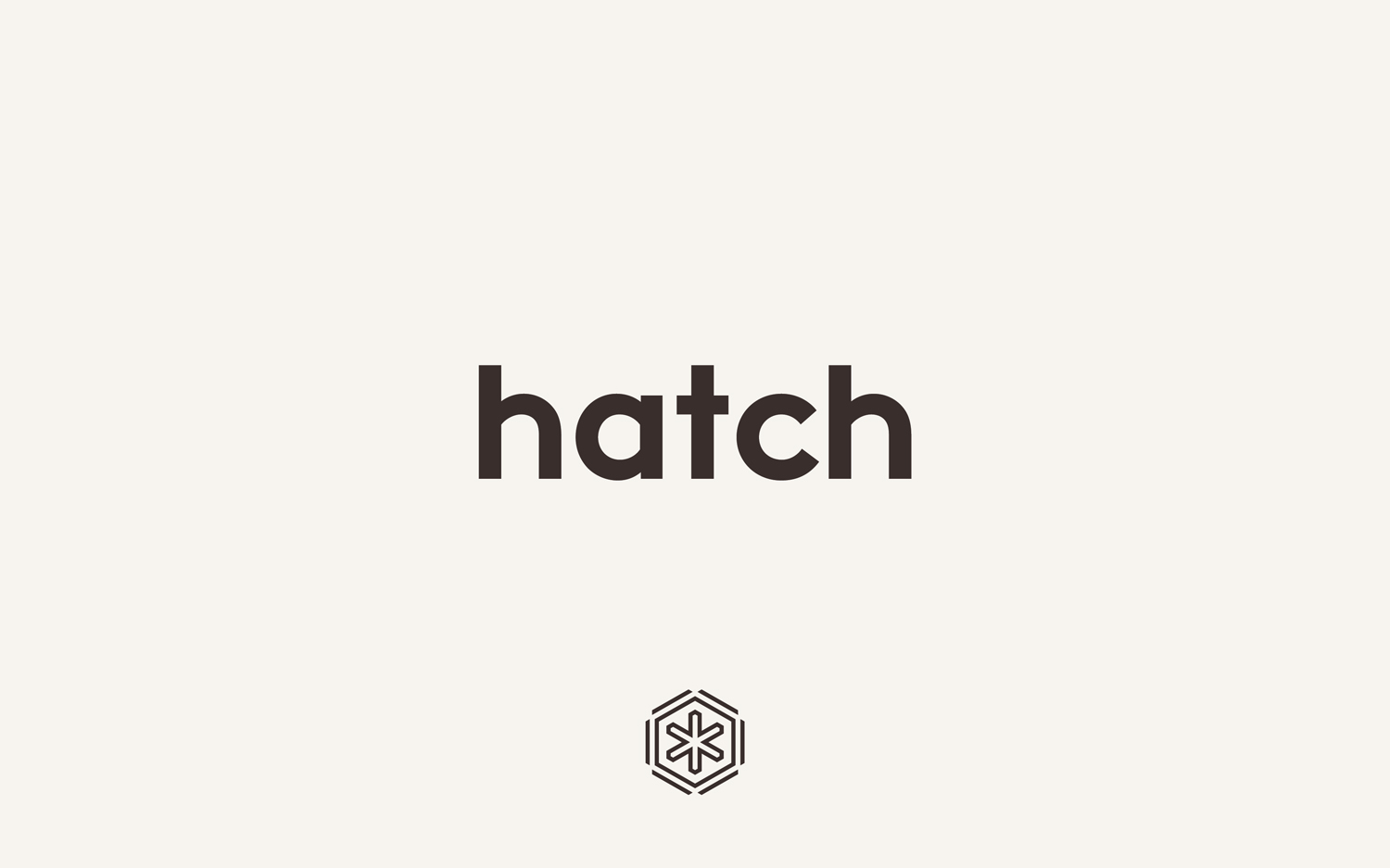
Type; various weights of Lineto’s Brown, is thoroughly current and accessible in its shapes, monolinear lines and all lowercase typesetting. Brown ink and debossing across uncoated board gives this a more earthy and crafted quality. Both typographical form, colour and material finish appear well-suited to a modern, convenient and high quality coffee product, and shares some of the qualities of illustration. Logomark is interesting but abstract in its forms, consistent with type and illustration in its lines and balance of space, and although brand name is compact, works better in social media contexts.
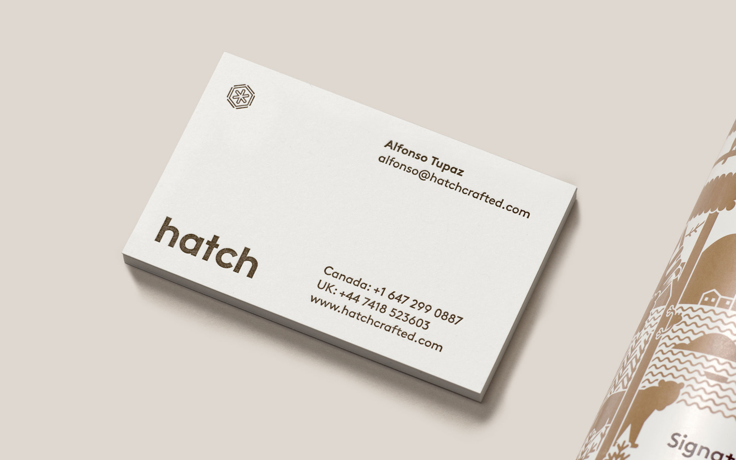
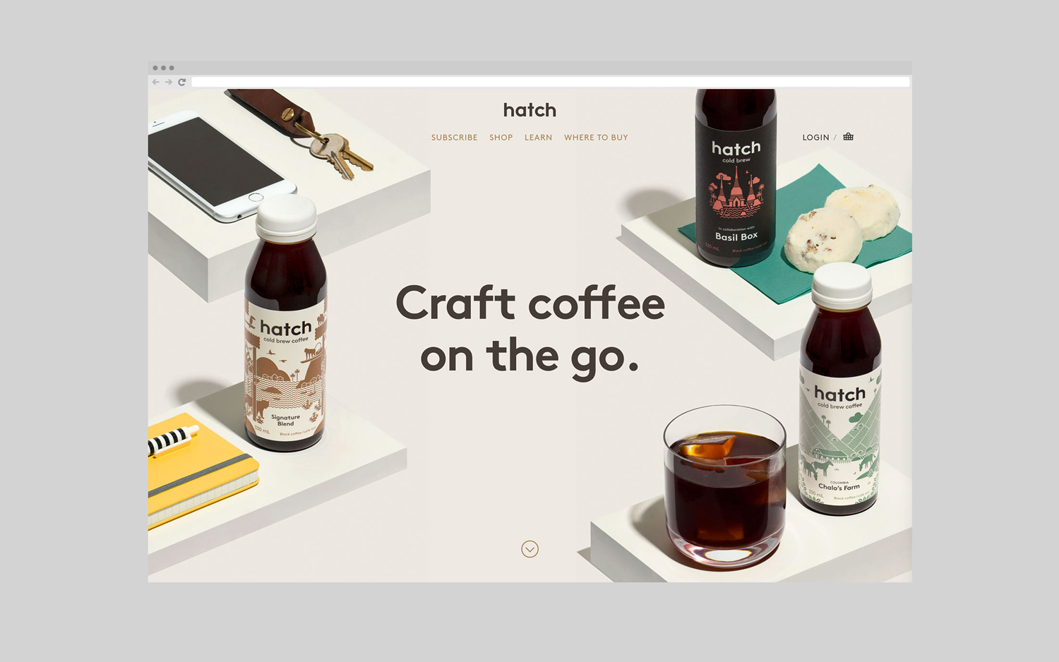
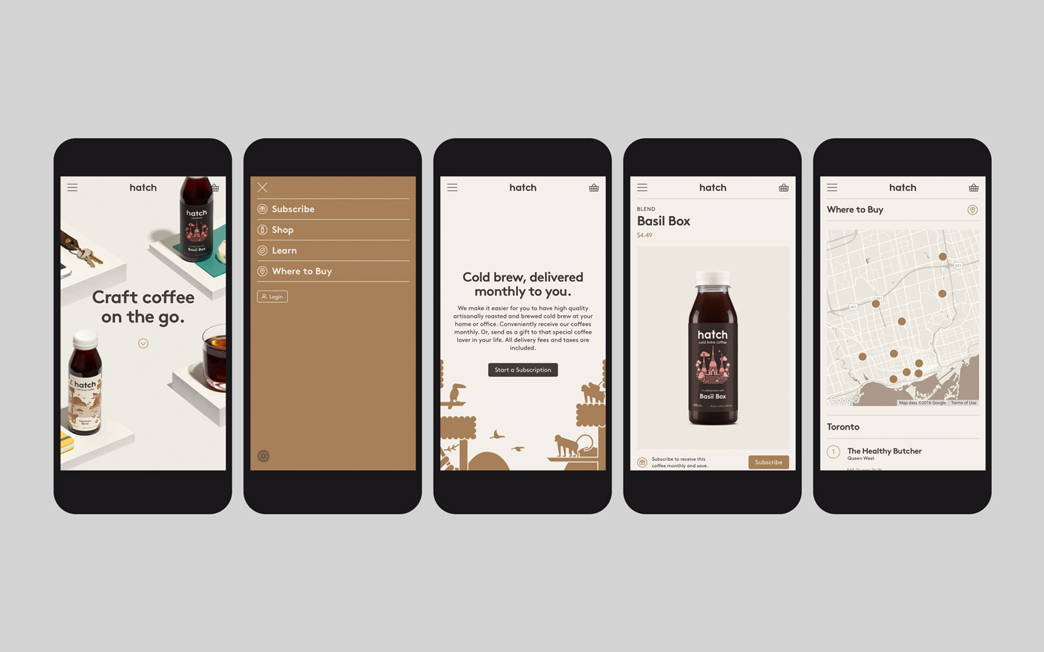
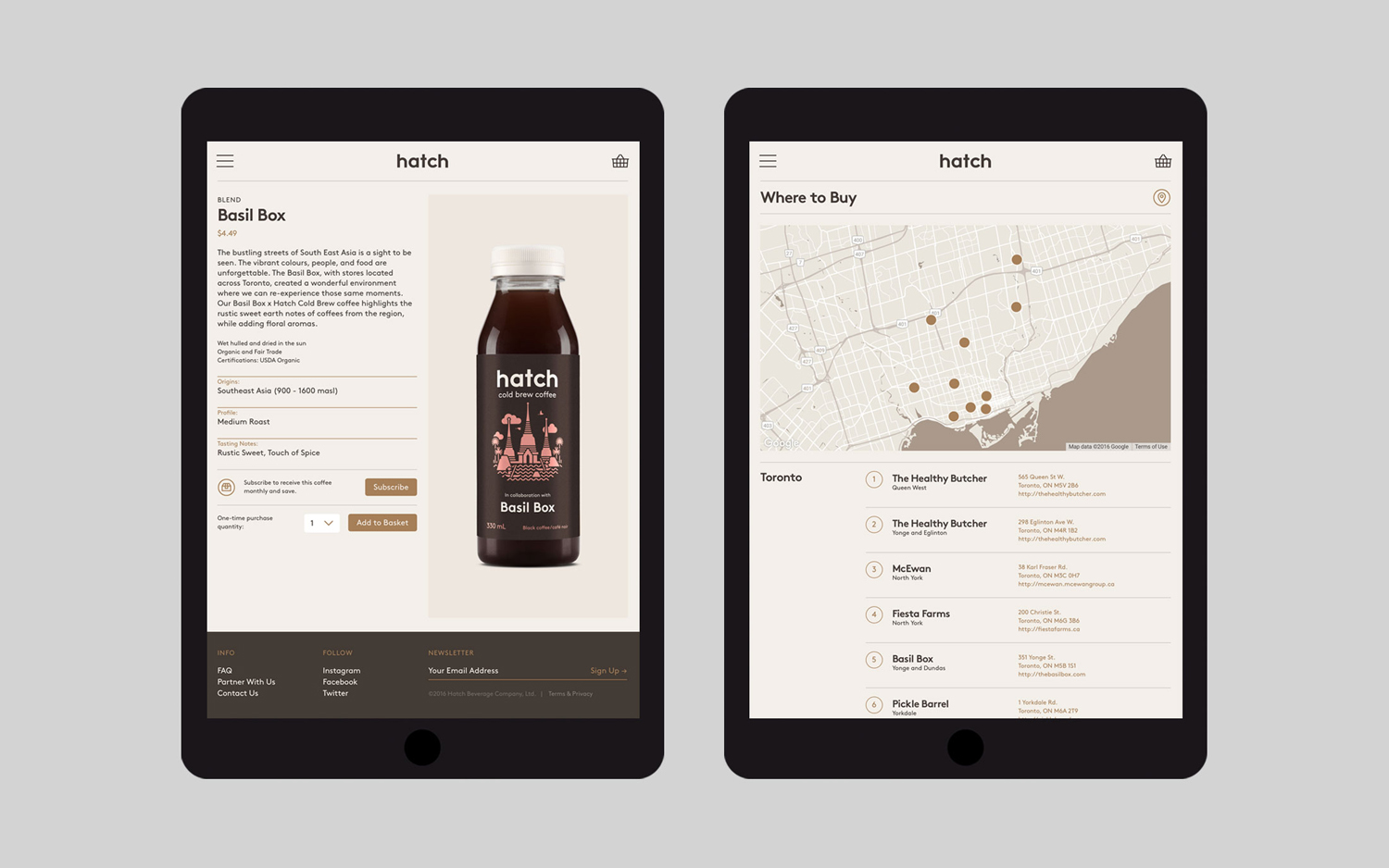
The continuity between packaging, visual identity and website is strong. The site offers a layer of functionality, providing access to shop, subscriptions and further insight, which is augmented by moving image. It is very well polished, end to end, and manages to move between the everyday accessibility and the insight expected by those more interested in flavour nuance, craft and origin.
Design: Tung. Opinion: Richard Baird. Fonts Used: Brown.
