Sant Jordi Festival 2017 by Requena & Capdevila
Opinion by Richard Baird Posted 25 May 2017
Sant Jordi Festival is an annual celebration that combines culture and romance, and takes place in the city of Barcelona on April 23rd. The festival honours Sant Jordi, the patron saint of lovers in Catalonia, is rooted in the legend of Sant Jordi and the dragon, and in the tradition of visiting the Chapel of Sant Jordi at Government Palace where a rose fair used to take place. In celebration, couples, friends and family exchange gifts of books and roses, bought at flower and book stalls set up along the streets of the city.
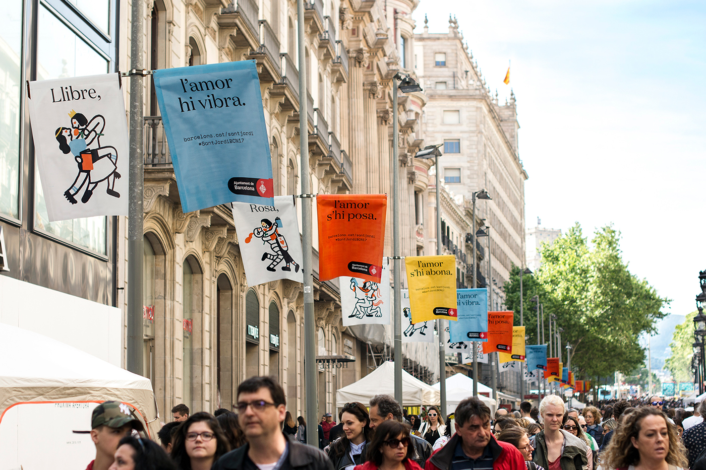
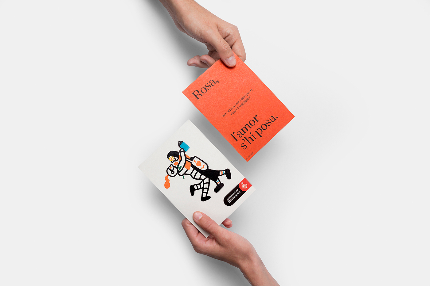
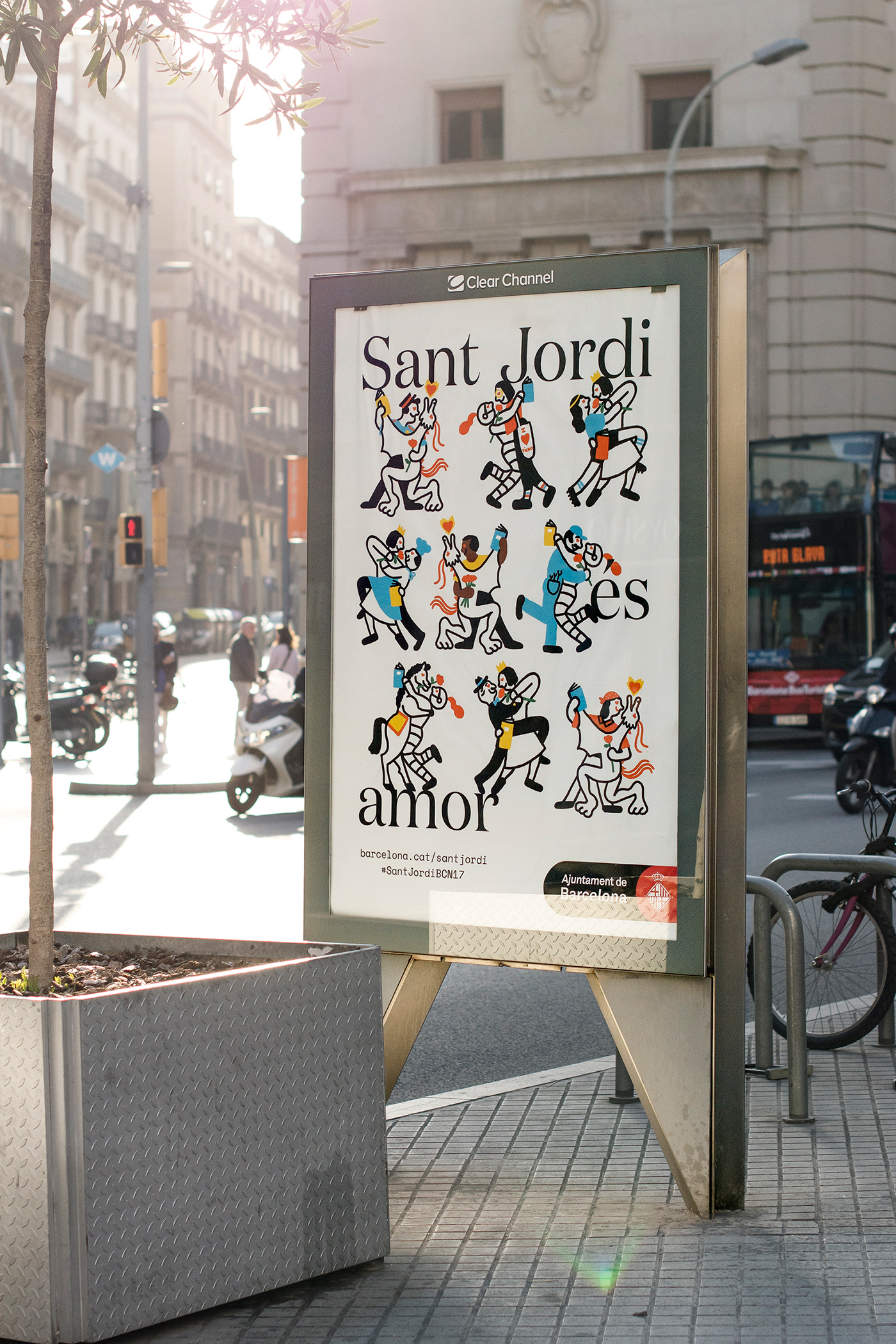
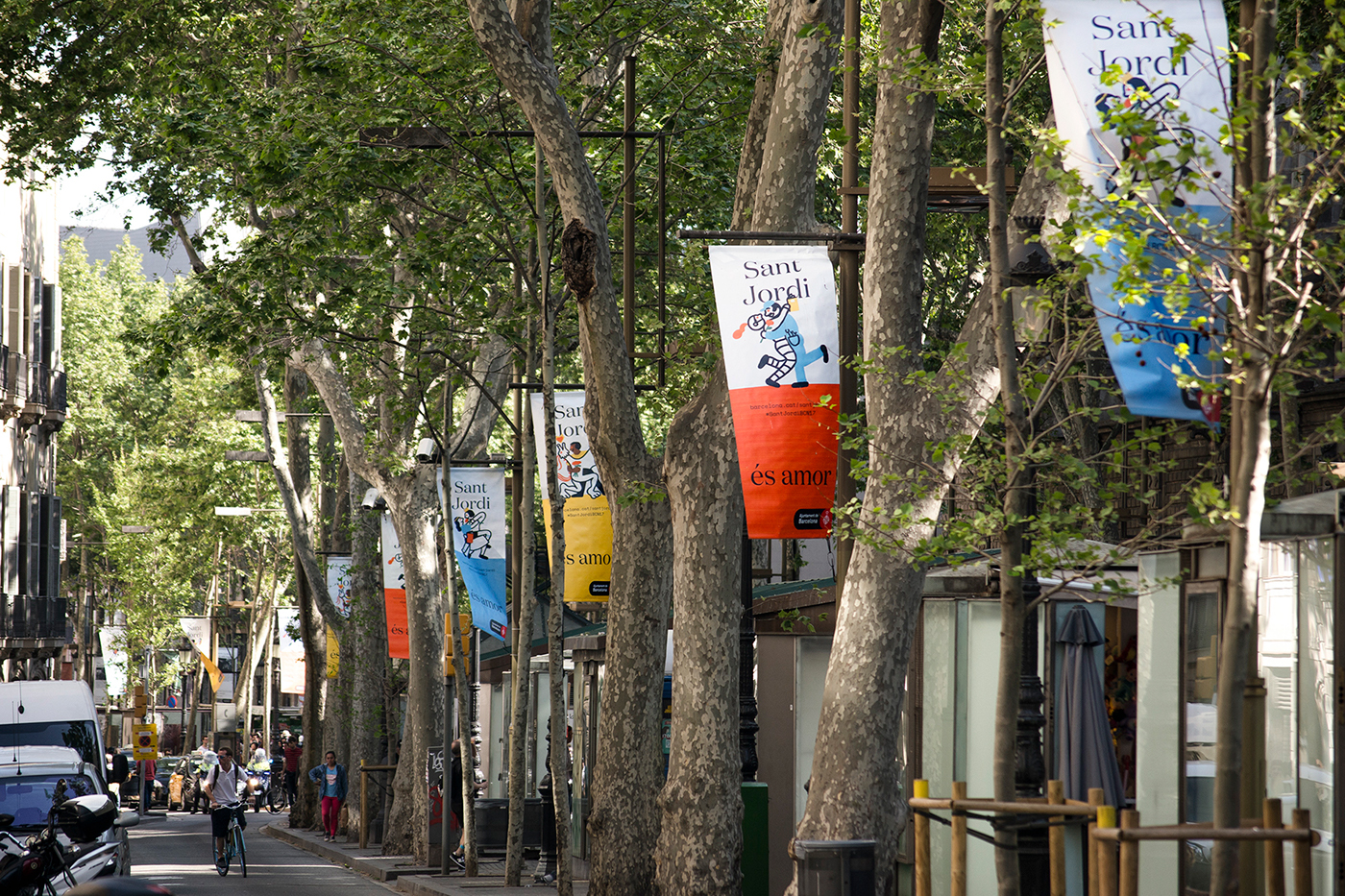
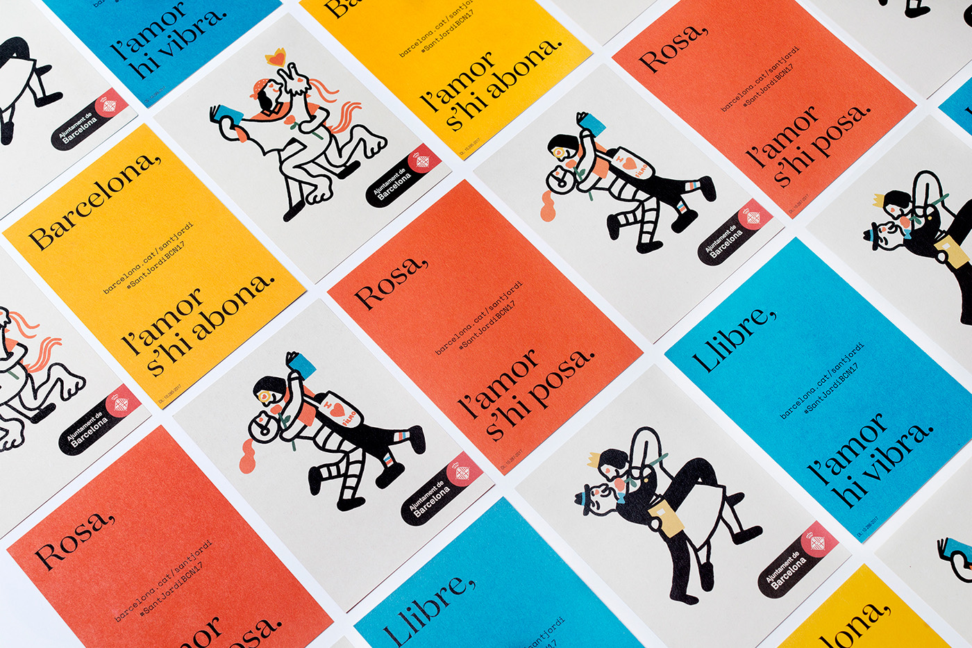
The historical legacy and legend of Sant Jordi, as well as the traditions that sprung up around these, are brought to life by Spanish design studio Requena, with the help of Olga Capdevila, in a series of illustrations. These capture the roses and books, history and celebratory air of the event, and are used as a strong focal point throughout the festival’s visual identity. This links large format posters and banners, flyers, flags and bookmarks.
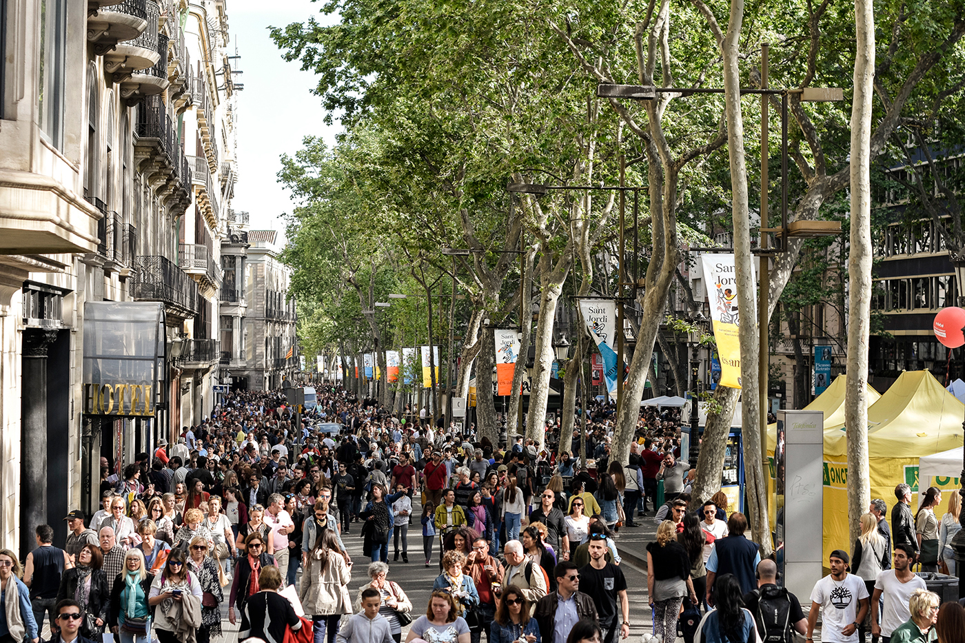
Sant Jordi Festival is a mix of book fair and the Spanish equivalent of valentines day. Although its origins are rooted in some well-established traditions, today’s festival is a modern and inclusive event. Where once books and roses were exchanged between couples, men and women, this is far more fluid, with women and men receiving both books and roses, and gifts also now given to friends and family.
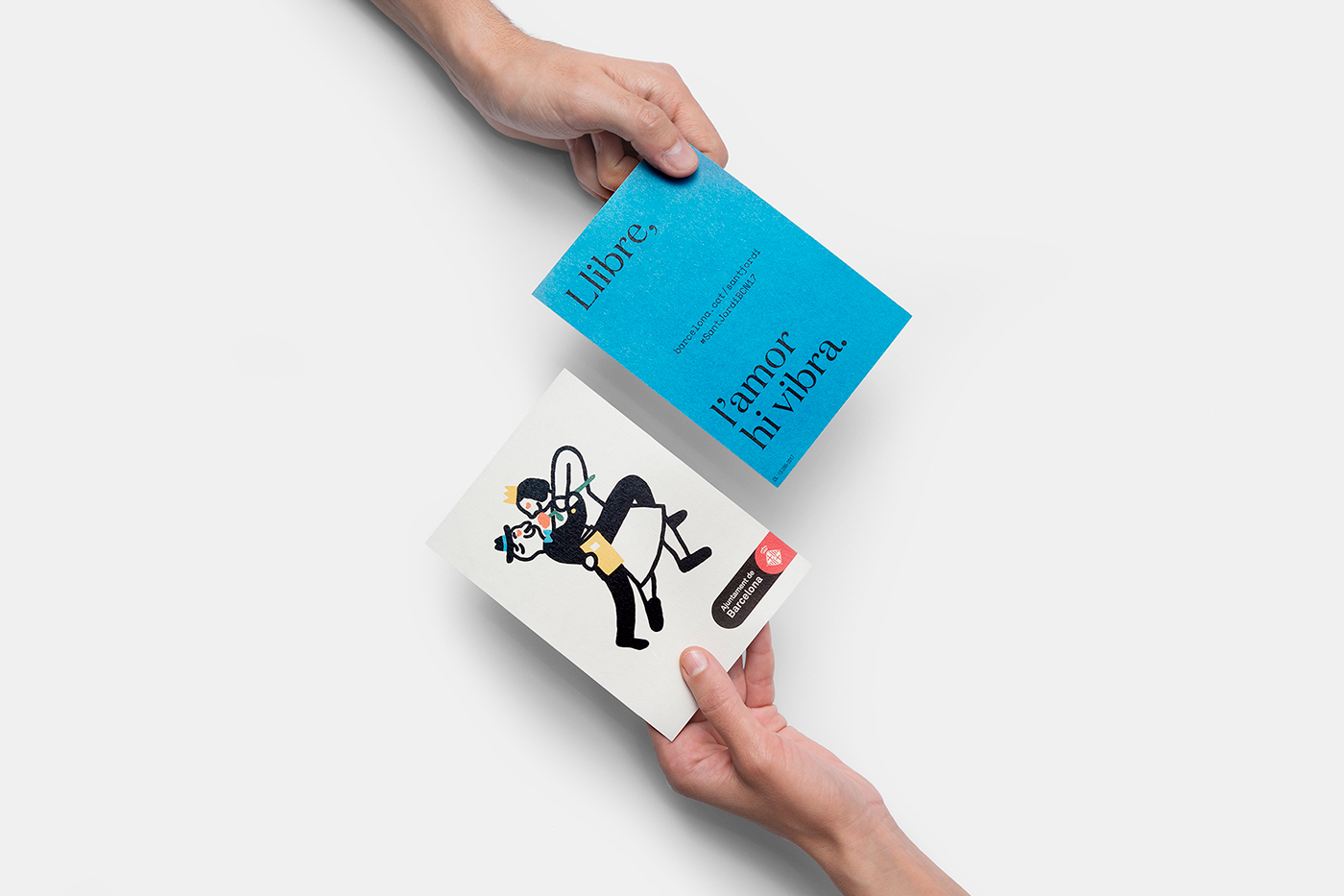
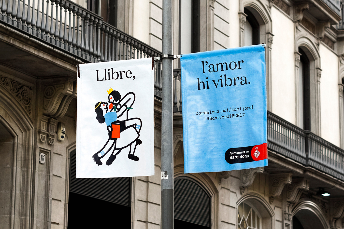
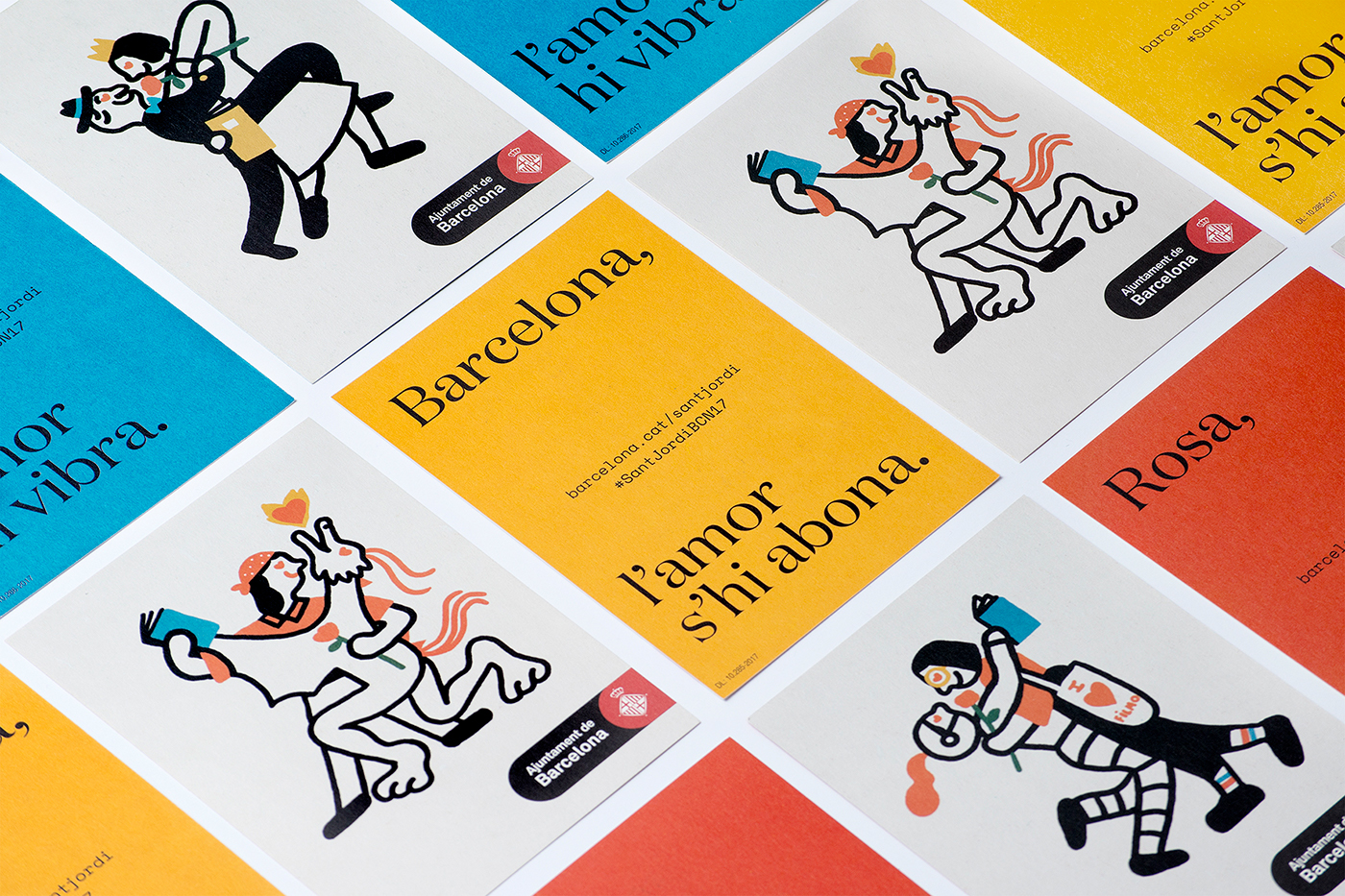
Visual identity weaves together past and present, well-established traditions and a modern inclusivity. This can be seen in the use of a bright, cheerful and contemporary colour palette punctuating the architectural history of the city. In the cohesive idiosyncratic qualities yet variety and diversity of Olga Capdevila’s illustration. And in the choice of Klim Type Foundry’s Domain which features a mix of formal and traditional stroke contrast and more playful hooked terminals that share something in common with the embraces key to illustration.
These are brought together well, alongside an awkward but self-contained city logo, with a good eye for clear layouts, space, impact from a distance and detail up close. The monospaced slab-serif adds a second contrasting typographical layer that functions to call out the digital aspects of the event.
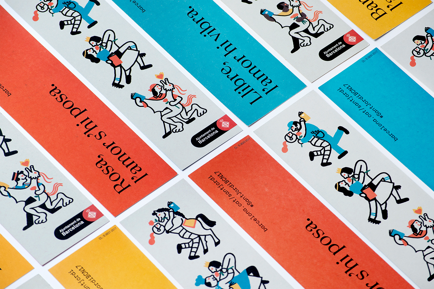
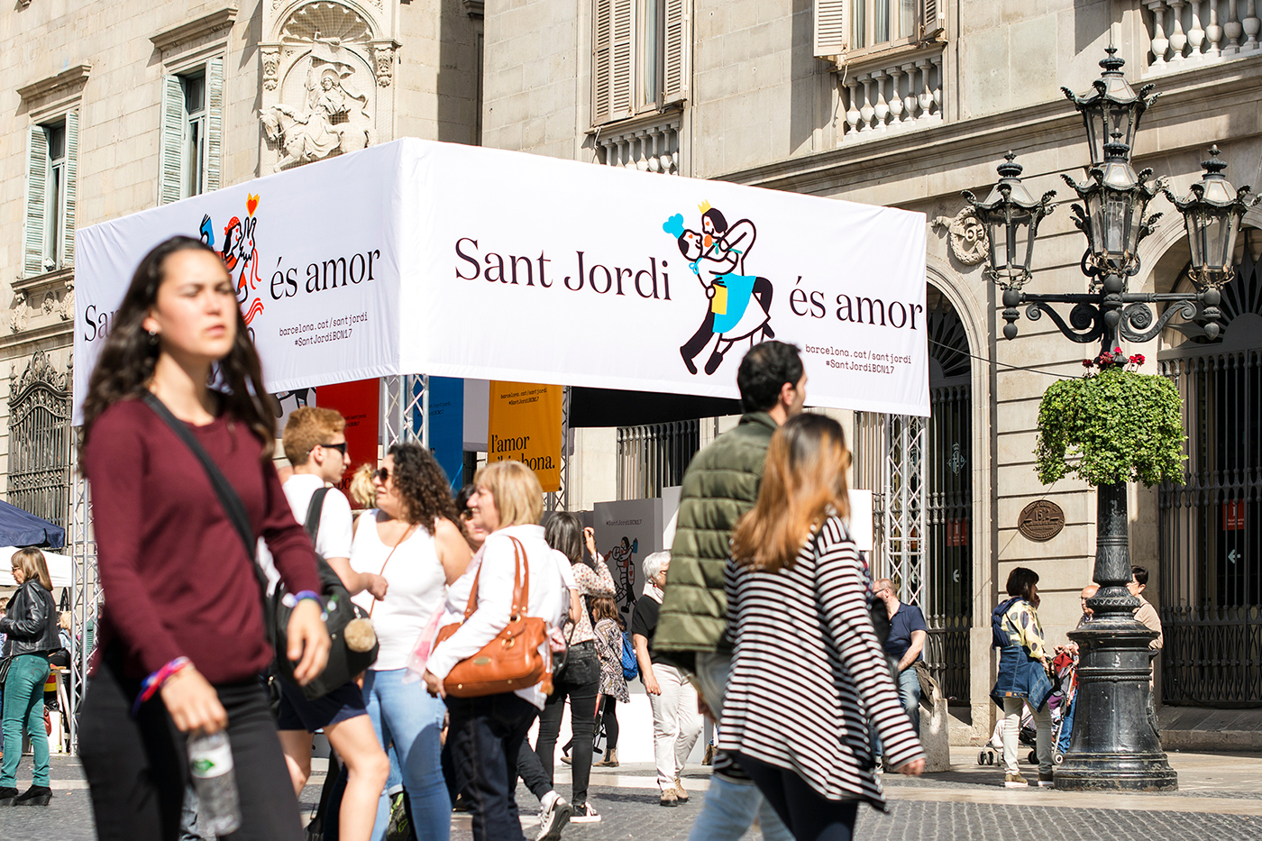
Illustration is the highlight. Olga Capdevila’s work functions to engage a broad age group by referencing the historical and legendary context of the celebration and in the silliness of some of the pairings. These work hard to balance diversity and a cohesion, and in the choice of type and the thick black lines, brings together and expresses both a literary and storybook quality.
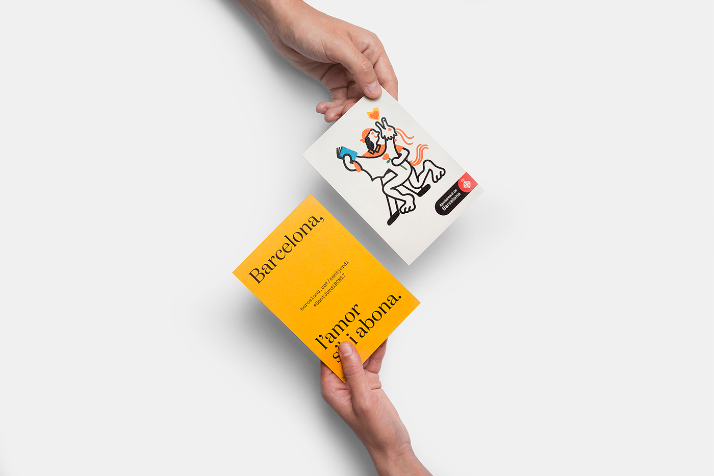
It is a simple system of few assets, yet there is plenty of impact in their arrangement, standing out from an urban environment of stone and trees. There is variety and continuity in the systematic and modular qualities of illustration, and the way these are used individually and collectively within different contexts, and manage to touch upon the city’s diverse character and history in a playful but thoughtful way.
Design: Requena & Capdevila. Photography: Koldo Castillo & Martí Pujol. Opinion: Richard Baird. Fonts Used: Domaine & Space Mono.
