Posted: | Author: Richard Baird | Filed under: Cafes, Bars and Restaurants, Graphic Design Reviews, Logo Reviews | Tags: Brand Book, Brand Guidelines, Brand Identity, Brand Identity Reviews, Branding, Branding Agency, Branding Blog, Branding Reviews, Cafe Logos, Design For Print, Design News, Design Opinion, Design Reviews, Designed by Paul Belford Ltd, Designed in London, Fonts in Use: Aktiv Grotesk, Graphic Design, Graphic Design Blog, Illustration, Lettering, Logo Design & Branding Blog, Logo Design Inspiration, Logo Design Resource, Logo Designs, Logo Opinion, Logotypes, Neon Sign Design, Patterns, Restaurant & Cafe Menu Designs, Sans-serif Typography, Sushi Branding, The Best Brand Identities of 2016, The Best Graphic Design Work of 2016, The Best Logo Designs of 2016, The Very Best of 2016, Typography, Wordmark Design | Opinion by Richard Baird.
London-based graphic design studio Paul Belford Ltd. worked with UK restaurant chain YO! Sushi, now Yo!, to rebrand, as it expands into the US, the Middle East and further into Europe. This included an updated logo together with an extensive 200 page brand book, presented in a bespoke Japanese bento box, that covered a variety of new assets. The brand book covers menus, packaging, signage and illustrative noren curtains, as well as a guide to art direction.
Continue reading this article
Posted: | Author: Richard Baird | Filed under: Business, Banking, Law and Finance, Fonts in Use, Logo Reviews | Tags: Binding, Brand Identity Reviews, Branding, Branding Blog, British Design, Brochure Design, Colour in Use: Fluorescent, Colour in Use: Green, Coloured Paper, Custom Typography, Design For Print, Design Reviews, Designed by dn&co., Exhibition Design, Fonts in Use: Aktiv Grotesk, Graphic Design, Graphic Design Blog, Logo Design & Branding Blog, Logo Design Inspiration, Logo Designs, Logos, Logotypes, Reviewed by Robert Holmkvist, Sans-serif Logotypes, Stitch Detail, Supergraphics, The Best Brand Identities of 2014, The Best Logo Designs of 2014, Tote Bag Design, Type Foundry: Dalton Maag, Typography, Visual Identity Design Blog | Opinion by Robert Holmkvist.
Here East is a 1.2 million sq ft commercial space developed by Delancey and housed within the former Olympic Press and Broadcast Centre near Hackney Wick in East London. Here East is described as an ecosystem looking to attract businesses from the design, technology and modern manufacturing sectors who are looking to scale, and those of scale looking to behave more creatively. So far BT Sport, Lougborough University, Infinity and Hackney Community College have all signed up for space.
Here East’s brand identity, developed by dn&co., reflects its intentions of bringing together specific business types and the connected nature of its space through a contrast of digital generative elements and physical handcrafted detail. The studio was also responsible for Here East’s broader brand strategy alongside Poke, who designed the website, and architects Hawkins\Brown. This post was updated in 2016 with images of signage and wayfinding, and 2018 with tenant guide, bus liveries and brand book.
Continue reading this article
Posted: | Author: Richard Baird | Filed under: Art and Design, Logo Reviews | Tags: Brand Identity, Brand Identity Design, Brand Identity Reviews, Branding, Branding Blog, Branding Reviews, Business Card Design, Designed by Studio Alexander, Designed in Auckland, Embossed Business Cards, Fonts in Use: Aktiv Grotesk, Fonts in Use: Proxima Nova, From New Zealand, Graphic Design, Logo Design & Branding Blog, Logo Designs, Logo News, Logotypes, Metallic Spot Colours, Monogram Design, New Logo, Stationery Design, The Best Brand Identities of 2014, The Best Business Cards of 2014, The Best Logo Designs of 2014, Triplex Business Cards, Type Foundry: Dalton Maag |
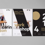
Carin Wilson is a renowned furniture maker, sculptor, design educator and leader of the New Zealand craft movement throughout the 1970s, 80s and 90s. As well as precisely crafted functional furniture, Carin also creates pieces that look to explore narrative through alternative form — check out his work Royal Pain in the Arse — and are influenced by his Maori heritage.
Carin Wilson’s new brand identity was designed by Auckland based Studio Alexander and recently announced as a finalist in this year’s Best Awards. By leveraging the traditional values typically associated with the craftsman’s monogram and using a contrast of heavy fill and fine lines, type size and weight, colour and the absence of colour, material choice, print finish and bilingual background online, the solution neatly resolves the heritage, craft and functionality of Carin’s work.
Continue reading this article